In today’s crowded online marketplace, there’s even less tolerance for sloppy, low-quality websites than there used to be.
All too often, site managers overlook basic issues that drive visitors away—obvious spelling mistakes, walls of uninterrupted text, clashing colors, and graphics that look like they were exported from a ‘90s clipart CD.
When problems like these show up on your site, visitors don’t just judge that page—they judge your brand. Most won’t stick around to give you a second chance.
Use this guide of 22 elements you’ll find on high-quality websites to attract more visitors and keep them engaged. If you’re launching a new site, work through it like a checklist. If you’re improving an existing site, keep it handy whenever you publish a new blog post, add a product, or ship an update.
- Fresh content
- Substance
- Credibility
- Typography
- Readability
- Scannability
- Original images
- Schema
- Linking strategy
- No dark patterns
- Suitable advertisements
- Ease of navigation
- Accessibility
- Responsive design
- Social proof
- Aesthetics
- White space
- Site speed
- Security
- Clearly state all policies
- Consistency
- Strong brand identity
1. Fresh Content
Websites that attract repeat visitors have one thing in common: consistently fresh, useful content that’s worth coming back for.
If you stop publishing or refreshing, posts can decay quickly—sometimes over years, sometimes over months or even weeks—especially in fast-moving niches. As interest fades, so does visibility in search.
Google treats reliable publishing and regular updates as signals that a site is active and helpful. Its goal is to surface the most relevant, highest-quality content for each query, not just the newest content—but freshness helps when it adds real value.
You don’t need to post daily, but you should be predictable. Aim for a cadence you can maintain—say, a few new posts per month plus timely updates to existing articles. Updating older, high-potential posts with new data, clearer steps, and better examples often delivers bigger wins than publishing something brand-new.
If you target a combined 16 new and refreshed posts per month, prioritize quality over volume. Thin, generic pieces—especially those churned out just to hit a number—won’t perform and can hurt trust with readers. Tools can help you draft, but publish only content that demonstrates judgment, accuracy, and originality.
Use Google’s E-E-A-T recipe for success: highlight real-world experience, show expertise, earn authoritativeness, and prove trustworthiness.
2. Substance
Opinions vary wildly on ideal post length. You’ll hear everything from “keep it to 500 words” to “go write a mini-book.”
Focus instead on comprehensive, mid-to-long-form guides (often 1,400–3,000+ words) that fully solve the searcher’s problem. Depth tends to earn more links and rank more reliably because it satisfies intent.
HubSpot ran a study on its own content and found best-performing articles averaged 2,330 words—useful context, not a rule.
Length only helps if quality is high. Cover the key subtopics, answer common objections, include current examples, and make next steps obvious.
Remember: some niches reward brevity, others demand depth. Balance rankings with readability, and let audience expectations, competitiveness, and the query itself guide how thorough you need to be.
3. Credibility
Every part of Google’s E-E-A-T framework points to one outcome—credibility.
- Experience: First-hand use or testing earns trust. Share what you tried, what worked, what didn’t, and what you’d do differently next time.
- Expertise: Show credentials and context in the byline and author bio. Make it obvious why you’re qualified to write the piece.
- Authoritativeness: Write clearly and confidently, cite reliable sources, and include specifics—numbers, screenshots, and step-by-steps.
- Trustworthiness: Back claims with evidence. Consider independent quotes (HARO still helps), add data visuals, and fact-check before you publish.
Do this consistently and you’ll earn the kind of credibility readers (and search engines) reward—especially on long-form content that solves real problems.
4. Typography
Imagine you’re searching for guidance on business tax forms—a serious topic—and you click through to a site covered in Comic Sans or ornamental scripts. Instant whiplash.
Typography sets tone and controls legibility. Choose type that matches your subject and is effortless to read on every device.
Use faces where characters are easy to distinguish (no squinting to tell an e from an o), and ensure comfortable reading sizes and spacing.
There are several elements to get right:
- Typeface: the family/design (e.g., a geometric sans vs. a handwritten script)
- Font: the specific style within a family (e.g., Lexend Thin vs. Lexend Semi Bold)
- Weight: how light or bold the stroke appears
- Kerning: spacing between specific letter pairs
- Leading: line spacing (often 1.5–1.8× improves readability)
- Tracking: overall letter-spacing across a range of text
Rule of thumb: it’s fine for headlines to be distinctive, but keep body copy and button labels simple and highly legible.
5. Readability
Readability is how easily someone can read and understand your text—quickly.
Favor short sentences and paragraphs, active voice, and precise word choice. Remove filler. Trim adverbs and stacked adjectives unless they add meaning.
Often, less really is more.
To gauge difficulty, use readability formulas like Flesch-Kincaid Reading Ease, ARI, or Gunning Fog.
Flesch-Kincaid is popular, but different tests suit different industries. Pick what aligns with your audience and jargon levels.
The Simple Measure of Goobledygook (SMOG) is especially useful for medical and legal content to keep complexity in check.
Most web copy should land around an eighth-grade level or lower. People come online to get answers, not to decode prose.
Tools like Hemingway, Grammarly, and Ginger Writing Assistant can help you simplify without dumbing things down.
6. Scannability
Some readers go line-by-line. Most scan first, decide if it’s relevant, and then dig in.
Make scanning effortless.
Use these three tips for scannability:
- Pay attention to visual hierarchy. Put critical content and CTAs where eyes land first. Size and style headings appropriately. Keep global navigation and social buttons in predictable places. Use white space to separate ideas and guide attention.
- Avoid fluff. Deliver exactly what the reader needs—no padding to inflate word count.
- Use HTML headings to break up content. H1/H2/H3 structure helps both readers and search engines. In articles, keep sections tight (?300 words or less) and paragraphs to three or four sentences for easy skimming.
Use bullets, numbered lists, tags, bold, and italics to highlight key points—sparingly, so emphasis still means something.
7. Original images
Social platforms like Instagram and TikTok prove how much compelling visuals matter. Your website should put original images and videos to work, too.
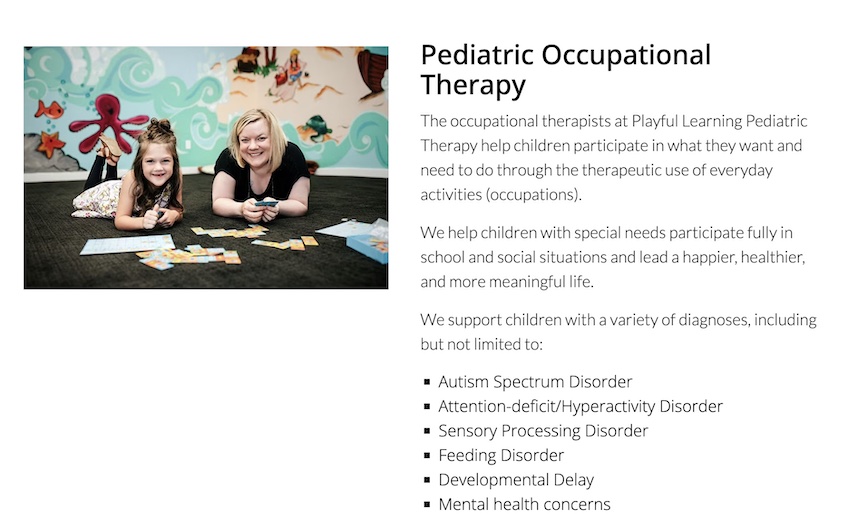
The most important rule: use authentic, original media. Stock photos rarely inspire trust. Show your product, team, process, and environment as they really are.
For example, a pediatric occupational therapy site showing a real therapist with a real child inside the actual clinic sets accurate expectations and builds confidence.
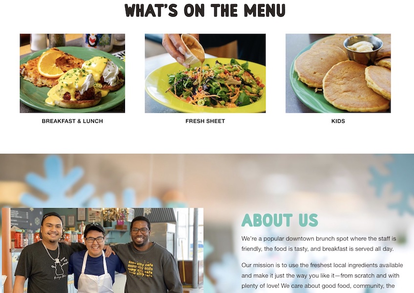
Snow City Café in Anchorage showcases its own dishes, staff, and space—an instant cue that the experience is real, not staged.
Original images also support accessibility and SEO. Always add descriptive alt text in your editor, use meaningful file names, and include captions when helpful.
Bottom line: relevant, high-quality visuals add depth and clarity. Capture your office, your team, your products, and your work in action so visitors can see what you do.
From annotated screenshots to short demo clips, there’s plenty to showcase. Keep assets crisp and lightweight (consider modern formats like WebP/AVIF and lazy loading) so they look great without slowing the page. My guide to website images can help you get started.
8. Schema markup
Schema markup is a shared vocabulary from Google, Bing, Yahoo, and Yandex that helps search engines understand your pages. Add structured data to clarify what a page contains.
Clear, valid markup can make crawling more efficient and improve eligibility for rich results on the SERP—those enhanced listings that attract more attention and clicks.
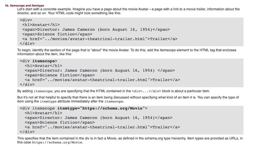
Explore Schema.org types that fit your content—such as LocalBusiness, Organization, Person, or Recipe.
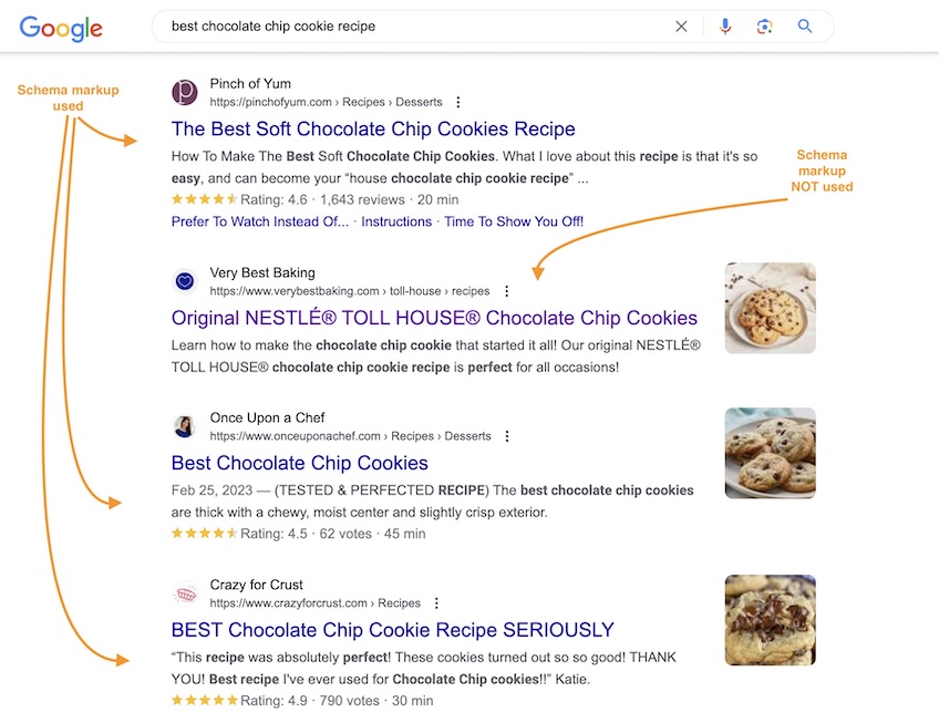
Search something like “best chocolate chip cookie recipe” and you’ll notice some results display ratings, time, or ingredients while others don’t.
That’s the difference structured data can make.
Note: Google now restricts certain rich results. For example, FAQ rich results generally appear only for well-known government and health sites, and How-To rich results are deprecated. Still add structured data when it helps machines interpret your content, but set expectations about which enhancements are likely to show. See Google’s update.
Markup doesn’t guarantee enhancements, but it does help search engines interpret your page correctly and gives searchers more details to compare before they click. That combination often boosts engagement.
9. Linking strategy
If the internet is a global map, links are the roads that connect it. Use them intentionally.
There are two types of links you should include:
- Internal links, which lead to relevant pages within your site
- External links, which lead to relevant content outside your site
Internal links keep readers engaged with your content and help search engines understand site structure. Use descriptive anchors, point to related guides, and fix orphan pages that have no internal paths to them.
External links show you’re well-read and transparent. Cite authoritative sources to support claims and send readers to helpful reference material when it genuinely adds value.
Strong linking also improves SEO. Review Google’s best linking practices to ensure links are crawlable, anchors are concise and descriptive, and sponsored or user-generated links are labeled appropriately.
10. No dark patterns
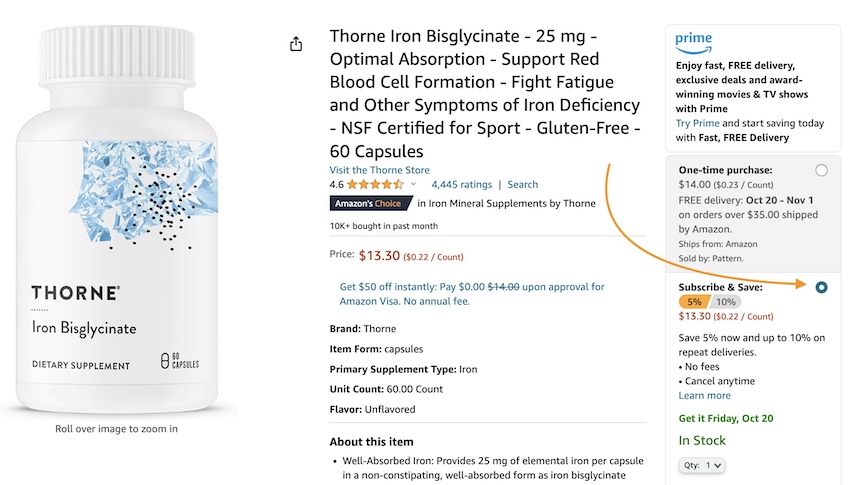
If you’ve ever tapped “Accept all cookies” because declining required a maze of submenus, you’ve encountered a dark (deceptive) pattern.
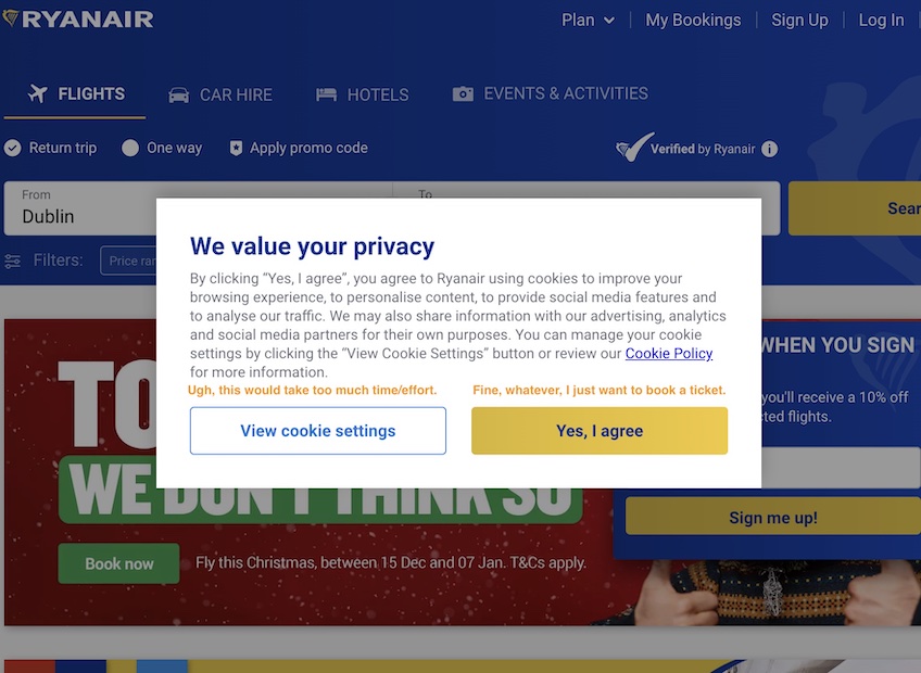
Dark patterns use interface design to push users into choices they wouldn’t make if options were presented clearly.
For instance, auto-selecting a “Subscribe & Save” purchase while hiding the one-time option in gray makes the upsell look like the default—and it’s easy to click without noticing.
Other common dark patterns include:
- Subscriptions that are easy to start and hard to cancel
- Shaming language on opt-outs (“No thanks, I hate saving money”)
- Countdown timers designed to rush decisions
- Hidden fees (or “junk fees”) revealed only at checkout
- Discriminatory pricing or experiences based on user data
- Forced account creation for simple actions
For your own site, avoid deceptive patterns entirely. Beyond user backlash, several privacy laws now treat dark patterns as invalid consent—California’s CPRA and Colorado’s CPA are two prominent examples—and the FTC has signaled enforcement against manipulative design. See CPRA guidance and Colorado updates.
11. Suitable advertisements
Visitors understand that quality content isn’t free to produce. Thoughtfully placed ads are fine—when they serve your audience and don’t hijack the experience.
You need revenue; just be selective about how you earn it.
Find the balance between monetization and a fast, frustration-free UX.
If visitors are wading through pop-ups, auto-playing videos, and layout shifts caused by ads, you’ll lose them (and harm Core Web Vitals).
Three practical tips:
- Know your audience and partner accordingly. Align sponsors, affiliates, and placements with what readers actually want. For B2B software, for example, integrate affiliate recommendations where they add genuine value.
- Be transparent. Clearly label sponsored content and affiliate links. Disclosures aren’t just legally required; they build trust.
- Sell inventory strategically. Don’t accept every offer. Keep ads relevant, cap density (especially on mobile), and avoid formats that trigger layout shifts.
12. Ease of navigation
Users should never have to hunt for what they need. Intuitive navigation is a hallmark of quality.
Keep these rules of thumb in mind:
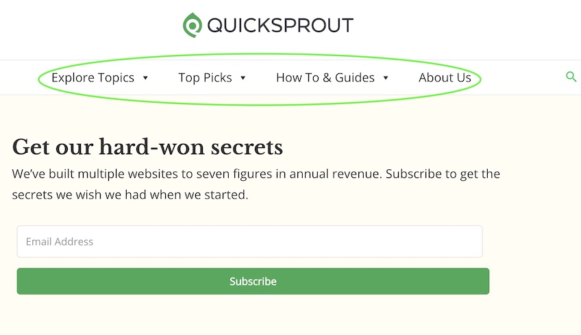
Menu options should be limited, not overwhelming. Most sites perform best with no more than seven primary items in the top navigation. Reserve the header for core destinations, and tuck lower-priority items into a hamburger or footer.
Hamburger menus save space on small screens and keep options tidy. Done well, drop-downs introduce your site structure without overwhelming new visitors.
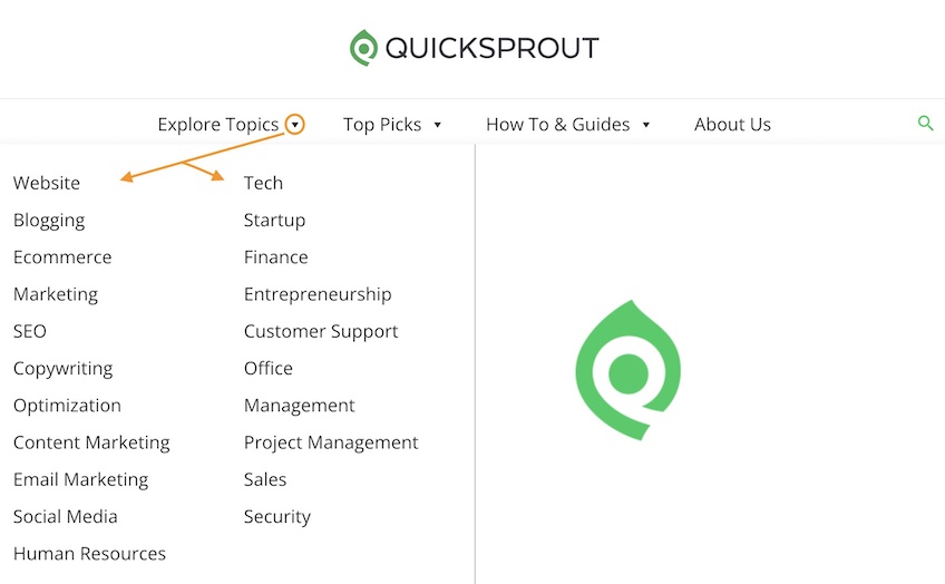
On Quick Sprout, I keep four main header buttons and expose categories in organized drop-downs. Listing everything in the top bar would be chaos.
Add a search bar. Users expect on-site search. Make it easy to find, make it fast, and make results useful.
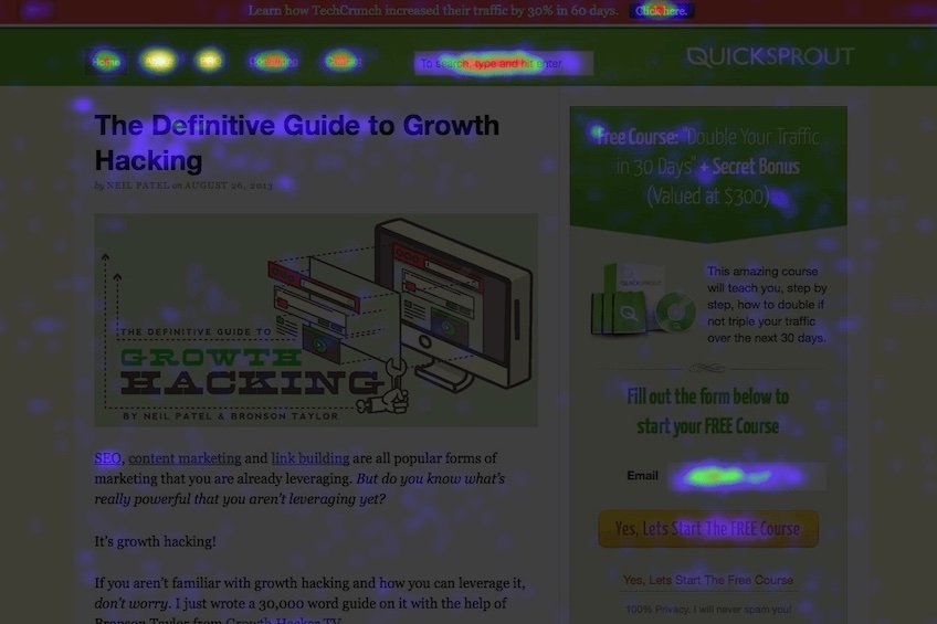
Feature important info at the top of the screen. Your logo, contact info, search, hamburger, and primary navigation belong in the header—where attention goes first on heatmaps.
13. Accessibility
Accessibility isn’t optional. In many countries (including the U.S.), digital accessibility is treated like physical accessibility—essential for participation and often required by law.
There’s no single universal law to copy-paste, but in April 2024 the U.S. Department of Justice finalized a rule under ADA Title II requiring state and local governments to meet specific web and mobile app accessibility standards on a timetable. Private businesses aren’t covered by that rule, but ADA case law and settlements still expect conformance with WCAG—aim for WCAG 2.2 AA across your experience. See DOJ summary.
Recommended best practices:
- Write alt text for every meaningful image. Screen readers rely on it. Be concise and descriptive, including for charts and tables.
- Use sufficient color contrast. High contrast helps users with color vision deficiencies and low vision. Offer a dark mode or high-contrast toggle if your palette is light.
- Use color plus another cue for emphasis. Don’t rely on color alone to convey meaning; pair it with text or icons.
- Caption videos and provide transcripts. Modern tools make this straightforward, and it helps more than just deaf or hard-of-hearing users. See tools for captions.
- Label form fields and surface clear errors. Every input should have a programmatic label and concise instructions. Explain errors in plain language with suggestions to fix them.
- Provide an easy way to report accessibility issues. As standards evolve, so should your site. Make feedback effortless.
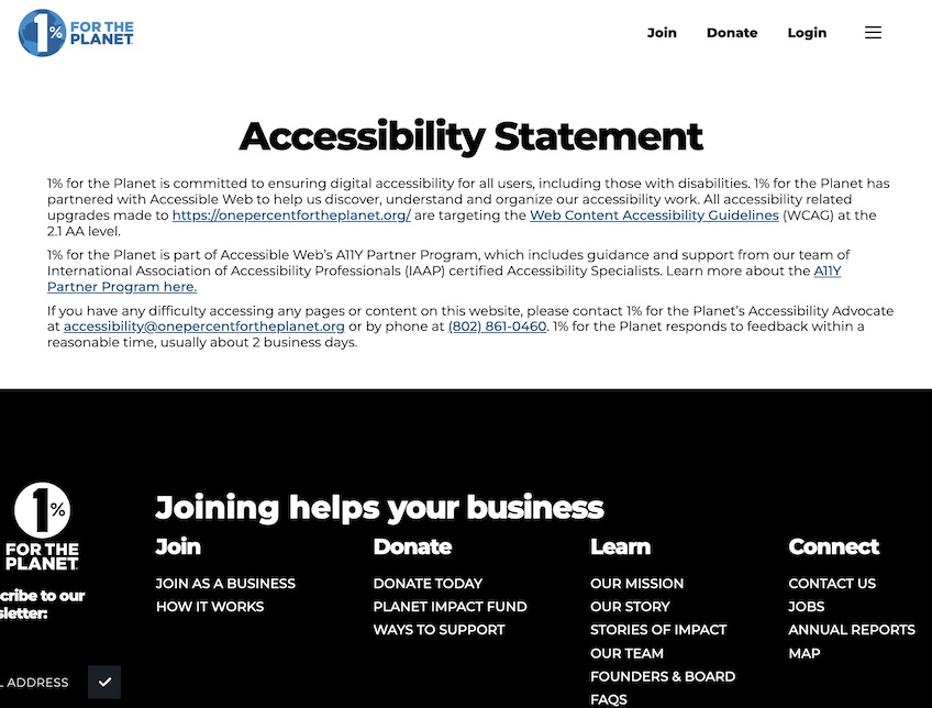
- Be transparent. Like 1% for the Planet, publish an accessibility statement with your commitments and a feedback channel.
Following the international Web Accessibility Initiative guidance (aim for WCAG 2.2 AA) improves usability for everyone—keyboard users, screen reader users, and mobile users alike.
14. Responsive Design
I’m well beyond “desktop vs. mobile.” Screens today range from wristwatches to 6K monitors. Your layout should adapt gracefully to all of them.
Adaptive design serves distinct, static layouts (desktop, tablet, mobile) based on detected screen size.
That can work for small sites, but larger properties benefit from responsive design that fluidly adapts to any viewport.
With CSS media queries (and increasingly container queries), one flexible layout can reflow content, resize type, and adjust navigation automatically.
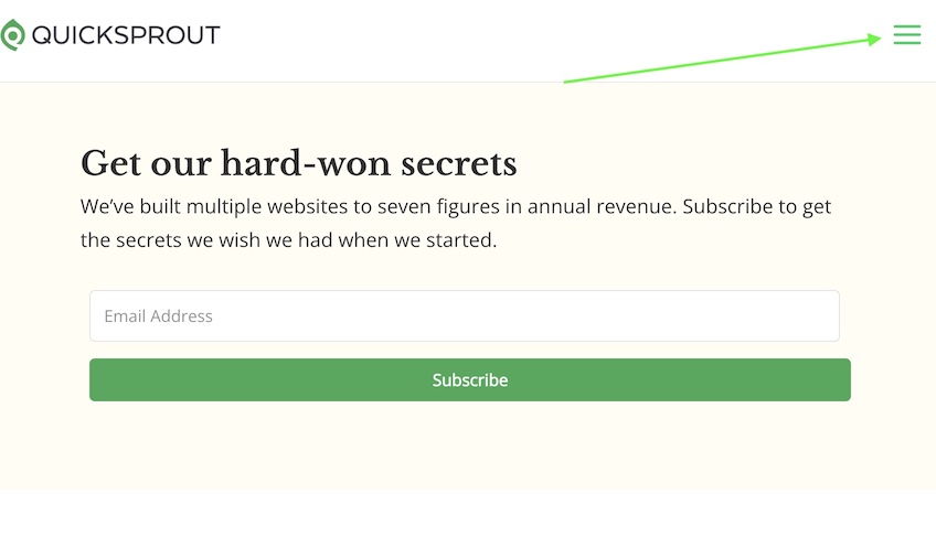
On Quick Sprout, the header shows four menu items at larger sizes…
…and collapses into a hamburger menu on tablets, phones, or a narrow browser window—same content, right format.
Don’t want to code from scratch? Use a website builder like WordPress, Weebly, or Squarespace—all support responsive templates that handle the heavy lifting.
15. Social proof
Testimonials and reviews signal that real people have succeeded with your product or advice. The more relevant the source, the stronger the signal.
If you’re an independent real estate agency, feature quotes from local contractors you partner with and from buyers you’ve helped—voices your audience recognizes.
Those carry far more weight than generic praise from friends and family who haven’t used your services.
Also give customers a clear place to leave reviews. A few less-than-perfect comments can actually boost credibility; a wall of 5-star blurbs can feel suspicious.
Look at Ahrefs’ testimonials: hand-picked, categorized, and specific—pros, content marketers, enterprise teams, agencies, SaaS, and ecommerce.
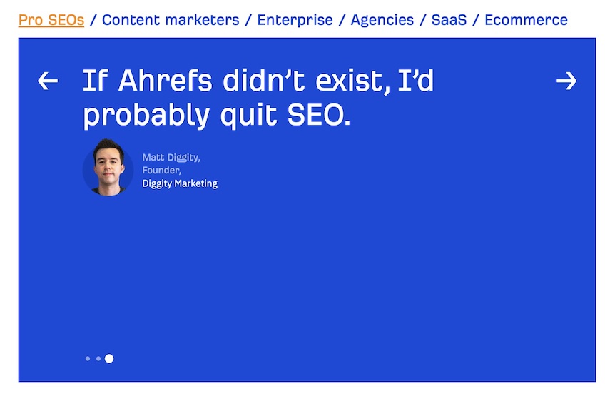
Bottom line: social proof is about trust. Use real names, real companies, and—when possible—real results.
16. Aesthetics
Inconsistent color palettes, giant blurry images, and unbroken text blocks make visitors bounce. Quality design feels cohesive and intentional.
Treat aesthetics as part of your experience strategy. Create a palette that fits your brand and apply it consistently.
Quick Sprout leans on green accents that reinforce the brand name and unify pages across categories.
Match your voice, too. Keep tone consistent across blog posts, landing pages, product copy, and email.
Use short, informative headings, break lists into bullets, and proof with tools like Grammarly so typos never undercut your message.
17. White space
White space (negative space) is the breathing room around your content—between paragraphs, images, buttons, and modules.
It may look “empty,” but it’s doing work. White space creates contrast, separates ideas, and guides attention.
PickFu’s site uses generous spacing so data and CTAs stand out without shouting.
PickFu, a split-testing service, has a website with ample white space that makes everything on the page stand out, from the data on the top of the page to the four buttons on the bottom.
Pages crammed with dense text, carousels, and competing CTAs tire people out. Decision fatigue sets in fast.
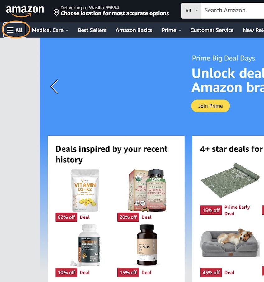
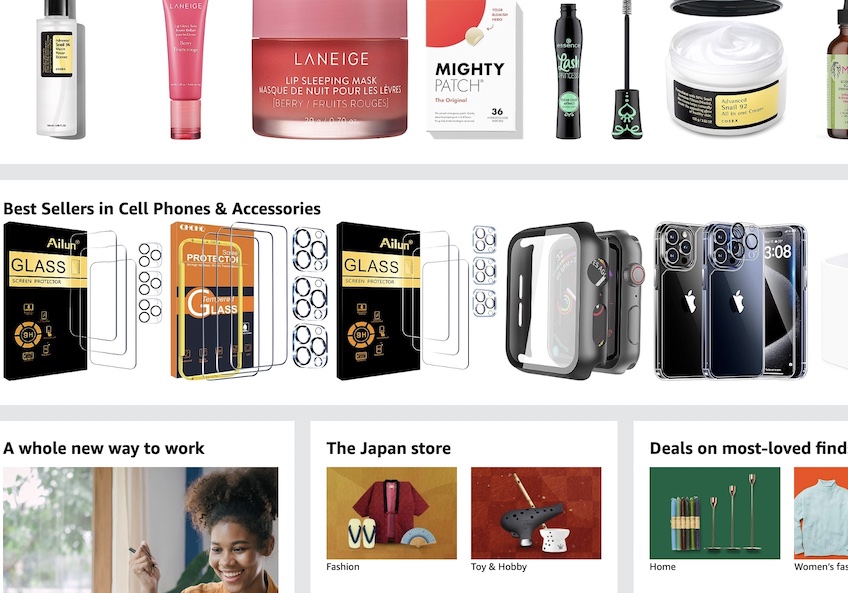
Scroll Amazon’s suggested items to see minimalist spacing in action—functional but busy compared to a focused landing page.
Use white space deliberately. It isn’t wasted; it’s the structure that makes everything else easy to digest.
18. Site speed
As load time rises, so do abandonment rates. Speed is a conversion feature.
Faster pages win more signups, sales, and shares because users expect snappy experiences—and search systems now factor performance into visibility.
So how do you keep your site feeling instant?
Start with reliable hosting and scale it as you grow. As traffic and content expand, upgrade resources to keep response times low and uptime high.
Choosing a dedicated server—or a high-performance VPS/managed plan—can be a major speed lever. With a host like Bluehost, you can start on shared hosting and move up as demand increases.
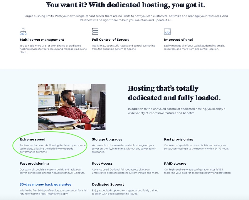
Dedicated resources cost more, but the stability and speed often justify the investment. Complement hosting with smart front-end work: optimize images, defer non-critical scripts, minimize third-party tags, cache aggressively, and use a CDN. Aim to pass modern Core Web Vitals—LCP, CLS, and INP (which replaced FID as of March 2024). Learn about INP.
Need help choosing infrastructure? See my guide to the best web hosting providers.
19. Security
If you’re not actively protecting your site and users, it’s time to change that. Attacks are common, and recovery is expensive.
Thousands of sites are compromised every day. You don’t need to be a high-profile brand to be a target—automated scans look for easy wins.
Start with these fundamentals:
- Use HTTPS everywhere. Encrypt traffic to protect logins, payments, and personal data. Enable HSTS to prevent protocol downgrades.
- Choose secure hosting. Shared plans are fine for small sites but carry more risk if a neighbor is breached. Consider managed hosting, regular patching, and a web application firewall.
- Back up consistently. Keep automated, off-site backups and test restores. When issues happen, backups turn disasters into inconveniences.
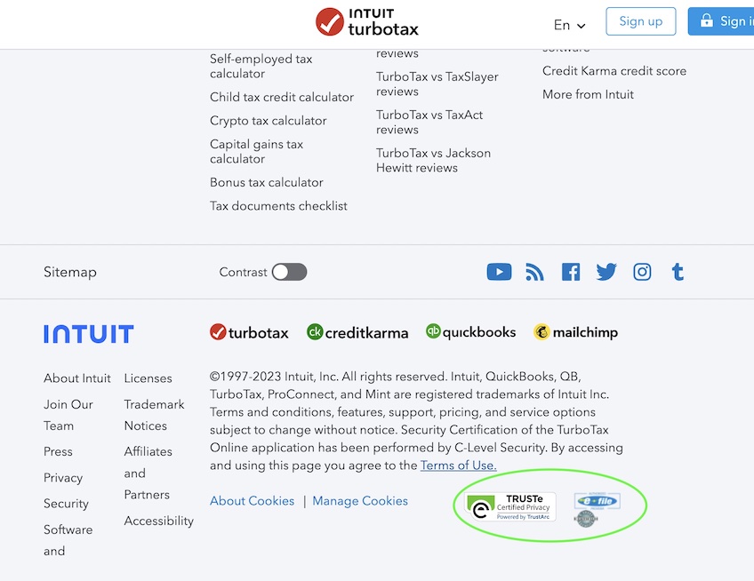
Good security also boosts perceived trust. Displaying recognized trust badges and certifications reassures visitors that you take protection seriously.
If your site uses a security or privacy service, show that in the footer. TurboTax, for instance, surfaces badges from TRUSTe/TrustArc, the IRS’s e-file provider program, and a security seal.
These cues matter even more for ecommerce, tax prep, law firms, healthcare, and any business that handles sensitive data.
20. Clearly state all policies
Privacy rules keep evolving. The EU’s GDPR (2018) applies broadly—even to non-EU sites that serve or track EU residents—and it set the tone for many newer state-level laws in the U.S.
In practice, that means almost any modern website is within scope of at least one privacy framework.
Several U.S. states have enacted GDPR-style laws as well, so build for compliance and clarity rather than chasing minimal checkboxes.
Review the GDPR laws and design consent that’s honest and simple. Explain what data you collect, why, and how it improves the experience.
When asking for cookie consent, provide a clear No choice and an easy Learn more path—don’t force users into acceptance via dark patterns.
Beyond privacy, publish policies that reduce purchase friction: returns, guarantees, shipping timelines, and support hours. For ecommerce, unclear or missing policies crush conversion because buyers assume the worst.
21. Consistency
Visitors learn and rely on your patterns. Sudden shifts in layout, UI, or tone make sites feel untrustworthy—even if the content is good.
Keep navigation, header/footer elements, and key components (search, share buttons, CTAs) consistent across pages.
Themes and design systems help enforce consistency automatically, but you should still document a brand and content style guide so new pages feel native, not bolted on.
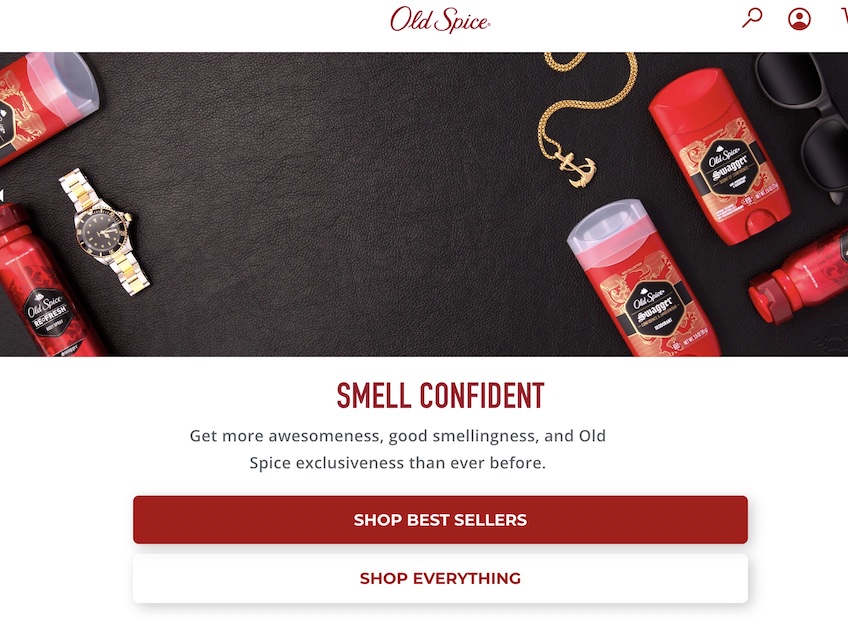
22. Strong brand identity
Whatever page a visitor lands on, they should instantly know it’s yours—without being hit over the head with a logo every paragraph.
Start with brand personality, then let it shape your colors, type, imagery, and voice. Align every touchpoint so the experience feels unmistakably “you.”
Old Spice nails this with playful copy and thematic visuals. Even the homepage language—“Get more awesomeness, good smellingness, and Old Spice exclusiveness”—is unmistakably on-brand.
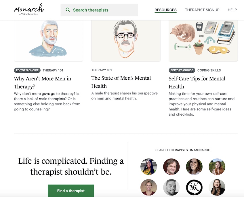
If your brand is more about calm, clarity, and service, let that lead. Emphasize how your product helps, show it in use with simple illustrations, and keep language direct and reassuring.
Monarch by SimplePractice does this well—its site connects users with licensed therapists, and the visuals and tone are steady and supportive, not salesy.
Take the time to define the identity and personality your website should express—then build everything to support it.
When you’re ready, go build it.