From stock photography to graphs, charts, screenshots, and infographics, you have plenty of ways to illustrate a blog post. The real question is: which image types actually help bloggers inform readers, earn links, and rank in search?
Yes—adding images is worth the effort. In BuzzSumo’s analysis of 1M+ articles, posts that included an image every 75–100 words earned roughly 2× more shares. Images also improve scanability, reinforce key points, and—when optimized—can help your Core Web Vitals.
With that in mind, here are the image and graphic types that most reliably lift engagement and organic visibility—and how to use each well.
Stock photography

Stock photos used to feel generic, but libraries have improved. Platforms like Shutterstock, Pixabay, and iStock offer huge catalogs, including diverse, authentic-looking scenes. The key is intent: choose images that advance your point—avoid filler shots that could appear in any post.
Use platform search filters (orientation, color, subject, copy space) to find visuals that match your topic and audience. Then lightly customize: crop, add a subtle overlay, or include brand colors and labels so the image supports your narrative and looks unique.
Always confirm licensing and usage rights, especially for commercial posts. When possible, favor original photography or edited stock that clearly relates to the specific paragraph it sits beside.
Screenshots

Screenshots shine in tutorials, reviews, and how-to guides. When I publish walkthroughs on Quick Sprout, step-by-step screenshots make instructions obvious and trustworthy. Annotate sparingly (boxes, arrows, labels), blur sensitive data, and capture at 100% zoom to keep text crisp.
Most devices have built-in capture tools, but quality matters. If your uploads look soft or pixelated, try a browser or desktop tool that exports at exact dimensions and high resolution (for example, full-page capture tools or purpose-built screenshot apps). Save UI images as PNG, WebP, or AVIF for clarity and compression, and optimize before upload to protect page speed.
Hand-drawn images

The Oatmeal is a classic example of using hand-drawn visuals to build a recognizable voice. Custom illustrations can communicate complex ideas with humor and originality—two things that attract links and shares.
They do take time or budget. If you’re not an illustrator, commission a freelancer for repeatable assets (characters, icons, scenes) you can reuse across posts. Provide a clear brief so the drawings reinforce your message, and keep accessibility in mind with descriptive alt text.
Graphs and charts

Graphs and charts are powerful because data persuades. Use them to quantify claims, compare options, or show trends. Favor simple chart types, label axes clearly, and include plain-language takeaways in the surrounding text so readers grasp the “so what” fast.
Data-rich posts tend to attract relevant links over time—especially when you cite reputable sources and keep numbers current. If your topic doesn’t suit a chart, a compact infographic or annotated screenshot often communicates the idea more cleanly.
Infographics

Infographics are one of my most-used formats after stock photography. They package complex info into a scannable asset that’s easy to embed and share. Keep the design clean, avoid tiny text, and front-load the key insight near the top to win attention on mobile and social.
Beyond traffic and shares, infographics can earn organic links when they summarize credible research and offer a unique angle. For best results, pair the image with explanatory paragraphs so the page can rank on its own—even if the graphic is re-used elsewhere.
Tools like Canva make it simple to resize for different platforms and export to WebP or AVIF for smaller file sizes. Add a brief caption crediting data sources when helpful.
Royalty free images

“Royalty-free” means you don’t pay ongoing royalties per use—not that the image is always free. Subscriptions like Canva Pro include broad licensing, while sites like Unsplash and Pexels offer no-cost images with generous, but specific, terms. Read licenses, especially for commercial use or when people and private property are visible.
Good practice: keep attribution details in your CMS or DAM, and credit creators when a license requests it. When the same image appears across multiple networks, tailor captions and alt text to the context so each placement remains useful and compliant.
Animated graphics

Animated visuals—GIFs, short loops, and motion infographics—grab attention in feeds and simplify multi-step concepts. They can outperform static images for engagement, but large GIFs are heavy. When possible, export short clips as MP4 or WebM for smaller files and faster pages, and include a caption that explains the key takeaway.
You can also create lightweight animated elements (progressions, arrows, highlight pulses) to guide the eye without distracting from the content. Tools that export ready-to-embed animations make this easier than fully hand-drawn sequences.
I occasionally publish animated infographics on Quick Sprout. They’re most cost-effective for evergreen topics where the same motion asset can be reused or syndicated.
Hero Images
Hero images are the visual “hello” for your brand—appearing on homepages, landing pages, blog posts, and even in email headers. They’re designed to be the very first thing a visitor or subscriber sees the moment a page loads or an email opens.
Because of that, a hero image’s main job is to capture attention instantly while your headline, short supporting copy, and primary CTA clarify what you offer and why it matters. Done well, this combination pulls people deeper into your content instead of bouncing.
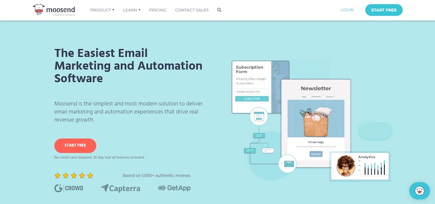
Take Moosend. Its hero image introduces the platform by highlighting core features, paired with a clear headline and concise copy that expands on the value. The intent is obvious: communicate benefits in seconds and drive clicks on the CTA beneath.
Many sites follow this familiar pattern—and that’s fine. Convention reduces cognitive load, so visitors know where to look and what to do. The key is using the pattern intentionally rather than generically.
In short: hero images work, but only if you implement them with care.
Hero Images Let You Control the First Impression
People form an opinion about a page in roughly 50 milliseconds, which makes your hero area a decisive part of how your brand is perceived.
That means the visual must be striking, relevant, and instantly legible. In a glance, visitors should be able to tell what you do and why they should keep scrolling.
Skip generic stock photos. Choose authentic imagery (or product UI) that reflects your audience and brand. Real people, real product, real context—these cues build trust fast and avoid the “template” feel.
Remember, the image isn’t a solo act. Pair it with a strong headline, a clarifying subhead or short body copy, and a focused CTA. The text gives context and promise; the CTA gives the next step.
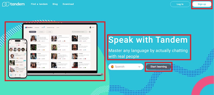
Tandem shows its app in action across mobile and desktop directly in the hero. That preview sets expectations and helps visitors picture themselves using the product.
Unlike Moosend, Tandem places the visual on the left. Because users spend about 80% of their time looking at the left side of a page, the app preview becomes the focal point within an F-pattern scan.
The concise headline and supporting copy to the right reinforce the value proposition—learning languages by chatting with real people—while the hero shows profiles to make that promise concrete.
The CTA text “Start learning” is specific to the product outcome (better than a generic “Sign up”), and its contrasting style makes it easy to spot without overwhelming the design.
The adjacent dropdown to choose a language adds light interactivity, nudging visitors to engage immediately and self-select their path.
A secondary CTA in the top-right nav provides an alternate, ever-present conversion path for visitors who skip the hero button.
Overall, Tandem’s hero clarifies what makes the product different and offers a realistic peek into the experience—effective and cohesive.
Everything Should Build on the Hero Image
Because the hero shapes the first impression, let it set the story—and let the rest of the page continue that story.
Your hero should communicate what you do and why it’s better. The sections below the fold then add proof, detail, and guided next steps—consistent with the promise you made up top.
Back to Tandem: the hero shows real profiles and the interface; the headline promises language learning through conversation. The rest of the page demonstrates how that happens in practice.
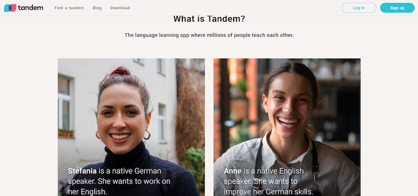
Below the fold, Tandem quickly explains the product, then uses a simple narrative: two people who want to learn each other’s language. Stories help visitors connect the promise to a real-life use case.
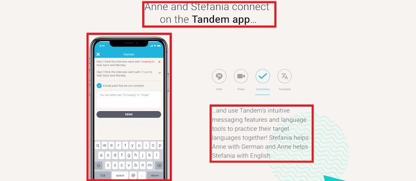
A short video on the left plus a text-based walkthrough on the right gives both visual and verbal learners what they need. The copy invites readers to imagine themselves in the flow; the video shows the steps.
Together, these sections reinforce the claims made in the hero and reduce uncertainty—exactly what you want before asking for a signup.
Do Hero Images Work?
Yes—when they’re purposeful. Despite how common they are, well-executed hero sections still lift attention, clarify value, and nudge conversions.
They make pages more scannable, reinforce brand identity, and communicate benefits without a wall of text. Measure impact with simple metrics: click-through on the primary CTA, scroll depth, signups, and Core Web Vitals for the hero (LCP/INP/CLS). Note that Interaction to Next Paint (INP) officially replaced First Input Delay (FID) as a Core Web Vital in March 2024.
When planning your website, treat the hero as the centerpiece and build outward. Nail the image, message, and action—and remember you have about 50 milliseconds to earn the next second.
Conclusion
To earn more traffic and links, prioritize images that are original, relevant, and genuinely helpful. If you can invest the time, custom drawings and tasteful animations stand out. If not, screenshots, clear charts, and well-chosen stock photography still elevate your posts and make concepts easy to grasp.
AI-generated art is an increasingly popular image choice. Test it for concepts and placeholders, review license terms for each tool, and add human editing so results match your brand and message.
Whatever you choose, match the visual to the content’s intent, write descriptive alt text, compress files, and place images near the paragraphs they support. For performance, serve modern formats (WebP/AVIF), avoid lazy-loading your hero (LCP) image, and consider preloading responsive hero sources; that combination improves user experience—and gives your post a better shot at ranking.