Interactive design elements can be pretty headache-inducing in terms of their development and maintenance requirements. Nevertheless, they’re usually worth the effort in the end—because websites with interactive content experience twice as many conversions as those without.
That makes sense, though, right? After all, if interactive elements can get visitors involved in the browsing experience, that almost necessarily leads to better user engagement—not to mention how they can also help you deliver your message more effectively.
At the end of the day, interactive content improves page dwell times and decreases bounce rates, so it’s even helpful for SEO purposes.
That said, there are many ways to implement interactive content on your website, so it’s definitely worth taking a look at a few examples to see how they get the job done in practice.
1. OpenAI
OpenAI made the headlines with its AI-powered tools like ChatGPT and DALL-E. In fact, with 100 million active users just two months after launch, ChatGTP set the record for the fastest-growing consumer base in history.
But the company’s boom in popularity wasn’t just a flash in the pan. In October of 2023, the OpenAI website attracted a staggering 1.72 billion visitors—which was a 13.75% increase from the previous month. Plus, with an average bounce rate of 36% and a five-minute visit duration, the website must be doing something right. (That is, beyond just being the homepage of a popular product.)
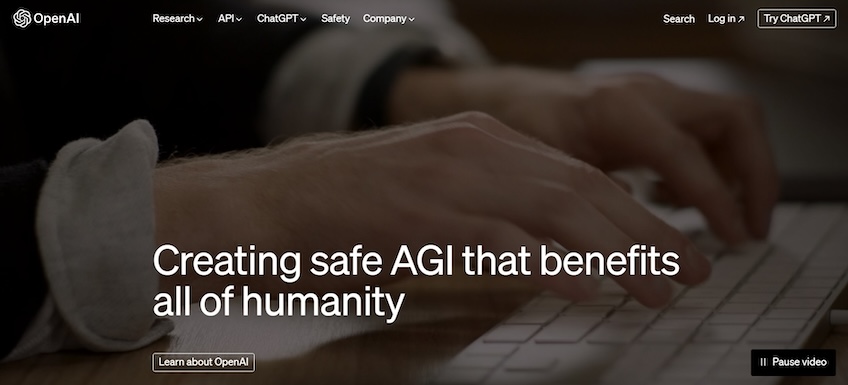
The homepage also does a perfect job of attracting attention and sparking the visitor’s curiosity. The above-the-fold section simply includes the website’s headline, which clearly explains what the company does.
This page compensates for the lack of design elements through a full-screen video background.
It grabs attention and makes visitors stop for a second—which is excellent for keeping the user’s focus above the fold. While interacting with the website, visitors can stop the video whenever they want via the button on the bottom-right portion of the screen.
There’s also a primary and secondary CTA in the bottom-left and in the header. The secondary header CTA invites users to set up an account and interact with the chatbot, while the primary CTA leads to an About page.
Overall, the background video gives the webpage a dynamic feel while the option to stop and play it gives visitors more control and leads to a pleasant browsing experience.
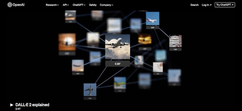
When you move over to OpenAI’s DALL-E-2 page (its AI-powered image generator), you’ll see that visitors can click on the image below the fold to play a video.
This video explains to visitors how the platform works in an engaging and easy-to-understand manner. When it comes down to it, AI-powered tools are still rather new, so some users may have trouble wrapping their heads around them without the help of a video like this.
In other words, OpenAI perfectly understands that writing walls of technobabble doesn’t work. As such, the video breaks down complex concepts and shows how the platform can be used through simple language and a bit of humor.
Additionally, OpenAI uses interactive elements as more of a design enhancement rather than making them a focal point.
The website doesn’t break the rules and sticks to the best practices in web design—it goes light on copy and lets its visuals do the talking. Similarly, the CTAs are clear and easy to spot, and the navigation menu is on the top left, which is exactly where most users expect it to be.
In the end, the website’s design banks on familiarity and ease of use, while its interactive elements contribute to a memorable and engaging browsing experience.
2. Pilsner Urquell
Founded in 1842, Pilsner Urquell revolutionized the brewing industry by making the world’s first pale lager, and it is the reason Pilsner beer exists.
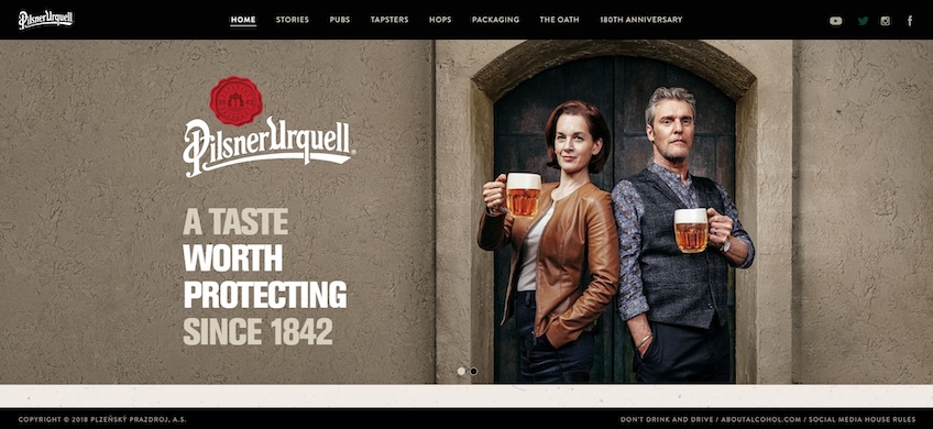
Pilsner Urquell’s website follows a simple design language. Its homepage starts with a full-screen image carousel that highlights the company’s slogan.
The carousel then goes on to share details about the company’s history and invites visitors to play a short video commercial that showcases the brewery’s emphasis on sticking to the original recipe. This is the first interactive website element, although Pilsner Urquell includes a few other subtle ones throughout.
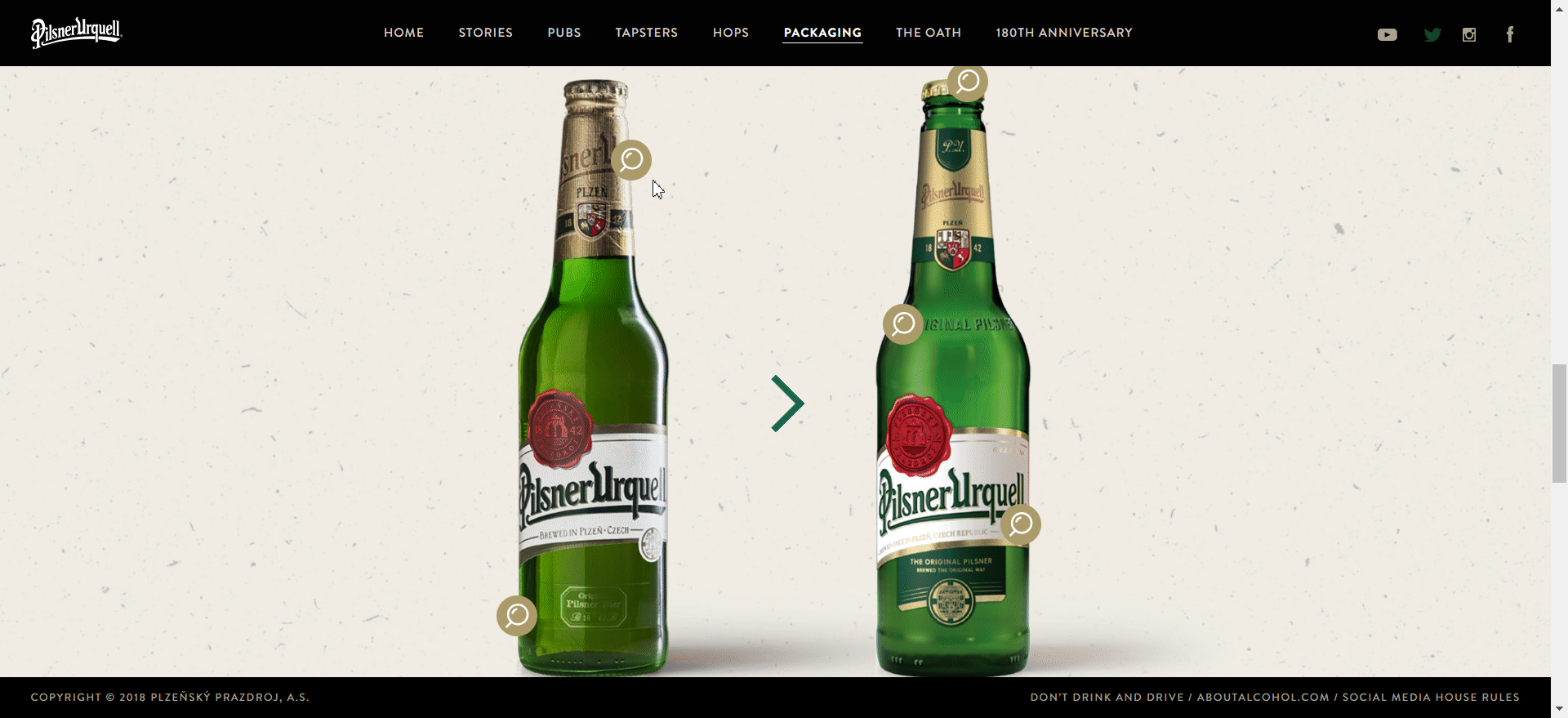
For instance, the website describes how the company changed its bottle design to be more eco-friendly. It provides before and after pictures of their bottles, and visitors can hover over highlighted areas to reveal more information about the changes.
This is an excellent way to educate users about a product—it’s engaging, it’s interactive, and it doesn’t require them to read walls of text. The Pilsner Urquell website is full of similar elements across the board, and although they are small touches, they create a highly engaging and memorable browsing experience.
3. S.T.A.L.K.E.R. 2
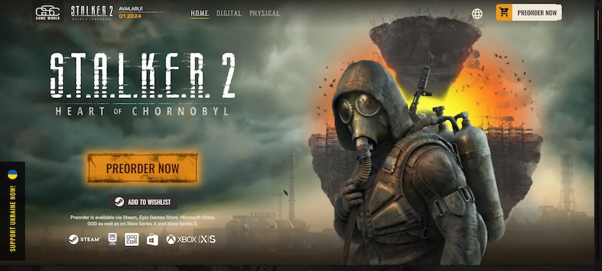
After years of radio silence, GSC Game World announced in 2018 that development had restarted on a game called S.T.A.L.K.E.R. 2. Since the game was originally supposed to come out in 2012 before being canceled, the 2018 announcement made front page news and generated a lot of hype among gamers.
The website for this game does a good job of maintaining that initial hype while also pushing for preorders. Again, the interactive elements are mild, but they add life to the website.
For instance, the hero image moves as visitors drag their cursor across the page, while the buttons in the header include hover animations.
The custom cursor also ties in nicely with the website’s overall theme and contributes to a more immersive browsing experience.
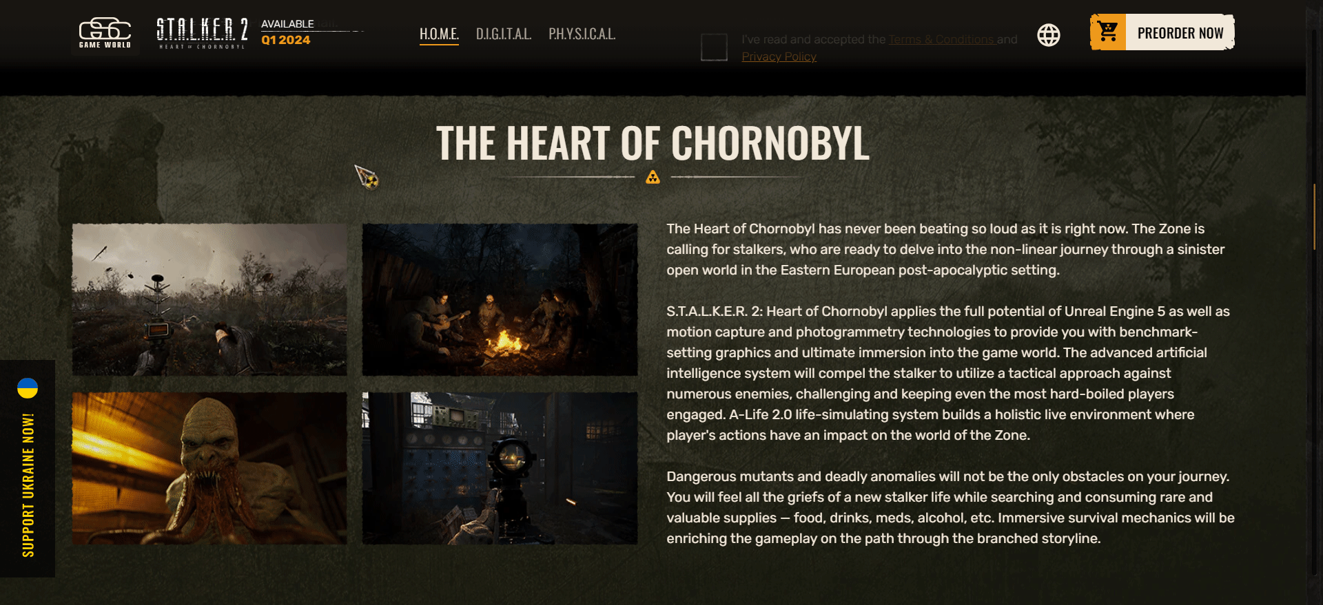
Visitors can learn a little more about the product below the fold, where the homepage goes into more detail about the game’s mechanics and shows a few in-game screenshots. You can even play short snippets of gameplay by hovering the mouse over a specific image.
The page then moves on to display various game editions under a three-column layout. Hovering the mouse over a specific edition will reveal its contents and bonuses—which is a clever way to make the website feel more dynamic, and it also saves a bit of screen space.
All in all, the S.T.A.L.K.E.R. 2 website is a good example of how a few mild interactive elements, such as hover animations, can make the browsing experience more fun and engaging.
4. Automobili Lamborghini
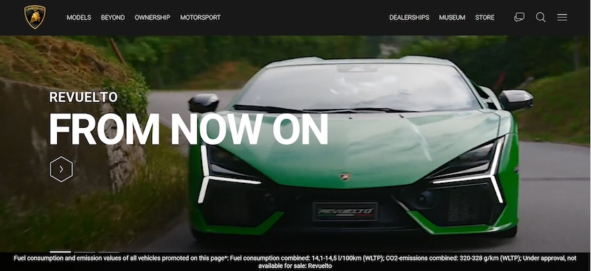
Lamborghini’s brand identity is all about being vibrant and flamboyant, but its website’s design is surprisingly tame. It follows a minimalistic design language that relies on visuals to drive attention toward the company’s car models.
The website starts with a fullscreen carousel. The first slide contains a video that shows off Lamborghini’s latest model, while the video’s fast-paced format alludes to the brand’s energetic feel. The other two slides take the form of static images, which help prevent the website from being too distracting or tiring to look at.
The site then invites visitors to learn more about the company’s latest models—and that’s where its interactive elements come in.
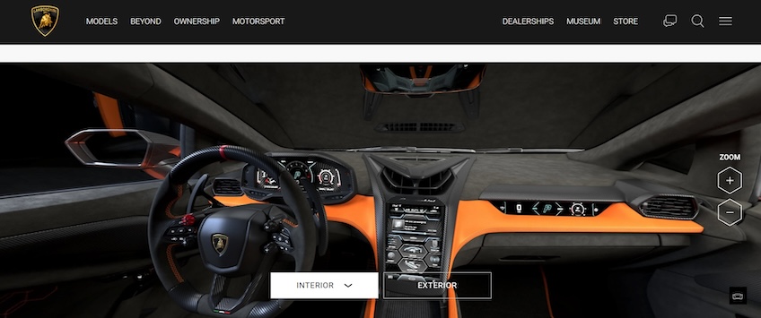
The option to view a model’s interior and exterior in a 360-degree view is the most notable here. You can zoom in and rotate the image to examine the car down to the smallest detail.
The website even lets you view models through AR—just scan the QR code and pan the phone camera around your surroundings, and then you can pretend you’ve got a brand-new Lambo sitting in your driveway.
Of course, the website also includes a car configurator that allows you to customize each model to your liking. This is a rather standard element to vehicle manufacturer websites, but another cool feature on this one is the option to play the car’s engine sound.
Overall, Lamborghini does a good job of using interactive elements on its website to make visitors feel like they’re in one of the company’s showrooms. The website aims to familiarize visitors with its models as much as possible, which is perfect for encouraging more conversions.
The more you get to know and interact with a product, the more likely you are to purchase it—once you hit the jackpot and can afford it, of course.
5. Prometheus Fuels
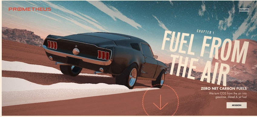
Prometheus Fuels is a US-based startup that removes carbon dioxide from the air and turns it into diesel, gasoline, and jet fuel. The company aims to produce net-zero carbon fuels at prices that can compete with the usual fossil fuels.
The company’s website design is just as sharp as its vision, gaining notoriety on sites like Awwwards and CSSDesignAwards. Its design banks on the scrolly-telling technique—a design practice presenting a narrative that unfolds as visitors scroll down the page.
This technique is backed up by numerous effects, animations, and transitions. It aims to hook visitors into a narrative and keep them engaged via interactive, bite-sized story elements.
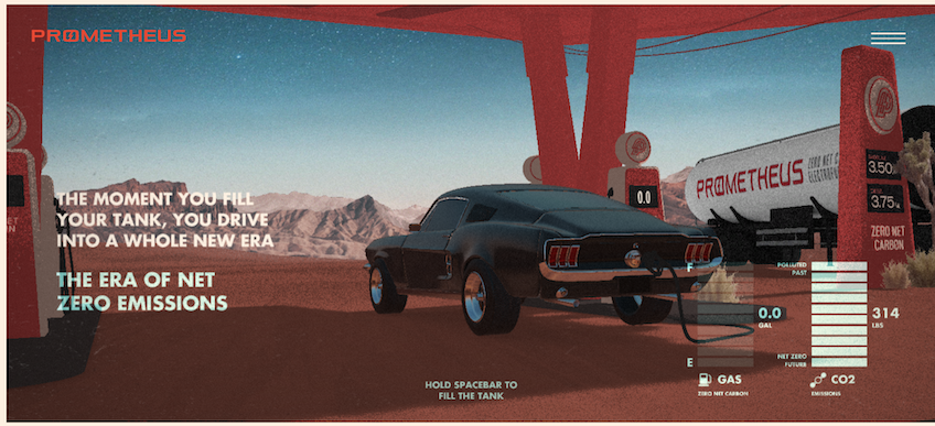
In Prometheus’s case, visitors can hold the spacebar to accelerate the car or fill it up with fuel, making the website feel almost like a mini-game. The website educates users about the importance and benefits of net zero emissions, as well as the steps necessary to achieve them.
Although it might seem like rocket science, everything is explained in an easy-to-understand manner, and the scrolly-telling format definitely helps you get through large amounts of information while keeping you engaged and avoiding walls of text.
6. Rammstein
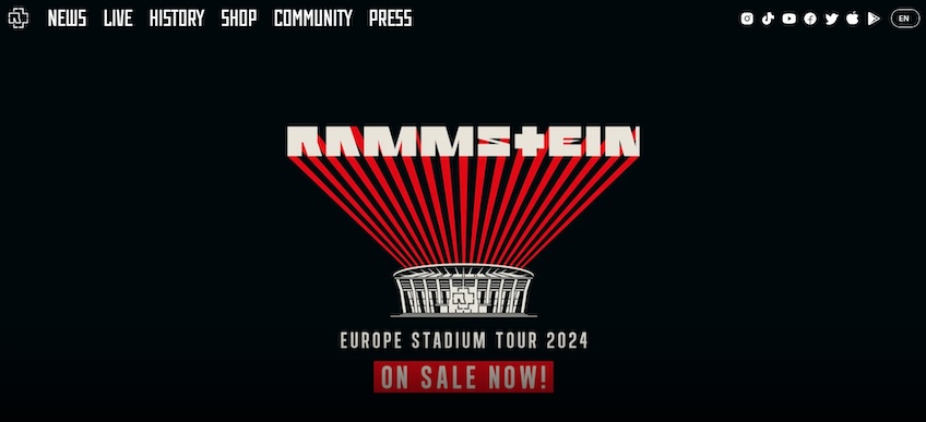
Despite the metal band’s theatrical, over-the-top live-stage performances, Rammstein’s website leaves out the pyrotechnics and shock factor in favor of a highly minimalistic approach.
The design follows a simple black-and-white color scheme with the occasional dashes of red. It also goes light on copy, and it uses images sparingly. Nevertheless, it still draws attention to the band’s live shows.
The above-the-fold section puts the clickable hero image at the forefront via the use of white space. The website lets visitors know they can click on the image through hover animations and leads them to the live shows page.
Rammstein’s website also includes hover animations in its navigation menu items, which make the site feel more dynamic.
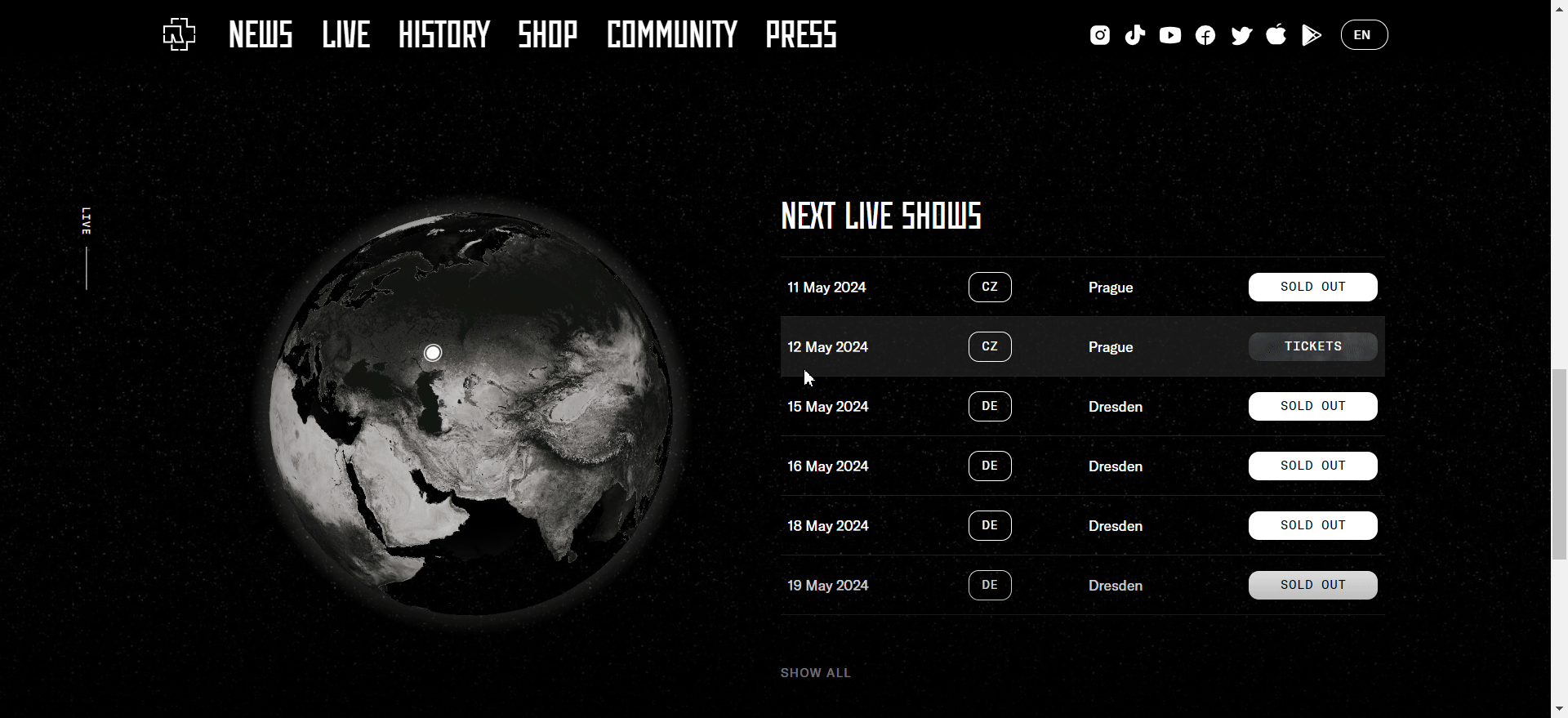
Below the fold, visitors will find information on upcoming shows. There’s an interactive 3D globe that spins to show a specific location as visitors hover their cursors over a particular event. Users can also spin the globe manually by clicking on it and dragging the cursor around, which is a nice touch.
Altogether, Rammstein’s minimalistic design puts the band’s live shows at the front and center, with no other distractions. Meanwhile, its interactive elements maintain the visitor’s attention and make the browsing experience more engaging, which could help drive more ticket sales.
7. Breakfast
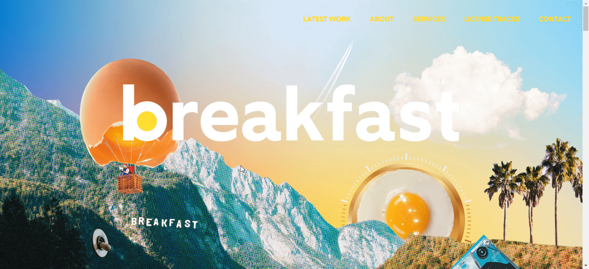
Breakfast is a creative music studio that specializes in soundtracks for movie trailers—such as those from the official trailers for Chaos Walking and Marvel’s Moon Knight.
Breakfast’s website does an excellent job showing off the company’s creativity. Although simple at first, the above-the-fold section has a lot more to it than meets the eye. It includes subtle animations and ways for visitors to change certain parts of the background, for instance.
The website then moves on to explain what the company is and what it does, in addition to showing off its work below the fold. It employs parallax scrolling effects to keep visitors engaged as they move down the page.
Other pages follow a similar format to the homepage, ensuring consistency in design by including minimal, straight-to-the-point copy. Meanwhile, the parallax scrolling effects and colorful visuals steal the show.
Rather than subtly improving the browsing experience, Breakfast goes all-in with interactive website elements to make itself stand out and hard to forget.
8. Sketch
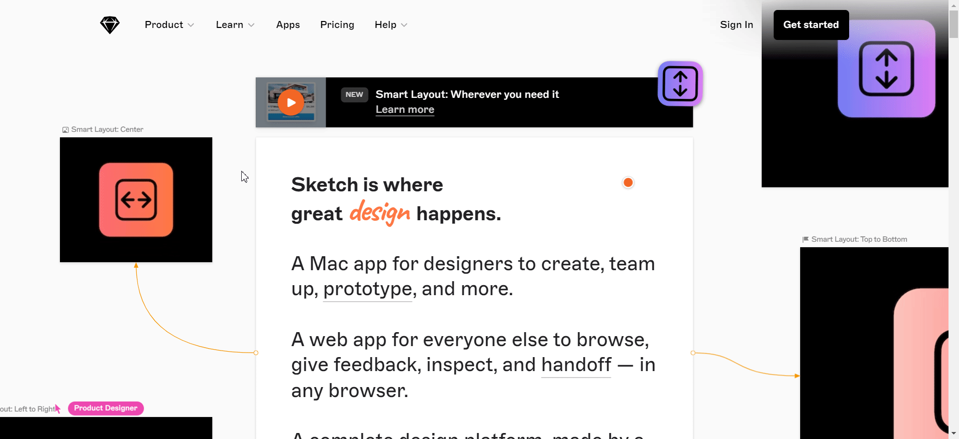
Sketch, which is a design and prototyping tool, seems to have a standard website at first, but it’s actually really clever in its design.
Most design elements allude to the platform’s standout features. For instance, the ability to move the icons anywhere you like on the homepage hints at Sketch’s pixel-perfect interface.
Meanwhile, the icons themselves highlight Sketch’s Smart Layout functionality—it automatically resizes your layout horizontally or vertically to speed up the editing process, and it establishes consistency across your design.
Additionally, the custom, animated cursors throughout the homepage bring out the platform’s real-time collaboration capabilities.
Sketch’s homepage goes into detail about the platform’s benefits, features, and how it works below the fold. It also uses other interactive elements, like scrolling and hover animations to retain attention as users scroll down the page.
9. Webflow
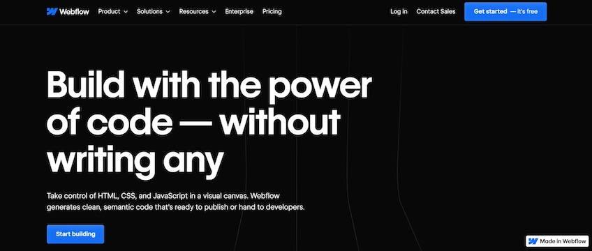
Webflow is a visual website builder that allows you to design sites via a drag-and-drop interface.
Its website’s above-the-fold design is simple and straight to the point—a headline highlights the platform’s unique selling point while supporting copy sits underneath it, briefly explaining how the platform works. The section concludes with a vibrant CTA that stands out through its contrasting color.
However, below the fold is where the magic happens.
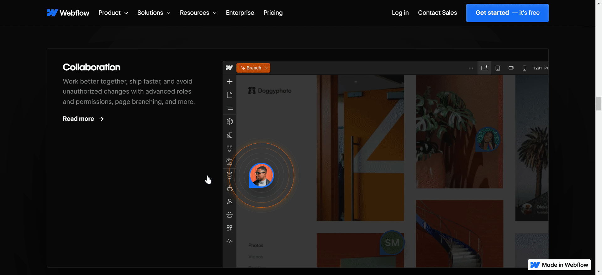
Similar to how Sketch’s interactive elements hint at the platform’s key features, Webflow’s go a step further by allowing you to interact with them. For instance, Webflow simulates its collaboration tool by letting you submit a reply directly on the homepage. You can also see how its website localization works by translating copy in real time.
Essentially, Weblow’s interactive elements work on the same principles as the ones from Lamborghini’s website. They nudge visitors to interact with the product directly, hopefully making them stick around long enough to encourage more conversions.
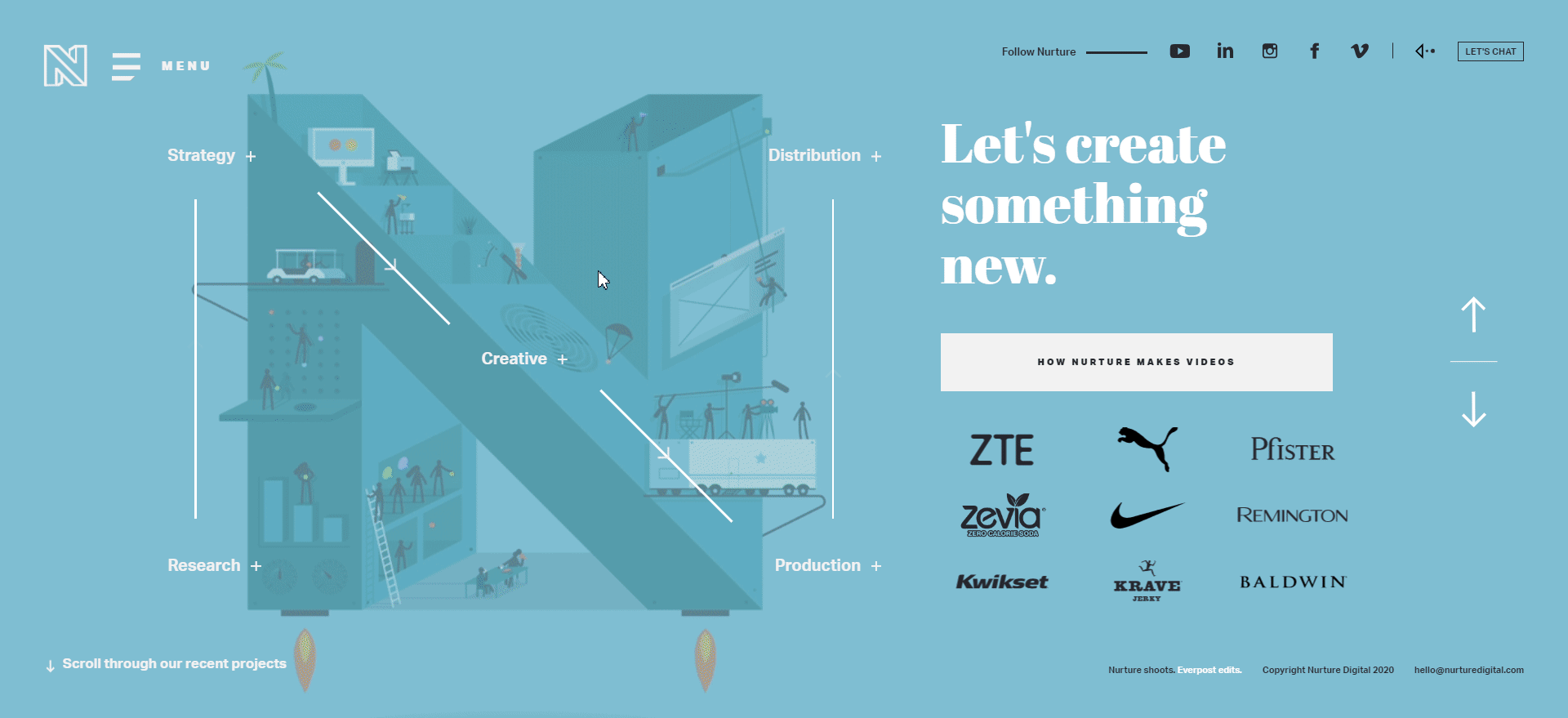
10. Nurture Digital
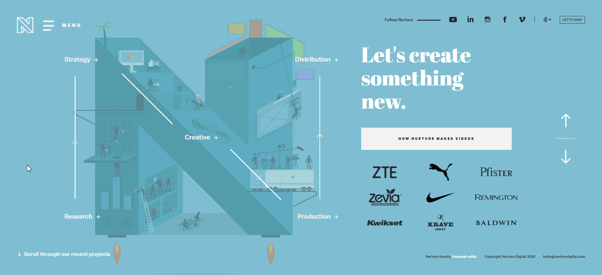
Nurture Digital is a creative content agency that specializes in video production and promotion.
Its website does an excellent job of highlighting its services to potential customers. The hero image is animated and interactive, breaking down the company’s video production process into five steps—from consumer research to content distribution.
These steps are placed along the edges of the logo. Visitors can click on them to trigger a pop-up that reveals more details. This is perfect for getting users to interact with the website and show them how the agency works without having to create separate dedicated service pages.
It’s also worth noting how Nurture Digital goes about its project portfolio.
The homepage has no below-the-fold section. Instead, it utilizes a slide show-based format.
When a visitor scrolls, it triggers animated transitions to display numerous slides, each of them showing a specific project. Visitors can either view the video commercial or read a case study from there.
11. Dpt.
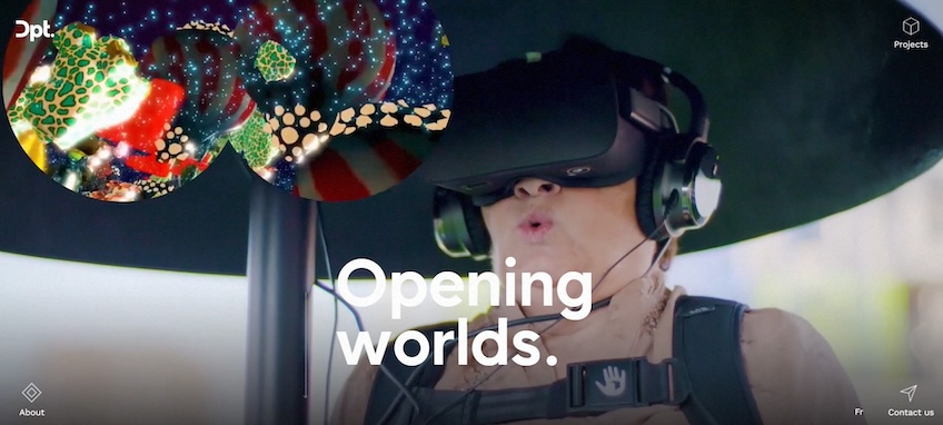
Dpt. is a Montreal-based creative studio specializing in VR and AR experiences. Its website’s design is highly minimalistic—it goes easy on copy and buttons while favoring high-quality visuals.
The above-the-fold section is merely made up of the headline, which includes the company’s slogan and a background video that showcases some of its projects.
Despite their unconventional placement in all four corners of the screen, the website’s navigation buttons are still highly visible due to their white outlines.
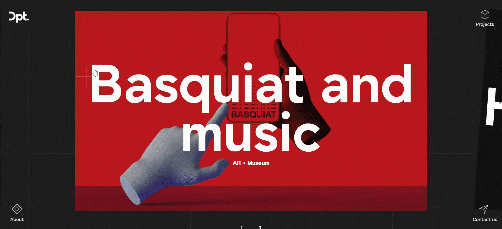
Dpt. has a rather unique take on website carousels, as it uses them to replicate the VR experience. Similarly, the grainy textures in the background further reinforce that effect.
Visitors can browse through some of the company’s projects by clicking and dragging their cursor along the webpage. As seen in many other examples, the interactive design elements here include parallax scrolling effects and hover animations.
Conclusion
Good interactive elements have a high chance of keeping visitors glued to your website a little bit longer, which can be just enough to make it more memorable.
Even smaller touches like hover animations can improve the browsing experience without leaving a hole in your wallet. They are also pretty easy to implement, so you may want to consider them when setting up your first website. If you end up using WordPress, you’ll find many free plugins that allow you to add hover effects.
Keep in mind that many interactive elements require extra coding which can eat at your site’s loading speeds, so you may need to consider going for the best web hosting service you can get.
With higher bandwidth, more SSD storage space, and access to CDNs, your interactive website’s performance can hover at an optimal level.