Homepages are crucial for first impressions—they’re the first thing most visitors see when they land on your website. The problem is, many businesses mistakenly confound good first impressions with flashy and unique homepage designs. But that’s not always the case.
Nearly 85% of web designers agree that cluttered and overcrowded page designs are the most common mistakes made by small businesses.
There’s nothing wrong with the simple approach, however. There are plenty of straightforward, tried-and-true design practices that work just as well if not better than the fancy stuff—and they’re effective for several reasons.
Why Simple Page Designs Work Every Time
Familiarity
Simple designs often appear similar to one another, and that’s usually a good thing.
Homepages don’t have to be unique, and many websites follow design best practices for the sheer fact that they are best practices. These are established design conventions that users are accustomed to and expect to see before entering a website.
Specifically, users want a navigation menu at the top, a business logo on the left, and a brief description of what the company does—along with its value proposition in the hero section of the webpage.
Some businesses tend to play around with these elements in an attempt to stand out and add a wow factor to their pages. This runs the risk of throwing users off and causing confusion. Consequently, first-time visitors may leave the homepage just as quickly as they entered.
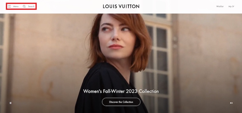
Luxury fashion brand Louis Vuitton has a homepage that goes off-script. The design is minimalist, but it also strays away from many of the conventions mentioned above.
The navigation menu hides behind a hamburger icon across all viewports. Although a popular method for decluttering the screen on mobiles, it’s not very useful for desktop visitors who expect a more traditional navigation bar.
Additionally, a fullscreen auto-playing video acts as the background, which can be an instant distraction for some users. The page also lacks any copy that explains what the company does or the types of products it sells apart from its latest collection—which uninformed visitors could take to mean a collection of anything.
Of course, Louis Vuitton is a globally recognized brand that probably won’t suffer from an unconventional website, so it gets away with it. For small businesses, however, this can be a big no-no.
First-time visitors should be able to tell right away who you are, what you do, and how you can help—it earns their trust and gives them the confidence necessary to keep browsing.
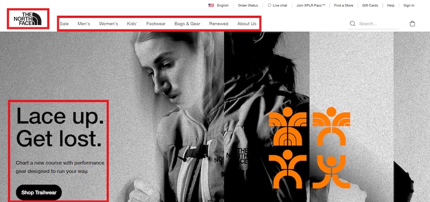
The North Face does a much better job with its homepage design. First of all, it includes a standard navigation bar with links that are relevant to its visitors.
The logo is placed in the top-left corner of the screen and is clickable. Visitors expect it to return them to the homepage once they’ve explored other areas of the website.
The headline includes a catchy slogan, while the supporting copy gives visitors an idea of what type of products the company sells. The CTA button is in-line and placed beneath the supporting copy and headline, establishing visual hierarchy—which is another good practice in web design.
User experience and conversion rates
Following web design conventions will make first-time visitors feel right at home with your website, improving user experience by default.
Limiting flashy design elements also gives your homepage more breathing room, making it easy to navigate and scan. Most importantly, it helps you attract and maintain the user’s attention where it matters—your unique value proposition and CTA buttons.
Additionally, including minimal design elements helps optimize your homepage for mobile devices. The less crowded your homepage is, the easier it is to make it fit properly on smaller screens.
This also addresses the issue of heavy hitters like videos, animated effects, or large image files. These elements significantly impact your site’s loading speed, which leads to increased bounce rates and a drop in conversions.
Search engine optimization
Google loves websites with an on-point user experience. Search algorithms use bounce rates and dwell times as an indication that visitors like browsing your site, which ties into your homepage’s loading speed and navigability.
Moreover, Google’s mobile-first indexing prioritizes your site’s mobile content to rank and index pages in search results. Again, by keeping the number of complex elements low, simple designs are much easier to optimize for mobile. They also have faster loading speeds and a familiar look that encourages visitors to stay on the website.
In other words, going for the simple approach will optimize your homepage for higher rankings right out of the box.
Ease of deployment and maintenance
As long as you stick to best practices, creating a website on your own is entirely doable without having to code or hire a design team. This automatically makes simple homepages more affordable and quicker to set up.
Straightforward page designs also help in the long run because they don’t include flavor of the month elements that go out of style. (Remember when landing pages used to have auto-playing audio? Yeah, we’re glad that’s over, too.)
Furthermore, chasing the latest design trends, such as 3D or gamified designs, will likely cost you more money down the line when your website needs reworking to accommodate the next big thing.
Lastly, even with some of the best web hosting providers, heavy design elements like videos and animated effects can still eat up a lot of bandwidth and storage space, requiring more expensive hosting packages. Meanwhile, simple websites work just fine with free web hosting services in most cases.
Five Homepage Designs That Work Every Time
Classic design layouts are timelessly effective, require less upkeep to stay visually relevant, and most importantly, they meet user expectations. Here’s five familiar types that can’t go wrong with users.
Hero
Hero images represent the above-the-fold visuals of a homepage—they can be things like graphics, product illustrations, and photos—and they are generally accompanied by CTA buttons, headlines, and supporting copy.
While keeping things simple, hero images attract attention and provide visual context for users. At the same time, the copy gets into more details and encourages visitors to click on the CTA button.
Hero images are the first thing visitors see on your homepage, so they are crucial for making a good first impression. It’s important to avoid using stock photos, as they’re bland, provide no visual context, and they often give off a lazy or unprofessional look.
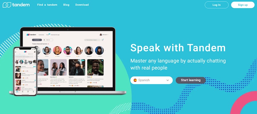
Tandem handles the hero image page setup perfectly. It showcases how the app looks in action and clearly lets visitors know what to expect from it. The image also acts as a teaser to spark their curiosity and nudge them to sign up.
The headline and supporting copy are straightforward and instantly communicate how visitors can benefit from the app. The CTA button stands out through contrasting colors, while the “Start learning” copy is engaging and specific.
Also, notice how the button next to the CTA allows visitors to select the language they want to learn. This encourages users to engage with the homepage right away, increasing the chances of generating conversions.
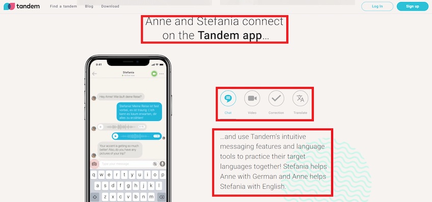
Tandem’s homepage follows the same theme below-the-fold as well. The image on the left simulates a real conversation to give a glimpse of how the app works. The buttons on the right allow visitors to explore Tandem’s key features.
The headline and supporting copy paint an image into the visitor’s mind—they tell a story, prompting users to imagine themselves using the app. This helps establish a stronger connection and pushes for a conversion.
Overall, Tandem’s homepage is well-designed. The above-the-fold section doesn’t go overboard with navigation links, copy, or any other distractions, and the hero image speaks for itself. The headline and supporting copy are short yet descriptive, and the CTA that follows is strong and focused.
Minimalist
Minimalist pages strike a perfect balance between functionality and aesthetics. They emphasize empty space and go easy on design elements to direct the visitor’s attention on the headline, supporting copy, and CTA buttons.
These page types typically use white-ish backgrounds to establish a stronger contrast between text and CTAs. The copy is written in large, simple fonts to ensure maximum impact while maintaining a clean, unobtrusive look.
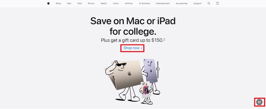
Apple provides an excellent example of a minimalist homepage. The above-the-fold section uses plenty of whitespace to make the headline, supporting copy, and CTA all stand out.
The copy uses simple fonts, while the headline is bold and straight to the point. It instantly lets visitors know they can get a good deal on an Apple device. The supporting text highlights an additional gift card to entice users to click on the CTA placed below, which happens to be plain hyperlink text. You can’t get much more minimalist than that.
Although the animated illustration beneath the CTA is not aligned with bare-bones minimalism, it adds a dash of life to the page in a very simplified way—plus users have a clear option to stop the animation by clicking on the pause button in the bottom right.
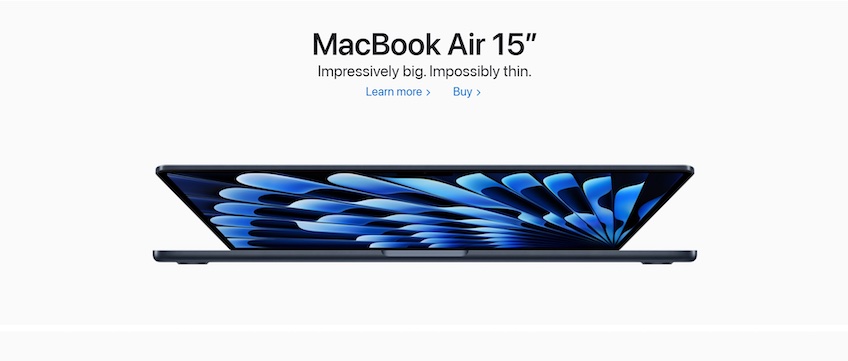
The below-the-fold content showcases a few products. Again, there’s heavy use of whitespace to bring out the headline, supporting copy, CTAs, and product photo. In this case, the headline simply states the name of the product, while the supporting text highlights its main benefits.
Besides that, there’s not much going on—which is why minimalism can be so effective. It leaves out all the distractions that can drive the visitor away. At the same time, the simplicity helps pages load significantly faster and end up being easier to optimize for mobile devices.
Generic service business
Generic business homepages are straightforward and give users all the necessary information to familiarize visitors with the business as quickly as possible. They don’t use walls of texts or clutter the page with excessive links—just descriptions of the products or services they offer, along with contact details and how to get started.
In addition to those key elements, many of these websites also include social proofs and FAQ sections to earn the visitor trust and hash out any potential unclarities.
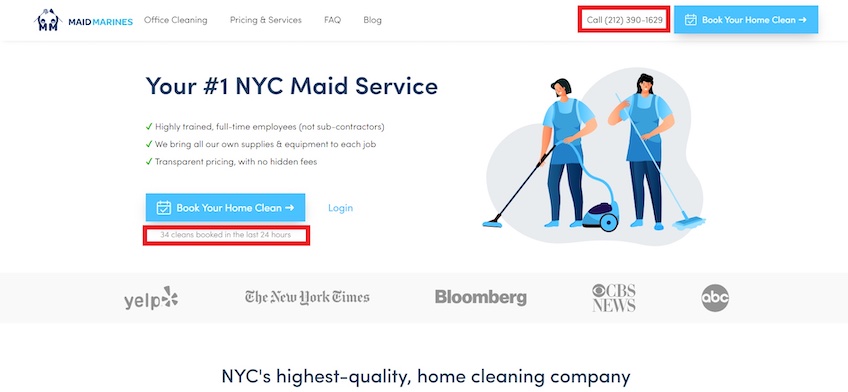
MaidMarines has a service business homepage that gets straight to the point and follows many best practices—the company logo and navigation links are placed in the top-left, the contact buttons are on the top-right, and the headline, supporting copy, and CTA buttons are all aligned.
Notice how it provides two CTAs in the top-right, one for making a phone call and the other for directly scheduling service. While this is generally frowned upon for non-business sites that have a singular conversion type, the MaidMarines site gives visitors the option to connect in whichever way they feel most comfortable—be it a phone call or an online scheduling platform. This adds a layer of convenience to visitors and can lead to more conversions.
As for the copy, the page’s headline is bold and straightforward—it briefly states what the company does, and the supporting copy aims to earn the visitor’s trust by presenting how the company works in a checklist to indicate reliability.
Another nice touch to the homepage is the simple way it shows the number of cleanings booked by other users in the last 24 hours, encouraging conversions by instilling a sense of urgency and ease of use.
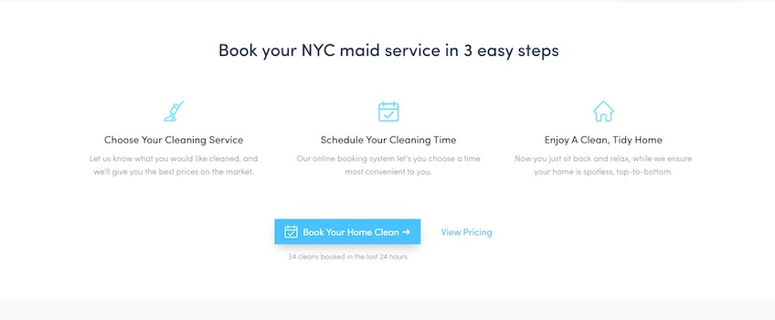
Below the fold, the MaidMarines homepage demonstrates how easy it is to book the service, and the rest of the content goes into further detail on the types of services the company offers.
If you’re looking to set up a generic business website like this, many of the top website builders like Squarespace and Wix have dozens of ready-made templates that you can use just by filling in the blanks.
Hot deal
Hot deal homepages emphasize discounted products or services and aim to convert visitors into customers as soon as they land on the website. Pages like these include very minimal distractions to focus the visitor’s attention on the discount.
Some of the most common design elements found on hot deal homepages are countdown timers and trust badges—these alleviate potential doubts visitors may have regarding the product and add a sense of urgency, compelling them to act fast.
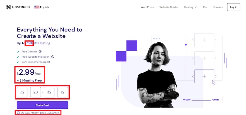
Hostinger does an excellent job with its hot deal page design. The main copy, the countdown timer, and the CTA are all on the left-hand side of the homepage—which is where users spend 80% of their time on the screen, by the way.
In other words, Hostinger uses its page to capture and maintain the visitor’s attention on the offer the moment they land on the homepage. Meanwhile, the hero image on the right is purely for aesthetics—it doesn’t need to distract from the offer.
The headline is bold and persuasive. It emphasizes that Hostinger is the only solution visitors need, and the messaging about the discount stands out through contrasting colors to attract attention and make the deal look more appealing.
Similar to MaidMarines, Hostinger includes a checklist, which highlights key aspects that make the offer valuable.
In order to drive a sense of urgency home, the Hostinger page includes a countdown timer to induce some FOMO (the fear of missing out) if users don’t secure the deal in time. The 30-day money-back guarantee beneath the CTA also acts as one last push in getting users to convert.
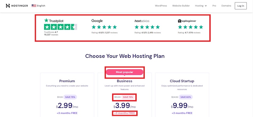
Below the fold, Hostinger reassures visitors by including trust elements immediately. It then follows up by listing the pricing packages, getting straight to the point while also showing discounts once again.
Another key element is how it highlights the mid-tier plan’s copy in red, encouraging visitors to go with the “most popular” plan. This can reduce the effects of choice paralysis, and it also nudges visitors to go a step above the cheapest plan.
Overall, Hostinger uses persuasive copy, trust elements, and FOMO to urge visitors into making a purchase as quickly as possible. This practice can also work for other types of conversions, like email or free-trial signups.
Most ecommerce website builders offer pre-made countdown timers and trust badge elements so you can quickly set up a hot deal homepage whenever necessary.
Split-screen layouts
A split-screen layout divides a webpage into two or more distinct sections. This design practice can work well for homepages that want to convey multiple messages simultaneously or bring attention to multiple products.
Although website visitors spend most of their time viewing the left side of a webpage, split-screen layouts help spread attention across the entire page. They typically include little copy with large, simple fonts, and emphasize imagery—similar to minimalist pages.
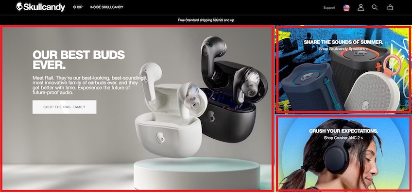
Skullcandy uses the split-screen layout on its homepage to highlight three main product categories. This allows visitors to find the products they’re looking for quickly without having to browse the navigation menu.
In this case, the homepage uses uneven splits—the company’s earbuds section occupies a larger portion of the screen and goes a little heavier on the copy, while the CTA is also more prominent compared to the other two categories. This helps attract attention to the company’s main offer and acts as guidance for visitors who aren’t sure of what products to choose.
At the same time, it doesn’t neglect the other product categories—allowing visitors who are interested in other products to stay interested.
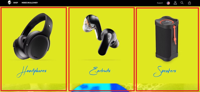
Below the fold, Skullcandy continues its split-screen layout. This time, however, the page brings equal attention to all product types to help visitors find what they are looking for more easily.
Overall, Skullcandy’s split-screen layout is highly minimalist and encourages users to discover its products. The homepage emphasizes imagery and the copy doesn’t offer more information than needed.
This is a good implementation of this layout because going too heavy with copy or other design elements in each section can make things feel excessively cluttered, hindering user experience.
Takeaways
When it comes to web design, sometimes less truly is more. The less your homepage is filled with complicated distractions, the more comfortable your visitors will be turning into converted customers.
There’s usually no reason to go overboard with your homepage’s design—sometimes it’ll only cost you more money and leave you prone to unnecessary risks like worsening the user experience and dropping your website in search engine rankings.
That said, stick to web design best practices and remember to let visitors know who you are, what you do, and how you can help them as soon as they land on your page. Keep things simple and who knows? You might end up next on our list.