Hero images act as visual introductions to brands or businesses and are equally common on website homepages and in email campaigns. They are meant to be the first thing that website visitors and email subscribers see when they land on a page or open an email.
As such, the primary role of a hero image is to attract attention while the remaining elements briefly state a company’s purpose and present products or services. They also compel users to keep browsing your content.
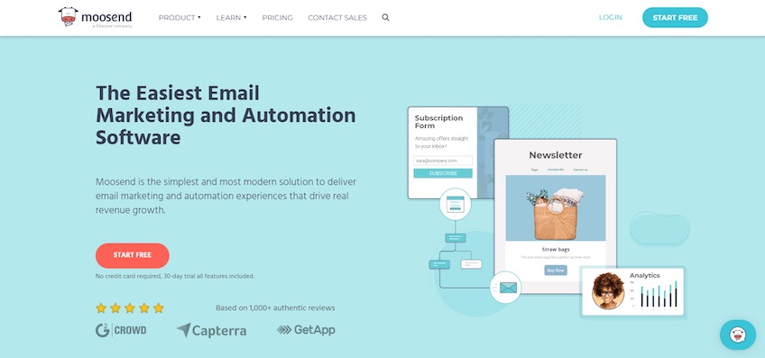
Take Moosend, for instance. Its hero image introduces the platform by showcasing the software’s key features. The image is accompanied by a headline, and supporting copy gets into more details. Clearly, the goal is to communicate the platform’s benefits quickly and persuade visitors to click on the CTA button beneath.
Most websites follow a similar format to Moosend, making this design element quite overused. However, its popularity attests to its effectiveness, since visitors know what to expect and where to look.
That said, there are many reasons why hero images are so effective, but it’s important to implement them properly.
Hero Images Let You Control the First Impression
Since users only take up to 50 milliseconds to form a first impression regarding your website, hero images are a decisive factor in a visitor’s perception of your brand.
In other words, hero images can make or break the success of your site. Their visuals need to be attention-grabbing, attractive, and they should do a good job of letting your visitors know what your website is about.
And, since you want to give off an original feel with an unoriginal design layout, it’s important to avoid using generic stock photos. These can give off a lazy or unprofessional look and ruin your first impression.
But a unique visual is not everything—an effective hero image also needs help from a strong headline, supporting copy, and a CTA. The text provides additional context regarding the benefits of your company’s products and/or services, while the CTA nudges users to convert as quickly as possible.
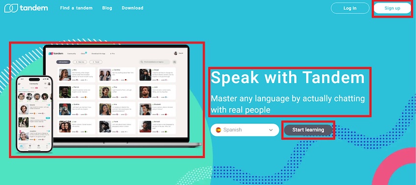
Tandem uses a hero image to show its app in action on both mobile and desktop devices. This gives visitors a glimpse into how the app works and allows them to set realistic expectations.
In contrast to Moosend, Tandem places its hero image on the left. Since users spend 80% of their time viewing the left-hand portion of the screen, this makes the hero image the focal point.
Tandem’s headline and supporting copy on the right are brief, yet effective. They highlight the unique value proposition that the company wants to show off—which is learning languages by chatting with real people. This establishes continuity with the hero image since it shows profiles of other language learners.
Underneath the headline, a CTA stands out because of its contrasting colors and straightforward copy. Unlike a generic “Sign-up now” CTA, Tandem’s “Start learning” is more specific to the language-learning theme. Again, this helps establish continuity across all of the elements.
Visitors can open a dropdown menu via the button next to the CTA to select the language they want to learn. This encourages users to engage with the website directly, potentially leading to more conversions as they discover the available languages.
Lastly, you’ll also notice another CTA in the top-right of the navigation bar. This serves as a secondary (or primary) conversion path for users who don’t click on the button in the hero image—providing a constant one-click push for conversions.
Overall, Tandem’s hero image lets visitors know what makes the platform unique and provides them with a sneak peek into how it works to spark their curiosity. Nicely done.
Everything Should Build on the Hero Image
Since hero images are the focal point in your visitor’s first impression, you should let them do the talking.
The hero image acts as the foundation of your brand’s messaging—it communicates what your company is about and why visitors should choose you over any others. All that’s left is for the rest of the content to reinforce that first impression by getting into more details.
Going back to Tandem, its hero image shows the app’s interface with profiles of real people, while the headline and supporting copy further clarify that visitors can learn a language by talking to other learners. Tandem adds to the hero image and demonstrates how the platform works throughout the rest of the homepage.
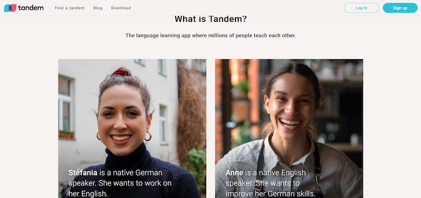
Its below-the-fold content starts with a quick explanation of what Tandem is. Then it moves on to paint a picture that serves as an illustrative example—it introduces two people who want to learn each other’s language.
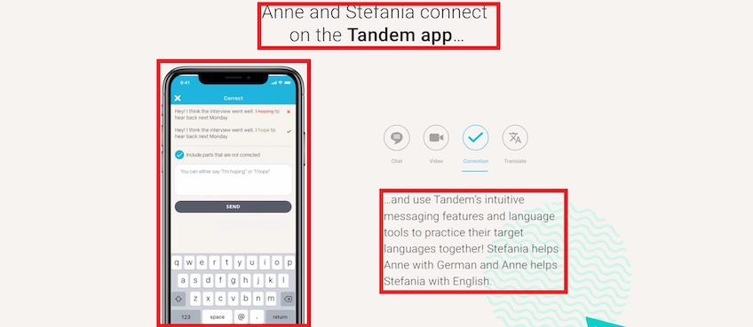
Tandem further shows how these two people interact with each other on the platform via a video on the left and text-based story on the right. This is a clever way to get visitors engaged and encourage more conversions. The text nudges visitors to imagine themselves using the app, while the video provides visual support.
Altogether, Tandem’s homepage content connects with the hero section and familiarizes visitors with the app. It gets down to the nitty-gritty by showing how visitors can achieve the benefits mentioned in the main headline and supporting copy.
Hero Image Best Practices
Hero images can be effective, but there are a few things you need to take into account to implement them correctly.
Find the right size
Your hero image’s size is an important factor to consider, as there’s usually a sweet spot between aesthetics and performance.
Top-notch quality images may seem like a no-brainer, but their file size can also negatively impact your website’s loading speed. A good rule of thumb is to avoid anything larger than 1MB. On the flip side, if your hero image looks stretched or pixelated, it can give off an unprofessional look.
The right dimensions also depend on the type of hero image you want to include. Although there are no exact guidelines, here are a few general recommendations:
- Full-screen hero images: 1,200 pixels wide with a 16:9 aspect ratio.
- Banner hero images: 1,600 x 500 pixels.
- Mobile hero images: 800 x 1,200 pixels with vertical and horizontal orientations for mobile phones and tablets.
Optimize elements for loading speed
Since 40% of visitors will abandon websites that load in more than three seconds, site optimization is no joke.
Not to mention that Google also prioritizes page performance when ranking websites. A good practice is to start by testing your website’s loading speed with Google’s PageSpeed Insights.
If performance is not up to standards, compressing your hero image is a potential first solution. Tools like Compress JPEG, Tiny JPG, and Smush for WordPress help reduce image file size without compromising quality. Again, anything above 1MB is a potential problem.
Web hosting can also have a significant impact on your site’s loading speed. Hosting providers offer varying levels of bandwidth, drive space, and RAM storage. The more of these resources your provider can allocate to your site, the faster it will perform. So take that into account when picking a web hosting service.
Go responsive
Given that mobile devices generate over 55% of web traffic, responsive images are a must. These automatically adapt their size to fit properly on different screen dimensions.
A 1,600 x 500 banner image might look good on desktops, but the same size on mobile devices will drastically impact user experience.
One way to automatically adjust an image’s size is by using relative units in CSS.
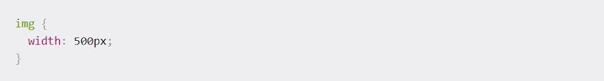
The above code uses an absolute unit. In this case, a set width of 500 pixels will take up 500 pixels of space no matter how wide the viewfield is on a device. That includes devices with widths that are smaller than 500 pixels, so the image would be cut off.
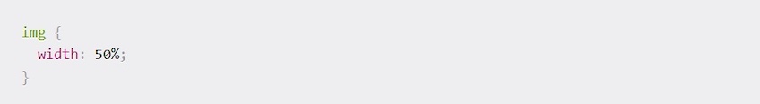
In contrast, this new code above uses a relative unit. Setting the image width at 50% makes the image fluid so that it only takes up 50% of the available space no matter the screen size. The image height will automatically adjust to keep the same ratio, so you don’t need to assign a property for it.
If you wish to have more control over how images resize across various screen sizes, you can use custom breakpoints, also known as media queries.
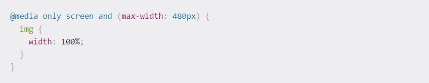
For instance, the above code will make an image occupy the full width of the screen, as long as it is 480 pixels wide at most.
Include powerful messaging
As illustrated by the Tandem and Moosend examples before, your hero image should connect with a powerful tagline. Again, make sure the copy builds on the hero image. This adds context and gives your hero image that extra oomph.
The copy should be short and sweet. It should let visitors know who you are, what you do, and how you can help them. This gives visitors the confidence needed to continue browsing your webpage.
Moreover, including a CTA beneath the supporting copy is a fast and effective way to nudge visitors to convert.
In the end, your headline, supporting copy, and CTA button should all be in-line and laid out in a way that compliments each other. This establishes visual hierarchy and goes along with the visitor’s natural reading pattern, increasing the chances of generating conversions.
Create harmony with the rest of the webpage
Your hero image should flow with the rest of your website’s design. Otherwise, the image would create too much contrast and distract from other essential design elements, like the CTA or headline.
As such, make sure your image goes along with your website’s color scheme, background, fonts, and buttons. This also serves as a good opportunity to build on your website’s brand identity and make its design more memorable—especially when you’re using a super common layout.
Powerful Hero Image Examples
- Planable
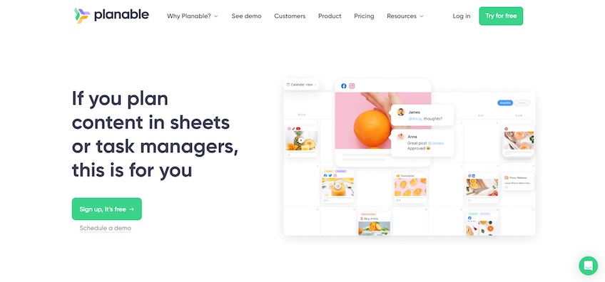
Planable uses a hero image to display the main features of its platform—which are social media scheduling and collaboration tools with a straightforward interface.
This hero image blends nicely with the rest of the homepage. The plain background coupled with splashes of bright colors gives the page a relaxed yet joyful atmosphere. The inclusion of fun animations and playful language throughout the homepage further adds to the ambiance.
Besides adding flavor to the overall aesthetic, the bright green color also draws attention to the CTA buttons. Meanwhile, the headline is emboldened to stand out and add context to the hero image at the same time.
- Vectr
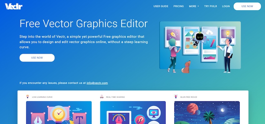
Similar to Planable, Vectr uses the hero image to show off the platform’s functionalities, like the option to resize images and tweak specific elements within graphics. The characters shown within the hero image can also insinuate that the platform is good for collaborating with other people.
This time, however, the hero image takes the form of an animated illustration. The animations are mild, adding a dash of life to the homepage without being too distracting. The headline and supporting text briefly explain what the platform is and its key benefits, while the white CTA button creates a stark contrast with the rest of the webpage.
The entire site follows the same design language as the hero image—the color scheme combines white with different shades of blue, making the page soothing and attractive. Coupled with the continued presence of illustrations throughout the webpage, Vectr uses the hero image as an enhancement of the rest of its site rather than treating it as a separate element.
- Apple
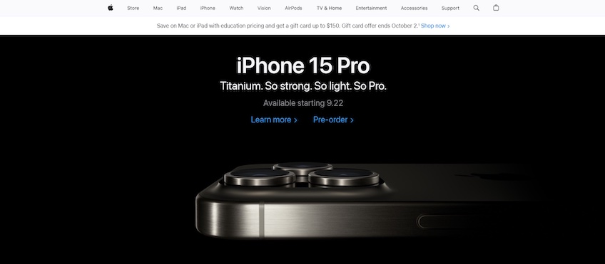
Apple’s hero image promotes its upcoming product. The iPhone’s aesthetics combined with the black background make the page feel minimalistic and posh—much like the company’s intended brand identity.
The headline is simply the new product’s name, while the supporting copy highlights its main differentiator and benefits. Notice how the hero image correlates directly with the first part of the supporting copy—it highlights the phone’s titanium sides.
The CTA buttons come in plain hyperlinked text. That may seem rudimentary, but it works well in this case. It blends with the website’s minimalist design and fonts, while the blue color is attention-grabbing.
The rest of the design follows the same format as the hero image. It emphasizes high-quality product imagery, which is then coupled with a straight-to-the-point copy. The homepage switches between white and black backgrounds to establish contrast and improve scannability.
Although highly minimalistic, Apple sticks to most web design best practices. It includes uncomplicated copy with short sentences, its color scheme successfully reflects the company’s brand identity, and the CTAs are clear and pop-out.
- CXL
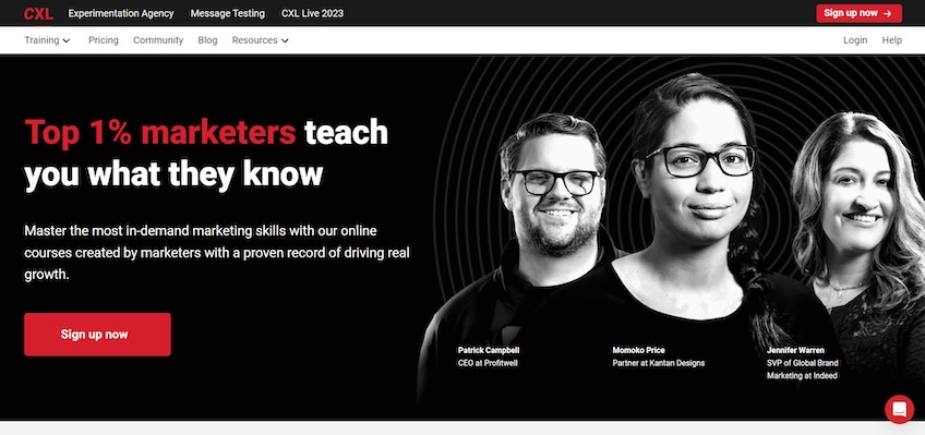
CXL’s hero image serves two purposes. First, it presents some of the coaches mentioned in the headline and supporting copy, which ensures continuity in messaging and adds extra context.
Second, the hero image also acts as a trust element. The inclusion of human faces allows visitors to better connect with the website and makes them more likely to sign up. (Or at least that’s the intention.)
Mentioning real people’s names and job titles further strengthens that trust element. The idea is that people are much more likely to take marketing advice from CEOs and Senior Vice Presidents than from anyone else.
- Cocokind
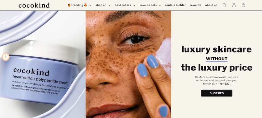
Cocokind is slightly different, but clever in its design. It uses a split-screen layout that divides the above-the-fold part of the web page into three equal sections, while the hero images take up two of these sections.
What’s interesting about this design is that each section serves a specific purpose. While the photo on the left promotes the store’s main product, the image in the middle shows how to use it, and the right-most section presents a catchy tagline as well as the product’s benefits.
Also, notice how these sections are ordered—most people read from left to right, so that’s the natural progression Cocokind wants visitors to follow. As such, the hero image and tagline convey a simple, effective message: “Here’s our product, here’s how to use it, and here’s why you should buy it.”
The rest of the homepage emphasizes product imagery and continues with a pastel-based color scheme to make the browsing experience relaxing and easy on the eyes. It’s simple, logical, and well-done.
Do Hero Images Work?
That’s a definite yes. Although their prevalence across the web may make them seem like a cliche at this point, you can’t go wrong with tried-and-true best practices.
If done properly, hero images are attention-grabbing, they improve your webpage’s overall aesthetics, and they strengthen your brand identity. They also convey a powerful image without needing walls of text—all of which contribute to making a good first impression.
Hero images should be the first thing related to design that you consider when planning your website. It should be the centerpiece of attention, while the rest of the homepage should build around it. After all, you’ve only got 50 milliseconds.