Whether you run a gym or sell online fitness courses, your website has to achieve one goal—to attract new members. But, with just over 32,000 fitness clubs in the United States alone, standing out from the crowd is often easier said than done.
Nevertheless, many of the top fitness websites still manage to stick out from their competition, attract new members, and appeal to different demographics. So it’s worth taking a look to see how they do it.
1. Gold’s Gym
Founded in 1965, Gold’s Gym now covers 600 locations across six continents, with 220 fitness centers in the United States alone. With Gold’s Gym being the historical favorite among bodybuilders like Franco Columbu and Arnold Schwarzenegger, the company achieved cult status in the bodybuilding community.
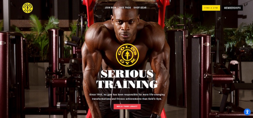
Despite the company’s size and reputation, Gold’s website is simple—and that’s a good thing. It follows a short, one-page design format with minimal distractions.
Its design directs the visitor’s attention toward the headline, supporting copy, and CTA, which are all aligned and placed on top of each other. This establishes a visual hierarchy and ensures that visitors read through the content.
The headline includes the gym’s catchphrase, while the supporting copy successfully reflects Gold’s no-nonsense reputation through powerful words, like “life-changing transformations,” “responsible,” and “achievements,” as well as by stating the gym’s years of expertise.
The CTA copy follows a similar format. Rather than a generic “Become a Member Today” text, the “Build Your Legacy” copy is more compelling and motivating, while it also adheres to the brand’s serious image. The hero image also adds to that theme, unquestionably.
Another key piece of the Gold’s Gym website is its navigation menu in the top-center portion of the screen. It includes only three options, all of which are conversion-oriented. This makes the website easy to navigate and helps maximize conversions. Thus, even if visitors don’t become paid members, they can still get a free gym pass or browse the company’s merchandise.
Altogether, the Gold’s Gym design doesn’t beat around the bush. The website includes little distractions, gets the message across, and pushes for conversions.
2. Equinox
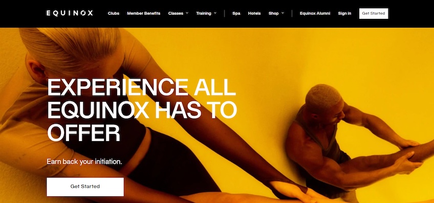
Equinox is a luxury fitness club with 106 fitness centers around the world. The website’s black-and-white color scheme and emphasis on large, high-quality images successfully reflect the brand’s luxury feel.
In contrast to Gold’s Gym, Equinox’s homepage is taller and goes into detail about its services and benefits—and that’s a good thing, too. Equinox aims to familiarize visitors with the company, so the website takes the time to highlight the brand’s standout service offerings to persuade visitors to sign up for a membership.
Meanwhile, the above-the-fold section of the homepage follows a similar format to Gold’s Gym—it includes a full-screen hero image with minimal copy and a CTA. In Equinox’s case, its headline aims to spark curiosity by alluding to the company’s broad range of services.
The below-the-fold content builds on the headline. It showcases everything Equinox has to offer—from its Pilates and personal training services to its mobile app, spa, and recovery facilities. It also encourages visitors to learn more about each resource by including links to dedicated service pages.
The navigation menu follows a similar theme. Visitors can browse through Equinox’s classes, member benefits, hotels, spas, and more.
Overall, Equinox’s website takes the time to acquaint visitors with the fitness club’s benefits and service offerings. This helps it appeal to multiple audience segments, while its large selection of services is a standout within itself.
3. Girls Gone Strong
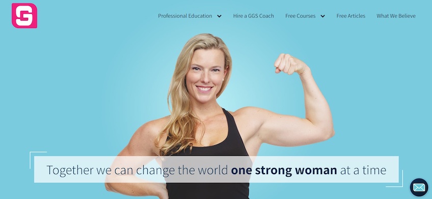
Girls Gone Strong is a fitness website with free courses and blogs dedicated to improving women’s health. It also offers paid one-on-one workout and nutrition coaching as well as certification programs for soon-to-be coaches.
The website’s minimalistic above-the-fold design adds extra impact to its core message mentioned in the headline—changing the world one strong woman at a time. The emboldened “one strong woman” copy within the headline is suggestive of the full-screen hero image and further reinforces that message.
The navigation menu on the top-right is visible yet unobtrusive—the website’s header blends nicely with the rest of the above-the-fold design. Navigation items, followed by their respective dropdown menus, are indicated by clear arrow icons.
The below-the-fold content goes into detail about what the website is about and how it can help visitors, and then it invites them to read the website’s blogs.
Although slightly copy-heavy, Girls Gone Strong uses whitespace and various shades of blue to break up the homepage into multiple sections. This improves scannability and makes it easy for visitors to get to the content they want.
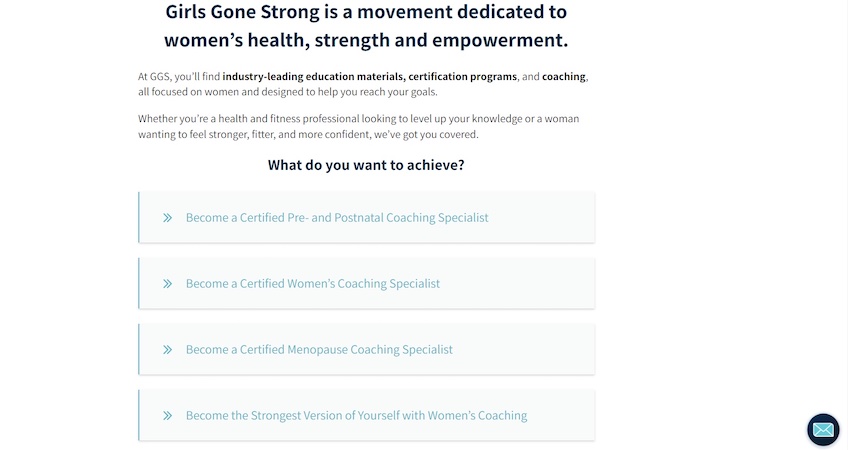
Shortly after scrolling below the fold, visitors are met with a brief explanation about the type of content they can find on the website, separated by what they might want to achieve.
Each item is an anchor link that automatically scrolls down to its specific section within the homepage, similar to a blog’s table of contents.
This is excellent for enhancing the browsing experience on content-heavy websites. It also directs the visitor’s attention towards specific website areas. In this case, the navigation links lead visitors to sections that may generate revenue for the website—cleverly leaving out its free courses and blogs.
In other words, despite being rather busy, Girls Gone Strong organizes its content very well. Its homepage starts out minimalistic and then gradually gets into more details about its offerings as users scroll down.
4. EkhartYoga
EkhartYoga is an online yoga and meditation platform founded in 2008. The platform has grown to have a following of over 1 million members across 152 countries.
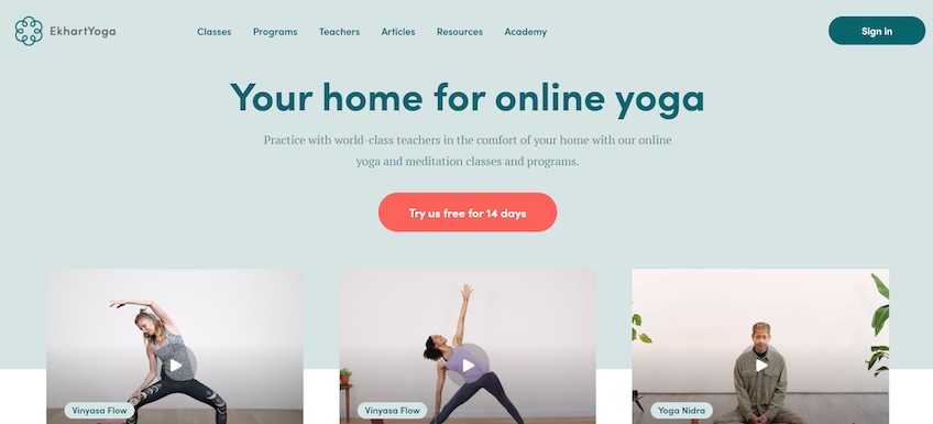
The website does a good job of nudging visitors to convert. The above-the-fold content is clutter-free and drives the visitor’s attention toward the headline, supporting copy, and CTA.
The headline and supporting copy briefly state what EkhartYoga is about and how it can help visitors. The CTA stands out through its bright red color and provides a stark contrast to the pastel-blue background color.
Rather than persuading visitors to opt for a paid membership, EkhartYoga invites them to sign up for a free trial. This encourages more overall engagement since users who want to see how it works before committing to a subscription have a way of doing so.
Also, it’s worth noticing how the website’s above-the-fold content has just enough space to include three videos. These act as teasers and give visitors a glimpse into the platform’s courses, while the rest of the homepage offers class details, testimonials, and a reminder to sign up for the free trial.
Overall, EkhartYoga is an excellent example of how important your homepage’s above-the-fold design is for driving conversions. The copy is brief and crystal-clear, while the videos beneath spark the visitor’s curiosity and encourage signups.
5. Fitness First
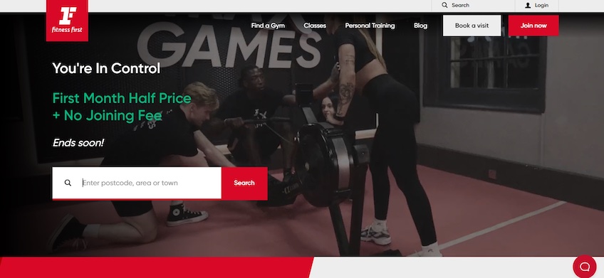
Founded in the UK in 1993, Fitness First now covers over 360 locations worldwide. The brand takes a strong stance on motivating members to push their limits and achieve their full potential—and the website certainly reflects that.
The color scheme has bold red accents, the copy is confident, and the full-screen, fast-paced video background evokes energy and passion. The website also invites users to join fitness challenges and displays leaderboards with the top-performing members.
Similar to Ekhart Yoga, Fitness First’s above-the-fold design aims to generate conversions as quickly as possible. The offer is written in green to be enticing, and there’s a sense of urgency to the “Ends soon!” copy beneath it. The website then encourages visitors to enter their location info so they can find a Fitness First center nearby.
Next to the navigation menu, the website’s header also includes two secondary CTA buttons for visitors to purchase a gym membership or book a club tour. These are meant to stand out due to their size and contrasting colors, and they’re also great for re-engaging with visitors who weren’t intrigued by the initial offer.
6. Black Country Barbell
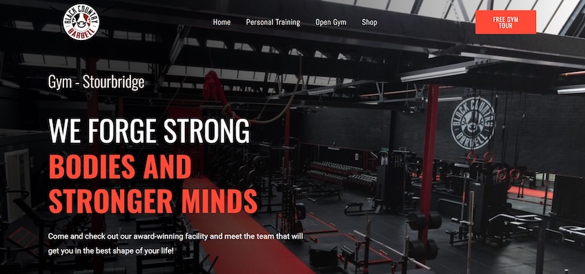
Black Country Barbell is a lesser-known local gym in the United Kingdom with a web presence that’s simple but effective.
The website uses a straightforward four-page design, and the homepage makes clever use of the full-screen hero image to show what the gym looks like while also blending in with the overall brand aesthetic.
The website’s design also ties in nicely with the hero image because it uses the same colors found in the image—a black and dark gray color scheme with occasional dashes of orange and white.
Each color serves its own purpose here. The black and gray act as the background, while the orange highlights CTAs, icons, and specific pieces of text. Lastly, white is used throughout the majority of the website’s copy to improve legibility.
Black Country Barbell’s website includes multiple conversion options, which is perfect for appealing to different needs. Visitors can either book a gym tour, talk with a coach, or learn more about the gym’s membership. In whichever case, they’ll need to fill in a quick form.
Most notably, the bottom of the homepage includes a free 6-week PDF workout guide, which acts as one last push for conversions. Unlike the other forms, this one only requires the visitor’s email address to incentivize signups.
Overall, Black Country Barbell’s design is simple but fulfills its purpose: showcasing the gym’s facilities while incentivizing locals to check it out in person.
7. Born Fitness
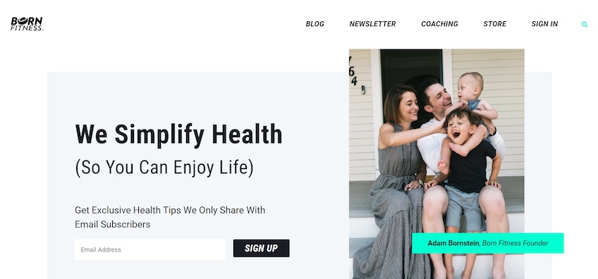
Born Fitness is a health and fitness coaching program and media platform founded by Adam Bornstein, a New York Times bestselling fitness and nutrition author. He coached figures like Arnold Schwarzenegger and LeBron James.
This website is attractive and sticks to many best practices in web design—the navigation menu offers simple and relevant links, the CTAs are clear and stand out from the rest of the design, and the imagery adds both visual support for the content and enhances the website’s overall look.
The above-the-fold section is really well-designed, too, as it directs the visitor’s attention to a lead magnet. The headline and supporting copy tell visitors just enough about the newsletter’s contents to make them know why they should sign up for it.
The hero image on the right not only improves the page’s aesthetics but also adds an emotional appeal and strengthens the headline’s message about enjoying life.
The rest of the homepage goes into more detail about how Born Fitness helps improve health, banking on social proof via customer testimonials and celebrity endorsements.
Lastly, Born Fitness also invites users to take a quick quiz—which can be excellent for boosting engagement. At the same time, the platform can also use the answers it receives to provide personalized coaching recommendations and marketing materials.
8. BLOK
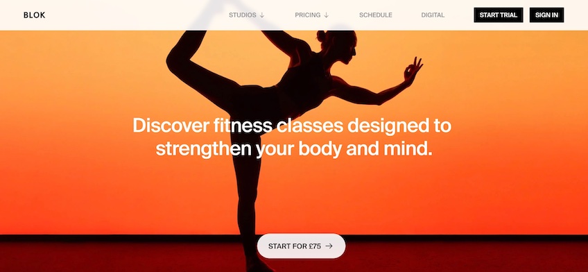
BLOK is another UK-based fitness center with locations in cities like London and Manchester. The gym specializes in cross-training with classes designed to improve endurance, strength, and flexibility.
Similar to Born Fitness, BLOK goes for the minimalistic approach. The headline highlights the gym’s diversity, while the CTA is crystal clear. It also mentions the membership price, leaving very little room for guesswork.
Notably, the CTA is also sticky and changes its color as users scroll down the page to establish contrast to the background. This is an excellent way to keep the CTA visible without having to add multiple buttons.
Anyway, when you move down the page, you’ll find straightforward copy and auto-rotating image carousels that showcase the fitness center’s standout offerings and classes.
Although carousels are generally not a good idea for web design (since they can both be distracting and hinder performance), they work well in this case. The below-the-fold design is also simple and includes minimal design elements, so the carousels make it feel more dynamic.
The BLOK homepage concludes with the gym’s pricing packages and customer testimonials, which are placed well for interested users who have gotten that far. There’s also a CTA in the footer, which adds one last layer of convenience for visitors who reach the bottom of the page.
Conclusion
Setting up an effective fitness website isn’t all that difficult, and most of the top website builders offer many templates dedicated to the fitness industry in the first place.
More often than not, the key to successful fitness websites seems to be pushing for conversions as soon as visitors land on the homepage, so that’s exactly what you should do when you create your own site as well.
Just remember to keep the design simple above the fold—you need to minimize distractions, drive attention to your lead magnet, and highlight your brand’s unique value proposition through a compelling headline.
Also, one more thing. With all of these England-based fitness websites, maybe it’s a good idea to move to the UK if you want to get jacked.