When someone navigates to your website’s contact page, it means they have a specific reason for reaching out to you. Sometimes, they may want to ask a question or make a request. Other times, it’s as a last resort because something has gone wrong and they need assistance.
That means that a poorly designed contact page could be the final straw that drives away visitors—and with them, potential sales.
Prioritizing an intuitive contact page design will lead to much better customer retention and greater brand confidence.
Check out our top 15 contact page designs below for inspiration on how to craft your own.
1. Grammarly
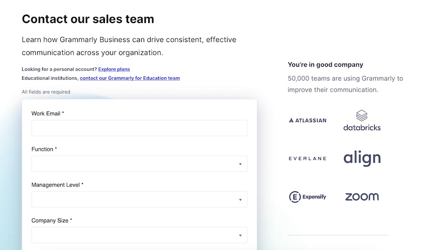
The first thing Grammarly does right is provide links to its different support funnels.
If you’re looking for help with a personal account, there’s a link for you. If you’re an educational institution, there’s a link for you as well. With these links, Grammarly makes sure that anyone who needs assistance easily gets to the right place.
Another plus for Grammarly’s contact page is the reassurance given by the phrase, “You’re in good company,” juxtaposed with six different reputable brands that all use Grammarly. When people find their way to Grammarly’s contact page, this social proof strategy provides extra reassurance that visitors are in good hands.
Finally, Grammarly’s built-in contact form makes it really easy to get in touch with a real human being—something that seems to be getting harder and harder as we move into an AI-centric future.
2. HubSpot
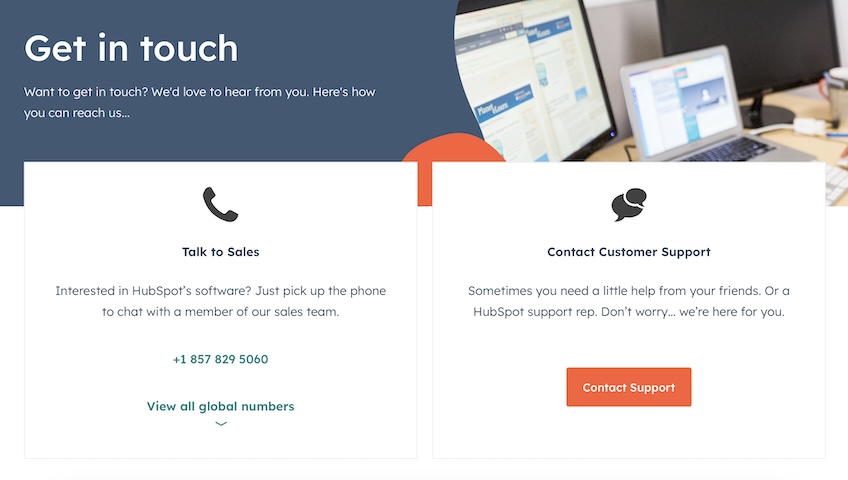
HubSpot’s contact page excels in its simplicity. The screen contains minimal text, as well as only two simple contact options: Sales and Customer Support. This lines up with one of the fundamental rules of contact pages, which is to make sure customers don’t feel overwhelmed. Oftentimes, an excessive selection of choices can actually result in customers taking no action at all.
HubSpot’s contact page is also aesthetically pleasing, with an attractive color scheme and a good blend of pictures and icons. It’s a timeless, no frills approach that works.
3. Slack
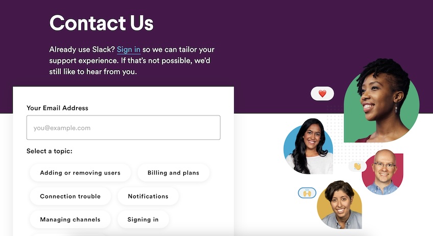
Slack takes a more casual approach with its contact page. The option to sign in allows users to find unique solutions that may be specific to the status of their account.
Additionally, the phrase, “If that’s not possible, we’d still like to hear from you,” contributes to the feeling that you’re going to get answers from real people as opposed to AI chatbots.
Slack also effectively utilizes the topic selection feature by listing popular topics in a clickable form. If you need help with something more obscure, there’s a custom field below, where you can input the specific topic with which you need assistance.
In general, built-in contact forms like this one also make it much easier to send an email on the spot, as opposed to having to copy the email address and paste it into your mail application.
4. Zendesk
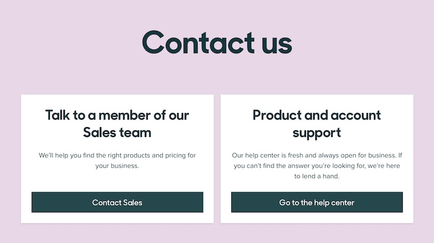
Zendesk’s entire website is beautifully designed, and the contact page is clearly no exception. Contact pages can often feel scrappy and barebones, as if you’ve stumbled into some long-forgotten corner of the website. Zendesk’s warm design ensures customers that the contact page is alive and well.
Like we saw with HubSpot, Zendesk uses a simple funneled approach, with only two initial support choices. This again ensures that no time is wasted, on both the customer side and the company side.
Upon clicking Go to the help center, you’ll be taken to a huge support page, where solutions are further broken down under even more specific categories. From this page, you can also access Zendesk’s extensive community forums hub, which is a vital feature for companies that can’t always provide one-on-one support for every small issue that pops up. It also allows customers to find the answers they need without always having to reach out to support.
5. Dropbox
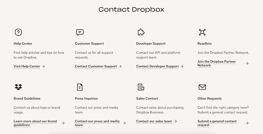
Dropbox’s contact page is definitely busier than the examples we’ve seen so far. That can either be a good thing or a bad thing, but in this case, it’s a good thing. Dropbox is a massive file-sharing platform, and there are numerous reasons why people might need to contact the company.
The strongest feature of this contact page is the way it presents all eight different options without overwhelming the user. Each section is clearly defined, with a separate icon and bolded header describing precisely what the section pertains to.
Sometimes this approach works better than a funneled approach, as you won’t have to follow a long page-path that gets more and more specific as you keep clicking—instead, all the options are clearly presented right away.
6. Zoom
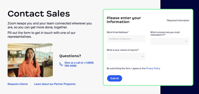
If you’ve ever searched in vain for a company’s customer support phone number, then the most reassuring thing about Zoom’s contact page is probably that the number is just easily visible. You don’t have to chat with an AI bot or confirm that your help topic is good enough to warrant a phone call.
Like we saw with Grammarly, Zoom also features a few “quick links” that serve to anticipate the user’s need and meet it right on the spot.
Many customers likely reached out requesting a demo version of Zoom or information about its Partner Programs—so the company wisely placed those links at the bottom of the page to streamline operations.
We also see again the use of a built-in contact form, making it just that much more convenient to send in an email.
7. PayPal
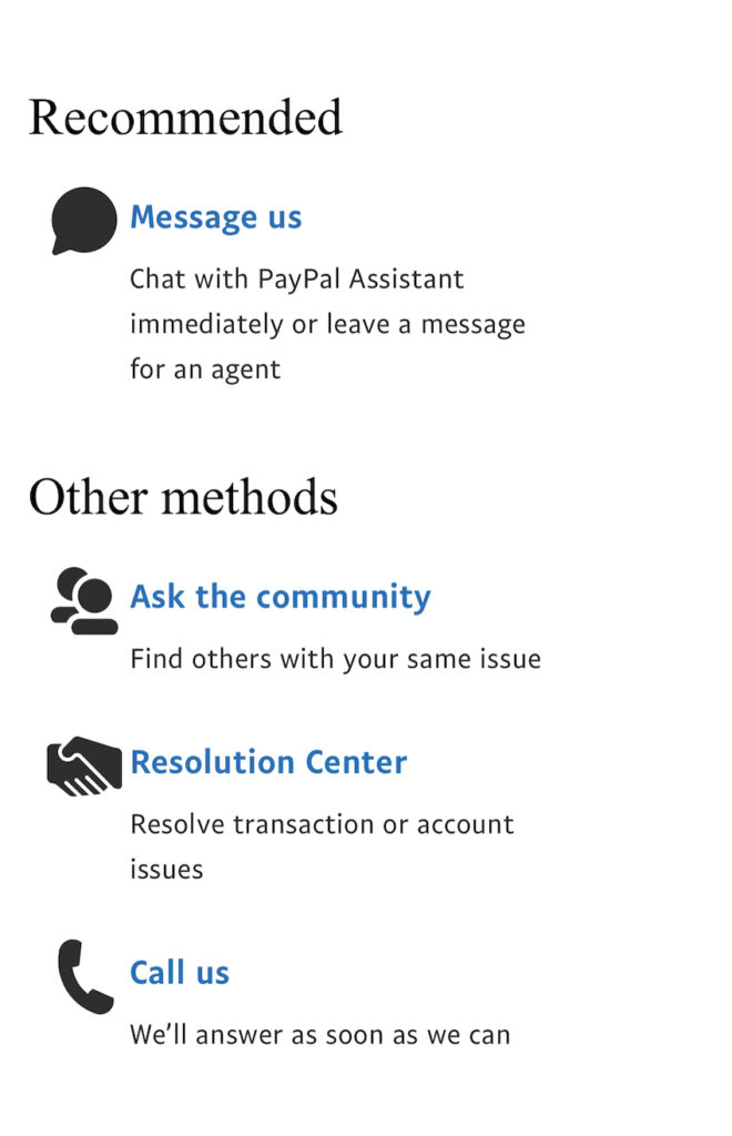
PayPal’s contact page is tactfully designed on the desktop view, but it especially shines when viewed on mobile. There’s obviously much less space to work with on a smartphone screen, so no space can be wasted.
PayPal does well in dividing the page into two sections: Recommended and Other methods. It’s likely that most customers on PayPal’s contact page are going to want to instant message with an agent—so the top option is prioritized. That said, the three other methods are clearly differentiated from one another, giving users clear options.
Finally, the descriptions under each section communicate all necessary information with as little text as possible, leaving a good amount of attractive white space on the screen. The bolded, blue headers are clearly links, which means even the least tech-savvy users will know which buttons are clickable and which ones aren’t.
8. Salesforce
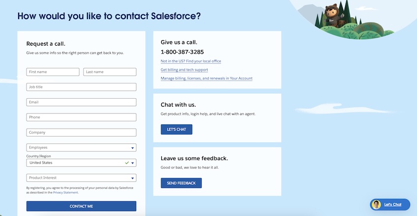
Salesforce presents three separate contact options right off the bat: you can call the company directly, hop on a live chat, or request a call back via the form. These options are less about navigating to the right department and more about catering to the customer’s specific communication preferences. This is a smart move, as it helps to ensure that even the busiest users will follow through with at least some type of contact.
That said, Salesforce also provides links leading to other contact departments, such as international support, billing and tech support, and specific account support.
As far as design goes, the screen certainly has a busier look than most of the other examples we’ve seen so far. The key, however, is that it’s busy for a purpose—all the fields, links, and buttons are necessary, and removing any of the options would hurt usability.
9. Stripe
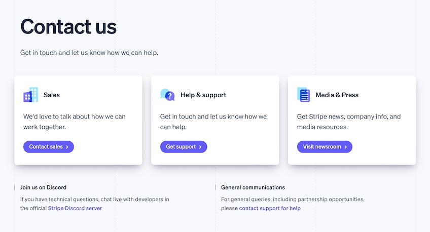
Like we saw earlier with Zendesk, Stripe really succeeds in assuring the user that the contact page is not a neglected, dusty relic that’s hardly worth the trouble of using it. Instead, it’s designed with the same theme as the rest of the website, with bright colors, icons, and animated buttons.
If you’re looking for help with technical questions, Stripe suggests you chat directly with their developers on their live Discord server. Discord is a newer instant messaging platform that offers numerous benefits over simple website chat screens, namely the ability to chat with developers and other users who may be having similar issues.
Stripe also excels in the fundamentals: the screen is neatly organized, with different support departments cleanly categorized to minimize confusion.
10. Airtable
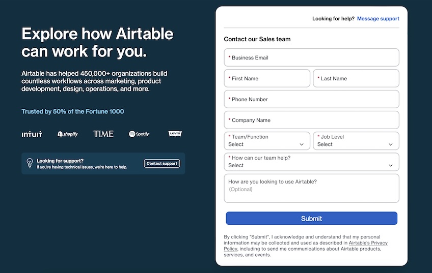
The key strength of Airtable’s contact page is clearly the subtle reassurance that you are, in fact, in good hands. Displaying that the company is “Trusted by 50% of the Fortune 1000,” and displaying the company names below does a tremendous job of building customer confidence.
Airtable undoubtedly receives a huge volume of sales inquiries as well as technical support questions. As such, its contact page is clearly geared more toward sales, with only two small—but easily noticeable—links to technical support pages.
While a built-in form with nine separate text fields may feel like overkill, providing this level of detailed information right off the bat will save potential clients tons of time down the road.
11. InVision
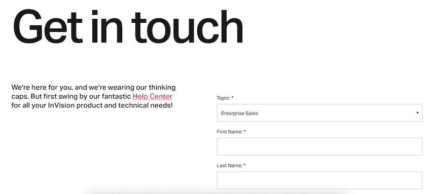
Out of all the contact pages we’ve looked at so far, InVision’s is far and above the simplest. This is especially interesting when you consider that InVision is a huge company with a massive client base, offering a complex product.
We’re not saying that all companies need to follow InVision’s lead in dramatically simplifying their contact pages—but it’s worth noting that it’s not always necessary to have a veritable sea of contact options. Sometimes less is indeed more.
What’s also worth noting is how InVision refers to its Help Center as “fantastic”—and fantastic it is. The sprawling quantity of solutions to be found in the Help Center is perhaps the biggest reason InVision has been successful with its ultra-minimalist contact page design.
12. Spotify for Artists
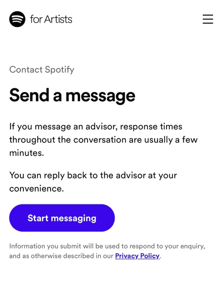
Like PayPal, Spotify for Artists’ contact page really shines when viewed in the mobile format. Why? Because it’s narrowed down its users’ preferred contact method and chosen to show only that option on the limited screen space of your smartphone.
In terms of contact efficiency, perhaps Spotify for Artists could benefit from offering a live phone contact feature and an email address. These features would likely result in an increase in customer communication.
However, the company has chosen to prioritize modern messaging, simplicity of options, and clean design instead—and we think that’s a good move.
13. Moz
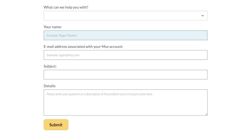
Moz also takes the minimalist approach with its contact page. Though the company is a sprawling SEO solutions firm, they’ve chosen to give customers only one contact method: a built-in email form.
Similar to Spotify for Artists and InVision, Moz benefits from having all contact inquiries flow into the same place. Though this likely reduces the total communications the company receives from customers, it also probably reduces the total time spent dealing with customers who don’t really mean business—and that’s a big win for any company.
For customers who like real-life interactions, Moz lists on its broader contact page the addresses of two of its office locations, in Seattle, Washington and Vancouver, Canada.
14. Squarespace
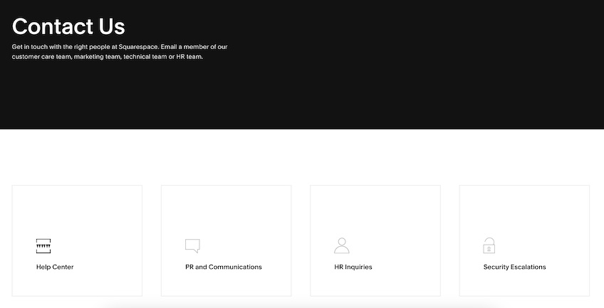
Squarespace’s contact page combines the best of two worlds: it’s clean and minimalistic but also chock full of options. The page is perfectly designed to provide ample information without overwhelming the user.
When you move your cursor over any of the four boxes, the space animates with a further description of the solutions offered in each category, so you can be sure you’re going to the right place even before you click. Particularly useful is the Help Center, which links to a separate page where users can narrow down their specific problem and find a detailed article explaining how to fix it.
As far as design goes, the black and white contrast, as well as the huge amount of empty space, contribute to the modern look that’s present everywhere else on Squarespace’s website.
15. Unbounce
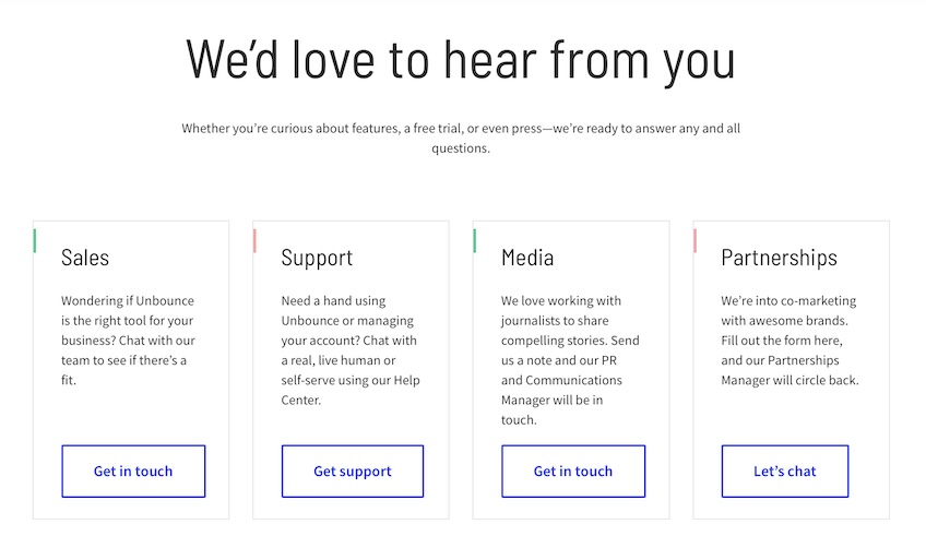
Unbounce’s contact page is strikingly similar to Squarespace’s—it’s minimalistic, but not overly so. It also shows four separate categories at the same time, enabling users to find the relevant support as quickly and painlessly as possible.
Unlike Squarespace, Unbounce shows the descriptions for each category by default, without requiring the user to move the cursor. The difference here is mostly immaterial—it just depends on how committed the company is to the minimalistic, text-free look.
Finally, just below these four boxes, Unbounce lists the addresses of its two main offices, as well as phone numbers for directly contacting the company in five different countries. So if all else fails, users know they can always speak to a real person if they need to.
The Core Elements of Contact Page Design
All 15 of these contact pages showcase tremendous diversity. Not one page is exactly like any of the others—and yet there are key similarities between them.
Every page above features:
- An intuitive layout so users know where they need to go to find the solutions to their specific problems
- A limited array of options, so users don’t feel overwhelmed and give up searching
- An aesthetically pleasing design scheme that largely matches the feel of the rest of the website
Use best website design practices and one of our recommended website builders to build your contact page, while also adhering to the fundamentals listed above—and you’ll be in good shape.