Did you know that each dollar spent on your website’s user experience can bring $100 back?
This return on investment makes sense if you think about it, since 88% of visitors are less likely to return to a website after one bad experience. Plus, when we judge the credibility of a website, we base 75% of that judgment on its design.
In other words, your website’s design is crucial for earning your visitor’s trust and getting them to stick around long enough to turn into customers. Nevertheless, there are still many companies that break every design rule in the book yet somehow manage to churn out millions each year.
Mind-boggling? Definitely. That’s why we’re taking a look at a few high-earning bad websites to get a sense of how they do it.
But first, a quick disclaimer—because although we do not recommend any of the bad design practices we’re about to discuss, we cannot deny that these websites still rake in the cash with them. We do, however, hope to shed some light on why that’s the case.
7 Bad Website Examples That Print Money
1. Ling’s Cars
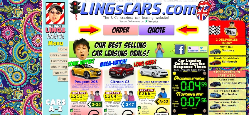
Ling’s Cars has been in the market since 2007, though the website looks like it’s stuck in 1997.
It’s overcrowded, the background doesn’t make any sense with the rest of the homepage, the color scheme is all over the place, and it includes many animations that distract from the browsing experience—just to name a few.
Still, Ling’s Cars managed to lease $106,192,200 worth of cars in 2015, while the company had a net worth of around $490,980 in 2022.
What’s interesting about Ling’s Cars is that the website’s design seems to be bad on purpose. It banks on the “it’s so bad it’s actually good” factor and uses the website as more of a publicity stunt than anything else. The site itself even brands itself as “the UK’s craziest car leasing website” beneath the header.
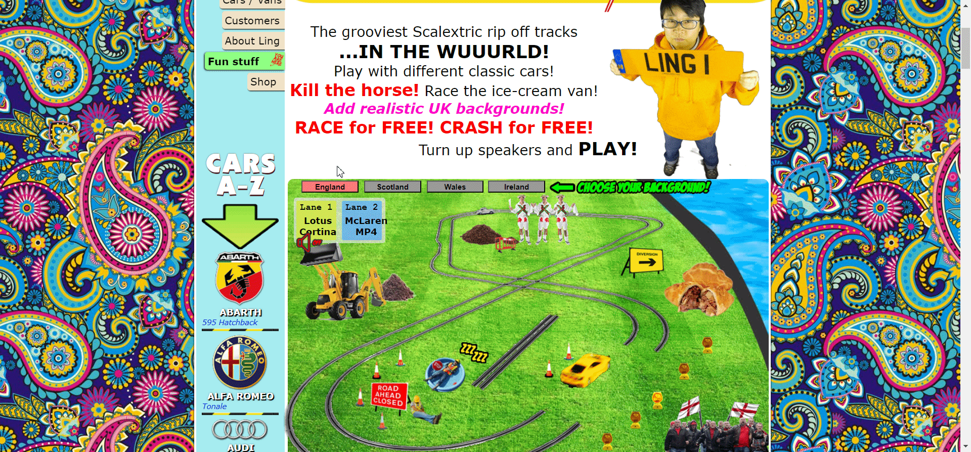
If you take a deeper look, you’ll see that the site is full of personality—the copy is fun and includes lots of quirky, funny animations. The site even includes a mini-game filled with jokes.
You probably wouldn’t expect this out of a car leasing website, and that’s the point. Ling’s Cars intentionally throws users off and gives them a good laugh to make the brand memorable.
Something to take note of is how the website focuses on the business owner, Ms. Ling, and not the company itself. Her name and face appear all over the site, getting visitors to establish a personal connection with the website and earning their trust.
The company aims to come across as a friend who can set you up with a car at a fair price, not just as any other car leasing company. The website does a great job at this. Its design oozes with the owner’s personality—quirky, fun, and a bit crazy in a good way. Ling’s Cars even used a missile truck for roadside advertising once, which further attests to the company’s shock marketing tactics.
The moral of the story here is that injecting personality into your design can do wonders. It helps you stand out from competitors, earn the visitor’s trust, and make your brand memorable.
Not everyone can succeed at this, though. You wouldn’t want to ditch user experience and web design conventions in favor of an over-the-top design—unless you also plan to slap a huge missile on the back of a truck for roadside advertising.
Otherwise, you risk increasing your bounce rates, which also impacts SEO.
2. Craigslist
Craigslist sits on the other side of the design spectrum—its website is excessively simple and bland. Despite that, Craigslist is one of the world’s most trafficked sites. The company also generated $694 million in 2022 and its market value sits at the $2-3 billion mark.
Nearly all of the website’s buttons are text hyperlinks, visuals are almost non-existent apart from user submissions on listings, and navigability is totally archaic. The homepage includes an extensive list of links to sub-domains corresponding to specific cities.
Each webpage follows the same theme as the homepage—a long list of links with not much else going around. Besides section links, the only thing that seems to help users get anywhere is a search bar.
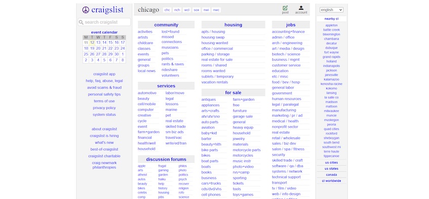
Craigslist’s secondary pages leave large amounts of untouched screen space, which most other websites might consider using to enhance navigation or spruce up the design with other elements.
However, the website’s rudimentary look is part of why Craigslist is so successful—it’s easily recognizable, and the lack of design elements makes the web pages load fast while also being highly accessible.
The absence of complex color schemes doesn’t create any problems for colorblind people, while the lack of imagery makes Craigslist easy to navigate for people using screen readers. Since Craigslist attracts around 200 million visitors per month and about 31% of its audience is above the age of 55, website accessibility is an important factor.
At the end of the day, Craigslist has a website design that does the bare minimum to fulfill its purpose. It connects people who post announcements, jobs, services, and products for sale with individuals who seek these types of posts—no more, no less.
The success of Craigslist is a good example of why function is more important than beauty, and it seems to benefit from being a part of the early stages of the internet. This may not work for you when creating a website, but you may be able to learn from the lesson that nailing down the site’s user experience, navigation, and accessibility can often take precedence over visual effects.
3. Berkshire Hathaway Inc.
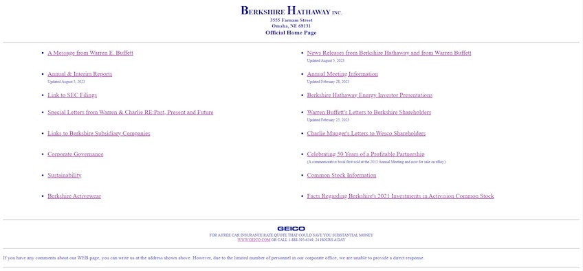
Like Craigslist, Berkshire Hathaway Inc. takes the spartan approach—navigation is made up of plain-old hyperlinks texts, it doesn’t include any visuals, and there’s no contact or about page.
For a company owned by Warren Buffet that generated $234 billion in revenue in 2022, the website’s fresh-out-the-90s look may seem out of place. But similar to Craigslist, Berkshire Hathaway’s website strictly focuses on function and serves its purpose.
In this case, Berkshire Hathaway’s site is not built for consumers—it doesn’t aim to attract new visitors and get them to convert. Instead, it’s built for shareholders, presenting all the information necessary to get them acquainted and up-to-date with the company. It offers details like stock information, SEC filings, financial performance reports, investor presentations, and company news.
The site’s bare-bones look makes that information readily accessible—no need for jaw-dropping graphics, interesting color schemes, and all the other bells and whistles. Shareholders are impressed by a company’s financial performance, not its website’s design.
That said, the reason why Berkshire Hathaway’s website design is successful is because it doesn’t need to be any good. Most businesses can’t say that.
4. Drudge Report
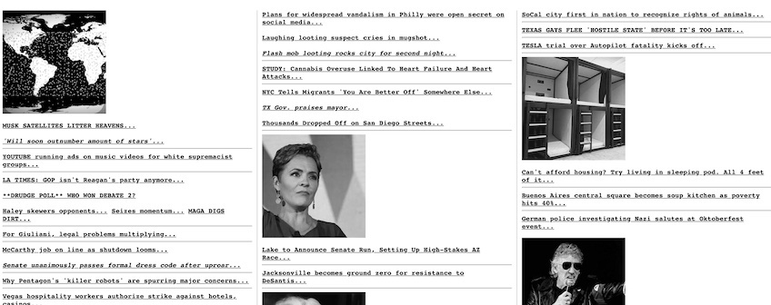
Drudge Report made its debut in 1997. Its fast news delivery times and emotionally charged headlines made it one of the most popular news aggregation websites. Although the site seems to still be stuck in 1997 as well, it received over 7 billion web visitors in the past year.
The reason for the site’s success is two-fold. For one, its simplicity contributes to the site’s fast loading speed, while its one-page layout and lack of distractions drive full attention to the sensationalized headlines.
Secondly, the site is not designed to keep users on the webpage. It provides a list of links that lead visitors to the original news sources. The website simply spins the headlines to make them juicier.
The content is structured and laid out well. The website draws attention to the main story by placing it in the center and including a relevant image. The copy is written in all caps, highlighted in red, and underlined—old-school, but effective.
The below-the-fold content is separated under a three-column layout to improve scannability, while some stories are highlighted using the same format as the main headline.
Coupled with the fast loading times and lack of distractions, visitors benefit from a quick in-and-out website experience. As such, there’s no point investing in design if you don’t plan to get users to stick around the website.
Once again, not every business can say that.
5. HuffPost
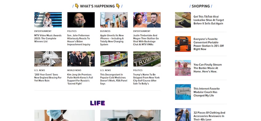
HuffPost is a news website that generated $40 million in revenue in 2022. Although more modern-looking than Drudge Report, HuffPost’s design is turned on its head—quite literally.
Users expect to see a website’s main navigation menu along with its logo at the top portion of the screen—but HuffPost does it the other way around. The upper section of the screen is mostly occupied by a carousel, while the navigation menu and logo are placed beneath. This design choice can often throw users off and cause them to bounce off the page.
Complying with web design conventions is crucial—it adds a sense of familiarity to your design, ensuring that your website is in line with the visitor’s expectations, which leads to an enhanced user experience.
The carousel itself is another questionable decision that could negatively impact the user experience. Carousels make it more difficult for visitors to get to the content they want. Users are more inclined to browse through content by scrolling down the page rather than moving between slides.
There’s also banner blindness to factor in here, since the carousels appear similar to the banner advertisements. Both are placed at the top, both prioritize imagery, and both are rectangular in shape. This causes visitors to subconsciously ignore anything that resembles a banner ad, potentially missing out on the carousel’s content.
Keep in mind that HuffPost displays numerous articles further down the page, which makes the top carousel almost pointless. Things don’t look much better beneath the navigation menu either.
The plain background, along with the font choice and image placement give this section a similar look to Drudge Report. Here, the use of whitespace could help drive attention to the main article, but the auto-playing video pop-up on the bottom right negates that effect.
Notwithstanding, the site’s design takes a turn for the better further down the page, where the whitespace is implemented to give the page plenty of breathing room despite the large volume of content.
The articles are nicely organized and split into various categories for better scannability. Each article is accompanied by relevant images and includes catchy, yet descriptive headlines to attract attention and give visitors a bit of context about the article’s topic.
Overall, HuffPost’s design is bad—but not that bad. It goes to show how a few misplaced design elements, like the carousel in the header and the auto-playing video pop-up, can have a significant all-around negative impact on your website’s design.
6. PC Connection
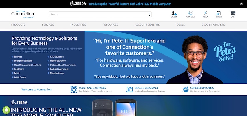
PC Connection generates around $3.1 billion in revenue annually. Although its website looks more modern compared to the other examples on this list, its design is incessantly busy—to the point where it may take a few seconds to figure out where to look after you land on the homepage.
First, it includes too much copy, while the light and dark blue color scheme also doesn’t create enough contrast. This can make it difficult for visitors to distinguish between content and lose focus across design elements.
Additionally, the navigation links beneath the headline on the left-hand side of the page are cramped and too small. This creates problems for users who may accidentally press on the wrong link while trying to navigate.
Speaking of poor navigation, most of the menu items in the header are followed by a dropdown or mega menu without prior notice that would give the user a hint at what is coming when they hover over them on desktops. This can startle visitors and feel overwhelming. Placing an arrow symbol next to each label would help let visitors know about the presence of additional links and make them feel less overwhelmed.
The busy theme is also present below the fold. However, now the whitespace and contrasting colors actually help distinguish between design elements and create a little bit of breathing room.
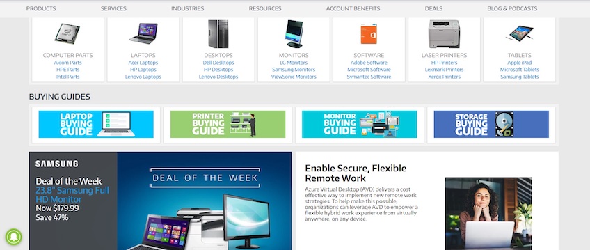
Another decent design move that PC Connection uses is a sticky navigation menu. This is excellent for giving users quick access to other pages regardless of where they are on the homepage—especially handy for lengthy pages.
Despite its flaws, PC Connection does a good job in the copy department. Its web copy is persuasive, concise, and clearly highlights the benefits of certain products or the company as a whole.
The problem is, it just uses too much of it. This can cause visitors to feel overloaded and lead them to bounce.
All in all, PC Connection shows how important whitespace is in design. The above-the-fold section uses almost every bit of available space to display numerous design elements, thus overcrowding the webpage.
The below-the-fold section makes the content much easier to scan and easier on the eyes, but it’s perhaps too little too late in the design department.
7. American Airlines
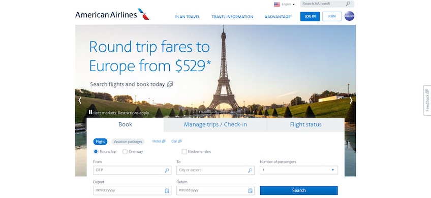
For a company that hit a record first-quarter revenue of $12.2 billion in 2023, the American Airlines website looks outdated, which can impact the airline’s credibility—especially when compared to some of its competitors.
The hero image is low-quality and is part of an automatic carousel. That’s a big no-no. Automatic carousels take control away from users, and there’s also no correct slide movement speed that works for everyone. If you go too fast, some visitors will likely miss a slide’s content, and if the slides are too slow, others may lose interest and shift their attention elsewhere.
Fortunately, American Airlines does allow visitors to speed up the slides via navigation arrows placed on both sides of the screen, and there’s also a pause/play button above the flight booking form on the left.
Speaking of forms, the website could reduce the number of fields by merging the depart and return dates, like how Delta Airlines does it on its website. The fewer form fields you have, the more likely visitors are to fill them in.
Despite its outdated look, American Airlines makes up for it by getting some things right. For instance, the header adheres to web design standards—the logo is clickable and placed on the left, followed by the navigation menu which doesn’t include too many navigation items. The homepage is also short and includes minimal distractions. This helps direct the visitor’s attention to the booking form.
That said, if sites like Craigslist show us that function is more important than aesthetics, American Airlines reminds us that it’s still not great to neglect looks. Remember, 75% of a site’s credibility is based on its design.
Conclusion
As these examples have shown, it’s entirely possible for online businesses to make millions and still have badly designed websites.
That said, it may be extremely difficult to grow an online business to millionaire status if the design is trash. It’s important to keep user experience at the top of your priority list, and strike a proper balance between using visuals and maintaining whitespace.
The good news is, most website builders already do that for you. They offer dozens of ready-made templates that handle your key functional design choices, and all you need to do is fill in the blanks.