“Above the fold” is the portion of a web page that’s visible the moment it loads—before a user scrolls. It’s your first impression and the highest-stakes real estate on any page.
People sometimes cite “about 600 pixels tall” for desktop, but the truth is it varies widely by device, browser UI, zoom level, and orientation. Anything that requires scrolling sits “below the fold.”
You Still Have to Win Above the Fold
Print editors stacked the most compelling headlines “above the fold” to grab attention and sell papers. Online, you face the same job—only now you’re competing with millions of pages and a back button that’s one tap away.
You have seconds to earn interest. If visitors don’t see something relevant immediately, they bounce. Treat the above-the-fold area like a storefront window: it should tell people exactly what’s inside and why they should come in.
What belongs there? A clear headline that matches search intent, a short supporting subhead, one primary call-to-action, and a visual or proof point that builds trust—nothing that distracts from these essentials.
- Headline: Plain-language promise that mirrors what the visitor came to do.
- Subhead: One or two lines clarifying the value or outcome.
- Primary CTA: One action (no menu of choices). Make it obvious and accessible.
- Trust cue: Social proof, ratings, client logos, or a quick stat.
- Speed & stability: Keep Largest Contentful Paint fast, avoid Cumulative Layout Shift, and ensure responsive interaction (INP) stays low.
The Exact Above the Fold Area Changes By Device
The visible area is dictated by the user’s device and browser chrome. Laptops, tablets, and phones all expose different amounts of content before scrolling.
Something that’s visible at page load on a 14-inch laptop might require a swipe on a phone. Pixel density, aspect ratio, and device toolbars all change what users actually see.
Display resolution (e.g., 1920×1080, 1366×768, 1290×2796) and device pixel ratio influence layout. Even within one brand line, sizes differ: for instance, one phone can be 1080×2340 while another flagship model stretches to 1440×3120.
There’s no universal “above the fold” height. Plan for a flexible hero that adapts gracefully across screens and orientations.
So how do you make sure your most important content is seen everywhere?
How to Control Above the Fold Despite Different Device Resolutions
Design for a range of viewports—not a single screen. Use responsive CSS so the hero area, headline, and CTA scale cleanly from small phones to large monitors.
Use modern responsive tools: media queries for page-level shifts, container queries for component-level polish, and fluid type/spacing with clamp(). Prefer dynamic viewport units (dvh/svh/lvh) over legacy vh so mobile browser UI (address bars) doesn’t hide content.
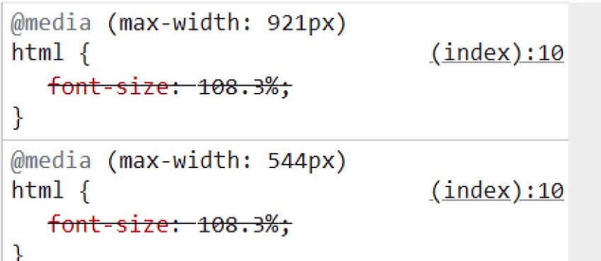
The example above shows two breakpoints—544 pixels and 921 pixels—that switch layouts based on available width.
In practice, you don’t need a style for every device model. Choose a small set of content-driven breakpoints that map to major ranges and let layout flow between them.
Breakpoints like 544px and 921px can cover many phones and tablets. On wide screens, expand spacing, surface supporting links, and keep the primary CTA visible without pushing it down.
On desktop, you might see a full navigation bar, a newsletter CTA, and several featured articles—all within the initial viewport.

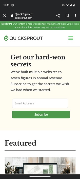
On a phone, the layout simplifies to a hamburger menu, a single newsletter CTA, and one featured article. This keeps focus where it matters.
Shrinking a desktop layout onto a phone usually produces tiny text, cramped buttons, and decision overload. Responsive rules—paired with smart defaults—prevent that.
Want to dig deeper? Check out my guide on making your website mobile-friendly.
- Make the hero “content-first”: Lead with the H1 and CTA, not a giant image that buries the message.
- Prevent layout shifts: Set intrinsic width/height on hero media, reserve space for web fonts/embeds, and use
font-displayplussize-adjustas needed. - Speed up the first screen: Compress hero media, minimize render-blocking scripts, and keep the headline visible ASAP (optimize LCP).
- Modern CSS: Media queries for page shifts; container queries for components; fluid type with
clamp(); dynamic viewport units (dvh/svh); respectprefers-reduced-motion.
How to Preview What’s Above the Fold on Your Site (Any Device)
You can preview your above-the-fold experience for popular devices right from your desktop in seconds.
I’ll use Google Chrome here, though Safari and Firefox offer similar tools.
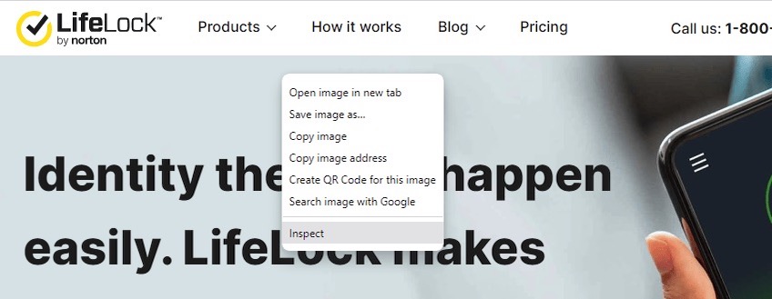
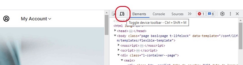
Step 1: Inspect Page
Open your website in Chrome. Right-click anywhere and choose Inspect.
Step 2: Toggle on Device Toolbar
Click the device icon in the top-left of the DevTools panel to enable the Device Toolbar.
This lets you simulate different screens and orientations without leaving your browser.
Step 3: Select Device Dimensions
Use the dropdown to pick a preset (iPhone, Pixel, iPad, and more) or stay on “Responsive” and drag to test custom sizes.
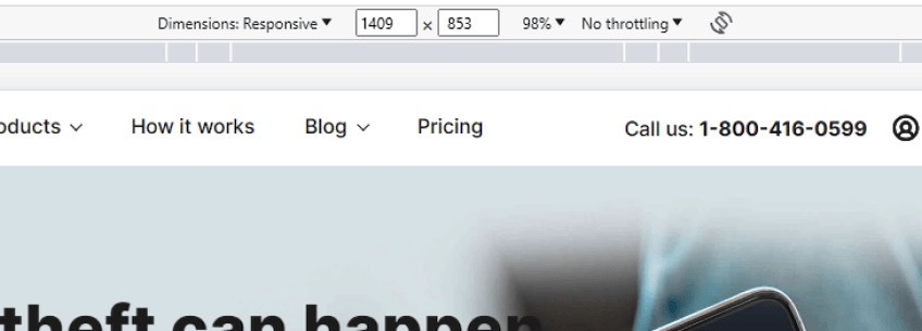
By default, “Responsive” adapts to your browser window. Selecting a specific device gives you a realistic snapshot of what that audience will see.
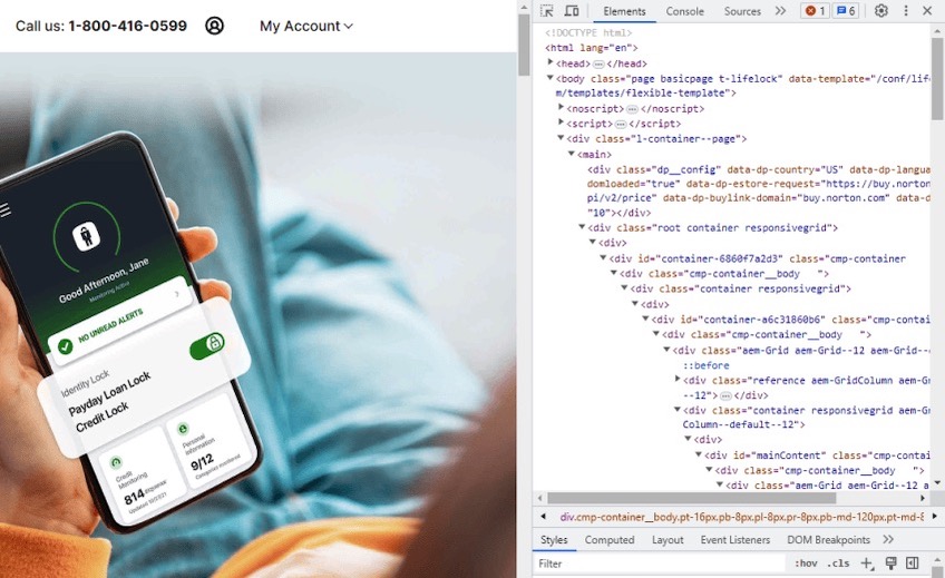
Here, I’ve selected “Pixel 5” to preview the experience:
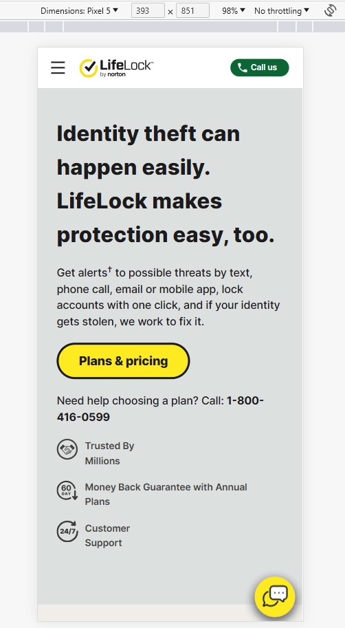
Notice the condensed navigation (hamburger) and a prominent “Call Us” CTA—everything important fits above the fold.
On many phones, the initial viewport can exceed 700–900+ pixels tall, so your hero may need to flex a bit more than on desktop.
Chrome shows dimensions like 393 × 851 for a Pixel 5, which means most of the hero content loads immediately.
I’ll compare this to a real-world screenshot.
Here’s how the same page looks on a physical Pixel 7:

Apart from a small overlap from the browser UI, the preview and the real device are nearly identical—good confirmation that DevTools is reliable for above-the-fold checks.
Can’t find the device you need? Click “Edit” in the dimension dropdown to add more presets or define a custom size so you can test anything your audience uses.
Tactics For Above the Fold Website Content (With Examples)
If you want quick wins, start by optimizing the first screen. It’s your best lever for engagement, conversions, and lowering bounce.
Below are real examples and patterns that consistently work.
Focus Everything On The Headline
Your headline should dominate visually and say the quiet part out loud: what this page does for the visitor. You don’t need clever—just clear.
Short, intent-matched headlines with a one-sentence explainer perform extremely well.
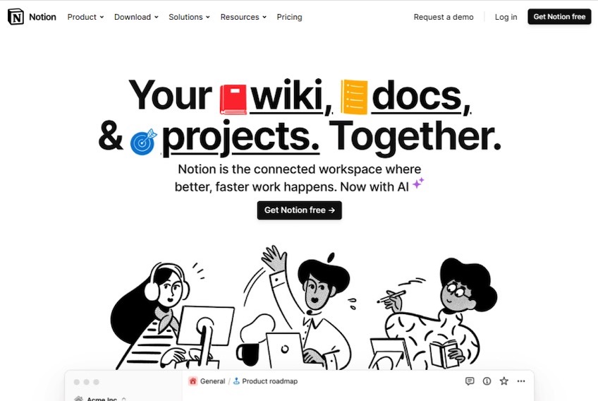
Notion’s homepage headline reads:
“Your wiki, docs, & projects. Together.”
Six words, instant clarity. The brief copy and “Get Notion free” CTA keep the focus where it belongs.
I also like how the interface peek invites a scroll without crowding the message.
Longer headlines can also work if they speak directly to the visitor’s goal.
Substack nails it with:
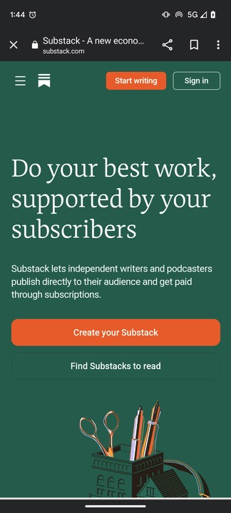
“Do your best work, supported by your subscribers.”
It’s aspirational and specific to creators, and the CTA—“Create your Substack”—is simple and action-oriented.
- Write to the user’s intent, not your internal tagline.
- Keep the CTA singular and aligned to the next best step.
- Make the headline accessible: readable size, strong contrast, and not hidden behind imagery.
Avoid distracting designs
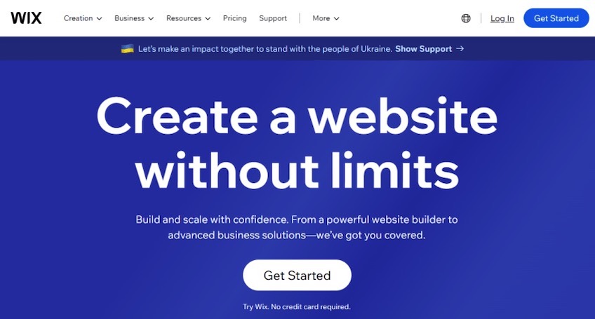
Minimalism wins more often than motion. Wix shows how a clean hero, clear copy, and a single CTA can out-perform flashy animations that siphon attention from the message.
Conversely, auto-playing videos, fast loops, or hover-heavy effects can bury the point. If motion doesn’t clarify the offer, it’s noise. Respect prefers-reduced-motion to keep experiences comfortable and accessible.
Take Toast’s homepage: the looping GIF repeatedly pulls the eye away from the headline without adding context. It’s attention-grabbing, not intention-serving.
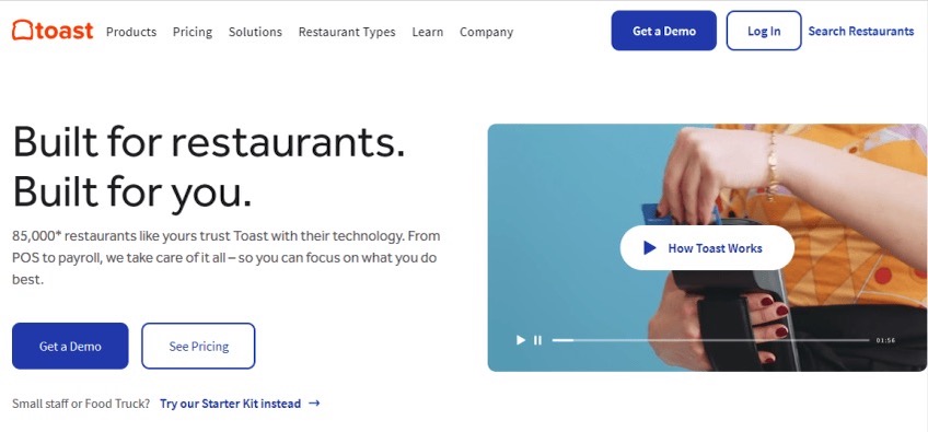
Use visuals to support the promise, not compete with it—especially above the fold.
Provide Focus With the Navigation Menu

Menus can either clarify or confuse. Keep top-level options tight and intuitive so users don’t get stuck choosing.
Cloudflare groups dozens of offerings into a handful of sensible buckets like “Solutions,” “Products,” and “Pricing,” which makes a complex product line approachable.
They also use smart CTA items:
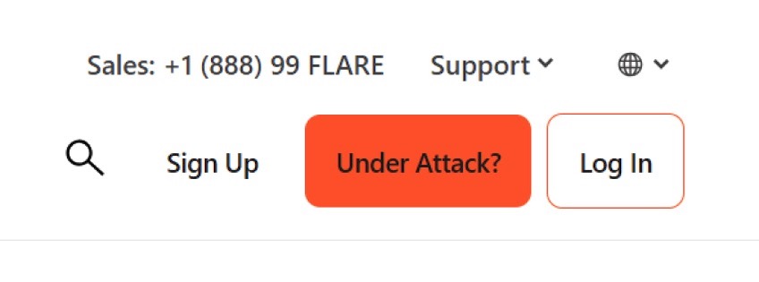
“Under Attack?” is both a call-to-action and a reassurance that help is immediate. A visible phone number is another trust builder—real humans are on the other end.
- Limit top-level choices; rely on mega menus or in-page nav for depth.
- Make search prominent if your catalog is large.
- Keep CTAs consistent (“Start free trial,” “Get a demo”) so users don’t hunt for the next step.
Provide Value Immediately
On landing pages and blog posts, give people what they came for right away. Don’t bury answers under a long preamble—lead with a direct solution or summary and then expand.
This earns trust, reduces pogo-sticking, and increases the likelihood that visitors keep reading.
Investopedia does this well—clear headline, instant explanation, and a table of contents that maps the page for readers.
Here’s an above-the-fold section that adds value immediately:
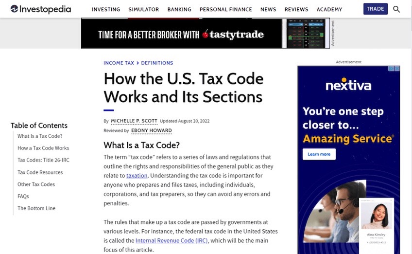
The page isn’t flashy, but it answers the query and shows where to go next. That’s why people stay.
- Open with the definition, result, or takeaway in the first screen.
- Add a concise table of contents or “Jump to” links.
- Use descriptive subheads so scanners can land where they need.
Don’t Overthink Above the Fold
It’s tempting to chase every flashy idea, but most cosmetic changes don’t move the needle. Clear, intent-matched messaging and fast delivery do.
I ran a test with two dramatically different visual treatments of a homepage: new colors, more imagery, fresh layout. Conversions barely budged—0.11% difference—because the headline and message didn’t change.
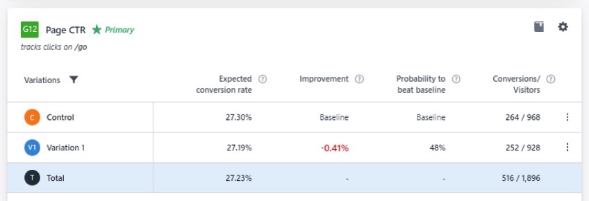
The lesson: content clarity beats decoration. If your headline and first-screen copy nail the promise—and the page loads quickly—you’re most of the way there.
- Test headlines and first-screen CTAs before obsessing over color tweaks.
- Keep the hero light and stable (no layout shifts, minimal blocking scripts).
- Align every element above the fold to one action and one promise.