Ecommerce websites live and die by their conversions.
For those of you who have a high volume of traffic to your website, that’s great news. But traffic alone doesn’t generate sales.
It doesn’t matter how much traffic you are generating or how cool your site looks if you can’t make a sale. The number of sales you get will impact how well your business does.
Is your website traffic translating to conversions?
There are certain metrics you can use to measure this. Look at your bounce rates. Analyze your shopping cart abandonment rates.
If your website visitors aren’t converting, your ecommerce site won’t make money.
Don’t get me wrong: the products you’re selling might be amazing. That’s not necessarily the issue here.
The design of your website and the checkout process might be what’s hurting you.
For the most part, simple website designs have higher conversion rates. This same concept needs to be applied to your checkout process.
Here’s the thing though. People often neglect the checkout process.
Your customers make their final purchasing decisions before they get to checkout.
So why bother, right?
That’s being incredibly short-sighted.
Shopping cart abandonment is a real problem for ecommerce stores.
In fact a study found that a whopping 69.23% of ecommerce shopping carts are abandoned.
To put this into perspective, for every 100 customers who start the checkout process, 69 don’t finish.
Customers expect their shopping experience to be seamless, easy, and without friction.
If your checkout process does not meet these expectations, your conversion rates will dive, and your revenue will head south.
Is it a massive problem? Absolutely.
These numbers shouldn’t sit right with any business owner. That’s too many lost sales and potential lifelong customers.
If someone starts the checkout process, it stands to reason they have a strong purchase intent.
So, why do so many shoppers fail to complete their purchases?
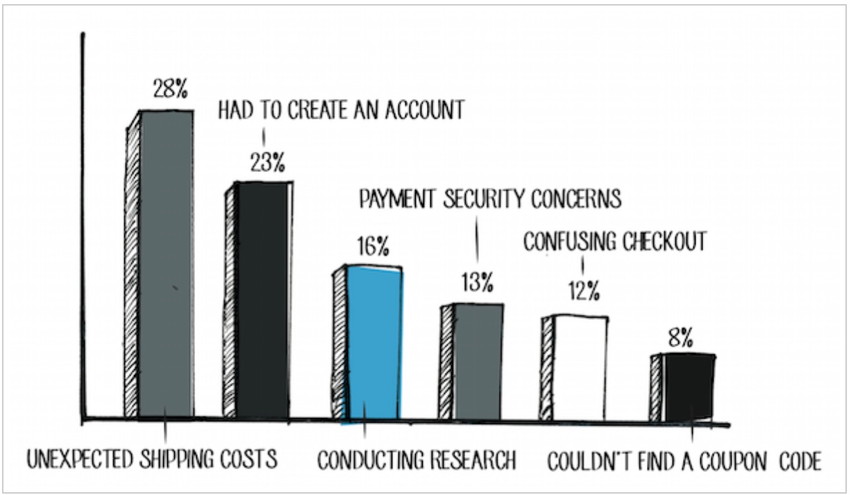
Take a look at this chart:
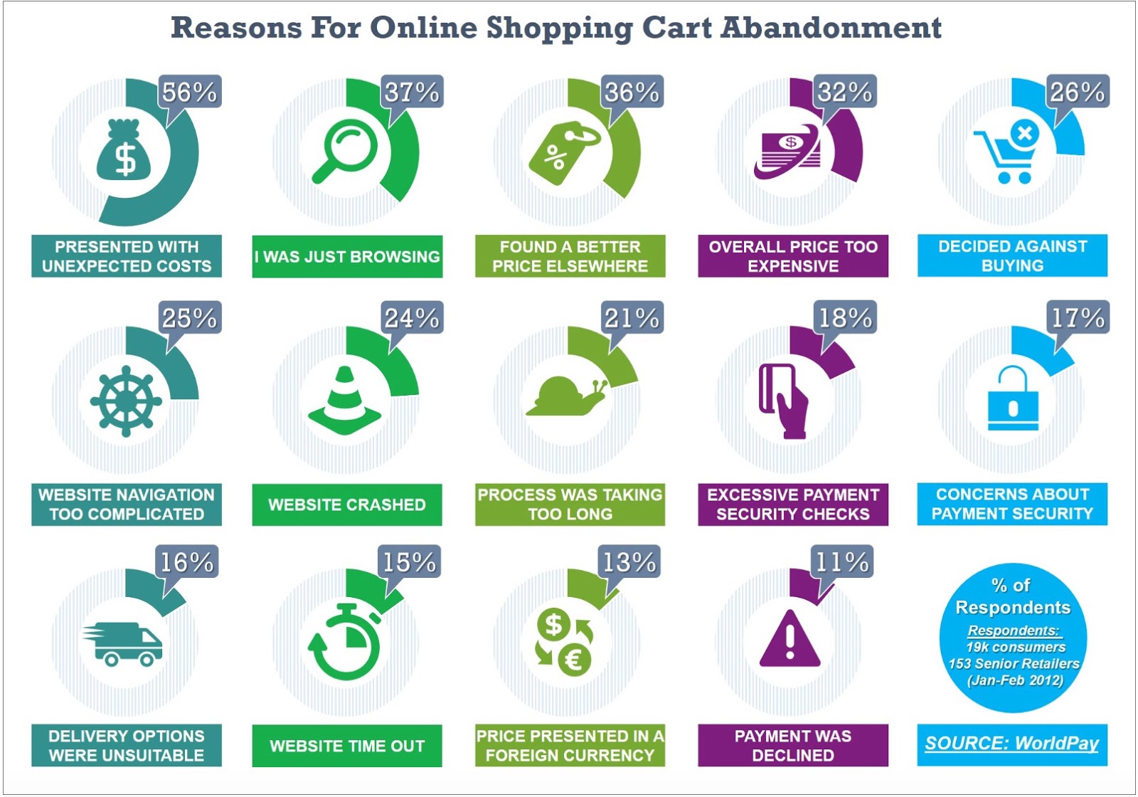
Out of all the reasons why shoppers abandon their carts, a majority are related to the checkout phase.
Does this apply to all businesses? Not necessarily.
Don’t get me wrong. All businesses—no matter how upscale—suffer from shopping cart abandonment.
You can’t do anything about a user who is just browsing. They may just want to save their favorite items in the cart for future reference.
With that said, there are varying reasons why shoppers do not complete a purchase and there are things that you can do to improve those numbers.
Here are 20 tips to improve your checkout process, reduce abandon rates, and boost your website checkout conversions.
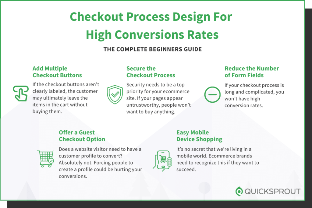
1. Add multiple checkout buttons
For website visitors to make a purchase, they need to be able to navigate to your checkout page.
Once someone decides to buy, they’ll add the items they want to their shopping cart. In a perfect world, you want them to continue shopping so they spend more money.
But if the checkout buttons aren’t clearly labeled, the customer may ultimately leave the items in the cart without buying them.
This could be why your shopping cart abandonment rates are so high. Instead, include checkout buttons on both the top and bottom of the screen.
Check out this example from the Champs Sports website:
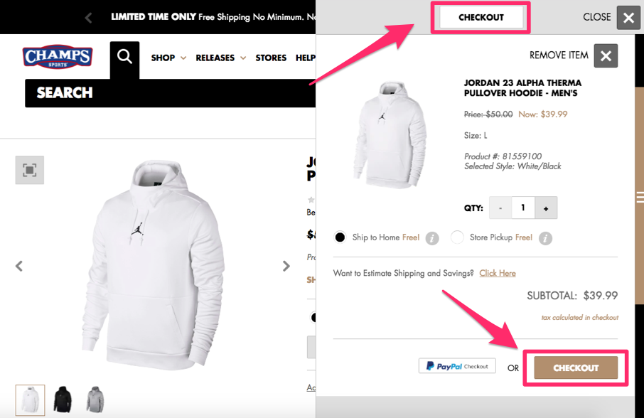
Positioning the checkout buttons in two places ensures the visitor will see and have access to both buttons.
The word “checkout” will stay in their line of vision, regardless of where they’re looking on the screen.
I also want you to notice that the location of the shopping cart on the right side of the screen allows the customer to continue shopping on the left.
This increases the likelihood that the average order amount will be higher and conversion rates remain high as well.
You can implement the same strategy on your ecommerce page to drive sales.
2. Secure the checkout process
Security needs to be a top priority for your ecommerce site. If your pages appear untrustworthy, people won’t want to buy anything.
In the past five years alone, 46% of people in the United States have been affected by credit card fraud.
There’s a high probability that nearly half of your website visitors have experienced this. Even if they haven’t personally fallen victims to fraud, I’m sure they know at least one person who has.
This puts people on high alert.
If your checkout process isn’t secure, people won’t feel safe entering their credit card information, which is ultimately what you need to make money.
All pages of the checkout process must be secure. It’s also in your best interest to include security badges, such as Norton, McAfee, or whatever else you’re using to protect your customers.
3. Reduce the number of form fields
A website visitor is ready to buy something. They’ve already made up their mind.
Don’t give them a chance to change their mind and abandon the cart. If your checkout process is long and complicated, you won’t have high conversion rates.
But if you can simplify the process by eliminating unneeded steps, you’ll make more money.
Ask yourself what information you really need from the customer to complete the purchase. Do you need the customer’s name?
Yes, but you don’t have to ask for it several times.
If a name is required to process the payment method or shipping information, don’t make them type those details twice.
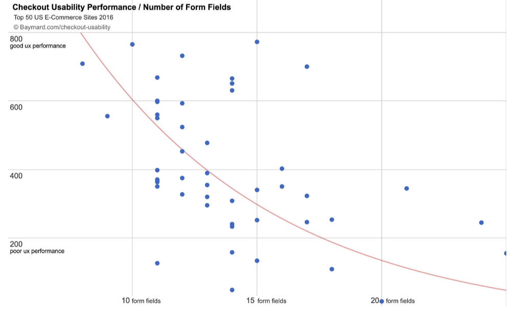
Research shows that websites with fewer form fields have a higher performance rate during checkout:
Only ask for information required to complete the transaction.
If the customer’s shipping and billing addresses are the same, they should be able to check off a box indicating that—instead of having to type their address twice, for shipping and billing.
That alone shaves an extra step off the process and significantly reduces the number of form fields.
The hoop theory article I wrote a while back also explains why getting your visitors to make small micro-commitments typically increases conversion rates…as in a two-step checkout process.
You can leverage this on your checkout page by requesting your customers’ name and email info on the first page and credit card details on the second page.

This typically will boost your conversion rate by 10%. It’s worked well on Crazy Egg, and when I ran that test on Timothy Sykes, he saw a 12% increase in conversion rate.
The reason it works is because people feel that they have already given you their name and email address, so they might as well give you the rest of their details. Plus, if they don’t complete the checkout process, you can email them and try to get them back to your site. You can even entice them with coupons or just create a remarketing campaign to get their attention.
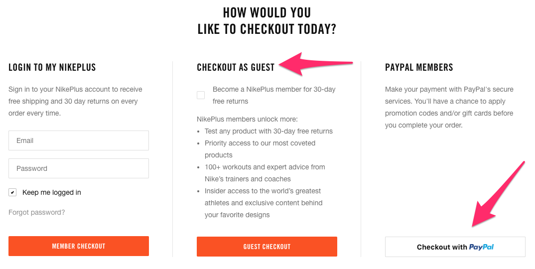
4. Offer a guest checkout option
I get it. You want to learn as much information about your customers as possible.
In a perfect world, everyone who visits your site will create a customer profile. This allows you to monitor their browsing behavior and suggest items to them based on this behavior and their purchase history.
Customer profiles allow you to segment your audience based on the customers’ locations and make it easier for you to add subscribers to your ecommerce email list.
When a customer is browsing from their customer profile, they can also place repeat orders with just a couple of clicks.
Customers can save their payment information to their accounts, which reduces the number of steps in the checkout process and makes it easier for them to convert.
If you’re encouraging customers to create a profile, I’m all for it.
But there is a big difference between encouraging and forcing. Does a website visitor need to have a customer profile to convert? Absolutely not.
Forcing people to create a profile could be hurting your conversions.
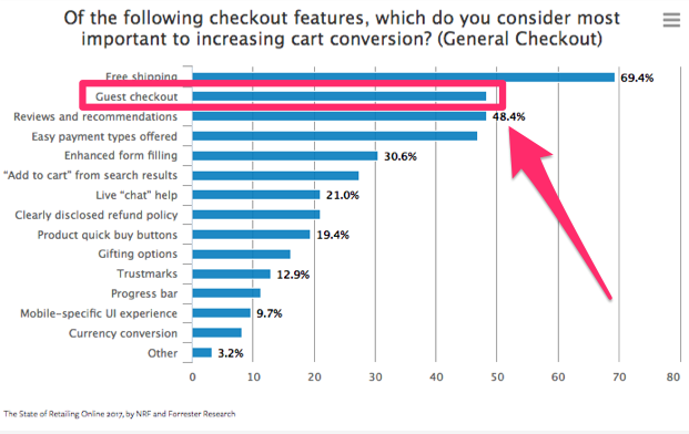
Need proof? This is the second most common reason for shopping cart abandonment:
Over 48% of online retailers also said a guest checkout was the most important factor to increasing shopping cart conversion rates on their websites.
This was the second highest response on the list, trailing only behind free shipping.
The lesson. People want to buy something. Let them give you their money.
Don’t prioritize your content marketing strategy over actual sales.
It’s always a good idea to follow the lead of the companies that have had major success in a particular space.
Here’s an example of how a global giant Walmart implemented this strategy:
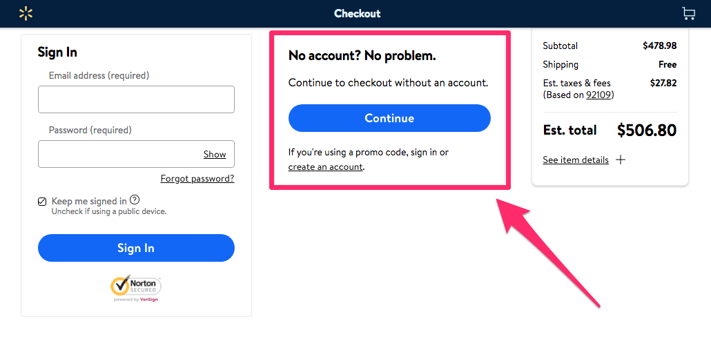
Creating a customer profile is not necessary to complete a purchase, so don’t make it so. Otherwise it will turn some customers away.
However one way to encourage your customer is to provide incentives for them if they create an account.
Notice how Walmart requires you to create an account to use a promo code in the screenshot above.
You can reward them with a coupon code or credit towards their next purchase:
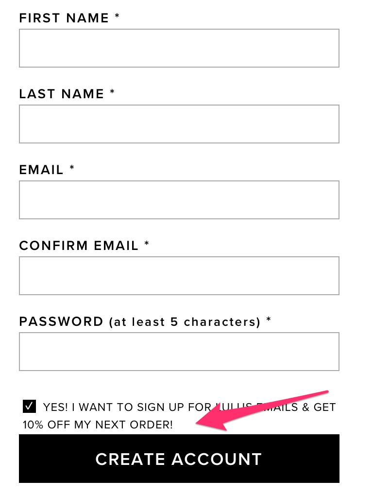
Guess what? Most people will jump on that offer.
That’s a much more effective approach than forcing them to create an account.
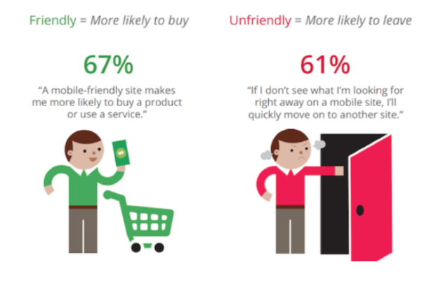
5. Make it easy to shop from mobile devices
It’s no secret that we’re living in a mobile world. Ecommerce brands need to recognize this if they want to succeed.
In fact, 62% of people who own a smartphone used their devices to make purchases online within the last six months alone.
It’s estimated that in the next three years, mobile retail sales will control 54% of the ecommerce market share in the United States.
Why is this the case?
It’s because technology has made it more convenient to shop from mobile devices.
People aren’t walking around with laptops in their pockets all day. But phones are seemingly always within an arm’s reach, if they’re not already glued to the consumers’ hands.
If someone visits your ecommerce site from a mobile phone, they need to have a great experience.
If your site isn’t optimized for mobile devices, there’s a slim chance you’ll be able to generate conversions.
The design of your mobile site can be the difference between customers buying something or bouncing and buying from your competitors instead.
But 74% of mobile users are more likely to revisit websites that are mobile-friendly.
If your site is properly optimized, it will increase the chances of your website visitors not only converting but also coming back and buying again in the future.
You may be thinking this is obvious, but let me explain.
There are multiple elements to mobile-friendliness.
I’ve seen mobile storefronts that are vastly different from their desktop versions.
If there’s no alignment between the two interfaces, shoppers will think they’re in the wrong place.
The result? They bounce.
As we’ve seen before, most people first go to the desktop site to browse, get reviews, and make their decisions.
Ensure your mobile store is familiar to those who’ve gone through that process.
The other element of a mobile-friendly checkout is speed.
Shoppers of all kinds—mobile or not—want instant gratification.
They’re not as concerned with buying your product as much as they are with owning it.
If you take that away from them, whether by having a slow site or asking for much information, they’ll walk away.
The desire to own the product doesn’t go away. Your customers will simply go to your competitor. That’s bad for business.
Another important consideration is browsing behavior.
Mobile browsing is unique in many ways.
Here’s how you can optimize the mobile checkout process with user behavior in mind:
- To navigate, users use their fingers, not a mouse: This means you should place all key elements on your page within reach of the thumb.
- Typing and clicking are trickier on mobile: You need to have bigger and wider easy-to-click buttons. A larger font size also helps with improving accuracy of text input.
- Fingers are less precise than a mouse, so the process is more error-prone: It’s crucial you make it easy to detect and correct errors.
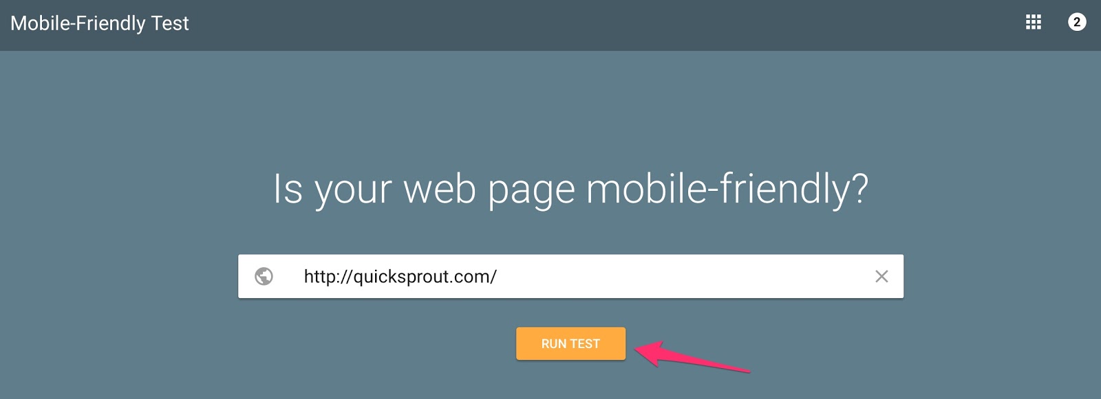
Bonus Tip: To test the speed and mobile-friendliness of your website. You can use Google’s mobile friendly test. Make immediate adjustment if it’s not up to par.
You could even consider creating a mobile app for a checkout process to minimize friction even further.
Touch of Modern is a great example of a successful retail mobile application:
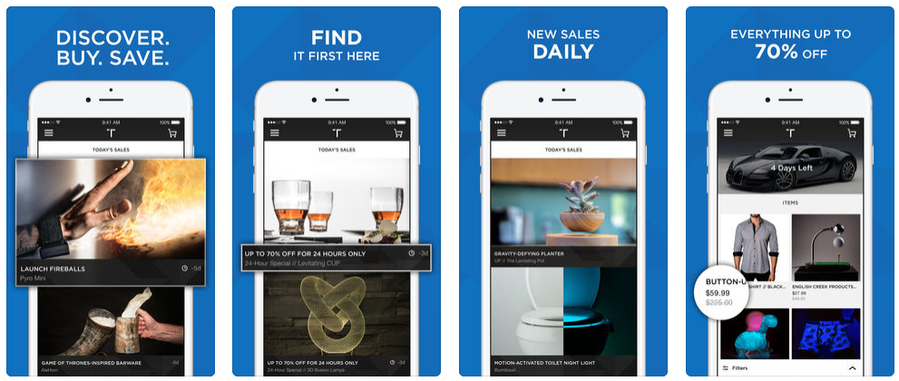
You can learn a lot about getting high conversions from their business model.
They get between 150,000 and 200,000 new downloads every month. More than half of their customers are repeat shoppers. Nearly two-thirds of their total sales come from their mobile application.
Those numbers are incredible.
The reason why this app is so successful is because they use daily flash sales and store all their customers’ data on the app, making the checkout process lightning fast.
Customers don’t have to re-input all of their credit card information and shipping addresses every time they want to buy something.
The reduced friction results in high conversions.
6. Focus on your top benefits
Besides the product, what else does the customer get when they buy something from your website? There are certain things you can do to add the perceived value of the purchase.
Here’s what I mean.
As I’ve mentioned, not everyone comes to your website with the intention of buying something. But while they are browsing, something might catch their attention.
They may want to buy it, but they want to make sure they aren’t stuck with it if they change their mind later. That’s why you should clearly state your return policy.
Take a look at this example from Lululemon:
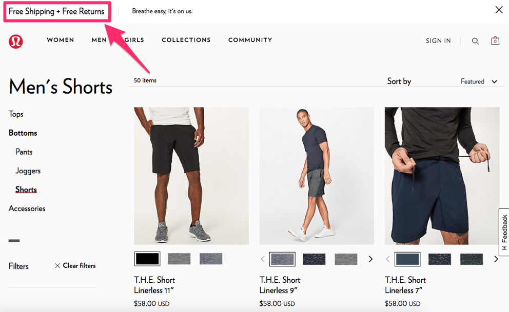
When you’re browsing on their website, you can clearly see at all times they offer free shipping and free returns. Their customers know they can get the item delivered free and send it back without any problems.
Obviously, you don’t want items to be returned. Don’t worry, they probably won’t be. In fact, according to the National Retail Federation, about 8% of all purchases get returned.
But just giving your customers the peace of mind can be enough to drive the sale.
In addition to your shipping and return policies, make sure you highlight any other features your company offers. Some things to consider:
- warranty information
- secure checkout
- social proof of the product
- any differentiating features.
One of these elements can turn a “window shopper” into a paying customer.
7. Learn how to use images
Believe it or not, pictures can help improve your conversion rates. Instead of just listing your products, show the customer what they’re buying.
While you may have an image or two of your products on your ecommerce shopping page, make sure that image shows up in the shopping cart.
Why?
This can help remind the consumer what they’re buying and reinforce their decision. Plus, it’s much more appealing than just reading some text on a page.
Here’s an example from the REI website:
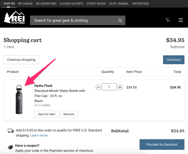
The consumer gets reminded of exactly what they added to their cart. This could also help avoid any confusion or mix-ups down the road if they selected the wrong color, size, etc.
When they see a visual confirmation of the product they want, psychologically they’ll feel more comfortable about completing the purchase.
Faces also help improve your conversion rates.
According to a recent case study, conversions jumped from 3.7% to 5.5% when an animated picture of a phone was replaced with the face of a customer service representative.
Include images of people on your website. They could be wearing your product, using your product, or be beside your product.
Check out this example from the Macy’s homepage:

Notice it shows a person, and that person is looking at the promotional information and the CTA button.
We’ve already established consumers are drawn to faces. In this case, you’d look at the model’s face and then follow his gaze directly toward the text.
This is a great method for increasing conversions.
8. Allow customers to see what’s in their carts as they shop
The whole shopping cart concept is a bit strange.
Think about it.
You browse through products and funnel different items to a page you don’t actually see.
It’s not until the end of the browsing process that you go to your cart to view your items.
Most ecommerce stores do nothing to improve this aspect.
It’s not uncommon for people to forget what they placed in their carts and be surprised by the total price.
Incidentally, these are also common reasons for shopping cart abandonment:
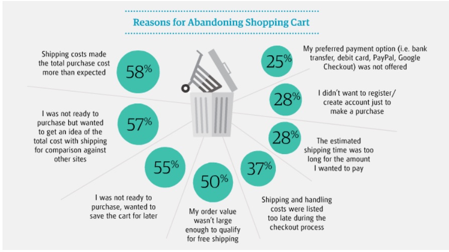
Based on the responses in the graphic above, here are some suggestions for improving the shopping cart experience:
- Show customers what’s already in their carts every time they add new items;
- Communicate the total price of their items every step of the way;
- Have a “save to cart” feature for those who are not ready to check out;
- Have your own comparison charts against competitors within product pages;
- List shipping costs as early as possible in the checkout process.
9. Give your customers lots of payment options
Ultimately, the most important aspect of a checkout procedure is the payment step.
Without the payment step, transactions can’t happen.
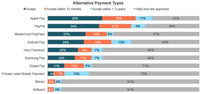
According to research, 54% of people feel having a variety of payment options is important when checking out online:
Some payment options may be more beneficial to your company than others.
I completely understand this.
One credit card company may charge higher transaction fees than others, but that doesn’t mean you shouldn’t accept that method of payment.
Recognize your customers have preferences. Certain payment options may give them better reward points or bonus miles over others.
If they want something but can’t buy it with their favorite card, they’ll just buy it from a different retailer instead.
You should accept newer and unconventional types of payment as well. In addition to accepting all major credit cards and debit cards, you need to accept as many payment methods as possible, including alternative forms of payment:
Let’s not get carried away here. In 2019, it’s probably not necessary to accept Bitcoin and other cryptocurrencies.
But in addition to all major credit cards, you need to accept alternatives such as Apple Pay and PayPal.
You don’t want your customers to leave your site without buying anything because you don’t accept the payment method they want to use.
Even if they have the options you accept, they still may go to one of your competitors instead so they can use their favorite method of payment.
The days of accepting only Visa and Mastercard are over. It’s time for you to adapt and add these other payment options to your checkout process.
I want to show you an example of this. Here’s a screenshot from the Nike website:
If you look at the bottom right corner of the screenshot above, you’ll see they allow their customers to check out using PayPal.
This could appeal to people who have a high PayPal balance and who want to use it for purchases. Accepting PayPal can also help eliminate concerns from customers who may be worried about their credit card information getting stolen.
The reason why I used this example from Nike is because it also highlights another concept I mentioned earlier.
Although they encourage customers to create a profile, they allow them to continue the checkout as guests. Even under the guest checkout area, it shows all the benefits of becoming a member.
To join, all you need to do is check off a box and proceed.
Another quick point about your payment methods. I recommend asking for payment as the last step of the checkout procedure.
By now, the customer has already invested some time into providing other information, so they’ll be more likely to continue. Asking for their payment first could drive them away.
10. Include trust elements throughout your whole funnel
You probably already know that placing seals like TRUSTe or VeriSign Secured can help boost your conversion rate. But did you know that in most cases you won’t see a lift if you place those badges just on your checkout page?

If people don’t feel secure when they first visit your site, they’ll bounce right off it before clicking through to your checkout page.
You can combat this by placing security seals throughout your whole funnel. So, from your front end pages to your product pages to even your checkout page… you are more likely to boost your conversion rate if you use the secure seals on more than just your checkout page.
I myself haven’t seen a big boost from adding them to my checkout page only, but I have seen nice lifts when I added them to the whole site. Before you do this, however, there are a few things that you need to know:
- It’s rare that security seals boost conversion rates by more than 10%.
- If you can’t afford a TRUSTe or VeriSign seal, creating your own free generic version typically provides the same conversion boost.
- This tactic works better in spammy industries like finance or health.
11. Frequently asked questions
No matter what, a good percentage of your visitors will have doubts in their minds when they are on your checkout page. For this reason, you won’t be able to convert 100% of your visitors. But if you can address their doubts, you can increase your conversion rate.
By using Qualaroo on your checkout page, you can ask people questions like:
What else can we place on this page to convince you to buy?
You’ll get a lot of responses from people telling you why they are worried about completing the purchase. You can then take this data to create a list of frequently asked questions with corresponding answers and place it on your checkout page.

When using this tactic on your checkout page, test placing the FAQ section towards the top of the page or below the page because placement can affect your conversion rate.
12. Help your visitors through live chat
When most companies test out using live chat, they aren’t seeing an increase in conversion rate because of two main reasons:
- They don’t have someone on the chat 24/7, so people are leaving with their questions unanswered.
- They are placing it on every page of their site, which can distract visitors.
If you want to test live chat, you need to make sure someone is there 24 hours a day. If you can’t put someone there, test a service like Chatter Lime as they provide you with someone who will respond to each chat request.

In addition to that, test having the chat only on your checkout page. That’s the page that typically brings up the most questions and uncertainty. Plus, if you add it to your homepage, people will focus their energy on typing in questions instead of reading your marketing copy, which could have persuaded them to buy.
13. Social proof
Adding corporate logos or testimonials from your current/past customers can help reassure your potential customers that you are offering a good product or service. This may not seem that important, but there is a lot of crap being sold on the web… and people are buying it.
This is leading to terrible online shopping experience for people and to buyer’s remorse. By placing social proof on your checkout page, you can increase the number of buyers going through your checkout page.

If you are going to use logos of companies who are buying from you, make sure you use logos of companies of all sizes, from big to small… this way you won’t neglect any customer segment.
In addition, if you are using testimonials, make sure you follow the steps in this blog post. Placing weak testimonials that don’t contain a person’s full name, location or even picture can hurt your conversions. So, if you are going to use them, make sure you do it the right way.
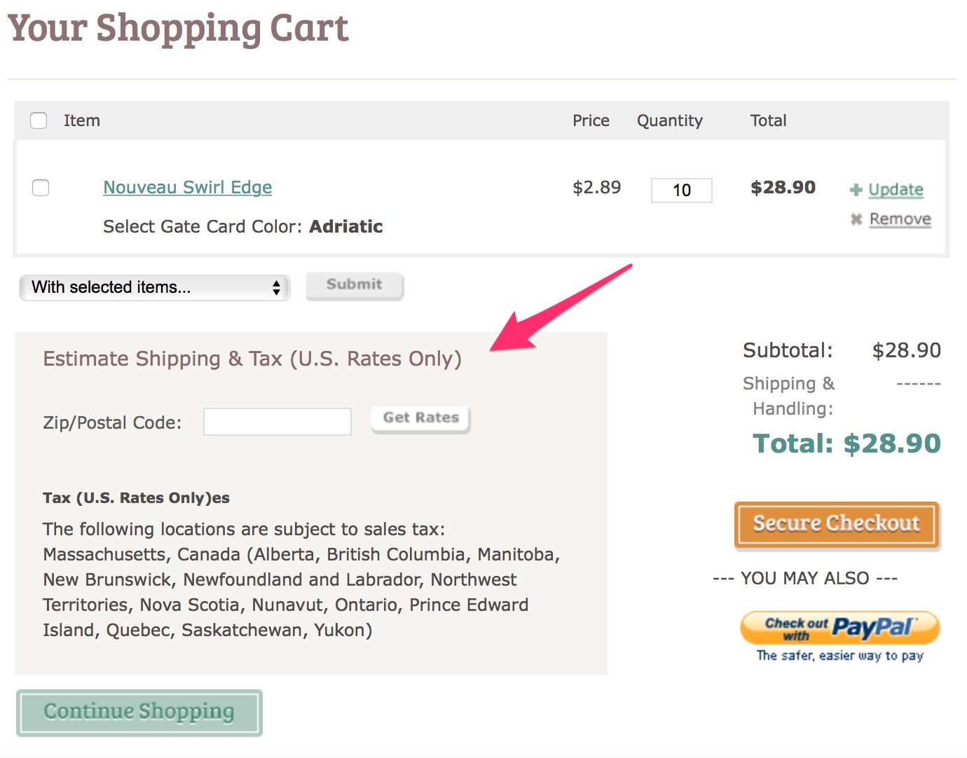
14. Let shoppers know their shipping costs early in the checkout process.
You can do this by introducing a shipping calculator to provide an estimate of the additional costs to be covered.
Here’s an example:
15. Offer free shipping
Here’s a common mentality I see from ecommerce sites all the time. If it costs you money to ship your products, that means you should charge your customers for shipping, right?
Wrong.
While this may sound like a reasonable justification to you, your customers don’t see it that way.
In fact, shipping costs play a major role in why shopping carts are abandoned in the United States:
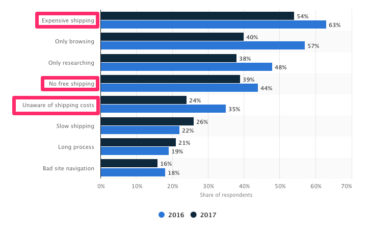
Do not charge your customers for shipping.
But you still need to make sure you’re turning a profit, even if you’re offering free shipping.
You’re better off raising the prices of your items so that the shipping costs are built into the base prices. Psychologically, this won’t impact your conversions.
That’s because customers won’t be surprised when they see additional charges when they check out. If your product is listed for $50 on the site, that’s what they expect to pay. But if the costs add up to $70 with taxes and shipping, it’ll hurt your conversions.
I’m not expecting you to be unrealistic here. Don’t ship your customers a piano overnight for free.
All I’m saying is you shouldn’t charge for standard ground shipping. If a customer wants the delivery to be expedited, you can let them pay an additional charge.
While this may not be feasible for everyone, it’s wise to find ways you can reduce costs for customers.
Many businesses offer free shipping once shoppers reach a certain price threshold.
Like this example from Fashion Nova:
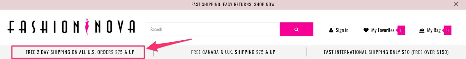
As customers add new items to their carts, they’re reminded of how much more they need to spend to meet the threshold.

Very clever.
16. Set up default billing/shipping address for returning customers
Most people hate filling out this information.
It’s time-consuming and repetitive, especially if you’re a returning customer.
This is necessary info, so people will do it anyway.
But there’s a lot of resistance.
What can you do?
In addition to eliminating unnecessary form fields, you can set up the form so that it auto-fills the information for returning customers.
Email address, name, billing address, and shipping address—all this information can be saved for future purchases.
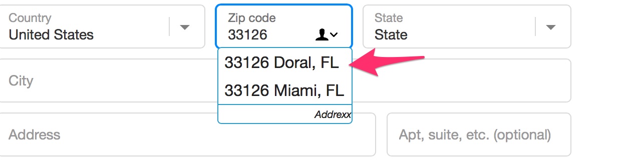
Some stores use a tool that looks up addresses based on a postal code and auto-fills that info.
Here’s how it works.
You type in a zip code:

You’re prompted with a window like this:
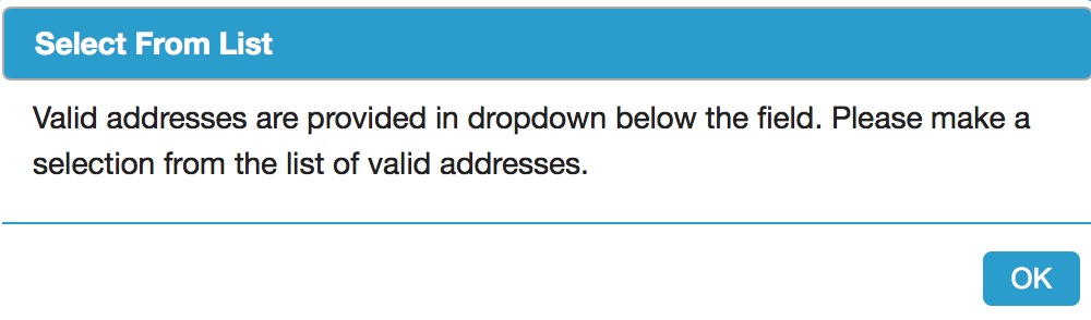
You’re given address options based on your zip code so you don’t have to fill this yourself:
There’s also an address validation tool similar to this one.
When a shopper types in their address, they get asked if it’s the right one and are given other options.
This is useful for a few reasons.
First, it auto-fills with more accurate information.
Secondly, it reassures customers they have the right shipping info. This way, they’re not anxious about missing their shipment due to error.
There’s one thing you need to note.
Address validators aren’t always correct. It means customers should have the option to reject the suggestions and fill in their info themselves.
17. Satisfy your customers’ need for instant gratification.
Here’s what that means:
You want to give customers a sense that they’ll get what they want immediately.
This is an innate human need.
If you appeal to it, your customers will respond.
If you’re selling an information product, instant gratification is easy to provide. Your customers can have electronic access without delay.
But it’s trickier when you’re selling a product that has to be shipped.
My advice?
Take a page out of Amazon’s playbook.
They do this brilliantly.
Here’s what I mean:
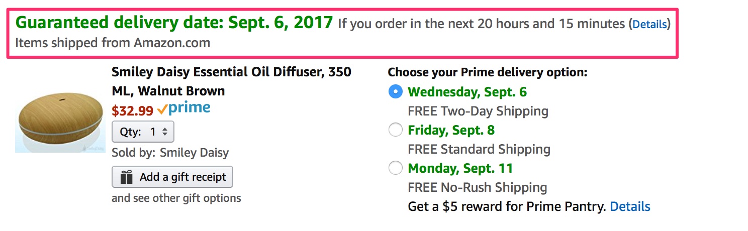
If you know your items will be delivered to you in a couple of days, chances are you’ll be more likely to check out ASAP.
18. A/B test the elements of your checkout process
You can never truly be sure your checkout process is designed for the maximum number of conversions unless you put your theory to the test.
The best way to determine which elements are driving the highest conversions is through A/B testing.
If you’ve never run an A/B test before, the concept is very simple. You start by identifying one element of the page you want to test.
Then 50% of your site traffic will see version A, while the other 50% will see version B. Compare the conversion rates between the two variations to see which one yielded the best results.
When testing the checkout page, it makes sense to start with the “purchase/buy now” button, or whatever your final CTA button is that completes the transaction.
There are lots of potential tests you can run on this button:
- size
- color
- placement
- wording
Test only one element at a time.
For example, let’s say you test the conversion button at the bottom right side of the screen compared to the bottom left side of the screen.
Once you have conclusive results, you can implement that change and then move on to testing the wording of the button, e.g., “purchase” versus “buy.”
19. A data-driven approach to dealing with shopping cart abandonment
Want to find out the exact cause of your shopping cart abandonment?
Google Analytics is the tool to use.
It’s simple. I’ll give you a step-by-step play.
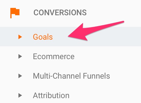
Step #1: Find the “Admin” tab so you can create a conversion goal:
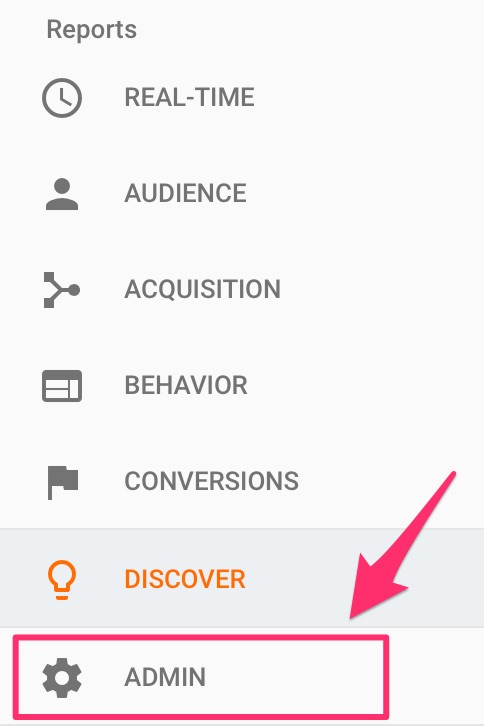
This is so you can track the actions your web visitors take.
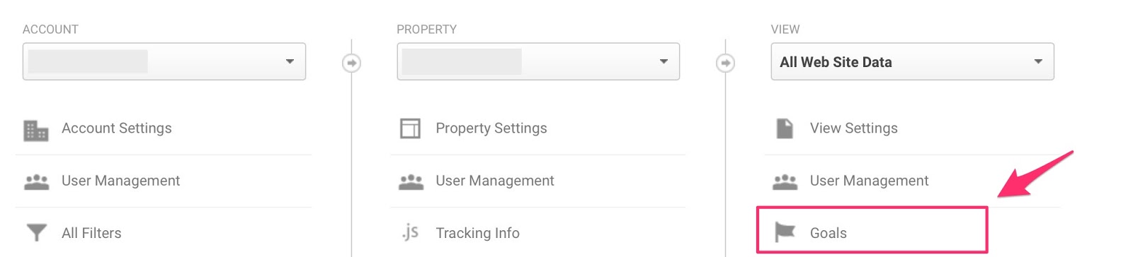
Click on “Goals”:
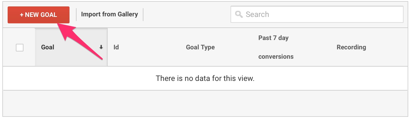
Step #2: Create a new goal and set it up to track a completed transaction.
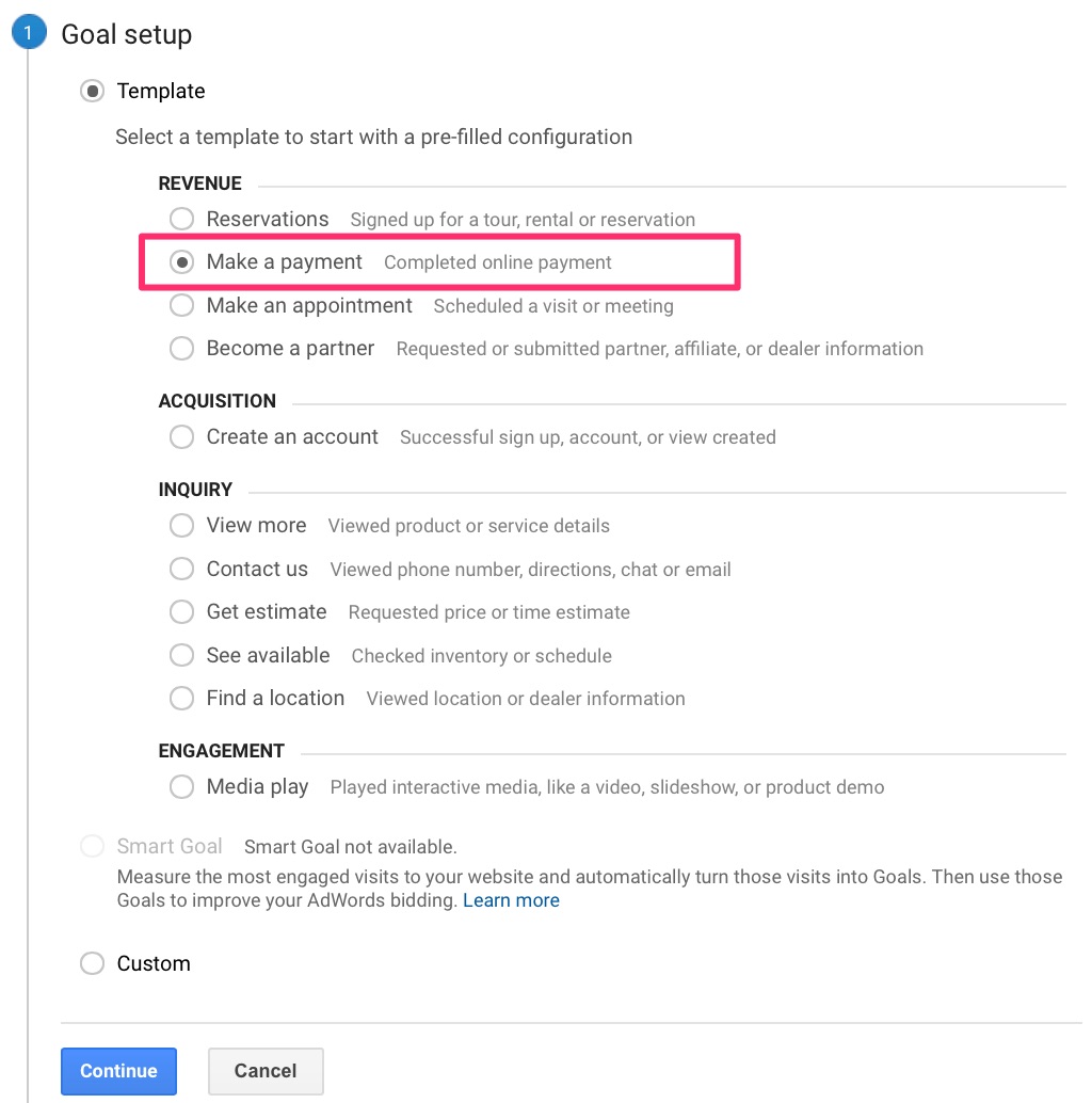
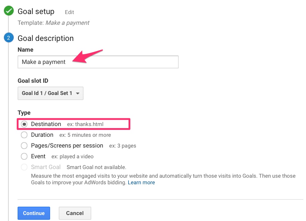
In the first step of the goal setup, select an appropriate template.
While you’re tracking cart abandonment, your ultimate goal is to get customers to make a completed online payment.
Select that option:
It’s time to describe your goal.
Name your goal, and select “Destination” as the goal type.
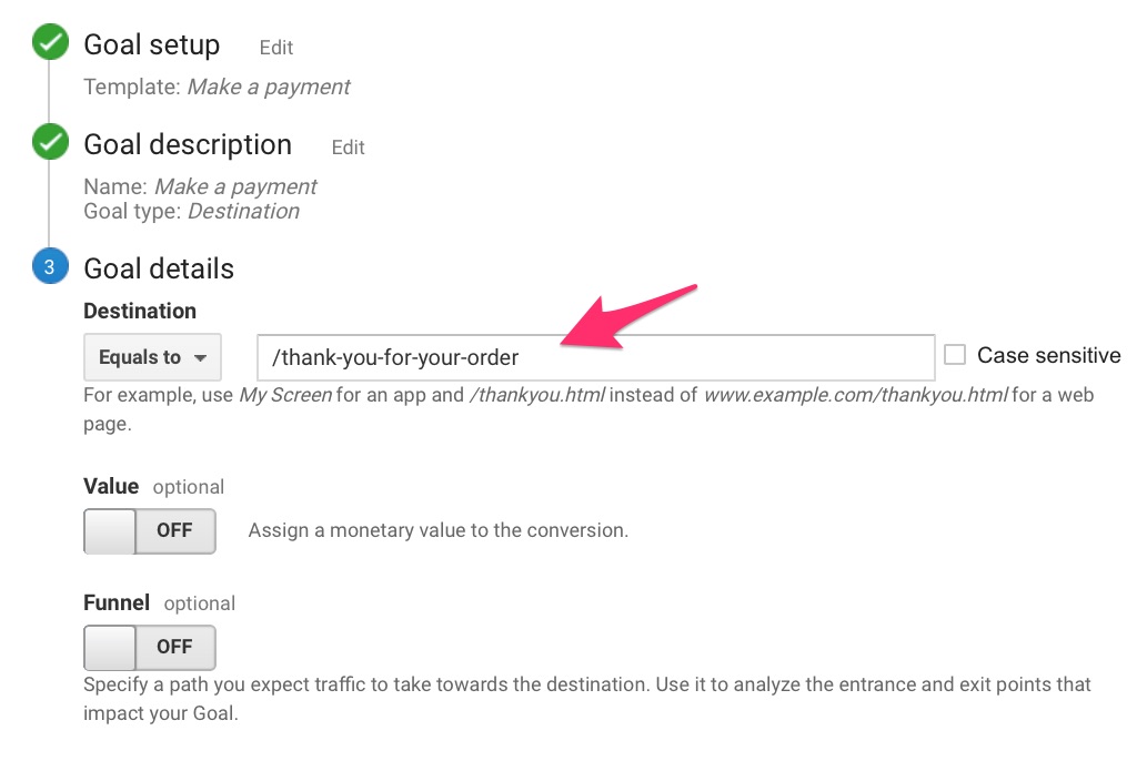
The destination can be a thank-you page, which will help you track the number of completed purchases.
Next, you want to set the URL of your Destination.
As I mentioned, this could be any page that customers are directed to after their purchases.
The only reason someone would be on this page is if they completed a transaction, right?
Step #3: Map the path customers take leading up to complete a transaction.
This is what will help you determine where the pitfalls in your sales funnel are.
In the same “Goal details” section, switch the Funnel option to “ON.”
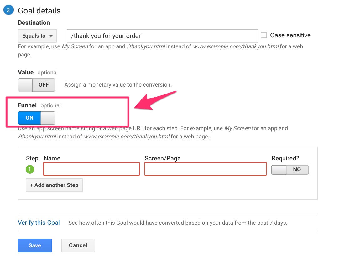
List all the steps that customers take leading up to the purchase. Name each step, and add the corresponding URL.
Like this:
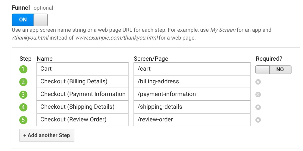
If you have a one-page checkout, only include that page, of course.
Whatever steps customers take, include them all.
You may want to go through the process yourself to make sure.
Save your goal, and that’s it for the setup. Tracking will begin, and you’ll now have detailed data for each step of your funnel.
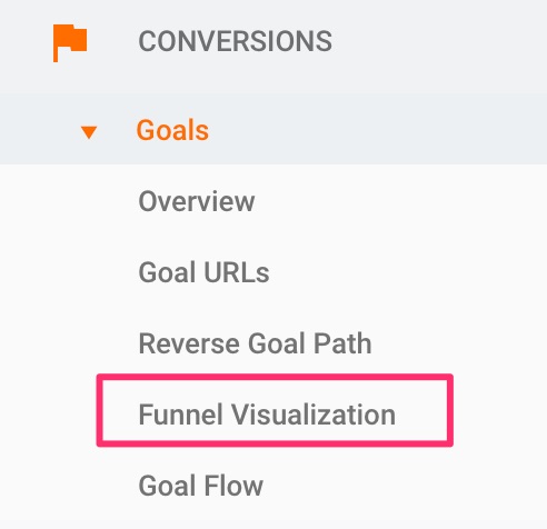
Step #4: Check your reports to analyze the data.
Here’s where to find them.
Under “Conversions,” click on “Goals.”
Pay special attention to “Funnel Visualization.”
You’ll see an illustration that looks something like this:
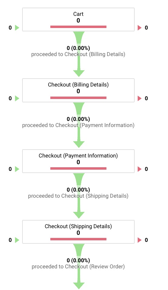
I just created this, so there’s no data. It will take some time for yours to show up as well.
This data will tell you where in your funnel customers are jumping ship. It will also tell you in how many sessions your goal was completed.
Useful, right?
You’ll have a complete view of the way customers move through your funnel. You can now make informed adjustments to decrease your shopping cart abandonment rate.
You should know this though: there’ll always be customers who drop out before completing a purchase.
That’s just the nature of the game.
You can optimize your process to reduce that percentage significantly.
But will the lost sales be lost forever?
Can they be salvaged?
They can, and I’ll tell you how.
20. The ultimate solution to recovering abandoned carts
I hate to bring up this depressing statistic again, but only 3 out of 10 shoppers complete their purchases.
There is, however, a simple follow-up step that can increase that number significantly.
Crazily enough, most businesses don’t take advantage of it.
I’m referring to cart abandonment emails.
This could be one email or a whole sequence. You decide.
The point of these emails is to recover lost sales. If a customer adds items to their cart and leaves without checking out, be sure to follow up via email.
Here’s a brilliant example from Vanity Planet:
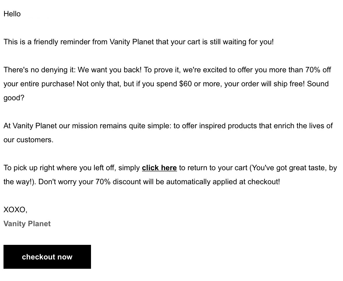
Many things are going right in this email. It:
- offers a massive discount
- includes a free shipping offer
- uses personal and persuasive language
- provides a simple solution for returning to cart
- has a direct link to checkout
They made an irresistible offer.
Many people would go back to complete their purchases in a heartbeat.
When cart abandonment emails are done right, they’re hands down the most powerful solution to recapture lost sales.
I highly recommend you test this strategy and watch it make a difference.
Conclusion
Getting higher conversions for your ecommerce checkout process isn’t that difficult.
It just takes a little effort.
As you can see from everything I talked about in this guide, these methods aren’t really too extreme. They are also fairly easy to implement.
If you’re driving lots of traffic to your ecommerce site but those visitors aren’t converting, you need to analyze the design of your checkout process.
If you follow the tactics above, you should see a nice lift in your checkout page conversion rate. But just like with all forms of conversion optimization, you will have to A/B test everything.
Why? Because what works for one business won’t always work for another… even if they are in the same industry.