Have you ever left a website because it was difficult to use?
Maybe you couldn’t find the page you were looking for. Or maybe their navigation menu didn’t have what you needed. Or perhaps there were way too many pop ups and advertisements.
Whatever the case, you didn’t put up with browsing a confusing website — even if it had something you know you wanted.
The same applies to your website. If your website isn’t user-friendly, it will never succeed. That’s why website usability needs to be a top priority.
A poor user experience impacts your site’s bounce rate, click-through rate, and (ultimately) your bottom line. If a user is unhappy with a website, they’ll just find a different website that does meet their needs.
Once they go, they’re gone: 88% of online users are unlikely to return to a website after a bad experience.
But following website usability best practices will also increase your conversion rates because visitors will be more likely to stick around and be open to your calls-to-action and other offers.
Most website owners don’t realize that their site isn’t user-friendly.
Obviously, nobody is going to intentionally make things difficult on their customers. But sometimes, we get so used to our websites that we don’t realize that there’s something wrong with it.
It can also happen when we don’t make intentional efforts to ensure our website is usable and accessible to large swaths of people.
That’s our inspiration for writing this guide. We want to show you the best practices you need to follow to make your site user friendly. Follow along and make sure these principles are applied to your website.
How to Make Sure Your Website Is User-Friendly
Below are our eight best practices for making your website as user-friendly and accessible as possible:
- Optimize for mobile devices
- Follow WCAG standards
- Stick to common design elements
- Create a visual hierarchy
- Simplify the navigation
- Establish credibility
- Make sure your content is legible
- Be consistent
Let’s dive in.
Optimize for mobile devices
This should go without saying but, surprisingly, we still find ourselves landing on websites that haven’t been optimized for mobile users.
It’s wild, because 92% of all Internet users access the Internet with a mobile device.
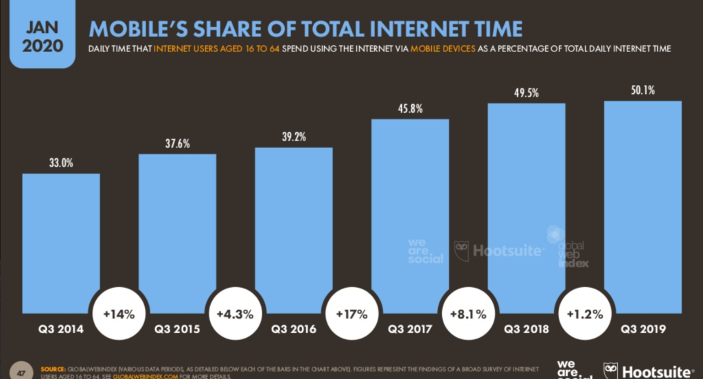
Those mobile users are doing more than just browsing from their devices; they’re buying as well.
In fact, mobile commerce is expected to be $3.44 trillion and 62% of global ecommerce sales by 2027.
And it’s not enough to just focus on audiences in your own country. In fact, if you don’t look abroad, you could be leaving a lot of money on the table. For example, roughly 75% of ecommerce sales in China come from mobile devices.
So the first thing you need to do is make sure that your website is optimized for mobile devices. Even after that’s done, there are still improvements you can make to improve the website usability for mobile users.
And there are a ton of different ways you can make your website mobile-friendly. For example, perhaps the quickest way is to use a responsive theme for your website. These are themes that will adjust your content to match different screen sizes.
When someone is browsing from a desktop computer, it’s easy for them to click nearly anywhere on the screen. On a desktop, there’s nothing wrong with putting your CTA or other clickable items in a corner.
That’s not the case for mobile devices where 75% of users navigate and click using their thumbs and 49% click with just one hand. Think about it. How often do you browse on your phone using just one hand, especially while you’re walking or doing something else?
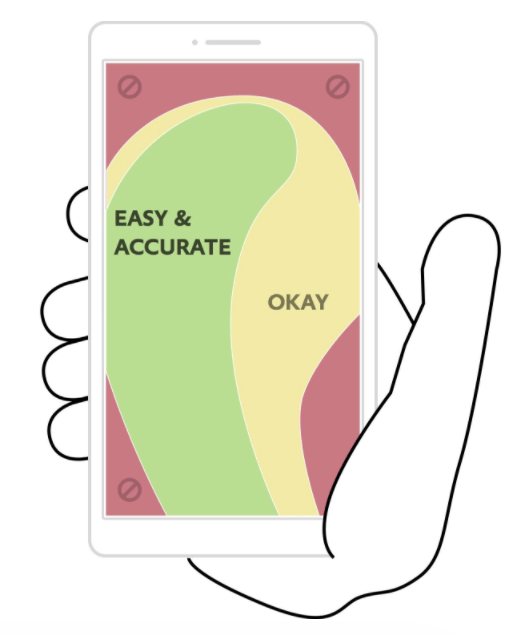
As you can see from this graphic, there are better places on the screen to interact with one hand. If you have buttons in those red zones, it’s going to frustrate people on your mobile website.
It’s uncomfortable for them to try and reach the corners, and they might even click on something else by mistake. If they navigate to the wrong page, it’s going to be frustrating, since it adds steps to their process.
So even if your website passes a mobile-friendly test, it doesn’t necessarily mean that it’s been fully optimized for the user experience. Your layout still needs to be optimized and easy for people to navigate with one hand. Below is a good example of this from the NYT app.

Notice how all the most important elements are centered and well within reach of your thumb as you scroll down.
Follow WCAG standards
The web content accessibility guidelines (WCAG) were created so that websites can meet the needs of people with disabilities. The WCAG gets updated occasionally too so it’s important to check back often to see what changes have been made.
Roughly 1.3 billion people across the globe live with some form of a disability. You don’t want to discourage or discriminate against anyone visiting your website. Everyone is entitled to a good experience.
Here are some of the categories of disabilities that can affect how people experience webpages:
Auditory
Auditory disabilities encompass those who are hard of hearing to fully deaf. If your website relies on videos, music, and other sound-related media, you’ll want to make sure that your site design accommodates them.
For example, you should add captions to all video content. Make sure that captions are displayed long enough for people to read and process the information.
Cognitive
Those with cognitive disabilities might suffer from a wide range of issues including mental disabilities as well as neurological issues such as Alzehimer’s and dementia. As such, these folks might have a difficult time remembering things or focusing on a task for a prolonged period of time.
To accommodate them, you should simplify your website as much as possible. For example, don’t pack your navigation menu with a ton of different options. Web usability expert Steve Krug says that a cardinal rule should be “Don’t make me think!” That applies here.
Physical
Physical disabilities limit a person’s ability to move. This might include their ability to walk, use their limbs, or have full motor control over their body. It also includes people who have experienced amputation.
Users need to be able to explore your website with as limited movement as possible. For example, don’t make them scroll endlessly to access a page they need. Make sure navigation buttons are within easy reach too.
Speech
Speech disabilities might include everything from stuttering to muteness. As such, programs such as voice command will be very difficult or even impossible for these users.
Make sure that any software your website has that requires a speech function also accommodates those who cannot speak. You might add an option to type in what they need for example.
Visual
About 300 million people in the world are color blind. That doesn’t necessarily mean that they see in black and white. It just means they process certain colors differently. You need to make sure your website isn’t using conflicting colors that can’t be processed by people with visual impairments.
Avoid alternating color backgrounds and flashing lights on your website. These elements can trigger seizures from people who suffer from light sensitivity.
The WCAG has four main principles to meet their web accessibility standards.
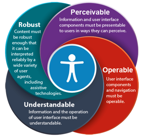
If your website is perceivable, operable, understandable, and robust for as many people as possible, you’ll meet those standards.
Stick to common design elements
When you’re designing a website, it can be tempting to get creative. Maybe creativity is part of your brand’s image, or maybe you just want to experiment with something new. But creativity ultimately works better for elements like marketing than it does for overall design and functionality.
There’s a reason these best practices are tried-and-true. So save that innovation for your products and marketing campaigns. When it comes to usability, it’s in your best interest to follow common web design best practices.
People have a certain expectation when they land on a website. Let me give you an analogy to showcase our point.
What do you expect when you walk into a fast food chain, like McDonald’s? You wait in line, order at the register, then they call your number when your food is ready. That’s a pretty standard experience.
But what if you walked into a McDonald’s and an employee sat you at a table. They brought you some menus and asked you what you want to drink. Then they came back five minutes later to take your order, emulating a fine dining experience.
That’s not what you expect from a McDonald’s. You want fast food and fast service. Sure, this is a creative and unique approach, but it disrupts the customers’ flow by negatively subverting their expectations for that experience. In the process, it actually hinders their experience.
Now, apply this same concept to your website. If you try to reinvent the wheel, it won’t be a good experience for your visitors who are used to having things a certain way.
According to a study, these are the most standard elements people expect when they visit a website:
- Logo in the top of screen
- Contact information in top right of screen
- Horizontal main menu navigation in the header at the top of each page
- Search bar in the header
- Social media follow icons in the footer
It’s in your best interest to follow these best practices. Don’t put the search bar in the footer and position your menu vertically on the right side of the screen. This will only confuse your visitors.
That said, there are areas you can get a little more creative. This includes things like your logo, CTA designs, and header images.
Here’s a good example from our friends over at Crazy Egg.
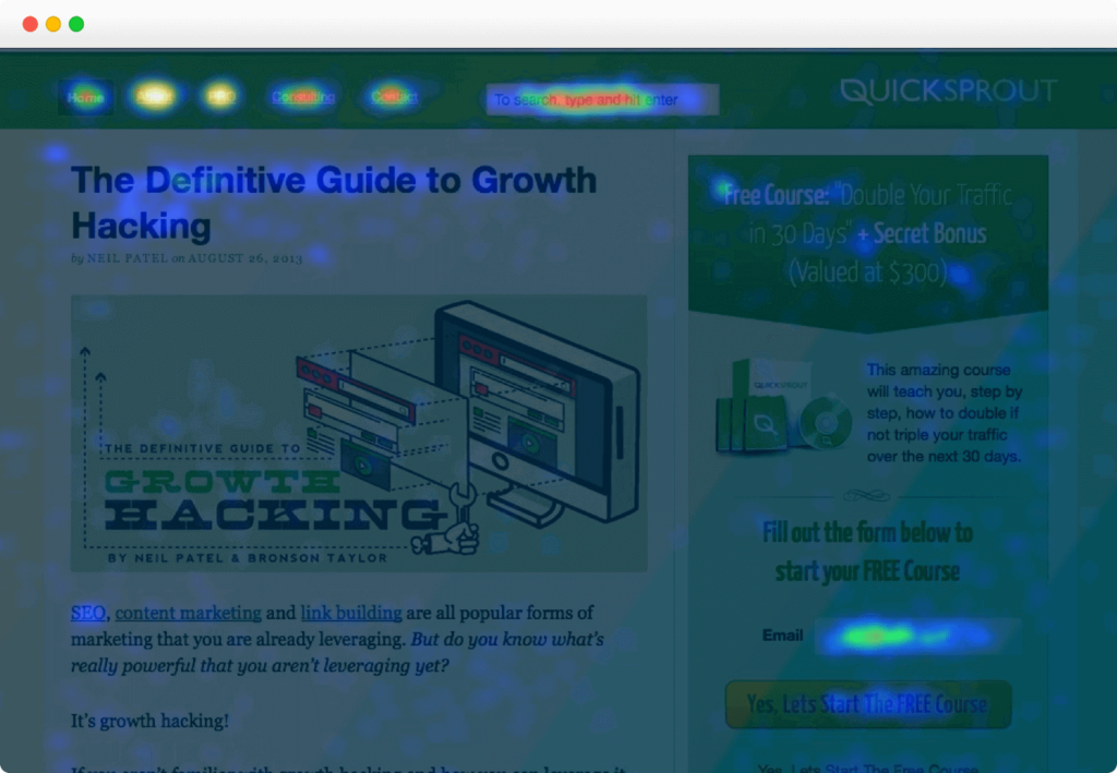
This heat map was developed by tracking where visitors to Quick Sprout clicked the most. Notice how this page follows the best practices for where to place navigational elements as well as the actual content. That’s because it adheres to a common visual hierarchy — which brings us to…
Create a visual hierarchy
It takes 2.6 seconds for a person’s eyes to land on an area of a website that will stimulate their first impression. This is something that happens involuntarily.
What does this mean in terms of your site’s usability? You need to make it easy for your visitors to understand what they’re looking at.
Imagine landing on a website that has 20 images on the homepage. Where do you look first?
Instead, create a visual hierarchy that shows users the most important pieces of your website. This means placing the most important elements of a page (e.g. images, CTAs) in natural focal points.
Here’s an example. Look at these four circles and rank them on their order of importance.

Even though you don’t know anything about these circles and what they represent, you still know that the blue one is the most important, followed by the green one. That’s what a visual hierarchy looks like.
So if the most important piece of content on your homepage that will add value to the visitor is positioned as the yellow circle, that hurts the user experience.
Without a visual hierarchy, people might navigate to the wrong page or focus on unimportant components of your website. That’s not what you want to happen.
These are the factors that you need to keep in mind when you’re designing your visual hierarchy for website usability.
- Size. Bigger is better.
- Color. Bright colors will catch the visitor’s eye.
- Contrast. Varied colors can emphasize (or de-emphasize) elements on your page.
- Negative space. The spaces that you don’t use are just as important as those that you do.
- Alignment. Visitors typically read from top to bottom and left to right when they get to a web page in an F pattern.
Keep these things in mind for simple, clean design. This will give your visitors a better user experience — while increasing their chances to accomplish goals like subscribing to a newsletter or purchasing a product.
Simplify the navigation
Ease of navigation is arguably the most important aspect of usability, especially for ecommerce businesses. Simplifying your navigational elements not only makes for clean design, but it also helps direct your visitors to landing pages in order to convert.
How does a user get from the homepage to checkout? How long does it take? How many clicks do they need to make?
These are all factors that need to be taken into consideration. Look at the top 10 reasons for shopping cart abandonment.
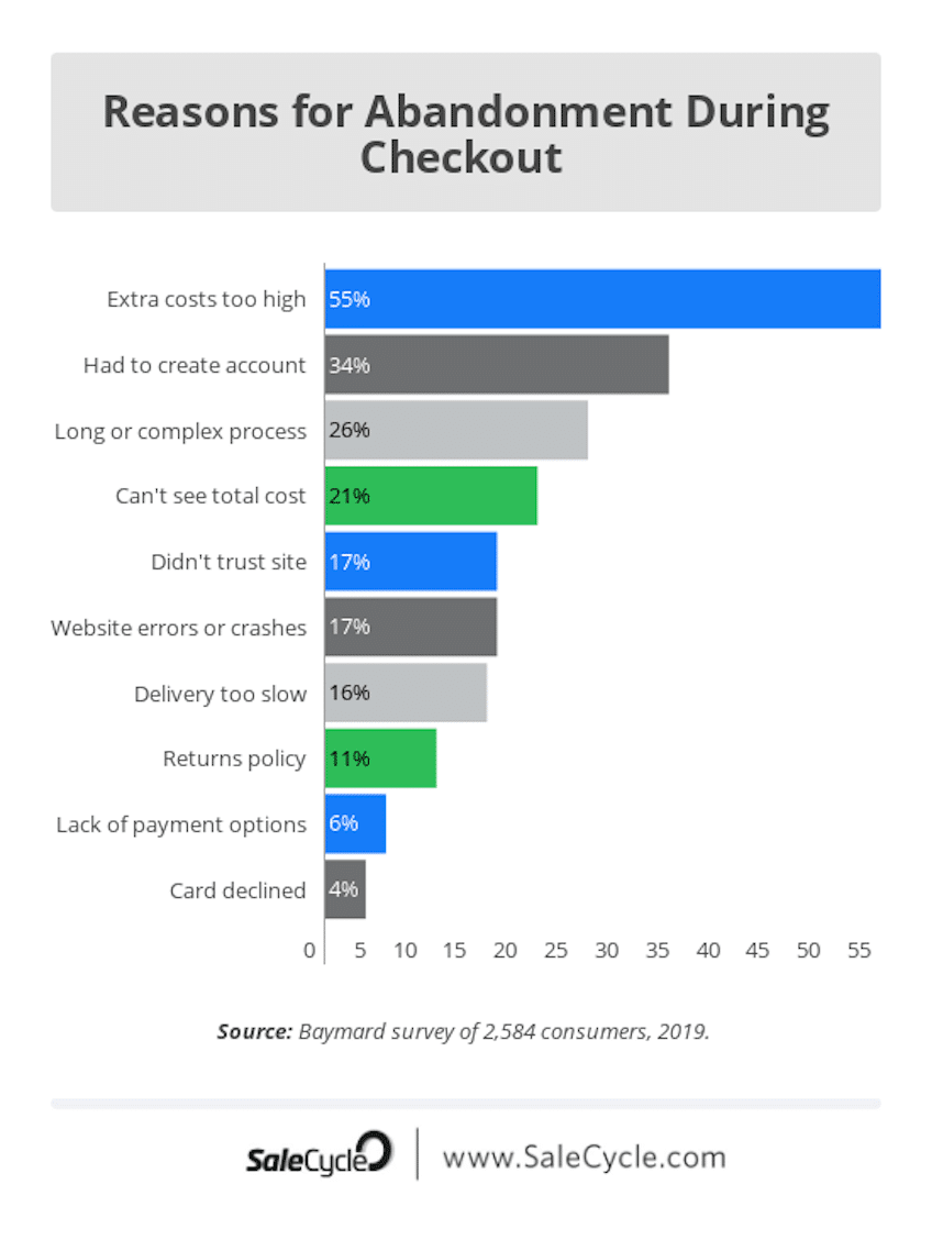
As you can see, two of the top three reasons for cart abandonment are related to navigation. Price was the only factor that ranked higher.
Though getting customers to sign up for an account might be crucial to your overall business strategy, you should find a simpler, more user-friendly way of doing so.
Simple navigation needs to be a priority for all websites, even if they aren’t selling products on an ecommerce platform.
Let’s say you run a simple blog. How do visitors get from your homepage to your blog? How are your blog posts organized? Can they search for a particular post?
All of these are related to navigation.
Clickable content also falls into this category. If the text on your homepage is clickable and brings people to another landing page, it needs to be clear. Make it obvious that certain images, text, and other assets are clickable. Change the color, underline it, or turn that text into a button. Otherwise, it will be challenging for people to know where to click.
Establish credibility
People won’t have a good user experience on your website if they think it’s untrustworthy. Credibility needs to be established right away. Otherwise, visitors will feel unsafe while they’re navigating.
Be transparent about your content, prices, and contact information. Don’t force people to hunt all of your website to find those things.
Here’s what people expect when they land on a homepage.
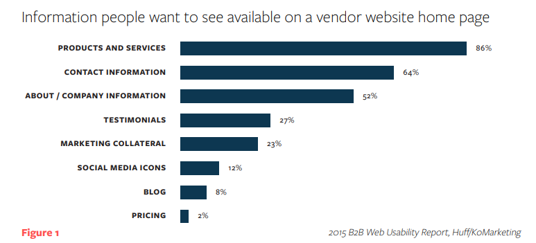
Keeping these numbers in mind, what do you think the perception of a website would be if the homepage doesn’t include product information, contact information, or an About Us page? It’s going to be negative.
Prices should be clearly displayed next to each product. If the user has to click or navigate to another page to view prices, it’s not optimal for their experience.
There are exceptions. For example, SaaS platforms and other service providers sometimes have prices elsewhere. In these cases, having a dedicated pricing page that’s clearly labeled will help.
This is primarily a workaround for offering deep discounts that they can’t advertise because of a relationship with the manufacturer.
Making security elements clear and visible (HTTPS/SSL, badges, etc) goes a long way in establishing credibility too. Once you’ve established credibility on your website, your visitors will be at ease.
They won’t be worried about getting scammed or clicking on a spam link. This will increase their chances of engaging with your content and converting.
Make sure your content is legible
Just because a font would look cool for your next tattoo, it doesn’t mean that it belongs on your website. If people can’t read the text on your site, they’re going to leave.
So, please, leave the Papyrus and Jokerman fonts for your fifth grader’s PowerPoint presentation. Instead, take a look at some of the best fonts that go together.
Even after you pick a font, it doesn’t necessarily mean that your content is legible. You also need to think about your color choices, paragraph length, kerning, and your spacing.
Let’s say you pick a standard font, like the one we’re using for this blog post right now. It’s clearly legible, but not if you make the text yellow and put it over an orange background.
People don’t read word for word. Think about it. When you’re going through a website, you’re likely just trying to find the information that’s most important to you. Your reader will do the same.
So your content needs to be highly scannable. You might be scanning this blog post right now. That’s why we write with short paragraphs and include lots of headers, images, and bullet points.
If each section was just one big block of text, it would be tough to read. But making it legible and scannable improves the user experience.
Be consistent
Your website needs to have consistency from page to page. If you’re always switching your themes and layouts, it’s going to be too confusing.
For example, let’s analyze this product page from Lululemon.
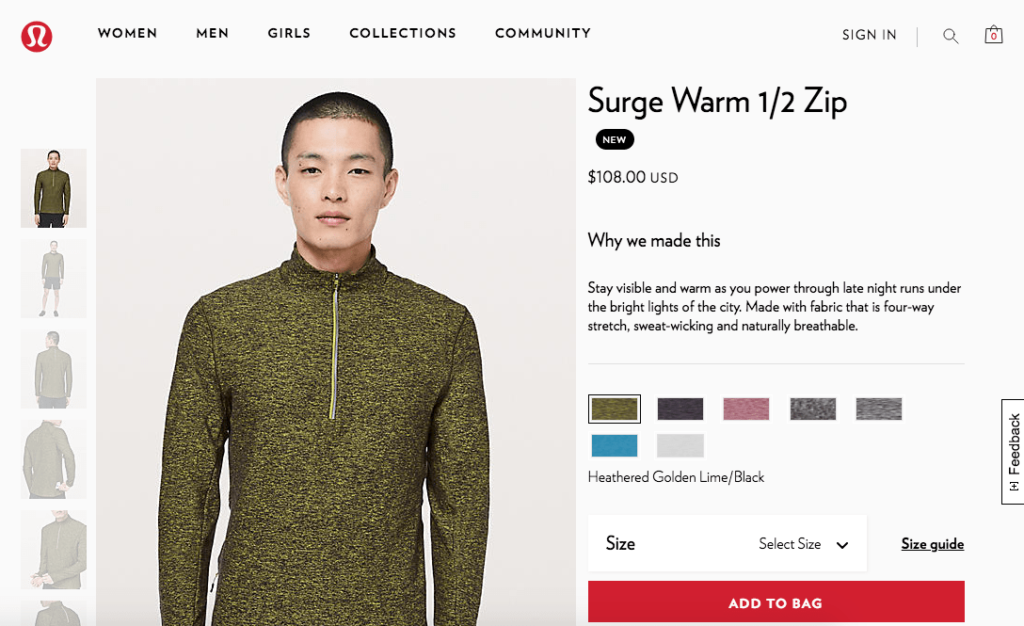
You’ll see all of these elements on product pages:
- Product images on the left
- Product name in on top right
- Price below product name
- Description on right
- Color choices below description
- Add to cart on bottom right
This is all very simple and straightforward. There’s absolutely nothing wrong with this layout.
Now, imagine that you’re browsing on this website and you land on this page. Maybe you add the item to your cart; maybe not. But either way, you decide to look at some more products.
If you navigate to another product page and it doesn’t look identical to this, you’re going to be very confused. All of these elements need to be consistent on each page.
Conclusion
Website usability can make or break the success of your site. If visitors don’t have a good experience, they aren’t going to come back.
That’s why you’ll want to keep in mind the best practices for website usability. These will help you create a website that’s not only accessible to more visitors, but will help accomplish sales goals and generate leads:
- Mobile optimization. Keep your website elements where the thumb can reach.
- Website accessibility. Ensure that your website can be read and accessed by more people.
- Common design elements. Familiar design lets new visitors easily navigate your website.
- Visual hierarchy. Helps keep your readers focused on what’s most important on your website.
- Simple navigation. Make sure that all your navigation buttons are intentional and lead your readers down the right path.
- Credibility. Meet your readers’ expectations for each of your pages.
- Legible and scannable content. Don’t hit your reader with a bunch of text they won’t read.
- Consistency from page to page. Keep a consistent theme, layout, and color throughout your entire website.
Use this guide as a reference to implement these components on your website. Once you’ve accomplished this, you’ll benefit from happy website visitors that will convert and keep coming back in the future.