Business cards are an easy way to make introductions memorable and build a professional reputation. When a potential customer asks for your details, handing over a polished, scannable card with everything they need keeps the conversation going long after the first hello.
Whether you want to design from scratch or work from a template, today’s printers make it simple to create beautiful, durable cards on any budget—and match them with other branded pieces like stickers, signs, and postcards.
But which service deserves your money? I’ll find out.
The Top 7 Best Business Card Printing Services in 2026
Each service below stands out for quality, value, or unique features. I break down pricing, finishes, and best-fit use cases, then share the key factors to compare before you order.
- Zazzle – Best for custom business cards and niche templates
- GotPrint – Best for cheap business cards
- Elite Flyers – Best for bulk order business cards
- MOO – Best for modern, premium business cards
- Staples — Best for same-day business cards
- PsPrint — Best for custom-shaped business cards
- Vistaprint – Best for advanced design tools and print quality
The in-depth reviews below cover features, finishes, pricing, and ideal use cases for each pick. You’ll also find a concise buyer’s guide so you can confidently match a printer to your quantity, timeline, and brand needs.
Zazzle — Best For Custom Business Cards
Zazzle shines when you want something truly custom. You’ll find thousands of designs from independent creators, a wide mix of sizes and shapes (standard, square, mini, Euro, folded, and more), and plenty of industry-specific templates so you don’t have to start from a blank canvas.
It’s easy to browse by style—minimal, modern, or bold—or by profession (photographer, barber, real estate, beauty, and dozens more). Start with a template, swap in your colors and logo, and you’re done.
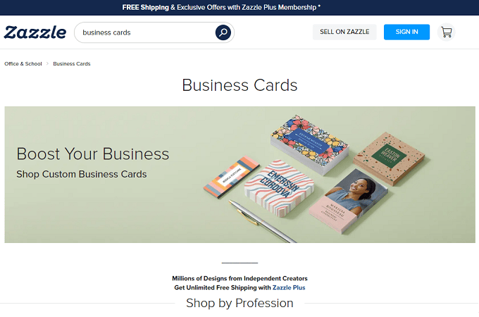
Beyond business cards, you can build a cohesive set of appointment, referral, and loyalty cards in matching styles. If you reorder often, consider Zazzle Plus for free standard shipping on eligible orders (or Plus Premium for faster shipping)—useful if you restock multiple items throughout the year.
Most Zazzle cards are sold in packs of 100, with frequent promotions that can bring “create your own” options into the high teens to low-$20s per 100, depending on paper and finish.
GotPrint — Best For Cheap Business Cards
If you want the lowest possible price without sacrificing basic quality, GotPrint is tough to beat. Standard matte or glossy cards commonly start around the low teens for 100 and roughly the mid-$20s for 500, with heavier stocks and special finishes still priced aggressively.
GotPrint also offers unusual shapes (square, circle, oval, folded) and even magnet cards. Choose from multiple stock weights, including ultra-thick options up to the high-30pt range for a sturdier, premium feel.
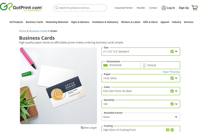
First-time customers are covered by a satisfaction guarantee, which is helpful when testing a new design or vendor. Shipping isn’t free, so factor delivery into your total—GotPrint usually remains one of the least expensive options even after freight.
Elite Flyers — Best For Bulk Order Business Cards
Elite Flyers is built for big runs and high-impact finishes. You’ll find soft-touch and velvet textures, foil stamping, spot-UV, suede, linen, and extra-thick 32–48pt options that feel substantial in hand.
There are 30+ material and finish categories to explore—natural white, dull matte, luster, silk, uncoated, and more. Minimums vary by process: many standard styles start at 100, while some premium finishes (like certain foil or specialty dies) require higher quantities, which works well for events or adding a card to every customer kit.
Beyond cards, Elite prints menus, direct-mail pieces, signage, and other collateral so you can keep branding consistent across everything you hand out.
MOO — Best For Modern Business Cards
MOO is the premium pick for stand-out designs and luxe paper. If you want cards that feel modern and make a statement, start here.
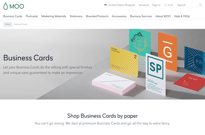
Pick from Standard, MOO size, Square, or Mini formats with matte, gloss, or soft-touch finishes. One signature perk—Printfinity—lets you print a different back design on every card in a pack, perfect for portfolios and product shots.
Pricing generally starts in the low-$20s for 50 standard cards and scales with paper and finish. If anything arrives off-spec, the MOO Promise means they’ll work to make it right.
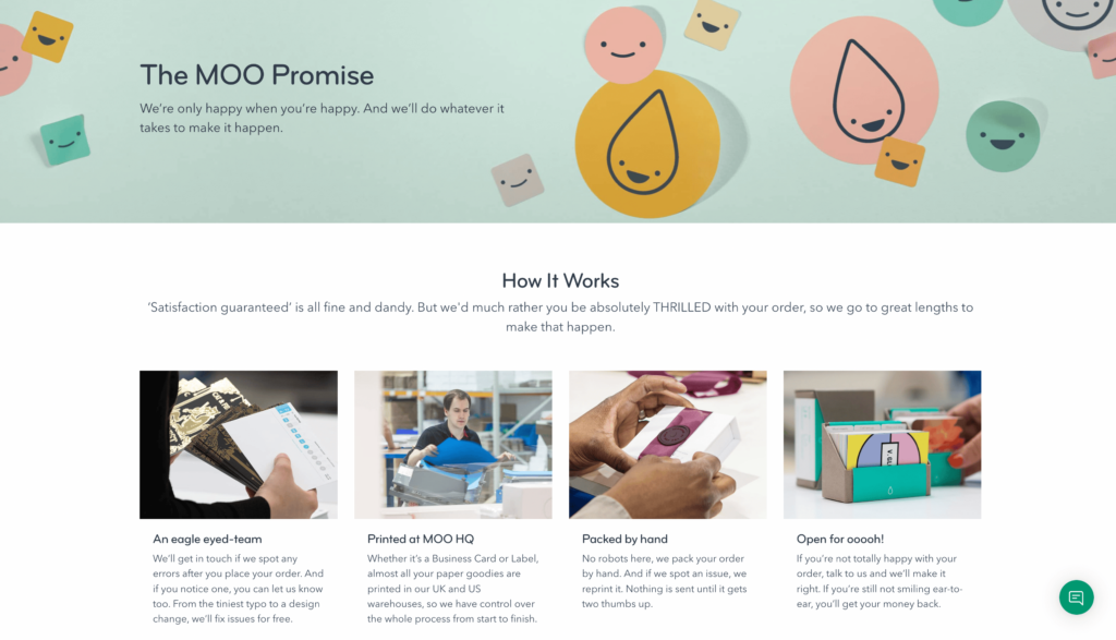
Frequent buyers can level up to managed business plans for discounts, a self-serve ordering portal, and optional design support. Agencies and designers can also use MOO’s reseller option to manage print for clients.
Staples — Best For Same-Day Business Cards
Staples is the go-to when you need cards today. Order by mid-day for same-day pickup on eligible styles at many locations. It’s not as design-forward as MOO or Vistaprint, but the online builder is fast, the templates are clean, and you can upload a print-ready 3.75" × 2.25" file for precise edge-to-edge designs.
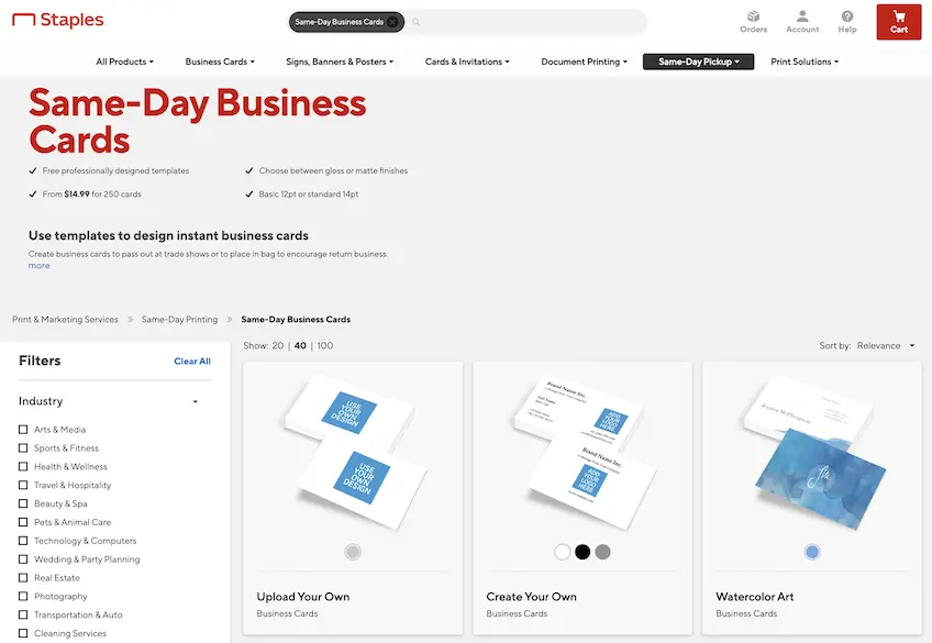
Pricing is competitive and frequently discounted. If you’re not in a rush, choose delivery; free ground shipping often kicks in above a minimum order amount. Jobs are covered by a quality commitment that includes reprints when something isn’t right.
Get started with Staples today.
PsPrint — Best For Custom-Shaped Business Cards
Want a card people won’t forget? PsPrint offers dozens of die-cut shapes—circles, hearts, curved corners, footballs, puzzle pieces, Rolodex cutouts, and more.
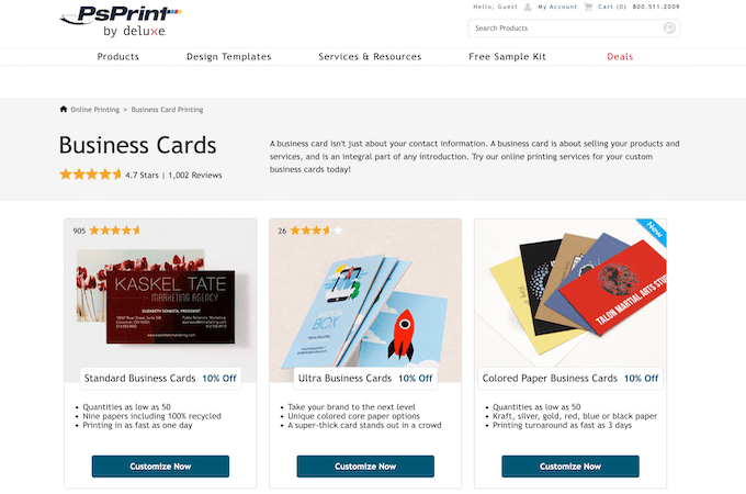
Die-cut runs typically carry higher minimums and a longer production window than standard rectangles. If you’re on a tighter budget or timeline, standard cards are available in small quantities (as low as 50) and can ship quickly.
Orders include a satisfaction guarantee—report issues promptly and the team will work with you on a fix or reprint.
Vistaprint — Best for Advanced Design and Print Quality
Vistaprint remains a top all-around choice. It combines an enormous template library with robust custom options, excellent color reproduction, and pro help when you need it. You can add QR codes to drive people to your site, menu, or booking page—and even upgrade to NFC “smart” cards via VistaConnect so a quick tap shares your details instantly.
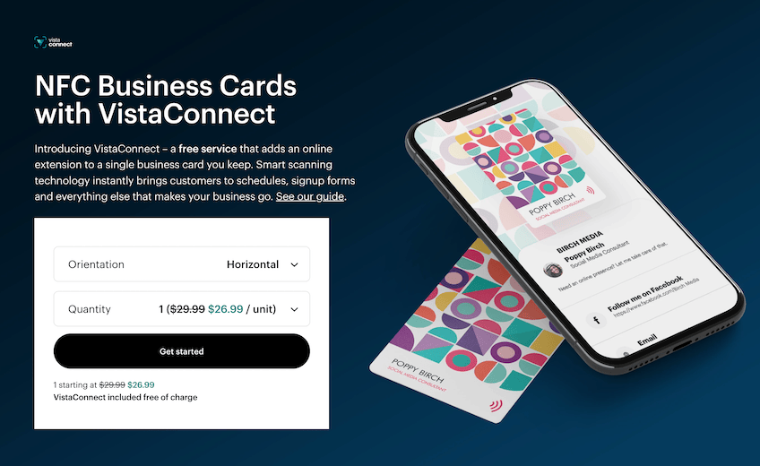
Stocks span standard 14pt, premium 16pt, and ultra-thick 32pt, with specialty finishes like foil, embossed gloss, soft touch, pearl, linen, recycled matte, and more. Shapes include square, rounded corner, circle, oval, and leaf so you can stand out without sacrificing usability.
Entry pricing is regularly promoted and per-card costs drop significantly at higher quantities (think 500+). Free sample kits help you feel papers and finishes before you buy, and eco-forward options like hemp-blend stocks are available if sustainability matters.
Get started today at Vistaprint and check the current offers page for deals and shipping promos.
How to Find the Best Business Card Printing Services For You
There’s no single “best for everyone.” Start with how you’ll use your cards (events, client kits, retail counters), then weigh the factors below to narrow your pick.
Quantity
Estimate how many cards you’ll hand out in the next 3–12 months. If you’re testing a new brand or role, start small (50–100). For conferences or team orders, step up to 500–1,000+ to unlock lower per-card costs. When ordering for multiple employees, save each person’s design as a template so reorders are two clicks.
Tiered pricing often makes 500 only marginally more than 100. If storage isn’t a problem and your info won’t change soon, buy in bulk and bank the savings.
Shipping
Look at total delivered cost and deadline. Free shipping usually kicks in above a spend threshold, while same-day local pickup can save you when you’re in a crunch. Plan ahead when you can—rush shipping erodes the savings from low base prices.
Card Size and Shape
Standard 3.5" × 2" fits wallets and card holders everywhere. Square, mini, circle, and oval shapes stand out but can be harder to store—great for creative industries, less ideal for conservative fields. If you want an attention-grabber without going wild, try rounded corners or a thicker stock.
Think about distribution. If most cards go in pockets or badge wallets, stick close to standard dimensions to avoid accidental toss-outs.
Material and Texture
Paper weight drives durability and feel—14pt is common; 16pt and 18pt feel sturdier; 32pt ultra-thick makes a strong first impression. Specialty stocks like soft-touch, linen, recycled matte, and pearl add tactile interest. For rugged use (contractors, field crews), consider plastic or coated finishes that resist grime and scuffs.
Eco-forward brands can opt for bamboo or hemp-blend stocks that reduce tree-based paper use and lend a premium texture.
Customization
Templates speed things up, but flexibility matters. Look for easy color and font controls, support for edge-to-edge designs, and options to add QR codes or NFC. If you showcase a portfolio, consider packs that let you vary artwork across a single order.
Uploading your own print-ready file? Follow each printer’s bleed and safe-zone guides to avoid white edges after trimming.
Other Business Supplies
It’s simpler to keep cards, postcards, banners, labels, and trade-show collateral with one vendor—especially if they offer consistent color profiles, stored templates, and bulk discounts. If you mail frequently, look for a provider that also supports direct mail so designs and lists stay in one place.
Simple Reordering
Great printers save your designs, fonts, and colors for quick reorders. When a new hire joins, you should be able to duplicate a template, swap the name and title, and check out in minutes—no redesign needed.
Quality and Satisfaction Guarantee
Even the best runs can have trimming or color issues. Favor vendors with clear reprint/refund policies and first-order guarantees when testing a new supplier.
Conclusion
Picking the right business card printer comes down to what matters most: price, speed, finish options, or premium feel.
Vistaprint is my top overall pick for its deep template library, specialty finishes, and pro-level tools. If you want unique art-driven cards, Zazzle delivers an unmatched template range. On a tight budget, GotPrint keeps costs low—just remember to factor in shipping.