Have you ever bounced off a website because it was just too frustrating to use?
Maybe you couldn’t find what you were looking for. The navigation might’ve been a mess. Or maybe the site bombarded you with pop-ups and ads the second you landed.
Whatever the reason, you didn’t stick around—even if the site had something you actually wanted.
Your visitors feel the same way. If your site isn’t user-friendly, it’s going to struggle. That’s why website usability should be a top priority from day one.
Bad user experience leads to high bounce rates, lower engagement, and lost revenue. If someone lands on your site and finds it difficult to use, they’ll just go to a competitor’s site that works better.
And once they’re gone, they rarely come back.
But here’s the good news: applying website usability best practices not only keeps visitors on your site longer, it also boosts your conversions by making your calls-to-action easier to follow.
The tricky part? Most site owners don’t realize their website isn’t user-friendly.
It’s not that anyone deliberately makes their site confusing. It’s just easy to overlook usability issues when you’ve been staring at your own design for too long.
That’s why it’s important to proactively test your site and build with accessibility and usability in mind from the start.
This guide walks you through the core best practices that make a website genuinely easy to use. If you apply these principles, your site will be more helpful, more accessible, and more effective—just the way Google likes it.
How to Make Sure Your Website Is User-Friendly
Here are the eight essential best practices to make your site more user-friendly and accessible:
- Optimize for mobile devices
- Follow WCAG standards
- Stick to common design elements
- Create a visual hierarchy
- Simplify the navigation
- Establish credibility
- Make sure your content is legible
- Be consistent
I’ll break them down.
Optimize for mobile devices
Some websites still aren’t optimized for mobile users—even though phones now generate close to 60% of global web traffic and the vast majority of people go online via a mobile device at least some of the time.
And they’re not just browsing—they’re buying. In the U.S., mobile is on track to account for roughly half of ecommerce sales by 2027, and globally mobile already makes up a dominant share of ecommerce.
Start by using a responsive website theme that adapts to different screen sizes automatically. That’s step one—but don’t stop there. Even a responsive site can have usability issues if it’s not designed with real users in mind.
Consider how people actually use their phones: many browse one-handed and tap with thumbs. That makes top corners and tiny buttons frustrating to reach.
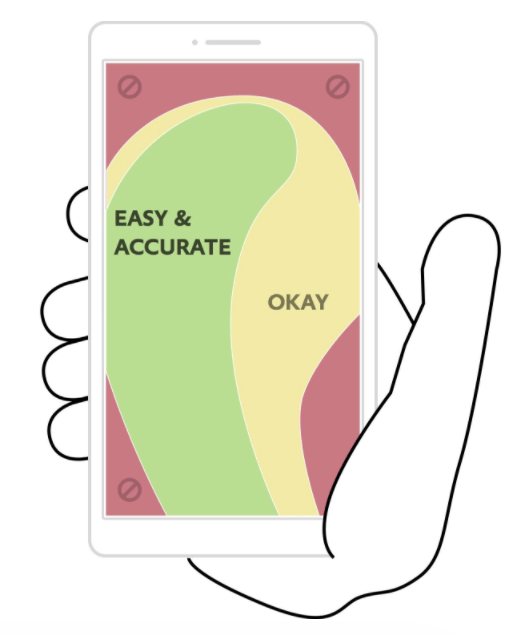
Put your most important buttons, CTAs, and navigation in easily reachable zones—centered vertically and within thumb range. Avoid forcing users to stretch or mis-tap.
Go beyond “responsive” and design for performance on mobile. Use modern image formats (WebP/AVIF), lazy-load below-the-fold media, minimize third-party scripts, and enable caching/CDN. On WordPress, choose a lightweight theme, keep plugins lean, and serve system fonts or use font-display for faster text rendering.
Keep tap targets finger-friendly (around 44–48px), add generous spacing between interactive elements, and avoid intrusive interstitials. Test forms with mobile autofill and numeric keyboards for number inputs.
Finally, monitor real-user performance. Aim for “good” Core Web Vitals: LCP > 2.5s, CLS > 0.1, and INP < 200ms
Just because your site passes Google’s mobile test doesn’t mean it’s truly mobile-friendly. You need to go beyond the checkbox and actually design for human behavior.
Follow WCAG standards
The Web Content Accessibility Guidelines (WCAG) are the gold standard for making websites usable for people with disabilities—and they’re more relevant than ever now. WCAG 2.2 (the current recommendation) adds criteria like Focus Not Obscured, Dragging Movements, and Target Size (Minimum) that reflect how people actually interact on touch devices. What’s new in 2.2
Roughly 1.3 billion people globally live with a disability. If your website doesn’t work for them, you’re excluding a huge number of potential customers—and potentially violating accessibility laws.
Accessibility covers a wide range of user needs:
- Auditory: Use captions for all video/audio content. Captions should be accurate and visible long enough to be understood.
- Cognitive: Simplify layouts, reduce distractions, and use clear, consistent language. Stick to one main CTA per page when possible.
- Physical: Make your site navigable via keyboard or voice, minimize required clicks, and avoid complex gestures or scrolling.
- Speech: If your site uses voice input, offer text input as an alternative.
- Visual: Avoid color-only cues, use high contrast, and support screen readers with proper heading structure and alt text.
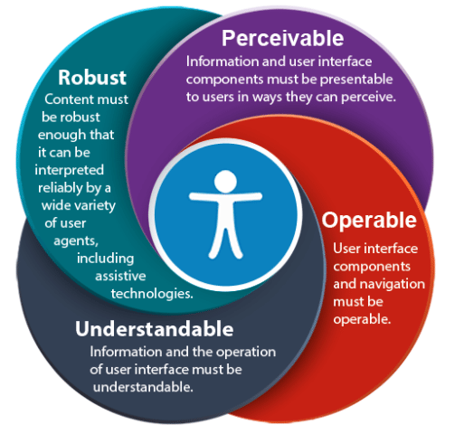
The four WCAG principles are simple but powerful: your website should be perceivable, operable, understandable, and robust. When in doubt, ask yourself: “Could everyone, regardless of ability, use this page?”
Practical checkpoints: ensure a logical heading hierarchy (H1?H2?H3), provide visible focus states, maintain sufficient color contrast (generally 4.5:1 for body text), write meaningful alt text, pair icons/colors with labels, and offer “skip to content” links. Label all form inputs, associate errors with fields, and don’t trap keyboard focus in modals. Where possible, meet WCAG 2.2 AA across templates. Learn more
Stick to common design elements
Creativity is great—until it gets in the way of usability. Your website shouldn’t feel like a puzzle. Familiarity is what makes visitors feel comfortable, and common design conventions exist for a reason.
Sure, you can get creative with your logo, colors, and marketing assets. But when it comes to layout, navigation, and structure, stick with what works. Web design best practices are best for a reason.
Think of it this way: you wouldn’t walk into a fast-food place and expect fine-dining service. That would feel odd—even if the food was good. The same principle applies to website UX. Unexpected layouts break the user’s mental model and cause friction.
According to studies, here are the core elements users expect to see on most websites:
- Logo at the top left
- Contact info in the top right
- Horizontal navigation bar at the top of each page
- Search bar in the header
- Social media icons in the footer
Don’t try to reinvent the wheel with your core site layout. Save your creativity for branding and content—not for rearranging UI elements in unfamiliar ways.
Make predictable interactions your baseline: the logo links to the homepage, the cart and account icons live in the header, primary CTAs look consistent, and breadcrumb trails show the current location. These small details reduce cognitive load and help users move with confidence.
Here’s a solid example from Crazy Egg using a heatmap to show how users interacted with a typical Quick Sprout layout.
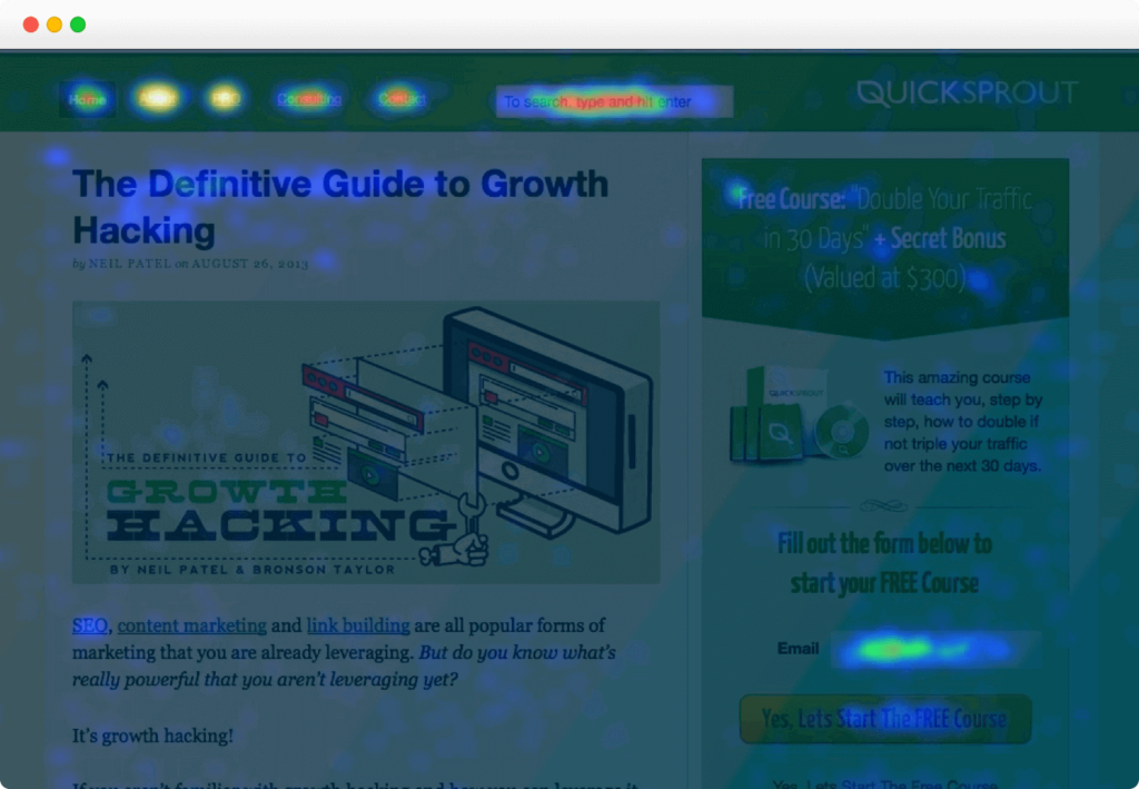
Everything important is exactly where users expect it. That’s why it performs so well.
Create a visual hierarchy
You only have a few seconds to make a first impression. A clear visual hierarchy helps users instantly understand what’s important and what to do next.
Without it, your visitors are left guessing. They may overlook your key CTA or get distracted by something unimportant. That hurts engagement and conversions.
Here’s a simple visual example of hierarchy in action:

You probably noticed the blue circle first, then the green. That’s not random—it’s visual hierarchy. Size, color, contrast, and positioning all tell the brain what to look at first.
To create effective hierarchy on your site, consider:
- Size: Bigger elements grab attention first.
- Color: Use color strategically to highlight or de-emphasize.
- Contrast: Make key elements stand out from their background.
- Negative space: Don’t overcrowd—white space directs focus.
- Alignment: Use an intuitive flow (like top-to-bottom, left-to-right) to guide the eye.
A clear visual hierarchy makes your site easier to scan, understand, and interact with. That’s a win for both usability and SEO.
Practical tips: place your value proposition and primary CTA “above the fold,” reinforce it with a secondary CTA below, and use distinct button styles for primary vs. secondary actions. Keep page width and line lengths comfortable so headlines and body copy are easy to scan.
Simplify the navigation
Navigation is one of the biggest factors in user experience—and one of the easiest to get wrong. If visitors can’t find what they’re looking for quickly, they’ll leave.
This is especially true in ecommerce. Recent research shows the top checkout abandonment reasons are still extra costs (shipping, taxes, fees), slow delivery, trust concerns, forced account creation, and overly complicated checkout flows. Source
Every click, every scroll, every step in the journey matters. Your site should feel intuitive—not like a scavenger hunt.
Ask yourself:
- How many clicks does it take to get from homepage to checkout?
- Are all important pages accessible from your main menu?
- Can users easily search and find specific blog posts or products?
- Are clickable elements clearly marked (e.g., underlined, buttons, hover states)?
Simplified navigation improves usability and drives more conversions—regardless of your business model.
Best practices: keep your top-level menu concise, use descriptive labels (not clever ones), add breadcrumbs on deep pages, and make search prominent with helpful results (autocomplete, synonyms, and graceful “no results” messaging). For stores, add clear filters, sorting, and visible shipping/return info from the product page onward.
During checkout, reduce friction: allow guest checkout, minimize fields, support address autocomplete, and offer modern payment options like digital wallets. Each removed barrier equals fewer abandoned carts.
Establish credibility
Visitors won’t stick around—or buy—if they don’t trust your website. Credibility must be obvious from the moment they land on the page.
Start with transparency. Make it easy to find prices, product info, and contact details. Don’t force users to hunt them down.
If your homepage lacks these basics—like product descriptions, pricing, or an About page—visitors may assume your site is sketchy or outdated.
Pricing should always be clearly listed next to each product. The only exception is for businesses like SaaS providers that use dynamic pricing—just make sure there’s a clearly labeled pricing page.
Security indicators like HTTPS (TLS), recognizable trust signals, and clear policies also build confidence. Visitors should never wonder if your site is safe to use.
When you demonstrate credibility, users are more likely to read, trust, and convert.
Go further with social proof and clarity: display reviews and ratings, show recent updates on content with bylines and dates, publish policies (privacy, shipping, returns), and make support options obvious (chat, email, phone). For product and business pages, use structured data so key facts can be understood by search engines and shown to users in richer ways.
Make sure your content is legible
Cool fonts don’t matter if people can’t read them. If your typography choices look like a school project or tattoo flash sheet, it’s time for a change.
Leave the quirky fonts for art projects. For web content, stick to clean, readable typefaces.
But good typography goes beyond the font choice. You also need to think about:
- Font size
- Line height and spacing
- Paragraph length
- Color contrast
- Whitespace between blocks
Also remember that people scan web content—they don’t read every word. Use short paragraphs, clear subheadings, bullet lists, and relevant images to make content easy to skim.
Well-formatted, readable content improves usability and keeps people engaged longer—both of which are great for SEO.
Practical guidelines: set a base font size around 16px or larger, use a comfortable line-height (about 1.5–1.8), keep line lengths within a readable range, and avoid center-justified or all-caps body text. Use descriptive link text instead of “click here,” and break up walls of text with meaningful subheads and lists.
Be consistent
Consistency builds trust. If every page of your website looks different—new colors, layouts, fonts—it creates friction and makes your site feel unprofessional.
Take this example from Lululemon. Their product pages follow a consistent, predictable layout:
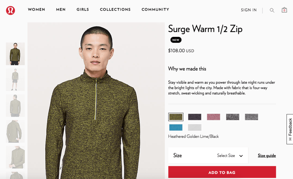
- Product image on the left
- Name, price, and description on the right
- Color and size options below
- Add to cart button in the same spot every time
If they suddenly changed this layout halfway through your shopping experience, you’d be confused. That’s what happens when websites aren’t consistent.
Use the same layout structure, menu format, and brand styling across every page. It makes navigation smoother and the user experience seamless.
Create a simple design system: define button styles, heading scales, color tokens, spacing rules, and component patterns (cards, forms, alerts). Document copy rules (tone, capitalization, CTA labels) so marketing, product, and support pages all feel like they belong to the same brand.
Improve Website Usability Even More With a Tool like Crazy Egg
Want to know what’s actually hurting your site’s usability? Watch your users. Tools like Crazy Egg help you gather real user data so you can make informed changes—no guesswork required.
Crazy Egg gives you insights into how visitors scroll, click, and behave on your site. You can see exactly where people are getting confused or dropping off, and use that info to improve your site.
Uncover Hidden Friction Points
Crazy Egg highlights the frustrating spots—like buttons no one sees, menus users avoid, or elements that users think are clickable (but aren’t).
Get Insights from Real Users at Scale
Instead of running one-on-one usability tests, Crazy Egg captures behavior from thousands of users. This gives you data you can act on fast—and at scale.
Prioritize Fixes Based on Behavior
Not everything needs to change—just what’s hurting your user experience. Crazy Egg helps you identify the biggest blockers so you can fix the things that matter most.
Test, Learn, Repeat
Crazy Egg also lets you run A/B tests, so you can experiment with changes and measure what works—without touching your core site code.
If you want to seriously level up your site’s usability and conversions, Crazy Egg is a must-have.
Conclusion
Usability isn’t just a nice-to-have—it’s a critical factor for success. If people can’t navigate or trust your site, they’re gone.
Apply these eight usability best practices to create a more helpful, intuitive, and engaging experience for your visitors:
- Mobile optimization: Design with thumbs in mind.
- Accessibility: Build for all users, not just the average ones.
- Familiar design: Stick to what users expect.
- Visual hierarchy: Guide attention where it matters most.
- Clear navigation: Make every step easy and obvious.
- Trust and credibility: Be transparent, secure, and consistent.
- Readable content: Use fonts, spacing, and structure that support scanning.
- Consistency: Keep your look and structure uniform throughout.
Use this guide as your blueprint for creating a website that people enjoy using—and want to come back to. Better usability leads to better outcomes across the board.