A website footer is the section you can find at the bottom of a website, typically shown on all pages of that site. Most often, the footer contains a business’s contact information, social media links, and links to commonly navigated pages on the website.
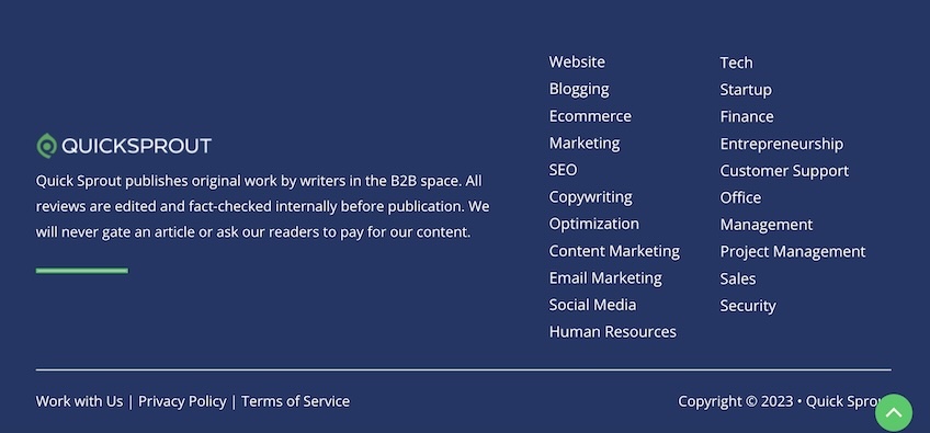
It’s also a good place to include a short description of the company’s objective or mission, like you can see in the screenshot of Quick Sprout’s footer above, where we clearly define what we do as a website: “Quick Sprout publishes original work by writers in the B2B space. All reviews are edited and fact-checked internally before publication. We will never gate an article or ask our readers to pay for our content.”
The footer is not the most critical part of a website—but it shouldn’t be an afterthought, either. Not only does a good website footer help users better navigate your website, but it also creates trust and enables you to be transparent with privacy and data collection practices.
So how do you create a website footer that serves you well and improves the overall user experience on your website?
Here’s the top 11 essential elements you should include in your footer.
11 Things To Include in a Website Footer
Company Logo

Company: Optimizely
Optimizely is an A/B testing company, which means they’ve probably tried out thousands of different website footer options. So we’re going to trust their design choices here.
By keeping a simple and minimalist design, Optimizely’s footer does a great job at making Optimizely’s logo pop. And because it’s so straightforward and bare bones, very little is lost when you switch from desktop to mobile.
Simple website footers that showcase the logo are great because they don’t overwhelm your page. They’re easy to navigate and give a professional and polished look to the website.
Privacy Policy & Legal Pages
Company: Salesforce
Having designated pages where you clearly state your privacy policy and other legal information are non-negotiable. Not only are you legally required to do so in most jurisdictions, but it also creates trust with your audience. You need to be fully transparent with your visitors as to how information is collected, handled, and used on your website.
Typically, links to these pages are found in the footer.
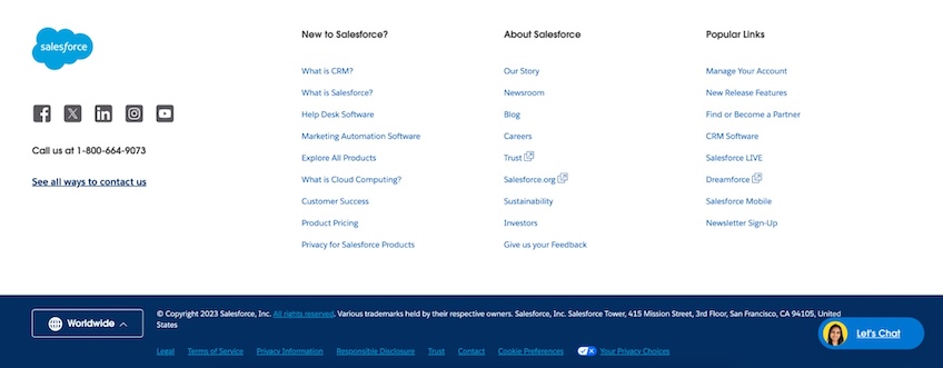
In the example above, Salesforce takes a double-footer approach. They show a top layer with columns that cover important pages on the website and a bottom layer where they list all their legal disclaimer pages horizontally. This type of footer is great if you have more than a handful of website links you want to share and want to make sure the legal pages stand out.
Company Address
Company: Semrush
Including your physical or mailing address in the footer can create trust and credibility with your audience because it emphasizes transparency. It also legitimizes your business.
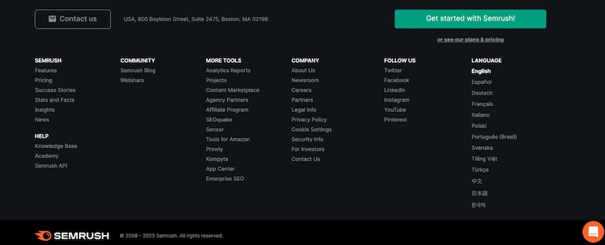
At first glance, Semrush’s footer might seem a bit overcrowded. However, it brings together virtually all information a first-time visitor may want to see: links to important pages, legal information, product information, their top in-app tools, and, yes, a mailing address.
To top it off, the footer also includes a call-to-action button and many languages you can select from. This is a prime example of how good UX design and an organized view can make even the most information-rich footer work for everyone.
About Pages

Company: TravelPerk
Including an About section in the footer might seem like it takes up a lot of space, but it’s important for your audience. The reason is simple: when you buy something (be it software or physical product), you want to know what you’re actually buying and who you’re buying it from. This is all about cultivating trust between the brand and the buyer.
In this TravelPerk example, you can see an entire “About” column, with the first entry dedicated to the company and the others devoted to customers, careers, social proof,and other pertinent info the reader might want to know.
Overall, the clean, vibrant design and the solid organization of all the pages in this footer make it not just an effective one, but also an aesthetic one.
Terms & Conditions
Company: Notion
Over the last few years, Notion’s rise to fame has been anything but accidental. They have a great product focused specifically on organization, documentation, and project management—so you’d expect their footer to be the same.
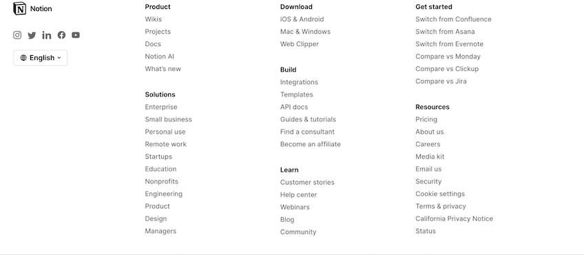
Needless to say, it does not disappoint. Although much more information-dense than many other footers, Notion’s bottom side of the website drives you through virtually anything you’d want to know about them.
From “switching from X tool” articles to tutorials, downloads, and legal pages (including Terms and Conditions, which they label as Terms & privacy), Notion has included all the needed pages into an aesthetic, easy-to-navigate footer section.
We also like that they specifically have a page for the California Privacy Notice. When it comes to legal pages on your site, sometimes more is more.
Navigation Links

Company: Canva
Want to lead customers to an important page—like, for example, an extensive blog post or page written by your CEO? Footer navigation links have multiple purposes. On the one hand, they make it easier for first-time site visitors to figure out where your most important content is.
On the other hand, a solid network of navigation links on the website can also help you with Search Engine Optimization (SEO).
To determine what your site is all about, Google’s crawler moves quickly through your website, analyzes its structure, and assesses the internal and external links to determine the quality of the content. Including some important links in the footer can be impactful for SEO.
In the example above, you can see how Canva chose to include and organize some of its best content. Their design is neatly organized and impeccable, especially with the pop of color you find at the corner of the screen with the company’s social buttons.
Freebies and Lead Magnets

Company: HubSpot
HubSpot is the undeclared royalty of catchy, interesting lead-generation assets. So it makes perfect sense they wanted to include their best ones in the footer. Any new visitors who like the word free are going to find themselves at home in HubSpot’s footer section.
Additionally, the footer itself is clean, well-structured, and to the point. It has a lot of information on the website, the features, and the platform’s specifics. This footer design is neat and well-structured to guide visitors, even if it’s their first time on HubSpot.
And with all those freebies, it’s likely not to be their last visit.
Search Bar
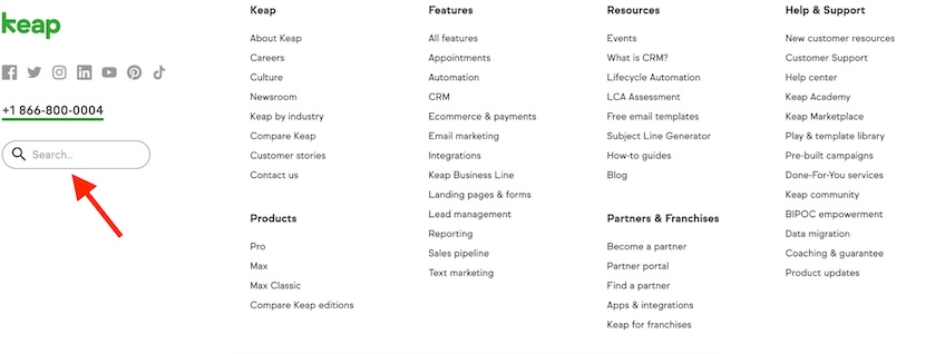
Company: Keap
Many web designers and developers include the search bar at the top of the screen. However, since those areas tend to be crammed with a ton of other information, including the search functionality in the footer is a perfectly viable option.
In the example above, Keap keeps things tidy, despite the many links they include in their footer.
Adding a search function shows even more attention and care for your visitors, as it provides them with a resource to find exactly what they need on your website. And like Keap, you can design it in such a way that it doesn’t detract from the main content.
Social Media Links
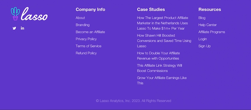
Company: Lasso
You don’t have to include social media links in your footer. However, since this is where you include contact information, showing site visitors that you can also be found on social media can make you appear more personable and approachable.
Plus, connecting on social with customers is an extra opportunity for you to build lasting relationships.
This Lasso footer doesn’t have many social media links, which shows you don’t have to be on every social channel on the planet. Choose the ones that are most relevant for your brand.
Additionally, the overall footer design is energizing and beautiful, with the logo placement and the organization of the footer striking a perfect visual balance.
Site Map
Company: Apple
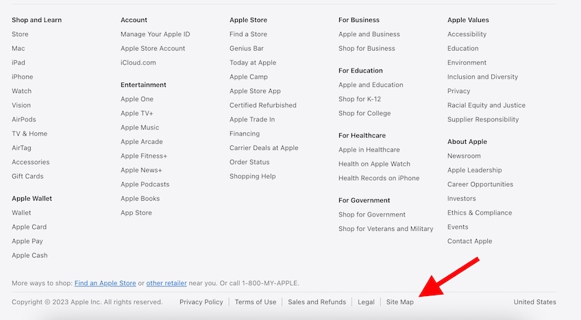
Site maps are lists that include all pages and posts on a website. Their goal is to show visitors what pages they can visit on a website. Of course, this is useful for humans—but it’s also useful for search engines, as they can quickly crawl and understand what your site is all about.
Apple’s footer example is perfectly on-brand in its simplicity. They link to all the main pages on the website and include a “Site Map” link on the horizontal menu at the bottom of the page, making it easy for visitors to access any page they might need.
Signup Form
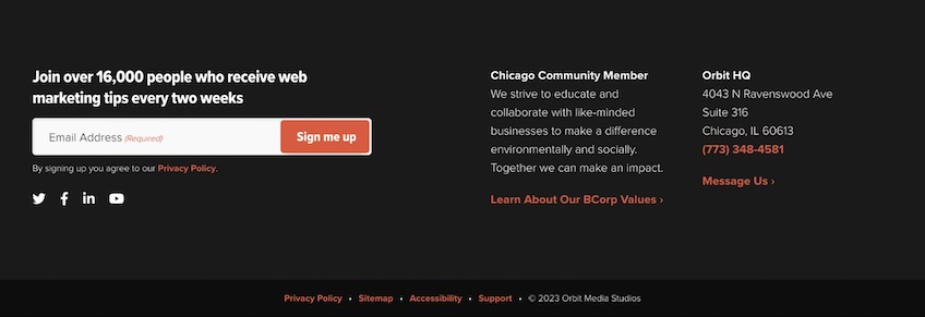
Company: Orbit Media Studios
If your goal is to capture email addresses from site visitors and potential customers, you’ll want to include signup forms everywhere on the website: at the end of longer pieces of content, on landing pages, and even in the footer.
In this example from Orbit Media Studios, the newsletter signup is the centerpiece—and, considering they’re a marketing agency, this makes a lot of sense.
The overall aesthetic of the signup form is engaging, and they add trust signals by noting that 16,000 people have already signed up for their newsletter. This makes it a lot easier for potential subscribers to make the decision to opt in.