Years ago, we ran a case study to see how much infographics could move the needle on traffic and links. The early 2010s were a golden era for infographic-led growth, so we wanted to know what still held true and what had changed.
In this update, we revisit that study and compare its takeaways with how infographic marketing performs today. The goal: separate nostalgia from what actually drives results in 2025.

Before our 2014 analysis, we were heavy users of infographics to grow traffic and brand awareness. Why? Because they delivered exceptional results when the format was still novel and distribution channels were less crowded.
When we began publishing infographics on the KISSmetrics blog in 2010, they helped generate 2,512,596 visitors and 41,142 backlinks. Those are monster numbers by any standard.
So yes, in 2010–2012 infographics clearly worked. The real question is: how much do they still work now—and for what, exactly?
We’ve created hundreds of infographics over the years. Here’s what the data showed us then—and how to interpret it now:
The KISSmetrics blog
From 2010 to 2012, 47 infographics generated 2,512,596 visitors and 41,142 backlinks from 3,741 unique domains. They also drove 41,359 posts on X (formerly Twitter) and 20,859 likes across social platforms.
On average, each infographic produced 53,459 visitors and 875 backlinks from 79 unique domains, along with ~879 X posts and ~443 likes. That’s the benchmark from the format’s peak novelty phase.
After 2012, performance moderated. A primary driver was saturation—more brands published more infographics, which diluted attention and placements.
Newer infographics averaged 21,582 visitors and 371 backlinks from 34 unique domains, with ~486 X posts and ~259 likes. The decline wasn’t due to weaker production—we used similar research methods, the same designer, and comparable promotion. The ecosystem simply matured, and baseline competition rose.
The takeaway from the KISSmetrics era: infographics continued to drive meaningful traffic and links, just not at the early-peak levels. Expect strong but not exponential returns unless you deliver uniquely valuable data and distribution.
Quick Sprout
We also published infographics on Quick Sprout every Friday, aiming to make complex marketing data simple and scannable while adding a steady traffic bump.
Because we didn’t jump on the format as early here, results were different from KISSmetrics. Each infographic still averaged 41,487 visitors and 469 backlinks from 38 unique domains, plus ~621 X posts and ~572 likes—solid outcomes by any measure.
However, those backlinks didn’t translate into a proportional increase in organic search. More links doesn’t automatically equal more search traffic—especially when many embeds link to the image file or a generic landing page without descriptive anchor text or surrounding context that helps Google understand topical relevance.
We also tested publishing on other days. Posting on Mondays yielded ~8% more traffic; Wednesdays delivered ~11% more. Timing matters, but it wasn’t a silver bullet.
Compared to text posts, infographics looked great at first glance, but our non-infographic articles ultimately generated ~35% more overall traffic and ~22% more search traffic. Long-form posts tend to capture more queries, earn topical authority, and attract consistent search demand over time—especially when they include original insights and clear how-tos.
There was a clear brand upside, though. We’ve received more notes from readers saying they “see Quick Sprout everywhere.” That halo comes from the logo carried with every embed—when others republish an infographic, your brand travels with it.

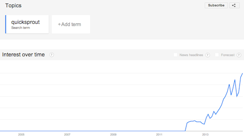
The chart above reflects that effect—brand interest in Google Trends rose as our infographics circulated, reinforcing direct traffic and recall.
Infographics’ role in 2025
Revisiting our 2014 findings, the positives hold: infographics can still attract attention, links, and social reach. What’s different now is how you earn durable, compounding value from them.
Expectations should shift from “infographics as a rankings shortcut” to “infographics as a format that enhances helpful content, supports E-E-A-T, and earns distribution when backed by original insights.” In short, they’re a strong supporting act—not the whole show.
Demand Sage aggregates useful context. A few highlights:
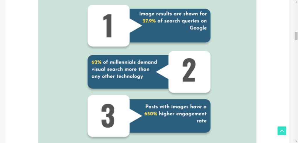
- Google shows image results for roughly 27.9% of searches, keeping visual assets in play for discovery.
- Many readers skim blog posts—recent surveys show about 35% primarily skim and another 38% mix skimming with careful reading, so pairing visuals with clear text structure matters.
- Sites using infographics report around ~12% faster traffic growth versus peers when quality and distribution are strong.
In other words, infographics are ideal for scanners—as long as they summarize real, useful insights and are paired with a thorough text explanation so search engines can index the substance behind the visual. (See Google’s “people-first content” guidance.)
It’s also critical to optimize delivery, not just design: use descriptive filenames and alt text, include a text summary below the image, compress assets (WebP/AVIF), add an embed code that credits the source, cite and link to your methodology, and place the infographic within a comprehensive article that answers the surrounding questions people actually search.
Here’s a practical tip to keep your infographics earning in 2025:
Survey customers or analyze your proprietary data to extract original findings, then build a simple, branded visual in a tool like Canva. Publish the infographic with a clear narrative, sources, and a copy-paste embed code that points back to your canonical URL. That combination maximizes brand reach, link attribution, and qualified traffic.
Conclusion
If your goal is a dramatic, immediate surge in organic search, infographics alone won’t do it. A decade ago, image-led link building packed more punch; since then, Google’s systems have become better at rewarding depth, originality, and intent satisfaction over raw link counts from thin embed pages.
Even so, we still recommend infographics—just use them where they shine most and pair them with helpful, comprehensive content:
- They still produce meaningful traffic – For most teams, a well-designed, insight-dense infographic will attract more immediate visits and social reach than a typical post. Treat it as the hook, then convert that attention with a supporting article, CTAs, and internal links.
- They build brand equity – Your logo and style travel with every embed and share, increasing branded search and direct visits over time. Consistent branding on each asset compounds recognition across channels.
- They earn qualified referral traffic – High-authority outlets still embed compelling visuals. Those links may not lift rankings like they once did, but they bring relevant audiences who convert when your page provides sources, methodology, and next steps.
