Ecommerce businesses live and die by sales. If you run an online store, you already know that consistent, predictable conversions are the engine of growth—not just bursts of traffic.
Whether you sell exclusively online or your site supports a brick-and-mortar store, you need strong conversion rates to hit your revenue goals and sustain profitable growth.
Across many categories, U.S. ecommerce sites often convert in the ~2–3% range, though this varies widely by niche, device, and traffic source.
If you’re hovering around that range, it can feel like you’re “good enough.” But averages hide opportunity—especially when you tailor the experience to your audience.
There’s almost always room to improve—on product pages, in the cart, and throughout your acquisition and retention flows.
Some top-performing digital storefronts—like app marketplaces—often see significantly higher conversion rates because the path to value is fast, the offer is clear, and friction is minimal.
So is 2–3% really your ceiling?
I don’t think so.
Whether you’re online-only or supporting in-store sales, your site’s job is to remove friction and guide visitors to the right next step—again and again.
If you want to lift conversion rates and generate more sales, you don’t need a total rebuild. A series of focused changes can compound into big gains.
Most of these improvements are low-cost but high-impact—and they pay back quickly when you measure and iterate.
You can often double—or even triple—key conversion steps over time with disciplined testing and the right conversion rate optimization (CRO) playbook.
If CRO feels unfamiliar, you’re in the right place. I’ve helped hundreds of stores tune their funnels and remove hidden blockers.
Below are 15 practical wins ecommerce sites use to increase conversions without chasing vanity metrics.
First, I’ll align on definitions.
What is conversion rate optimization?
In plain English, conversion optimization increases the percentage of visitors who complete a specific action that moves your business forward.
“Conversion” depends on your goal.
Examples include subscribing to your email list, creating an account, finishing checkout, starting a free trial, or downloading software.
Here are some more examples:
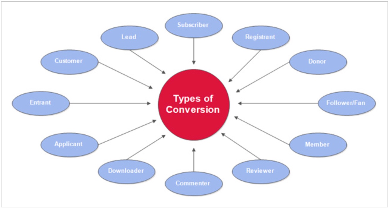
The more often high-value actions occur, the more revenue and LTV you unlock.
In theory, that sounds simple.
In practice, it’s about sequencing: getting the right people to take the right action at the right moment with as little friction as possible.
That means aligning acquisition, messaging, UX, merchandising, and checkout so your funnel guides users naturally from intent to purchase.
What can conversion rate optimization do for your business?
1. You can have a fighting chance against Goliath competitors
When I think of competition, one line always comes to mind:
The strong eat the weak.
It’s true in business—unless you out-optimize them.
Ecommerce gets more crowded every year. New entrants target your customers with aggressive offers and paid media.
Rising competition means you win by building loyalty, nailing your value proposition, and eliminating friction—so switching feels costly for customers.
That starts by moving more people—faster—through your sales funnel.
A common mistake: pouring budget into traffic before fixing the leaks in your funnel.
Instead, prioritize the systems to:
- convert qualified visitors into leads or buyers;
- turn first-time buyers into loyal, repeat customers.
If you already have traffic, optimizing the funnel gives you the fastest ROI—because you’re monetizing what you already earn.
You might never match bigger brands on ad spend or price.
But you can beat them on relevance, clarity, speed, and trust—CRO is how you operationalize that advantage.
2. You can learn more about your users’ behavior
User behavior is your best proxy for intent.
It tells you what visitors value, which messages resonate, and where friction lives.
Use those insights to give people precisely what they need on each page—so they convert sooner with fewer doubts.
Don’t rely on a single snapshot of analytics. Patterns emerge over time as you ship changes and seasonality shifts.
Track behavior continuously so you can separate noise from signal and prioritize changes that move metrics.
My advice?
Get fluent with Google Analytics 4 (GA4) event and funnel reports. It’s the current standard for Google Analytics and a powerful, free foundation for measuring what matters.
Start by answering:
- Which sources and campaigns drive the most qualified traffic?
- Which landing pages and categories hold attention and convert best?
- Where do visitors stall or bounce? (Device, page, and step matter.)
- How “sticky” is your site? Monitor engagement and time on task.
That’s the starting point. Behavior has many layers—especially across devices.
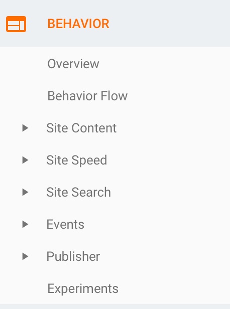
Where do you find this?
Open your behavior and funnel reports in GA4 to see how people move through your key flows.
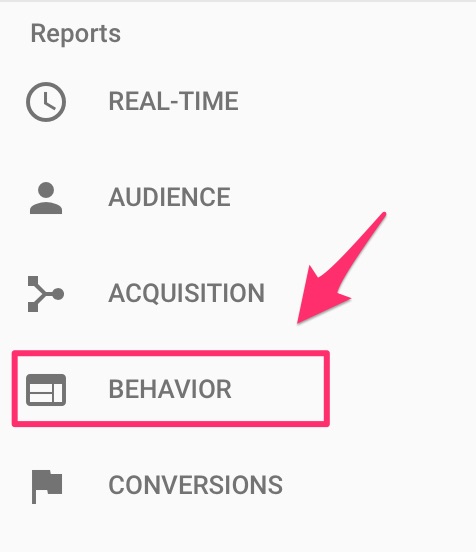
Explore the subsections for deeper insights on content engagement, events, and pathing.
Ideally, you already have GA4 data flowing.
Review historical performance, then set clear benchmarks and targets by channel and device.
Double down on what’s working; isolate underperforming pages and fix the specific friction you find.
These insights fuel better decisions across your entire marketing mix—not just CRO.
Content, social, email, SEO, and paid media all benefit when you understand what users actually do.
Analytics also protects you from “gut-feel” changes that hurt results. Data keeps you honest and efficient.
For deeper behavior insight, tools like Crazy Egg add heatmaps, scrollmaps, and session recordings so you can see where people click, stop, and get stuck.
Those visuals quickly reveal what to keep, what to move, and what to remove on high-impact pages.
Recordings often surface issues you won’t catch in aggregate data—like confusing microcopy, hidden errors, or tap-target problems on mobile.
Use this evidence to prioritize changes—and to validate that your fixes actually improved the experience and the metrics you care about.
With that foundation, you’ll ship fewer guesses and more wins.
3. You can maximize your profits
More conversions—at the same traffic and spend—mean higher revenue and better margins.
But you only realize that upside if each step—from discovery to checkout to post-purchase—pulls in the same direction.
Optimizing the top of the funnel without fixing mid- and bottom-funnel friction leaves money on the table.
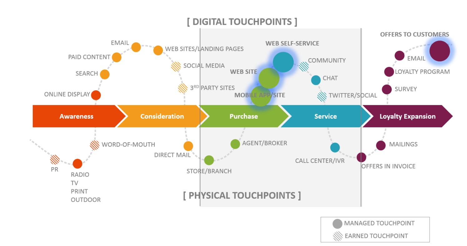
Start by mapping your customer journey end-to-end to find the biggest drop-offs and the easiest wins.
A journey map visualizes the path customers take, the questions they ask, and the emotions they feel at each step.
Once you can see the journey, the next right optimizations become obvious.
Here’s a simple visualization:
4. Your customer acquisition cost will be lowered
CRO is the most reliable way to reduce customer acquisition cost (CAC) without cutting quality traffic.
Here’s the classic definition of CAC:
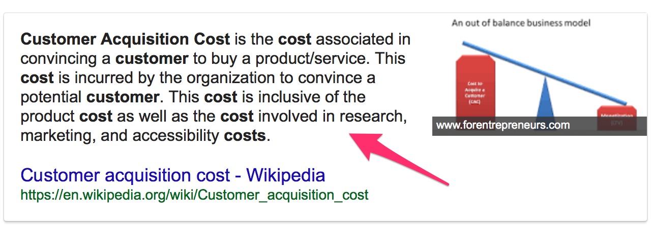
In short: it’s what you pay to acquire a customer.
High CAC squeezes margins and throttles growth.
Lowering CAC gives you more room to invest in product, service, and brand—and to scale profitably.
How does CRO help?
Imagine you optimize key product pages and checkout.
With a handful of focused changes, conversions lift by a few percentage points.
Traffic and ad spend are unchanged. The only variable is a better experience.
That lift means more customers for the same spend—so CAC drops while revenue and ROI climb.
You’ll invest to make improvements, but the payback accrues every day your new experience runs.
Lower CAC plus higher LTV is how you get compounding returns. That’s the game.
Now that you know why CRO matters, here are 15 high-leverage optimizations to test.
Top 15 conversion rate optimization wins to test
1. Simplify your website
Simple, focused designs convert better because visitors immediately understand where to click and why.
You may sell hundreds or thousands of SKUs, but cramming everything onto a page overwhelms users and depresses action.
De-clutter. Prioritize top sellers, hero bundles, or highest-margin items and make paths to them obvious.
Consider Apple’s homepage.
Apple offers a vast catalog, yet each page elevates a single story with clear category navigation to move quickly.
If they jammed every product onto the homepage, it would be chaos. Instead, one focused hero + intuitive nav keeps shoppers oriented.
Make it easy to scan, choose, and act. The result is fewer bounces and more adds to cart.
2. Include a search box
Shoppers should find products fast—by browsing and by search.
A prominent search box matters because a large share of visitors prefer to search on ecommerce sites.
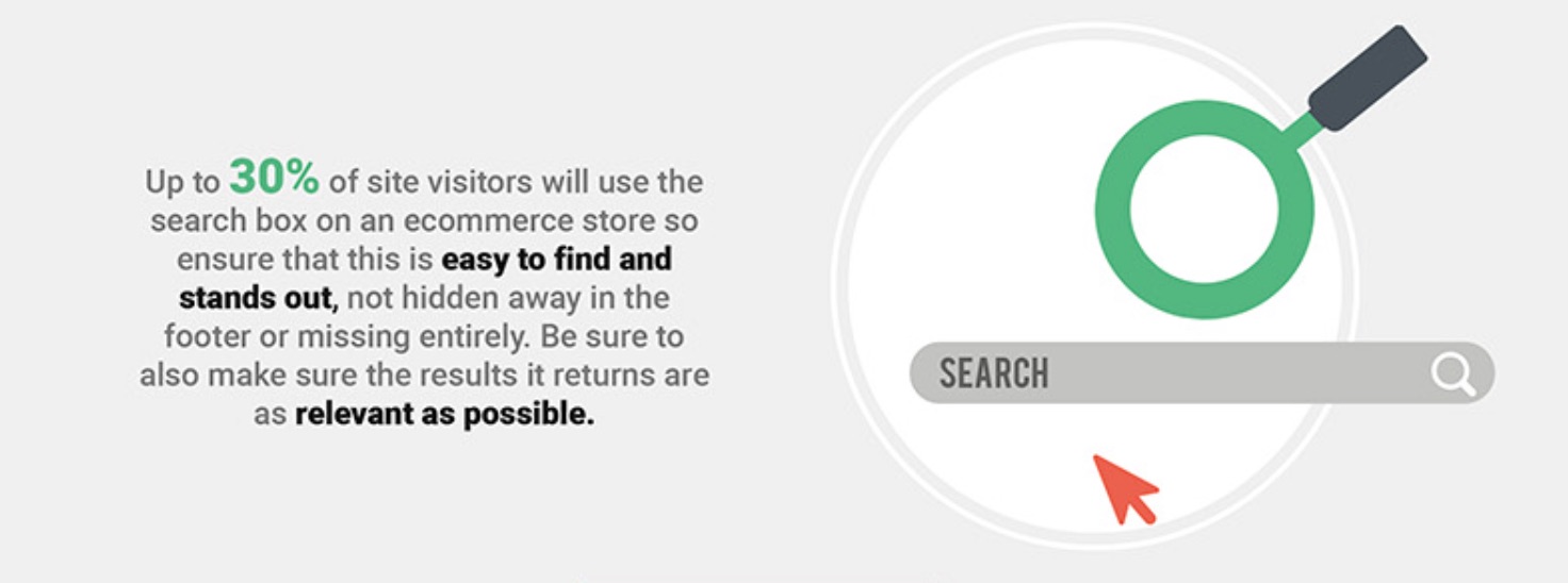
Faster findability = faster conversions.
Keep navigation simple and distraction-free with clear category labels and filters that reflect how customers shop.
Make add-to-cart and checkout controls obvious and reachable on mobile and desktop.
3. Have clear CTA buttons
No button color will rescue a broken funnel.
But hard-to-see CTAs silently kill conversions.
It’s a common miss.
UX research consistently shows that unclear or visually buried primary actions create hesitation. Make your primary action unmistakable.
Pick a high-contrast button style that stands out from the rest of your UI. Ensure the label is specific (“Add to Cart,” “Buy Now,” “Start Free Trial”).
Language matters more than color. Words like “now” and “today” add urgency; benefit-driven CTAs (“Get My Glasses”) can also lift clicks.
Use this simple framework to design each page:
Step #1: Choose a single primary goal for the page.
Step #2: Identify secondary goals that support the primary action (e.g., social proof, size guide, trust badges).
For example, on product pages the primary goal is “Add to Cart.”
Secondary elements (reviews, shipping info, returns) reduce anxiety and help the primary goal happen faster.
That alignment keeps users moving.
Step #3: Make the primary CTA the most prominent element on the page.
Step #4: Include only supportive secondary actions. Remove anything that doesn’t point to your main goal.
Then A/B test creative, copy, placement, and size to confirm what actually improves clicks and completions.
Above all, CTAs must be unmistakable.
Bold, clearly separated buttons help visitors act without hunting around.
Notice how The North Face makes “Add to Cart” obvious when viewing an item.
Here’s how the button state changes on selection:
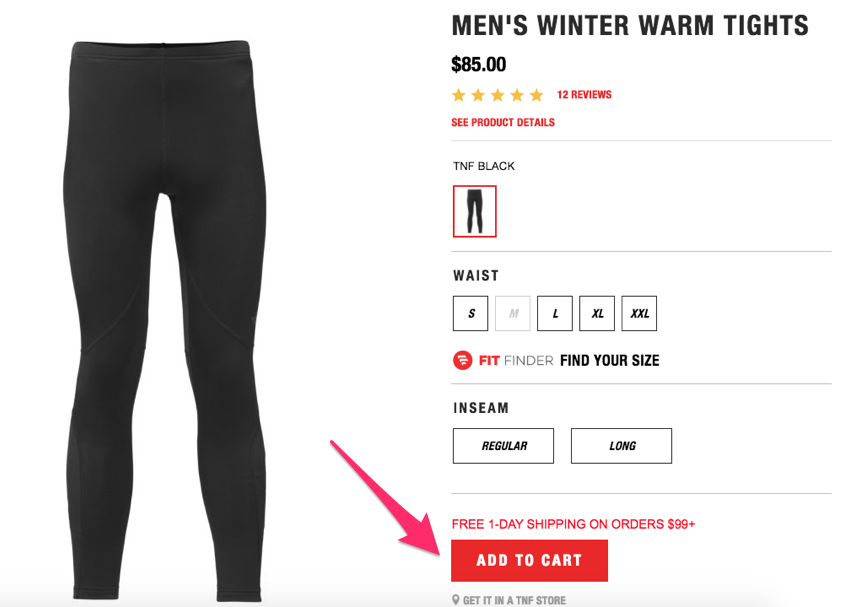
The bold color draws the eye, leaving no doubt about the next step.
Don’t hide the action—guide it.
Clear, high-contrast CTAs boost add-to-cart and checkout starts across devices.
4. Highlight items that are on sale
Price-sensitive shoppers compare across sites before buying.
Since price is pivotal, don’t bury your deals.
See how Macy’s spotlights markdowns right on the homepage:
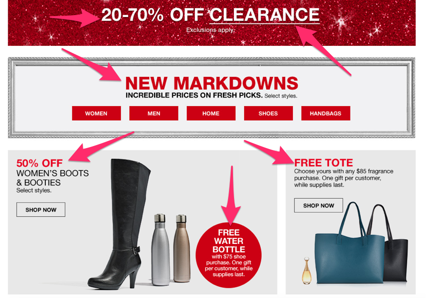
Shoppers instantly see “free,” “X% off,” “markdowns,” and “sale”—all words that drive clicks.
Visible deals lift conversions and AOV when paired with smart cross-sells.
Buying on sale feels good and reduces hesitation—so make discounts easy to spot.
Don’t hide offers to protect full-price items. Promote them strategically and use lifecycle marketing to upsell later.
Feature discounted products clearly, then follow up with bundles, accessories, or replenishment flows.
5. Display multiple pictures of the product
Never ask customers to buy from a description alone.
Show high-quality images from multiple angles, on models, in use, and zoomed to highlight materials or features.
Ensure your images are crisp and accurate so expectations match reality.
Here’s a solid example from Lululemon:
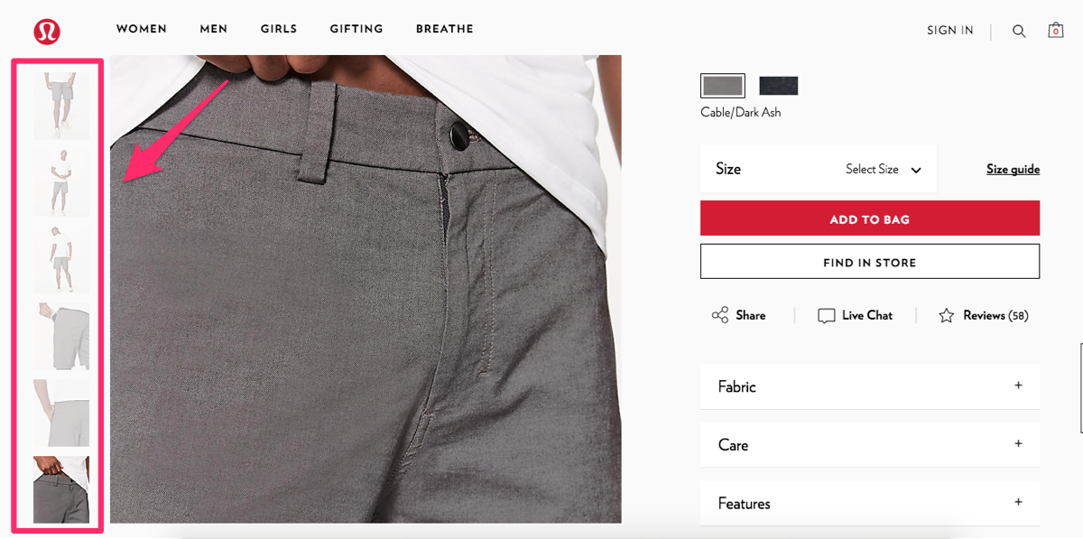
Multiple shots show fit, fabric, and utility details (like a secure phone pocket).
Pictures communicate what specs can’t and reduce returns—especially on mobile where users skim.
Yes, great visuals take effort—but they pay for themselves in conversion and satisfaction.
Add video or 360-view where it helps users decide faster.
6. Include a detailed product description
Images attract attention; copy closes the gap between curiosity and confidence.
For simple apparel, keep it concise but specific. For electronics or products with learning curves, detailed specs and plain-language benefits are essential.
In a store, associates answer questions. Online, your description must do that work—without jargon.
Even for basics like tees, call out differentiators: fabric, stretch, cooling or thermal properties, and care.
Here’s how Amazon handles a TV wall mount:

Photos help, but the copy seals the deal with compatibility, weight, VESA patterns, and extension/tilt distances.
Most buyers aren’t experts. Spell out what matters in everyday terms and remove guesswork.
Clear, specific descriptions increase confidence, reduce pre-purchase support, and cut returns.
7. Offer easily accessible customer service
Even with great pages, many shoppers still have questions. If no one is “there,” conversion rates drop.
Replicate the in-store experience online. Offer quick ways to reach a real person when needed.
Provide multiple support channels:
- phone
- live chat
Meet customers where they are and respect their preferences and time.
Offer coverage across time zones. Ecommerce is 24/7; support should be, too—via agents or well-trained chat.
Consider a shopper who’s ready to buy but needs one answer. If they can’t reach you, they’ll leave. If they can, they’ll convert.
Think of it as a digital sales associate: fast, friendly, and helpful.
See how Apple does live chat during shopping:
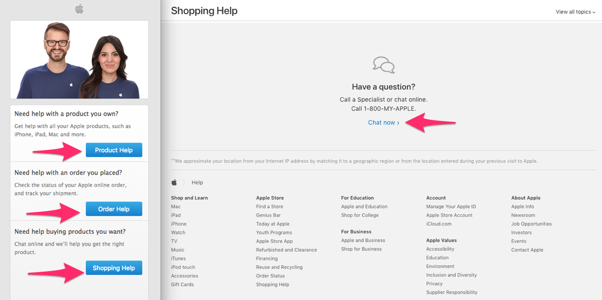
It’s easy to start a chat and get fast, relevant answers—perfect for higher-consideration products.
Assume customers don’t know your terminology. Use chat to translate features into benefits and guide the purchase.
Timely help is often the nudge that turns interest into a sale.
8. Include all your contact information
Beyond live help, display company details prominently to build trust.
Clearly show your:
- physical address or registered business location
- phone numbers and support hours
- help center or live chat link
- support email
Hiding contact info feels sketchy. If something goes wrong, customers want to know how to reach you.
Make trust effortless and you’ll see less hesitation at checkout.
9. Simplify the checkout process
How many steps does it take to buy?
Recent research finds the average checkout in 2024 has ~5 steps and ~11 form fields, and complexity still drives abandonment.
Many sites still require too many fields and screens—each one adds friction and drop-off.
Shorten the path. Fewer steps, fewer fields, fewer surprises.
Only ask for the essentials you need to fulfill the order:
- shipping information
- payment information
- email address for receipt and order updates
That’s it. Everything else can wait until after purchase or go into an optional profile.
You’ll still know where the customer lives, their name, and how to reach them.
From there, use post-purchase email to confirm, upsell, and deepen the relationship.
Don’t make checkout feel like a clinic intake form. Let guest checkout, address autocomplete, and progress indicators do the heavy lifting.
Trim the process to essentials and watch completion rates rise.
10. Offer multiple payment options
Imagine someone ready to buy—but they can’t because their preferred payment isn’t available.
That should never be the reason you lose a sale.
While processing fees vary, accommodate as many mainstream methods as you can.
At minimum, accept all major cards:
- Visa
- MasterCard
- American Express
- Discover
Also offer popular alternatives and accelerated checkouts:
- PayPal
- Apple Pay & Google Pay
- Shop Pay (Shopify)
- PayPal Pay in 4, Klarna, or Afterpay (where appropriate)
Convenience wins—digital wallets and accelerated checkouts keep mobile conversion high, and broader choice covers more buyer preferences.
Assume shoppers can find similar products elsewhere with the payment method they prefer. Don’t give them a reason to leave.
11. Include user reviews
Most shoppers check online reviews and rely on them to validate quality, fit, and expectations.
Ask recent buyers to review and display ratings and commentary on product pages.
More reviews = more credibility—especially when they’re detailed and include photos.
Your product copy will be positive by design; peer reviews feel objective and specific.
Don’t fear imperfect feedback. A few critical notes make the rest feel authentic and help set expectations.
When positives outweigh negatives, reviews increase confidence and conversion—and reduce returns.
12. Add a video demonstration
If your product is unique or benefits from a walkthrough, add short demo videos.
Even simple products can benefit—video shows real-world size, use cases, and hidden features.
Everyone knows how to use luggage, but Thule still uses video to surface compartments, handles, and fit:
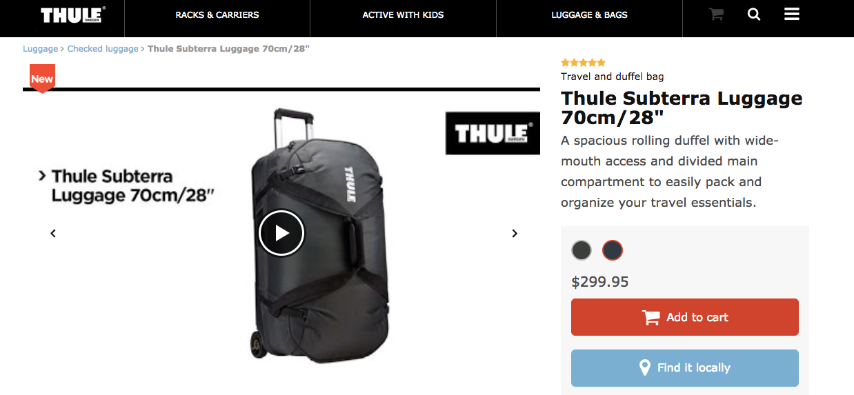
Video reduces uncertainty and highlights differentiators you can’t capture in a single photo.
Even apparel benefits—show styling ideas, movement, and seasonality to help buyers picture themselves using it.
Keep clips short, focused, and optimized for mobile.
13. Don’t surprise your customers with extra fees
Price surprises kill trust. Be upfront about the full cost early in the journey.
Customers expect price consistency across PDP, cart, and checkout.
Hidden charges, taxes, and shipping added late are a leading cause of cart abandonment.
Multiple studies identify unexpected costs as the top reason shoppers quit.
I know taxes and shipping exist. Instead of surprise fees at the end, surface estimated totals and delivery dates earlier—or bake costs into pricing and offer “free shipping” thresholds.
You’ll protect margins while keeping the experience transparent—a win-win.
Transparency reduces abandonment and lifts completed checkouts.
14. Send shopping cart abandonment emails
Even with great UX, some carts will be abandoned. Don’t waste that intent.
These shoppers picked products and nearly converted. They’re far easier to win back than net-new traffic.
They already know your brand and liked something enough to add it to the cart—sometimes they just need a timely nudge.
Send a cart abandonment email sequence: trigger the first within 30–60 minutes, then follow up at ~24 hours and ~72 hours if the cart is still open.
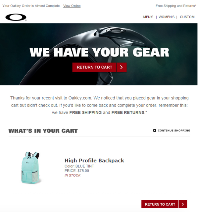
Include product image, price, and a direct link back to the cart. A gentle incentive or free-shipping reminder can tip the decision—use sparingly to protect margins.
15. Recommend products to enhance the shopping experience
If your site uses cookies and order history, personalize recommendations based on browsing and past purchases.
It shows customers you understand their taste and shortens discovery time.
Use “related,” “often bought together,” and “recently viewed” modules—and add intelligent accessories in cart (e.g., cases with headphones).
Done well, recommendations feel helpful, not pushy—and they reliably increase AOV and repeat purchases.
Conclusion
Your ecommerce site can and should convert better—and that lifts revenue without buying more traffic.
If you do one thing today, start optimizing for conversion. Don’t settle for the average for your category.
Focus on high-impact friction first—navigation clarity, PDP confidence, checkout simplicity, and trust.
Why?
Because with the same traffic and budget, higher conversion unlocks profitable growth. You can scale without outspending bigger competitors.
That’s golden.
Whether you launched yesterday or years ago, there’s always room to improve.
Use the tips above to ship clear, simple changes that make it easier to buy—then keep iterating with data.
You don’t need to implement everything at once. Start with the biggest bottleneck, test, and expand what works.
Keep optimizing over time and you’ll see meaningful lifts in conversions, revenue, and customer lifetime value.
Trust the process—it works.