A picture is worth a thousand words.
You’ve heard this ageless adage countless times. It’s simple: showing beats telling. When you translate that into blogging, strong visuals make your points clearer, faster, and more memorable.
Are you actually applying this to your blog posts?
Storytelling and tight writing matter, but words alone rarely maximize engagement.
You also need visual elements woven throughout the post. If you’ve been reading our blogs for a while, you know we practice what we preach.
We lean on visuals to elevate our content. If that feels intimidating at first, don’t worry—once you know what to add and when to add it, the process becomes second nature.
Where should you start? How many visuals make sense? Which formats work best—and when?
Use this guide as your playbook for adding the right visual content to your blog posts. Here’s what to know (and do).
Understand how people read your blog
You can be a great writer, but most visitors won’t read every word. That’s reality.
According to a recent study, people read only 20% of your content on a page.
Let that sink in. Research shows the “ideal” read-time sweet spot is around seven minutes:
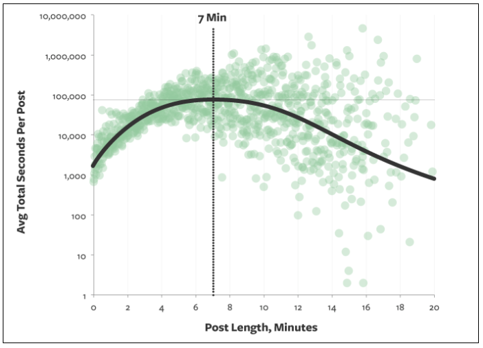
Seven minutes typically lands near 1,600 words. But remember, most people scan. They’ll only engage with a fraction of that unless your format helps them.
If your post is 1,600 words and only 20% gets read, readers see roughly 320 words. Visuals and structure determine which 320 they notice.
The takeaway: people scan.
Write and format for scanners. Break up text walls. Use descriptive headings and short paragraphs. Bold key phrases sparingly. Front-load value in each section so scanners still learn something meaningful.
Keep sentences tight and paragraphs just a few lines long. Make every screenful easy to digest.
Add visuals to break up the content.
Visuals stop the scroll. Scanners naturally pause at images, charts, pull-quotes, and videos—then skim the nearby lines to capture your main point.
Be consistent. Establish a rhythm with visuals so readers know what to expect.
For example, if you’ve got a 3,000-word post and include an image every 250–350 words early on, keep that cadence throughout. Don’t go 1,500 words without another visual—readers will skim right past your best insights.
They’ll pause at visuals. If they learn to scroll until the next image or chart, long gaps mean they’ll miss entire sections.
Consider the common elements of a typical blog post:
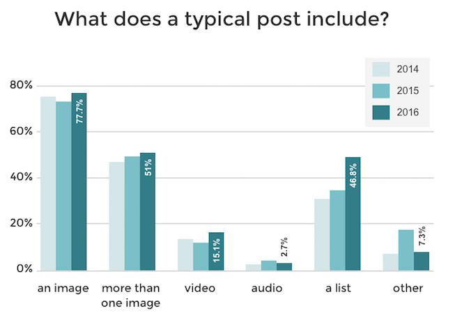
Most posts include at least one image, but far fewer include several. Multiple, purposeful visuals give you a real advantage.
Next, let’s look at the visual types that consistently drive engagement—and how to use each well.
Create infographics
Charts and infographics spotlight data in seconds. They validate your claims and strengthen credibility—especially when you cite reputable sources right on the graphic.
They also aid memory. People retain information better when text and visuals reinforce each other, so pair key stats with simple, well-labeled graphics.
When you can, create original infographics for your posts. Original visuals are uniquely link-worthy and shareable, earning citations that compound over time.
Try using free online resources, such as Canva, to design your infographics.
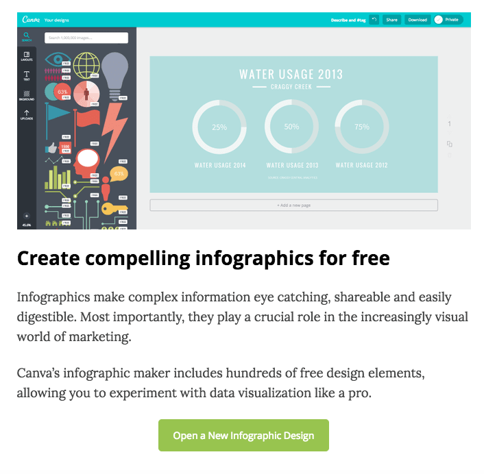
The platform is straightforward—you don’t need formal design training to ship clean, branded visuals.
Infographics shine when your post covers proprietary data or a multi-step process. They’re also great for “before/after” comparisons, timelines, and checklists. Add the source line and date on the graphic, keep labels plain-language, and avoid clutter.
There’s a bonus: original infographics attract links. Other writers embed and reference them, sending qualified traffic your way and helping your overall organic visibility.
Use original photos
Originality matters. Even if others cover a similar topic, your own photos differentiate your post and signal real-world experience.
If you reuse a third-party chart or stock image, others likely will too—that’s fine, but pepper in your own photos to make the piece feel lived-in and trustworthy.
Original photos—behind-the-scenes shots, product close-ups, process steps, whiteboard sketches—inject authenticity. They communicate that you’ve actually done the work.
If you’re handy with a camera, great. If not, your smartphone is enough. Good lighting, simple backgrounds, and steady framing beat fancy gear.
Skip generic image searches when possible. Your own pictures feel more credible than glossy stock that readers have seen a hundred times.
Authentic photos can also earn inbound links when others cite you as the source—another quiet lift to visibility over time.
No DSLR? No problem. Learn a few basics—natural light over flash, the rule of thirds, clean up the frame, and take 3–5 angles per shot. Minor cropping and straightening go a long way.
Get out and shoot. A small library of originals makes your future posts faster to produce and far more engaging.
Annotate screenshots
“How-to” content performs best with visuals that show the exact clicks and fields. Think like a teacher: each step should be obvious without reading a paragraph of instructions.
When you walk through a process, pair short steps with annotated screenshots. Use arrows, boxes, and brief labels. Keep the focus tight and crop out distractions.
It’s easier to learn by seeing. Screenshots with minimal markup reduce confusion and help readers succeed on the first try.
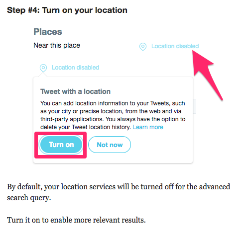
For example, here’s a section from a post about generating leads on Twitter:
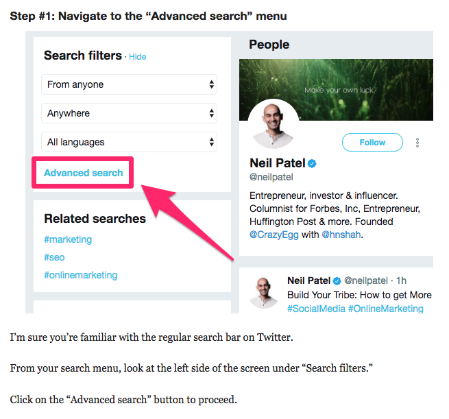
In this step, we highlight how to use Twitter’s advanced search to find prospects so the action is unmissable.
Rather than saying, “Click the advanced search button,” we show exactly where it is and add a short note for context.
Here’s another example from the same post:
Again, the annotation points directly to the control so readers don’t have to hunt around the interface.
We’re sure your computer has some screenshot editing software, but we like to use Skitch to annotate our content.
It’s free and simple. Built-in tools on your operating system work well, too—use whichever lets you add clear arrows and short labels quickly.
Add videos
So far we’ve focused on images, but video belongs in your toolbox as well.
Short, relevant videos increase time on page, clarify complex ideas, and let you demonstrate outcomes in real time.
Check your analytics for average time on page and drop-off points. Strategic video embeds can lift both.
Even better, you don’t need to produce new footage for every post. Repurpose high-performing videos from your library when they match the topic.
Have a YouTube channel? Great—embed those demonstrations, walkthroughs, or case studies wherever they reinforce your text.
Anytime your post aligns with an existing video, embed it. It’s fast leverage.
Like images, videos also break up text and reset reader attention. Here’s an example from a post we wrote about Facebook cover photos:
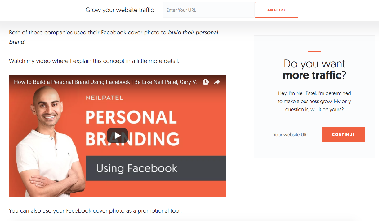
We embedded a directly relevant YouTube clip so readers can see the concepts in action without leaving the page.
One quick tip that consistently boosts results: captions. They help viewers follow along with the sound off, improve accessibility, and often increase completion rates.
Add captions. Captions tend to lift views and watch-through; in some tests, the improvement has been in the single-digit percent range—but meaningful at scale.
Conclusion
If you want higher engagement, add more—and better—visuals to every post.
Know your audience’s behavior: most skim. Structure for scanners with short sections, clear headings, and visuals that surface your key points.
Use a mix of formats. Diagrams, charts, and custom infographics make data stick. Original photos add credibility. Annotated screenshots remove guesswork. Videos demonstrate outcomes and keep people on the page.
Keep a steady cadence of visuals across the full post, write descriptive captions or nearby context, and make every asset earn its place by clarifying or proving a point.
Do this consistently and your blog will feel clearer, more useful, and more memorable—exactly what readers (and customers) return for.