Color is one of your business’s most sneakily influential levers—even if it doesn’t seem like it at first glance.
It shapes how people perceive your brand and it affects the bottom line. Customers make snap judgments about whether to explore, trust, and buy based on your color choices. That’s why restaurants are intentional about color—it nudges appetite, energy, and spend behavior.
This isn’t hearsay. Color psychology is a legitimate field of study. It influences daily decisions and can meaningfully shape how people experience your products, pricing pages, and checkout flow. Research consistently shows color affects brand recognition, perceived quality, and purchase intent—especially in low-information, fast-choice scenarios—though the size and direction of effects depend on context, category, and audience.
Eye-opening, yes—but color isn’t a magic switch. Repainting your site from red to blue won’t double sales overnight. Conversion optimization is a system. Color is one piece of the puzzle alongside messaging, offer, UX, and speed.
Still, it proves you should choose colors for more than aesthetics. With the right palette and usage, you can guide attention, reduce friction, and increase meaningful actions across your site.
Those improvements add up to more sales and more revenue.
In this post, I’ll break down practical ways to use color well and make confident creative choices for your ecommerce shop. Later, I’ll also point you to helpful resources for designing a high-performing ecommerce experience.
7 Tips to Choose the Right Color Schemes for Your Business
- Choose colors for your brand—not just your ecommerce store
- Apply color psychology
- Consider your industry and products
- Consider your target demographic
- Use the right color usage pattern
- Consider user experience
- Color psychology won’t always fit your business
As with anything in business, what works best for you will be unique. Just because other ecommerce stores lean on a specific palette doesn’t mean you should copy it.
UPS and FedEx sell similar services but signal different brand promises with distinct palettes (UPS with brown and gold; FedEx with blue, orange, and white).
Also remember: color theory and psychology are guides, not laws. Use them as starting points for your final design.
With that out of the way, I’ll jump in.
Tip #1: Choose colors for your brand—not just your ecommerce store
Too many entrepreneurs treat color as a surface choice. It’s a branding decision. Without a clear brand, you can’t reliably choose the right visual system.
Your store is no exception. Your palette should be consistent across every asset—website, emails, packaging, social posts, ads, and business cards—so customers recognize you instantly.
Pro teams nail this. The Los Angeles Lakers’ purple-and-gold is unmistakable across uniforms, merch, social, and ads. That consistency builds memory and trust.
Don’t just pick a few colors you like and run with them. Get crystal clear on your brand first; translating that identity into color gets much easier once values, voice, and audience are defined.
Use these prompts to translate brand identity into color direction:
- In one sentence, state who you are, what you do, and whom you do it for.
- Choose one word that describes your ideal customer.
- Choose one word that describes your brand.
- How do you want people to feel during and after interacting with your business?
- What problem do you solve, and how do customers feel once it’s solved?
Capture your answers. You’ll use them in the next tip.
Tip #2: Apply color psychology
In the exercises above, I place a lot of emphasis on feelings.
Mood influences purchasing. A frustrated visitor needs more proof and reassurance; a confident visitor is primed to act. Color can tilt that mindset before a single pitch is read.
That’s where color psychology helps. The right palette can shape first impressions and set expectations for your offer and price point.
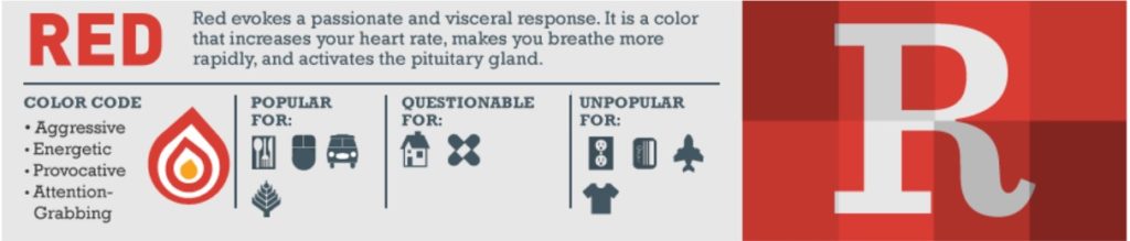
Think about red’s connotations of energy and urgency—it’s why you might choose a bold red outfit to stand out. Used well in UI, it can cue action or attention.
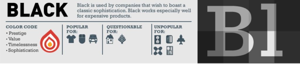
Or black’s association with sophistication and luxury. Used well, it signals premium quality and restraint—perfect for high-end products.
I associate emotions, concepts, and qualities with colors because of cultural conditioning and experience. Use those connotations to your advantage—but always in context.
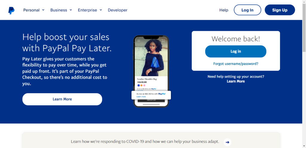
Want to emphasize trust and dependability? Consider blue. Financial brands often lean on it because it reads as secure and steady.
That’s why it fits companies like PayPal.
So does Citigroup.

And many others like Goldman Sachs.

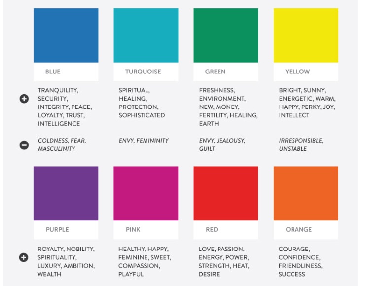
Just note: every color can evoke positives and negatives depending on hue, saturation, and context. Even blue can read cold or distant if overused.
And some more …
Note: Color psychology is more nuanced than a simple chart. Consider shade, contrast, saturation, industry norms, and audience expectations—not just your logo and header.
The takeaway: use these patterns, but validate them with your brand positioning and actual customer behavior.
Tip #3: Consider your industry and your products
Most industries have familiar palettes your audience already recognizes.
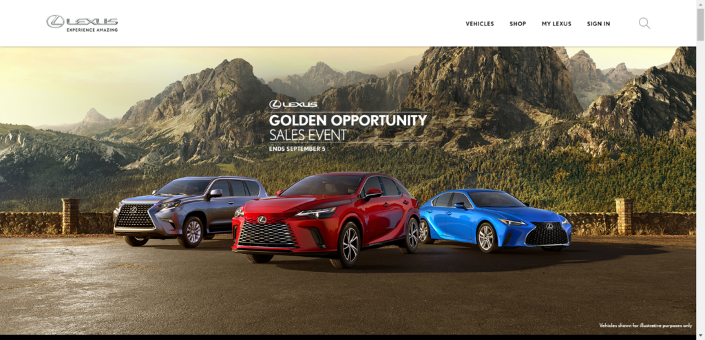
Luxury auto brands favor black, gold, and silver to evoke refinement, wealth, and status.
Take Lexus, for instance.
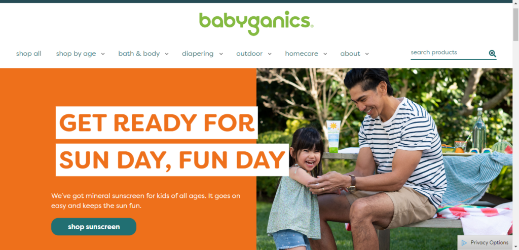
Health and eco-forward brands like Babyganics gravitate toward greens, blues, and yellows—fresh, natural, and playful.
Do a quick landscape review. Visit competitors and adjacent brands. Note palettes, use of white space, button colors, and product photo backgrounds.
What works—and why?
What patterns keep showing up?
This exercise helps even if you ultimately zag. Understanding the visual language of your category makes intentional differentiation easier.
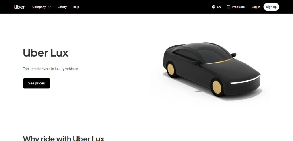
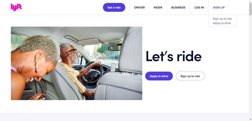
You might also see an overused hue and decide to stand out. That’s what Uber and Lyft did. Uber leans black—sophistication, luxury, reliability—and even offers services tailored to riders who want a premium experience.
Lyft uses white and magenta—friendlier, more playful, and a better fit for social, casual rides.
Go deeper: Uber Eats documents its core colors and usage. Skim it to see how a large company reasons about palette and consistency.
Tip #4: Consider your target demographic
This is one of the most crucial steps.
Know your audience deeply. It informs what you sell, where you market, and the colors that feel “right” to your buyers.
And your color scheme is no exception.
Great brands serve a well-defined group of people. Palette preferences shift across gender, culture, locale, and age—and so do associations.
Consider culture. White often symbolizes purity and new beginnings in the West but is associated with mourning in many parts of East and South Asia. Purple is linked with mourning in some Catholic communities in Brazil and with widows’ mourning in Thailand. If you sell internationally, sanity-check your palette against local conventions.
Define who you serve—age, location, culture, language, context of use—and let those insights guide your palette choices.
For example, imagine a time-pressed marketing VP who values expertise and clarity. A palette anchored in cool, professional hues (e.g., blue with a violet accent) can reinforce intelligence, calm, and confidence.
Tip #5: Use the right color usage pattern
Industry norms and audience specifics both shape your palette—but there’s no one-size-fits-all answer.
When options feel overwhelming, lean on usage patterns that are proven to look good and work well.
There’s no universal “best” color. It’s about combining complementary hues and values to create a distinct, memorable system.
That approach keeps you inclusive while still prioritizing visual appeal and clarity.
Use this simple three-step formula:
Step #1: Choose a core color.
This is your base—the one visitors will see most. Pick a hue that aligns with the feeling you want to evoke.
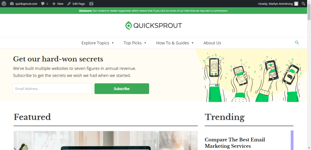
For instance, Quick Sprout’s core color is green—growth, abundance, and money—which maps to my purpose of helping businesses grow.
That mission makes green a natural fit for my industry and audience.
(And yes, choosing the right palette is part of that growth.)
Step #2: Choose a color complementary to your core color.
Your secondary color should contrast and complement your base. A quick rule of thumb: use the color wheel to find opposites and near-opposites that pair well.
The color wheel shows primary, secondary, and tertiary relationships. Colors opposite each other typically provide pleasing contrast—useful for headings, badges, and secondary buttons.
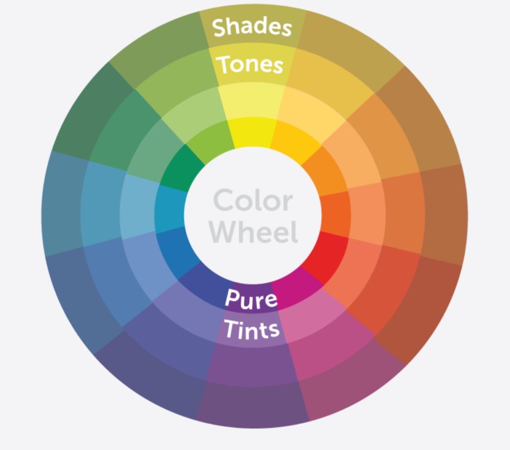
Go deeper: The wheel also helps you evaluate contrast and harmony beyond simple opposites. Learn how designers apply it here.
Just remember: some pairings carry strong cultural meanings (e.g., red and green read as “holiday”). Choose combos that support, not distract from, your message.
You don’t have to pick exact opposites either. Analogous and split-complementary schemes can look great and be easier to extend.
Step #3: Choose a color that pops against the other two.
This is your accent—the color for calls to action, key links, and important notices. It should be clearly visible against your base and secondary colors so visitors can’t miss what to do next.
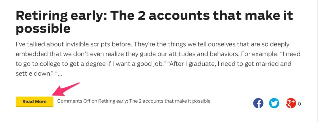
Consider Ramit Sethi’s site.

Calls to action are consistently yellow—and they pop against high-contrast black and white backgrounds.
Here’s a call to read more content:
And a prompt to enroll in a course:

That consistency + pop combo quietly directs behavior without shouting.
How do you pick your accent?
Use the wheel again. With three colors, a triadic scheme gives you balance and contrast across UI elements and content components.
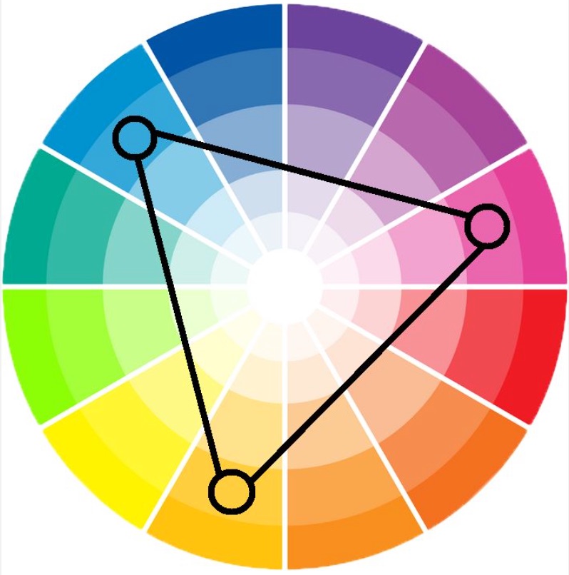
Practically, that means you’ll get close to the opposite of your base color without picking the exact complement, which can look jarring at scale.
Example: if blue is your base, orange is the complement. For a triad, you might choose purple as your secondary and use yellow as your accent for CTAs and highlights.
Want more than three colors?
Same principle: keep relationships intentional. Use contrasting yet compatible hues, and ensure each has a job (base, surface, text, CTA, feedback).
Tip #6: Consider user experience when selecting a color scheme
Above all, optimize for user experience.
Readability is where color decisions most often help or hurt.
Nothing drives bounces faster than low-contrast text (e.g., yellow on white or light gray on white).

Choose high-contrast pairings for body copy and buttons. A classic white background with black or very dark text is still hard to beat for long-form readability. As a baseline, follow current WCAG guidance: at least a 4.5:1 contrast ratio for normal text (3:1 for large text), and ensure UI components have sufficient contrast. Use a contrast checker before you ship—then test hover/focus states and dark-mode variants on real devices.
Tip #7: Color psychology won’t always fit with your business
By now you’ve seen how many factors influence palette choices.
Color psychology has extensive academic backing, but business context rules. Your brand position and audience expectations should guide the final call.
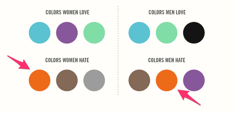
For instance, broad “men vs. women” preference charts can be misleading. Some surveys report lower affinity for orange, yet plenty of successful brands use orange effectively as an accent. Always validate assumptions with your own audience and A/B tests.
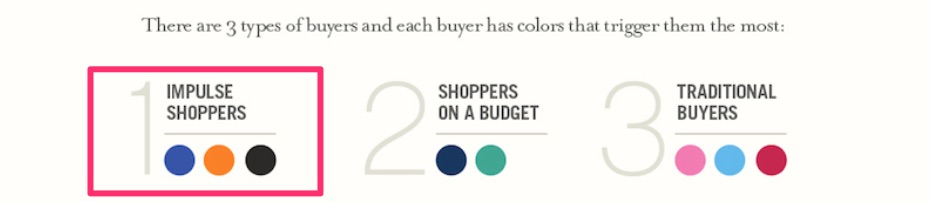
Amazon is a prime example. Early on it leaned heavily on orange (today it uses orange as an accent). Orange can also encourage impulse actions when used thoughtfully.
No single palette makes people line up to buy. But using color intentionally is a powerful starting point for better UX and higher conversions.
So study color psychology, understand its impact on attention and emotion, and then adapt it to your brand and audience.
Pick colors you genuinely like and can commit to across channels.
Then test. Run split tests where color is the only variable on your CTAs, headers, and badges. Keep the winners; iterate on the rest.
Conclusion
I’m a champion of color strategy and consumer psychology because I’ve seen them work in the real world.
But I’m equally committed to practice over theory.
Your brand and buyers are unique. The only way to know what resonates is to apply these principles, measure the impact, and refine.
With the guidance above—and a little testing—you’ll land on a color system that looks great, reads clearly, and quietly boosts conversions for your ecommerce business.