In the early days of online marketing, a lot of shady tactics slipped through. Between inbox-clogging spam, “free iPod” scams, and flashy surprise banners, consumers were bombarded with obnoxious, over-the-top ads.
And the wild part? Many of those tactics worked. People clicked sketchy banners hoping for…who knows what.
Fast forward to today. Consumers are sharper than ever. They still see aggressive messaging, but they’re armed with spam filters, ad blockers, and a healthy dose of skepticism.
It’s safe to say the age of pushy, deceptive marketing is over. Hammer the nail in the coffin and don’t look back.
Modern marketing is about empowering buyers with what they need to make confident decisions. This post explains how to do that.
Driven By Research
Most buyers complete a big chunk of their research before they ever contact a sales rep. They compare options, read reviews, watch demos, and ask peers for recommendations long before they fill out a form or hop on a call.
With the internet in their pockets, people can access an ocean of customer reviews, blog posts, and competitor sites from anywhere in the world.
Even in your brick-and-mortar store, a shopper can pull out a phone, compare prices, and place an order with a competitor in seconds.
You can fight this behavior — and probably annoy customers.
Or you can support it fully. If people want information and can’t find it, they’ll feel frustrated. If you make everything clear, transparent, and easy to compare, they’ll be thrilled — and more likely to choose you.
The idea is simple: people don’t want to sit on hold with support. They’d rather self-serve and learn on their own timeline.
Aim to make the entire experience positive, clear, and pain-free.
But it’s not enough to publish content. Online, people have near-infinite options. When they want answers, they want them now — in the exact moment the question pops up.
That’s why your content must be discoverable and instantly accessible at the moment of need.
Brands can accomplish this in two ways:
- Match content to funnel stage. Anticipate what buyers need at awareness, consideration, and decision stages. Create the right piece for the right moment.
- Be where questions get asked. Make your site search-friendly, participate on social platforms and Q&A communities, and publish content that directly answers search queries. When people turn to a search engine, your guide, post, or comparison should be front and center.
Your content should work like a pull mechanism — helping people find exactly what they need at the moment they’re looking for it.
Create and distribute information that actually solves problems. If you publish a high-level guide on a topic your audience already knows — and skip the details they’re actively seeking — you’ll miss the mark.
Tailor what you create to the specific needs of your audience. This guide exists because readers asked for it.
Chances are, you already have a sense of what customers want. If not, start here:
- Review your Google Analytics 4 (GA4) and Google Search Console to see the queries, pages, and on-site searches that bring people in — and where they drop off.
- Talk to your customers. Interview them. Ask open-ended questions about goals, blockers, and what would make your product indispensable.
- Ask sales, success, and support teams about common questions and objections. Turn those into a knowledge center and highly targeted articles.
You could talk about anything with customers. Instead of overwhelming yourself, look for patterns. Learn what truly motivates your audience by reading between the lines. The clearer you are on what people care about, the easier it is to create content that resonates.
Strong Filtering Systems
People process information at lightning speed. They’ve developed noise filters to focus only on what’s relevant. Most people are natural skeptics and can spot B.S. from a mile away.
Even with all the noise, people are constantly scanning for real value — to learn, to advance their careers, to be entertained, or to take a needed brain break. They remember the brands that deliver.
People are bombarded with pitches and promotions — and trained to power through. They’ll hit delete and never look back.
Consumers filter with both rational and emotional brains. The strongest brands speak to both. That starts with understanding what truly motivates people.
Top Motivations
Readers of this guide are equal parts consumer and marketer. I love great marketing as an art form — when I see it done well, I notice.
But most people aren’t marketers. They’re small business owners who picked up the internet later in life. They’re surgeons who spend 5% of their time at a computer. They’re students online to unwind, not to work.
Here are the key motivations influencing consumers today:
Personal Gain
People care about products and services that clearly improve their lives. Time and money are precious. They won’t trade either for something subpar. Show a clear, compelling benefit.
Questions consumers are asking:
- What’s in it for me?
- What will I get from using your product?
- Which option gives me the most value for the time and money I invest?
Here’s how ModCloth, a women’s fashion retailer, appeals to personal gain.

Delight
Life is busy. People juggle errands, work, and family. They actively seek moments of joy, and when they find them, five minutes can feel like five hours.
Questions consumers are asking:
- Do I have to go back to work?
- How did I get so lucky?
- Can I feel this way more often?
- How do I make this moment last?
Social Influence
People trust the people they trust — friends, family, mentors, and communities. Even independent shoppers rely on recommendations and social proof.
Questions consumers are asking:
- What are my friends using?
- What would my best friends think of this?
- Would my mom give this the seal of approval?
- Can I trust this brand?
“You”
There’s power in the word “you”. It signals that the brand is focused on the customer, not itself.
Questions consumers are asking:
- Does this company care about me?
- Does this company understand me?
- Was this product designed for me?
Familiarity
Past experiences shape new decisions. Even when people are ready to try something different, they rely on memory to judge what’s safe. If they keep seeing an offer for something they’ve been eyeing, they’re more likely to buy.
Questions consumers are asking:
- Is this something I’ve wanted before?
- Have I been thinking about buying this for a while?
- Where have I seen this before?
Trust And Safety
The internet still has a reputation for being sketchy. Even legitimate companies face scrutiny. Until you prove otherwise, some visitors will assume the worst.
Questions they’re asking:
- How do I know this site won’t rip me off?
- How long has this company been around?
- Is my personal data safe?
- Do I feel okay entering my credit card here?
Build trust on your checkout page with security guarantees and badges — simple, clear reassurance at the moment of truth.
The Conversion Funnel
You’ve probably heard about conversion funnels or sales funnels. If you’re already familiar, skim ahead. If not, here’s the gist: the funnel represents the full journey a person takes before becoming a customer.
When visitors arrive, most aren’t ready to buy immediately.

That can feel uncomfortable — you want instant transactions. Direct response campaigns follow a straight line: visit > purchase.
But in reality, paths to purchase are rarely straight. They’re messy — and that’s normal.

The funnel helps you plan content, offers, and measurement for every step — not just the end.
Top Of The Funnel — Brand Awareness
People are exploring. They’re not ready to buy. They’re gathering information, researching options, and getting to know your brand — like a first date, not a proposal.
Most top-of-funnel visitors won’t become customers — that’s why it’s a funnel. Your job is to educate and earn attention.

Cast a wide net with blog posts, guides, checklists, webinars, tools, and light offers — all designed to answer real questions.
Your goals and success metrics:
- Qualified web traffic
- Email/newsletter sign-ups
- Average time on page and engaged sessions
Middle Funnel — Consideration
Your company isn’t for everyone. Only a portion of prospects make it here — and that’s fine.
Now they’re evaluating whether to do business with you. They need comparisons, pricing clarity, outcomes, and proof.
Your goals and success metrics:
- Marketing-qualified and sales-qualified leads
- Calls or demos with sales
- Meaningful 1:1 conversations and nurtures
- Free trial and freemium activations
Bottom Funnel — Conversion
Here, a subset of leads is ready to buy. They commit to contracts, purchase products, and choose you over alternatives.
Time to conversion varies by model. Ecommerce tends to be faster; services and B2B cycles are longer and involve more stakeholders.
Your goals and success metrics:
- Conversion rate and number of transactions
- Average order value (AOV) or contract value (ACV)
- Customer acquisition cost (CAC) and CAC payback
- Trial-to-paid and close rates
Post-Conversion
Don’t leave happy customers hanging. Repeat purchases and renewals are often your most profitable growth lever.
Build community, encourage sharing, and make it easy to come back. Useful lifecycle emails, education, and occasional offers keep customers engaged.
Your goals and success metrics:
- Repeat purchase rate and renewal rate
- Lifetime customer value (LTV) and net revenue retention
The Value Of Personalization
Broadcast-style messages don’t cut it anymore. People don’t have time to sift through noise.
The most effective way to spark action is with 1:1 relevance.
Use these techniques:
Create customer personas
Personas put a face to your segments. Instead of stopping at demographics, group users by goals, jobs-to-be-done, pains, and triggers. Start here:
Pick a buyer segment (product managers, men, marketers, designers, etc.). Choose a name and photo that represent the group.
Answer these questions:
- How do prospects first discover you — search, referrals, word of mouth?
- What questions do they ask at the start?
- What does the decision process look like? Which stakeholders are involved, and what objections come up?
- How long does the process take? How much time does each stage require?
- Why do deals fall through — price, fit, timing, competing priorities?
Write to these people directly. It humanizes your copy and keeps you focused on outcomes that matter.
Target your messaging to conversion-related activities on your website
Clarity, a network that connects advice-seekers with experts, is great at engaging users at the right moment.
The business model is simple: users book calls with experts. If you start to book a call and abandon the flow, Clarity notices.
They’ll send a targeted reminder to help you finish scheduling — a small nudge at a high-intent moment.

Be casual in your tone
I’ll be honest: boardrooms are stuffy. Whether you’re communicating in B2B or B2C, a stiff tone pushes people away.
Conversations with friends are more engaging. Marketers often get hung up on legalese and perfect grammar. If you obsess over formality, you bury the heart of your message.
Be yourself and let the people behind your company shine through.
Talk to buyers like you’d talk to a smart friend. Ditch the pitch. Be warm, helpful, and down-to-earth.
Pay attention to subtleties
What you say matters — but how you present it matters just as much. Stock photos might look fine, but they rarely feel authentic. People notice those details, even if they can’t explain why.
Use real customer stories, real screenshots, clear alt text, and inclusive language. Authenticity beats polish.
Reciprocal Altruism
There’s a concept in consumer psychology called reciprocal altruism. In marketing terms, when brands genuinely give value away, they earn attention, trust, and loyalty — and more than make it back.
Give generously — through useful posts, videos, tools, and e-books — and you’ll see disproportionate returns over time. Useful, ungated content builds trust fast.
The best part: it’s measurable. Use GA4, your CRM, and attribution to connect content consumption to assisted conversions, pipeline, and revenue.
How To Measure A Customer Bond
Great marketers drive sales by appealing to real customer psychology. That’s not wishful thinking — it’s measurable and optimizable.
Anchor on one foundational metric: lifetime customer value (LTV).
Teams that build lasting bonds prioritize LTV over vanity wins. Many organizations fixate on short-term direct response only. That limits growth.
A $1,000 campaign might look negative in-session but generate $5,000 in LTV over time. If you only chase immediate revenue, you’ll miss the long-term lever.
Optimize the gap between in-session revenue and LTV. Create a buffer that lets you invest now and realize larger gains later.
The Psychology Of Color
Color and visual cues can dramatically influence conversion rates by guiding attention, shaping emotion, and clarifying what to do next.
People skim online at high speed. To earn a click or a scroll, your page needs strong visual hierarchy that stands out from everything competing for attention. Color is one of the simplest, most reliable ways to create that contrast and hierarchy.
Color has value far beyond aesthetics—and individual color preferences directly impact marketing performance and conversion optimization. Color surrounds us, but we rarely stop to consider how it nudges perception and behavior.
Read on to master practical color psychology for modern web design and marketing.
Color Theory
There is a well-established science to choosing colors that work together. While taste, culture, generation, and personal preference introduce subjectivity, designers and psychologists rely on best practices to build dependable palettes. Colm Tuite, a user experience designer, uses the following framework.
Pures, Tints, Shades & Tones
PURE COLOR

Pure hues aren’t mixed with other colors. They’re common in bright designs and work well for youthful, summery, energetic, or “cool” brand expressions that need immediate impact.
TINTS

Tints are created by mixing a hue with white. They feel lighter, calmer, and less intense than pure colors. Tints are often used by health, spa, wellness, and beauty brands to convey serenity, care, and approachability.
SHADES

Shades are created by mixing a hue with black. They can communicate mystery, sophistication, drama, or danger. Shades pair well with gradients and with lighter tints to create depth and focus.
The Meanings Of Colors
Colors carry cultural, emotional, and social associations. Below are common Western associations that can influence first impressions and brand fit.
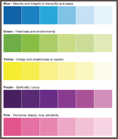
Tints and shades modify those meanings. A darker blue can signal stability and integrity; a lighter blue feels airy and tranquil. Over time, organizations also reinforce associations—think deep purples and reds in religious contexts or pink’s association with femininity. Nations do the same (e.g., Ireland and green). Use these patterns as a starting point, then validate with your specific audience.
Remember: context matters. The same color can feel premium or playful depending on typography, spacing, and imagery around it.
Maintaining Simplicity
A frequent mistake is using too many colors. Most interfaces perform best with one dominant brand color paired with neutrals (white, gray, black, or off-white). Too many hues create mixed messages and visual fatigue; fewer colors create clearer hierarchy and easier decisions.
Contrast
High contrast is essential for readability and emphasis. Dark-on-light or light-on-dark pairings typically work best—hence black text on white pages in print. Yellow and light green have low luminance and are hard to read on white. When in doubt, test contrast against accepted accessibility thresholds and consider how your colors perform in both light and dark modes.

Example
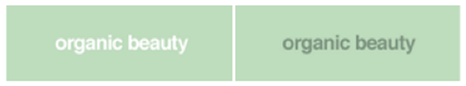
Imagine a spa owner approaches your design team for a logo. The spa uses natural, organic products and targets women. She wants a peaceful, restorative vibe—so tints are a better fit than pure colors or heavy shades. Colors frequently associated with tranquility and femininity include pink, yellow, purple, and blue.

To emphasize “organic,” green is a natural choice because it cues freshness and nature. But a deep, saturated green can feel heavy or less feminine in this context:

Lightening the green shifts the mood toward gentle and calming while keeping the “natural” association intact.

Adding a touch of blue introduces tranquility and spa-like serenity without losing the organic feel.
Color And Conversions
Quick facts about color and conversions (with the caveat that results depend on context, audience, and design quality):
- Visual appearance is a leading factor in purchase decisions for many shoppers, often outranking other sensory cues when browsing online.
- People form subconscious judgments about products within seconds of first view, and color plays an outsized role in that initial impression.
- Full-color ads consistently outperform black-and-white ads for attention and recall in controlled studies.
- Packaging and product color changes can materially affect sales (famously, color variants can drive short-term spikes by renewing attention and novelty).
Additional perspective on how color influences purchasing:
- When launching new products, visual appearance and color are often evaluated before features—especially in crowded categories.
- Color can be a primary reason to pick one product over another when options feel otherwise similar.
- Consistent color use strengthens brand recognition and can build confidence and trust over time.
- Color preferences vary across geographies and cultures. What’s compelling in North America may not resonate elsewhere—validate with target users.
- Color is one element among many that drive behavior. Information scent, copy, layout, load time, and convenience also have major effects.
Color affects us in countless ways—mentally and physiologically. Poor color choices can hurt usability and conversions as much as weak copy or slow performance. Treat palette decisions like any other CRO variable: hypothesize, test, and iterate.
Gender
Gender is often discussed in color preference research, but broad generalizations are risky and increasingly unhelpful. Your audience is a mix of people with diverse identities and tastes. If your visuals lean too hard into one gendered stereotype, you can alienate large parts of your market.
Shift from “what I like” to “what the audience needs.” Color is one of the most practical tools for inclusive marketing when used thoughtfully.
In short: research shows mixed and context-dependent findings on gender and color. Preferences overlap far more than they diverge.
Historical studies observed differences, but modern marketing practice prioritizes audience fit over stereotypes. A better approach:
- Review classic research as inspiration—not as rules. Consider that early studies used different methods and populations than today’s audiences.
- Test with your real users. Let inclusive design and A/B tests validate what resonates for your segments rather than assuming preferences.
- Favor accessible, high-contrast palettes and clear hierarchy, which benefit everyone regardless of preference.
Cultural and social contexts evolve. You won’t please everyone with one palette, and perfectionism delays progress. Move forward with research and testing.
The best answers live in your data. Pair qualitative interviews with continuous A/B testing to see how color changes affect engagement and conversion in your funnel.
Accessibility
Design for how people actually see. Many users have low vision or color-vision deficiencies. The W3C Web Accessibility Initiative offers guidance to help designers build inclusive experiences. Use it to set color checkpoints and verify contrast in real interfaces.
Brightness
Instead of relying on legacy “brightness” shortcuts, use WCAG contrast ratios. For body text, aim for at least 4.5:1. For large text (18pt regular/14pt bold and up), logos, and bold headlines, 3:1 is generally acceptable. Interactive/non-text UI components (buttons, inputs, icons) should also meet at least 3:1 against adjacent colors to remain perceivable. WCAG 2.2 additionally emphasizes visible focus indicators—don’t rely on color alone; ensure focus styles have sufficient area and contrast.
Test colors in both light and dark themes, and avoid relying on color alone to convey meaning—pair color with labels, icons, patterns, or text states. If your audience uses modern wide-gamut displays (e.g., Display-P3), preview palettes in both sRGB and wide gamut to prevent unintended oversaturation.
Color Difference
Perceived “difference” comes from hue, saturation, and luminance. Prioritize luminance contrast for readability, then fine-tune hue and saturation for brand expression. Validate with contrast-checking tools and color-blind simulators rather than manual formulas. (APCA/“WCAG 3” research is ongoing; treat it as complementary guidance alongside WCAG 2.2.)
Ensure text, icons, focus states, and form errors remain visible under common color-vision deficiencies (protanopia, deuteranopia, tritanopia) and in grayscale. Clear outlines, underlines for links, and patterns for status states help non-color cues stand out.
Remember: contrast requirements apply to text and essential graphics. Decorative elements don’t need strict ratios, but they shouldn’t distract from readable content.
Rules Of Thumb
Use these practical guidelines to keep your site accessible:
- Use sufficiently large, readable type. Color works with typography, spacing, and layout to determine overall legibility.
- Keep paragraphs short so content is scannable (and users don’t face a wall of color).
- Use complementary and contrasting colors between background and foreground. A color wheel can help you find pairings, but always check contrast ratios against WCAG 2.2. Ensure focus states and error messages are identifiable without relying on color alone.
Relevance To Sales
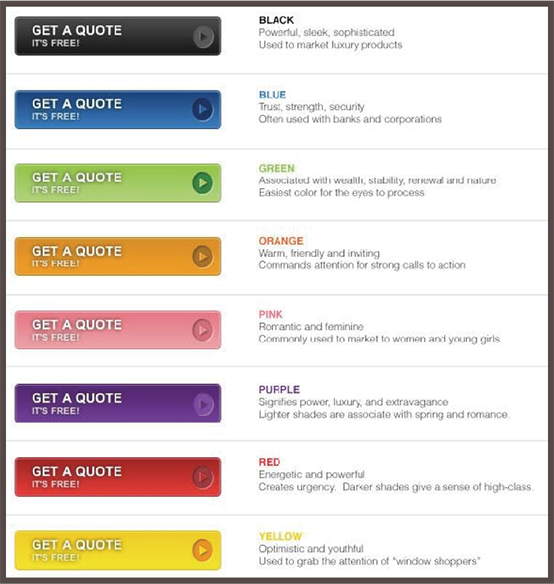
When choosing colors for pages, forms, and calls to action, you’re shaping behavior—not just decorating. Here’s a helpful overview from Ren Walker at Adpearance that frames common CTA color choices in Western markets.
So which color should you pick? Even with color psychology knowledge, context wins. Choose colors that match the page’s job and audience expectations.
Start by considering the form’s risk and information sensitivity. If you’re asking for personal details, calmer hues (greens, blues) often feel safer. Then look at the full page: your CTA must both stand out from its surroundings and keep text-to-button contrast at or above accessibility thresholds.
Capturing Audience’s Attention
Consider this widely cited A/B test:
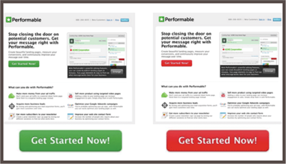
Performable—an email marketing platform later acquired by HubSpot—reported a 21% lift when its CTA changed from green to red on a green-dominant page.
The takeaway isn’t “red beats green”; it’s “contrast beats camouflage.” The winning color stood out from the page’s palette and focused attention on the action.
Apply the principle: choose CTA colors that clearly separate from background and adjacent elements while still fitting your brand palette, and verify that the label text on the button meets contrast requirements against the button fill.
Website Elements Affected
Color choices influence many interface components. Focus on these:
Text Links
Monochromatic links can disappear. Give links a distinct color and consider subtle backgrounds or underlines on hover and focus to lift them off the page and improve orientation.
Navigation
Saturated colors and clear active states draw attention to navigation. Use consistent color cues for “current page” and hover/focus to improve wayfinding.
Buttons
Make primary actions visually distinct from secondary or tertiary actions. Size, weight, and color should all signal priority and next steps at a glance.
Headings
Use restrained color in headings to clarify hierarchy and spotlight key ideas without overwhelming the layout.
List Items
Color can emphasize key bullets or features. Use it sparingly so emphasis remains emphasis—not the baseline.
Complement Your Brand’s Personality
Color is a powerful lever for brand personality. Use it to accentuate identity and create a cohesive system across pages and channels. Color should work with your brand voice, tone, and values—not fight them.
Here are the steps that I advise marketers take:
Step 1 – Decide Which Emotions You Want to Convey
Define the feelings you want to evoke, then pick colors to support them. Choose from common palette structures:
- Monochromatic: colors from a single family (e.g., blues at different tints and shades)
- Analogous: two or three neighbors on the color wheel
- Complementary: two colors opposite each other on the wheel
- Triadic: three colors evenly spaced on the wheel
Step 2 – Choose the Palette That Best Communicates Your Company’s Style
- Warm and Comforting Browns – Browns suggest home, craft, and warmth. Pair with grays or blues for grounded, cozy experiences.
- Playful Greens – For playful or energetic brands, greens with blues and oranges can feel fresh and down to earth while keeping momentum.
- Serious Blues – Blues are calming and trustworthy. Combine with gray, tan, or muted orange accents—but keep secondaries restrained to avoid visual noise.
- Energetic Reds – Reds inject energy and urgency. Use ample white space and clear hierarchy so intensity doesn’t overwhelm readability.
Step 3 – Know Your Niche
Industry context shapes expectations. A finance site should feel grounded and trustworthy. Pushing too far from norms can create cognitive dissonance and erode confidence.
You wouldn’t want to use a rainbow of brights or a fast-food red/yellow combo for wealth management.
Instead, consider a smooth green for growth and stability. Accents of gold and black can reinforce prosperity and longevity without feeling heavy.
Financial brands can still feel modern and approachable—think refined palettes, generous spacing, and clear microinteractions instead of loud color walls.
Don’t forget white space. Strategic breathing room makes pages feel clean and trustworthy—critical for conversions in finance and other high-consideration niches.
Key Color Psychology Takeaways
I could talk about color all day, but here are the essentials to move forward with confidence:
- There’s a science to harmonious color. Master pure hues, tints, and shades—and know the moods they tend to evoke.
- Colors come with cultural context. Start with common associations, then validate with your audience.
- People have different visual abilities. Use high contrast to keep text readable, regardless of screen, lighting, or eyesight.
- Red and green are common problem colors for color-vision deficiencies. Provide non-color cues and ensure contrast.
- Color can boost conversions when it clarifies hierarchy. Make CTAs contrast with surrounding elements so they’re unmissable.
- Let the data decide. Treat palette choices like other CRO variables—A/B test and iterate.
- Respect industry norms enough to avoid confusion. Go too off-brand for the niche and users may misread your intent.
- When in doubt, blues and greens are broadly accepted—and are easier to keep accessible across light/dark modes and device color gamuts.
- Invest in strong visual design. Consistent, intentional color use supports brand recognition and trust.
- Use color to emphasize navigation, lists, buttons, and other key elements—sparingly and purposefully.
- Memorable doesn’t mean loud. Aim for distinctive, consistent palettes that users can instantly associate with your brand.
- Ask customers what resonates, study peers in your niche, and use modern accessibility checks and testing tools (WCAG 2.2 contrast, focus visibility, and color-blind simulators) to confirm your choices. Keep an eye on APCA guidance as it matures.
The Psychology Of Pricing
Pricing goes beyond profit margins. It’s also a marketing lever that can boost sales volume and shorten time-to-purchase. When you think about pricing, you need to focus on more than covering operating expenses. You need price points and messaging that make people feel confident hitting “buy.” This post shows you how to do that—ethically and effectively.
Emphasize Value & ROI Above Cost
Instead of leading with what prospects will spend, lead with what they’ll earn or save. As a marketer, you know costs are always relative to outcomes. Rather than fixating on having the “lowest price,” communicate that your product delivers unbeatable results for the right customer.
Bidsketch, a company that sells proposal templates to agencies and freelancers, illustrates this idea. The product helps subscribers create polished proposals in minutes—a task that might otherwise take solopreneurs hours (sometimes days).
The message centers on ROI: time saved and revenue won. That’s the language buyers care about most.
Business owners are well-aware that time is more valuable than money.
One testimonial highlights a client who cut proposal creation from 3 hours to 45 minutes. Bidsketch also positions the product as a way to slash proposal time in half—clear, outcome-focused language that makes the value obvious.
Collectively, Bidsketch now reports that customers have earned over $2 billion using the platform—evidence that users can win more business in less time.
Now comes the tough question—how much does this cost? The homepage explains the benefits and value clearly, but what level of commitment is required to get started?
$29 per month.
A smart business owner immediately runs a quick cost-benefit analysis:
Say it takes 3 hours to complete a proposal. Anyone who runs (or works for) a business can approximate their hourly rate. For clarity, assume $100/hour. Using Bidsketch, proposals take ~1.5 hours instead of 3, so the labor cost drops from $300 to $150. If the tool costs $29, the incremental value on that one proposal is $121.
Is the $29 cost worth it? Absolutely. In fact, it’s a no-brainer.
Cost is always in the eye of the beholder. Lead with ROI before cost enters the conversation. When you articulate outcomes in concrete terms, your price looks small relative to the value.
If Bidsketch took a different approach and hid the value on its homepage, a $29 monthly price would feel much bigger.
Small business owners and entrepreneurs are famously frugal. They’re often investing personal savings back into the company. Why spend $29 on a proposal tool when you could put that money into Google Ads (or next week’s groceries) instead?
All of a sudden, cost becomes the headline.
“It’s Miller Time”
For a beer brand, a slogan that sells “time” instead of “price” might sound odd at first.
But research on “selling time” over money suggests it can be the perfect choice.
“Because a person’s experience with a product tends to foster feelings of personal connection with it, referring to time typically leads to more favorable attitudes—and to more purchases.”
So says Jennifer Aaker, the General Atlantic Professor of Marketing at Stanford Graduate School of Business.
Why does focusing on experience (or time spent) with a product often beat highlighting a favorable price?
Aaker noted that many (around 48% of those analyzed) advertisements referenced time—suggesting marketers intuitively grasp its importance to consumers.
Until recently, few controlled studies backed this up.
In their first experiment, Aaker and co-author Cassie Mogilner set up a lemonade stand using two 6-year-olds (to make it feel authentic).
The lemonade cost $1–$3 (customer’s choice), and they rotated three different signs.
The 3 separate signs to advertise the lemonade were as follows:
- The first said, “Spend a little time and enjoy C&D’s lemonade”
- The second said, “Spend a little money and enjoy C&D’s lemonade”
- The third said, “Enjoy C&D’s lemonade” (neutral sign)
Even with this simple setup, the results were clear.
The sign emphasizing time attracted about twice as many customers, who also paid roughly twice as much.
The researchers offered a few explanations:
- Our relationship with time is more personal than our relationship with money.
- “Ultimately, time is a more scarce resource—once it’s gone, it’s gone—and therefore more meaningful to us,” says Mogilner.
- “How we spend our time says more about who we are than how we spend our money.”
A second study drove the point home.
At a concert with free admission, the real “cost” was time—people stood in line to get good seats. Researchers asked attendees one of two questions.
This time only two questions were asked. The “cost” was actually time, as the concert was free, but people had to “spend” time in line to get the good seats.
The two questions asked by the researchers in this scenario were:
- “How much time will you have spent to see the concert today?”
- “How much money will you have spent to see the concert today?”
The results?
Even where time was the only resource spent, asking about time increased favorable opinions toward the concert.
Not only that, people who waited the longest—incurring the highest “cost”—reported the greatest satisfaction.
“Even though waiting is presumably a bad thing, it somehow made people concentrate on the overall experience,” says Aaker.
So what’s the takeaway?
Marketers should highlight the meaning and experiences their products create before fixating on price. When appropriate, sell the time, not the tag.
The notable exception: prestige products.
If you sell sports cars or bespoke suits, status may trump time. For these purchases, ownership itself carries the value.
“With such ‘prestige’ purchases, consumers feel that possessing the products reflects important aspects of themselves, and they get more satisfaction from owning the product than from spending time with it,” says Mogilner.
When you price your product, factor in the value of customers’ most precious resource—their time. In many cases, emphasizing time saved and outcomes achieved will be more persuasive than a deeper discount.
Be Wary Of Comparative Pricing
You walk into a drugstore to buy Ibuprofen. You’re faced with two options—a major pharma brand and a generic.
The generic is 30% cheaper than its retail equivalent. Why not save a few dollars?
Comparative pricing isn’t as foolproof as it seems. Price comparisons can sway perceptions in unexpected ways.
According to Itamar Simonson, consumers don’t always pick the cheapest option. Many choose the brand that feels like a ‘safer’ bet—or avoid purchasing altogether.
Research from Stanford shows that asking customers to compare prices can have unintended consequences. The study examined both implicit and explicit comparisons.
Implicit comparisons occur when a customer decides on their own to weigh options.
Conversely, explicit comparisons are introduced directly by the marketer or advertiser.
To test comparative advertising, Simonson and Dholakia ran two trials.
The first involved selling CDs on eBay.
The researchers listed top-selling albums in CD format, such as “The Wall” by Pink Floyd.
The cost of the CDs for sale always started at $1.99.
They then “framed” these auctions in two distinct ways.
In one setup, the CD was ‘flanked’ by two additional copies (same title) with a starting bid of $0.99.
In the other, the CD was flanked by two copies starting at $6.99.
The results were clear: CDs flanked with higher-priced options ($6.99) consistently attracted higher final prices than CDs next to $0.99 offerings.
“We didn’t tell people to make a comparison; they did it on their own,” said Simonson.
“And when people make these kinds of comparisons on their own, they are very influential.”
To test explicit comparisons, the researchers repeated the experiment but asked buyers to compare the $1.99 CD to the adjacent offerings.
In that scenario, the starting prices of nearby CDs became statistically irrelevant to bidding on the middle disc.
Buyers also became more cautious and risk-averse:
“The mere fact that we had asked them to make a comparison caused them to fear that they were being tricked in some way,” said Simonson.
People placed fewer bids, waited longer to place the first bid, and were less likely to participate in multiple auctions.
“Marketers need to be aware that comparative selling, although it can be very powerful, is not without its risks.”
Keep that in mind before you directly compare your product to a competitor’s. Use comparisons sparingly, and only when they add clarity rather than doubt.
Instead, you may get better results by highlighting unique strengths, using proof of outcomes, and emphasizing time saved over money saved…
Avoid Option Overload
Pricing is where art meets science.
On one hand, you want to empower customers with information, flexibility, and ‘premium’ packages.
But when it comes to pricing, less is often more.
As Unbounce’s Oli Gardner puts it, “Consumers constantly face “analysis paralysis,” where too many options result in no decision being made.
Gardner explains this with the Toothpaste Trance: an aisle full of nearly identical choices overwhelms shoppers. They stop evaluating individual benefits and start seeing everything as ‘one and the same’, leading to random or deferred decisions.
A famous supermarket jam study by Sheena Iyengar and Mark R. Lepper tested tasting stations with 24 flavors versus 6.
With 24 flavors, only 3% of samplers purchased jam. With 6 flavors, 30% purchased. More choice attracted attention, but fewer options drove action.
Apply the same thinking to your pricing tables. Choose 3–5 services your company truly excels at. Bundle features into those services and present 3 streamlined packages with a clear “recommended” option.
What matters is packaging that maps to your target customer’s jobs-to-be-done. Presentation can be as important as the price points themselves.
Consider the following case study from Visual Website Optimizer:
BaseKit, a white-label website builder, wanted to improve the performance of its pricing page. The primary metric was the number of visitors who moved from the ‘Plans and Pricing’ page to the ‘Buy Now’ page.
(For follow-up studies, Visual Website Optimizer recommended tracking revenue as the north-star metric.)
The traffic to the pricing page was primarily paid, so visitors were highly qualified.
They tested a variation with brighter, bolder, clearer pricing, added a testimonial, and made currency selection more obvious. The redesigned pricing page yielded a 25% increase in conversions:
The new design reached 95% statistical significance within 24 hours. Over the full test, it delivered a sustained 25% improvement.
Price Vs. Value
Is price a measure of value? Not necessarily, says research by Goldstein and colleagues: people “do not derive more enjoyment from more expensive wine” when they don’t know the price. Yet other studies show a strong link between price and perceived value: when told a wine is expensive, people rate it higher.
Brain imaging adds another layer.
When participants believed a wine cost more, regions associated with pleasure showed higher activation. In short, price can shape how products feel—before quality differences are even detected.
Dan Ariely found a similar effect with cold medicine: students who paid more reported feeling better than those who bought the same medicine at a discount.
Still, expensive isn’t always better. Budgets are real. Some buyers simply can’t afford higher-priced products or services, even if they recognize the quality. They’ll prioritize essentials over luxuries.
‘Need vs. luxury’ is foundational in economics: people fund necessities—food, shelter, clothing—before splurging on designer goods, exotic materials, or pricey cars.
Some consumers are aggressive comparison shoppers. Others aren’t. And comparisons can backfire.
Comparison shopping helps retailers compete, but it can also position your product as inferior—even when the products are functionally identical. Why? Comparisons send minds wandering: “Why is this cheaper? What am I missing?” People may convince themselves the pricier option has hidden value.
The moral: there’s no cookie-cutter answer on whether to price higher or lower. Different segments have different sensitivities. Your job is to define a focused market and align your price and packaging to the outcomes that segment values most.
Talk to customers and run qualitative research to learn what your target audience values. Build your pricing models around those insights. You won’t please everyone—and that’s fine. Saying “yes” to your ideal customer often means saying “no” to others.
Tricks Of The Trade
CBS News summarized several pricing tactics retailers use to nudge purchases. Here are a few:
Getting Rid of Dollar Signs
A 2009 Cornell University study found that menus without dollar signs are correlated with higher spending. Diners in upscale restaurants spent less when menus used the word “dollars” or the symbol “$”. The reasoning: we’re overloaded with information, and extra symbols draw attention to price. Minimalist menus (‘24’ vs. ‘$24’) keep the focus on the food.
‘10 for $10’
You’ve seen this framing in supermarkets and drugstores. Shoppers assume they must buy 10 to get the deal and load up their carts.
In reality, it’s an anchoring tactic. You can often buy 1 for $1. The ‘10 for $10’ message is designed to increase quantity purchased.
Per-Customer Limits
This language manufactures scarcity. “Limit 3 per customer” triggers a fear of missing out, which nudges shoppers to buy now and buy more. Remember, it’s a framing device more than a supply constraint.
The Power Of ‘9’
“Prices ending in 9, 99, or 95 are called ‘charm prices’. Apparently, we’ve been culturally conditioned to associate 9-ending prices with discounts and better deals.”
-William Poundstone Author of Priceless: The Myth of Fair Value and How to Take Advantage of It
Because we read numbers left to right, we encode $7.99 as $7—especially when skimming. That’s the “left-digit effect”:
“We encode it in our minds before we read all the digits”
-Vicki Morwitz Research Professor of Marketing at the Stern School of Business at New York University and president of The Society For Consumer Psychology
Walk into virtually any store (online or brick-and-mortar), and you’ll see prices ending in “9” everywhere.
We all know the theory—make the price look lower—but does it really work? Will $99 really outperform $100?
Across multiple studies, “charm prices” tend to work.
In Priceless, William Poundstone reviews eight studies showing charm prices boosted sales by an average of 24% versus nearby rounded prices.
In a joint MIT/University of Chicago test, a women’s clothing item priced at $34, $39, and $44 sold best at $39—even beating the lower $34 price.
So, can anything beat 9?
Sale prices that clearly reference the original price often outperform charm pricing in A/B tests—especially when the discount is meaningful and easy to understand.
Easy Math
Attention is scarce. Don’t make buyers do extra math. That’s why many retailers use clean, round numbers.
When a product goes on sale, smart signage shows the original and new prices in easy-to-calc terms: $10 now $8, not $7.97. Even though ‘$7.97’ is technically cheaper, ‘$10–$8’ communicates savings instantly.
Reduced Font Size
Marketing professors at Clark University and the University of Connecticut found that people perceive sale prices as better values when written in smaller fonts rather than large, bold type. Our brains connect physical magnitude with numerical magnitude.
Balance readability with psychology. Tiny fonts can harm accessibility—especially on screens. Use clear, legible type while avoiding oversized, shouty price callouts that scream “expensive.”
Key Pricing Psychology Takeaways
Pricing is more than numbers. Buyers are trying to solve problems and relieve pain points. When setting the ‘right’ price, speak directly to outcomes your audience values. A well-framed solution can outweigh the sticker price. Build around customer data and real use cases—not arbitrary figures.
- Simplify the buying experience. Avoid option overload, present 3 streamlined packages, and keep price displays easy to parse. When showing discounts or competitor comparisons, use simple math—avoid distracting decimals and commas.
- Remember that pricing is contextual. Some segments are highly price-sensitive; others prioritize time and results. Talk to customers, run surveys and interviews, and validate with experiments. Align prices and packages to the outcomes your best-fit customers care about—even if that means not serving everyone.
Conclusion
- People don’t want aggressive sales pitches. Focus on engaging and helping, not hard-selling.
- Buyers do most of their homework before contacting sales. Meet them where they are with transparent, useful information — be the first to answer the question they’re asking.
- Treat audiences like humans, not clicks. Metrics matter, but motivation drives action.
- Consumers have strong B.S. meters. Stand out with genuinely high-quality, experience-rich content. “Good” isn’t good enough.
- Use colors and pricing to help lead your customers to convert with the least friction.
- Conversion funnels are simple in concept but complex in practice. Paths are windy and timelines vary by model. Plan for every stage.
- Lead with heart. Give more than you expect to get. Build relationships that last years, not days.
- Measure what matters: LTV. Compare LTV against in-session revenue to understand short-term tradeoffs and long-term gains.