Do you know exactly where your website traffic is coming from—and which channels reliably move the needle?
If you rely on people discovering you through Google, search engine optimization (SEO) needs to be a core priority, not a side project.
You can’t generate consistent leads or sales if people can’t find you in the first place.
Most online journeys still start with a search. What happens immediately after that first query determines whether your brand is discovered or ignored.
The top results on Google capture the lion’s share of clicks. If you’re not ranking on page one—ideally in the top few positions—you’re handing qualified traffic to competitors who invest in SEO.
The upside? You can close the gap.
With a focused plan, you can lift rankings and start attracting more qualified search traffic quickly.
Below are proven, practical plays that work for beginners and teams alike.
These techniques are aligned with what works in 2026.
Let’s dive in:
Improve Your Page Loading Speed
Speed impacts both user experience and rankings. Slow pages frustrate people, depress conversions, and make it harder to compete in search.
Google’s Core Web Vitals—LCP (Largest Contentful Paint), INP (Interaction to Next Paint), and CLS (Cumulative Layout Shift)—are used as ranking signals. Laggy pages tend to underperform, especially on mobile.
In practice, a slow site hurts twice: search engines see weaker performance, and real users bounce before they ever read your content.
So what’s “fast enough”? Aim for pages that feel instant: keep key content visible within a couple seconds, avoid janky interaction, and prevent layout shifts.
As a rule of thumb, target strong Core Web Vitals—fast load of main content, responsive interactions, and stable layouts.
Sites that feel snappy earn more repeat visits and conversions—which reinforces rankings over time.
To improve speed, trim server response time and remove bloat (heavy themes, unused plugins, render-blocking scripts).
Test with tools like Pingdom from multiple locations. Also check Google PageSpeed Insights and Lighthouse for specific fixes such as image compression, code splitting, and caching.
If performance is still sluggish after cleanup, your hosting may be the bottleneck. We’ve reviewed the best web hosting providers—consider moving to a faster tier or host.
Produce High Quality Content
How often are you updating content?
If the answer is “rarely,” you’re leaving rankings—and revenue—on the table. Google favors sites that stay current and demonstrably helpful.
Driving more traffic to your website starts with content that satisfies search intent, answers real questions, and is updated when facts change.
Publishing genuinely helpful content increases time on page, repeat visits, and trust—all positive signals for SEO.
Think about engagement holistically: do visitors find what they need quickly, continue reading, and take a next step? That behavior tells Google your page is useful.
One more consideration:
Google Chrome remains the most-used browser globally. While bookmarks themselves aren’t a direct ranking factor, memorable, useful content earns repeat visits and branded searches—both strong signals of user satisfaction.
Update and expand content regularly to earn shares, saves, and return visits—exactly the pattern you want.
Optimize Your Images
Great visuals improve comprehension and trust, but unoptimized images tank performance.
Compress assets (TinyPNG, ShortPixel), use modern formats (WebP/optimized JPEG), and define width/height to prevent layout shifts. Add descriptive alt text for accessibility and image SEO.
Use meaningful file names (e.g., “best-shampoo-for-dry-hair.jpg” rather than “IMG1234.jpg”) and, where appropriate, include a relevant keyword naturally.
Leverage lazy loading, responsive srcset/sizes, and concise captions to reinforce relevance—without keyword stuffing.
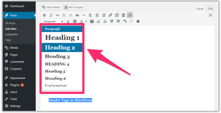
Break Up Your Content With Header Tags
Clear hierarchy (H2, H3, etc.) makes content scannable for readers and understandable for crawlers.
Descriptive subheadings help visitors find what they need fast and can unlock featured snippets and People Also Ask visibility.
Walls of text drive exits. Structure keeps people reading.
If you use WordPress, updating header tags is easy in the editor.
We use header tags on every page and post. If you’re not, start now.
Start Blogging
Blogging is still one of the fastest ways to earn organic traffic and rank for broader topic clusters.
It’s also a reliable engine for lead generation when you publish consistently and match search intent.
Use posts to demonstrate experience, answer questions thoroughly, and interlink related articles so readers (and crawlers) can navigate your expertise.
The more value you deliver, the longer people stay—and the more keywords you’ll earn visibility for.
Add More Than Text
Don’t rely on text alone.
Augment articles with images, short and long-form video, audio clips, diagrams, and slides where it makes the content easier to understand.
Why it works:
People engage more with rich media. Video, in particular, keeps visitors on-page longer and can earn visibility in search, Discover, and AI-driven summaries.
That’s why brands continue investing heavily in video marketing.
Even a one-minute explainer can be the difference between a bounce and a conversion.
If you want to climb in search results, smart multimedia is a must.
Turn a Standard Post Into a Long-Form Post
All else equal, comprehensive, trustworthy guides tend to outrank thin posts. Cover the topic deeply and answer follow-up questions a searcher is likely to have.
Have older posts under 1,000 words that show promise? Don’t scrap them—expand them.
In 30–45 minutes, you can add expert quotes, original screenshots, up-to-date data, FAQs, and internal links. Prioritize “information gain”—what your version adds that others lack.
“Good enough” is no longer good enough.
Make Sure Your Site is Readable
Write for the audience you want. Clarity beats jargon every time.
Short sentences, plain language, and concrete examples keep readers engaged and help your page win competitive queries.
Even in expert niches, prioritize accessibility—then link out or expand for those who want the deeper dive.
Not sure how you’re doing?
Use a tool like Readable.com to flag long sentences, complex phrasing, and passive voice you can tighten.
Cleaner copy improves engagement—and your odds of ranking.
Optimize Your Links
Want to boost trust and rankings at the same time?
Cite credible sources. Supporting claims with respected references builds authority and signals quality to Google.
Throughout this guide, we link to tools, data, and examples to help readers and strengthen topical relevance.
Outbound links back up key points with data from trustworthy sites.
Tip: favor high-authority domains, recent publications, and original research. Replace outdated or irrelevant citations.
Also, add internal links to related posts and product pages. They help search engines understand your site and keep visitors exploring.
We practice this throughout—linking to relevant resources to reinforce topic clusters and distribute authority.
Fix Any Broken Links
Links rot over time. Broken links erode trust and hurt SEO.
Google interprets broken links as weak maintenance. Fewer working references = a poorer experience.
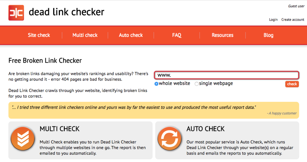
Use a tool like Dead Link Checker to scan your site regularly:
Set scheduled checks, then replace, redirect, or remove broken links before they drag down performance.
Bonus: monitor broken links on sites in your niche. When you find one, suggest your relevant resource as a replacement—classic broken link building.
It’s a win-win: they fix a problem, you earn a quality backlink.
Backlinks remain one of the strongest ranking signals in 2026.
Find Link Opportunities on BuzzSumo
BuzzSumo is excellent for finding proven topics and potential amplifiers.
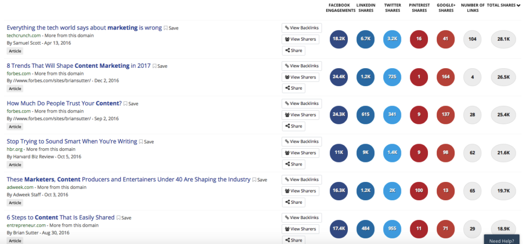
Enter a keyword to see the most shared and linked content, then study what made it work.
For example, here’s “content marketing”:
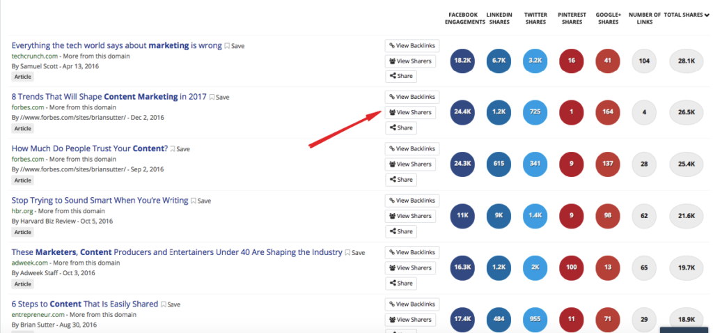
Click “View Sharers” to see people and sites who shared it:
Those folks already care about the topic and may be open to sharing or linking to your better, fresher version.
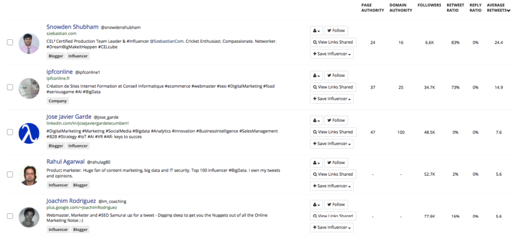
Use this to build relationships, earn amplification, and grow authority systematically.
Diversify Your Links
A natural link profile includes variety. Mix sources and placements to avoid patterns that look manufactured.
- Links from blog posts
- Links from homepages
- Educational or .edu links
- Directory listings
- Footer and sidebar links (use sparingly)
- Mentions from news sites or PR coverage
If all your links come from the same type of page, it looks unnatural and tends to underperform.
We rank well partly because our links span major blogs, educational resources, SaaS partners, and press.
Diversity also cushions you against future algorithm changes.
If Links Are Hard to Find, Think Laterally
Some niches have endless blogs to pitch. Others—like trades or industrial—don’t.
Use lateral topics to widen your reach without diluting relevance.
For example, a plumber can target:
- Home improvement blogs
- DIY forums
- Homeowner financial advice sites
Share expertise on preventing repairs, budgeting for upgrades, or which fixes add resale value.
Decorators can publish “How home décor boosts resale value” and pitch both design and real estate sites.This approach opens guest posts, expert quotes, and cross-industry traffic—while staying aligned to your main keywords.
Don’t limit yourself to a single niche. Expand into adjacent topics where your perspective helps.
Optimize Your Site For Mobile Devices
Mobile dominates search. In 2026, most queries happen on phones, so your mobile experience is your primary experience.
If your site isn’t excellent on mobile—fast, readable, tap-friendly—users bounce and rankings slip.
Google primarily uses your mobile version for indexing. If desktop shines but mobile struggles, expect weaker results.
The good news: modern builders ship with responsive defaults. Still, test on real devices and fix issues like slow media, intrusive interstitials, and tiny tap targets.
Create a Mobile App
Not for everyone, but if it fits your model, an app can expand visibility.
Google Search can surface app content via deep links when implemented correctly—use Android App Links and iOS Universal Links and associate them with the equivalent web URLs. (Note: Firebase Dynamic Links is deprecated in 2026, so plan on standard deep linking rather than FDL.)
For local businesses, SaaS, ecommerce, and content brands, indexed deep-linked content can drive meaningful incremental discovery. As an alternative or complement, consider a high-quality PWA.
If it aligns with your goals, an app can deliver both brand and search benefits in 2026.
Properly Format Your Page
Formatting affects usability, engagement, and SEO. Clean pages keep people reading; messy pages don’t.
When content is easy to scan, visitors stay longer and progress deeper—positive signals for search.
Use these fundamentals:
- Readable font sizes and line spacing
- Clean, consistent typography
- H2/H3 hierarchy for sections
- Generous whitespace to avoid clutter
- Bullets and numbered steps for scanning
- Judicious bold and italics to highlight key points
Take this page from Square as an example:
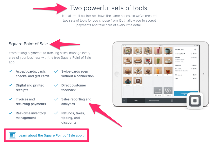
It’s visually clean, uses hierarchy and whitespace well, and communicates quickly.
Compare that to ad-heavy, pop-up-ridden pages with dense blocks of text—users bounce fast.
Also consider navigation and internal linking. If people (and crawlers) can’t easily explore your content, performance suffers.
Provide Appropriate Contact Information
Trust evaporates when visitors can’t figure out how to reach you.
Clear contact details are a credibility signal. Inconsistencies across your site and profiles can hurt local and organic performance.
List your phone, email, and physical address (if applicable) in the footer and on a dedicated contact page. Keep hours and service areas current.
Bonus: add structured data (organization, local business, and social profiles) so search engines can display rich results.
Encourage Sharing on Social Media
Social activity isn’t a direct ranking factor, but it drives the visibility that earns links and mentions—both of which help SEO.
Make sharing effortless so your best content travels farther.
Here’s how to remove friction.
Include Share Buttons on All Content
Don’t make readers copy/paste URLs.
Add visible share buttons at the top, alongside, or as a lightweight floating bar.
Tools like ShareThis work well. Note: AddThis has been discontinued, so use platform-native or modern alternatives in WordPress and Wix.
Pro tip: monitor which posts earn the most shares and replicate the winning angles, formats, and hooks.
Make It Easy to Comment
Comments are a simple engagement lever. They keep people on the page and surface new angles and questions you can address.
Ask a clear question at the end of posts, respond to readers, and keep login friction low. Moderate for spam to protect quality.
Reader feedback also informs your next posts and internal link opportunities.
Use Original Images
Stock photos are everywhere. Original visuals set your content apart and can appear in rich results.
Create charts, product screenshots, annotated how-tos, and infographics that genuinely help.
- Improve user experience
- Increase shareability
- Strengthen image SEO and eligibility for visual surfaces
- Differentiate your brand from look-alike competitors
Unique visuals also perform better in Featured Snippets, Google Discover, and AI overviews. Add descriptive alt text and meaningful file names (e.g., email-marketing-automation-dashboard.jpg) and prefer lightweight formats like WebP to keep pages fast.
Speed matters—especially on mobile—so compress before you upload.
Monitor Your Performance
Once you’ve optimized, measure relentlessly. SEO is iterative: publish, monitor, improve, repeat.
Track traffic, rankings, and engagement, then refine based on what the data shows.
Here’s a simple workflow.
Track Rankings With Ahrefs or Semrush
Ahrefs and Semrush can monitor keyword positions and surface opportunities you’re close to winning.
Look for:
- Keywords that actually drive traffic
- Competitors outranking you—and why
- Pages sitting on page two you can refresh to tip onto page one
Don’t chase rankings in isolation. Prioritize improvements that increase qualified visits and conversions.
If a page slips, study the winners. What did they add (recency, depth, examples, visuals) that you can exceed?
Use Google Analytics to Monitor Engagement
Rankings get the click; engagement earns the win.
Google Analytics 4 shows how people behave once they arrive.
Watch metrics like:
- Engaged sessions
- Average engagement time
- Scroll depth
- Event completions
- Conversion rates
If engagement is weak, revisit search intent, structure, and clarity. GA4 helps you pinpoint where readers drop off so you can fix it.
Check for Indexing Issues With Google Search Console
Sometimes rankings lag because pages aren’t indexed correctly. Google Search Console is your source of truth.
Use it to check:
- Which pages are indexed (and why others aren’t)
- URL inspection details and crawl issues
- Core Web Vitals (LCP, INP, CLS) and HTTPS coverage
- Structured data validity
If a high-value page isn’t indexed, fix the issue (noindex, canonical, robots.txt, blocked resources), then request indexing.
GSC also reveals the queries driving impressions and clicks so you can double down on what’s working and shore up gaps.
Final Thoughts
SEO isn’t magic—it’s methodical. But the compounding payoff is worth it.
Publish helpful content that matches intent, deliver a fast mobile experience, earn credible links, and improve pages based on real data. Do that consistently and you’ll outrank most competitors in 2026.
Write for people first, keep information accurate and current, and let search engines reward the value you deliver.
Stick with it—and the rankings will follow.