Truly understanding who your customers are—and how they perceive you—is the foundation of any great brand. People form opinions based on what you say and how you behave: your honesty, usefulness, and how consistently you live your values across every touchpoint.
Is your brand reachable? Can customers think of your company as something tangible, personal, and real? When a brand acts open, inviting, and human—like a trusted friend—you earn the right to have real conversations, not just transactions.
A logo is not a brand. Approval on a mark is the midpoint, not the finish line. A brand is your promise and personality expressed through systems—tone of voice, design language, experiences, and proof that you deliver. A logo is one of the tools to create that connection.
You need four core ingredients to create a successful brand:
- An understanding of your customers—who they are, what they value, and how they decide
- Friendliness toward your customers—clear language, useful content, and generous support
- Honesty in how your company presents itself—no hype, just evidence and results
- Depth beyond color and typography—a system that scales across channels and scenarios
Impact people’s lives. Slow them down with something personal and relevant. It’s about them, not you. Give them clarity, confidence, and a reason to believe. Great experiences create great memories—and that’s what sticks.
Mistakes to avoid when creating a brand
Timeless brands from decades past still work because they’re simple, consistent, and flexible. Aim for a brand people would put on a laptop, a water bottle, or—yes—a bumper sticker.
“Your brand is what people say about you when you’re not in the room.” – Jeff Bezos, Founder of Amazon
Ask the right questions about your company and customers. Your goal is to align message, beliefs, and values with the identity you create—so the tone, visuals, and experiences all reinforce the same story.
- Don’t start with the logo. Start with positioning, audience insights, and proof.
- Don’t chase trends. Use trends sparingly; build systems that age well.
- Don’t skip accessibility. Color contrast, legibility, and alt text are non-negotiable (target at least WCAG 2.2 AA: 4.5:1 for normal text and 3:1 for large text).
- Don’t brand by committee. Assign a decider; gather feedback, not vetoes.
- Don’t ignore usage. Test your identity in real contexts before you ship.
When you work with experienced brand designers, you’ll often receive two or three strong concepts early. Multiple routes reduce fixation on a single approach and invite faster, clearer feedback.
Websites like 99designs by Vista can be useful for gathering options—just make sure you provide a thorough creative brief and relevant examples up front. Better inputs lead to better outputs.
Picking colors for your brand
Use what you learn about your customers and category to guide color choices. Map competitor palettes to spot patterns, then deliberately differentiate while staying appropriate for your market.
Document your palette in your brand guidelines: primary/secondary colors, tints/shades, intended meanings, and usage rules (what to use where, and what to avoid).
Colors carry emotion and memory, but they must also be usable. Confirm contrast ratios for text and UI and define tokens for light/dark modes so your palette stays consistent across devices.
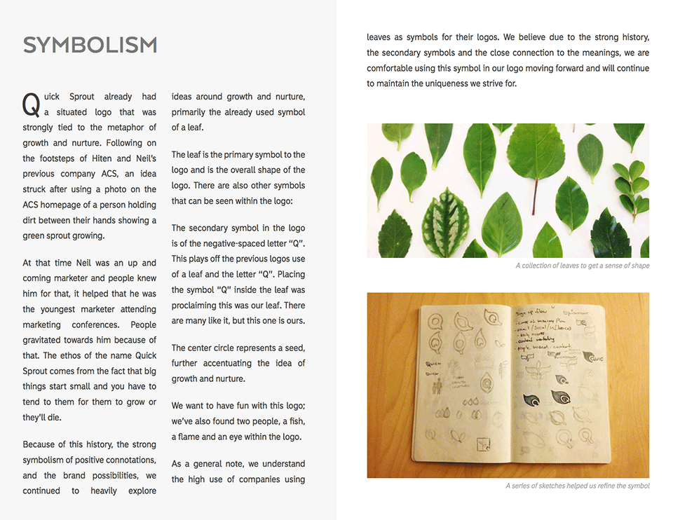
Symbols. A common trend.
Most logos fit into one of three types:
- Symbol/Logomark
- Logotype/Wordmark
- Combination Mark
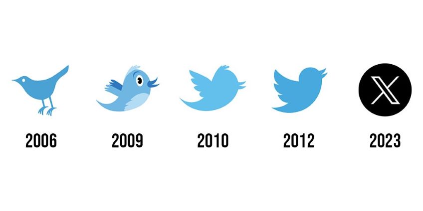
In recent years, more brands have leaned on symbols alone—especially where space is tight (favicons, app icons, social avatars). Automotive brands have long led here; many use the symbol as the hero on the product and reserve the wordmark for documents and legal materials.
Think of Apple’s icon, or how brands like Starbucks and X (formerly Twitter) simplified over time—Twitter rebranded to X in July 2023. The best symbols are distinct, easy to remember, and flexible enough to work at any size or in a single color.
Combination marks offer the most versatility. You can pair symbol + wordmark together for unfamiliar audiences, then shift to symbol-only once recognition is high. Designing for separation from day one gives you options later.
Which route is right for you depends on your industry, audience, message, and tone. Match the identity to the job it needs to do.
A real life example
My new Quick Sprout logo was one artifact of a broader strategic look at how the brand has evolved since Neil launched it in 2007.
I sat down with Neil to clarify Quick Sprout’s beliefs, the promise I make to readers, and how the brand is perceived today. Those conversations shaped a design brief that guided every decision—including the logo.
The design brief is the centerpiece of the process. It reveals patterns that aren’t obvious at first glance and surfaces the differentiators that make you unique.
Several themes captured Quick Sprout well. Asked about the name’s origin, I heard: “Big things start small—and they grow only if you nurture them.”
More lines that resonated:
- “I teach modern marketing that actually works.”
- “I help people get better—smarter, faster, more confident.”
- “Give the audience what they need to improve their work and life.”
- “Results matter—but so does growing in your career.”
- “I want readers on the forefront of their industry.”
- “Everyone’s a marketer—they just don’t know it yet.”
Quick Sprout’s values point to helping and nurturing growth—for people and companies. That validated the current brand direction: greens and natural motifs signaling growth and openness. (And yes, leaves—not “leafs.”)
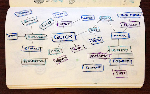
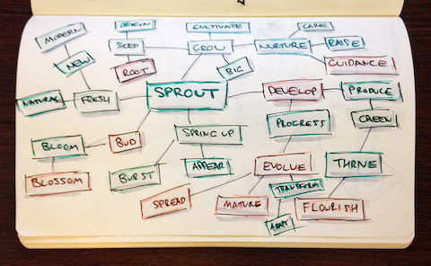
Research
A simple way to clarify what a company means is to mind map keywords from stakeholder interviews. I created two maps—one for “Quick,” one for “Sprout”—to visualize useful associations for later exploration.
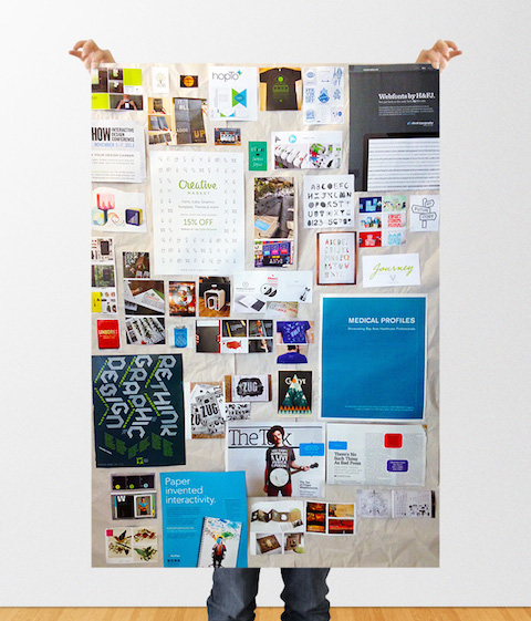
Mood boards helped me see everything in one place. Stepping away from screens to pin up references—shapes, colors, textures, and type—made patterns jump out faster.
For brand work, a physical board can be surprisingly effective. Touching and rearranging artifacts invites more honest critique and curiosity.


Sketching
Rapid, messy sketching is the best way to bypass preconceived ideas. Explore volume, not polish. Get the obvious directions out of your system, then combine fragments from different sketches to find stronger routes.
Keep momentum by time-boxing each idea. Use a morphological matrix (list parts, styles, metaphors, and constraints; then mix and match) to generate combos you wouldn’t think of otherwise.
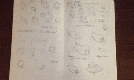
Systematic exploration beats waiting for inspiration. The matrix makes idea generation repeatable.
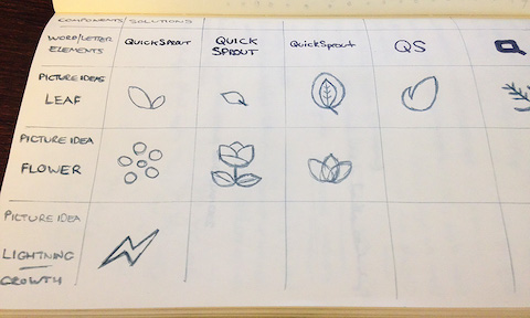
Formalizing
As promising directions emerge, cross-reference them with your brief. Do they push the message forward? Are they memorable and positive? Are they simple enough to survive at small sizes?
Now slow down. Vectorize the strongest routes, build a basic system (logo, color, type, spacing), and test in realistic scenarios: website header, social avatar, favicon, presentation cover, mobile app icon, and one-color print.
Run quick checks: does the mark hold up in black and white? Can it sit on light and dark backgrounds? Is the wordmark legible next to body copy? Does the icon still read at 16×16 pixels?
Polishing
This is where refinement pays off. Iterate on color, typography, and arrangement with purpose—not endlessly. Name your colors, define type scales, and set spacing tokens so designers and developers can implement consistently.
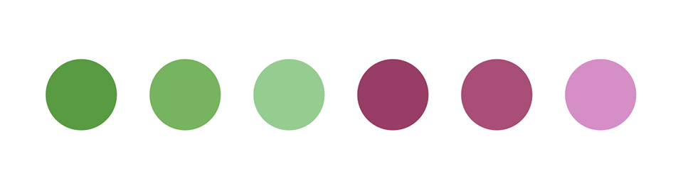
Quick Sprout already leaned on green, so I explored natural hues that feel calm and confident—tones that support long-form reading and invite learning.
I evaluated greens across light/dark modes, ensured contrast for text and UI, and documented do’s and don’ts (when to use the accent vs. the neutral palette).
Delivering
All of that research and iteration rolls up into a coherent brand package you can present internally—and ship externally. Treat the presentation like a narrative: problem, principles, explorations, choices, and final system.
Create a logo rationale that explains decisions and trade-offs. Include real-world mockups and a concise guidelines doc covering logo usage, clear space, minimum size, color, type, imagery, tone of voice, and accessibility.
Presenting the new Quick Sprout to you!
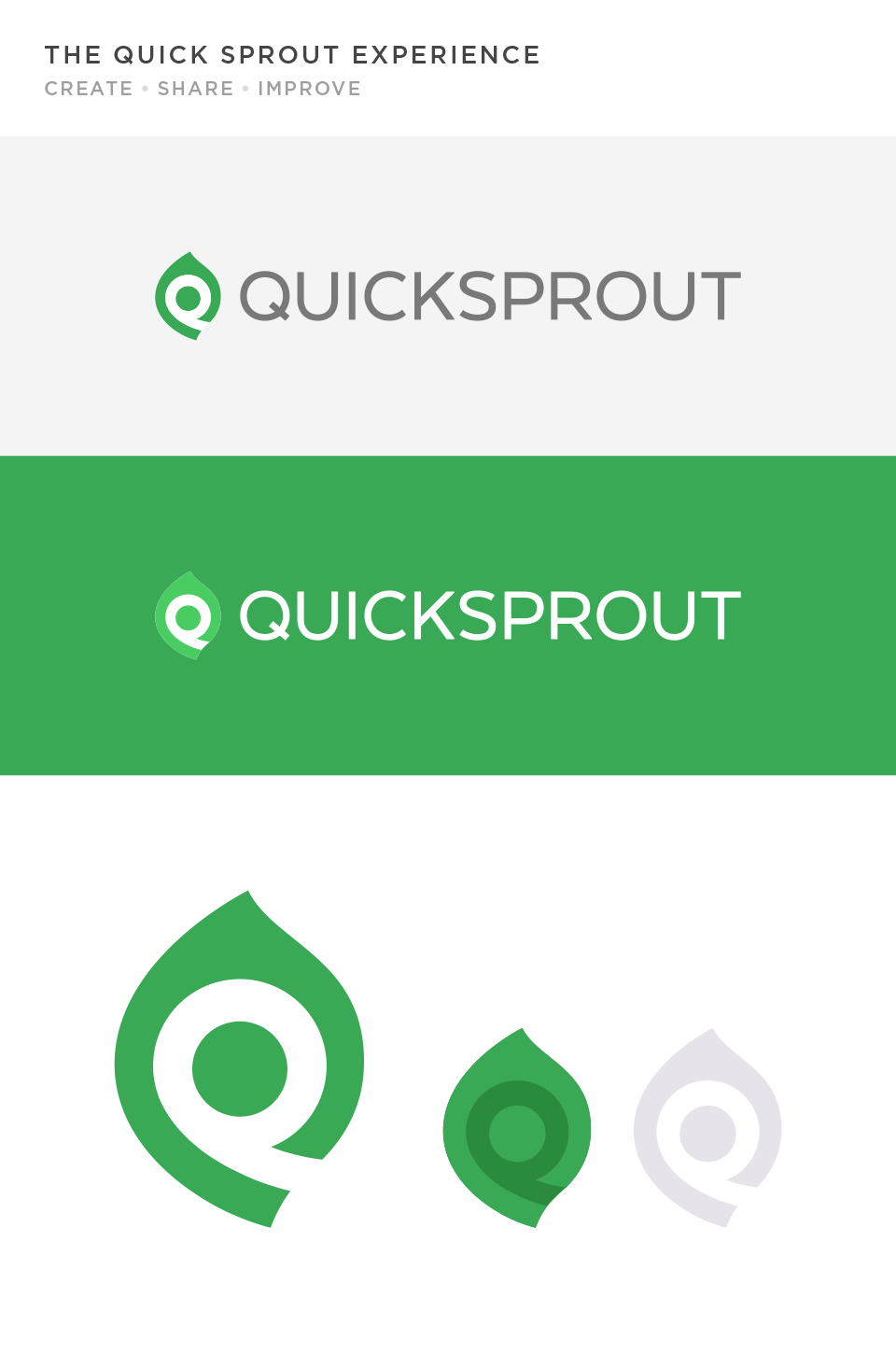
The mark you see here reflects that full process. More importantly, it comes with a system and standards that make the brand easier to use—and harder to break—as Quick Sprout grows.
This is all possible even with a small budget!
The Nike swoosh started with a $35 commission to student designer Carolyn Davidson in 1971. While she was later compensated, the lesson endures: clarity and simplicity can scale farther than complexity—and great ideas can come from lean budgets.
If you’re working with constraints, double down on preparation. A strong brief, relevant references, and a few well-chosen iterations can produce a lasting identity without overspending.
Use this to get started: a free design brief template you can fill out and hand to your designer.
Brand governance & measurement
Brands drift when no one owns them. Assign a steward, set up a simple review process, and keep a living guidelines doc. Track brand consistency in key assets (site, blog visuals, email, social headers) and watch awareness and engagement metrics over time.
- Set ownership: who approves logo use, colors, and voice
- Publish assets: shared folder with logos, colors, type, and templates
- Audit quarterly: catch drift in visuals or tone early
- Measure signals: direct traffic, brand search, branded CTR, time on page
Conclusion
Creating a memorable brand isn’t easy, but a clear process makes it manageable: understand your audience, explore widely, test in reality, and deliver a system—not just a logo. More spend doesn’t guarantee better results; better inputs and discipline do. Put in the work up front so your identity reflects your values—and earns trust every time people encounter it.