Color and visual cues can dramatically influence conversion rates by guiding attention, shaping emotion, and clarifying what to do next.
People skim online at high speed. To earn a click or a scroll, your page needs strong visual hierarchy that stands out from everything competing for attention. Color is one of the simplest, most reliable ways to create that contrast and hierarchy.
Color has value far beyond aesthetics—and individual color preferences directly impact marketing performance and conversion optimization. Color surrounds us, but we rarely stop to consider how it nudges perception and behavior.
Read on to master practical color psychology for modern web design and marketing.
Color Theory
There is a well-established science to choosing colors that work together. While taste, culture, generation, and personal preference introduce subjectivity, designers and psychologists rely on best practices to build dependable palettes. Colm Tuite, a user experience designer, uses the following framework.
Pures, Tints, Shades & Tones
PURE COLOR

Pure hues aren’t mixed with other colors. They’re common in bright designs and work well for youthful, summery, energetic, or “cool” brand expressions that need immediate impact.
TINTS

Tints are created by mixing a hue with white. They feel lighter, calmer, and less intense than pure colors. Tints are often used by health, spa, wellness, and beauty brands to convey serenity, care, and approachability.
SHADES

Shades are created by mixing a hue with black. They can communicate mystery, sophistication, drama, or danger. Shades pair well with gradients and with lighter tints to create depth and focus.
The Meanings Of Colors
Colors carry cultural, emotional, and social associations. Below are common Western associations that can influence first impressions and brand fit.
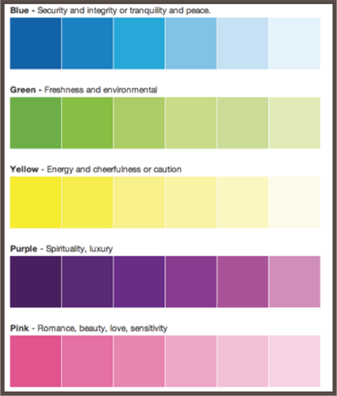
Tints and shades modify those meanings. A darker blue can signal stability and integrity; a lighter blue feels airy and tranquil. Over time, organizations also reinforce associations—think deep purples and reds in religious contexts or pink’s association with femininity. Nations do the same (e.g., Ireland and green). Use these patterns as a starting point, then validate with your specific audience.
Remember: context matters. The same color can feel premium or playful depending on typography, spacing, and imagery around it.
Maintaining Simplicity
A frequent mistake is using too many colors. Most interfaces perform best with one dominant brand color paired with neutrals (white, gray, black, or off-white). Too many hues create mixed messages and visual fatigue; fewer colors create clearer hierarchy and easier decisions.
Contrast
High contrast is essential for readability and emphasis. Dark-on-light or light-on-dark pairings typically work best—hence black text on white pages in print. Yellow and light green have low luminance and are hard to read on white. When in doubt, test contrast against accepted accessibility thresholds and consider how your colors perform in both light and dark modes.

Example
Imagine a spa owner approaches your design team for a logo. The spa uses natural, organic products and targets women. She wants a peaceful, restorative vibe—so tints are a better fit than pure colors or heavy shades. Colors frequently associated with tranquility and femininity include pink, yellow, purple, and blue.

To emphasize “organic,” green is a natural choice because it cues freshness and nature. But a deep, saturated green can feel heavy or less feminine in this context:

Lightening the green shifts the mood toward gentle and calming while keeping the “natural” association intact.

Adding a touch of blue introduces tranquility and spa-like serenity without losing the organic feel.

Color And Conversions
Quick facts about color and conversions (with the caveat that results depend on context, audience, and design quality):
- Visual appearance is a leading factor in purchase decisions for many shoppers, often outranking other sensory cues when browsing online.
- People form subconscious judgments about products within seconds of first view, and color plays an outsized role in that initial impression.
- Full-color ads consistently outperform black-and-white ads for attention and recall in controlled studies.
- Packaging and product color changes can materially affect sales (famously, color variants can drive short-term spikes by renewing attention and novelty).
Additional perspective on how color influences purchasing:
- When launching new products, visual appearance and color are often evaluated before features—especially in crowded categories.
- Color can be a primary reason to pick one product over another when options feel otherwise similar.
- Consistent color use strengthens brand recognition and can build confidence and trust over time.
- Color preferences vary across geographies and cultures. What’s compelling in North America may not resonate elsewhere—validate with target users.
- Color is one element among many that drive behavior. Information scent, copy, layout, load time, and convenience also have major effects.
Color affects us in countless ways—mentally and physiologically. Poor color choices can hurt usability and conversions as much as weak copy or slow performance. Treat palette decisions like any other CRO variable: hypothesize, test, and iterate.
Gender
Gender is often discussed in color preference research, but broad generalizations are risky and increasingly unhelpful. Your audience is a mix of people with diverse identities and tastes. If your visuals lean too hard into one gendered stereotype, you can alienate large parts of your market.
Shift from “what I like” to “what the audience needs.” Color is one of the most practical tools for inclusive marketing when used thoughtfully.
In short: research shows mixed and context-dependent findings on gender and color. Preferences overlap far more than they diverge.
Historical studies observed differences, but modern marketing practice prioritizes audience fit over stereotypes. A better approach:
- Review classic research as inspiration—not as rules. Consider that early studies used different methods and populations than today’s audiences.
- Test with your real users. Let inclusive design and A/B tests validate what resonates for your segments rather than assuming preferences.
- Favor accessible, high-contrast palettes and clear hierarchy, which benefit everyone regardless of preference.
Cultural and social contexts evolve. You won’t please everyone with one palette, and perfectionism delays progress. Move forward with research and testing.
The best answers live in your data. Pair qualitative interviews with continuous A/B testing to see how color changes affect engagement and conversion in your funnel.
Accessibility
Design for how people actually see. Many users have low vision or color-vision deficiencies. The W3C Web Accessibility Initiative offers guidance to help designers build inclusive experiences. Use it to set color checkpoints and verify contrast in real interfaces.
Brightness
Instead of relying on legacy “brightness” shortcuts, use WCAG contrast ratios. For body text, aim for at least 4.5:1. For large text (18pt regular/14pt bold and up), logos, and bold headlines, 3:1 is generally acceptable. Interactive/non-text UI components (buttons, inputs, icons) should also meet at least 3:1 against adjacent colors to remain perceivable. WCAG 2.2 additionally emphasizes visible focus indicators—don’t rely on color alone; ensure focus styles have sufficient area and contrast.
Test colors in both light and dark themes, and avoid relying on color alone to convey meaning—pair color with labels, icons, patterns, or text states. If your audience uses modern wide-gamut displays (e.g., Display-P3), preview palettes in both sRGB and wide gamut to prevent unintended oversaturation.
Color Difference
Perceived “difference” comes from hue, saturation, and luminance. Prioritize luminance contrast for readability, then fine-tune hue and saturation for brand expression. Validate with contrast-checking tools and color-blind simulators rather than manual formulas. (APCA/“WCAG 3” research is ongoing; treat it as complementary guidance alongside WCAG 2.2.)
Ensure text, icons, focus states, and form errors remain visible under common color-vision deficiencies (protanopia, deuteranopia, tritanopia) and in grayscale. Clear outlines, underlines for links, and patterns for status states help non-color cues stand out.
Remember: contrast requirements apply to text and essential graphics. Decorative elements don’t need strict ratios, but they shouldn’t distract from readable content.
Rules Of Thumb
Use these practical guidelines to keep your site accessible:
- Use sufficiently large, readable type. Color works with typography, spacing, and layout to determine overall legibility.
- Keep paragraphs short so content is scannable (and users don’t face a wall of color).
- Use complementary and contrasting colors between background and foreground. A color wheel can help you find pairings, but always check contrast ratios against WCAG 2.2. Ensure focus states and error messages are identifiable without relying on color alone.
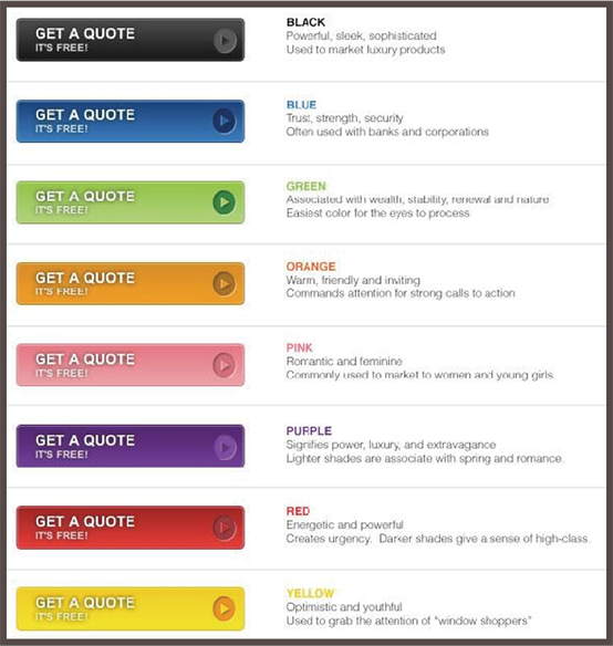
Relevance To Sales
When choosing colors for pages, forms, and calls to action, you’re shaping behavior—not just decorating. Here’s a helpful overview from Ren Walker at Adpearance that frames common CTA color choices in Western markets.
So which color should you pick? Even with color psychology knowledge, context wins. Choose colors that match the page’s job and audience expectations.
Start by considering the form’s risk and information sensitivity. If you’re asking for personal details, calmer hues (greens, blues) often feel safer. Then look at the full page: your CTA must both stand out from its surroundings and keep text-to-button contrast at or above accessibility thresholds.
Capturing Audience’s Attention
Consider this widely cited A/B test:

Performable—an email marketing platform later acquired by HubSpot—reported a 21% lift when its CTA changed from green to red on a green-dominant page.
The takeaway isn’t “red beats green”; it’s “contrast beats camouflage.” The winning color stood out from the page’s palette and focused attention on the action.
Apply the principle: choose CTA colors that clearly separate from background and adjacent elements while still fitting your brand palette, and verify that the label text on the button meets contrast requirements against the button fill.
Website Elements Affected
Color choices influence many interface components. Focus on these:
Text Links
Monochromatic links can disappear. Give links a distinct color and consider subtle backgrounds or underlines on hover and focus to lift them off the page and improve orientation.
Navigation
Saturated colors and clear active states draw attention to navigation. Use consistent color cues for “current page” and hover/focus to improve wayfinding.
Buttons
Make primary actions visually distinct from secondary or tertiary actions. Size, weight, and color should all signal priority and next steps at a glance.
Headings
Use restrained color in headings to clarify hierarchy and spotlight key ideas without overwhelming the layout.
List Items
Color can emphasize key bullets or features. Use it sparingly so emphasis remains emphasis—not the baseline.
Complement Your Brand’s Personality
Color is a powerful lever for brand personality. Use it to accentuate identity and create a cohesive system across pages and channels. Color should work with your brand voice, tone, and values—not fight them.
Here are the steps that I advise marketers take:
Step 1 – Decide Which Emotions You Want to Convey
Define the feelings you want to evoke, then pick colors to support them. Choose from common palette structures:
- Monochromatic: colors from a single family (e.g., blues at different tints and shades)
- Analogous: two or three neighbors on the color wheel
- Complementary: two colors opposite each other on the wheel
- Triadic: three colors evenly spaced on the wheel
Step 2 – Choose the Palette That Best Communicates Your Company’s Style
- Warm and Comforting Browns – Browns suggest home, craft, and warmth. Pair with grays or blues for grounded, cozy experiences.
- Playful Greens – For playful or energetic brands, greens with blues and oranges can feel fresh and down to earth while keeping momentum.
- Serious Blues – Blues are calming and trustworthy. Combine with gray, tan, or muted orange accents—but keep secondaries restrained to avoid visual noise.
- Energetic Reds – Reds inject energy and urgency. Use ample white space and clear hierarchy so intensity doesn’t overwhelm readability.
Step 3 – Know Your Niche
Industry context shapes expectations. A finance site should feel grounded and trustworthy. Pushing too far from norms can create cognitive dissonance and erode confidence.
You wouldn’t want to use a rainbow of brights or a fast-food red/yellow combo for wealth management.
Instead, consider a smooth green for growth and stability. Accents of gold and black can reinforce prosperity and longevity without feeling heavy.
Financial brands can still feel modern and approachable—think refined palettes, generous spacing, and clear microinteractions instead of loud color walls.
Don’t forget white space. Strategic breathing room makes pages feel clean and trustworthy—critical for conversions in finance and other high-consideration niches.
Key Takeaways
I could talk about color all day, but here are the essentials to move forward with confidence:
- There’s a science to harmonious color. Master pure hues, tints, and shades—and know the moods they tend to evoke.
- Colors come with cultural context. Start with common associations, then validate with your audience.
- People have different visual abilities. Use high contrast to keep text readable, regardless of screen, lighting, or eyesight.
- Red and green are common problem colors for color-vision deficiencies. Provide non-color cues and ensure contrast.
- Color can boost conversions when it clarifies hierarchy. Make CTAs contrast with surrounding elements so they’re unmissable.
- Let the data decide. Treat palette choices like other CRO variables—A/B test and iterate.
- Respect industry norms enough to avoid confusion. Go too off-brand for the niche and users may misread your intent.
- When in doubt, blues and greens are broadly accepted—and are easier to keep accessible across light/dark modes and device color gamuts.
- Invest in strong visual design. Consistent, intentional color use supports brand recognition and trust.
- Use color to emphasize navigation, lists, buttons, and other key elements—sparingly and purposefully.
- Memorable doesn’t mean loud. Aim for distinctive, consistent palettes that users can instantly associate with your brand.
- Ask customers what resonates, study peers in your niche, and use modern accessibility checks and testing tools (WCAG 2.2 contrast, focus visibility, and color-blind simulators) to confirm your choices. Keep an eye on APCA guidance as it matures.