Eye-tracking research shows people first scan a page’s layout, logo, and top-level navigation—and they decide quickly whether a page feels usable. After a poor experience, 88% of online consumers are less likely to return, so clear, predictable navigation is a key signal that encourages visitors to stay and explore.
Users also spend about 6.44 seconds evaluating the main navigation—nearly as long as the time they spend on the logo—so what you put in your menu (and how you label it) really matters. Eye-tracking studies consistently highlight this behavior.
In other words, navigation is a core part of user experience. Good navigation helps visitors find key pages faster, increases the chances they explore more of your site, and supports conversions. Poor navigation does the opposite by creating friction, confusion, and drop-offs.
Strong navigation also supports SEO. Clear, consistent menus create an internal linking structure that helps search engines understand your site’s hierarchy, and a smoother UX aligns with modern page-experience expectations.
There are several common patterns behind successful menus. Before we get into best practices, here’s what a navigation menu is and the main styles you’ll see.
What is a Navigation Menu
A navigation menu is an organized list of links to the most important sections of a website. It typically appears in the header or a sidebar and often repeats (in expanded form) in the footer. Done well, it acts like a map that helps visitors complete their tasks quickly.
Because the menu impacts usability, many site owners rely on a website builder to set up accessible, responsive navigation without hand-coding HTML or CSS.
Here are a few common navigation styles you can adopt, depending on your content and audience.
Horizontal bars
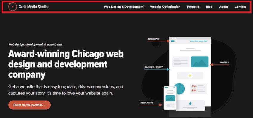
The horizontal bar is the most familiar pattern. It sits at the top of the page and places links side-by-side to your highest-value pages, giving all of them prominent, equal access.
Most sites place the logo on the left of the bar and make it a Home link. This gives users an always-available reset button to get back to the starting point.
Dropdown navigation
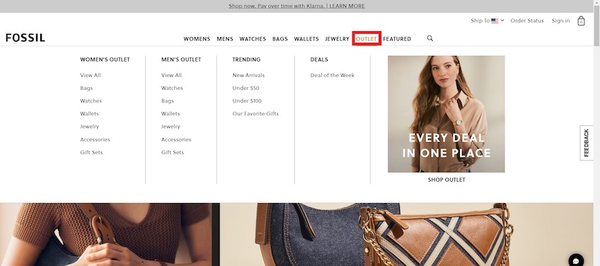
Dropdowns look like horizontal bars but reveal a secondary panel when a user hovers or clicks. They’re ideal for ecommerce and other page-heavy sites where you need to expose more options without overwhelming the header.
Use dropdowns to group related categories and surface popular subpages. Keep interaction simple (hover or click—don’t require both) and make sure the menus are keyboard-navigable for accessibility.
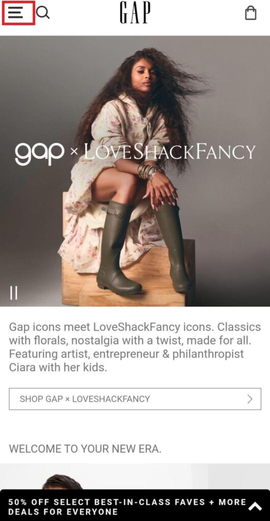
Hamburger menu
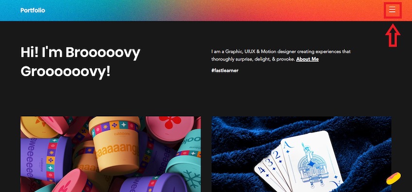
The “hamburger”—three stacked lines that open a slide-out or dropdown—hides links until needed. It shines on mobile where space is scarce and the icon is universally recognized.
On desktop, consider exposing key links instead of hiding them behind the icon. First-time visitors often look for top-level navigation immediately; burying links can reduce exploration. If you do use a hamburger on desktop, combine it with visible, high-priority links to reduce friction.
Desktop layouts typically have plenty of room, so reserve hidden navigation for lower-priority links and keep core paths visible.
Vertical sidebar menu
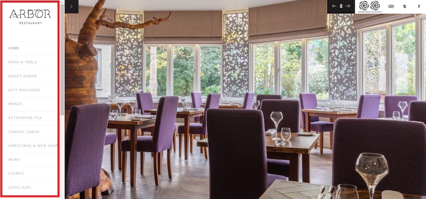
Vertical menus stack links in a sidebar. They’re useful when you have many options but want to avoid a sprawling header or complex dropdowns. Sections can expand and collapse to keep the list scannable.
Because items stack top-to-bottom, users may assume the first few are the most important. Put your primary tasks (e.g., “Book a Table” or “Pricing”) near the top and use clear section headers so people don’t miss critical links further down.
Footer menu
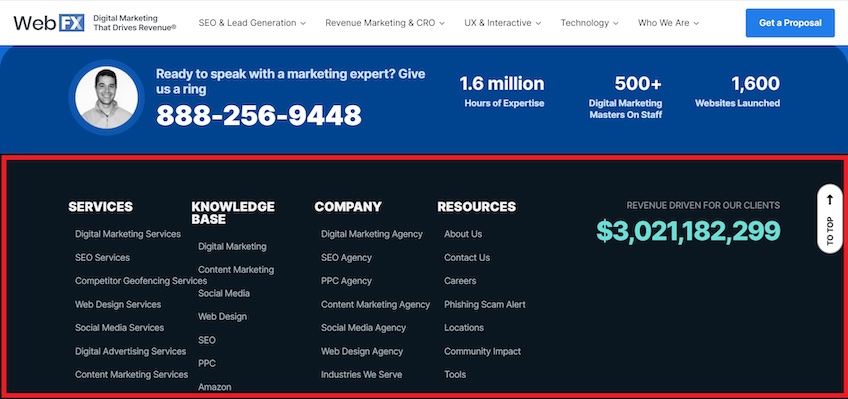
Most sites pair a primary header menu with a broader footer menu. The footer expands on the top-level options and houses lower-priority items like contact details, legal pages, careers, and resource links without cluttering the header.
Footers can also help SEO when used thoughtfully—for example, by listing core services with descriptive, keyword-aligned labels and linking to the most relevant pages. This reinforces your internal linking and helps visitors and crawlers understand your offerings.
Use concise groupings and avoid turning the footer into a link farm. The goal is clarity, not quantity.
7 Things Every Useful Navigation Menu Does Really Well
Website builders can set up the basic menu patterns, but great navigation is about the choices you make for your audience and content. Here’s what effective menus have in common.
Uses clear navigation labels
Labels are the words on each link. They should be specific, plain-language descriptions of what’s on the destination page—using the same words your audience uses.
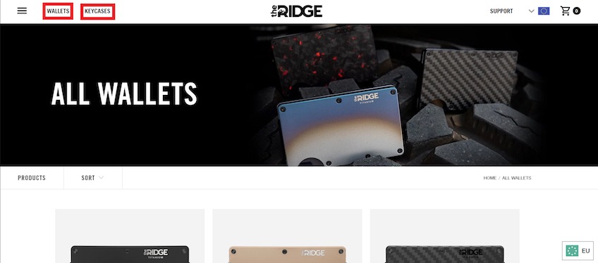
Avoid vague terms like “Products” when visitors are looking for “Wallets,” “Key Cases,” or “Gift Cards.” Specific labels reduce guesswork, improve click confidence, and help people complete tasks faster.
Align labels with visitor intent. When link text matches what people came to do (e.g., “Pricing,” “Templates,” “Schedule a Demo”), they find answers faster and are more likely to continue deeper—benefiting both user satisfaction and internal link discovery.
Creating distinct pages for distinct products or topics also helps you target a primary keyword per page. A catch-all page forces you to dilute relevance across many terms; focused pages can earn visibility for the specific queries your audience searches.
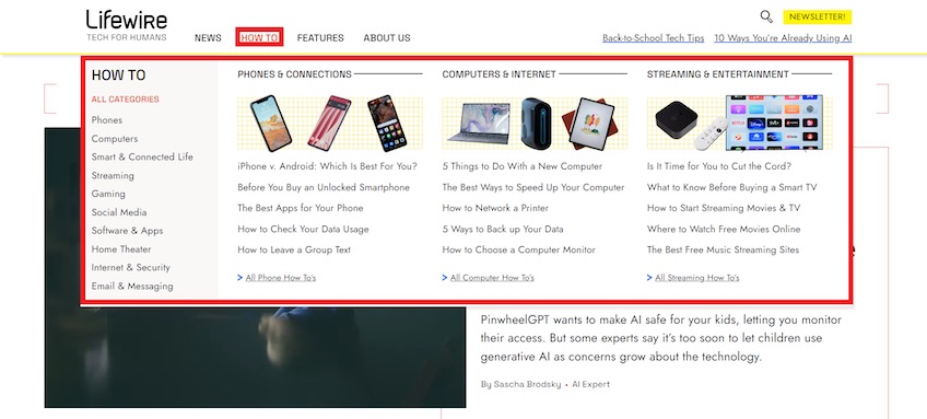
Includes essential navigation options only
Too many top-level links create choice overload and make the header feel chaotic. Prioritize the small set of pages that matter most to first-time visitors and prospects.
Your homepage typically carries the most authority. Linking it to every possible page spreads that authority thin. Concentrate it on a focused set of interior pages so those pages are more likely to earn visibility.
As a practical guideline, aim for about five to seven top-level links. If you have a large catalog or deep content library, use well-organized dropdowns or a mega menu instead of cramming everything into the header.
If you start an online store and need many links, a mega menu can work well—provided you group items into clear categories, use short descriptive labels, and ensure the panel is fast, accessible, and easy to navigate by keyboard.
Structure mega menus with clear headings, logical groupings, and visual cues. This keeps a long list of links scannable and reduces the chance that visitors miss key destinations.
Incorporates breadcrumb navigation
Breadcrumbs show people where they are in your site hierarchy and let them jump back a level with one click. They’re especially useful on multi-level sites like ecommerce stores, documentation hubs, or directories.
Place breadcrumbs near the top of the content area so they’re easy to spot without stealing attention from your main heading.
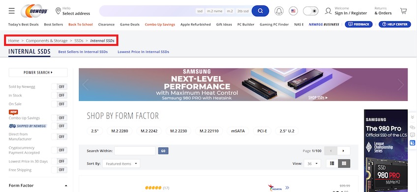
Breadcrumbs reduce dead-ends. If someone lands on a page that isn’t quite right, they can step up a level instead of bouncing. They also strengthen internal linking and can appear in search results, clarifying where a link leads. See Google’s guidance on Breadcrumb structured data.
They’re most helpful when your structure has multiple levels. If every page is one click from Home, breadcrumbs add little value. If you use them, keep the design subtle and include separators (like “>”) so the path is easy to scan.
For consistency, match breadcrumb labels to your page titles and menu labels. This alignment helps both users and crawlers interpret the hierarchy.
Puts a CTA in the header
Visitors commonly look to the upper-right area of the header for important actions (e.g., Contact, Sign In, Cart) due to established scanning patterns and conventions.
You can go further by adding a high-intent call-to-action (CTA) in the header, such as “Start Free Trial,” “Get Pricing,” or “Book a Demo.” Because the header is visible on every page, this gives motivated visitors a fast path to convert.
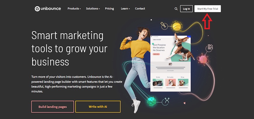
Make the CTA stand out with sufficient contrast and specific copy. “Start My Free Trial” is clearer than “Get Started.” If you repeat CTAs throughout the page, the header placement is a great spot to A/B test wording and microcopy to increase clicks.
Keep the number of header CTAs to one primary action to avoid competing choices. Secondary actions can live in the menu or on the page itself.
Uses sticky navigation when necessary
Sticky (fixed) headers remain visible as people scroll, giving them constant access to search, the menu, and your primary CTA. This is especially helpful on long-form pages where scrolling back to the top is cumbersome.

Use sticky headers thoughtfully: keep them compact, avoid heavy drop-shadows, and ensure they don’t cover important on-page content. On mobile, consider hiding non-essential links behind the hamburger to preserve vertical space.
A fixed header that keeps your CTA visible can lift conversions, but only if it stays unobtrusive and doesn’t compete with the content itself.
Test on multiple screen sizes to confirm that sticky elements don’t overlap page anchors, forms, or cookie notices.
Excludes social media links
Your header’s job is to keep people moving through your site—not send them away to another platform.
Grappus is a good example of what to avoid.
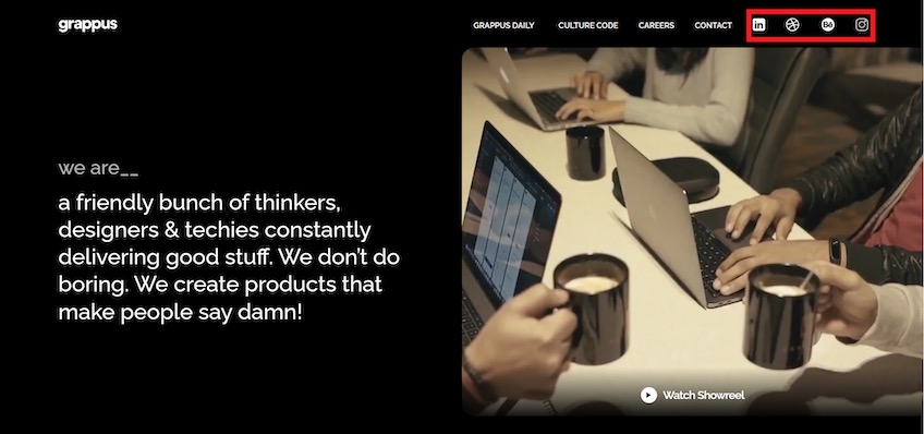
While social links can grow your audience, placing them beside your main navigation increases the chance visitors leave immediately. Social feeds are designed to distract—don’t let them siphon attention before someone learns what you offer.
If social profiles are important to your brand, put the icons in the footer or on a dedicated “Follow Us” page. People who want to connect will know where to look, and everyone else can stay focused on your content.
This approach also keeps your header cleaner and your primary tasks more prominent.
Optimizes design for mobile devices
About 58% of global web traffic now comes from mobile, and Google completed mobile-first indexing (with Googlebot Smartphone as the primary crawler). A mobile-friendly navigation experience isn’t optional anymore—it’s the default.
Standard desktop patterns don’t always translate to small screens. Use mobile-specific navigation that conserves space, keeps labels readable, and allows for one-handed use.
The hamburger menu remains a reliable solution for link-heavy sites on mobile. Keep the icon consistent (three lines), make the tap target large enough, and present a clean, scrollable list of options.
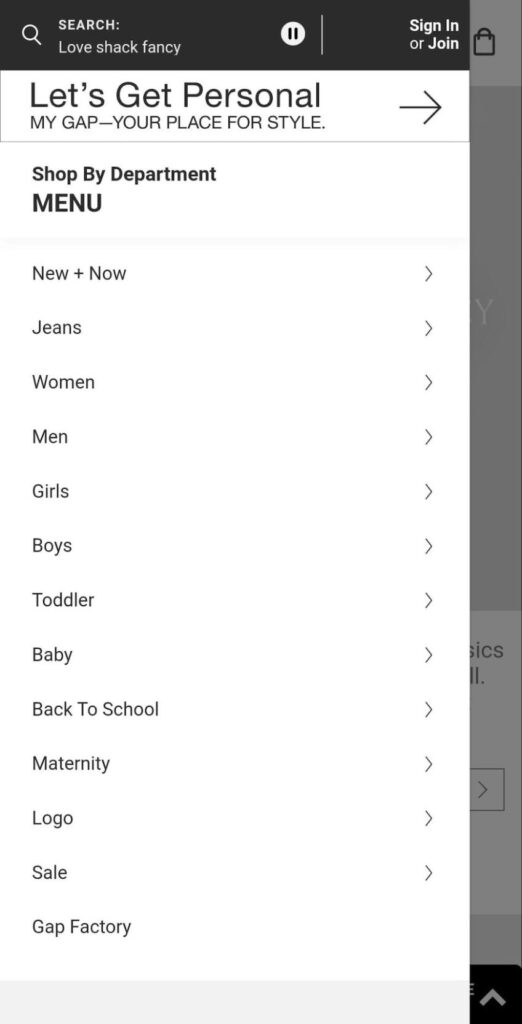
Stack menu options vertically and allow expandable sections for sub-navigation. This keeps everything scannable and reduces back-and-forth page loads while people drill down to what they need.
Reserve the hamburger primarily for mobile and small screens. On larger screens, expose the most important links so visitors can see their choices at a glance.
Beyond menus, ensure your entire layout is responsive, tap targets meet accessibility sizing, and the header doesn’t consume excessive vertical space. If your builder can’t deliver the control you need, consider professional web design help to fine-tune UX.
Takeaways
Navigation should be the easiest part of your site. When it’s intuitive, people hardly notice it—they just find what they need and keep going.
Great menus balance simplicity with depth. They use clear labels, prioritize the most important paths, offer breadcrumbs where helpful, and keep conversion actions within reach without getting in the way.
Design with user intent first: make essential tasks obvious, remove distractions, and keep everything accessible on any device. If you’re building from scratch or overhauling your structure, start with a clear hierarchy and labels that match how your audience talks.
For a fast start on a clean, responsive menu, see my top website builders.