To reach wider audiences, websites must use elements that ordinary users can grasp quickly.
In web design, an HTML accordion provides online visitors with a user-friendly option to navigate layered content. It also provides a streamlined structural design with interactive visual cues so that users can display the content of their choosing.
If you’re new to building an HTML accordion and want to do so with the least amount of hassle and technical complexity, there are many things that you should know—starting with the very basics, like what HTML accordions are and what they’re good for.
What Is an HTML Accordion?
An HTML accordion is a type of website menu with vertically stacked headers. It is an interactive web element that responds to user inputs in the form of clicking, tapping, or using keyboard inputs on its title headers. Once triggered, an individual header will open and close to display or hide the content of its underlying section.
The goals and benefits of using an HTML accordion menu
When deployed appropriately, an HTML accordion is a hallmark of responsive design. It improves the user experience in various ways, especially when users are viewing from smaller screens.
Since the real estate on a web page is visually limited, improperly managed space can lead to unnecessary clutter and a suboptimal user experience. As a result, the aim of a web designer or developer is to utilize the space on a web page effectively and efficiently.
An HTML accordion is designed specifically to achieve this purpose. It provides a minimalist, economical view of long-form content that would never fit or look good on a single page in its entirety. Instead, it gives users control of a more compact element that they can toggle and expand at their convenience.
To direct user attention, a good accordion highlights critical information through its headers, guiding readers to consume key pieces of their underlying information.
The roles of CSS and JavaScript in HTML accordion functionality
Most HTML accordions rely on cascading style sheets (CSS) and/or JavaScript to execute their functions. These two technologies are the foundation for web page styling and interactivity.
If you don’t want your website to use the very basic HTML styles of default web browsers, you’ll have to leverage the power of CSS. It is a markup language that lets you define and present how the design elements on your web page will appear when people visit your site.
CSS enables you to dictate how HTML elements will appear on a web document, including things like their alignment, margins, width, height, and so on. However, CSS also goes beyond simple design and layout, as it also empowers you to control how pages and elements are rendered on various devices and screen sizes.
When it comes to how your accordion will appear on a browser or in an app that uses HTML, CSS enables you to design and establish the rules for things like color, font-family, font-size, transitions, borders, shadows, and more.
Meanwhile, JavaScript is a frontend scripting language that makes it possible to add interactivity to HTML elements like the accordion. It gives developers the tools to implement complex features like animations, timed content updates, scrolling videos, and much more.
In order to work, JavaScript uses the document object model (DOM), which means it is built when a page is loaded. DOM acts as a data representation for objects on an HTML page, like a tree of objects that JavaScript uses as a roadmap for all the elements that exist.
Ultimately, DOM empowers JavaScript developers with a programming interface standard to create, change, remove, and react to the elements on a web page. Since each HTML element on a page embodies a default behavior, JavaScript uses DOM to add an event listener to each accordion element.
When triggered, each of these event listeners calls a piece of JavaScript code. This enables JavaScript to drive and animate the collapsable and open effect on the accordion’s UI elements and content sections.
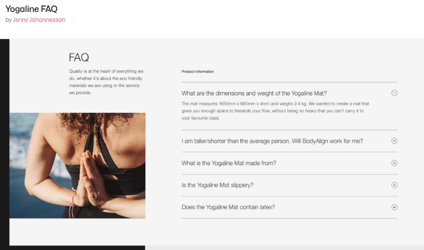
Examples of accordion menus on websites
Here are a couple of accordion menus we’ve highlighted from other websites to illustrate how they appear online.
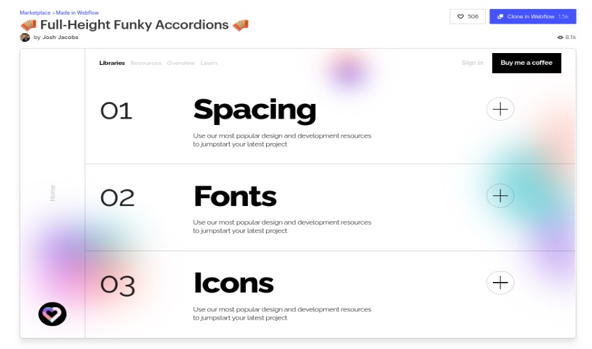
In many accordion menus, headers will use plus symbols to indicate that certain sections can be expanded, and minus symbols when they can be collapsed.
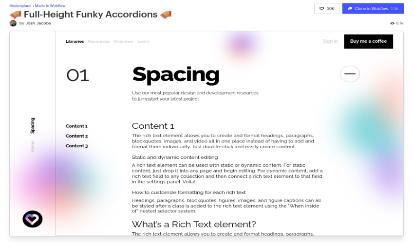
Other accordions will use arrows or carets that point users in the right directions.
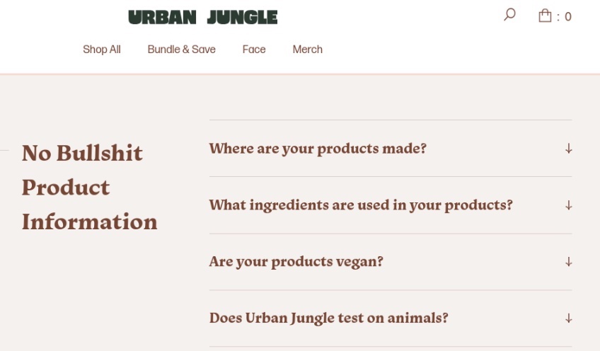
One of the most common use cases of an accordion menu is a section for frequently asked questions.
The Easiest Way to Build An HTML Accordion
An HTML accordion is a simple tool with a high concept impact. Even beginners can create a basic, CSS-only accordion without JavaScript.
Please note that the following steps are for building a very bare-bones HTML accordion. The objective is to show beginners how to get up and running with basic HTML and CSS to create an unadorned and simple accordion tool.
1. Defining the content
The first step in creating an HTML accordion is identifying the element objects it needs to contain. You need to account for the following elements in your design:
Headers—An HTML accordion header displays the titles of its respective sections. The ideal header is concise and to the point while being descriptive enough to convey its underlying content.
Icons—The role of this object is to provide a visual cue to the user, letting them know they can click to expand or collapse the sections on the accordion.
If your accordion allows multiple open sections at once, then you can use checkboxes or radio buttons rather than arrows to indicate that users can expand more than one section simultaneously.
Panels—These are the sections where the content pertaining to each header is contained and displayed. By design, they are typically collapsed, closed, or hidden until the user initiates some action to activate them. This is usually in the form of key action or clicking on the icon or header of the accordion.
A panel can contain a bulleted list, full paragraphs of text, or any other information you want to relay to your web page viewers. However, each panel should be consistent and related to the information described in its header.
2. Starting to program
After determining the basic elements of your accordion, the next step is to start building the programmatic details that’ll bring the accordion to life on a web page.
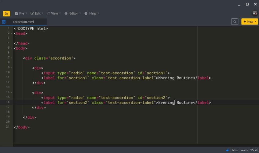
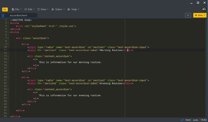
With your programming text editor tool (we used CodePad for the purposes of this tutorial), create and name an HTML file that will contain and display the accordion. We named ours accordion.html, but you can call yours anything you like. Keep in mind that if the file will serve as a homepage, it is typically named index.html.
Next, populate the file with the relevant tags needed to render the HTML document on a browser. At a minimum, it must contain head and body tags.
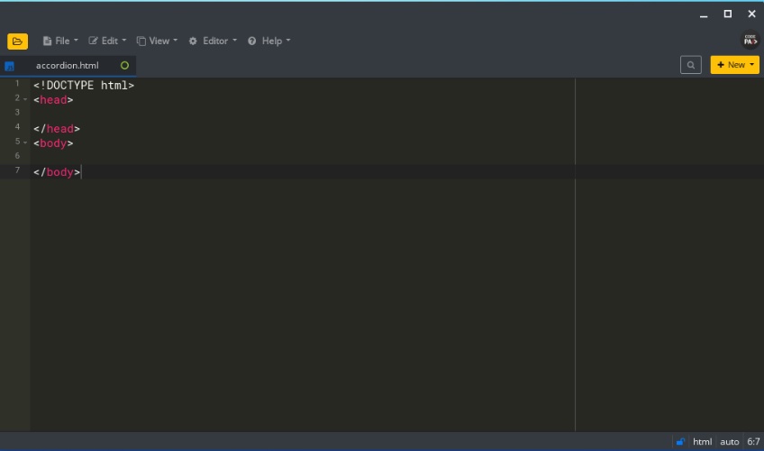
The head tag is where the title tag for the document is placed, along with other meta tags. In addition, you typically place links to the relevant CSS style sheet and JavaScript files that the web page uses in the head tag.
The body tag is where visual content you want to display to the user is placed in the HTML page document. Since you’ll need to create a place to put the accordion on your web page, create a div container tag for the accordion inside the body tag.
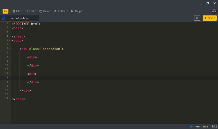
You can use whatever naming you prefer, but we assigned our accordion div a class named accordion, depicted like this:
<div class="accordion"></div>Inside the accordion div class, create individual divs corresponding to the number of sections you desire the accordion to have.
In this example, we only want our accordion to have two collapsable sections, so we added two divs inside our accordion class.
The divs help meet the requirement that the HTML accordion be CSS-only, and we have one div per section.
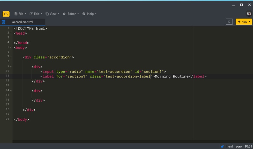
The next step is configuring the input types that will serve as radio buttons and labels that users will click on. In HTML, input types give developers an avenue to create interactive controls for capturing input from users.
For our accordion, the label tag must correspond to its preceding input. Note that the label’s tag for attribute must have the same name as its preceding input tag id. This ensures the elements that constitute the accordion’s header are synced together.
We also gave our first accordion header the title of “Morning Routine” in the label tag.
3. Preliminary testing
Now would be a good time to check out how the HTML page with your budding accordion is panning out. You can do it from your local computer, but you must have a web server installed and running. It also helps to be familiar with the functionality of localhost and your local server.
The local server denotes a server running on the same machine (computer or laptop) you are using. Alternatively, you can upload and host your accordion HTML document on a remote server like a cloud hosting platform with website builders. However, testing it on your local computer is usually more straightforward and quicker than uploading it to a remote server.
To access localhost on your browser, type localhost or 127.0.0.1 on the navigation bar. If you see nothing there or an error message, it simply means you don’t currently have a web server running.
You can use any web server application like Apache Tomcat for a web server. However, PHP and Python are the two most popular open-source languages used for HTML and backend scripting of web pages. Both have in-built servers, so we advise utilizing either of these languages to launch a web server.
If you have Python installed on your computer, you can use the SimpleHTTPServer.
On your terminal, type sudo apt-get install SimpleHTTPServer if you don’t already have it installed.
To start the Python web server, try something similar to the following:
- For Python 2, type python -m SimpleHTTPServer 8000
- For Python 3, type python3 -m http.server 8000
We used 8000 because SimpleHTTPServer listens to port 8000 by default, but you can use whatever number you want—just beware that you may get permission-denied errors with any port below 1024, especially when you aren’t executing as root.
Conversely, you can activate the PHP local web server if you have PHP installed on your computer.
Check for PHP installation by typing PHP — version on your terminal.
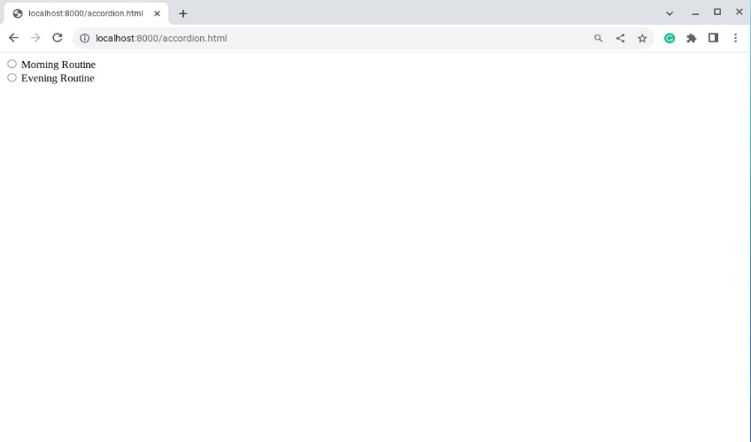
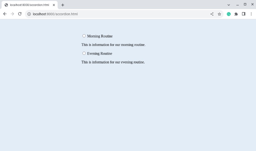
We subsequently used our browser to navigate to http://localhost:8000/accordion.html.
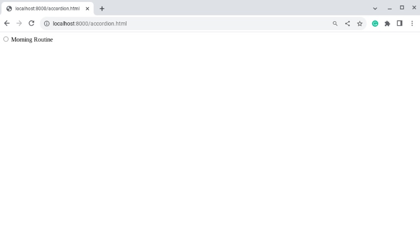
Don’t be alarmed at how threadbare and ordinary it looks at this stage. We haven’t even begun to apply CSS styles to change the appearance.
Since the objective is to create an accordion with two collapsable sections, we can copy and paste the first one and then make necessary edits to end up with a second section.
Be sure to use the same name attribute for each radio button input, as it’s important for synching their actions. After we refreshed our browser, we now had two starting points for section heads.
4. Filling up the accordion
The central use case of an HTML accordion is to provide a way to present content in an economical, user-friendly space. Therefore, the next step is to start populating your accordion section with relevant content.
To do this, create a new div tag with a class attribute named content_accordion that’ll essentially act as your accordion panel. We decided to encompass our content further in a p tag, which stands for paragraph.
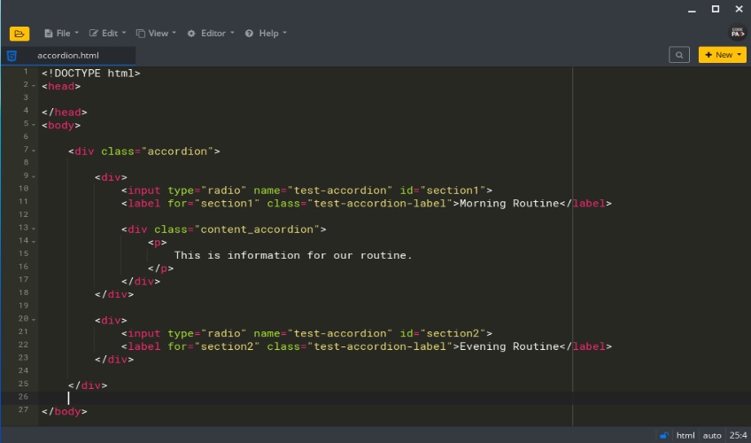
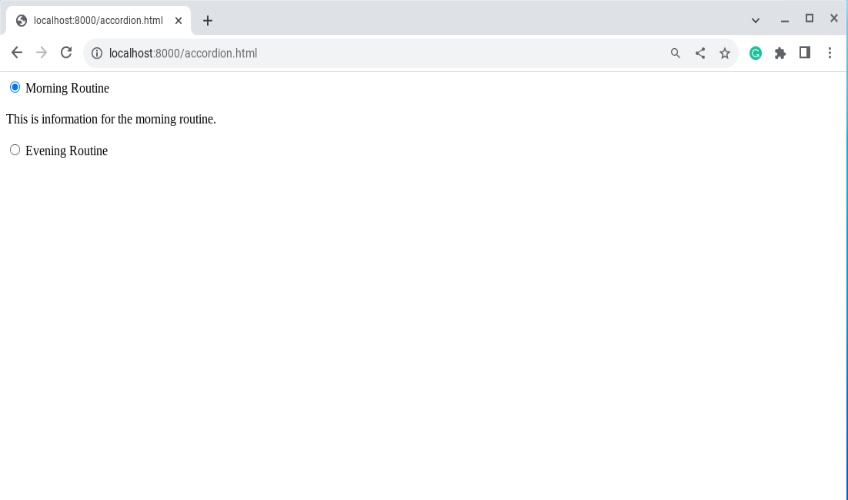
Upon updating our browser, it still doesn’t look like an accordion, but at least the relevant content is displayed alongside its corresponding radio button—so we’re making progress.
5. Adding style
To make our design elements look more like an HTML accordion, we must delve into the CSS.
First things first, although it’s possible to use in-line CSS for this, it’s not very advisable because the approach doesn’t scale well and it doesn’t follow the design principle known as the separation of concerns.
Instead, we created a CSS file called style.css that will affect the appearance of our web page and accordion elements. This goes between the <head></head> tag, where you’ll enter the command that links the style.css file to the accordion.html document.
<head>
    <link rel="stylesheet" href="./style.css">
</head>
Hopefully, you already understand your directory structure well enough to link your stylesheet in the correct folder where it resides.
Now you have a complete accordion.html document, so now we have to give it a makeover.
In the style.css, you can use a command to change the background color of your web page.
body{
    background-color: #e3edf7;
}
The following text targets the accordion class we created in accordion.html, and we’ve added comments to indicate what each statement does.
.accordion{
    margin:60px auto; /* This horizontally centers the accordion on the page */
   max-width: 400px; /* Makes our accordion responsive, shrinking appropriately on smaller screens */
}
Adding commands like those will slowly start to change the look of your page.
After the max-width statement, we added more information for further styling, but most of these choices are optional. Therefore, we’ll only be commenting on the most relevant statements that impact the fundamental design of the accordion moving forward.
For instance, we added a border to the element with a radius and a shadow.
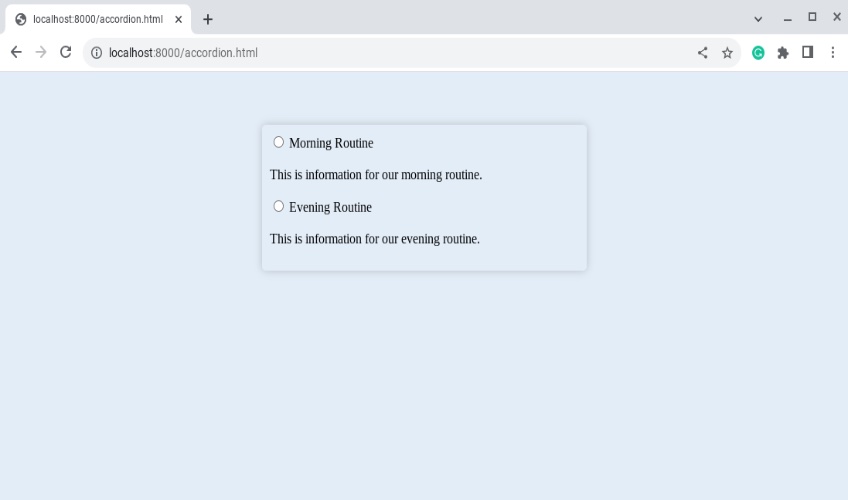
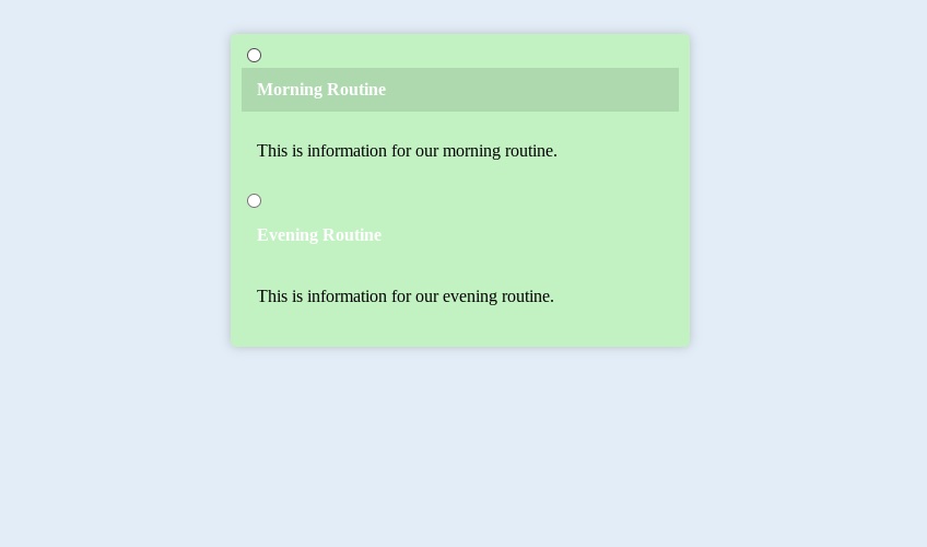
To distinguish between the page’s body and the accordion, we also gave the accordion a different background color.
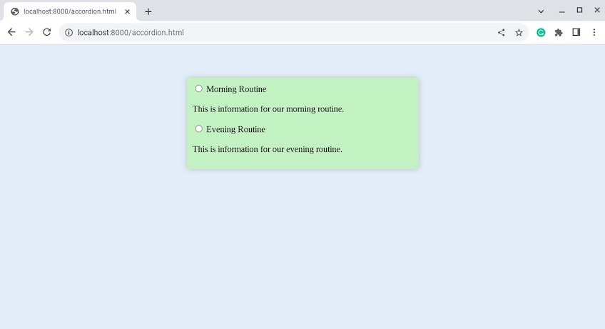
Here’s our complete accordion class at this point in style.css:
.accordion{
    margin:60px auto;
    max-width: 400px;
    padding: 10px;
    box-shadow: 0 0 10px rgba(0, 0, 0, 0.2);
    border-radius: 5px;
    overflow: hidden; /* Ensures the above border-radius still works if child elements exist */
    background: #c2f2c2;
}
6. Defining behaviors
The next step is configuring the accordion label and content panel through their respective classes to reflect HTML accordion functionality. In the style.css file, we target the test-accordion-label class with these statements:
.test-accordion-label{
    display: block;
    color: #ffffff;
    font-size: 18px;
    font-weight: 600;
    cursor: pointer; /* This changes the cursor to a pointer when hovered over the label */
    position: relative;
    transition: background 0.1s; /* Controls the animation speed during mouse hover */
}
.test-accordion-label: hover{
    background: rgba(0, 0, 0, 0.1);
}
The cumulative effect of these current changes provides a cursor pointer and a transition hover effect when you hover over a label. The label in question will have a different background color when highlighted.
To replace the radio button with a plus sign and provide a more user-friendly appearance, use the label::before command on the accordion label.
.test-accordion-label::before{
    content:"+";
    margin-right: 10px;
    font-size: 24px;
    font-weight: 900;
}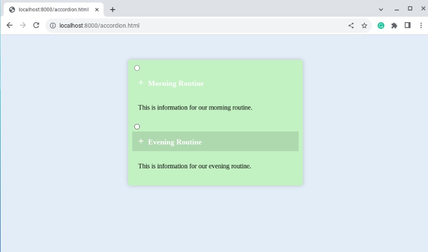
Next, in order for the plus sign to replace the radio button, we have to suppress the radio button from the input field box and prevent it from showing. Therefore, return to your CSS file and hide it in the test-accordion-input class with the following statement:
.test-accordion-input{
    display: none;
}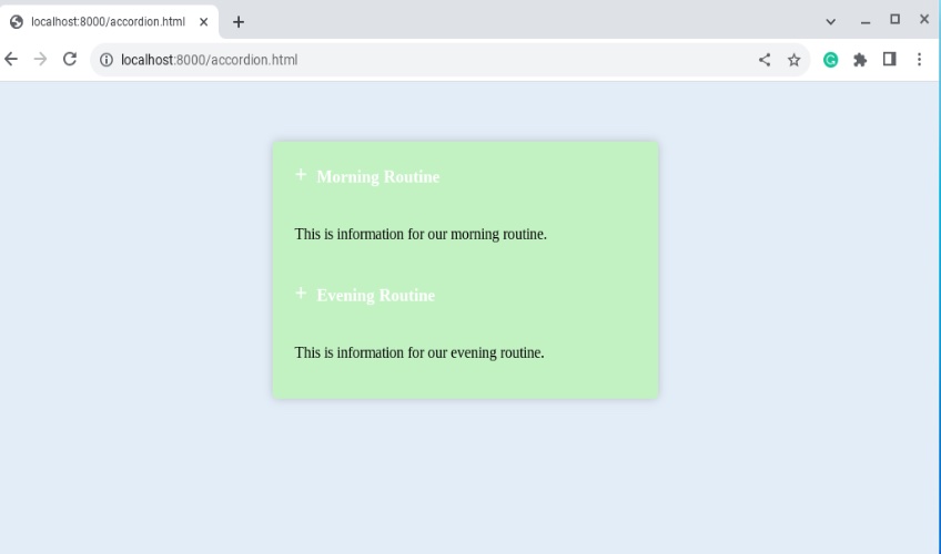
7. Setting up the default view
At this point, all the descriptions are visible upon arrival, so our next task is to hide the accordion’s content until a user selects an item by proactively clicking on its header, label, or expand icon.
Proceed by adding the following style commands to your style.css:
.accordion .content_accordion{
    display: none;
}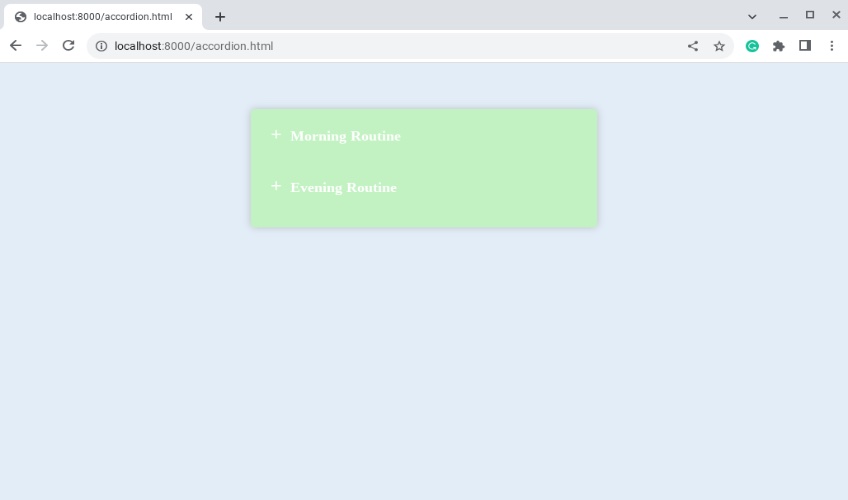
8. Final tests
The next step is to ensure that when the user clicks on a label header, the plus sign changes to a minus sign and the corresponding content panel gets displayed.
To do so, target the accordion class radio input buttons and ensure that its respective label class (test-accordion-label) changes to the minus sign whenever it’s currently checked or clicked.
.accordion input[type='radio']:checked + .test-accordion-label::before{
    content:"-";
}
The following CSS command ensures that the accordion content for the clicked label is subsequently displayed:
.test-accordion-input:checked ~ .content_accordion{
    display: block;
}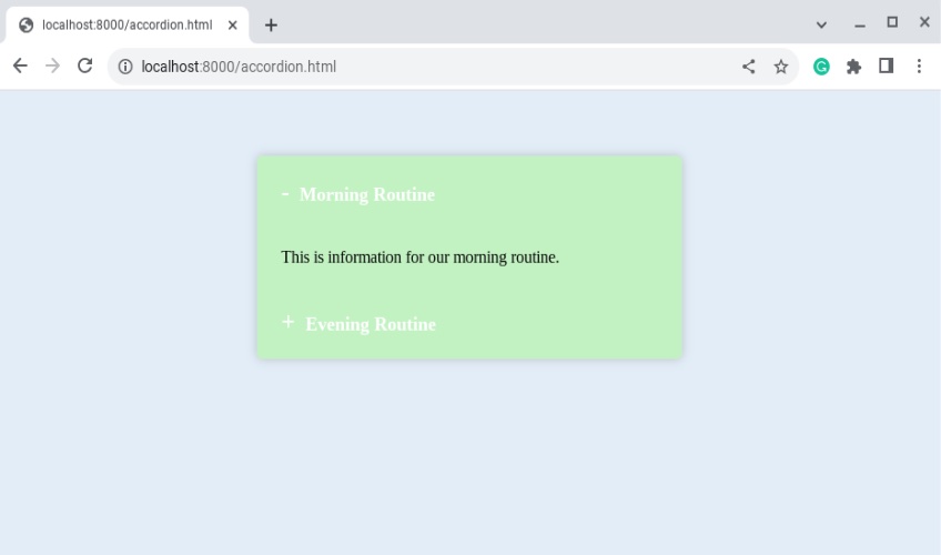
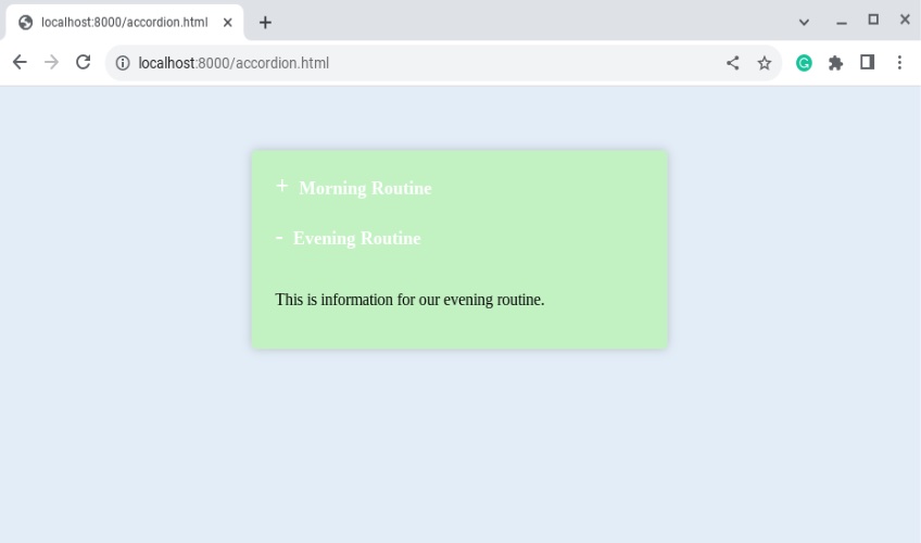
Clicking the first and second headers should now work as intended.
Final Thoughts
Altogether, designing an HTML accordion with only CSS is quite feasible and relatively straightforward. That said, you may want to use a website builder to get the job done a bit faster.
In the near future, we will likely see the use of artificial intelligence in web design for some of these web elements, but for now, putting in the extra work on your own can do wonders for boosting traffic to your website.
Lastly, we’re including the full code from this walkthrough below for easy copying and pasting—you know, just in case you fell head over heels in love with our super robust example design.
HTML
<!DOCTYPE html>
<head>
    <link rel="stylesheet" href="./style.css">
</head>
<body>

    <div class="accordion">

        <div>
            <input type="radio" name="test-accordion" id="section1" class="test-accordion-input">
            <label for="section1" class="test-accordion-label">Morning Routine</label>

            <div class="content_accordion">
                <p>
                    This is information for our morning routine.
                </p>
            </div>
        </div>

        <div>
            <input type="radio" name="test-accordion" id="section2" class="test-accordion-input">
            <label for="section2" class="test-accordion-label">Evening Routine</label>

            <div class="content_accordion">
                <p>
                    This is information for our evening routine.
                </p>
            </div>
        </div>

    </div>

</body>
CSS
body{
    background-color: #e3edf7;
}

.accordion{
    margin:60px auto;
    max-width: 400px;
    padding: 10px;
    box-shadow: 0 0 10px rgba(0, 0, 0, 0.2);
    border-radius: 5px;
    overflow: hidden;
    background: #c2f2c2;
}

.test-accordion-label, .content_accordion{
    padding: 10px 14px;
}

.test-accordion-label{
    display:block;
    color: #ffffff;
    font-size: 18px;
    font-weight: 600;
    cursor: pointer;
    position: relative;
    transition: background 0.1s;
}

.test-accordion-label:hover{
    /*background: #000000;*/
    background: rgba(0, 0, 0, 0.1);
}

.test-accordion-label::before{
    content:"+";
    margin-right: 10px;
    font-size: 24px;
    font-weight: 900;
}

.test-accordion-input{
    display: none;
}

.accordion input[type='radio']:checked + .test-accordion-label::before{
    content:"-";
}

.accordion .content_accordion{
    display: none;
}

.test-accordion-input:checked ~ .content_accordion{
    display: block;
}