Before we begin – if you’re an aspiring blogger but you aren’t sure what platform to use, we’ve broken down the best blogging websites here.
Let’s be honest. Creating pulse-quickening, super-engaging content that blows the socks off every single reader 100% of the time probably isn’t realistic.
It would be nice, yeah. But it just doesn’t happen.
This is especially true for companies in so-called boring industries—micro-niches with very few people having an overwhelming interest in the subject matter.
But if you’re always boring your audience to tears, this will obviously have a negative effect on your traffic, leads, conversions, brand reputation, and—ultimately—profitability.
Basically, boring content is awful. Boring content is worse than no content at all!
If you think your content marketing campaign is in a death spiral, resolving the situation ASAP is important.
We used to write some pretty boring crap. Once we figured it out, everything changed. Today, We’re not necessarily channeling J. K. Rowling all the time, but we do know when (or if) our audience is bored.
How do we know?
We’re about to tell you.
It’s about data—the warning signs are in the data.
Whether you’re a marketer, SEO, or content creator, data is your friend. But don’t worry; we won’t tell you to buy some expensive analytics software. Nearly all the data we cite in this article is free.
Here are telltale signs that your audience finds your content boring.
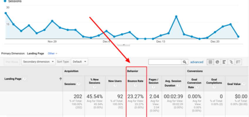
Your bounce rate is abnormally high
What does the term bounce rate mean?
Bounce Rate is the percentage of single-page sessions (i.e., sessions in which the person left your site from the entrance page without interacting with the page).
Basically, someone looks at your site and leaves.
You can find your bounce rate in Google Console.
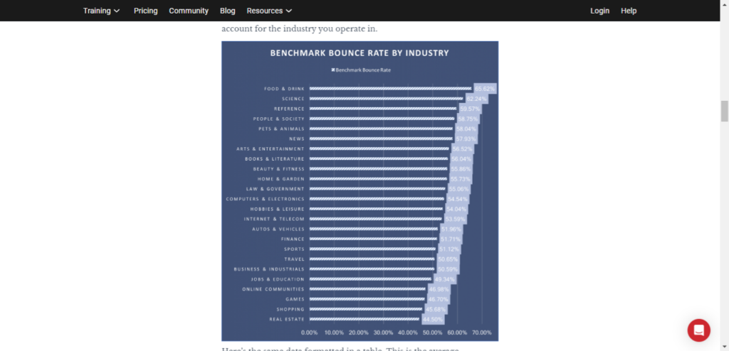
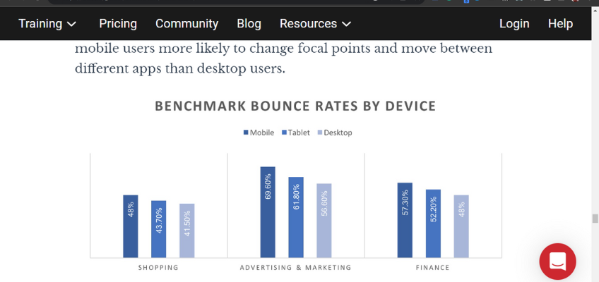
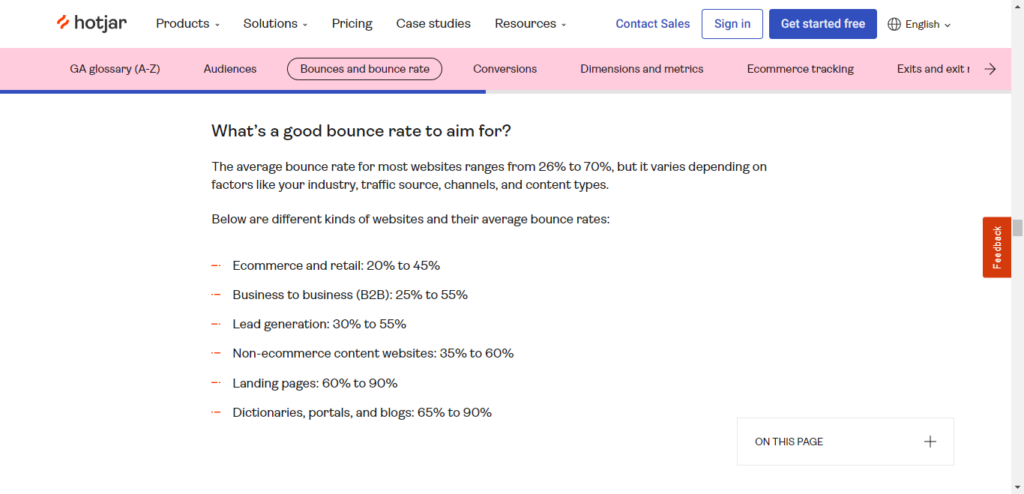
How do you know if your bounce rate is awful or not?
Here are some benchmarks according to the type of site you have:
Multiple issues can contribute to a high bounce rate.
Slow page load time, ugly web design, annoying pop-ups, or a crappy mobile experience are just a few of these reasons.
For example, mobile bounce rates are typically higher because of the less-than-optimal mobile design of some sites.
However, it can also simply be because readers are less than thrilled with your content, and they abandon the ship before even making it halfway through.
If your bounce rate is over 70%, there’s probably cause for concern. However, hotjar provides an interesting counterpoint that suggests that measuring bounce rate in isolation isn’t necessarily an accurate method or perspective.
Lacklustre content could very well be the culprit when there’s no other discernible reason.
You get few comments or no comments at all
Are you creating blog posts, guest posts, social media updates, etc., that are consistently getting little to no reaction?
Maybe you’re even asking open-ended questions at the end and begging readers to chime in to spark a discussion.
What’s happening?
If nothing, take this as a warning sign.
About fifteen years ago, we didn’t get many comments on our articles at the beginning of blogging and running websites.
Before we continue, we’d like to point out that we’re using examples and data that stretch back to those early days. We usually stick to current images and data, but in this instance, it’s necessary to show screenshots that match the information we’re discussing.
This means you might see older versions of Google Analytics and other software.
This one post (about postcards?!) received only 17 comments and basically no social shares:

We could have gotten all depressed about that.
Instead, we learned a lesson. Maybe our audience gets bored with stuff about postcards.
So, maybe we need to change the game up a little bit.
We focused on the topics and styles our audience wanted. As it turns out, a post like this got hundreds of comments:

Comment counts are a great thermometer of the interest level of your audience.
If you write a sizzling-hot article on a sizzling-hot topic, the number of comments will reflect it.
But if you write a complete snoozer, no one will comment.
This is the kind of information that tells you exactly what you need to know about your content’s bore score.
Your content isn’t getting socially shared
We think that social shares are one of the most simple yet informative metrics in content marketing.
A quick glance at the number of likes, tweets, and other shares a piece of content receives often serves as a basic litmus test to see how your audience has responded favorably (or unfavorably).
For example, it’s fair to say that if “Blog Post A” received 250 total shares and “Blog Post B” received only 12 total shares, Blog Post A was received by the readers significantly better.
While it wouldn’t be realistic to expect every piece of content to be a home run, a continually low number of social shares often indicates audience boredom.
The readers are not captivated by your content and don’t feel it warrants sharing.
The only caveat would be if you’re fairly new to the scene and haven’t really established an audience yet.
But if you used to receive a reasonable number of social shares and those numbers are noticeably dropping, boring content could definitely be the reason.
There’s a simple way to measure how your content is being shared.
You can use a tool such as Buzzsumo. Simply enter the URL of your website or blog, and click “Search!”
You’ll see a screen of results like this:
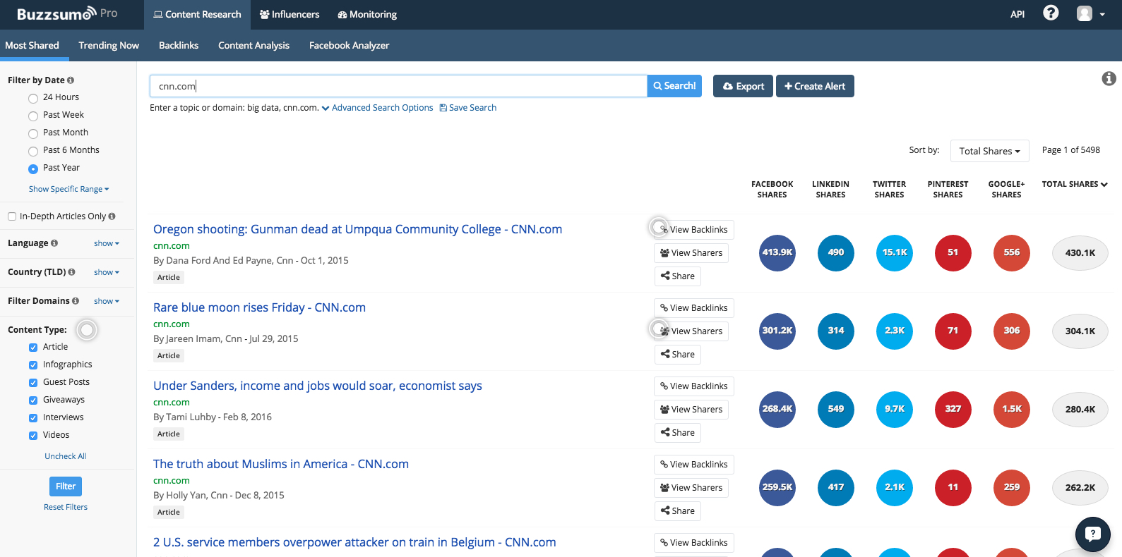
You may not have thousands of shares on a single post as CNN does. Ideally, though, you’ll see at least a few.
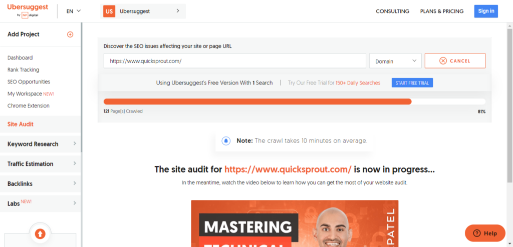
Another free tool you can use is the NeilPatel.com website.
To use this tool, enter your blog’s URL, and click the “Analyze” button.

You’ll be transported to Ubersuggest, where the analyzer will crawl your website. This can take up to 10 minutes to complete.
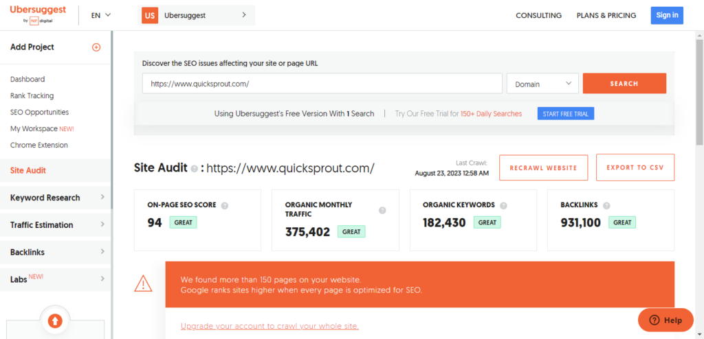
When the site audit is complete, you’ll have a full report to dig into,
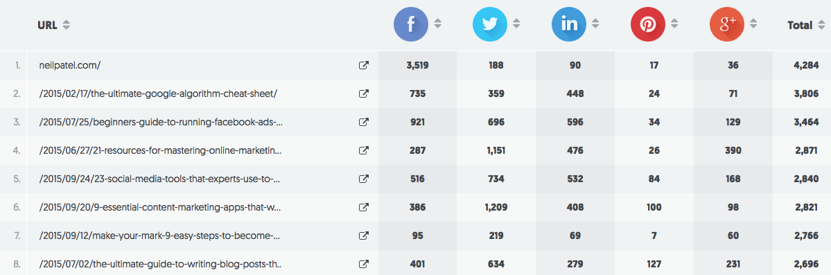
Circling back to our older content, here’s a summary of the social shares for the blog:
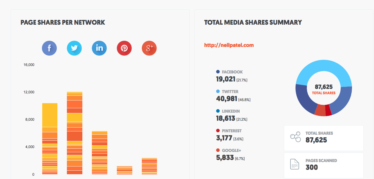
The “page shares per network” statistic tells you which individual pages were shared and the number of shares each page received:
You can also see the number of shares each page received according to the social network:
If people are not sharing your content, they probably aren’t too impressed with it.
But let’s be realistic. If your traffic is low, your shares will be low too. No one will share your content if no one sees it, to begin with.
Don’t beat yourself up over your low share counts unless you have really high traffic combined with low share counts.
There are usually several reasons why social sharing fluctuates and/or nosedives. Even a content marketing juggernaut like Buffer admitted, “We’ve lost nearly half our social referral traffic in the last year.”
Kevan Lee, Buffer’s content creator, tried to come up with a few reasons why it happened.
Here are his maybes:
- Maybe we need to hire a full-time social media manager to devote some time and energy to doing great work on social media.
- Maybe we’re not good at social media marketing.
- Maybe our sharing ratio is off; too much content, not enough conversation.
- Maybe everyone else is failing, too!
- Maybe we need to post more often.
- Maybe we need to post less often.
- Maybe, maybe, maybe …
So, while low share counts can indicate boring content, they are not the only measuring stick.
You have low Twitter engagement
Although it’s not always easy to determine your exact engagement level on all social media platforms, X (Twitter) makes it incredibly transparent.
Back in the day, we used Twitter Analytics. Back then, analysis tools were in the embryonic stages. Now, most third-party apps for X (Twitter) have robust analytics. A few examples are Tweet Hunter, Zlappo, and Hypefury.
Here’s what we do.
We compare the number of impressions our content has received with the number of engagements, including retweets, favorites, link clicks, etc.
Take a look at an example of this in Twitter Analytics.
A 28-day summary of this particular Twitter account shows that the number of tweets is down, impressions are down, profile visits are down, mentions are down, and followers are up.
This kind of data shows an overall decline in Twitter engagement, suggesting that the content being published on the account is less than exciting.
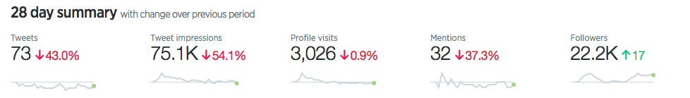
Obviously, that’s not the whole story, but it provides a fairly clear snapshot of how our X (Twitter) audience responds to the content we post.
Analytics is helpful because it provides month-by-month accounting for your X (Twitter) engagement levels. You can instantly find out:
- Your top tweet.
- The number of impressions your top tweet earned.
- Your top mention.
- The number of engagements your top mention earned.
- Your number of tweets.
- Your total number of tweet impressions.
- Your profile visits.
- Your new followers.
- Your mentions.
- Your top follower.
- The follower count of your top followers.
- Your top media tweet.
- The total number of impressions earned by your top media tweet.
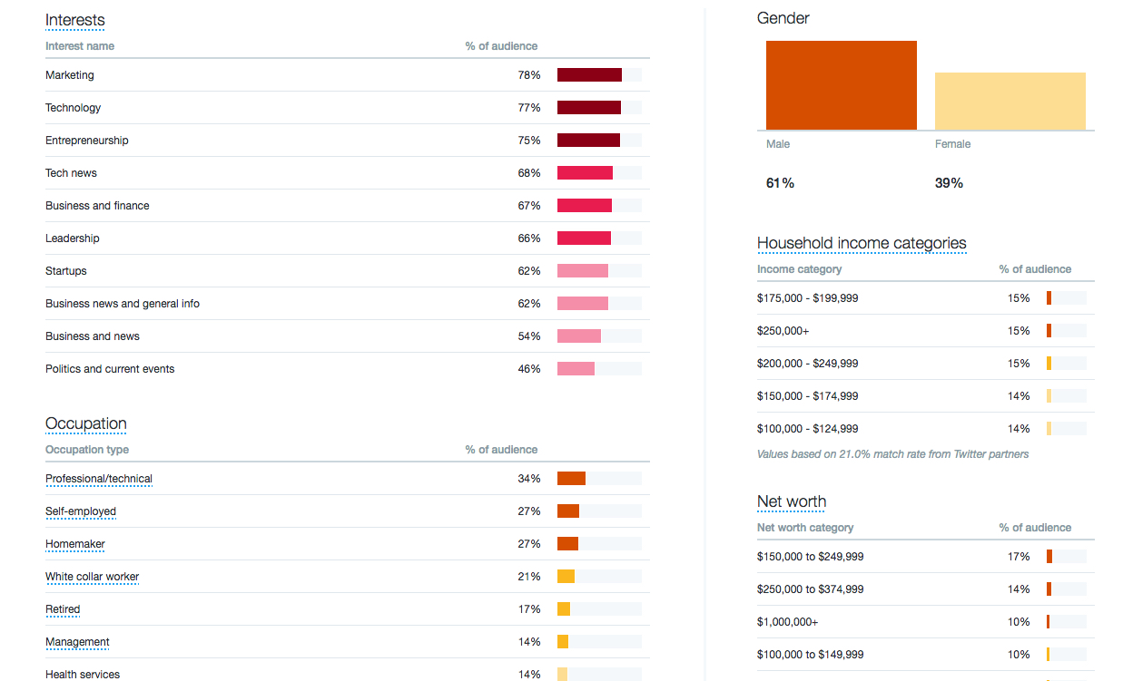
In addition, studying your analytics gives you a sharper perspective of who’s engaging with you. For example, our X (Twitter) followers are interested in marketing, and 61% are male. There’s plenty of juicy information here:
How does this data help us?
- We can understand how, why, and by whom our content is being shared.
- We can understand the demographics of our audience.
- We can retool our content to sustain higher interest.
In other words, all this data serves a point: it helps us create more engaging content!
Your unfollow rate is climbing
Are your social media followers unfollowing left and right?
Is your audience shrinking rather than growing with each update?
This is obviously a sign that something is wrong.
Many social media users are particular about what pops up in their feeds, and they’re simply not going to keep following an account that’s not revving their engines.
In yesteryears, finding detailed information and updates on follows and unfollows on X (Twitter) was much simpler. However, the latest changes to their API have made many analysis tools obsolete overnight. To reuse a previous point, most third-party X (Twitter) apps come with audience metric analysis.

Therefore, unless you posted something that’s highly offensive, a high number of unfollows usually points to uninspiring content overall.
Unless you posted something that’s highly offensive, a high number of unfollows usually points to uninspiring content overall.
Traffic overall is dropping
If you’ve noticed a steady decline or, even worse, a dramatic drop in overall traffic, this can also be a sign that your audience is losing interest.
While they probably don’t expect everything you post to be completely awe-inspiring, spotting a sinking ship is pretty easy. Many people won’t come back for more.
Over time, this can cause traffic numbers to plunge. If you’re noticing that your number of repeat visitors is diminishing, boring content could be why.
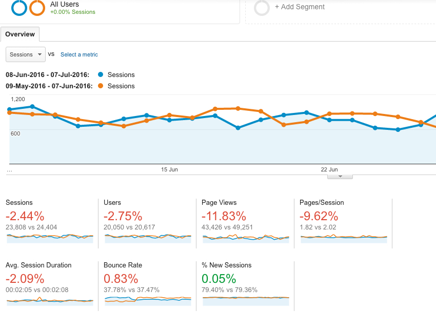
To analyze your content from this angle, quickly survey your traffic stats on Google Analytics.
We run comparison reports to see how the traffic for a current period ranks against our traffic from a previous period.
Sinking numbers is a sign that something is wrong. This website we recently checked is an example of that:
Data is a tricky beast to tame. If you’re not careful with it, you can come away with a false picture of what’s wrong.
Data only tells you what’s happening but doesn’t diagnose the problem.
If you suspect that boring content is a problem, work on fixing it, and see how things change.
Conclusion
Boring content isn’t good for anyone. It’s not stimulating your audience, and it’s not helping your brand grow.
But what do you do if your content just isn’t exciting? How do you fix this problem before it gets out of control?
We recently contributed a post to the Content Marketing Institute that offers some ideas on can do when your content is boring. This will provide you with some specific techniques for remedying the situation and spicing things up.
Remember, data is your friend. You can get a clear perspective of what’s happening and how to fix it by constantly looking at your data, running your numbers, poring over the metrics, and staying on top.