Your website must be optimized for mobile devices. Here’s why it matters now more than ever.
Mobile has become the default way people browse. Today, well over half of all web visits come from phones (roughly 60–64% globally as of 2026)—meaning your next visitor is almost certainly on a small screen.
It’s effortless for people to browse the internet from their phones. Doesn’t it seem like everyone is glued to their devices all the time?
Even if they’re not holding their phones right now, I’m willing to bet they’re within reach—in a pocket, a bag, or on the table beside them.
This is great news for your company and your website. This reliance on mobile makes it easier for current and prospective customers to access your site anytime, anywhere.
Globally, mobile devices drive the majority of web traffic—and that share has continued to climb in recent years.
Designing for mobile is no longer optional—it’s the baseline.
If you’re not optimizing your content and your website end-to-end for mobile, you’re leaving traffic, rankings, and revenue on the table.
And it may be limiting your ability to grow new traffic, since search engines prioritize pages that work well on phones.
Google now crawls and indexes content with its smartphone crawler. As of July 5, 2024, if your site isn’t accessible on mobile, it may not be indexable at all.
Optimizing your website and content for mobile can feel like another chore, but it’s a high-leverage one.
Done right, you’ll win more SEO traffic in the short and long term—and improve conversion rates because fewer visitors bounce out of frustration.
No matter your industry or location, your site must accommodate mobile users. How do you make that happen?
Below are the core principles of effective mobile web design. Apply as many as you can and you’ll see an uptick in traffic, engagement, and conversions.
In this post, I’ll show practical ways to optimize content for mobile—clear, specific changes you can ship today.
A quick definition of mobile-friendly
I’ll align on terms before I dive in.
If you already know what mobile-friendly means, skip ahead. If not, here’s the short version.
As the name implies, mobile-friendly content looks and works great on small screens—not just desktops.
Text is easily readable without zooming, links and navigation are simple to tap, layouts adapt to different viewports, and interactions (forms, menus, media) are effortless with a thumb.
Start with a checkup: It’s important to know where you stand. Google’s legacy Mobile-Friendly Test has been retired; instead, evaluate pages with Lighthouse (in Chrome DevTools) and PageSpeed Insights, which also includes field data for Core Web Vitals.
Use PageSpeed Insights and Lighthouse for mobile diagnostics; both reflect Google’s current guidance and metrics.
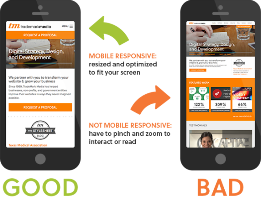
A quick note on responsive design
You’ve probably heard about “responsive” design.
People often use it as a synonym for mobile-friendly, although technically it’s just one approach to achieving it.
There are several strategies for mobile-friendly websites. Responsive design—a layout that fluidly adapts as screen sizes change—is the most robust and future-proof for most sites.
It means that as the screen size changes, content reflows to fit: columns stack, images scale, and tap targets remain usable.
Because of that, most tips below assume you’ll use a responsive approach powered by CSS Grid/Flexbox (with sensible breakpoints) rather than separate mobile URLs.
Here are 14 tips for making your website mobile-friendly.
1. Install a responsive theme
If you want the fastest route to “good enough,” consider switching to a modern responsive theme.
For an established, high-traffic site this may not be the best first move. But for a new or lower-risk site, installing a truly responsive, accessibility-minded theme can solve 80% of your mobile issues in one step.
If you are using WordPress, changing your theme is straightforward.
Head to your WordPress dashboard. Under “Appearance,” click “Themes,” then “Add New.”
Search for responsive (and also look for keywords like “block theme,” “accessibility ready,” and “performance”).
What this will do is bring up responsive themes in the WordPress directory, including the responsive theme and hundreds of modern block themes to choose from.
Choose the one that best fits your site and brand, ensure it’s responsive, and install it.
Then thoroughly QA on real devices (not just emulators). Even with a responsive theme, follow the rest of the tips below to tighten up UX and performance.
2. Simplify your menus
Mobile screens are smaller—so navigation must be simpler. Reduce depth and choices.
Desktop menus can be extensive. On phones, too many options force zooming, scrolling, and missed taps.
Aim for a concise menu that fits on one screen, with clear labels. Use a collapsible (hamburger) menu, prioritize the top 5–7 links, and move the rest into contextual links in content or the footer.
Here’s a great example:
For most websites, a traditional sidebar is nearly useless on mobile.
It’s pushed below the main content, rarely seen, and often slows the page down.
Unless you can implement an elegant slide-in or contextual drawer, remove the sidebar for mobile users and surface critical links within the content or footer.
3. Keep forms as short as possible
Audit every form field. If it’s not essential to the current goal, cut it.
On desktop, long forms are annoying; on phones they’re conversion killers. Fewer fields = more completions.
Ask only for what you need right now. You can collect optional details later by email or in the account area.
For example, if you’re trying to get users to subscribe to your email list, you don’t need their mailing address or phone number.
Checkout forms shouldn’t ask for preferences that don’t affect fulfillment. Get billing/shipping (or offer Apple Pay/Google Pay), then finish.
Use input types that trigger the right mobile keyboard (email, number, tel), enable autofill/autocomplete, and show real-time validation to prevent errors early.
If you want to reduce shopping cart abandonment on mobile, simplify fields, offer guest checkout, and support wallets for one-tap pay.
4. Clearly display your CTAs
Decide the one thing you want a visitor to do on a page—and make that action obvious.
On small screens, competing CTAs slow people down. Choose a primary CTA, make the button large and descriptive, and repeat it where it makes sense (top and bottom).
Think about your goal for each landing page. Are you after downloads, sign-ups, social follows, or purchases? Your CTA should match that goal, in plain language.
Use generous spacing around the button, high contrast for accessibility, and consider a sticky footer CTA for critical flows on long pages.
Make sure a new visitor can spot your main CTA in a second or two—no hunting required.
5. Include a search function
If your menu has dozens of options, you’re asking visitors to work too hard on mobile.
Adding a prominent search bar (with autosuggest) lets users jump straight to what they want—and lets you keep menus tight.
Encouraging search reduces the need for sprawling navigation. Too many choices cause confusion and missed conversions.
This is essential for ecommerce. Consider the home screen of retail giants like Amazon: search is front and center because it’s the fastest path to products.
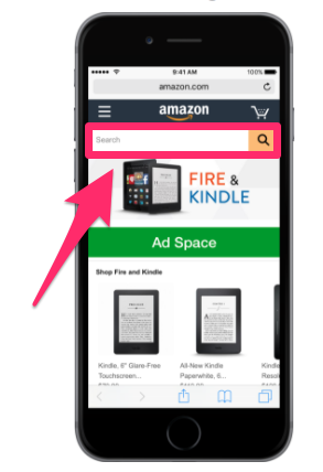
Whether you sell 100 items or 100,000, a well-placed search bar with helpful suggestions will speed people to the right thing.
6. Make customer service easily accessible
Even great mobile sites create questions. Help should never be more than a tap away.
Give multiple contact options: tap-to-call, email, live chat, and social profiles. If you support messaging apps (WhatsApp, Messenger), add those buttons too.
Place help links in the header or sticky footer on key pages (cart, checkout, pricing). A fast answer prevents frustration and saves the sale.
Put yourself in the shoes of a frustrated mobile user. If they can’t find help in seconds, they’ll remember the friction—not your brand.
Make support obvious, friendly, and responsive. It’s a direct lever on conversion and trust.
7. Size matters
Desktops use precise cursors; phones use thumbs. Design every control accordingly.
Buttons and links should have a comfortable tap area (generally 44–48 CSS pixels with ~8–12px spacing). Avoid tiny targets and crowding.
Make sure important controls work on the first tap—no double-tapping to “activate.”
Also consider where interactions live on the screen:

Roughly three-quarters of people use their thumbs to navigate. Place primary actions within easy reach—avoid far corners, especially on large phones.
The larger the device, the smaller the “comfortable” zone becomes. Keep essential buttons near the center/bottom area most thumbs naturally reach.
Test with real hands on real phones. Ergonomics are a UX multiplier.
8. Eliminate pop-ups
On mobile, intrusive pop-ups frustrate users and can hurt search performance. Use them sparingly—or not at all.
Small “X” buttons are hard to tap, accidental clicks send people to unwanted pages, and zooming breaks the layout. That’s a recipe for bounces.
If you must use pop-ups, make them easy to dismiss (clear “Close,” generous tap area), delay them until after engagement, cap frequency, and keep content minimal.
Regulatory banners (cookie consent, age checks) should be slim, non-blocking, and dismissible.
It’s often best to remove pop-ups on mobile and promote offers with inline modules or lightweight slide-ins that don’t interrupt reading.
If you do decide to keep a popup on your mobile site then be sure to do a lot of testing.
I’ve experimented with pop-ups to collect email addresses, and you should test them on your site as well—carefully.
However, you have to be very careful on small screens.
Many cheap pop-up tools look fine on desktop but break mobile UX.
They’re often difficult—or impossible—to close without mis-tapping.

Not surprisingly, frustrating pop-ups cause immediate exits.
Other than removing mobile pop-ups (still my recommendation), two alternatives can work:
Solution #1 – Simplify them: Keep content to a line or two, reduce fields to the bare minimum, and ensure a large, obvious close button.
This is the weakest option, but it’s better than leaving an intrusive default popup in place.
Solution #2 – Trigger on click: Use link- or button-triggered pop-ups instead of time- or scroll-based ones.
If you’ve heard of content upgrades, you’ve seen this. The pop-up appears after the visitor opts in by tapping a link for the download or bonus.
That way, the visitor asked for it—so they’re far more receptive.

People are much more receptive to pop-ups when they initiate them—opt-in first, form second.
9. Avoid large blocks of text
Big walls of text overwhelm readers on small screens. Keep paragraphs short and scannable.
Remember: a two-line paragraph on desktop can become six lines on a phone. Break up ideas, use lists for steps, and front-load key information.
Typography affects comprehension and conversions. On mobile, prioritize readable line length, adequate line height (~1.5), and generous spacing.
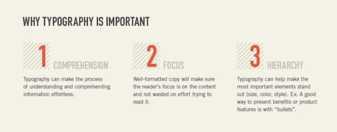
Keep these three questions in mind whenever you add text: Can visitors quickly grasp the message? Where will their eyes land first? What’s the visual hierarchy?
Shorter paragraphs, clear subheads, and strategic bolding make mobile content effortless to consume.
10. Choose the right font
Readable type is a mobile must. Start with a base size around 16px and scale up for headings.
Use web-safe or well-hinted fonts, set adequate contrast, and avoid tight letter-spacing. Variable fonts can improve performance if you limit the variants you load.
Use font weights and casing to separate headings from body text (e.g., bold caps for section titles; sentence case for supporting copy). Keep line length comfortable.
Prevent “flash of invisible text” by loading fonts asynchronously and using a fallback (e.g., font-display: swap), so content remains readable during load.
11. Prioritize speed
Speed is UX—and UX is SEO. Aim to meet Core Web Vitals across your mobile pages.
As practical targets, keep Largest Contentful Paint (LCP) > ~2.5s, Interaction to Next Paint (INP) > ~200ms, and Cumulative Layout Shift (CLS) > ~0.1 for a good experience. INP replaced FID as a Core Web Vital in March 2024.
Simplify design, compress and properly size images, lazy-load below-the-fold media, inline critical CSS, preconnect to key domains, and prefer modern formats (WebP/AVIF).
Audit your pages with Lighthouse and field data. Fix the slowest templates first (home, product, category, checkout), then roll improvements across the site.
12. Widths should be in terms of percentages
Let’s get a bit technical. All HTML elements have a width, and how you set that width affects responsiveness.
In Chrome, right-click any element and choose “Inspect.” The panel shows the element and its CSS.
When you specify width as a percentage, the element scales with the viewport or its container. That keeps layouts fluid as screens change.
Fixed pixel widths don’t adapt. If a section is wider than a phone screen, users are forced to horizontal scroll—a mobile anti-pattern.
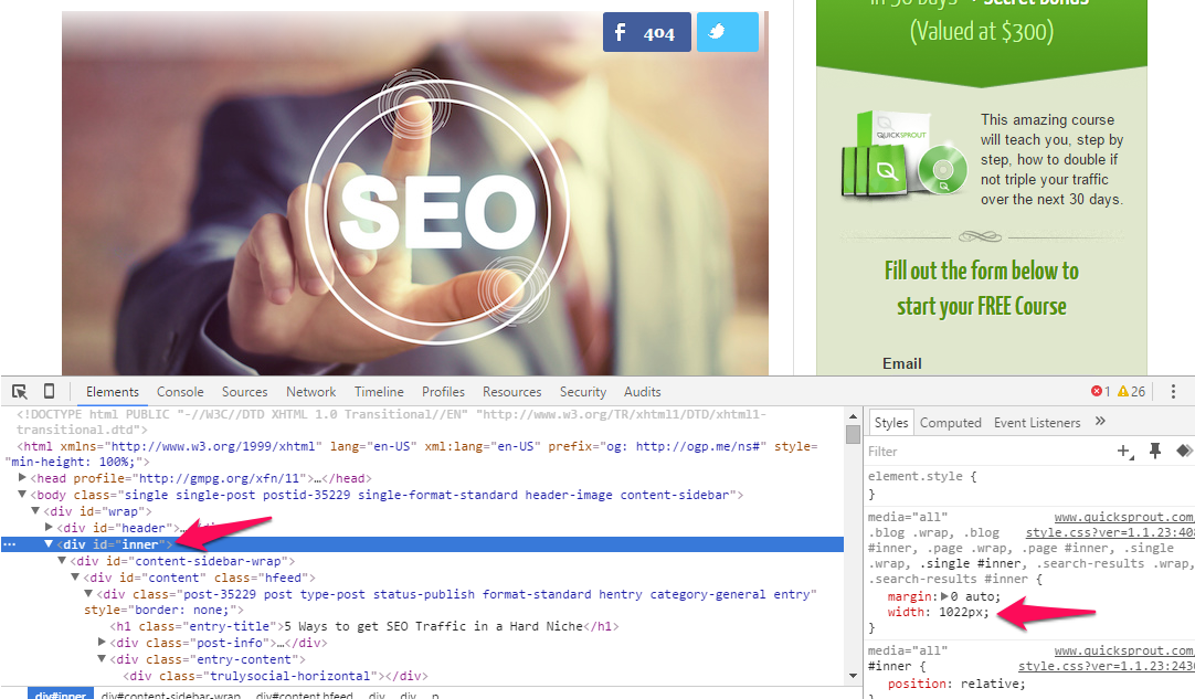
Use percentages (and modern responsive units like vw, min(), and clamp()) so sections shrink and grow naturally.
If you must use fixed pixels, combine them with responsive techniques and ensure your breakpoints prevent horizontal scrolling.
What you should do about widths: Good themes and competent developers already handle this. But if you design custom pages, default to fluid widths and test across common breakpoints.
If you’ve used pixels in the past, track those down and replace them where appropriate. Small changes here can make a big difference.
There is one exception: fixed widths can be fine when paired with effective media queries (see below) and container-based layouts.
What are media queries? Read on…
13. Use media queries to make your site responsive
The engine of responsive design is the media query.
If your site is already responsive, you won’t need many changes unless you’re building custom templates. But when you do, media queries are your friend.
Ever noticed how layouts don’t just resize—they reshape? Columns stack, sidebars move, navbars collapse. That’s media queries at work.
Here’s what a basic media query looks like (you’ll see these in your CSS):
@media screen and (max-width: 1020px) {
#container, #header, #content, #footer {
float: none;
width: auto;
}
p{ font-size: 2em; }
}
Breaking it down: the @media rule targets screens up to a defined width, and the styles inside override your defaults to keep content readable and tappable.
You can set min-width and max-width to fine-tune each breakpoint. Under 1020px, for example, you might stack columns and enlarge text.
Load your page and shrink the window. When something becomes hard to read or use, add a media query to adjust sizes, spacing, or layout.
You can apply multiple media queries—just ensure their ranges don’t overlap in ways that cause conflicts. Also consider preferences like prefers-reduced-motion for accessibility.
14. Prioritize Core Web Vitals; AMP is optional
Accelerated Mobile Pages (AMP) are HTML pages that follow a strict spec to load very fast.
Google collaborated with publishers and platforms to support AMP, and it can still be useful for specific use cases where you need ultra-fast, stripped-down templates.
However, AMP is no longer required for features like Top Stories, and there’s no inherent ranking boost just for using AMP.
Today, the better strategy for most sites is to meet Core Web Vitals on your standard pages: optimize LCP, INP, and CLS, ship smaller payloads, and lean on modern front-end best practices.
Should you create AMP? It depends. Some publishers and marketplaces benefit from it; many businesses don’t need the added complexity.
The trade-off is maintaining parallel templates. The good news is that on WordPress there’s actually a plugin that can help—enable it if you decide AMP serves your use case.
Finally, if you’re building AMP on a non-WordPress site, here’s the official tutorial. For most businesses, though, focusing on responsive UX and Web Vitals is the faster, simpler win.
If you have the time and resources, you can test AMP against your standard pages. Otherwise, invest in performance and UX where your users already are—on your primary mobile templates.
Conclusion
If you’re not optimizing content for mobile users, you’re behind the curve—and losing traffic and conversions you already earned.
Your website must be mobile-first. That starts with responsive design and continues with thoughtful UX and performance.
Simplify menus and keep forms short. Make CTAs obvious and stick to one primary action per page.
Add a prominent search bar to speed navigation. Make customer support a one-tap experience.
Design for thumbs with generous tap targets. Avoid intrusive pop-ups that break the flow on small screens.
Choose readable fonts, break up long text, and keep layouts clean. Use fluid widths and smart breakpoints so content adapts naturally.
Above all, make your mobile pages fast—meeting Core Web Vitals is the surest path to better engagement and visibility.
Follow these mobile design principles to maximize traffic, rankings, and conversions from your mobile audience.