When it comes to data, I’m convinced you can’t have enough. Turning analytics into decisions—running experiments, tracking behavior, and learning from patterns—is how great businesses and high-performing websites are built.
One fascinating branch of consumer behavior research is eye tracking. Insights from eye tracking can make you a sharper web designer, copywriter, conversion optimizer, or marketer by showing exactly where attention flows—and where it stalls.
Below, I’ve distilled eight research-backed takeaways from eye tracking studies so you can apply them immediately and see better results.
First, a quick definition: eye tracking measures where people look on a web page and for how long. Results are typically shown as heatmaps or gaze plots overlaid on the screen, so you can see attention hotspots and scan paths at a glance.
With eye tracking, you can identify what people look at first, second, and third, plus which areas attract the most interest and for how long. These patterns explain what visitors notice, what they ignore, and what they act on.
Full-scale eye tracking research can be expensive and time-consuming, but you can still benefit from published studies and complementary behavioral tools (like scroll maps and session replays). From that body of work, here are 8 practical takeaways to guide your design and content.
Takeaway #1: Put your most valuable content above the fold
It’s no surprise that above-the-fold content gets the most initial attention. Use this prime real estate to communicate a clear value proposition, reinforce relevance, and set the expectation for what comes next.
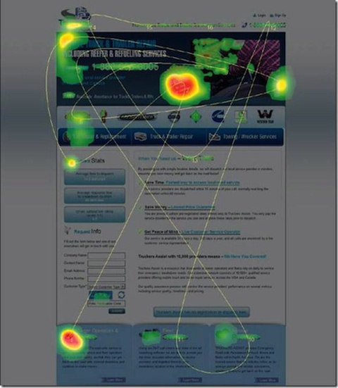
Even though it’s the most important real estate on your page, resist the urge to cram everything up top. Overloading the fold hurts clarity and usability—and often reduces engagement with the rest of the page.
You have only a few seconds to earn attention, so lead with a crisp headline, a short supporting subhead, and the next logical step. Avoid stuffing multiple competing calls to action into the first screen; one clear path beats five tiny ones.
Work on making your messaging and copy immediately relevant. That’s what encourages people to keep scrolling, explore your offer, and ultimately convert. In my own testing, pushing a hard CTA too early underperformed compared to leading with value and proof before the ask.
Takeaway #2: Place CTAs at natural decision points (including the bottom)
The top of the page receives the first look, but the bottom is a key decision point—people scroll, and many jump to the end to decide what to do next. Make the page’s endpoint a strong, obvious place to convert with a clear, friction-free call to action.
Don’t rely on a single button. Surface a primary CTA at natural decision moments—after benefits, after social proof, after pricing or demos—and again at the end. This matches how people evaluate information and reduces the need to scroll back up to act.
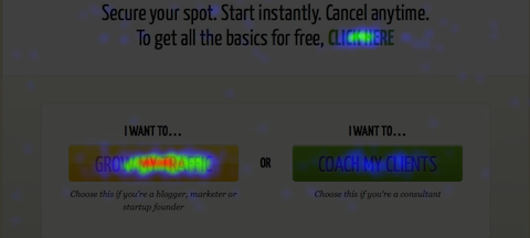
If you look at the Crazy Egg heatmap, you’ll notice that the call to action near the bottom of long pages often attracts substantial clicks, sometimes outperforming mid-page buttons because readers have the full context and are ready to act.
Takeaway #3: People read big, bold headlines
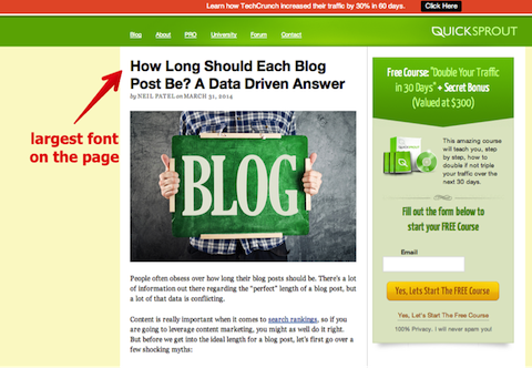
The bigger and more prominent your headlines are, the more likely people are to read them. Decades of research—including the well-known F-shaped pattern—show that headline prominence drives first fixation and sets scanning paths.
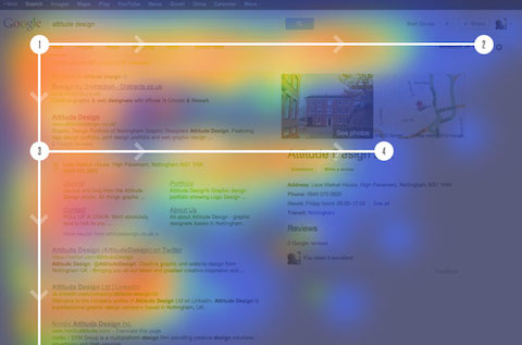
Studies from organizations like The Poynter Institute have repeatedly found that dominant headlines command the initial glance. Make yours specific, benefit-oriented, and easy to parse at a skim.
I’ve covered the importance of headlines and how to write them. Beyond strong wording, give headlines visual weight—size, spacing, and contrast—so they anchor the page and guide the eye.
I sometimes add visual flair to reinforce the message:
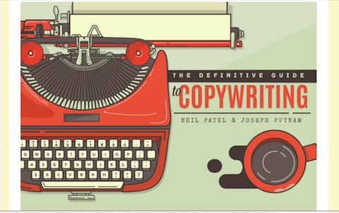
But most of the time, a clean, large typeface is enough—especially on mobile where scannability matters most.
Takeaway #4: Chunks of information are best
You’ve probably heard to use short paragraphs, clear subheadings, bullets, and numbered steps.
The reason is simple: big text walls are hard to process. Breaking content into meaningful chunks reduces cognitive load and keeps readers oriented.
An eye-tracking heatmap highlights how attention clusters around scannable elements. Group related ideas, front-load key points, and use descriptive headings—not clever ones—so readers instantly understand each section.
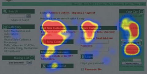
Readers gravitate to well-labeled chunks. Strong visual hierarchy (clear headings, consistent spacing, and aligned elements) makes it obvious where to focus next and improves comprehension.
Takeaway #5: You need a lot of white space
White space—also called negative space—is a core design tool, not wasted pixels. Eye tracking confirms that generous spacing improves flow and helps people digest complex information.
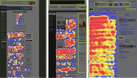
As layouts breathe, the eye moves more naturally from one element to the next. Dense pages force extra effort and cause people to skip around or abandon the content.
Negative space seems wasted. Why not put something there, right? In practice, spacing creates rhythm, defines relationships, and prevents visual fatigue—giving the eye a place to “rest” and a cue for where to go next.
Use it deliberately around headlines, images, forms, and CTAs to increase clarity and clicks.
Takeaway #6: The left side of your page is important
Eye tracking studies indicate that users spend most of their time with their eyes on the left half of the page.
For left-to-right languages, this pattern is reinforced by reading habits and web conventions. On mobile, the “left bias” often translates to “top bias”—people see and act on what appears first. For right-to-left audiences, design accordingly.
Prioritize key elements—value prop, navigation, and primary actions—where attention starts. Align content to match your audience’s reading direction and device context.
Takeaway #7: Be cautious with banners and intrusive elements
People ignore web banners. That behavior emerged early in the web’s history and has only intensified as users learned to filter out anything that looks like an ad.
Banner ads started out fairly innocuous. They were just ads. Then they started vibrating to get your attention. Or they looked like a system error. Or they told you that you were the millionth visitor to a website and would therefore receive your own gold Ferrari….
Click on the ad!? Yeah, right.
Dubbed “banner blindness,” this was one of the first and most talked about usability phenomena in the early days of eye tracking studies. Jakob Nielsen started uncovering this data in 1997.
Today, the same avoidance often extends to autoplay video, heavy cookie/consent overlays, and sticky elements that obscure content. Unless display ads are central to your business model, replace generic banners with relevant, clearly labeled, and nonintrusive placements—or better yet, contextual CTAs and product modules that feel native to the page.
Takeaway #8: Pictures of people are good
The experts agree: pictures of people work. Seeing real faces often triggers positive reactions—attention, empathy, and trust.
Pages that feature authentic faces tend to encourage interaction and can reduce bounce rates—especially when the image reinforces the surrounding message.
There are at least four takeaways from the eye-tracking studies on this subject:
- Use pictures of people as design elements – you may wish to use images of people on your home page. People look at other people and, as a result, stay longer on the page.
- Use a picture on your About page – people are more likely to believe you, trust you, and do business with you if they see what you look like.
- Use your picture on your LinkedIn profile – it engenders trust.
- Work on author reputation & bylines – add clear author bios, credentials, and a real headshot on your site to build credibility; while authorship photos no longer appear in Google results, strong author signals still improve user trust and clicks.
Conclusion
You can improve your website, conversions, and customer experience by applying what eye tracking reveals about attention. Design for how people actually scan and decide—not how you wish they would.
Where people look shapes what they learn, what they do, and what they buy. Earn the first look with clarity, guide the next look with hierarchy, and make the final look an easy “yes.” A look precedes a click.
