Copywriting can feel like a dark art. It isn’t.
There are a few simple moves that consistently lift sales, leads, and traffic—often by changing just a handful of words.
They’re straightforward enough for a complete beginner to use.
Follow the steps below and you’ll outwrite 99% of marketers. I’ve worked with many of them—most struggle with copy. A little deliberate practice goes a very long way.
The tactics are not complicated, easy to remember, and anyone can put them into action.
1. Focus on Headlines
Above all else, invest time in your headlines.
The fastest lever? The homepage headline. A single line could swing free-trial signups by 30%—up or down.
I’ve seen the same pattern everywhere. Headlines placed at key choke points in your funnel have outsized impact:
- The headline on your homepage
- Subject lines in sales and lifecycle emails
- The headline at the top of a core landing page or sales page
- The campaign headline you use across ads, social, and email
- Product names and first description lines
You’ll hear endless copy tips. After a decade of study, I’ve learned you can safely ignore most of them. Spend a disproportionate amount of time perfecting headlines.
If you want a great primer, read Great Leads.
Quick headline playbook:
- Make a single, specific promise (quantify it when you can).
- Front-load the benefit (“Get X without Y,” “Do A in B minutes”).
- Name the audience (“For founders who…”, “For HR teams that…”).
- Test contrasts: benefit vs. fear, speed vs. certainty, outcome vs. mechanism.
- Write 15–25 variants before you choose one. The first 5 are almost never the best.
2. Write Like You Would to a Friend
Many people get stuck on “voice.”
The common trap is sounding stiff and overly formal. That kills clarity—even in professional contexts.
A simple trick: write as if you’re texting a close friend who asked for help.
You wouldn’t use corporate jargon with a friend. Drop it here too.
Be simple. Be direct. Be clear.
I’m human—and I read what’s easy.
If you want an objective yardstick, aim for a 4th–6th grade reading level. The exact readability formula doesn’t matter; the outcome does.
Easy reading leads to more engagement—and in copy, that means more sales.
Friend-style checklist:
- Use short sentences (under 20 words).
- Prefer strong verbs over adjectives.
- Cut qualifiers (“just,” “really,” “very”) unless they serve a purpose.
- Say one thing per sentence, one idea per paragraph.
3. Use the Problem/Solution Format
You’ll encounter a dozen copy frameworks. AIDA (attention, interest, desire, action) is the classic, and there are many more.
World-class copywriters can recite them all and often create their own.
You don’t need that to win.
When in doubt, fall back on the simplest structure imaginable:
- Describe the problem in your reader’s words.
- Present your product or service as the solution.
It almost feels too easy. Will it match a master’s work? No. Will it make money? Absolutely.
Since most copy is mediocre, being clear and relevant puts you ahead. Keep it simple—lead with the problem, then the solution.
Problem/Solution in practice:
- Problem: “Our proposals take a week and still get ignored.” Solution: “Send a 3-slide proposal template clients sign in 24 hours.”
- Problem: “New reps drown in information.” Solution: “A 7-day onboarding path with one daily task.”
4. Go From the Clouds to the Street
I hear “sell benefits, not features” all the time. True—but beginners drift into benefits that are too lofty. “Grow your business! Find love! Lose weight! Make more money!”
Fix it by taking your copy from the clouds to the street. Get specific about how tomorrow gets better.
I knew someone who sold a “start your first business” program called Zero to Launch (which later evolved into Earnable). The space is crowded and most promises sound the same.
Instead of “Start the business of your dreams,” the sales page opened with a vivid, real-world outcome. It spoke to feeling chained to a calendar, needing a paycheck, and wanting breathing room—then promised a business that “pays you to live the life you’ve always wanted.”
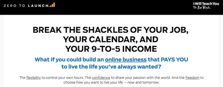
Why it works: it paints an everyday picture—blocking weeks on your calendar while revenue still arrives, waking up to overnight orders, weekends that still earn. Concrete beats vague aspiration.
Cut the fluff in the clouds. Put your promise on the street where readers live.
Clouds > Street examples:
- Clouds: “Improve team productivity.” Street: “End 60-minute status meetings—replace with a 5-minute daily async check-in.”
- Clouds: “Get healthier.” Street: “Follow a 10-minute, no-equipment routine before your morning coffee.”
- Clouds: “Save money.” Street: “Negotiate your internet bill in 7 minutes with this script.”
5. Steal Structure for Inspiration
When you’re stuck, steal structure.
No great copywriter invents everything from scratch. They mine headlines, angles, and flows from what already works.
Don’t copy/paste someone else’s words. Borrow the skeleton, then write your own flesh.
Sources I like for structure and angles:
- Headlines from tabloids, People, Vogue, and smart clickbait. These teams obsess over pulling readers in.
- Public swipe files—collections of proven ads and sales pages
- Ads that pique your interest. Click through, study the landing flow, and screenshot the best bits into your own swipe file.
Skip massive brand campaigns (Coca-Cola, Ford). Their goals and budgets change the rules. Learn from direct-response marketers who live and die by measurable sales.
6. Use Language that Your Customers Use
Here’s the fastest way to nail word choice: use the exact phrases your customers already use.
Do this well and prospects will think, “How are they in my head?” That’s when conversion gets easy.
You don’t have to invent anything. You just have to listen.
Go collect phrases directly from customers—or from competitors’ customers if you’re new.
Reliable places to harvest language:
- Customer surveys and post-purchase polls
- Recorded sales and support calls
- Amazon and app store reviews
- Reddit threads and community forums
- Social media comment chains
Look for phrases that repeat—especially around pains, fears, and desired outcomes.
From my infoproduct days: students obsessed over Facebook ads because they wanted to “turn $1 into $2.” If I had built that program, that exact phrase would have headlined my messaging everywhere. Short. Concrete. Powerful.
Capture the phrases your market repeats and weave them into headlines, bullets, and CTAs.
7. If It Doesn’t Work, Change the Offer
I obsess over every line on my sales pages.
One variable dwarfs all others: the core offer—your positioning and promise. Nail it and revenue 10X’d. Miss it and you couldn’t buy a win.
If your copy isn’t working, don’t tweak adjectives. Change the offer.
Trial-and-error your way to positioning that resonates.
This applies at both the marketing and business levels:
- Marketing: if a lead magnet stalls, swap it completely. Try a checklist, a workshop, a toolkit, a calculator, a free audit—something fundamentally different.
- Business: if sales are flat, repackage the product, change the pricing model, add a done-for-you tier, or target a different segment.
How to Write Like a Pro
Pros don’t write fancier—they revise harder. Steal this simple process.
Draft fast, edit slow:
- Pass 1 (Idea): Write the messy version without stopping.
- Pass 2 (Structure): Reorder for logic—problem > solution > proof > action.
- Pass 3 (Clarity): Shorten sentences. Replace weak verbs (“is/are/have”) with stronger ones.
- Pass 4 (Specifics): Add numbers, names, timeframes, and examples.
- Pass 5 (Voice): Read aloud. Cut filler, clichés, and hedging.
Pro tips you can apply today:
- Start with a “Because.” Readers want reasons.
- Use “you” more than “I.” Make it about the reader.
- Swap features for outcomes (“5 GB storage” > “Store 10,000 photos on day one”).
- Show proof early: numbers, testimonials, screenshots, or a 30-second demo GIF.
- End with an unmistakable next step and a reason to act now.
How to Create Scannable Content
Most readers don’t read every word—they scan first. Your job is to help them find the payoff fast, then guide them to the action you want.
The Scannability Playbook
- Lead with the takeaway. Open each section with one sentence that tells readers exactly what they’ll get.
- Use descriptive subheads every 150–250 words. Treat subheads like mini-promises (“Cut onboarding from 14 days to 3”).
- Keep paragraphs short. Aim for 1–3 sentences per paragraph. Break walls of text without mercy.
- Turn sequences into lists. Anytime you have steps, comparisons, or examples, use bullets or numbers.
- Write parallel bullets. Start each bullet with the same part of speech and shape (“Action verb + outcome”).
- Front-load key words. Put the important noun or verb at the start of the sentence or bullet so scanners catch it.
- Bold sparingly for emphasis. Highlight only must-read phrases; too much bold becomes noise.
- Use data and specifics. Numbers (timeframes, percentages, costs) anchor the eye and build trust.
- End sections with a micro-CTA. Tell the reader the next click or the one action to take now.
10-Minute Scannability Audit
- Find three long paragraphs and split each into two or three shorter ones.
- Turn one dense explanation into a 3–5 step numbered list.
- Add a descriptive subhead above any section that runs longer than 200 words.
- Bold one key phrase per section (max) that signals the takeaway.
- Replace vague claims with a specific metric or example.
Before/After Example
Before: “Our platform helps teams collaborate better by providing tools that streamline workflows and improve productivity across departments.”
After:
- Cut status meetings to 5 minutes with daily async check-ins.
- Ship faster with one shared board for tasks, files, and approvals.
- See bottlenecks instantly with auto-generated progress reports.
Reusable Section Template
Hook: One-sentence promise.
What you’ll get: 2–3 bullets.
Steps: Numbered list.
Result: One concrete outcome.
Next action: A single clear CTA.
Try it now: pick one long section on your page, apply the audit above, and add a micro-CTA at the end.
How to Create Engaging Content
Engagement is earned with momentum: hook, payoff, proof, and action—repeated in tight loops.
Use these engagement patterns:
- Open with a specific moment (a metric swing, a customer quote, a vivid scene).
- Plant an “open loop” question you’ll answer a few lines later.
- Alternate story and takeaway (1–3 sentences each) to keep pace high.
- Address objections in-line (“What if our data is messy?” Then show what happens.).
- Invite micro-interactions: “Pick one step and do it today.”
Simple hook formulas:
- “Most people do X. Here’s what the top 1% do instead.”
- “I changed one input and got Y result in Z days.”
- “If you only fix A, B and C take care of themselves.”
CTAs That Close the Deal
Your call to action is the moment of truth. Make it obvious, low-friction, and tied to a concrete benefit.
Where to Place CTAs
- Above the fold: One primary CTA near the headline for ready buyers.
- Mid-page: After your first proof block (testimonial, number, or demo GIF).
- End of page: Recap value > CTA with risk reversal.
- Mobile: Sticky bottom CTA (short text) that never fights the content.
What the Button Should Say
- Outcome + next step: “Start my free trial,” “Get my proposal,” “Book my 15-minute demo.”
- Use first person: Often outperforms second person (“Start my trial” beats “Start your trial”).
- Remove ambiguity: Pair the button with a 1-line explainer under it: “No credit card,” “Cancel anytime,” “Takes 60 seconds.”
- Match intent by funnel stage: TOFU: “Get the guide.” MOFU: “See it in action.” BOFU: “Start free trial,” “Get pricing.”
Make Saying “Yes” Easy
- Risk reversal: Free trial, guarantee, cancel anytime, sample chapter, sandbox demo.
- Social proof proximity: Place a high-cred testimonial or stat within 50–100px of the CTA.
- One primary action: If you must include a secondary link, style it as a text link to avoid splitting attention.
- Short forms win: Ask only for what you need now (email > progressive profiling later).
CTA QA Checklist
- Can a scanner identify the CTA in one second?
- Does the button copy describe the outcome, not the task?
- Is there a nearby proof point and a risk-reversal line?
- Is there only one primary CTA per screen on mobile?
- Are click and completion rates tracked separately (CTR and post-click conversion)?
Quick Copy Swipes
- “Start my 14-day free trial” > add subtext: “No credit card. Cancel anytime.”
- “Book a demo” > “Book a 15-minute demo” (sets expectation and reduces friction).
- “Download” > “Get the 7-step template” (specify the value inside).
Combine Design and Copy for Optimal Results
Great design makes your message effortless to understand and your action irresistible. Marry words and visuals so each strengthens the other.
Build a One-Screen Story
- Hierarchy: Headline (promise) > Subhead (how) > Proof (logo bar, stat, testimonial) > Primary CTA.
- One idea per section: Separate blocks with generous spacing so each thought lands.
- Visual anchors: Use icons or images to label sections; keep them simple so they don’t compete with the copy.
Typography that Sells
- Contrast: 3–4 step type scale (e.g., H1, H2, body, caption). Big enough to scan at arm’s length.
- Line length: 45–75 characters for body copy to keep reading smooth.
- Buttons: Sentence case beats ALL CAPS for readability; add clear focus states for accessibility.
Layout Patterns That Convert
- Z- or F-pattern: Place headlines and CTAs where the eye naturally lands.
- Proof near promise: Put logos, ratings, or data immediately under the claim they support.
- Directional cues: Arrows, gaze direction in photos, or subtle lines that point to the CTA.
- Whitespace is a feature: If everything is emphasized, nothing is.
Images That Earn Their Keep
- Show the outcome: Dashboards with real numbers, before/after shots, GIFs of the product solving the problem.
- Use captions: Many readers scan captions first—treat them like mini-headlines with a benefit.
- Compress and lazy-load: Faster pages convert better; visuals should never slow the “yes.”
Mobile-First, Accessible by Default
- Thumb reach: Place key CTAs within easy reach; avoid tiny tap targets.
- Readable contrast: Meet color contrast guidelines so text is legible in daylight.
- Alt text and labels: Describe image value; label form fields clearly; announce errors in plain language.
Copy-First Workflow (That Designers Love)
- Outline the message: headline promise, 3 benefits, 1 proof, 1 CTA.
- Wireframe sections with boxes—no colors yet—so hierarchy is clear.
- Pair each benefit with a visual (icon, screenshot, or stat).
- Add spacing, type scale, and button styles; keep the palette simple.
- Run a 5-second test: can a new reader tell what it is, for whom, and what to do next?
Result: copy that’s impossible to miss, design that guides the eye, and CTAs that feel like the natural next step.