Content management systems (CMS) make it possible to create, organize, and publish content on the web without needing to code everything from scratch. Without a CMS, you’d have to learn HTML, CSS, and likely JavaScript or rely on a developer just to launch and keep a site updated.
Most modern CMS platforms let you build and manage a full website without writing code. There are excellent options for every skill level and use case—from simple blogs to global ecommerce. Below, we break down the best choices and how to pick the right one.
The Top 10 Best Content Management Systems in 2026
I point readers to WordPress because it’s the CMS stack I use to publish Quick Sprout. It’s fast, flexible, and battle-tested. Set up WordPress with Hostinger for as low as $2.49 per month with long-term plans—Hostinger often includes a free domain for the first year and frequent promotions like extra months of hosting.
- Hostinger + WordPress – Best overall content management system
- Wix – Best website builder for content management
- Shopify – Best CMS for ecommerce
- Squarespace – Best CMS for beautiful designs
- BigCommerce – Best CMS for enterprise ecommerce
- Joomla! – Best WordPress alternative
- Drupal – Best CMS for security
- Adobe Commerce (Formerly Magento) – Best CMS for advanced ecommerce users
- Adobe Experience Manager Sites – Best AI-powered CMS
- Magnolia CMS – Best omnichannel content hub
I’ve been managing web sites for more than a decade. After extensive research and hands-on testing with all of the major platforms, these ten CMS options cover the widest range of needs, budgets, and team sizes.
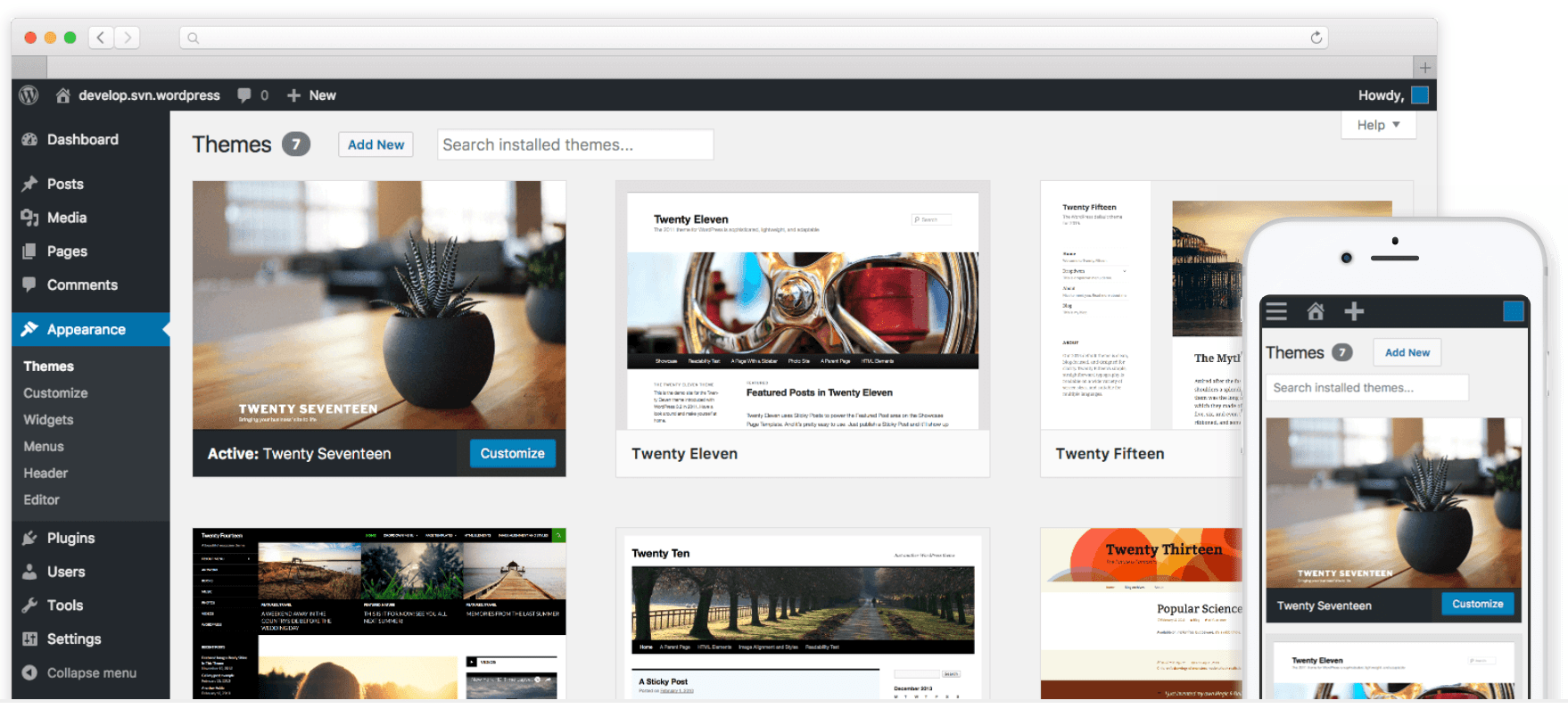
Hostinger + WordPress — Best Overall Content Management System
WordPress powers a massive share of the web and is the most popular CMS on the planet. Millions of sites—from hobby blogs to the world’s biggest publishers—trust it for unmatched flexibility. Pairing WordPress with Hostinger gives you an affordable, fast, and stable foundation.
As a free, open-source CMS, WordPress is endlessly customizable. There are 60,000+ plugins and thousands of themes to add SEO tools, ecommerce, membership areas, learning platforms, bookings, and more—without touching code.
While WordPress itself is free, you’ll still need web hosting—and Hostinger is my favorite for speed and value.
Intro plans often start around $2.49 per month with long-term commitments, which is far cheaper than most website builders that run $10–$25 per month. Hostinger also includes a no-code, drag-and-drop site builder if you want to launch something simple fast.
Why I like this stack: Hostinger offers one-click installs, automatic updates, staging, backups, and performance features like LiteSpeed caching—so you can focus on publishing. WordPress gives you full control over your content and design with the Gutenberg block editor, full-site editing, and patterns.
You can build a free site on WordPress.com using a subdomain to experiment. That’s fine for learning, but businesses should run WordPress.org with their own domain and hosting for full control and branding.
Bottom line: WordPress is SEO-friendly, secure when maintained, mobile-responsive, and ideal for content-heavy sites. Beginners can get up to speed quickly, and advanced users can extend or customize anything they want.
Get a strong deal on a new WordPress site when you sign up for web hosting with Hostinger. Depending on your plan and term length, you can save up to 75%. Hostinger frequently includes a free domain for one year and promotional extras like additional free months.
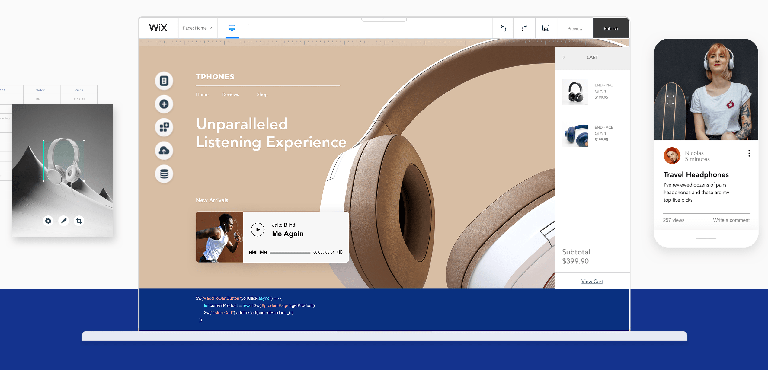
Wix — Best Website Builder for Content Management
Wix is a powerful website builder with CMS-like features. You get hosting, templates, apps, and an editor in one package—ideal for anyone who wants to go live fast without technical overhead.
Wix’s drag-and-drop editor makes it easy to design pages and manage content for blogs, small stores, portfolios, bookings, memberships, and more. The App Market and built-in tools extend functionality as you grow.
You can publish a free Wix site on a subdomain. To remove Wix branding, connect a custom domain, and unlock ecommerce and advanced features, choose a paid plan.
- Light — $17 per month (annual)
- Core — $29 per month (annual)
- Business — $39 per month (annual)
- Business Elite — $159 per month (annual)
- Enterprise — Custom
Wix handles security and reliability for you with automatic updates, SSL, backups, and a globally distributed infrastructure. If you ever need to restore your site, the built-in site history makes it straightforward.
While Wix is incredibly beginner-friendly, it’s not as extensible as a fully open-source CMS like WordPress. For many small businesses, though, the simplicity and “it just works” factor is a huge win.
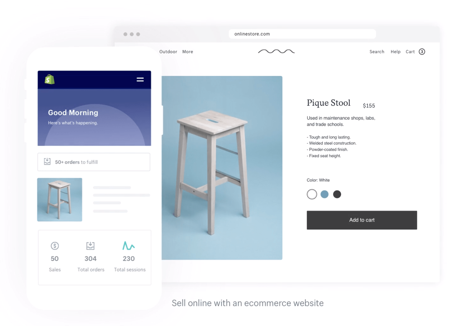
Shopify — Best CMS for Ecommerce
Shopify is the gold standard for selling online. It combines a website builder, CMS, built-in payments, inventory, and omnichannel tools (POS, social, marketplaces) in one intuitive dashboard.
Create product catalogs with variants, track inventory, manage orders and shipping, and build content with a clean editor. You also get a robust app ecosystem, fast checkout with Shop Pay, and options for international selling.
Yearly pricing tiers:
- Basic — $29 per month
- Shopify — $79 per month
- Advanced — $299 per month
You can try Shopify free for three days.
Squarespace — Best CMS for Beautiful Designs
Squarespace is perfect for creative professionals and anyone who wants pixel-perfect templates without fiddling with code. Portfolios, restaurants, service businesses, and boutique stores are all a natural fit.
It includes modern templates, blogging, scheduling, member areas, and ecommerce with a streamlined editor. If your site is primarily visual, Squarespace shines.

Plan names are in transition. Squarespace is rolling out new plans (Basic, Core, Plus, Advanced) to replace the legacy Personal, Business, and Commerce tiers. Pricing depends on whether your account has the new plans yet—your pricing page will show the options available to you. Month-to-month and annual billing are both offered.
BigCommerce — Best CMS for Enterprise Ecommerce
BigCommerce is built for scale. It’s an all-in-one ecommerce platform with a CMS designed to handle large catalogs, multi-storefronts, B2B, and international selling.
Non-technical teams can make site changes quickly, while developers can go headless and use APIs for custom storefronts. It’s a strong choice if you’re outgrowing basic ecommerce tools.

Plans and pricing:
- Standard — $39 per month or $29 per month with an annual plan
- Plus — $105 per month or $79 per month with an annual plan
- Pro — $399 per month or $299 per month with an annual plan
- Enterprise — Custom pricing
Create a fully customizable enterprise ecommerce site with BigCommerce today.
Joomla! — Best WordPress Alternative CMS
Joomla is a free, open-source platform often compared to WordPress. It has a steeper learning curve but offers powerful tools for building custom content types and membership-style sites.
Joomla excels at user management (ACL), supports multilingual sites out of the box, and lets you run different templates on different sections of your site—handy for complex builds.
If you like the idea of an open-source CMS but want something more structured than WordPress, Joomla is a solid alternative. Just note the extension ecosystem is smaller than WordPress, so you may build more features yourself or hire a developer for advanced customizations.
Drupal — Best CMS For Security
Drupal is another free, open-source CMS favored by organizations with strict security and compliance needs. It offers granular permissions, advanced caching, and a mature developer ecosystem.
Drupal excels in many of the same areas as Joomla—custom content types, flexible taxonomies, and multilingual capabilities—while standing out for its security posture and enterprise-grade stability.
Security features include database encryption options, robust access controls, update mechanisms, and extensive community reporting that help harden deployments. Drupal powers banks, governments, healthcare, and high-traffic publishers for good reason.
Recommendation: choose Drupal if you have developer resources and need deep customization with rigorous security. It’s not the most beginner-friendly option.
Adobe Commerce (formerly Magento) — Best CMS For Advanced Ecommerce Users
Adobe Commerce (formerly Magento) is built for companies that need total control over complex ecommerce—B2C and B2B. Expect deep catalog management, custom workflows, and integrations at enterprise scale.
It’s developer-centric and not meant for beginners. Progressive Web App tooling, strong B2B features, and extensive extensions make it a powerhouse for sophisticated stores.
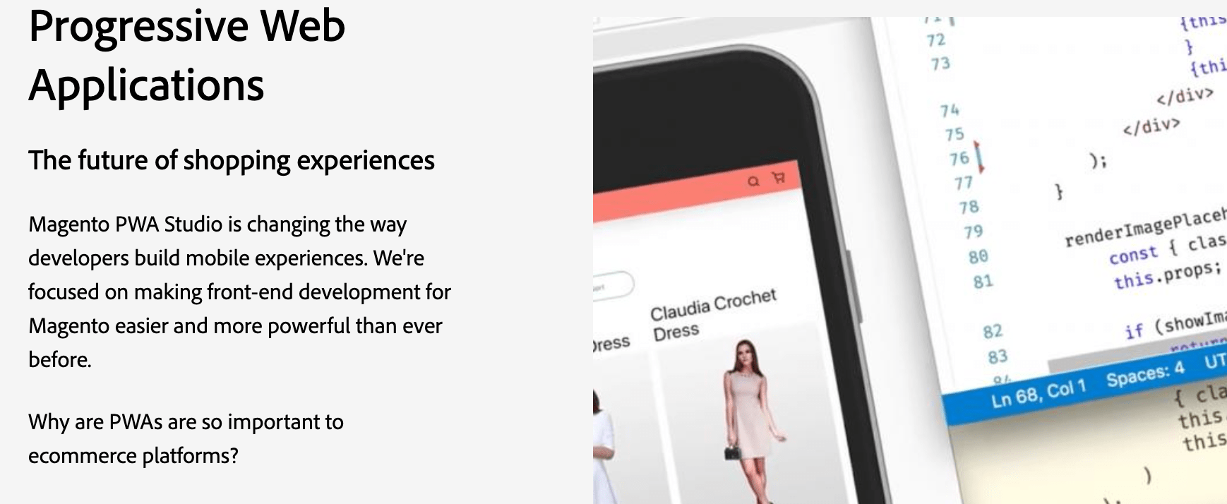
Pricing is quote-based and typically expensive—enterprise deployments commonly run into five figures annually. Request a demo to scope features and budget.
Adobe Experience Manager Sites — Best AI Powered CMS
Adobe Experience Manager Sites is a hybrid CMS for brands that need to create once and publish everywhere—web, mobile apps, kiosks, and beyond—with enterprise governance and personalization.
It combines web content management, headless APIs, developer tooling, and AI-driven features to speed up authoring and deliver personalized experiences at scale.
Benefits of Adobe Experience Manager Sites include:
- Web content management
- Developer-facing tools
- Cross-channel content management
- Personalized experiences
- Scalability with machine learning
- API delivery
Choose AEM Sites if you need enterprise-grade orchestration across many channels and teams, with tight integration into the broader Adobe stack.
Magnolia CMS — Best Omnichannel Content Hub
Magnolia CMS is a headless-first, enterprise content platform built for omnichannel delivery. Marketers like the modern UI and the way Magnolia connects content from multiple systems into one hub.
AI-assisted content discovery helps teams find assets across connected apps. Smart tagging, centralized taxonomies, and planning tools streamline production.
Additional benefits include:
- Dynamic content pools
- Global AI content search
- Smart tagging for centralized taxonomy
- Automated assembly
- Content planning tools
- Omnichannel delivery
Magnolia supports web pages, apps, digital signage, web-to-print, and more. It also offers campaign management, DX architecture, and personalization features.
Contact sales for pricing. (Magnolia’s DX Cloud currently starts from around $5,000/month.) You can request a demo and try Magnolia free for 30 days.
How to Find the Best Content Management System for You
With so many options, start by mapping your goals, team skills, and must-have features. Use the criteria below to quickly narrow your shortlist.
Website Type
Pick a platform aligned with your primary use case. Blogs and content hubs thrive on WordPress. Stores with complex catalogs gravitate toward Shopify or BigCommerce. Visual portfolios often shine on Squarespace or Wix. Enterprise teams needing omnichannel or strict governance should evaluate AEM Sites or Magnolia.
Technical Skill Level
Non-technical teams do best with all-in-one builders (Wix, Squarespace, Shopify). Developers and power users often prefer open-source platforms (WordPress, Joomla, Drupal) for full control and extensibility.
Customization
Website builders are faster to launch but have guardrails. Open-source CMS platforms let you customize anything, and large marketplaces (like WordPress plugins) add advanced features without rebuilding the wheel. Confirm the add-ons you’ll need exist and are well-maintained.
Support
All-in-one platforms include direct support. Open-source platforms rely on documentation, communities, and your hosting partner. With WordPress, look for hosts that offer useful extras like staging, backups, and security hardening.
Price
No CMS is truly free. Even “free and open-source” options require hosting, a domain, possibly premium themes or plugins, and your team’s time. Compare total cost of ownership over 1–3 years, not just the first month.
SEO & Performance
Confirm you can set custom titles and meta descriptions, control indexing, generate sitemaps, and manage redirects. Performance matters for rankings and UX, so look for image optimization, caching, CDN options, and clean templates that pass Core Web Vitals.
Headless & APIs
If you need to deliver content to websites, apps, and other devices, consider a headless or hybrid CMS (BigCommerce, AEM Sites, Magnolia, or WordPress with a headless setup). Strong APIs future-proof your content model.
Workflow & Governance
Growing teams need roles and permissions, approval workflows, version history, and audit trails. Ensure the CMS supports how your marketing and product teams actually work.
AI & Automation
AI can assist with content creation, metadata, translations, and personalization. Evaluate what’s built-in versus available through third-party tools and whether those capabilities fit your processes and compliance requirements.
Security & Compliance
Look for SSL, 2FA, role-based access, backups, and hardening guidance. If you’re in regulated industries, verify compliance and data residency options with your host or vendor.
Data Portability
Make sure you can export your content, media, and data. Avoid lock-in by choosing platforms with straightforward migration paths and widely used formats.
The Top Content Management Systems in 2026
For most people, WordPress with Hostinger or Wix is the fastest path to a modern, reliable site. Shopify and BigCommerce lead for ecommerce. Joomla and Drupal serve advanced, security-minded builds. Adobe’s enterprise tools and Magnolia support complex, omnichannel content operations.
Whether you want a simple site you can launch today or a flexible platform that can scale with your business, the options above cover every scenario. Choose the one that matches your goals, skill level, and budget—and you’ll be set up for long-term success.