Your website’s contact form might look ordinary, but it’s one of the highest-intent touchpoints on your site—and every marketer should obsess over it.
For years, I treated the contact page like a back-burner extra while I focused on “bigger” projects.
Then I ran a simple test—removing one non-essential field—and that single change boosted conversions by 26%.
Twenty-six percent may not sound wild at first glance, but over a year that lift translated into six-figure revenue gains.
I’m relentless about split testing. I kept iterating on the contact page—copy, fields, layout, micro-copy, validation—and learned something new with every run.
My biggest takeaway: Getting people to contact you is valuable. Making it effortless is even better.
Why? Because these visitors are warm leads—already problem-aware and solution-seeking.
Anything that nudges qualified prospects into your funnel is a smart move.
So how do you turn a boring contact page into a dependable lead generator?
Use this quick reset to set the right perspective—then apply the tactics below.
Shift perspective to focus on the right things
Marketers zoom in on funnels and obsess over calls to action (CTAs)—as they should.
I test color, copy, placement, and micro-interactions until my landing pages convert like crazy.
Search for conversion case studies and you’ll mostly find landing pages, product pages, and opt-ins.
What you see far less often are contact page case studies—even though it’s the one page nearly every visitor recognizes and uses for dozens of intents:
- Can’t find something on the site.
- Need help with a return.
- Custom order information.
- Wholesale request.
- Vendor inquiry.
- Press and media requests.
- Affiliate requests.
- Finding out hours of operation.
And that list is only the start. Treat your contact page like a core conversion point—not a utility page.
The magic of contact page optimization
Because it can generate leads, reinforce trust, and resolve issues fast, your contact page belongs in your top five conversion assets to optimize.
Case in point: Click Optimize took on a client averaging ~3,800 monthly visits with ~56 goal completions on the Contact Us page.

They simplified the page and added a short contact form in the sidebar of the content. Traffic stayed flat, but goal completions jumped to 175. Cleaner path, clearer ask, better results.

Imaginary Landscape relied on a 21-field contact form to pre-qualify leads.
Conversion rate: barely over 5%.
They rebuilt the page around four essential fields—nothing extra, no busywork for the visitor:
Over and over, I see the same pattern with contact pages: less feels safer, which makes more people start—and finish—the form.
Many long forms collect data you can capture later. Those fields add friction without adding qualifying power.
Trim to only what matters for first contact and conversion climbs. In this case, it went from 5.4% to 11.9%—a 120% increase.
Important: don’t sprint to your Contact Us page and chop fields blindly.
“Less” isn’t a magic trick. It works when you remove low-value questions and keep (or add) high-value ones that help the user and your team.
For example, Econsultancy shared a Kindercare test where a longer form didn’t hurt conversions and actually improved lead quality—because each added field clearly served the parent’s goal.
That’s the point: it’s not about counting fields—it’s about asking useful questions with clear value to the prospect.
If a field feels pointless or intrusive, people bail. If it feels helpful (“Tell us your preferred time to talk”), people cooperate.
HubSpot’s historical analysis of large form datasets found that reducing fields can lift conversion—but your mileage will vary by audience and offer. Treat any benchmark as a starting hypothesis, not a rule.
Bottom line: test on your own traffic, not someone else’s hunch.
Here’s what to refine to build a contact page that converts and actually helps people.
1. Long forms or multi-step
If you need more detail, you don’t have to cram it into one intimidating screen.
Keep step one short (name, email, message—or use a purpose selector). Then use a second step for optional details. This progressive approach keeps momentum and lets motivated users share more.
When you must collect specifics, consider multi-step with conditional logic, inline validation, and a clear progress indicator. Prefill what you can via browser autofill to reduce typing (use proper autocomplete tokens so browsers can help).
Vendio’s design is a good example of splitting the ask across steps to lower perceived effort.

The version on the left used a bulleted intro that led to a short first step.
The version on the right put the entire form on the first page as a single step.
The two-step version delivered a 59% increase in completions. Smaller asks create bigger wins.
2. Building trust with visitors
Visitors have already invested attention. They’re assessing whether you’re safe, responsive, and real before they share personal info.
Meet them halfway: reduce uncertainty, show credibility, and make next steps obvious.
If you want them to share details, establish trust and lower friction. Think about the small cues you use in real-life conversations and mirror them on the page:
- Be explicit about what you’ll do with the info and why you need each field. Include a plain-language note near the form’s purpose.
- Link to your privacy policy and clarify consent in simple terms—especially if you plan to email or call—so people understand what happens after submit.
- List real contact options (address, phone, email, office hours, time zone) on the Contact Us page so users know a team—not a void—will receive their message.
- Keep UX friendly: use plain fields (no odd formatting), allow autofill, and accept reasonable variations so users don’t fight validators.
- Add trust signals—affiliations, certifications, awards, membership badges—and keep them current.
- Use social proof with a face and a name; short testimonials near the form calm doubts and set expectations.
3. Be hesitant to use mandatory form fields
“But sales needs all this info.”
I’ve heard it.
The reality: prospects don’t care what you want—they care how easy and safe it feels. Over-using “required” backfires.
Plenty of tests show that fewer required fields often yield more (and better) leads. Start from data minimization: only collect what’s needed to respond to the inquiry, then enrich later during follow-up.
The example below removed required flags and converted 31% more visitors into leads with stronger buying intent.

Trust is reciprocal. Show it, and people reciprocate with accurate details instead of defensive half-answers.
4. Ask only for information that matters
Simply put,
if you don’t need to know it, don’t ask for it.
Start with the minimum that lets you understand the request and reply quickly. Everything else can wait until after first contact.
Push deep discovery into your follow-up or CRM once a human is involved. That’s when longer questions feel natural—not forced.
Your first job is getting a confident click on “submit.”
Unnecessary questions create instant friction. For example:
- Asking for age can shave conversions by a few points because it feels irrelevant for most inquiries.
- Requesting a phone number signals “expect a call,” which deters some users and can reduce completions.
- Targeted geographic fields (city/state) add effort with little payoff at first touch.
- Going all the way to street address raises the bar even higher and pushes people away.
Add those up and the drop can be meaningful. On decent traffic, a mid-teens percentage loss is real money.
The good news: you can collect every one of those details later—after trust is established. This also aligns with modern privacy rules that favor data minimization and clear purpose limitation.
5. Be responsive
Here “responsive” starts with design, not reply time. Most visitors will experience your contact page on a phone first, so make it mobile-first and accessible.
Use large tap targets, readable labels, and native inputs (email, tel, date). Support browser autofill (with correct autocomplete tokens), avoid fragile format masks, and ensure error messages explain how to fix problems. Click-to-call numbers and map links should open the right apps.
Make sure the page meets current accessibility guidance (WCAG 2.2)—including focus visibility, clear labels, helpful error prevention/correction, and alternatives to drag-only interactions—so everyone can complete your form without barriers.
If you rely on local details (address, hours, parking), make them scannable and accurate on small screens. Don’t make users pinch-zoom to find the basics.
To confirm it actually works in the wild, use tools like UserTesting.com for quick mobile UX checks and iterate on the feedback.
6. Reduce friction with minimal design
Service businesses can remove nearly all friction by stripping the interface down to what’s essential and letting whitespace do the work.
InvisionApp keeps its contact form clean, asks only for essentials, and uses negative space to guide the eye. With so little in the way, completion feels effortless.

Dropdowns can cause friction, but when used sparingly (and paired with a short form), they help route requests without overwhelming the user.

7. Match your brand
Don’t let the contact page feel like an off-brand detour. Minimalist can work, but it should still sound and look like you.
Mostly Serious—a digital agency focused on interactive experiences—uses a form that mirrors its brand: segmented questions, interactive sliders, and plain-English prompts. It gathers more data without feeling like a chore.
Breaking the ask into small, themed sections lowers cognitive load and keeps the experience consistent with the rest of the site.

8. Take a new approach
Not every contact page needs a traditional form. Built By Buffalo prioritizes the channels their team actually uses to talk with customers and keeps the page uncluttered.
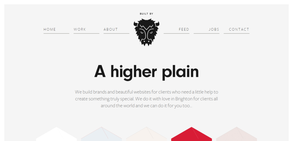
By emphasizing their primary communication methods, they make it easy to start a real conversation—without burying users under options.
9. Change your call to action
You don’t need a masterclass in button design for the contact page, but you do need specific microcopy.
Skip “Submit.” It’s generic and underperforms in tests. In one study, forms with Submit converted worse by a few percentage points.
Use action-oriented, expectation-setting text like Send message, Request a quote, or Get my demo. Phrases like Click here and Go also beat generic copy in tests.
10. Avoid intrusive CAPTCHAs (use low-friction spam protection)
Spam is real—but forcing every visitor to solve a puzzle hurts conversions and accessibility. Modern, low-friction options let legitimate users glide through while filtering bots.
- Prefer invisible, risk-based protections (e.g., behavior scoring, server-side validation, time-to-complete checks, rate limiting). Google’s reCAPTCHA v3 and invisible modes score risk with little or no user interaction.
- Privacy-friendly alternatives like Cloudflare Turnstile and hCaptcha can reduce challenges and avoid ad-tracking while keeping bots out. Turn challenges on only after suspicious behavior, not for everyone.
- Always provide an accessible fallback and keep forms usable with assistive tech. Avoid image-only challenges when possible.

Conclusion
Don’t chase fancy visuals for your contact page. Visitors won’t contact you because they’re dazzled—they’ll contact you because it’s fast, clear, and feels safe.
Every unit of friction you remove—confusing fields, vague copy, unnecessary requirements—turns into more completed forms, better conversations, and higher revenue.
Make the experience better, test everything (copy, fields, layout, validation, button text), and keep iterating. Your pipeline—and your customers—will feel the difference.