Ecommerce websites live and die by their conversions—every visit should move shoppers closer to checkout.
Getting lots of traffic is a solid start. But traffic alone doesn’t generate revenue—conversions do.
It doesn’t matter how slick your design is or how many visitors you attract if the site can’t close the sale. Your sales volume determines how healthy your business really is.
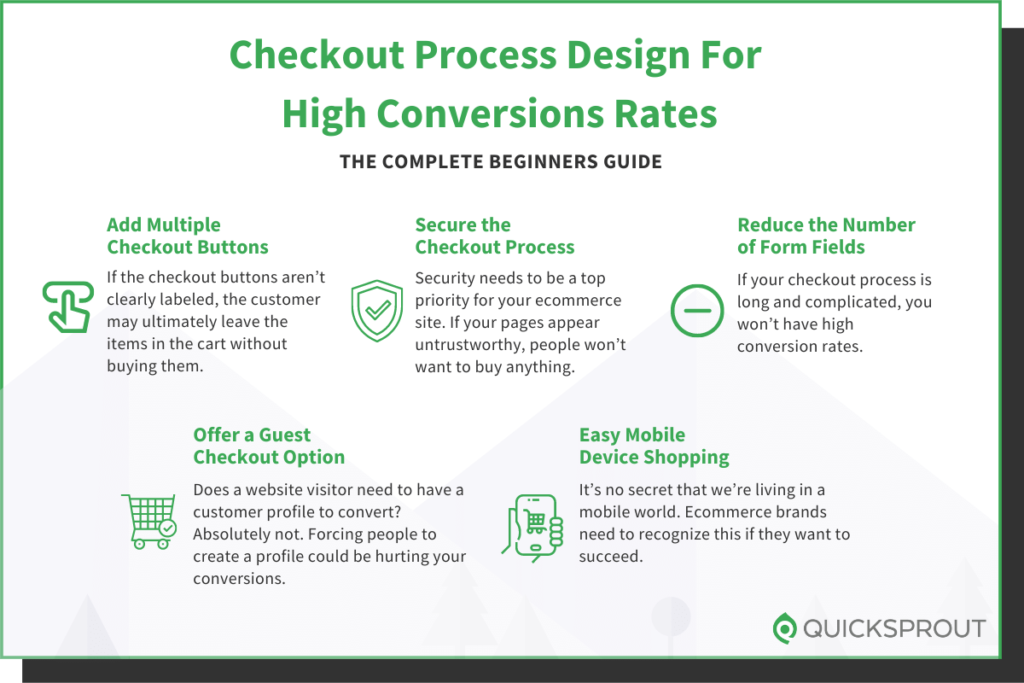
Is your website traffic actually turning into completed orders?
Use hard numbers to find out. Monitor bounce rate, checkout funnel drop-off, and—most importantly—shopping cart abandonment.
If visitors aren’t converting, your ecommerce site won’t make money. It’s that simple.
Don’t get me wrong: your products might be fantastic. That’s usually not the core problem.
It’s often the design details—especially your checkout experience—that quietly kill sales.
For most stores, simpler website designs convert better. Apply the same “less friction, fewer surprises” principle to checkout.
Here’s the catch: teams obsess over product pages and forget checkout.
Many assume customers have decided before they hit the cart.
So why fuss over checkout, right?
That thinking is incredibly short-sighted.
Cart abandonment is a persistent, expensive problem for every ecommerce brand.
Across the industry, roughly seven in ten carts are abandoned—most during checkout itself.
Put differently: for every 100 shoppers who begin checkout, about 70 don’t finish.
Shoppers expect checkout to be fast, intuitive, and trustworthy—no hoops, no confusion.
When it isn’t, conversion rates tank and revenue follows.
Is that a massive problem? Absolutely.
Those are lost sales and lost lifetime customers—neither should sit well with any operator.
If someone starts checkout, they’ve signaled strong buying intent.
So why do so many still walk away?
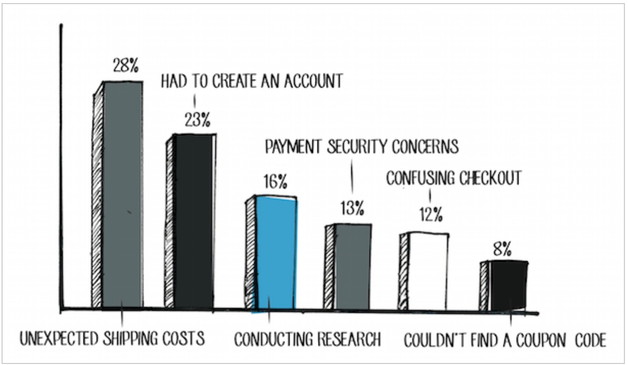
Take a look at this chart:
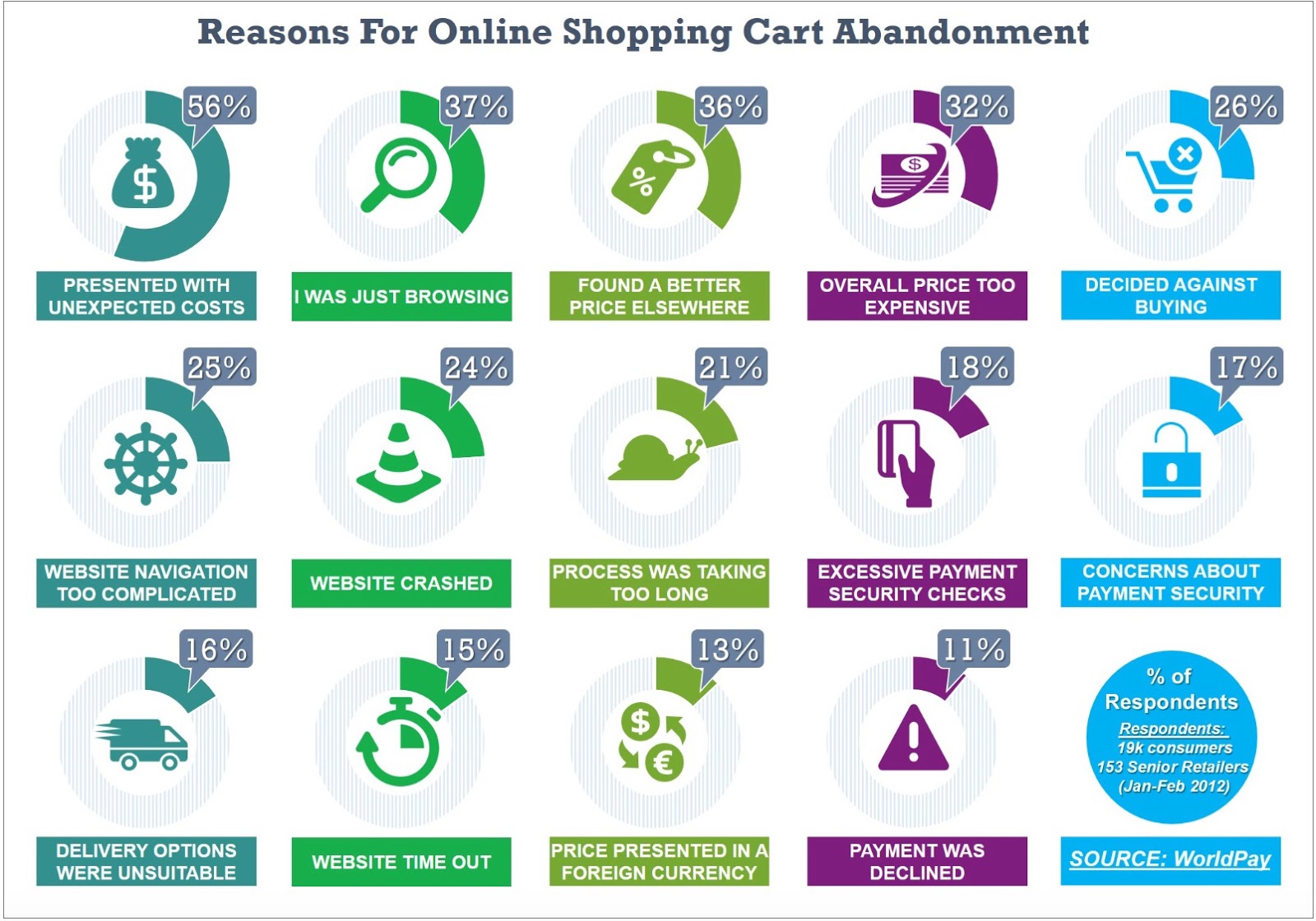
The majority of reasons tie directly to friction and trust issues in the checkout phase.
Does every business see the exact same issues? Not always.
But every business—luxury included—loses sales to abandonment.
You can’t eliminate casual browsers saving items for later. But you can remove the avoidable friction that drives ready-to-buy shoppers away.
With that in mind, here’s how to fix it.
Here are 20 tips to improve your checkout process, reduce abandon rates, and boost your website checkout conversions.
1. Add multiple checkout buttons
Make it effortless to get to checkout from anywhere in the cart view—no hunting required.
After adding items, shoppers should see obvious next steps. In a perfect world, they keep browsing and raise AOV—but only if checkout is always in reach.
If your “Checkout” callouts are buried or inconsistent, people will abandon full carts.
Place primary checkout CTAs at both the top and bottom of the cart and keep them visible on long carts.
Check out this example from the Champs Sports website:
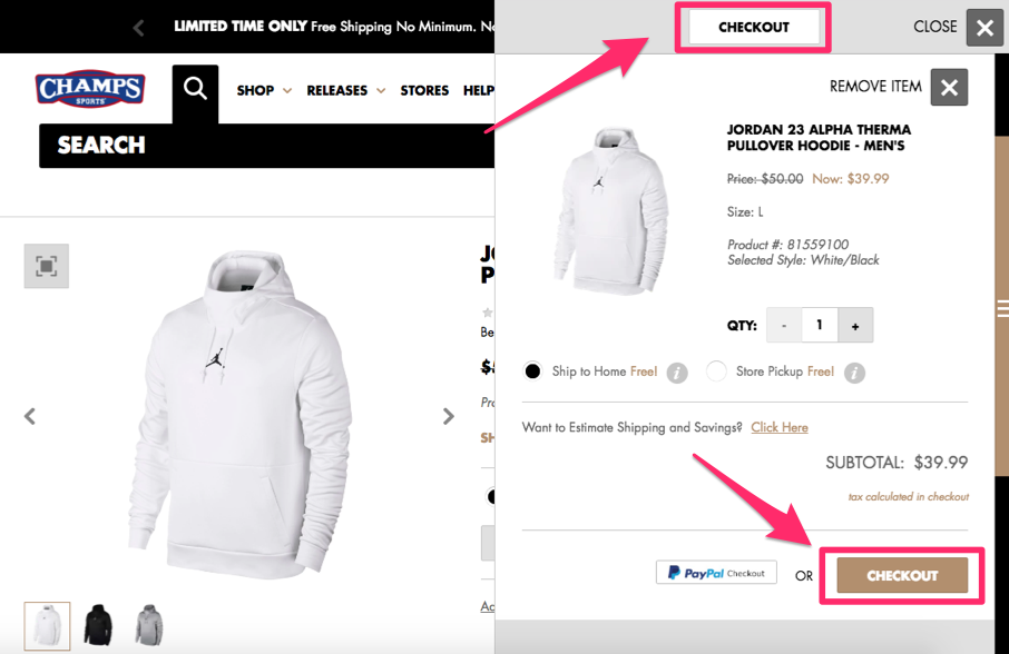
Dual placement keeps “Checkout” inside the shopper’s field of view at all times.
Notice the cart module on the right while the product grid remains accessible on the left—great for continued shopping without losing the path to purchase.
This layout encourages larger orders while maintaining high conversion momentum.
Adopt the same pattern on your site to reduce dead ends and speed up purchase intent.
2. Secure the checkout process
Security is non-negotiable. If checkout feels risky, shoppers won’t enter card details—period.
Many customers have experienced or know someone who’s experienced card fraud. They shop with their guard up.
Make trust visible: use full-site HTTPS, show recognizable security badges, and clearly state how you protect customer data.
Secure every step of checkout. Add trust signals like Norton or McAfee badges and mention practices like encryption and PCI-compliant processing.
Modernize risk controls behind the scenes, too: enable 3-D Secure 2, AVS/CVV checks, and real-time fraud screening to reduce declines without adding friction.
3. Reduce the number of form fields
Shoppers who reach checkout have already decided to buy—don’t give them time to reconsider.
Long, repetitive forms crush momentum. Strip them down.
Ask only what’s essential to fulfill and charge the order. Remove duplicate requests and merge fields where possible.
Yes, you need their name—but you don’t need to request it twice.
If the name is collected for shipping, don’t repeat it for billing. Use checkboxes like “Billing same as shipping” to auto-fill and skip redundant fields.
Research consistently shows that fewer form fields mean faster, higher-converting checkouts:
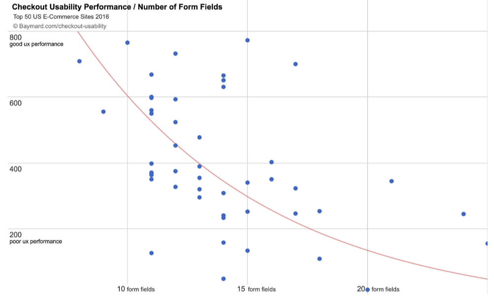
Collect only what’s required to complete the transaction—nothing more.
Enable a single checkbox when shipping and billing match so customers don’t re-type their address.
That tiny step removes multiple fields and lowers friction dramatically.
My hoop theory explains why micro-commitments lift conversions—a two-step checkout often wins.
Start by asking for name and email on step one, then request payment on step two. If they drop, you can follow up via email to recover the sale.
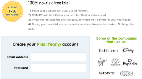
This simple change has lifted conversions by ~10% for us at Crazy Egg, and Timothy Sykes saw a 12% lift in testing.
It works because once shoppers share their contact info, finishing feels like the natural next step. And if they don’t, you can send helpful reminders or limited-time incentives to bring them back.
4. Offer a guest checkout option
Yes, accounts are valuable. They enable personalization, faster reorders, and stronger LTV.
But forcing account creation at checkout is a conversion killer.
Encourage accounts—don’t require them. Let shoppers buy as guests, then offer to create an account post-purchase with one click.
Profiles help you segment by location, build your email list, and make repeat purchases quicker.
Saved payment details reduce steps and boost repeat conversions—worth promoting, never worth forcing.
If you’re encouraging sign-ups, great—just don’t let the desire for data block the sale.
Shoppers don’t need an account to pay you. Forcing it increases abandonment.
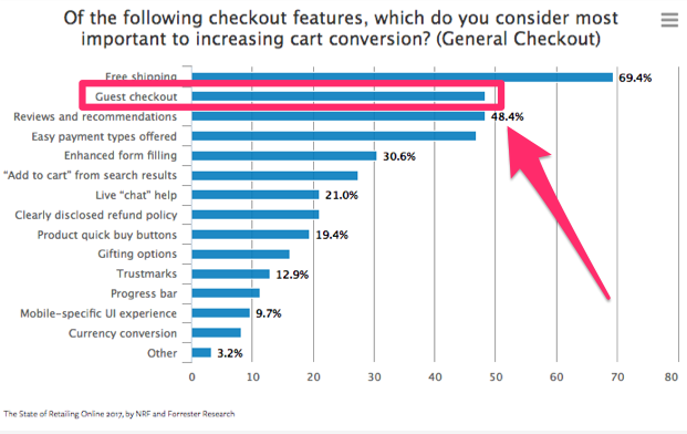
Need proof? Guest checkout consistently ranks among the top factors that increase cart conversion.
Retailers frequently cite guest checkout as one of the highest-impact changes—second only to free shipping in many surveys.
This was the second highest response on the list, trailing only behind free shipping.
The lesson: let people give you their money with as few barriers as possible.
Don’t prioritize data capture over actual sales.
Follow the leaders who already solved this at scale.
Here’s an example of how a global giant Walmart implemented this strategy:
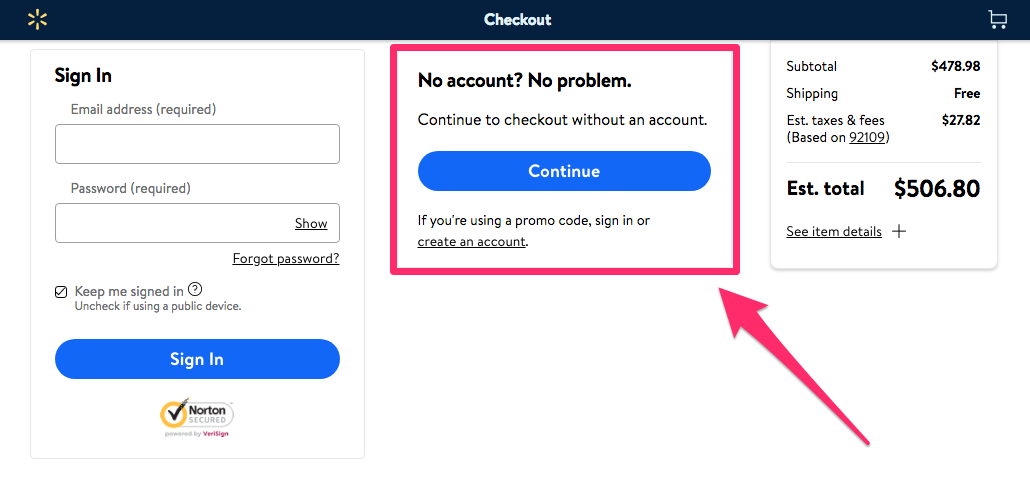
Account creation isn’t required to buy—smart. Want to nudge sign-ups? Offer a perk.
One effective tactic is to reserve certain benefits—like promo codes, loyalty points, or order history—for logged-in customers.
Notice how Walmart requires an account to use a promo code in the screenshot above.
You can reward sign-ups with a coupon or store credit toward the next purchase:
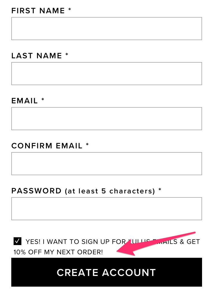
Most shoppers will take that deal—no arm-twisting needed.
That’s far more effective than forcing an account before purchase.
5. Make it easy to shop from mobile devices
We live in a mobile-first world. If your checkout struggles on phones, you’re leaving serious money on the table.
A majority of shoppers purchase on their phones. In many categories, mobile already represents more than half of ecommerce sales.
Why? Because phones are always within reach—shopping happens in spare moments, not just at a desk.
When someone lands on your store from a phone, the experience must be fast, familiar, and friction-free.
Without mobile optimization, conversions plummet and bounce rates spike.
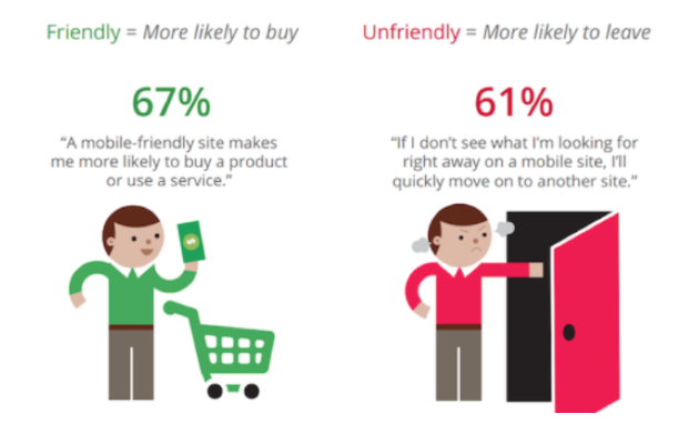
Design can make or break mobile sales. Keep the look consistent with desktop so shoppers know they’re in the right place.
Mobile-friendly sites earn more repeat visits and higher conversion rates.
Obvious? Sure. But many stores still treat mobile as a shrunk desktop page.
Mobile-friendliness has layers: consistent UI, readable type, large tap targets, simple forms, and blazing speed.
Don’t let your mobile storefront feel like a different brand. Keep product names, imagery, and navigation aligned with desktop to avoid “am I in the right place?” confusion.
Speed matters most. Shoppers—especially on mobile—expect instant progress.
They’re not attached to “buying” your product—they’re attached to having it. Slow pages or excessive typing break that feeling.
If you create friction, the desire doesn’t disappear—shoppers head to a faster competitor. Bad for business.
Mobile behavior is different—optimize for thumbs, not mice.
Here’s how to optimize the mobile checkout experience with behavior in mind:
- To navigate, users use their fingers, not a mouse: Place key actions within comfortable thumb reach, and keep CTAs sticky where helpful.
- Typing and clicking are trickier on mobile: Use larger tap targets, numeric keyboards for phone and ZIP fields, and auto-complete wherever possible.
- Fingers are less precise than a mouse, so the process is more error-prone: Make errors easy to spot and fix; validate inline and preserve inputs so customers never re-type everything.

Bonus Tip: Test your site with Google’s mobile-friendly test and a real-world 4G/5G connection. Fix anything that drags speed or legibility.
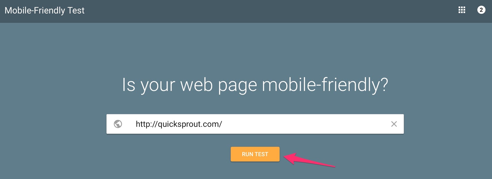
If you have strong repeat purchase behavior, consider a mobile app to cut friction further with saved logins and one-tap checkout.
Touch of Modern is a strong example of a retail app built for speed and habit:
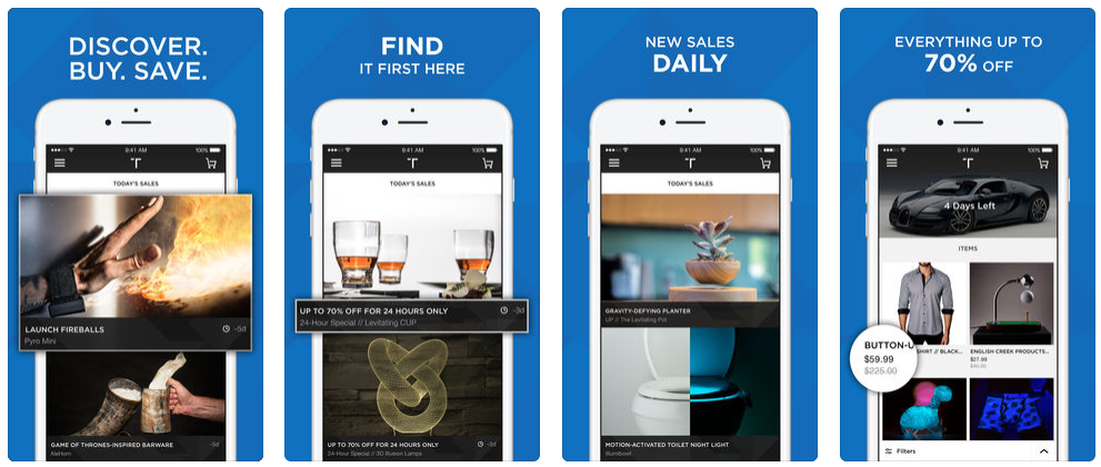
They drive daily engagement with time-boxed deals and store customer data to make checkout nearly instantaneous.
New downloads in the six figures per month, a majority of repeat customers, and most sales from the app—those are the kinds of numbers fast UX unlocks.
Saving shipping and payment details eliminates re-typing and reduces friction—conversion rocket fuel on mobile.
Less friction equals more orders. It’s that direct.
6. Focus on your top benefits
Beyond the product itself, what value assurances convince shoppers to buy now? Surface those benefits early and often.
Here’s the idea.
Many visitors browse without intent to purchase. The right reassurance—like an easy return policy—can turn curiosity into commitment.
Clearly state key policies where decisions are made.
Take a look at this example from Lululemon:
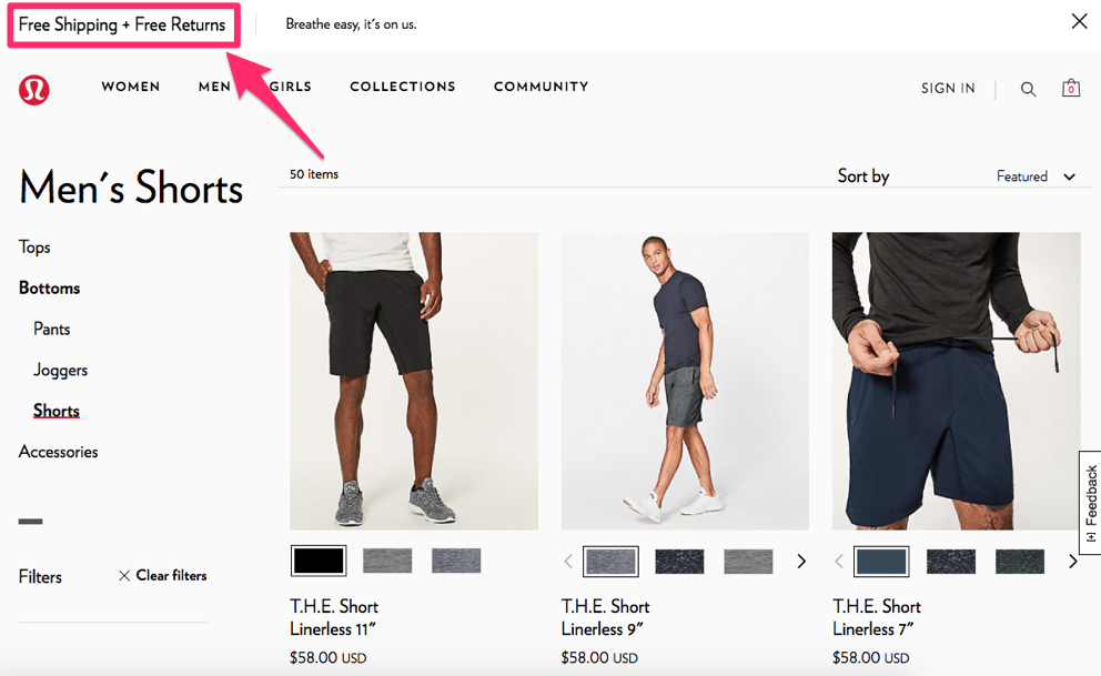
“Free shipping, free returns” stays visible across the experience. Shoppers know delivery is simple and returns are painless.
Returns will happen—industry averages hover in the single digits for many verticals—but the promise reduces hesitation and increases first-time orders.
Highlight additional reassurance across PDPs, cart, and checkout, such as:
- warranty information
- secure checkout
- social proof of the product
- any differentiating features.
Any one of these can push a window-shopper over the line.
7. Learn how to use images
Images sell. Don’t just list products—show them clearly and carry those visuals into cart and checkout.
Ensure the product thumbnail (with selected color/size) appears in the cart and during checkout.
Why?
Visual confirmation reduces doubt, reminds shoppers what they picked, and prevents mistakes like ordering the wrong variant.
Here’s an example from the REI website:
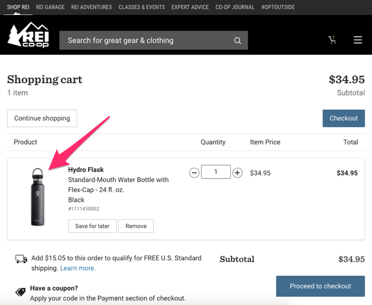
Seeing the exact item reinforces the decision and minimizes post-purchase anxiety.
Faces also lift conversions. People follow people.
Replacing generic graphics with a real human—support rep, model, or customer—can increase engagement and trust.
Include images of people interacting with your product or directing attention toward key offers.
Check out this example from the Macy’s homepage:

The model’s gaze points to the promo and CTA—subtle, effective directional cues that guide attention and clicks.
Use imagery intentionally to pull eyes toward copy and calls-to-action that matter.
8. Allow customers to see what’s in their carts as they shop
Traditional carts hide out of sight while shoppers browse. That disconnect creates sticker shock and confusion later.
Think about it.
People add items to an invisible place, then discover the total only at the end.
That’s where surprises creep in—and where many abandon.
Most stores leave this UX friction untouched.
It’s common for shoppers to forget what’s already in the cart and get blindsided by the total.
Those “surprises” are among the top reasons for abandonment:
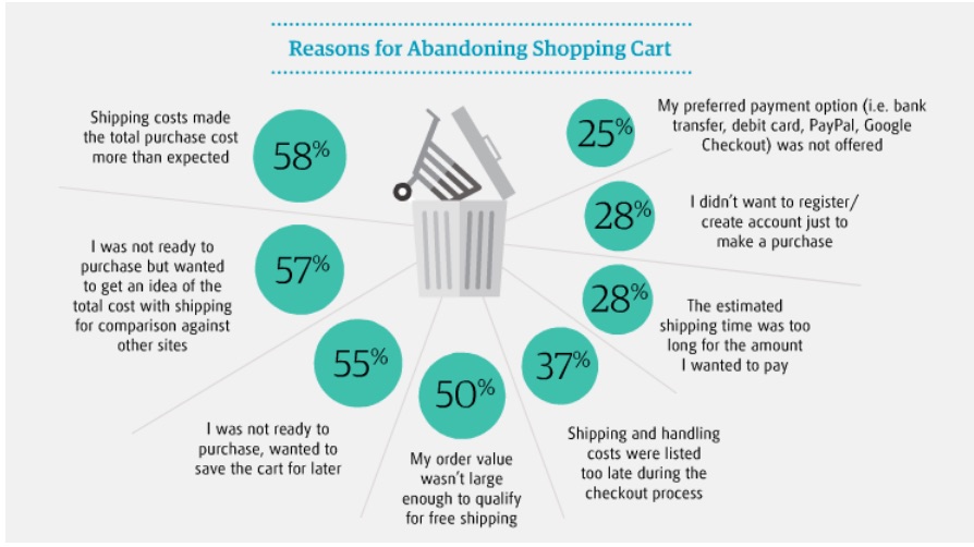
Fix it with a more transparent cart experience:
- Show what’s already in the cart every time a new item is added;
- Display running totals (items, taxes, shipping estimates) as shoppers go;
- Offer “save to cart” or “save for later” for undecided shoppers;
- Provide quick comparison details on product pages where it helps decisions;
- Reveal estimated shipping costs early to avoid last-minute sticker shock.
9. Give your customers lots of payment options
Payment is the moment of truth. If you don’t support a shopper’s preferred method, you risk losing the order.
No payment step, no transaction.
Shoppers value choice at checkout—variety increases trust and completion rates:
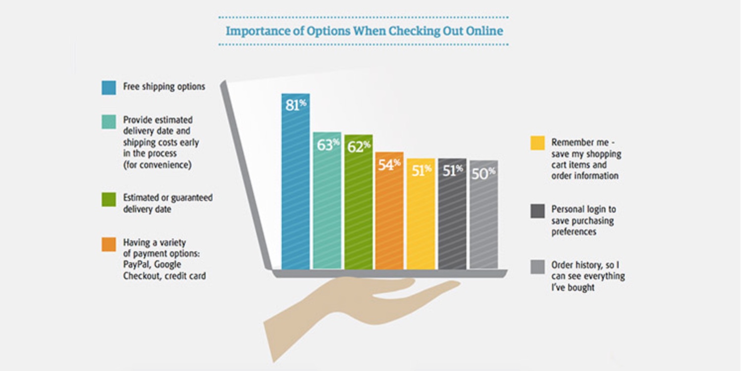
Yes, some processors cost more than others. But blocking common options is more expensive—lost revenue.
Recognize that customers favor cards and wallets that earn rewards or feel safer to them.
If you don’t support their go-to option, many will buy from a retailer who does.
Cover all major credit/debit cards and today’s standard alternatives: Apple Pay, Google Pay, PayPal, Shop Pay, and—if it fits your audience—BNPL options like Affirm, Klarna, or Afterpay.
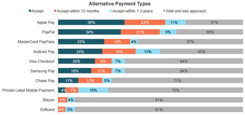
You don’t need to accept crypto to convert mainstream shoppers. Focus on the methods your customers actually use.
Alongside cards, add express options like Apple Pay and PayPal—these reduce typing, especially on mobile, and lift conversion rates.
Don’t lose sales because you lack a popular payment method.
Even if you support their second-choice method, many will still leave to use their favorite elsewhere.
The “Visa and Mastercard only” era is long gone. Modernize your payment stack.
Here’s how Nike does it:
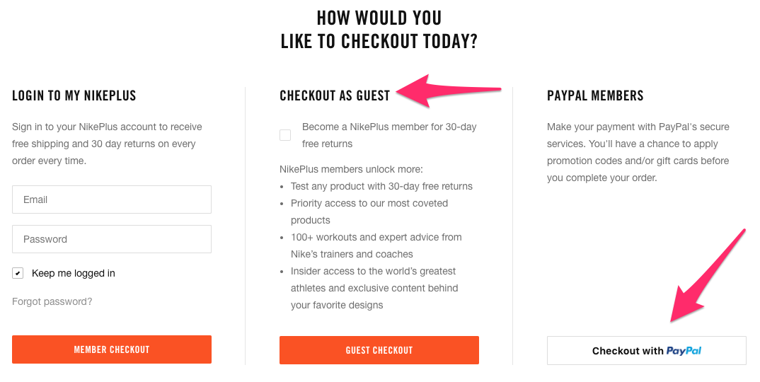
See the PayPal option in the lower right? That appeals to shoppers with PayPal balances and those who prefer not to share card details.
Note another best practice: encourage account creation, but still allow guest checkout—and show the benefits of joining alongside the guest path.
Joining is a single checkbox away—no friction added.
Ask for payment after you’ve collected simpler details. Once shoppers invest time filling out shipping info, they’re more likely to complete payment.
Leading with payment fields can spook undecided shoppers and increase drop-off.
10. Include trust elements throughout your whole funnel
Trust badges (TRUSTe, Norton, McAfee, etc.) can help—but not if they appear only on the final step.
If a visitor feels uneasy on your homepage or PDP, they’ll bounce before ever seeing those badges.
Place trust signals across the journey—homepage, category pages, PDPs, cart, and checkout—to create a consistent feeling of safety.
I’ve seen minimal impact from badges on checkout alone, but noticeable lifts when they’re used site-wide. Keep a few realities in mind:
- Big conversion jumps (>10%) from badges alone are rare.
- If premium seals aren’t in budget, a clear “Secure checkout—SSL encrypted” indicator can provide a similar reassurance.
- Badges help most where skepticism is high (finance, health, supplements, new brands).
11. Frequently asked questions
Many visitors carry doubts into checkout. You’ll never convert 100%, but answering common objections can meaningfully lift completion rates.
Use a survey tool like Qualaroo on your cart/checkout to ask:
What else can we add to this page to help you complete your purchase?
Turn real objections into an on-page FAQ with concise answers—think shipping speed, returns, warranties, payment options, and data security.
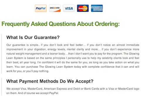
Test FAQ placement near the top versus below the fold. Position and length can affect conversion.
12. Help your visitors through live chat
Live chat can lift conversions—if you run it well. Most tests fail for two reasons:
- No 24/7 coverage, so shoppers never get answers when they need them.
- Chat appears on every page and distracts people from key tasks.
If you can’t staff chat, use a managed service like Chatter Lime to respond in real time—or limit chat to peak hours when your team is online.
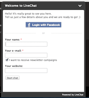
Start by enabling chat on cart and checkout only—the stages with the most questions. Putting it on the homepage can siphon attention away from copy that would have sold them.
13. Social proof
Show that real people and real brands trust you. Logos and testimonials reduce risk and reassure shoppers they’re making a smart decision.
There’s plenty of junk online, which leads to buyer’s remorse. Strong, credible social proof on your checkout page can counter that.

Use a mix of recognizable and smaller customer logos to appeal to all segments.
For testimonials, follow best practices: include full names, roles, locations, and photos where possible. Vague quotes can hurt more than help.
14. Let shoppers know their shipping costs early in the checkout process.
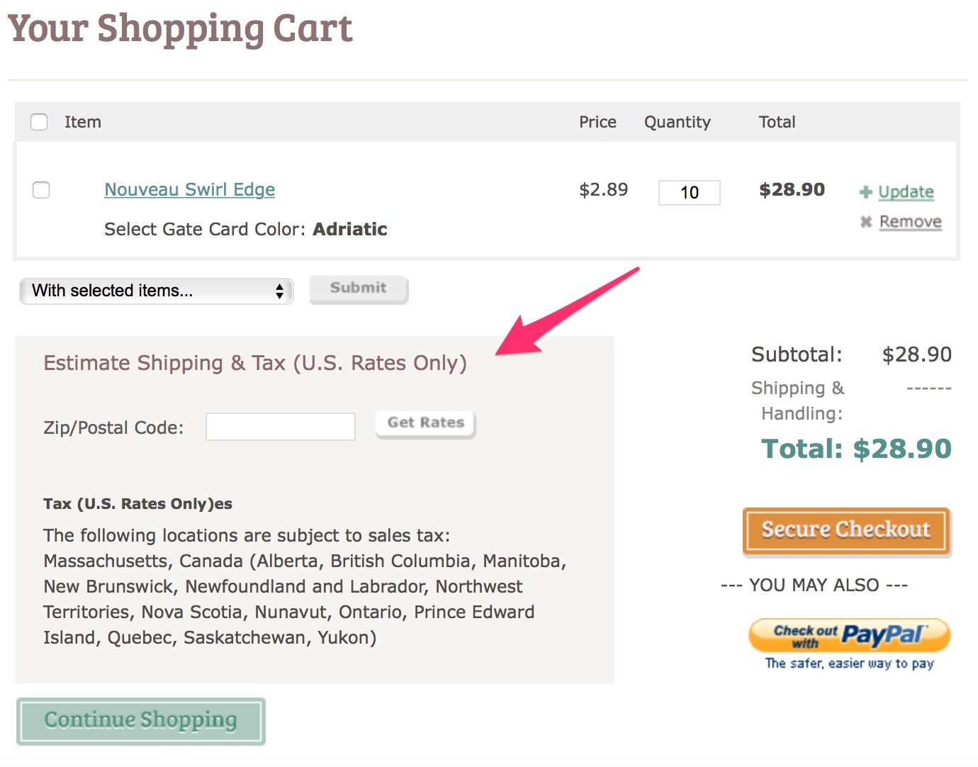
Use a shipping estimator in cart to preview costs by ZIP/postal code before payment. No surprises = fewer abandons.
Here’s an example:
15. Offer free shipping
Many brands think: “Shipping costs us money, so we should charge for it.” Customers think: “Hidden shipping fees feel like a penalty.” Only one of those views wins at checkout.
Charging for standard shipping is a top driver of abandonment.
Whenever you can, bake average shipping costs into product pricing and advertise “Free shipping” clearly.
Psychologically, shoppers anchor to the product price they saw on the PDP. If that $50 item becomes $70 with taxes and shipping, you create friction at the worst moment.
Be reasonable—no one expects free overnight delivery on oversized items.
Offer free standard ground. If customers want it faster, let them choose an expedited (paid) option.
If universal free shipping isn’t viable, reduce friction with thresholds.
Many businesses offer free shipping once shoppers reach a certain cart value.
Like this example from Fashion Nova:

As customers add items, show progress toward the threshold to encourage bigger baskets.

Smart and effective.
16. Set up default billing/shipping address for returning customers
Typing addresses is tedious. Returning customers especially hate it.
Yes, the info is necessary—but it shouldn’t be repetitive.
Reduce resistance with auto-fill and saved profiles.
When shoppers opt in, store their email, name, billing, and shipping details securely for one-click reuse.
Use address auto-complete (e.g., by ZIP/postal code) to populate fields accurately and quickly.
Here’s how it works.
You type in a zip code:

You’re prompted with a window like this:

You’re given address options based on your zip code so you don’t have to fill this yourself:

Use address validation to catch typos before shipping. Give customers the option to keep their entry if suggested changes aren’t correct.
Benefits are twofold: faster checkout and fewer misdeliveries.
Do remember: validators aren’t perfect, so always let customers override suggestions.
17. Satisfy your customers’ need for instant gratification.
Here’s the idea:

People love knowing exactly when they’ll receive what they bought.
That certainty scratches a deep psychological itch.
Promise clarity and deliver speed, and shoppers will reward you.
Digital products make this easy—instant access, instant satisfaction.
Physical goods require logistics—but you can still reduce uncertainty.
My advice?
Steal a page from Amazon.
They nail this.
Here’s what I mean:

Show guaranteed delivery dates (or windows) early and keep them visible through checkout. When buyers know “Order within 2 hours to get it by Friday,” they’re far more likely to finish.
18. A/B test the elements of your checkout process
You can’t optimize on intuition alone. Test to know—then scale what works.
A/B testing pinpoints which elements actually lift conversions for your audience.
If you’ve never run an A/B test before, it’s simple: pick one element, split traffic, and measure the winner against a clear conversion goal.
On checkout, start with the final action button (“Buy now,” “Pay now,” etc.).
Variables worth testing include:
- size
- color
- placement
- wording
Test one change at a time to get clean results—then iterate.
For example, try bottom-right vs. bottom-left placement. Once you have a winner, lock it in and move to copy (“Purchase” vs. “Complete order”).
19. A data-driven approach to dealing with shopping cart abandonment
Want the exact reasons people drop off? Instrument your funnel and follow the data.
Google Analytics remains a straightforward way to map and measure checkout behavior.
Here’s a quick walkthrough.
Step #1: Find the “Admin” tab so you can create a conversion goal:
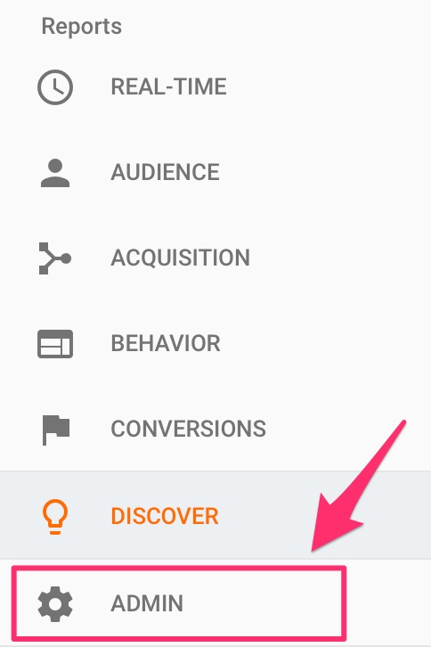
Goals let you track the actions visitors take toward purchase.
Click on “Goals”:

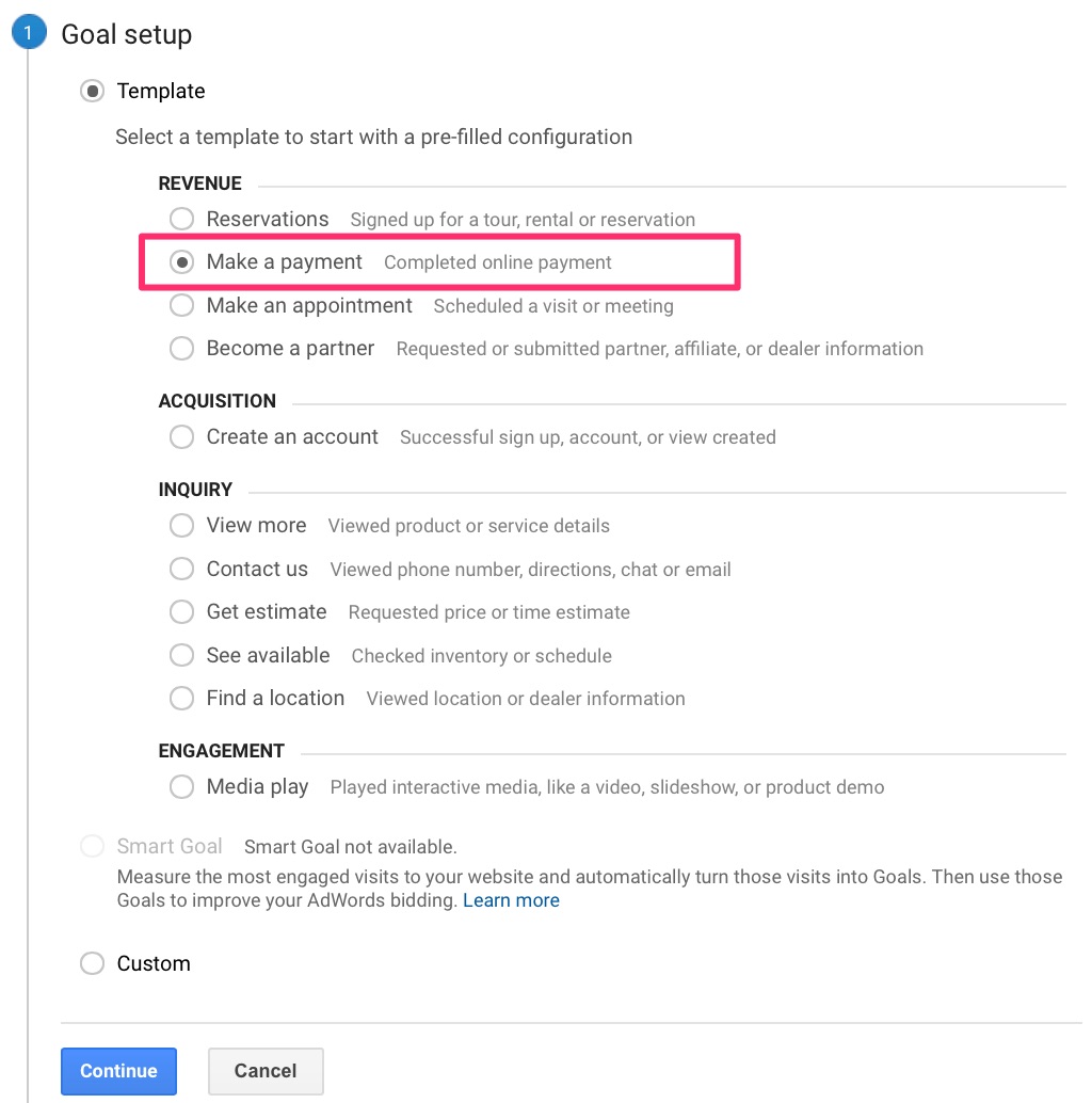
Step #2: Create a new goal and set it up to track a completed transaction.

In the setup, choose a template aligned with ecommerce checkout.
While you’re tracking abandonment, the end goal is still a successful online payment.
Select that option:
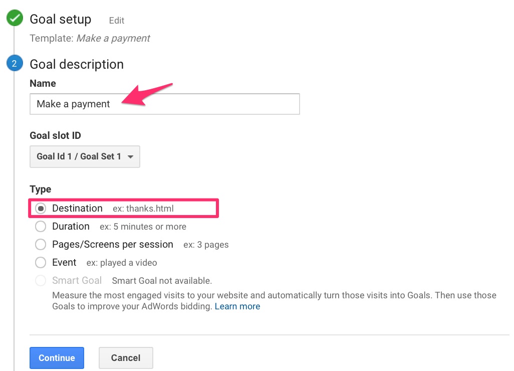
Describe your goal clearly.
Name it and choose “Destination” as the type.
Use your post-purchase thank-you page as the destination to count completed orders.
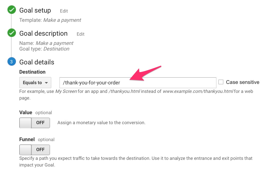
Next, set the exact Destination URL.
Only customers who complete checkout should land there—making it a reliable conversion signal.
Enter that URL and save.
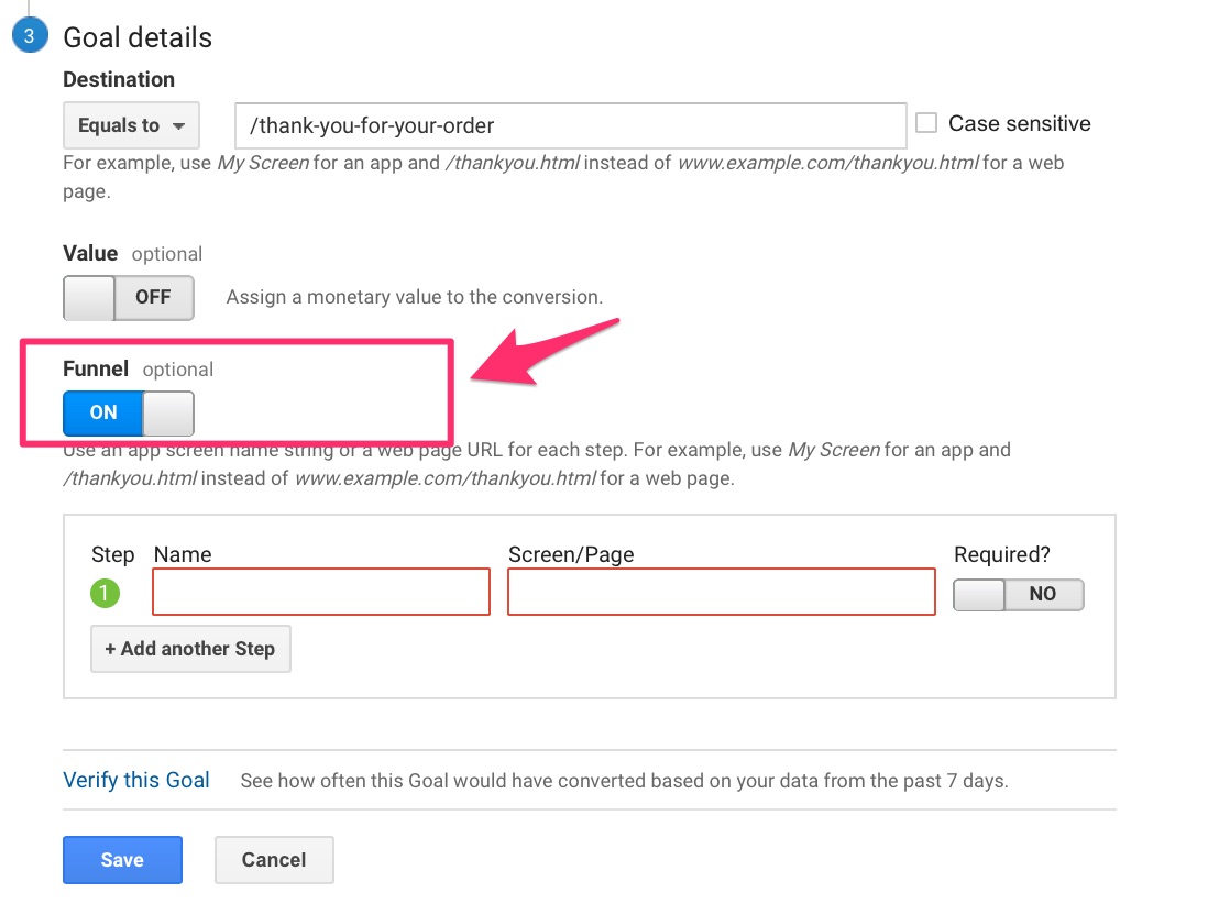
Step #3: Map the path customers take leading up to complete a transaction.
This exposes where drop-offs happen so you can fix the leaks.
In “Goal details,” toggle the Funnel option to “ON.”
List each step to purchase (cart ? shipping ? payment ? confirmation) and add the matching URLs.
Like this:
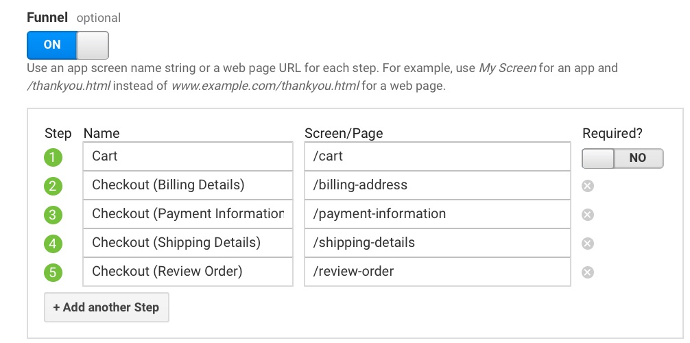
If you use a one-page checkout, include just that step.
Whatever your flow, mirror it exactly.
Run through checkout yourself to sanity-check the path and URLs.
Save the goal. Tracking starts from now on—you’ll soon have step-by-step funnel data.
Step #4: Check your reports to analyze the data.
Here’s where to find them.
Under “Conversions,” click “Goals.”
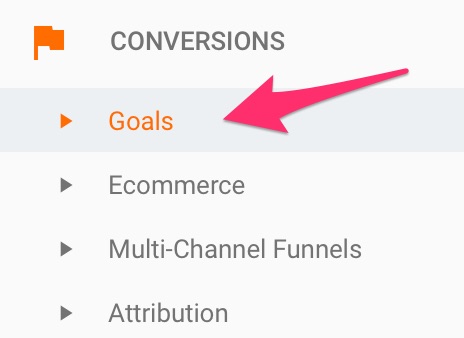
Pay particular attention to “Funnel Visualization.”
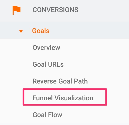
You’ll see something like this:
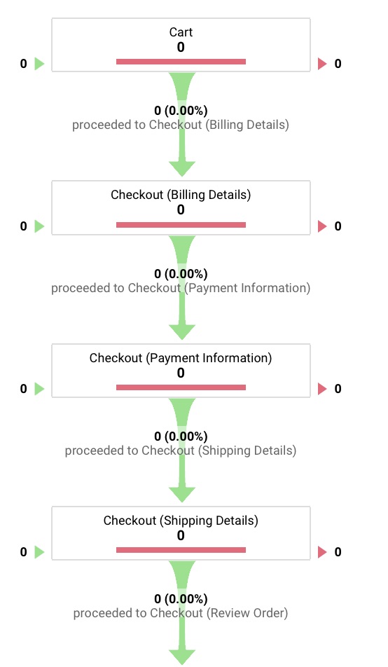
New setups need time to collect data, so don’t worry if it’s blank at first.
This view shows exactly where shoppers exit and how many sessions it takes to convert.
Powerful, right?
With full visibility, you can fix the highest-impact steps and lower your abandonment rate.
Some drop-off is inevitable—that’s ecommerce.
But you can reduce it dramatically with focused improvements.
And when shoppers do leave, all is not lost.
Can those sales be recovered?
Absolutely—if you follow up.
20. The ultimate solution to recovering abandoned carts
Only three out of ten shoppers complete purchases on the first try.
One simple follow-up can move the needle in your favor.
Most brands still underuse it.
Send cart abandonment emails.
Whether it’s a single reminder or a short sequence, the goal is the same: help customers pick up where they left off.
Trigger an email when someone adds to cart, enters their email, and leaves without paying. Keep the message helpful, not pushy.
Here’s a strong example from Vanity Planet:
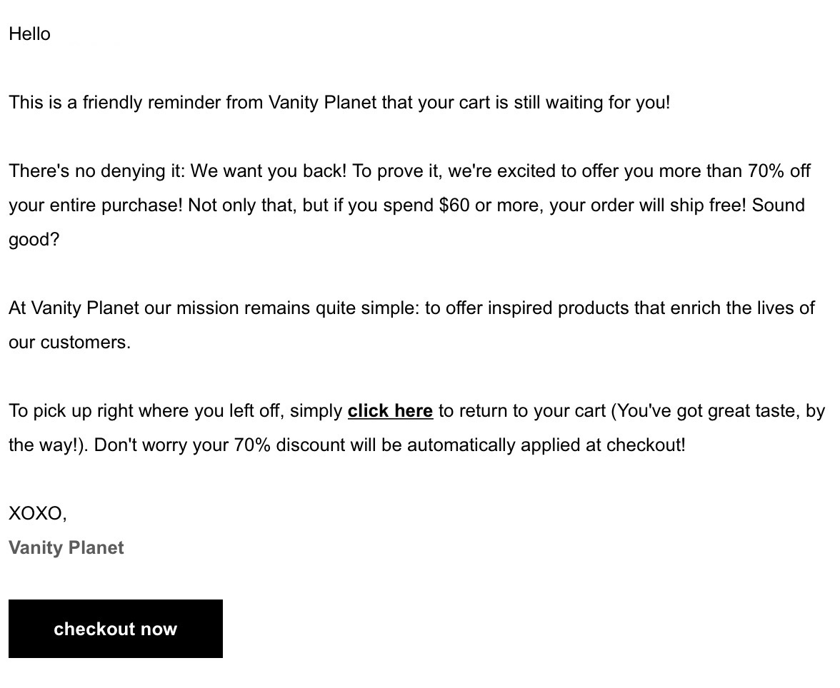
What works here:
- a compelling incentive (used sparingly)
- a free shipping offer
- warm, personal copy that lowers resistance
- one-click return to the exact cart state
- a direct link to checkout—no extra steps
It’s an easy “yes” for someone who wanted the product in the first place.
Executed well, abandonment flows are one of the highest-ROI revenue levers in ecommerce.
Set them up, test variations, and watch recovered orders climb.
Conclusion
Improving checkout conversions isn’t mysterious—it’s the result of removing friction and reinforcing trust at every step.
It takes focused effort, not complex overhauls.
The tactics in this guide are straightforward to implement and proven to work across industries.
If you’re driving traffic but not revenue, scrutinize your checkout experience with the same care you give to product pages.
Use the playbook above and A/B test each change. What wins for one brand may not be the winner for another—even in the same category.
That’s why you test. Identify your store’s friction, remove it, and keep iterating. Your conversion rate—and bottom line—will reflect it.
