There are two essential levers in marketing: bringing qualified visitors to your site and turning those visitors into customers. You could attract a million people, but if they don’t take the next step—buy, book, subscribe, or request a demo—what’s the point?
After thousands of tests and years of refinement, one pattern holds true: small, intentional improvements to your calls to action (CTAs) can produce outsized gains.
Below are 11 proven CTA tactics—plus a few modern additions—to help you lift conversions without redesigning your entire site:
Tactic #1: Test button copy
What should your button say? “Click here,” “Buy now,” “Add to cart,” “Order now”—you’ll see these everywhere. In practice, generic phrasing rarely moves the needle by itself. If it appears to, there’s usually another variable (offer clarity, page friction, trust) doing the heavy lifting.
Copying someone else’s winning test—like 37signals’ famous “See pricing and plans”—won’t guarantee the same results for you. Different audiences, intents, and price points behave differently.
In our own tests at Crazy Egg, that exact phrasing decreased conversions. Outcome-focused, product-specific copy (“Show me my heatmap,” “Start my free 7-day trial,” “Generate my report”) consistently beat generic verbs.
Lesson learned: Make the button describe the next meaningful outcome for the visitor. Use clear verbs, reduce anxiety (“No credit card required”), and prefer first-person phrasing when it fits the voice (“Start my trial”).
Tactic #2: Color matters
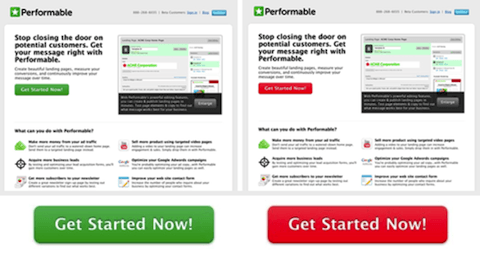
Color tests can work—but not because one magic color wins everywhere. Visibility and contrast are what matter. A button that visually separates from surrounding elements gets noticed and clicked.
Use strong contrast and adequate accessibility standards. As a rule of thumb, meet or exceed current WCAG guidance: at least 3:1 contrast for UI components (like button borders/states) and 4.5:1 for normal body text near the CTA. (WCAG 2.1/2.2)

Lesson learned: Your goal is salience, not a specific hue. Make the button unmistakable against your layout and ensure text on the button is easy to read for all users.
Tactic #3: Location, location, location
Placement changes performance. Test above-the-fold vs. just below, and insert secondary CTAs further down the page. On some pages, a premature CTA hurts results because visitors need a bit of context first.
On NeilPatel.com, placing the primary CTA right below the fold outperformed an above-the-fold variant because readers wanted quick proof and benefits before committing.

Lesson learned: Don’t assume “higher is better.” Give visitors enough information to say “yes,” then place a clear CTA. On long pages, repeat CTAs at logical decision points (after features, pricing, testimonials).
Tactic #4: Design matters
We A/B tested the Quick Sprout Traffic System and learned that a plain “add to cart” button underperformed when visitors weren’t sure what they’d receive. Small design tweaks—like adding a product image, a short benefit line, or an icon—clarified the offer and increased conversions.
Survey feedback revealed confusion about deliverables. We addressed that inside the CTA area itself.
The result? A sizable lift when the button visually reinforced the product and included microcopy (e.g., “Instant access,” “Downloadable templates,” “Ships free”).
Lesson learned: Add clarity where attention is highest—the CTA block. Consider size, shape, iconography, and short reassurance text (delivery, security, refund terms) to reduce friction.
Tactic #5: Timing is everything
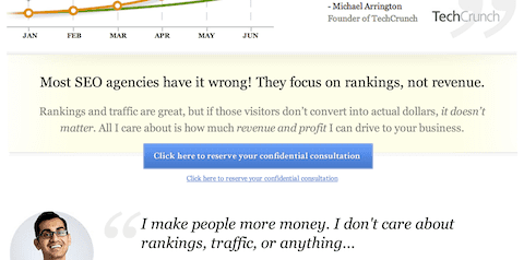
Delaying a CTA until after the pitch can pre-qualify clicks. For example, requiring viewers to watch or scan key benefits before revealing the button has lifted conversions in specific funnels.
Use this thoughtfully. If you gate the CTA behind a long video, provide a summary or transcript for skimmers, respect reduced-motion preferences, and avoid aggressive interruptions on mobile.
Lesson learned: Sequence matters. Educate first, then ask. Reveal CTAs when a user has enough context to act—and test different reveal moments (on scroll, after a section, post-video).
Tactic #6: Be creative
CTAs aren’t limited to buttons. Inline links within articles, end-of-post prompts, tooltips, slide-ins, or in-video overlays can outperform the sidebar status quo when they align with the reader’s current task.
In-context CTAs that appear exactly when someone is consuming related content often see significantly higher click-throughs than static, always-visible elements.
Lesson learned: Place the ask where momentum already exists. If someone is watching a tutorial, a “Try this in your account” prompt embedded at the right moment can beat any sidebar button.
Tactic #7: Tell people not to click
Reverse-psychology copy (“Don’t click here if you’re lazy”) can spark curiosity and qualify clicks. We’ve seen it outperform straightforward “Click here” in specific brands and audiences that embrace a cheeky voice.
It’s not universal. Use it sparingly, match your brand, and avoid it in high-trust situations (finance, healthcare, compliance).
Lesson learned: Pattern breaks can work, but only when they align with audience expectations. Test variations that set a standard (“Don’t click unless you want x result”) rather than being contrarian for its own sake.
Tactic #8: Special effects
Motion and stickiness can boost visibility: sticky bars, on-scroll reveal, subtle wiggles, or a CTA that follows the reader. These often increase clicks—but they must be respectful.
Honor user preferences with @media (prefers-reduced-motion: reduce), and monitor Core Web Vitals—heavy animations or sticky elements can hurt responsiveness (INP) or cause layout shift (CLS), which can impact UX and search performance.
Lesson learned: Use effects to assist attention, not hijack it. More clicks don’t always mean more completed purchases—watch downstream metrics too.
Tactic #9: Exit calls to action
Exit-intent prompts trigger when a desktop cursor moves toward the back button. They can recover abandoning users with a discount, a checklist, or a lead magnet. Be mindful: on mobile, “exit intent” is less precise, and intrusive interstitials can harm user experience and search performance.
Keep offers genuinely helpful, easy to dismiss, and sized responsibly for smaller screens. Follow Google’s current guidance to avoid intrusive dialogs that obscure content, especially for users arriving from Search.
Lesson learned: Rescue value, don’t ambush. If you use exit CTAs, make them relevant (cart saver, price-drop alert, free resource) and avoid aggressive overlays on mobile.
Tactic #10: Whitespace
One of the easiest ways to make CTAs pop is to simplify the area around them. Whitespace increases legibility and focus, especially on cluttered pages. Start with these basics:
- Reduce competing elements near the CTA (links, badges, dense paragraphs).
- Limit bright, saturated colors around the CTA so the button keeps visual priority.
- Give the button a generous touch target (commonly ~44–48px on mobile UIs) and, at minimum, ensure it meets the WCAG 2.2 target-size requirement of 24×24 CSS pixels (with allowed exceptions).
Lesson learned: Clutter kills clarity. If everything shouts, nothing does. Let your primary CTA breathe.
Tactic #11: No call to actions
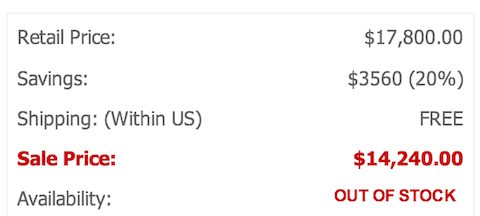
Would you ever remove CTAs? In rare cases, limiting availability or replacing “Buy now” with “Join the waitlist” can increase interest by invoking scarcity. One merchant discovered more product inquiries when the cart wasn’t active.
Proceed with caution. For most businesses, hiding CTAs depresses sales. If you test it, provide a clear next step (“Notify me,” “Reserve my spot”) so intent isn’t wasted.

Lesson learned: Scarcity and exclusivity can amplify desire, but don’t create friction that stalls qualified buyers. Offer an alternative path (email alert, waitlist, store finder).
Tactic #12: Mobile-first & accessibility (new)
Most users will see your CTA on a phone. Design for thumbs and for everyone: large targets, readable labels, clear focus states, and strong contrast. Ensure the primary CTA is above the keyboard on forms and not blocked by chat widgets or consent banners. Meet WCAG minimums (for example, 24×24 CSS px target size with exceptions, and 3:1 contrast for UI components / 4.5:1 for normal text).
Lesson learned: A button you can’t reach, read, or identify won’t convert—no matter the copy. Prioritize mobile ergonomics and accessibility from the start.
Tactic #13: Reduce risk & friction (new)
Pair CTAs with friction-reducers: “Free shipping,” “Cancel anytime,” “No credit card,” concise trust badges, and near-button social proof (“Trusted by 50,000+ teams”). Shorten forms, support wallet payments, and surface the most common pre-purchase answers within one scroll. Also watch modern Core Web Vitals—especially INP, which became the responsiveness metric in March 2024—so reassurance elements don’t slow interactions.
Lesson learned: People don’t fear clicking—they fear what happens after the click. Remove uncertainty right where the decision happens.
Conclusion
No single tactic wins everywhere. What boosts our conversions may not boost yours—and vice versa. The only way to know is to test methodically and measure what matters (not just clicks, but sign-ups, purchases, and retention).
Adopt a simple rhythm: identify a friction point, form a clear hypothesis, A/B test one change at a time, and run tests long enough to be confident. As you iterate, keep the user’s goal front and center. Helpful, clear CTAs that respect the visitor’s time and intent are the ones that keep winning.
