Collecting the data your business needs to make smart decisions is only the beginning. You need to organize, analyze, and present that data in a way that everyone in the organization can understand and act on properly.
The best reporting tools can do this in a variety of ways, giving businesses easy access to the information they need. Luckily, many reporting tools focus on creating a visual presentation, which allows people to digest the information quickly.
The Top 7 Best Reporting Tools
- Zoho Analytics – Best overall
- Tableau – Best for interpreting complex data
- Microsoft Power BI – Best for large orgs with lots of data
- SAP Crystal Reports – Best for using data from multiple sources
- Crazy Egg – Best for Visualizing User Behavior
- Looker Studio – Best free reporting tool
- Whatagraph – Best for creating marketing reports
Selecting strong reporting tool software works better when you match the tool to the type of work you need it to do. Each of the reporting tools on our list provides certain strengths to help with your business’s data interpretation needs.
Zoho Analytics – Best Overall
With Zoho Analytics, enterprise customers receive a series of high-end features to help them develop detailed reports. It remains easy to use for those who only want the basics as well.
If you need advanced features, Zoho Analytics includes the ability to fully customize the reports. You can collaborate with other users through the software to determine the best way to set up the reporting features.
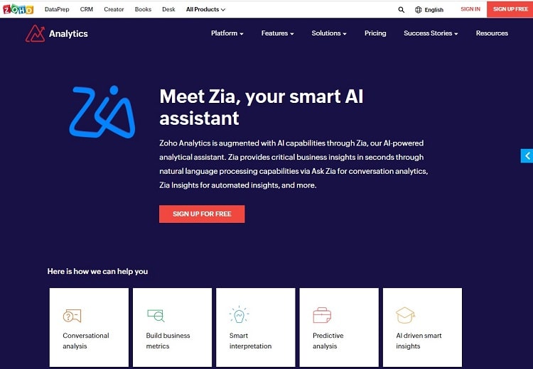
Zoho Analytics includes a powerful AI tool, called Zia, that aids you in analyzing your data. If desired, Zia can help you with spotting trends or with making forecasts of how the company may perform in a certain area in the future. Zia also includes a natural language query option, so you can ask questions about your reports and data in a manner that makes sense.
If your company makes use of the other tools that fit under the Zoho software umbrella, those tools will integrate seamlessly with Zoho Analytics. This makes it easier for you to pull in data for Zoho Analytics to use as it creates reports.
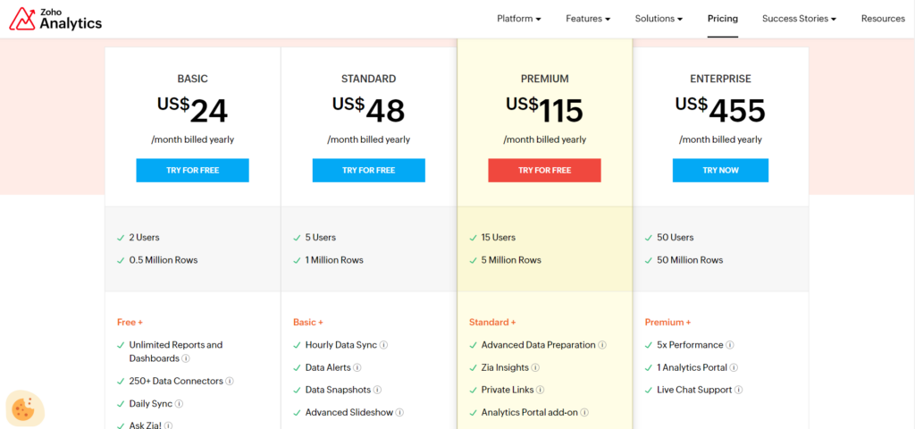
Pricing plans for Zoho Analytics start at $24 per month for an annual contract with two users on the account. The most expensive Enterprise plan costs $455 per month for the annual contract for up to 50 users on the account. You can try some of the pricing tiers for free before deciding whether to subscribe. You can also make use of the tool’s mobile app as part of your subscription too.
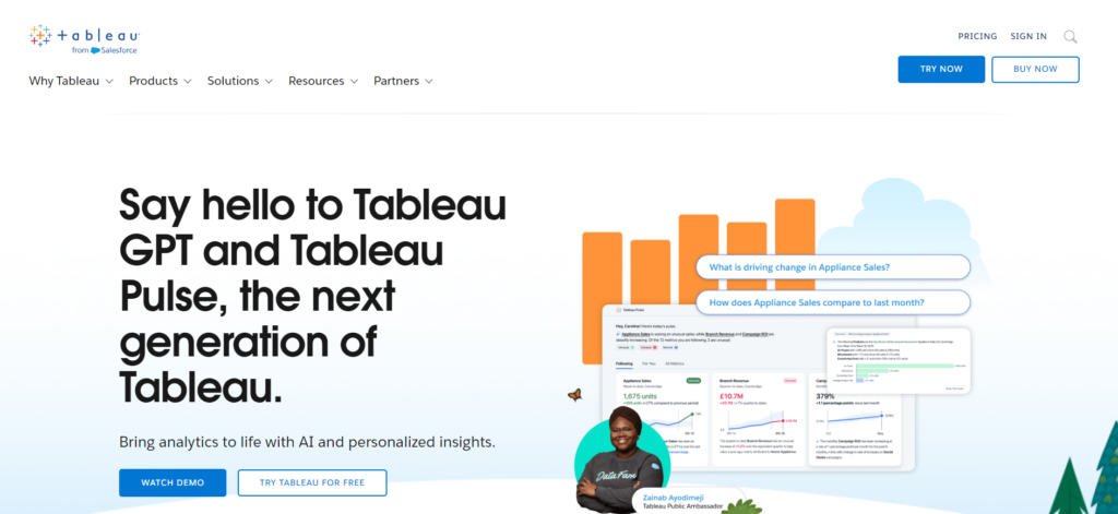
Tableau – Best for Interpreting Complex Data
When your business needs to work with complex sets of data, Tableau has a wide range of features aimed at delivering results. It excels at breaking down data from multiple sources before creating graphs and other visual representations of the data that are easy to understand.
You can pull data from many different formats, making it easier to create reports. Tableau delivers powerful customization options within individual reports, resulting in reports with a professional look that will impress executives and business partners alike.
Additionally, Tableau can dive deep into a certain set of data to provide complex results that other reporting tools struggle to match. With Tableau, you may be able to reach new interpretations of the data because of this deep dive that you could not decipher in the past.
Tableau has a strong AI tool that allows for natural language queries, making it easier for you and your team to discover the answers you need.
Tableau offers three pricing tiers. The cheapest tier, called Viewer, costs $15 per user per month when billed on an annual basis. At the top end, the Creator tier costs $70 per user per month for an annual contract. You receive access to the Tableau mobile app with your subscription.
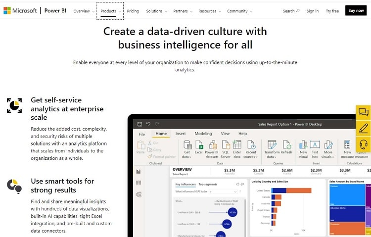
Microsoft Power BI – Best for Large Orgs With Lots of Data
Large organizations can end up with so much data that its various departments almost become frozen. They may be unable to make the decisions they need because of the overwhelming amount of data. Rather than rocking the boat based on unclear data, they choose the safer option of standing pat.
Microsoft Power BI attempts to fix this issue. It has the capability and features made to help large organizations drill down to find the data that means the most to each department. You can even customize the reports to match the varying needs of employees, managers, and executives.
Additionally, Power BI offers multiple security measures that keep your data from going into the hands of people who should not see it. This is important for a large organization that may deal with quite a bit of proprietary data.
You can pull data from more than 100 different sources with Microsoft Power BI and even with so many options for finding data, Power BI makes the process of building reports easier than you may expect.
Microsoft Power BI is available in multiple pricing tiers, starting at $10 per user per month for the annual plan in the Pro tier, which is a surprisingly low price. In fact, the Pro tier of Power BI is free for subscribers to Microsoft 365 ES. You also can try Power BI for a free trial period.
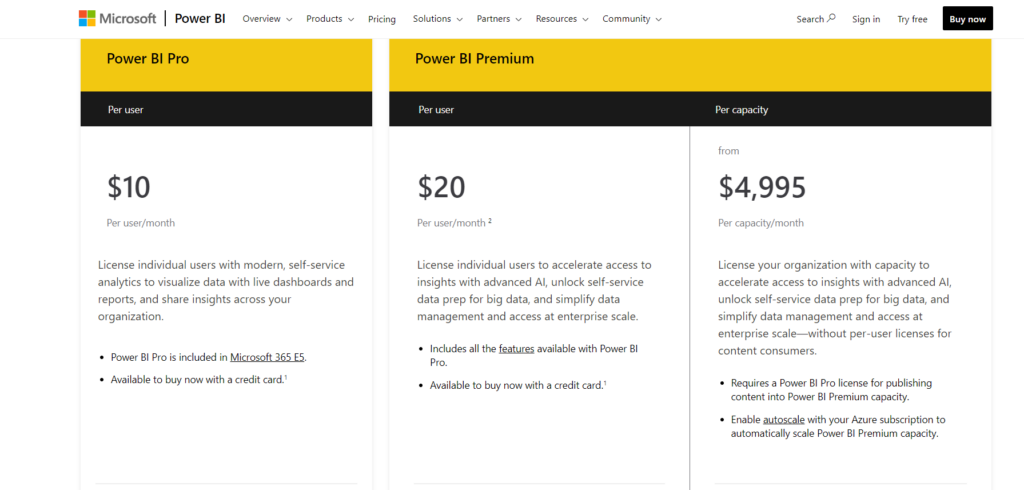
That said, the majority of large organizations will need to go with the Power BI Premium tier. Contact Microsoft’s sales department to receive a custom price.
SAP Crystal Reports – Best for Using Data From Multiple Sources
You may expect SAP Crystal Reports to perform best as a reporting tool when it is pulling data from SAP HANA. It does excel in this area, giving current SAP users great results. However, SAP Crystal Reports also can draw data from an almost unlimited number of locations, making it a highly versatile reporting tool.
You can pull data from many sources that your small and medium business may already be using, including:
- Spreadsheets
- Text files
- Web page logs
- Data from Oracle
- Data from MySQL
- Data from SQL Server
- Data from XML
- Data from SAP HANA
- Data from Salesforce
- Data from IBM DB2
- Data from Sage
- Data from JDBC sources
- Data from ODBC sources
Once you have the data in SAP Crystal Reports, you can deliver customized reports that show basic information, highly detailed information, or anything in between. You can customize the colors and look of the reports, including displaying them in dozens of languages.
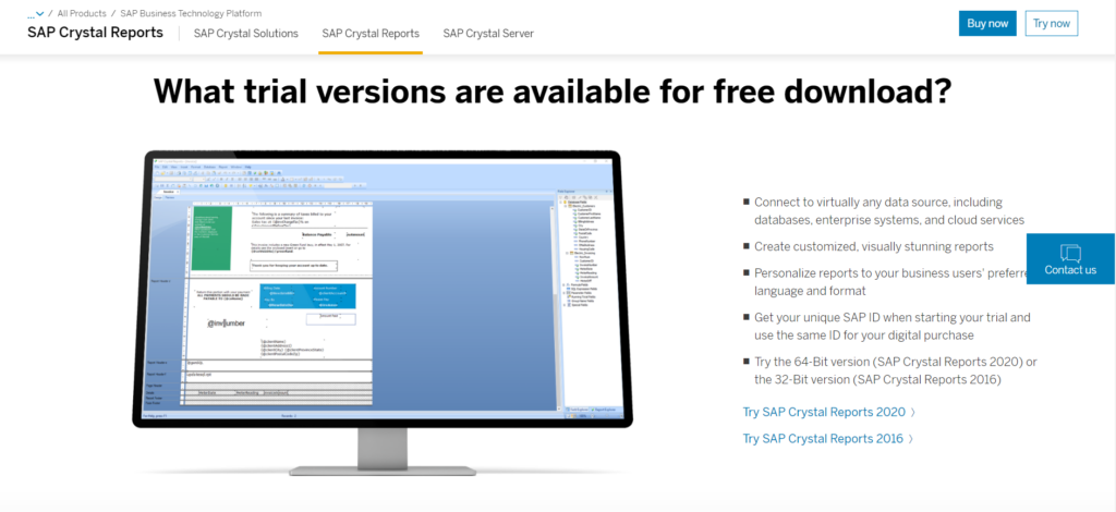
SAP starts at $495 per license, but you may have add-on costs for extra features. If you’re looking to upgrade from an older version of SAP Crystal Reports to the newest version, you can potentially receive a discount. A free trial period is available too.
Crazy Egg – Best for Visualizing User Behavior
Crazy Egg is a powerful tool that offers visual insights into how users interact with your website. By providing heatmaps, scrollmaps, and other visual reports, it helps you identify areas where users are engaging and where they might be encountering issues.?
Here are some of the key features of Crazy Egg…
- Heatmaps: Visual representations showing where users click, move, and scroll on your pages.?
- Scrollmaps: Indicate how far down users scroll, helping you determine if important content is being seen.?
- Confetti Reports: Break down clicks by referral sources, search terms, and more, giving you detailed insights into user behavior.?
- A/B Testing: Allows you to test different versions of a page to see which performs better in terms of user engagement and conversions.?
- Session Recordings: Watch real user sessions to see how they navigate your site, where they hesitate, and where they drop off.?
Overall, Crazy Egg stands out for its ability to provide clear, visual data that can inform your website design and content decisions.
By understanding exactly how users interact with your site, you can make targeted improvements that enhance usability and drive conversions.?
For more information, visit Crazy Egg’s official website.
Looker Studio – Best Free Reporting Tool
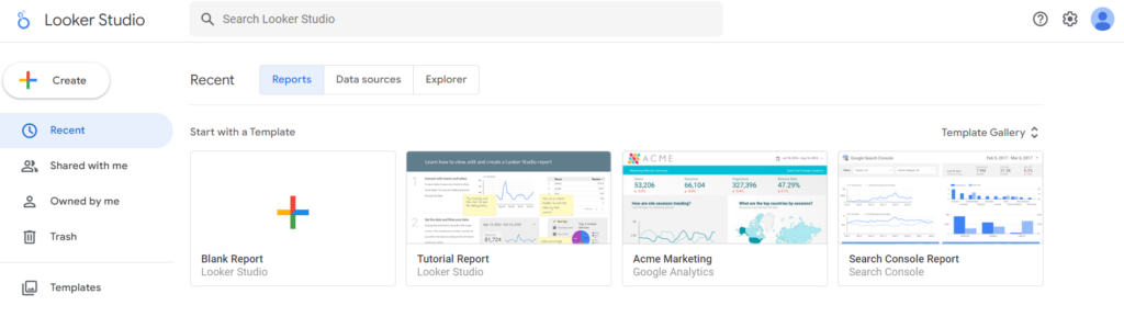
For those who aren’t sure they want to make use of a reporting tool to study business data, Looker Studio serves as a good introduction to this type of software. You can use this reporting tool for free forever.
As with nearly every type of software or app that Google provides, Looker Studio is very easy to use. Yet you can still create customizable reports and designs with this tool.
When creating reports through the Looker Studio reporting tool, you can tap into the power of Google’s collaborative features, solicit comments from other team members and give certain team members permission to make changes, if desired.
Looker Studio pulls data from spreadsheets and Google Analytics primarily. Although it does mesh with a few other data sources, it doesn’t offer quite as many options for sourcing data as some of the other best reporting tools on our list.
As you may expect with a completely free tool, the level of performance you receive has limitations. For example, if you attempt to pull data from multiple sources at the same time, this reporting tool’s operational speed will slow to a crawl. But if you only need the basics from your reporting tool, you can’t beat the free price for Looker Studio.
Whatagraph – Best for creating marketing reports
For agencies that need to track the results of marketing campaigns and deliver the results to clients in a beautiful format, Whatagraph is an outstanding option. It’s not always easy to show clients the results of a marketing campaign in a way they can easily understand, but the Whatagraph reporting tool excels in this area.
You even can set up customized reports that Whatagraph automatically generates for you and automatically emails to clients. This keeps them in the loop with the latest data at all times. Whatagraph includes collaboration features that encourage comments between your team members and clients concerning the report’s data.
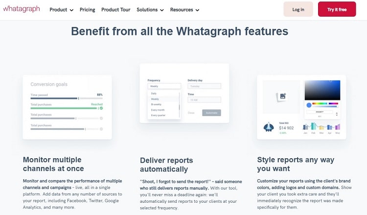
When choosing the reporting format you want to use, you can rely on any of the many templates built into Whatagraph. Or you can create a custom report that includes your client’s logo and preferred color scheme, showing that you pay attention to the tiniest detail when representing your client.
Whatagraph offers three pricing tiers. The Professional tier starts at $199 per month when billed annually and allows up to five users. The Premium tier starts at $299 per month with an annual contract and allows up to 10 users. A custom pricing tier is also available for an unlimited number of users. You can also expect to receive a free trial period and a 30-day money-back guarantee.
How to Find the Best Reporting Tools for You
All reporting tools perform the same basic function of presenting data in an easy-to-understand manner. However, they don’t necessarily go about it in the same way. Your best opportunity to find the reporting software tool that will meet your particular needs is to understand the most important features of these tools.
Customization in Design
When creating your report, you want to be able to display only the vital data in the best format for your team. This is a standard customization feature that every reporting tool should have.
However, you also may need the ability to customize the look of the report that the software generates. If you need to present the report to potential clients or to administrators in your organization, you will need a professional look for your report, for example. Some of the customization options you may find in the best reporting tools include:
- Matching your company’s colors
- Including your company logo
- Marking certain reports as priority
- Customizing the layout of the report’s information
- Adding internal notes
Sources of Data
Some simplistic reporting tool software packages have severe limitations on the potential data sources you can use. For these basic tools, the limitation leaves you only able to use a spreadsheet or a few types of databases. If you primarily keep all your data in one location, such limitations shouldn’t bother you.
However, the best reporting tools should be able to pull the data they use from a range of sources, such as spreadsheets, web page analytics software, many types of databases, text files, accounting software, and more.
Having multiple options for pulling in the data to create the reports can save you quite a bit of time. Without this capability, you may have to collect all the data within one source, like a spreadsheet. It can be extremely time-consuming to manually move the data from your other sources into a spreadsheet before introducing it to the reporting tool.
Predictive Analytics
All reporting tools source data to create a report, giving you a snapshot of the current standing of your company or of a particular marketing campaign. The reporting tool also can show you the past data trends that led to the current data position.
Perhaps you would like your reporting tool to give you an ability to look forward, toward the future. Maybe you would like to try to predict what things will look like for the company a few weeks or months down the road, based on the data.
Some reporting tools may take advantage of artificial intelligence to run a series of potential outcomes for a date in the future. It may run hundreds of thousands of scenarios when using the data, trying to determine which are the most likely to occur.
Ideally, the predictive analytics capabilities remove any human bias from the equation when trying to determine what may happen in the future.
Notifications
If you set up your reporting tool to run various reports automatically at certain time intervals, you may not look at the report immediately. When you finally have a chance to review the report a couple of days later, you may find a significant issue that needs immediate attention.
Some of the best reporting tools offer you the chance to set up alerts or notifications. As you create the parameters for the automatic creation of the reports, you can define thresholds in your report’s data that should generate an alert. If the data in your report exceeds these thresholds, the reporting tool will send you an email message. You should be able to specify which people in your organization will receive the email alerts as well.
The Top Reporting Tools in Summary
Reporting tools give you the ability to view data about multiple aspects of your business in a way that actually benefits you. It gives you a true picture of where your business stands or of the progress of a marketing campaign, simplifying the process of making decisions about the next steps for the business.
Rather than looking at rows and columns of numbers in a spreadsheet format, the reporting tool presents the data in whatever way makes the most sense to you. If data is king in business, then your reporting tool is what gives the king its power.