Collecting the data your business needs to make smart decisions is only the beginning. You also have to organize, analyze, and present that data so every team—marketing, product, finance, and ops—can quickly understand it and act with confidence.
The right reporting tools make this simple. They centralize data from your sources, turn numbers into clear visuals, and package insights for fast, cross-functional decision-making. Many platforms now emphasize visual, interactive dashboards and AI-assisted analysis, helping people digest complex information in minutes.
The Top 7 Best Reporting Tools
- Zoho Analytics – Best overall
- Tableau – Best for interpreting complex data
- Microsoft Power BI – Best for large orgs with lots of data
- SAP Crystal Reports – Best for using data from multiple sources
- Crazy Egg – Best for visualizing user behavior
- Looker Studio – Best free reporting tool (with low-cost Pro upgrade)
- Whatagraph – Best for creating client-ready marketing reports
Start by matching each tool to the jobs you need done—data sources, audience, governance, collaboration, and visual complexity. Every option below has particular strengths; pick based on your reporting workflows, not brand name alone.
Zoho Analytics – Best Overall
Zoho Analytics delivers a rare mix of power and simplicity. Non-technical users can spin up clean, interactive dashboards quickly, while data teams get granular control over models, permissions, and performance.
Advanced users can fully customize reports and semantic models, set fine-grained row-level permissions, and collaborate with teammates in real time. Built-in scheduling and sharing send branded dashboards to stakeholders automatically.
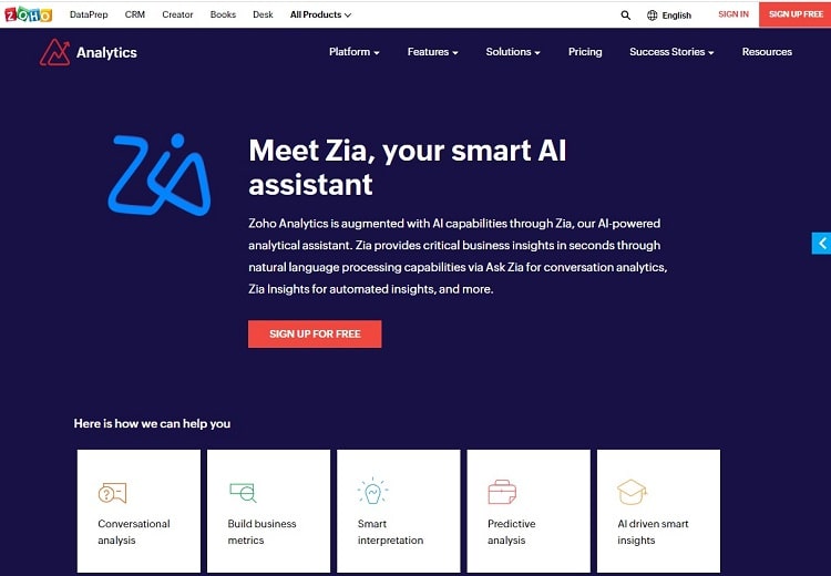
Zoho’s AI assistant, Zia, now supports conversational analysis, automated insights, anomaly detection, clustering, and forecasting. Ask questions in plain English and get charts, KPIs, and narratives back. You can even generate “why” diagnostics to understand drivers behind spikes and dips.
If your company already uses Zoho apps (CRM, Books, Projects, Desk, and more), the native connectors are seamless. You can also pull from popular third-party tools, databases, and files, then shape data with Zoho DataPrep before it hits your dashboards.
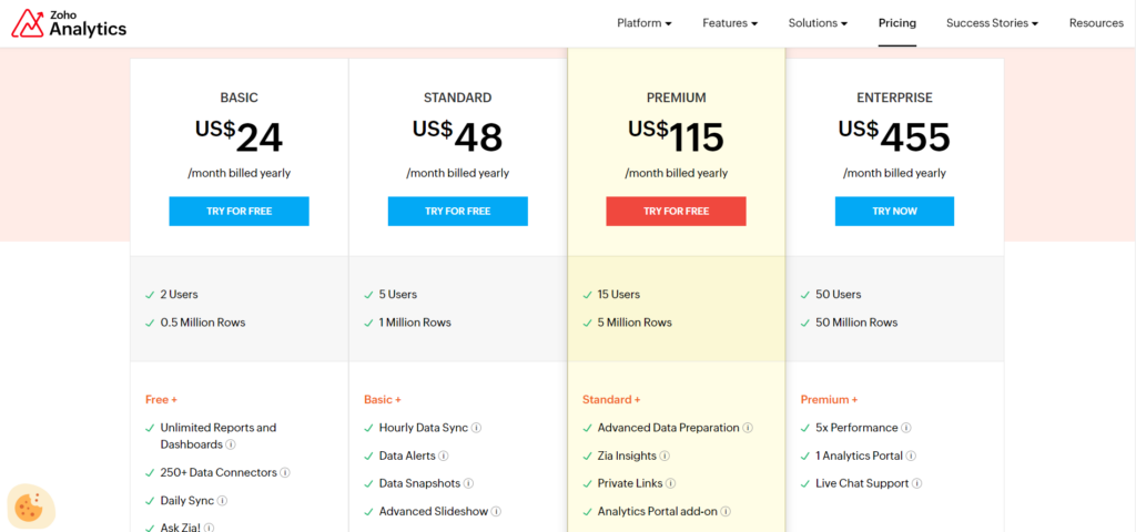
Pricing remains accessible. There’s a free plan for small needs, and paid cloud tiers typically start around $30 per month and scale up based on users and row limits. Enterprise tiers add higher data volumes, governance, and embedding. A mobile app for iOS and Android is included.
Tableau – Best for Interpreting Complex Data
When you need to explore complex, multi-source datasets, Tableau excels. Its visual analytics engine lets you drill into large data and surface patterns you’d miss in spreadsheets. Dashboards are polished, interactive, and easy to share with executives and clients.
Tableau supports live connections and extracts, robust calculations, forecasting, and sophisticated visuals. Teams can set certified data sources, manage permissions, and standardize metrics to keep “one version of the truth.”
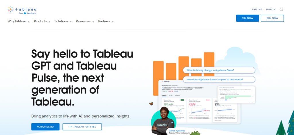
AI-assisted analysis and natural-language queries make it easier to get answers fast, and Tableau’s community templates speed up build time. Pricing follows a role-based model with Viewer, Explorer, and Creator tiers billed annually; mobile access is included.
Bottom line: Tableau’s depth and polish make it ideal for organizations that demand flexible exploration and executive-ready visuals.
Microsoft Power BI – Best for Large Orgs With Lots of Data
Enterprises can drown in data. Microsoft Power BI helps teams cut through the noise with deep integrations across Microsoft 365, Azure, Excel, and Teams. It supports hundreds of connectors, rich modeling with DAX, and row-level security so every department sees only what it should.
Power BI also offers centralized governance, certified datasets, and deployment pipelines—critical for enterprises that must balance speed with compliance. Sharing via Teams and PowerPoint makes adoption easy for non-analysts.
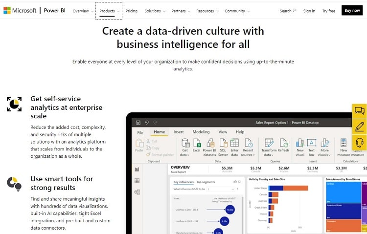
You can connect to 100+ sources and build reports quickly with drag-and-drop visuals. Pricing remains competitive: Pro as a per-user license for collaboration, Premium Per User for advanced AI and larger capacities, and Premium capacity for company-wide workloads. Pro is included with Microsoft 365 E5 and Office 365 E5 licenses.
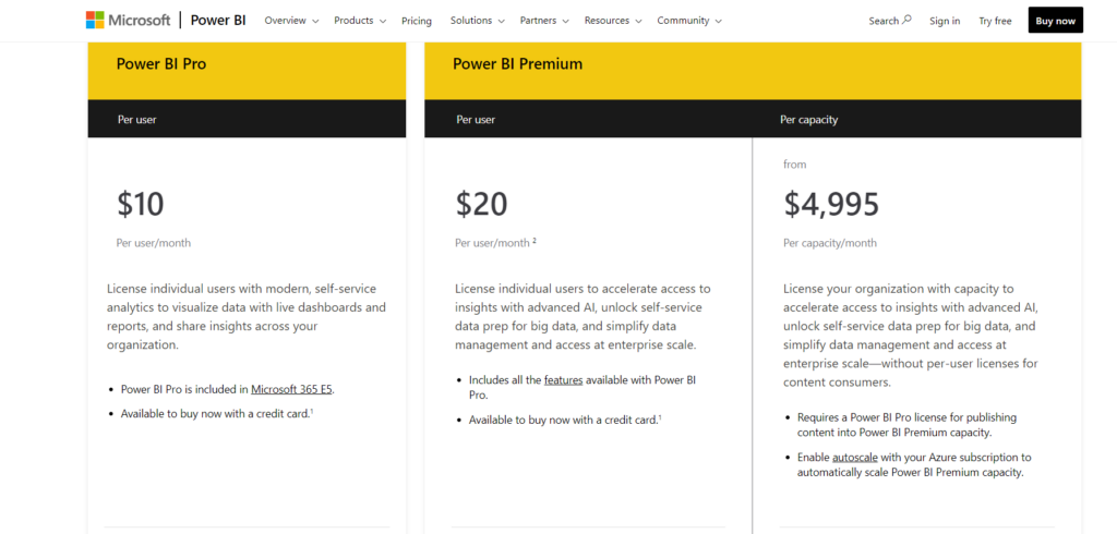
For most large organizations, Premium is the right fit thanks to higher refresh rates, larger model sizes, and advanced governance. Expect to engage sales for enterprise capacity pricing.
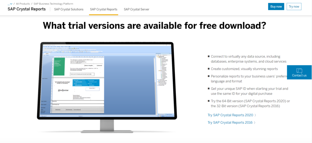
SAP Crystal Reports – Best for Using Data From Multiple Sources
SAP Crystal Reports shines when you need pixel-perfect, operational reporting that pulls from many systems—not just SAP HANA. It’s great for finance, operations, and compliance teams that rely on scheduled, layout-controlled reports.
Supported sources include (among others):
- Spreadsheets
- Text files
- Web page logs
- Data from Oracle
- Data from MySQL
- Data from SQL Server
- Data from XML
- Data from SAP HANA
- Data from Salesforce
- Data from IBM DB2
- Data from Sage
- Data from JDBC sources
- Data from ODBC sources
Once your data is in Crystal Reports, you can build anything from simple summaries to highly formatted statements and multi-page documents. Themes, multilingual output, and scheduling make it easy to deliver the exact layout stakeholders require.
Licensing is sold per named user for the desktop application, with a one-time cost and optional add-ons. A free trial is available, and upgrade discounts are common if you’re moving from older versions.
Crazy Egg – Best for Visualizing User Behavior
Crazy Egg shows exactly how visitors engage with your pages so you can fix friction and boost conversions. Heatmaps, scrollmaps, recordings, and A/B testing make it clear which elements attract attention, get ignored, or cause confusion.
Key features include:
- Heatmaps: See where users click, move, and scroll on each page.
- Scrollmaps: Learn how far visitors read so you can move key CTAs into the “seen” zone.
- Confetti: Break down clicks by source, device, and other dimensions to understand behavior by segment.
- A/B testing: Test headlines, images, and layouts to improve engagement and conversion rates.
- Session recordings: Watch real user sessions to spot hesitations, dead clicks, and drop-offs.
Plans are straightforward and include a 30-day free trial. It’s a fast way to pair behavioral insights with your analytics, so design and content decisions are based on what users actually do—not guesses.
For more information, visit Crazy Egg’s official website.
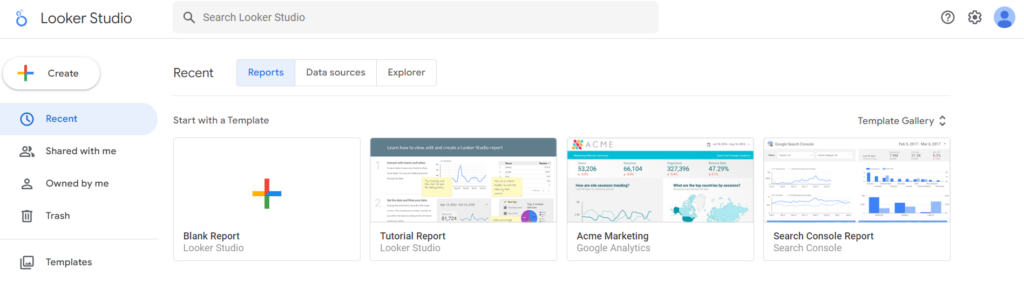
Looker Studio – Best Free Reporting Tool
If you want to try reporting without a big investment, Looker Studio is free and easy to learn. Build dashboards from Google Sheets, GA4, Google Ads, BigQuery, and other connectors. It’s excellent for lightweight reporting and client-friendly visuals.
Collaboration is simple: share links, collect comments, and manage edit access. For teams that need governance, team workspaces, scheduled delivery with alerts, and enterprise support, Looker Studio Pro adds those capabilities with a low per-user fee while keeping the same interface.
Note that pulling from many non-Google platforms often requires paid third-party connectors, and very complex, blended queries can slow down. For the price, though, it’s hard to beat for small teams and quick stakeholder dashboards.
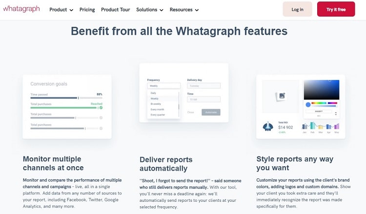
Whatagraph – Best for creating marketing reports
For agencies and in-house marketers, Whatagraph makes it easy to turn campaign data into client-ready reports. Prebuilt templates, white labeling, and automated email delivery mean clients stay updated without you rebuilding decks every week.
You can schedule recurring reports, add comments for context, and collaborate with clients right in the platform. Reports can be customized with your client’s logo and color palette for a polished, on-brand feel.
Pricing is quote-based today, but most teams can expect entry tiers suitable for up to five users, a mid-tier for growing teams with more sources and users, and custom plans for large agencies that need unlimited users, onboarding, and SLA support. Free trials or proof-of-concepts are often available on request.
Bottom line: If “send beautiful marketing reports on autopilot” is the goal, Whatagraph is purpose-built for it.
How to Find the Best Reporting Tools for You
All reporting tools aim to present data clearly, but they differ in how they connect to sources, govern access, scale performance, and support collaboration. Use the criteria below to shortlist confidently.
Customization in Design
You should be able to tailor dashboards to the audience—executives, managers, or individual contributors—showing only what matters in a format that’s easy to scan. Look for customization beyond charts, including branded themes, page layouts, filters, drill-downs, and narrative text for context.
For client-facing or board-level reporting, prioritize professional output: company colors, logos, saved layouts, and the ability to star priority views. Internal notes and data stories keep everyone aligned on interpretation.
- Match brand colors and typography
- Add your logo and client branding where needed
- Flag priority or SLA dashboards
- Customize page layouts, filters, and drill paths
- Embed annotations and internal notes for context
Sources of Data
Basic tools may limit you to spreadsheets or a small set of databases. That’s fine if all your data lives in one place. If not, choose a platform with native connectors to your key apps (CRM, ads, web analytics, billing), files, and cloud databases—and support for live connections when you need real-time freshness.
Broad connectivity saves time and reduces manual errors. Without it, you’ll spend hours exporting and reconciling spreadsheets before you can even build a chart.
Predictive Analytics
Dashboards tell you what happened. The latest tools also help you project what’s likely to happen next. Look for built-in forecasting, anomaly detection, driver analysis, and narrative insights that explain the “why” behind trends—ideally without heavy coding.
Well-implemented predictive features reduce bias and accelerate planning. Just make sure you can audit assumptions and methodology so stakeholders trust the output.
Notifications
Automated schedules are table stakes. Go further with threshold-based alerts sent to email, Slack, or Teams when KPIs cross targets—so you don’t discover a problem days later. Role-based alerts keep the right people informed without spamming everyone else.
The Top Reporting Tools in Summary
Modern reporting tools turn raw data into insights people can use. Whether you need AI-assisted exploration (Zoho Analytics), enterprise-grade governance (Power BI), deep visual analysis (Tableau), pixel-perfect operational reports (SAP Crystal Reports), behavioral UX insights (Crazy Egg), free and familiar dashboards (Looker Studio), or automated client reporting (Whatagraph), there’s a best-fit option for your stack.
Pick based on your sources, audience, and governance needs—not just brand. Then standardize definitions, schedule delivery, and add alerts. With those pieces in place, your reporting doesn’t just describe the business—it drives it.