Form design is too often an afterthought when building a website. It shouldn’t be. Poorly designed or confusing forms can tank conversions, choke lead flow, and leave visitors with a negative impression of your brand. Thoughtful, user-first forms do the opposite: they reduce friction, build trust, and move people to take action.
The strongest form-design principles put the user front and center, baking critical user experience (UX) standards into layout, copy, interaction, and validation. Below are 31 practical UX principles you can apply today to design forms that feel effortless and convert reliably.
1. Welcome Your Form Visitor
Set the tone early so users feel confident about finishing. Just like you’d introduce yourself before asking questions in person, introduce the form and explain what’s about to happen. A single line of friendly microcopy (“This takes about 2 minutes”) or a brief explainer can lower anxiety and boost completion rates.
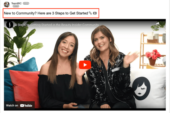
Effective form experiences often include a quick orientation. Sephora, for example, welcomes users with a short video that walks through joining the Beauty Insider Community—clarifying the steps, time, and benefits before any field is filled.
2. Show What’s In It for Them
People complete forms when the value is clear. State the benefit in plain language near the header and CTA: what they’ll get, when they’ll get it, and how it helps. If there’s a deliverable (demo access, PDF, discount, booking), say so up front and reiterate it at the button.
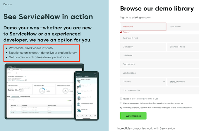
ServiceNow does this well by previewing the outcome of submission and reinforcing the value throughout the flow.
3. Keep Track of User Progress
Let users know where they are and what’s left. A progress bar or stepper at the top can show stages, percent complete, and an estimated time remaining. Consider a “Save and finish later” option for longer forms. Visibility keeps motivation high and abandonment low.
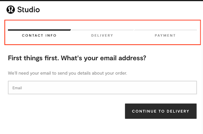
Lululemon Studio uses a simple, three-step progress indicator in cart to set expectations at a glance.
4. Use a Compelling Call-to-Action
Swap generic buttons for action-matching copy. “Submit” says nothing. “Get the demo,” “Create my account,” or “Send my quote” tells users exactly what happens next and reinforces value. Keep it short, specific, and benefit-driven.
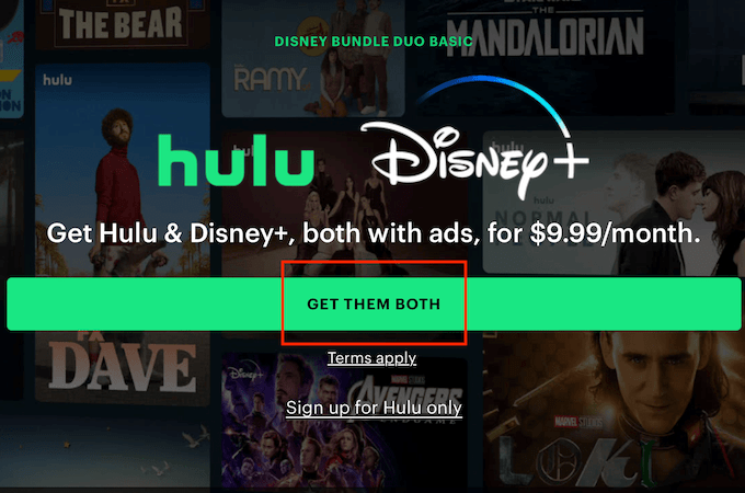
Hulu’s primary CTA asks, “why not have it all?”—on brand, inviting, and outcome-oriented.
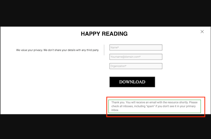
5. Thank the User
Never leave people wondering if submission worked. Show an immediate thank-you with a quick recap of what happens next (timing, sender name, any required action). Include a link to return to browsing, and if relevant, let them modify their submission or update preferences.
Xcubelabs keeps confirmation clean and direct—no fluff, just clarity and next steps.
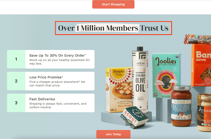
6. Include Social Proof
Trust accelerates completion. Place testimonials, star ratings, client logos, usage stats, or third-party badges near the CTA or header. Keep it truthful and current; social proof should reduce doubt, not trigger skepticism.
Thrive Market highlights community size to signal legitimacy and momentum.
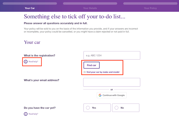
7. Provide Examples To Minimize Data Entry Error
Errors kill momentum. Use helper text that shows the correct format (e.g., “name@domain.com” or “+1 555-555-5555”). Prefer helper text over placeholder-only labels, and use input masks and the right keyboard (email, number, tel) to cut typos.
The Dribbble example demonstrates simple, legible inline hints that prevent guesswork.
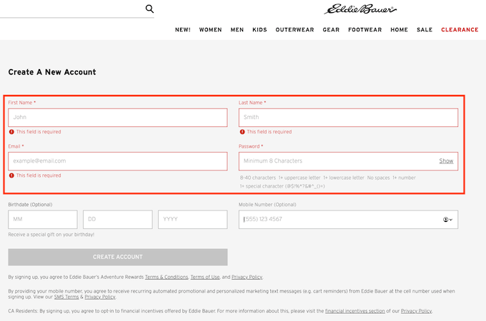
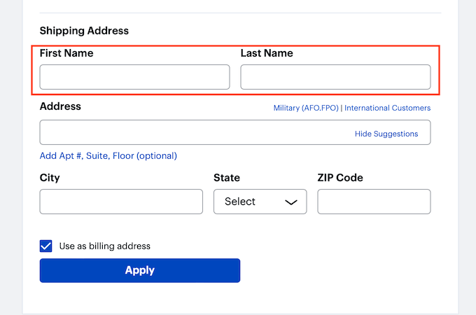
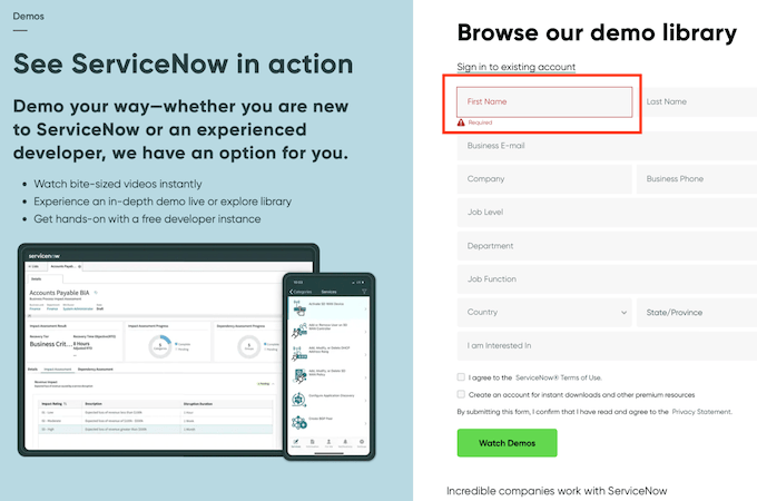
8. Highlight Required Fields
Make required fields obvious and consistent. The standard is an asterisk plus a short note (“* required”). Color cues help, but don’t rely on color alone—pair with icons or text for accessibility. Resist marking too many fields as required; every extra requirement hurts completion.
Eddie Bauer reinforces this visually by highlighting must-fill boxes in red while leaving optional fields neutral.
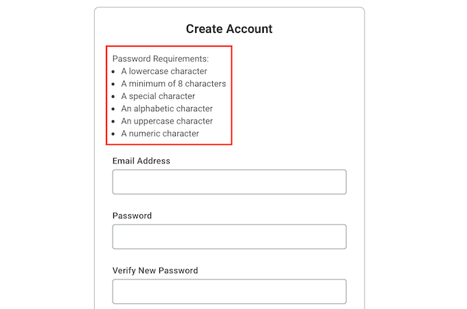
9. Provide Clear Directions for Data Entry
Fields like passwords and document IDs need explicit rules. State the criteria in plain language (length, character types, no personal info), and show them before the user starts typing. When possible, offer modern sign-in options like passkeys or one-tap SSO to remove the password burden entirely.
Workday clearly lists password requirements during account creation, reducing trial-and-error.
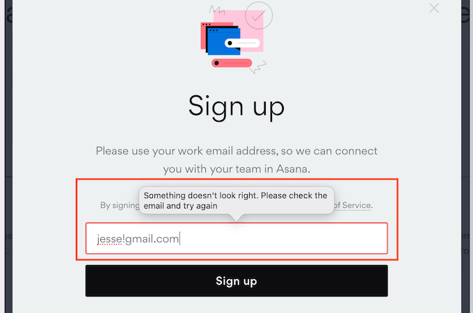
10. Notify Users Immediately When Errors Are Made
Inline, real-time validation beats surprise failures at submit. As soon as an entry doesn’t meet the rule, show a short, specific message next to the field and how to fix it. Keep the submit button active once everything’s valid, and consider an error summary at the top after submission attempts.
Asana models this well—errors appear instantly, with a clear correction path.
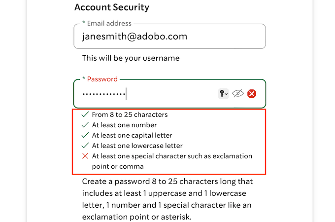
11. Provide Positive Feedback
Positive reinforcement helps people finish. Use checkmarks and short confirmations as requirements are met (e.g., password rules turning red Xs to green checks). For longer flows, micro-success messages like “Nice—halfway there” can keep energy up.
Starbucks visually confirms each met password requirement, removing uncertainty in real time.
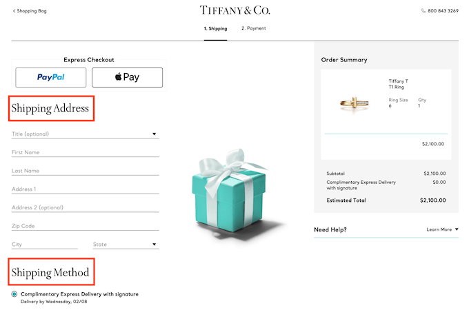
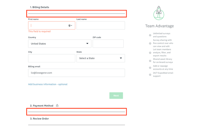
12. Include Headers and Subheaders
People scan. Clear section headers and short subheaders help them understand what information is on each step, and why you need it. Keep labels concise, group related fields, and consider sticky section titles on long pages to maintain orientation.
Tiffany & Co. uses simple headers to guide users through shipping, billing, and payment.
13. Dividers Make the Difference
Small UI elements can have outsized impact. Use dividers, whitespace, and accordions to group related fields and collapse what’s not needed yet. Breaking forms into digestible chunks cuts cognitive load and helps people finish.
SurveyMonkey uses collapsible sections and clear dividers to simplify complex inputs.
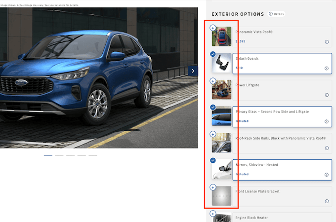
14. Keep Field Options Intuitively Easy
Match control to task: radio buttons for one choice, checkboxes for many. Avoid long dropdowns when possible—they slow people down. If you must use them (e.g., country), add type-ahead search. For short, mutually exclusive choices, segmented buttons are fast and mobile-friendly.
Ford keeps option selection straightforward while building a vehicle—an easy read at a glance.
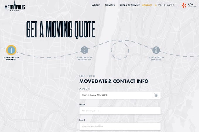
15. Order Fields From Easy to Hard
Start with quick wins (name, email) and build to more complex inputs. Early momentum increases the likelihood users will finish longer sections. For lead gen, consider a two-step flow: value first, then additional details after initial commitment.
Metropolis Moving eases into the quote process with simple questions before specifics.
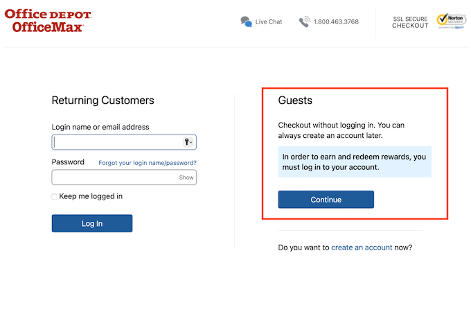
16. Make It Easy for Users
Not everyone wants an account. Offer guest checkout for one-time purchases and let people create an account after success with a single click. Support fast, low-friction payments (Apple Pay, Google Pay, PayPal, Shop Pay) to minimize typing and maximize trust.
Office Depot gives a clear guest option so buying simple items doesn’t require long-term commitment.
17. Align Labels to the Top and Left of Fields
Users expect labels above and left-aligned. Stick with the convention for readability and accessibility. Avoid placeholder-only labels and ensure labels remain visible when typing or reviewing. Consistent alignment reduces scanning time and mistakes.
Best Buy follows this pattern, making it easy to map labels to inputs at a glance.
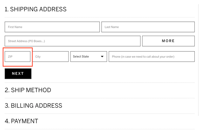
18. Keep Field Length Relative to the Input
Field size should hint at the expected answer. Short fields for ZIP/postal codes and CVV, medium for city, full width for street address. This improves comprehension and lowers error rates. Pair with sensible character limits to prevent over-typing.
Frontgate lays out contact fields proportionally, keeping the form compact and clear.
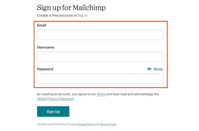
19. Include Only Necessary Fields
The fewer fields, the higher the completion rate. Ask only for what you truly need to fulfill the request. Save “nice-to-have” details for later via progressive profiling, and explain how any personal data is used to build trust.
Mailchimp keeps sign-up to the essentials—fast to read, faster to complete.
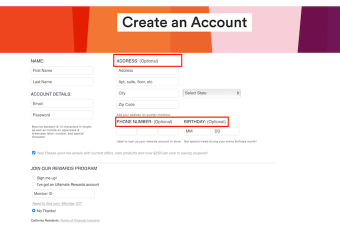
20. Make Clear What Data Is Optional
Some users gladly share an email but hesitate on phone numbers or addresses. If a field isn’t required, label it “optional” right in the field label. When sensitive info is useful but not mandatory, explain the upside so users can make an informed choice.
Ulta reverses the pattern by clearly indicating the few mandatory items and letting everything else be optional.
21. Help a User Out
Anticipate common blockers and solve them in context. Tooltips for unfamiliar terms, “What’s this?” links for CVV or tax ID, and “Don’t know your plate? Look it up” helpers prevent stalls. Add “show password” toggles and “use shipping as billing” checkboxes to remove duplication.
MoneySuperMarket embeds timely guidance (like car registration resources) so users never have to leave the flow to search.
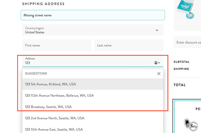
22. Give Users Shortcuts
Speed up entry with smart defaults and autofill: address lookup, “use current location,” auto-formatting for phone and credit card, and auto-advancing one-time code inputs. Respect browser-saved data and password managers—don’t disable paste in sensitive fields.
Pura Vida suggests addresses as you type, turning a chore into a quick selection.
23. Keep Users Focused
Use autofocus to guide the cursor to the next field and highlight active inputs so users know exactly where to type. On mobile, optimize “Next” and “Go” labels on the keyboard to match the task, and keep distractions off the page.
ServiceNow uses a prominent focus state to show where to begin and what’s next.
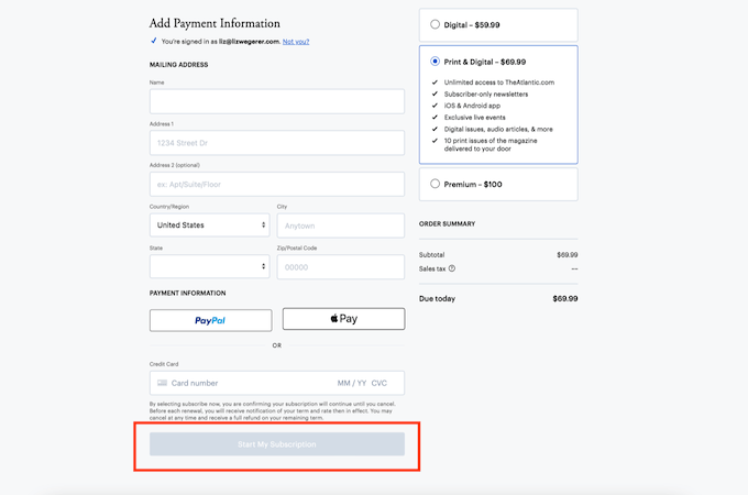
24. Maintain Form Integrity by Restricting Actions
Prevent bad submissions by disabling the CTA until required fields are valid. Pair this with clear messages about what’s missing and smooth scrolling to the first error. Show why the button is disabled (e.g., “Add your email to continue”) so users know what to do.
The Atlantic keeps “Start my Subscription” inactive until all required info is present—no dead-end errors.
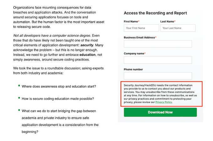
25. Preemptively Address User Concerns
Explain why you’re asking for sensitive info (birthdate, phone) and how it’s used. Short privacy notes (“We use this to verify your age”) and links to policies reduce friction and improve perceived safety—especially for fields that feel intrusive.
Security Journey does this directly, making the rationale obvious and reasonable.
26. Use Short, Engaging Copy
Form copy should be human, brief, and active. Use second person (“you”), speak at an 8th-grade reading level, and cut jargon. Where words aren’t needed, use icons or short labels. Always test microcopy—small tweaks can unlock meaningful lifts.
Duolingo leans on friendly, colorful cues that keep users moving with minimal text.

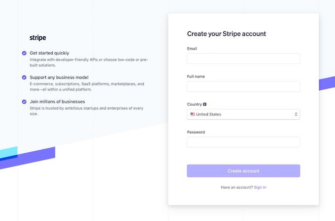
27. Consider Colors Carefully
Simple color palettes improve readability and accessibility. Ensure sufficient contrast, avoid using color alone to convey meaning, and reserve bold color for primary actions. Subtle elevation (shadows) can help forms stand out without shouting.
Stripe uses minimal color with thoughtful emphasis, keeping the eye on what matters.
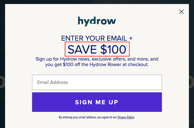
28. Emphasize the Good Stuff
If you’re offering a free trial, discount, or bonus, make it obvious around the header and CTA. Use concise, benefit-first copy and avoid dark patterns—be transparent about terms, trial length, and renewals. Honest incentives drive action and reduce refunds.
Hydrow puts the $100 savings front and center, making the value hard to miss.
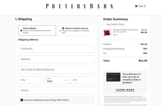
29. Design Your Form for Your Ideal Buyer Persona
Form tone, length, and visual weight should reflect your audience. A finance app may need more reassurance and formality; a lifestyle brand can be lighter and more visual. Use vocabulary your users use, and tailor questions to the job they’re trying to get done.
Pottery Barn keeps checkout calm and minimalist—exactly what their buyers expect.
30. Stick to a One-Column Layout
Single-column forms are easier to scan and complete on any device. If content feels cramped, split it into steps instead of adding columns. Keep key actions (order summary, total, CTA) visible or sticky so users never lose the thread.
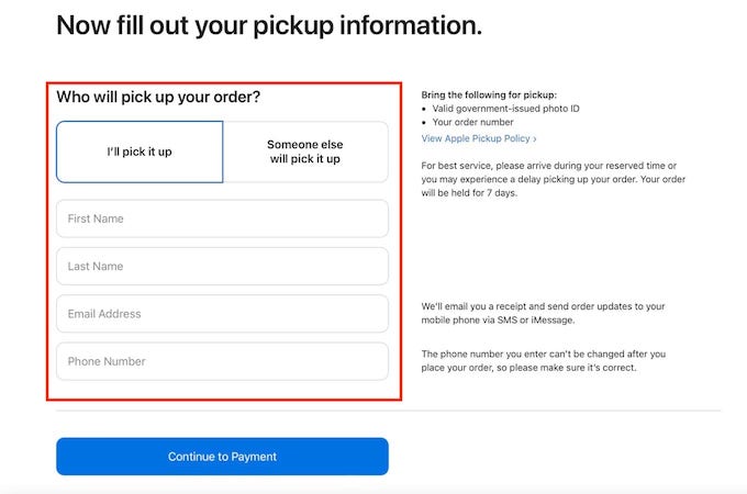
Take a cue from Apple: simple, linear flows reduce decision fatigue and errors.
31. Design Mobile-Friendly Forms, Too
Mobile now drives a large share of ecommerce and lead submissions, so your form must be just as smooth on phones as on desktop. Use large touch targets, mobile-friendly keyboards, minimal typing, and one-tap payment or verification options. Keep labels visible, avoid cramped layouts, and test on multiple screen sizes.
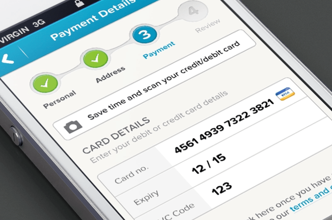
Murat Mutlu’s design on Dribbble shows a streamlined mobile checkout—even enabling card scanning to remove manual entry.
Final Thoughts
Great form design is about more than aesthetics. It’s about clarity, trust, and momentum—removing every unnecessary decision and keystroke. Start by auditing your current forms for the principles above, then prioritize fixes that reduce friction fastest.
Measure what matters (completion rate, error rate, time to submit, and abandonment). Iterate with A/B tests and real user feedback. When you lead with user-first UX and keep improving, your forms will convert more visitors into customers—consistently.