There are so many components to a killer website design. But all too often, people overlook details like typography—even though it quietly shapes how every page feels and performs.
I know what some of you might be thinking: how important can a website’s font really be?
Believe it or not, something as simple as choosing the right font can have a major impact on conversion. It also sets the tone for your brand and affects readability, scanability, and accessibility across devices.
It’s unlikely you’ve been on a website and thought, “Wow! I absolutely love this font!”
I don’t always notice great typography—because good type just gets out of the way. But you’ve probably landed on sites where the text felt generic, unappealing, hard to read, or out of place. You obviously don’t want people to have that impression of your website.
Why your website font matters
Different fonts can change how readers perceive a topic, how quickly they understand it, and how much they trust it.
Errol Morris conducted a survey in an article published in The New York Times. He included a passage from a book that claimed we live in an era of unprecedented safety, and followed the passage with two questions:
- Is the claim true? (yes or no)
- How confident are you with the answer? (slightly, moderately, very)
Morris didn’t care about anyone’s opinion of the claim. He wanted to know if the font influenced their answers. Forty thousand people unknowingly participated. Everyone read the same passage, but not in the same typography.
Check out these results.
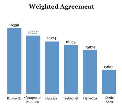
This graph shows the respondents who agreed with the first question. Morris took their confidence levels from the second question and assigned a weighted value to each response.
The differences were clear: confidence in the answer shifted based on the font people saw. Now here’s what happened among respondents who disagreed with the passage.
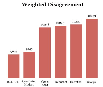
Compare the two graphs. Do you notice any similarities?
The Baskerville font was ranked highest for weighted agreement and lowest for weighted disagreement. Comic Sans ranked lowest for weighted agreement and high for weighted disagreement.
Based on this data, Morris concluded that fonts can influence how people perceive information. In short, your typeface can actually affect the credibility of your website.
Bottom line: yes, website fonts matter.
The best Google Font pairings
You don’t want the same font everywhere on your site—that’s too monotonous. Mix it up, but pick families that complement each other. I created this guide to help you do just that.
There are plenty of platforms for finding free fonts, but Google Fonts is my favorite. Below are tried-and-true pairings you can use this year. Explore the list and choose the combination that fits your brand and use case.
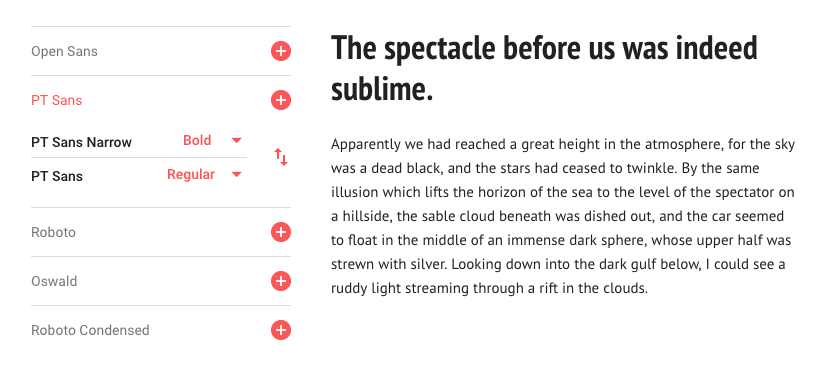
Open Sans and Roboto
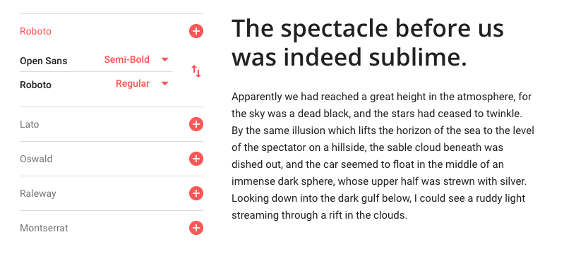
The header in this screenshot is Open Sans semi-bold; the paragraph is Roboto regular. The semi-bold header adds extra punch over the regular weight, but regular can work if your brand is more understated.
Why this pairing works: both families are crisp, neutral, and highly legible across screen sizes. Use Open Sans for headings and Roboto for paragraphs on homepages, landing pages, and dashboards where clarity is critical.
You can also swap roles—Roboto for headings (try medium) and Open Sans for body (regular). Keep line-height around 1.5–1.7 for paragraphs and use clear hierarchy (e.g., H1 36–48px, H2 28–36px, body 16–18px).
Playfair Display and Montserrat
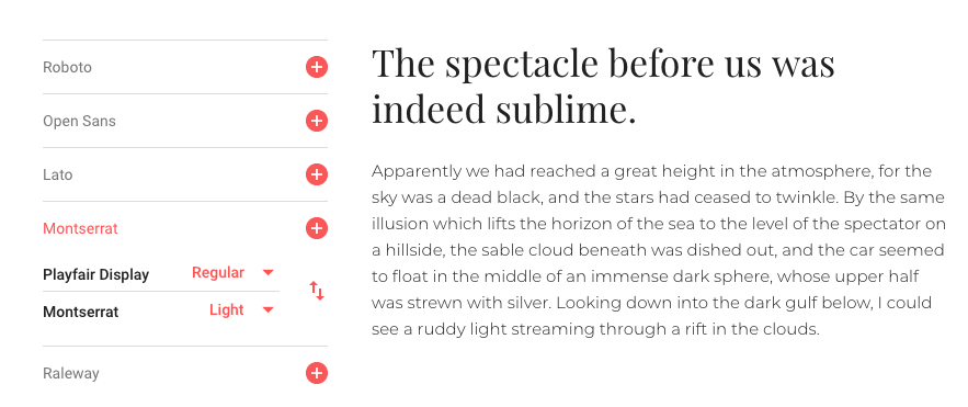
This pairing shines for short-form text and brand statements. It’s not my first choice for long blog posts, but it’s perfect for hero sections, feature callouts, and ecommerce product modules.
For fashion or luxury, try Playfair Display for headlines and Montserrat Light or Regular for supporting details. If you flip it—Montserrat for headlines and Playfair for accents—the vibe skews more modern or tech-forward (great for apps and landing pages).
Tip: keep letter-spacing normal on Playfair (serifs don’t need much tracking) and use a slightly larger line-height on Montserrat to maintain airiness.
Lora and Alegreya
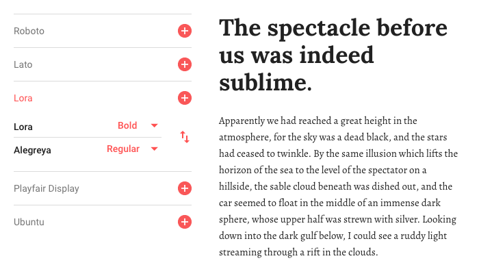
Lora Bold is strong and approachable, which makes it ideal for titles and section headers. It brings warmth without sacrificing clarity.
Alegreya Regular complements Lora nicely for captions, pull quotes, and short descriptions. For extended reading, keep Alegreya at 16–18px with generous line-height; otherwise, use Lora Regular for body text to reduce fatigue.
Swapping positions also works: Alegreya Bold for headers and Lora Regular for copy. This combo fits customer testimonials, case study intros, and content where a literary feel supports the story.
Merriweather and Lato
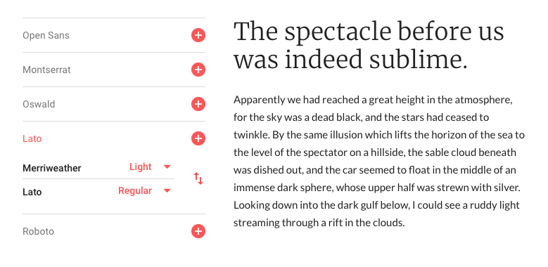
Merriweather Light with Lato Regular feels clean, credible, and professional—perfect for services, SaaS, and educational sites.
It’s popular because it’s versatile. Merriweather brings a modern, editorial tone; Lato keeps paragraphs simple and highly readable. This pairing works especially well on homepages with alternating image/text sections.
Use it in scrolling layouts: image on the left with headline and copy on the right, then alternate. It adds polish without calling attention to itself.
If this matches your current design, lean into it for a refined, trustworthy feel.
Amatic SC and Josefin Slab
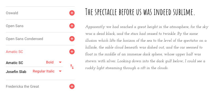
Amatic SC (bold) with Josefin Slab (italic) is a niche pairing for artsy brands. It can be delightful in small doses for musicians, painters, photographers, or makers.
Give the text room to breathe—use plenty of white space and light backgrounds. See my post on the top trending website color schemes for palette ideas that won’t fight the type.
If you sell ceramics or sculpture, this handwriting-meets-slab look can feel crafted and personal. Just avoid long passages: keep it to headlines, labels, and short bios, and switch to a more readable body face for anything lengthy.
Cinzel and Raleway
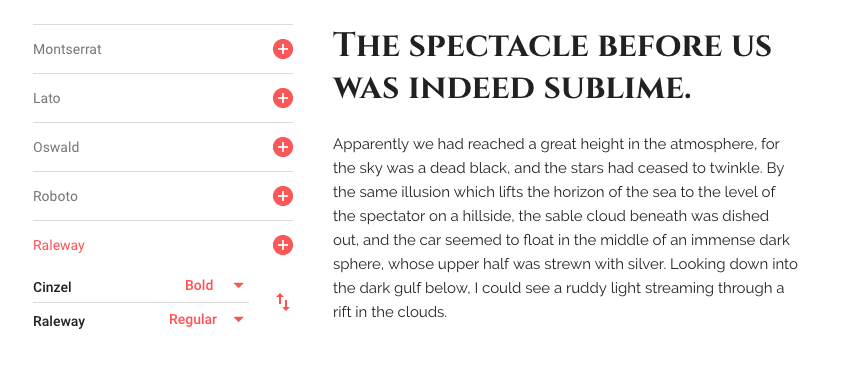
Cinzel is striking and all-caps by design, which makes it ideal for short text: category labels, headings, and navigational elements.
Pair it with the friendlier Raleway for descriptions and supporting copy. This combo works especially well for menus in the food and drink space or boutique hospitality.
Example menu hierarchy: category labels in Cinzel Black, dish titles in Cinzel Bold, and descriptions in Raleway Regular. For a modern twist, you can flip them—Raleway for headings and Cinzel for high-impact accents like price tags or specialty callouts.
PT Sans Narrow and PT Sans
PT Sans Narrow with PT Sans is a classic, flexible pairing that fits nearly any industry.
Both faces are very legible, so you can use them for short UI labels and long-form content alike. PT Sans Narrow is great for sidebars, footers, and UI where space is tight; PT Sans keeps paragraphs smooth and readable.
They’re easy to read without feeling generic—perfect for home screens, landing pages, and article templates.
How to pick the best website fonts
Now that you’ve seen strong Google Fonts combinations, how can you decide which one is best for your website?
Start by defining where each font will live: blog posts, homepage hero, product detail pages, navigation, or UI components. Different contexts have different readability needs.
Consider your industry and audience. Do you need a conservative, professional tone—or do you have room for something more distinctive?
Pair for contrast, not conflict. Choose faces that are visually distinct (serif vs. sans-serif, display vs. text) but share enough rhythm that they feel related.
Limit the palette. Use two fonts per page—three at most. If you need variety, use the same family’s weights and styles (light, regular, medium, bold, italic) instead of adding new families.
Practical typography checklist
- Set a clear type scale: establish H1–H6 and body sizes (e.g., 48 / 36 / 28 / 22 / 18 / 16 for headings; 16–18 for body).
- Dial in line-height: 1.2–1.35 for headings; 1.5–1.8 for paragraphs to improve scanability.
- Mind contrast: ensure color contrast meets accessibility guidelines so text stays readable on all screens.
- Use hierarchy consistently: one H1 per page, logical H2/H3 structure, and consistent spacing before/after headings.
- Keep weight variety tight: most pages only need 2–3 weights (e.g., regular, medium, bold). Too many slows the site and clutters the look.
- Test on mobile first: check sizes, line lengths (45–85 characters per line), and tap targets.
- Use whitespace: padding and margins make text feel effortless to read; cramped type always looks cheap.
Performance & accessibility tips
Typography isn’t just aesthetics—it’s speed and inclusivity, too. Keep things fast and readable with these practices:
- Prefer modern, lightweight files: serve WOFF2 and variable fonts where available to reduce requests and total bytes.
- Control loading behavior: ensure
font-display: swap(or a similar strategy) so text is readable immediately while custom fonts load. - Preconnect and cache effectively: if using a CDN like Google Fonts, add
preconnectto speed up handshakes; if you self-host, leverage long cache lifetimes. - Use sensible fallbacks: define a system stack fallback (e.g.,
-apple-system, BlinkMacSystemFont, "Segoe UI", Roboto, "Helvetica Neue", Arial, sans-serif) so layout shifts are minimized. - Avoid fragile styling: skip very light weights for paragraphs, excessive all-caps, or tight tracking that harms readability.
- Design for real screens: review pages on common devices and browsers, including low-contrast environments and reduced-motion settings.
- Keep text live: don’t bake critical copy into images—use real HTML text for accessibility, search, and translation.
Conclusion
Fonts are important, so it’s time to graduate from the defaults. Google Fonts is one of the best resources for free website type, with plenty of families that pair beautifully.
I tried to provide a little something for everyone. Not every pairing will fit every brand, so pick the ones that match your business, industry, audience, and theme. If none of these feel right, no worries—go back to the drawing board and explore more options on Google Fonts. The right typography will make your site look better, read easier, and convert more visitors.