Everyone talks about building traffic.
That’s fine, but it’s not the end of the story. If you don’t convert your traffic, building it is pointless.
Building traffic is like building a shopping mall. You can easily get people to come through the doors, but if you have only a few lackluster stores, none of those people will turn into customers.
You have to give them a reason to stay.
We’ve seen tons of sites fail miserably because they didn’t convert their traffic. A site can have the best idea in the world, but if it doesn’t focus on conversion, it’ll flop.
If there’s one thing we hear all the time, it’s this: “I just want to get more conversions from my website.”
That’s it. That’s the big one. We get it.
Conversion rates are notoriously low.
It doesn’t matter whether we’re talking with a group of startup entrepreneurs in San Francisco, a meetup of marketers in Sao Paulo, or a team of ecommerce geeks in Seattle.
Everyone wants more conversions.
Are there some simple ways to turn up the conversion juice and make more money from your blog, ecommerce site, startup, or landing page?
Yep, there are. And we’re about to show them to you.
Here are 37 tips and strategies to help you take all that traffic you worked so hard to build and successfully convert it.
Let’s begin.
1. Getting the right mindset
We firmly believe that conversion is an attitude, not just an action. It takes focus and dedication. You have to internalize your goals until they’re second nature.
We realize this sounds a little philosophical, but stay with me. You need to see conversion as more than just a bunch of numbers. Why? If you become obsessed with converting, you’ll fail.
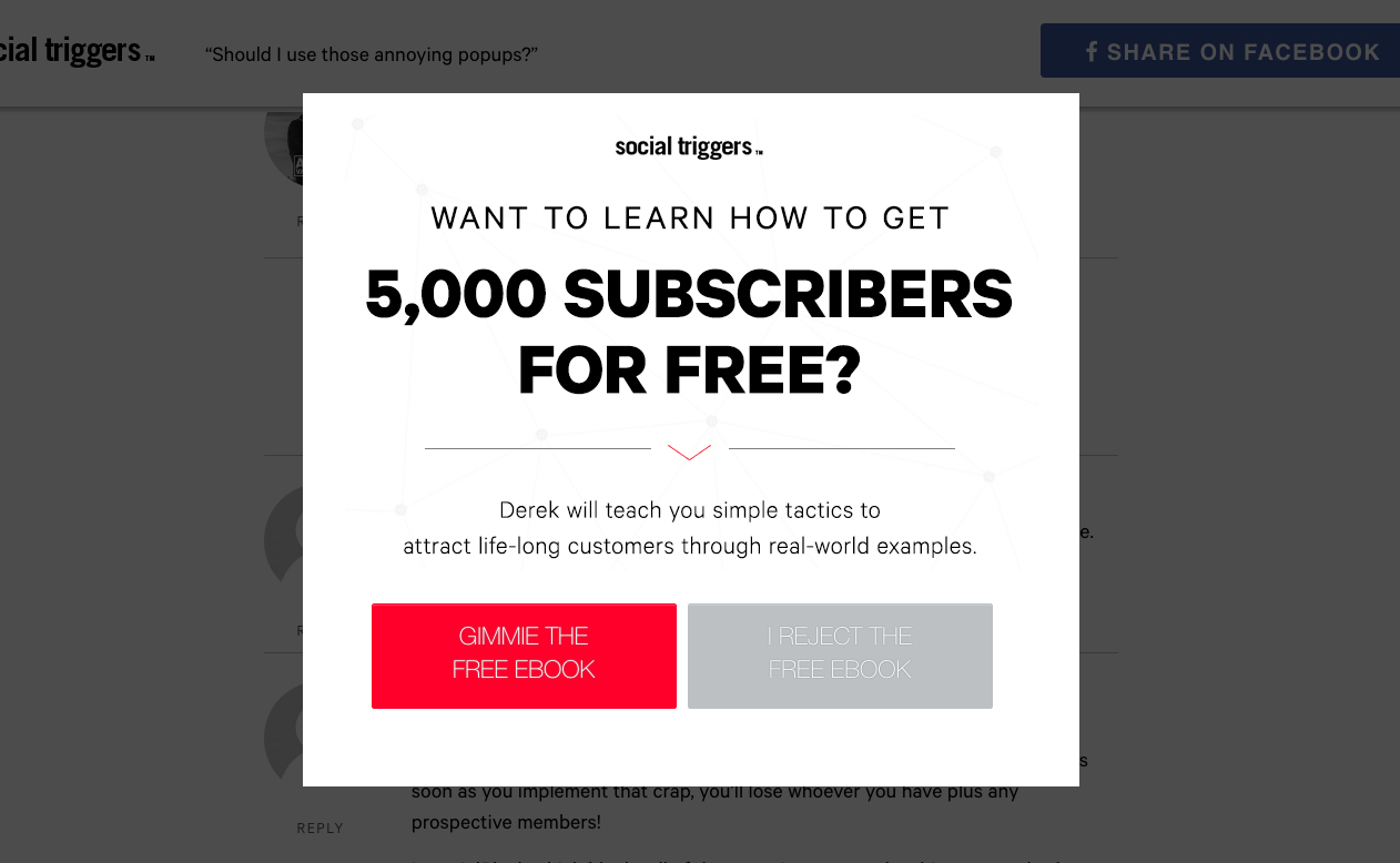
Here’s an example. Say you’re hyper-focused on converting. You include a few popups and some social buttons, and before long, your site looks like this:
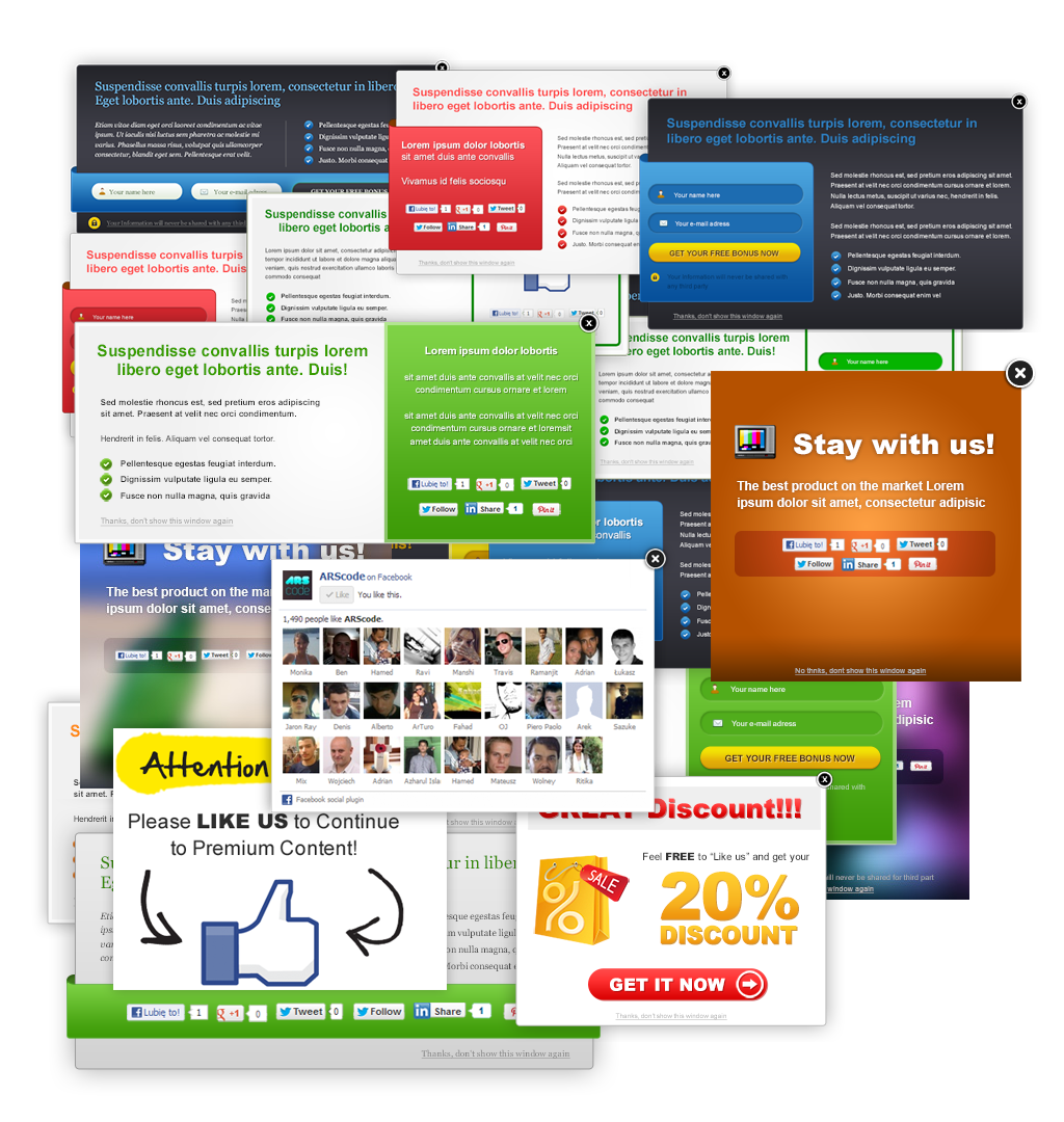
Okay, it’s probably not that bad. But you get the idea.
It’s easy to go overboard, and we get that. However, going too far can actually become your conversion rate’s worst enemy.
You should definitely focus on conversion, but don’t get a death grip on it. Conversion is a long-term strategy, not a short-term win.
Now that you’ve understood the conversion mindset, let’s take a look at how to convert all your traffic.
2. Publish the right content
If we had to pick a favorite form of marketing, it’d be content marketing.
Great content is wildly powerful. The converse is true too: horrible content is wildly destructive.
In fact, your blog can (and will) fail if you get the content wrong. If you create too much content, you’ll fail. If you create content that’s not relevant to your readers, you’ll fail.
So it’s imperative you get the content right.
First, you have to decide on the type of content you’ll provide. There are many options to choose from: blog posts, webinars, and podcasts, to name a few.
How do you know which type of content is right for you? You have to know your audience. We know our readers are looking for thorough guides, and that’s one of the many reasons we use blog posts.
On the other hand, there are people like Tim Ferriss who use podcasts as their medium of choice.
Tim knows his audience loves interviews with experts, and that’s what he gives them.
The lesson: Study your audience until you know them as well as you know your friends. Find out what type of content they respond to the most.
You also have to get the length right. We’ve found that longform content works best. You might be surprised to know that 3000+ word blog posts get more traffic than shorter posts.
3. It’s all about relevance
Fortunately, optimizing at each stage for the most relevancy not only has a great ripple effect on your search engine rankings, but also ensures that your visitor finds themselves nodding affirmatively to everything you’re writing — as if you wrote it just for them. And that’s exactly the kind of impression you want to convey!
So how do we do it?
Optimizing the Sales Funnel
With landing page optimization, it’s time to take a serious look at your sales funnel and where visitors may be slipping through the cracks. The typical sales funnel looks something like this:

Having landing pages for each step of the process is vital to capturing the largest share of targeted customers no matter where they are in the buying process:
Awareness
At this point, the potential customer is just learning about your brand or your site. Maybe they heard about you through another blog or link. They don’t have an opinion one way or the other about you. The goal of your landing page should therefore be to demonstrate your expertise in a way that can benefit them and help them with their question, concern or frustration.
Leveraging any existing trust that the customer has brought with them from the referring site (for example, if it’s a well-known news site or a leader in your industry) can be definite plus, since that built-in authority carries over subconsciously and gives you a much warmer reception with the prospect than if they had simply found you through a search engine.
Interest
By this point, the customer has heard of you and may be in the market for your offer, but they haven’t started to seriously weigh the pros or cons or decide either way. So far, however, your headline or your ad has captured their attention — so you now need to build it up with bullet points that are easy to scan and pull the customer deeper into your site.
Your landing page could entice them to do this through a free trial (“no credit card required” is a great confidence booster here), a download or some other high quality giveaway that gives them just enough information to whet their appetite and take them through to the next stage, which is…
Consideration
The prospect has learned about you, and they’re interested in what you have to offer, so at this point they’re seriously considering doing business with you or otherwise taking the action you want. So far, it has been green lights all the way — so your landing page will need to carry on these feelings by mentioning any security/service/transaction safety seals, your guarantee and any other points that will make them more comfortable and confident.
Intent
At this point, the customer knows that you’re the one they want to do business with. They may be looking to make sure their decision is a valid one — so your landing page for this segment should incorporate testimonials that convince them to take that coveted action.
Be sure to let them know what happens after they order, as many ‘thank you’ pages fail to do more than just thank the customer. Do this BEFORE the thank you page. Answer questions like:
- How soon will my order be shipped?
- If it’s a digital product, how do I download it?
- What should I do if I have questions?
- What if I need to cancel my order?
- How do I get started with it? Is there a tutorial?
These things will put their purchasing mind at ease and give them some direction as they proceed to the next step, which is:
Evaluation
The customer has moved on from deciding to take action, and is actively comparing your solution to others in the market. This is the point at which you want to handle comparisons very carefully.
Oftentimes companies will bash their competitors in a one-to-one comparison chart, but this can backfire — since, if the prospect has tried the competitor, it may be perceived as an insult to their decision — and that can in turn hurt the confidence you’ve worked hard to build up to this point.
A better idea is not to compare or compete on things like features, but to share what makes your solution stand out. Here again, easily scanned bullet points with “just the facts” will let customers know not only how you’re different, but will do so without you ever having to mention your competition.
Purchase
The final step — and the one everybody wants more of — the purchase! You’ve worked hard up to this point, crafting landing pages that get the prospect to learn about, compare, decide and ultimately move forward with an order.
Now is the time to deliver on the promises you made back at the Intent section of the funnel — going beyond the “thank you” page to keep the customer informed and education every step of the way, so that they will hopefully find themselves among the glowing testimonials that you’ve presented to other visitors who are still in the “just looking” phase.
4. Fear is a powerful motivator
Fear — the need for safety, security, care and shelter powers many of our core decisions. The “what if’s” start to seep into our minds and create all kinds of unfortunate scenarios — none of which we want to see happen.
All you have to do to see fear as a motivator in action is to turn on the evening news — there’s fear about the job market, fear about the stock market, the list goes on and on… Closer to home, we fear losing the ones we love, paying the rent/mortgage on time, or whether or not we’re doing this thing called “life” the right way.
Many landing pages hint at fear by pushing all the prospect’s pain buttons. It’s best to be careful with this motivator though, as it’s very much like playing with fire. Too little fear, and the user doesn’t take your offer seriously (“that could never happen to me!”) Too much fear, and the negativity jars their focus away from what you have to say.
Case in point — United Agencies conducted an email subject line test in the hopes of increasing open rates. They tested a fear based versus a “how-to” based subject line. Which one would you be more likely to click?

The first subject line, about $20,000,000 homes burned to the ground, increased leads by 65% for the insurer. Prospects rationalize that if million-dollar-mansions aren’t protected from brush fires, chances are their home isn’t either — and it motivates them to not only see the potential damage, but also protect themselves from it.
The best way to create a fear-based motivator in your landing page is to ask yourself – what is the deepest, most unspoken fear that my customer really has about my offer? Is it the fear that things ultimately won’t work out? That they’ll never get something (or someone) back? That they’ll lose or fail?
Whatever the answer is — how does your product address and calm that fear, specifically? What would make the customer shift from a mood of uncertainty and anxiety to one of calm hopefulness and confidence?
5. Urgency is a powerful motivator
The need to act quickly is another strong motivator. However, most landing pages misuse urgency terribly — in the sense that “there are only 10 copies of this e-book left” when we all know that it’s a digital good and you have an unlimited supply.
Don’t be that kind of marketer.
Not only does it cheapen your offer, but it also positions you as a fly-by-night cash-grabber who sets artificial limits where there shouldn’t be any. Had this been 1997 and e-books were new and novel, it may have been a sleek practice — but now it only serves to make you look dumb.
Instead, leverage urgency not in terms of time, but in terms of what will happen if the user doesn’t act right now. What might they be missing out on by choosing to take no action at all? That kind of thought could even potentially lead to the fear motivator above.
We humans like our comfort zone and are none too keen to step out of it. By pushing the boundaries and showing life (or a great offer) passing us by, we’re urged to step up and claim it. Some sites, like Groupon, use both time and offer urgency to create compelling deals:

- You have X hours/minutes/seconds left to buy
- X number of your friends or other people have already bought this deal (what are they getting that I’m not?)
- X number of coupons have already been sold out of Y available
So you see, not only do they use time itself as a motivator, but also the sense that “you’ll be left out” if you don’t act now.
The Disney Vault is another example of this practice at work:

Periodically, Disney films will be made available and then put in the vault for several years, until it is re-released (usually in another format, such as Blu-Ray or 3D).
Although they could technically make and sell an unlimited number of movies, they voluntarily choose to limit the amount of time a specific movie is available, thus increasing its scarcity and in turn, its value. Thanks to the internet, people have bought up several copies of movies headed to the vault, and then resold them on auction sites like eBay for an extraordinary amount of money when they’re no longer available in stores.
6. Provide case studies
As you’ve probably already seen, we have case studies on Quick Sprout. From TechCrunch to Gawker Media and even Timothy Sykes… We break down what we’ve done for other people and how you can replicate those results.
Can you guess what percentage of the visitors who read those case studies convert into leads? It’s currently at 13.8%.
The reason they convert so well is because the case studies don’t just talk about the traffic or revenue increases, but they also break down exactly what we did to help our customers achieve those results.
To top it off, we integrated testimonials within the case studies to back up the claims we’ve made.
What we’ve seen in the past is that most case studies don’t convert visitors into customers. It’s because they are too vague, which causes people to not believe what they are reading.
7. Display testimonials
It sounds easy to create and use testimonials, but most people don’t know how to use them.
Why?
Because they use simple testimonials like this one:

Although that testimonial contains a full name and image, the testimonial itself isn’t too convincing compared to the one below:

Sure this testimonial is a bit long, but it’s authentic. It tells a story to hook you in, and it also talks about the results achieved.
Can you guess what the difference in conversion rate between the short testimonial and the long one is? The longer one resulted in 11.3% more sales than the shorter version.
When using testimonials, make sure you sprinkle them across your whole site. From sales pages to checkout pages, use them on any page that can impact a sale.
8. Herd mentality
Have you noticed that people move in herds? If they see other people jumping on the bandwagon, they’ll typically do the same.
Timothy Sykes does this by showing you who recently applied to his Millionaire Challenge.

If a lot of people are doing something, they must know something you don’t, right? Showing how other people are using your product or service can boost your signup rate.
Basecamp also does something similar by telling you how many customers signed up in the last week.

If over 5,000 companies signed up for Basecamp in the last 7 days, it must be worth trying. That’s at least the message they are trying to get across.
If you want to increase your signups, show how many people have recently signed up or are currently using your product or service.
9. Logo porn
Don’t worry, logo porn isn’t something that is disgusting or perverted. You’ve seen it before too.

We use them throughout Quick Sprout. Whether it is companies we have worked for, mentions within press pieces or awards we’ve received, we try to showcase them all.
It helps increase our conversion rates. When we removed the logos, our conversion rate went down by 9.9%. Although that isn’t a huge number, every little bit adds up.
If you have worked with some well-known companies or you have received some great press, showcase it. You may not see a conversion increase like we did, but it’s worth testing.
10. Customize your pitch
Lets face it, we all like things that are tailored for us. Who wants to buy or sign up to something generic when you can sign up for something that is just for you?
One way to do this is to create a unique product or service for each of your customers. If you can do that, great… but chances are you won’t be able to do so.
Another thing you can try is to customize your sale pitch by putting in unique information targeted towards each of your visitors.
You can use software like Maxmind to insert your visitors’ city and state within your pitch.
For example, if you are selling anti-aging cream, you can use Maxmind to create a custom headline that will insert the visitor’s city into your headline. It would look like this:
Learn How You Can Have The Most Beautiful Skin in Atlanta, Georgia
Or you can do something a bit more generic like:

Some people have seen an increase in conversion rate by up to 33% using this tactic, but it only works well with audiences who aren’t too sophisticated.
11. Limited access
One of our favorite sites on the web is Quora, not because one can learn almost anything on it, but because we love how they get you to register and signup.
After you read a few threads on Quora, they block you from reading the rest by showing you something like this:

They know that you’re already hooked because you’ve read a few threads, and now they can force you to register.
If you have a great product, you can consider giving everyone limited access to it and block off certain parts for only registered or paid users.
We are trying something similar on Quick Sprout by getting you to put in your email address to read the rest of the post.

We know it can be irritating for you, but it has tripled the number of emails we’ve collected. Plus, our overall traffic still continues to increase.
12. Speed
Although speed is something that we tend to forget about, it has a huge impact on conversion rates. This is the main reason companies like Amazon and eBay do everything possible to make sure their websites load super fast.
For every second delay in page response, there is a 7% decrease in conversion rate.

Focus on improving your overall site speed as it can boost your conversion rate and increase your overall search engine traffic.
If you are wondering how to increase your site speed, check out Google PageSpeed. It is a free program by Google that can help you decrease your load time.
13. Be willing to accept criticism
While it may not initially seem like it, accepting criticism is a valid method of persuasion. You’re not always right. People know that.
If you’re carrying yourself as though every word you write and speak is never wrong, your audience may think you’re arrogant. As a result, they will be less likely to take action.
Instead, show your audience you’re reasonable and open-minded by accepting feedback and criticism.
Here’s an example from a blog post written by Ben Labay at ConversionXL:
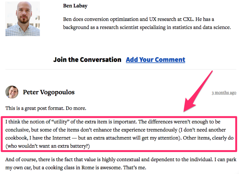
One of the readers wrote a comment that disagreed with some of the points made in the article. There’s nothing wrong with that.
Some people are afraid to enable comments on their blog posts because they fear criticism. We always welcome comments and respond to them even if we don’t always see eye-to-eye with the writer.
Make sure you digest the opposite side of every argument. You may even realize the other person has valid points.
Now you can spin that criticism and re-position your argument with a positive angle that entices the person to take a specific action.
Live video streaming is another great platform to utilize for this purpose. You can converse with your audience in real time through these channels and have a discussion.
After watching a branded video, 64% of consumers are likely to make a purchase.
Furthermore, 46% of users complete an action after viewing a video advertisement.
Use this information in your marketing campaign. Next time you’re writing a post or streaming a live video, be more receptive to opposing opinions, and leverage that position to persuade your audience.
14. Find ways to get your audience to agree with you
On the other hand, it’s always better if your audience agrees with you. It just involves less work on your end.
But if you’re starting from a clean slate, the first thing you need to do is get people to start nodding their heads.
Make obvious claims or statements they’ll agree with.
Here’s a great example from an article written by Ian Blair at BuildFire:
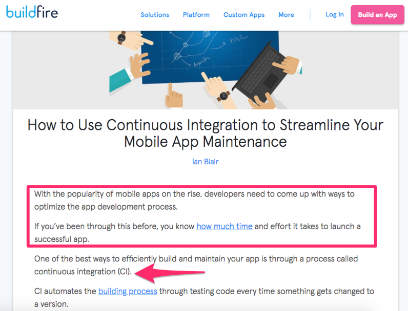
Ian’s persuasion is set up perfectly in the first few lines. These opening statements get the reader nodding their head right off the bat.
-
mobile apps are growing in popularity
-
the development process needs to be optimized
-
it takes a long time and lots of effort to launch an app
Anyone reading the above statements would agree with all of them. Now that the reader is in agreement, Ian offers a solution in the third line.
And the audience is hooked. They’ll continue reading and follow the advice to take specific actions.
This tactic isn’t limited to blogging. You can do this when you’re speaking to someone in person as well.
For example, a car salesman may set up a pitch for a certain vehicle by discussing the rising cost of gas. In the very next breath, they’ll show the consumer a hybrid vehicle with great gas mileage.
It’s a simple technique, but it’s extremely underrated. Try to implement this into your marketing strategy.
15. Show them actual evidence
Telling people something isn’t always enough to convince them. This is especially true if they don’t know you personally.
While your closest friends and family members know you wouldn’t lie to them, consumers may be skeptical.
So you’ll need to show evidence to back up your claims.
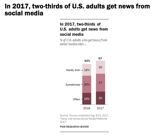
For example, you could tell your audience people like to use Facebook to get their news. But does that really mean anything if you don’t have any proof?
It’s much more effective to say,
According to a study conducted by the Pew Research Center, 67% of adults in the United States use social media platforms to get news.
Show graphs or other data sources as a visual reference for your claims as well. If you’ve been following my blogs for a while, you know we use this technique all the time.
Visual evidence can have a remarkable impact on someone’s ability to retain information.
When information is communicated orally, the listener is only likely to remember 10% of what they heard three days later. But if images are paired with that data, 65% of the information is retained three days later.
You want your audience to take a specific action, but they may not do it right away. Give them some time.
Visual evidence will keep your persuasive voice in their minds even days after they consumed your content.
16. Limit their choices
If you’re trying to get people to buy a product or make a selection, limit their choices.
Marketers make this mistake all the time. They think offering hundreds of choices will appeal to a wider audience, leading to more sales.
The reality is, it has the opposite effect.
One of the best examples of this concept is referred to as the “Jam Study.” Here’s what researchers discovered.
A grocery store had a display table with 24 different types of jam. The table attracted 60% of people shopping in the store.
On average, each shopper sampled 2 flavors of jam, but only 3% of shoppers actually made a purchase.
On a different day in that same grocery store, a smaller display table offered 6 different jams. This time, 40% of shoppers were attracted to this display.
While people still sampled an average only 2 flavors, 30% of shoppers purchased jam.
When consumers had fewer choices, they were 10 times more likely to buy something. It’s known as the paradox of choice.
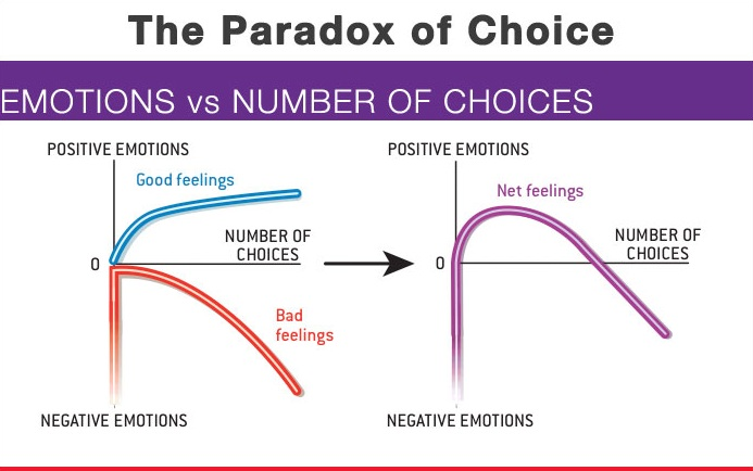
People are indecisive. Giving them too many options will overwhelm them. They can’t make a decision, so they end up getting nothing.
Consumers are also more likely to feel buyer’s remorse if you offer too many options.
They will constantly second-guess their choices and may end up having a negative perception of your brand. Obviously, you don’t want this to happen.
If you’re trying to persuade someone to choose something, narrow down their options, and you’ll have higher conversion rates.
17. Know what your audience wants
It’s important to make sure you know your audience so that you can properly persuade them to do something.
You should know what platforms they are using and how to distribute content to the right audience. For example, research shows that men are more responsive to email, but women respond better to face-to-face interactions.
Find ways to captivate your audience and get their attention. This will make it easier for you to get them to do something.
Let’s say you have a broad target audience of men. What gets their attention? If ads for men’s products include photos and videos of attractive women, it definitely grabs their attention.
18. Focus on repetition
Just because your marketing campaign didn’t work the first time doesn’t mean you should completely trash it. Sometimes it takes a couple of attempts to persuade your audience.
Studies show that in a group setting, if one person in the group repeats an opinion, others are more likely to see it as a representation of the entire group.
Still don’t think repetition is important? Let’s see what you think of the following phrases:
- Just do it
- I’m lovin’ it
- 15 minutes could save you 15% or more on car insurance
As you know, those aren’t just random words. Those are recognizable company slogans. We don’t even have to say the names of those companies.
You knew exactly what we were referring to because these slogans have been repeated enough times to become familiar.
Are you experiencing shopping cart abandonment on your ecommerce website? Use the concept of repetition to remind the consumer about your products.
This reminder improves your chances of persuading the recipient to finalize the purchase.
19. Learn how to tell a great story
Rather than just telling someone to take a specific action, you can entice them to do that by telling a captivating story.
The story could even be about a personal experience.
92% of consumers say they want advertisements from brands to feel like a story.
Your stories should trigger an emotional response from your audience. Make sure you’re telling a story they can relate to.
Stories can be shared through multiple distribution channels, such as blogs, social media platforms, or your YouTube channel.
You can even tell stories if you’re speaking to a crowd to keep them engaged.
It’s an effective sales technique. Take a look at this example from the Nutrisystem website:
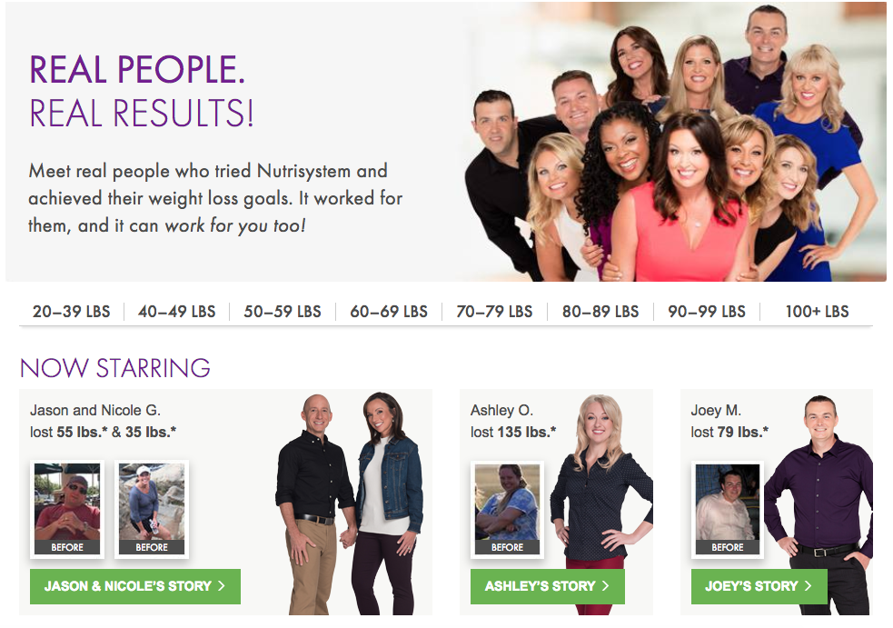
They display success stories of people who have lost weight using their products. After hearing these stories, their audience is more likely to be persuaded to try the product.
This also relates back to a tactic we discussed earlier about showing evidence.
Saying your products can make someone lose weight is much different than showing them actual people who were able to lose weight.
20. A lack of “power words”
Power words are action-verbs like “Get”, “Download” “Access” and more. Compare these to weaker, more passive words like “Find”, “Learn” or “See”. “Click Here” tells the reader nothing. “Click here to get your free download” is much more powerful. The word alone won’t change thing — “Get Whitepaper” for instance, will likely not increase your click-throughs and conversion rate as much as “Get a Free Whitepaper that Shows You How to Boost Business by 150%”.

21. Too much information
Sometimes, despite your best efforts, your landing page copy will be overwhelming — especially when it’s combined with a lot of visual elements. The very things that are supposed to attract people to take action are only serving to distract them.
Look at the example below, of a site selling email leads. It’s not clear what path they want visitors to take — should they watch the video first or fill out the form? What about those bullet points in the sidebar, are they important?

Contrast that with the second version which offers a much easier-to-follow eye-tracking flow, a cleaner opt-in form and a real order and direction to the content.
22. Make your email subject lines stand out with emojis
You need to learn how to increase your open rates with different subject lines. If people don’t open your messages, your campaigns won’t be successful.
One of the best ways to use emojis to increase clicks is by adding them to your email subject lines.
We know how much time and effort you put into your content. Don’t slack off when it comes to crafting a subject line.
Research shows that 56% of brands saw an increase in their open rates when they added an emoji to their subject lines.
They experienced higher click-through rates as well. Recipients were more engaged with the content.
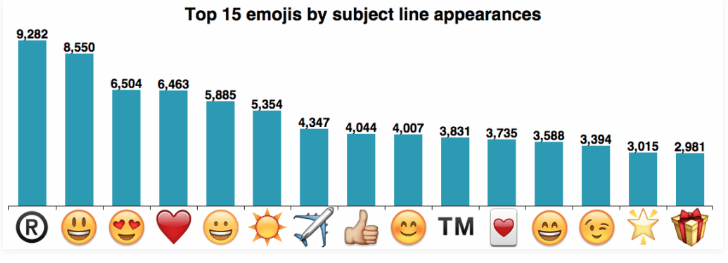
These are the most frequently used emojis for email subject lines:
That doesn’t mean they were the most successful.
You’ll have to see which ones work best for you depending on your brand, industry, and purpose of the message.
For example, using the gift emoji or airplane emoji in a subject line would be irrelevant if you’re a restaurant informing your subscribers of your new dinner menu.
Adding emojis to your subject line is a winning strategy because it helps you stand out from the crowd.
Your subscribers get their inboxes flooded with promotional content on a daily basis. Anything you can do to be different will help your cause.
Look at how Grubhub used an emoji in this subject line:
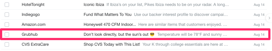
It stands out from the others because it’s the only one with an emoji.
Plus, it’s relevant to the subject line. They used the smiling face with sunglasses for a subject line that’s related to the sun being out.
23. Add an emoji to your ad headlines
If you’re using sponsored ads to market your business, you should definitely consider adding an emoji to your headlines.
We know it may sound simple, but you’d be surprised at the results you’ll see.
Take a look at this example of a promoted Facebook advertisement from Scoro:
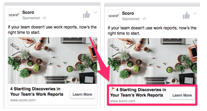
At first glance, the two ads are seemingly identical. But the ad on the right has a simple red flag emoji added to the headline.
Nothing major, right?
Well, Scoro A/B tested these two headlines, and the results were astonishing. The headline with the emoji had 241% more clicks than the one without an emoji.
It’s worth finding out whether your company can have the same success.
Start running A/B tests on your upcoming ad headlines.
24. Use emojis in your push notifications
If you have a mobile app for your business, you have an advantage over all of your competitors who don’t.
Having the app is a great start, but you need to make sure you’re getting the most out of the tools at your disposal. You need to learn how to target your mobile customers with push notifications.
These messages get sent directly to the devices of your app users. It’s a great way to contact them with various promotions.
But just like with your email subject lines, the campaigns are useless if nobody clicks on them.
Studies suggest that adding emojis to push notifications can increase open rates by 85%.
The open rates are 135% higher on Android devices than on iOS devices.
That’s an enormous difference.
Here’s an example of how Postmates used this strategy with one of its push notifications:
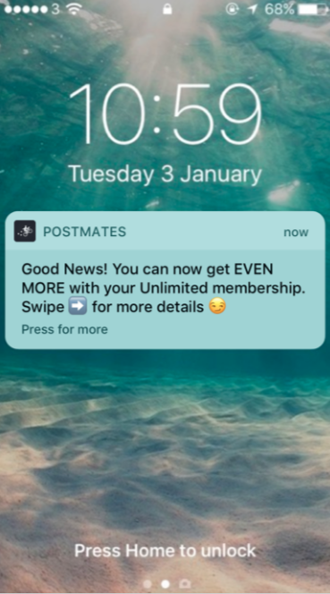
It’s a simple and effective way to promote its membership.
Since push notifications have a limited character count, it’s important to grab the attention of your app users with just a sentence or two at most.
The arrow emoji reflects the swiping motion. And the side smirking face implies there is some type of secret or information worth reading.
Here’s another example, from Yelp:
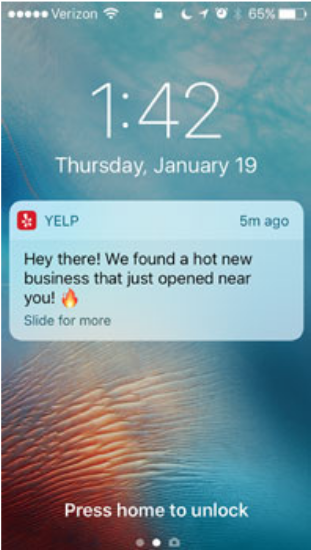
Again, it’s very simple. It’s using a flame emoji to enhance the phrase “hot new business.”
It’s not rocket science.
You don’t need to create your entire push notification strategy around emojis.
Just write what you were planning to say in the first place. Then add an emoji or two that fit the description, and you’re all set.
25. Program your chatbots to use emojis
How are you communicating with your customers?
You can provide better customer service by implementing live chat. Now your customers can reach you when it’s convenient for them, without having to make a phone call or send an email.
But it’s not always easy to have a customer service representative available to respond to these messages 24 hours a day, 365 days a year.
That’s where chatbots come into play. You can set up a chatbox to automatically appear in the corner when someone lands on your website.
An emoji from a chatbot adds a human element to the conversation, even though the communication is with a robot.
26. Include emojis in your meta titles
While you may not think of it, people are using emojis in search queries.
Adding an emoji to your meta titles can help improve your SEO strategy. The increase in clicks will drive more traffic to your website.
Here’s an example of what happens when you add the birthday cake emoji to your Google search:
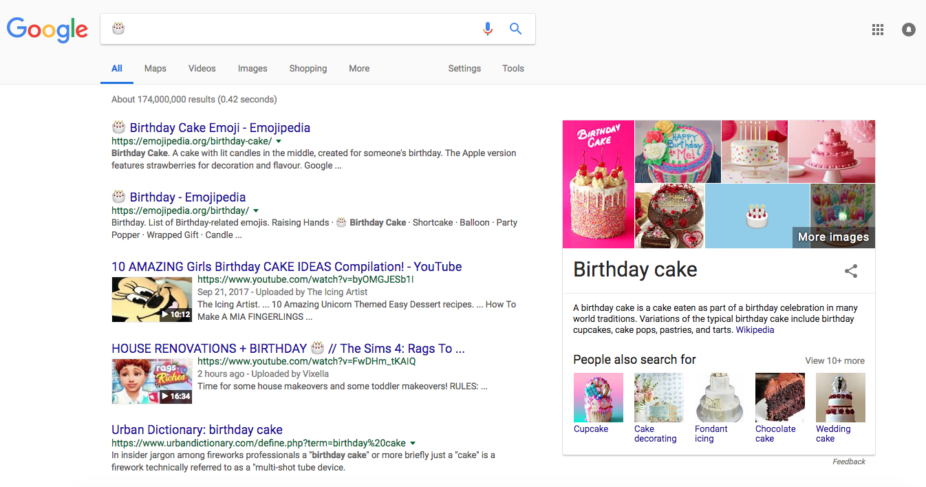
Look at the top two results on the page. They both have a birthday cake emoji in the meta title.
The top two ranked pages of search results control roughly 50% of all clicks.
Adding an emoji to your meta titles and even meta descriptions can increase your chances of getting ranked higher.
27. Add emojis within the text of your marketing emails
Earlier we discussed how you can use emojis in email subject lines to increase your open rates. But that’s only half of the battle.
Now you need the email recipients to consume the content, click, and convert.
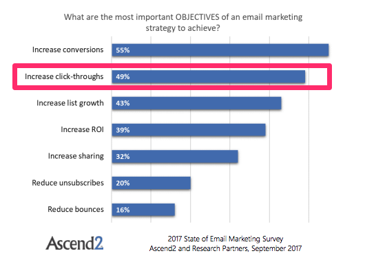
Increasing click-through rates is a top email marketing objective according to a survey of business owners and marketers.
That’s because there is a direct correlation between clicks and conversions.
Getting more clicks can ultimately help your business make more money. Depending on the goal of your campaigns, these clicks can directly drive sales.
A recent study reported that some businesses enjoyed a 93% increase in click-through rates after adding emojis to their email content.
Use emojis in the subject line to generate opens. Then continue using them within the body of the message to increase click-throughs.
28. Enhance your Instagram captions
You can’t have an effective emoji strategy without changing the way you do things on social media.
Adding an emoji to your Instagram captions is a great way to increase engagement with your followers.
Here’s a look at the top ten most used emojis on Instagram in 2017:
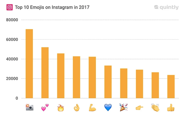
Furthermore, posts with emojis increase interactions by 47.7%, which means users are more engaged with the posts.
It’s no surprise that the camera emoji was at the top of the list. We see this one used all the time.
People commonly use the camera emoji to give credit to another user who took the photo.
If your brand is encouraging user-generated content and sharing photos submitted by your followers, you can use this emoji instead of typing “photo credit.”
29. Gain an advantage over your competition with emojis
If you start using emojis in your marketing strategy, it will help you stand out among your competitors.
While emojis are popular for personal use, businesses are still adapting to this trend. It’s not a strategy that’s being implemented by everyone just yet.
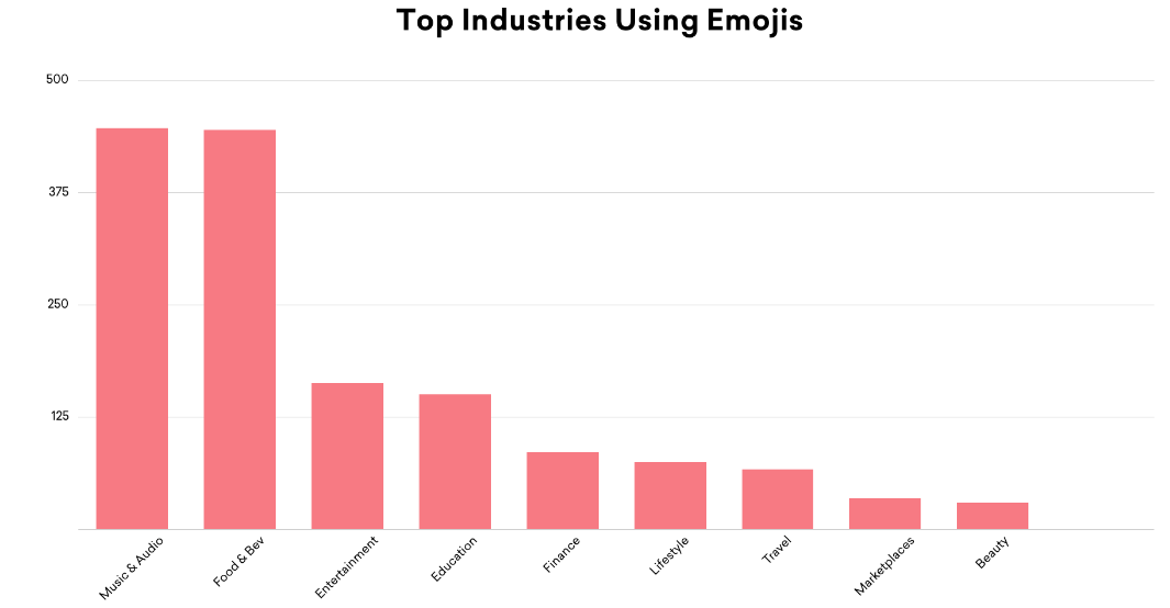
These are the top industries using emojis:
As we said earlier, emojis bring a human element to your marketing strategy.
Consumers don’t feel comfortable interacting with giant corporations. If you take yourself too seriously, you won’t appeal to your customers.
You can use emojis while still remaining professional.
When consumers see emojis in your marketing campaigns, they will feel as though they’re getting a message from one of their friends.
Jump on the emoji bandwagon before your competitors have a chance to catch up with these trends.
30. Get creative on Twitter with emojis
While Twitter may not be your primary marketing channel, you should still have an active account and post content on a regular basis.
Emojis are a great way to drive engagement on your posts and generate clicks. This is especially true if you’re sharing a video.
Pairing an emoji in a tweet containing a video generates six times higher interest and emotional connection among your followers.
Even if you’re not sharing a video, you can still get creative with emojis to improve your tweets. Look at this example from Domino’s Pizza:
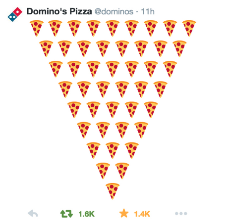
Sure, it may be a bit corny, but it’s definitely creative.
Just look at the engagement on this post. It has more retweets than favorites, which means it’s being exposed to a wide audience.
As a result, the page will be seen by more users, even if they don’t follow the brand.
This increase in exposure will translate to more traffic to the company’s profile and website and ultimately yield more clicks.
31. Optimize your emails
Even if a subscription form isn’t part of your landing page, optimizing your emails to speak directly to your subscribers is an important step in proper landing page optimization. There are all kinds of segmentation options to consider, and depending on the email marketing software you’re using, there may be more sophisticated branching and if/then options to truly narrow down specific users and their goals — for example:
Behavioral Segmentation
You can segment your lists depending on the actions a user took while on your site. For instance, if they spent X amount of time on your pages or visited Y pages, they’re in more of a buying or information-gathering mode than someone who just haphazardly came across your site from a simple search.
This can, in turn, help you understand where each user falls in the sales funnel, and craft emails that correspond to their location in the decision-making process.
Former B2B marketing platform Bizo (acquired by LinkedIn) ran an email split test to encourage downloads of a whitepaper on their services. They split the test between a more marketing-focused design vs. a plainer “article style”.
First is the marketing-style design:

Bizo’s marketing style design email
Notice how this version maintains common best practices, including putting an image and the download now button above the fold, plus making the headline a more dynamic color — compare this to the second version:

Here the layout is much plainer, the headline blends in more with the content, and the download button and image are below the fold. Which email would you choose to download the product from?
Would you be surprised to learn that the second variation beat the first by increasing whitepaper downloads by 63%? That’s no small feat — but it’s also surprising, since the first email takes into account all the “best practices” we hear about — above the fold, large call-to-action, product image, noticeable headline, etc.
This just proves yet again, that even though you have a hunch that one creative will outperform another — that you should always test and have your audience decide. In this case, when marketing emails look a bit too much like marketing, customers opted not to click through because they didn’t want to feel like they were being ‘sold’ to.
Job Title Segmentation
Another method of segmenting users is by job title. A CEO is going to have different needs and expectations than someone working in the sales department. As such, if you’re attracting a broad base of users, it’s a good idea to email them periodically and let them know that you want to connect with them and make sure you’re sending them information that they find useful and actionable.
With this in mind, it’s easy to create a simple survey with a few specific questions such as their job title, industry and other non-personal questions (no asking how much money they make or their highest level of education — unless it’s directly related to your industry, they would likely rather not say).
Ask only the questions you need to get the answers you need and nothing else.
Social Media Segmentation
With the explosion of Facebook, Pinterest, Twitter, LinkedIn and other social networks, email list management programs have had to scramble to offer more segmentation options through these channels. If a user came to you through Facebook, for example, they may be more interested in visual emails that share stories as opposed to a user coming from Twitter, who might expect more quotable snippets.
Even beyond how they found your list are their own interests as influencers and participants in their own respective social media spheres. Klout did a good job creating categories that most social media participants fit into, and turned it into a matrix, where there is no one “right” way to interact and engage:

Although you shouldn’t segment your social media-based email marketing list from this chart, it will give you a good idea of the different types of users you’ll encounter and how to converse with them.
However, once you’ve got your emails properly segmented and optimized, there’s still the content of the offer itself. Many of the same strategies that apply broadly to landing pages work just as well for the copy on the page.
32. Use popups
It’s time to open the proverbial can of worms.
Yes. It’s time to talk about popups.
When you visit Teachable.com, you’ll see this:

And after five seconds, you’ll see this:
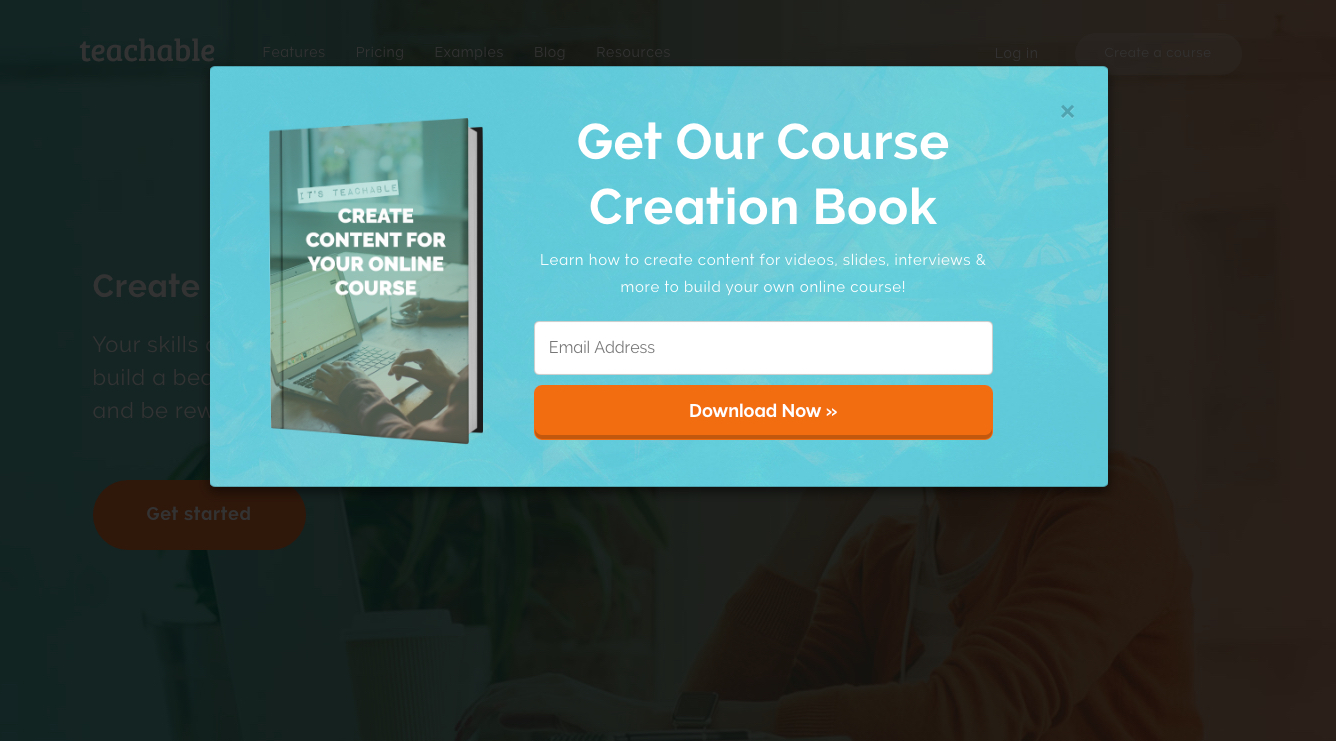
What just happened?
A timed popup.
Popups are synonymous with pull-your-hair-out levels of frustration. It’s accepted as absolute truth that popups are bad.
But are popups bad?
According to some people, yes.
Jakob Nielsen surveyed users on their responses to popups: 95% of them rated the experience of “pop-ups in front of your window” as negative.
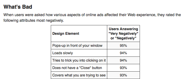
That survey of 605 respondents was conducted in 2004.
In Internet epochs, 2004 is the equivalent of the paleolithic era.
And back in 2004, popups were pretty bad.
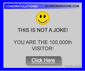
Seriously, look at this. Really?
But today, popups have matured into an art form: they are helpful, compelling, useful, and valuable.
The real truth? Popups are not bad. And if you want to increase conversions on your long-form content, we strongly suggest you use popups.
Derek Halpern says it like this,
If you don’t use popups, you’re an idiot.
We try not to call people idiots, but we do agree with Derek’s point: you should use popups.
Popups are a useful, powerful, in-your-face technique that can skyrocket your conversions on long-form content.
On his blog, Derek himself uses this popup on the article discussing popups:
Think about it like this. Users who don’t like popups may not be your ideal customer anyway.
Never thought about it like that, did you?
If you lose a reader for disliking your popup, you have not lost a customer. You’ve just lost a visitor. And that’s okay. In fact, it might be a good thing.
We will always counsel you to make website improvements that enhance the user experience. Some may argue that a popup is detrimental to the user experience.
We need some balance between the perceived tension of UX and marketing goals.
To help achieve this balance, take a look at a handful of representative statistics:
- Using the List Builder popup, Sumo Me collected 23,645,948 email addresses in 24 months.
- One marketer instantly doubled his conversion rates by using an exit overlay popup.
- A recipe blog experienced a 10x boost in conversions after adding a popup.
Considering the issue from a data-driven and results-oriented perspective, you’ll see popups work.
But before you rush to install a popup creator, listen to this:
- The average popup converts at 3.09%
- The best popups convert at 9.28%
That’s a huge difference!
My guess is, you want the conversion rate of the best converting popup, right?
Sean Bestor’s guide on the subject shares all the juicy details.
To sum it up, here are the eight elements of ultra-converting popups, as explained by Sean:
- Popups with more context have higher conversion rates.
- The highest-converting popups don’t appear immediately.
- Being unclear with your headline and offer will sink your conversion rates.
- Personality creates interest.
- The best popups offer something of value.
- Popups shouldn’t appear immediately after a visitor closes out.
- Calls to action need to match the offer.
- Exit popups need an overwhelmingly valuable offer.
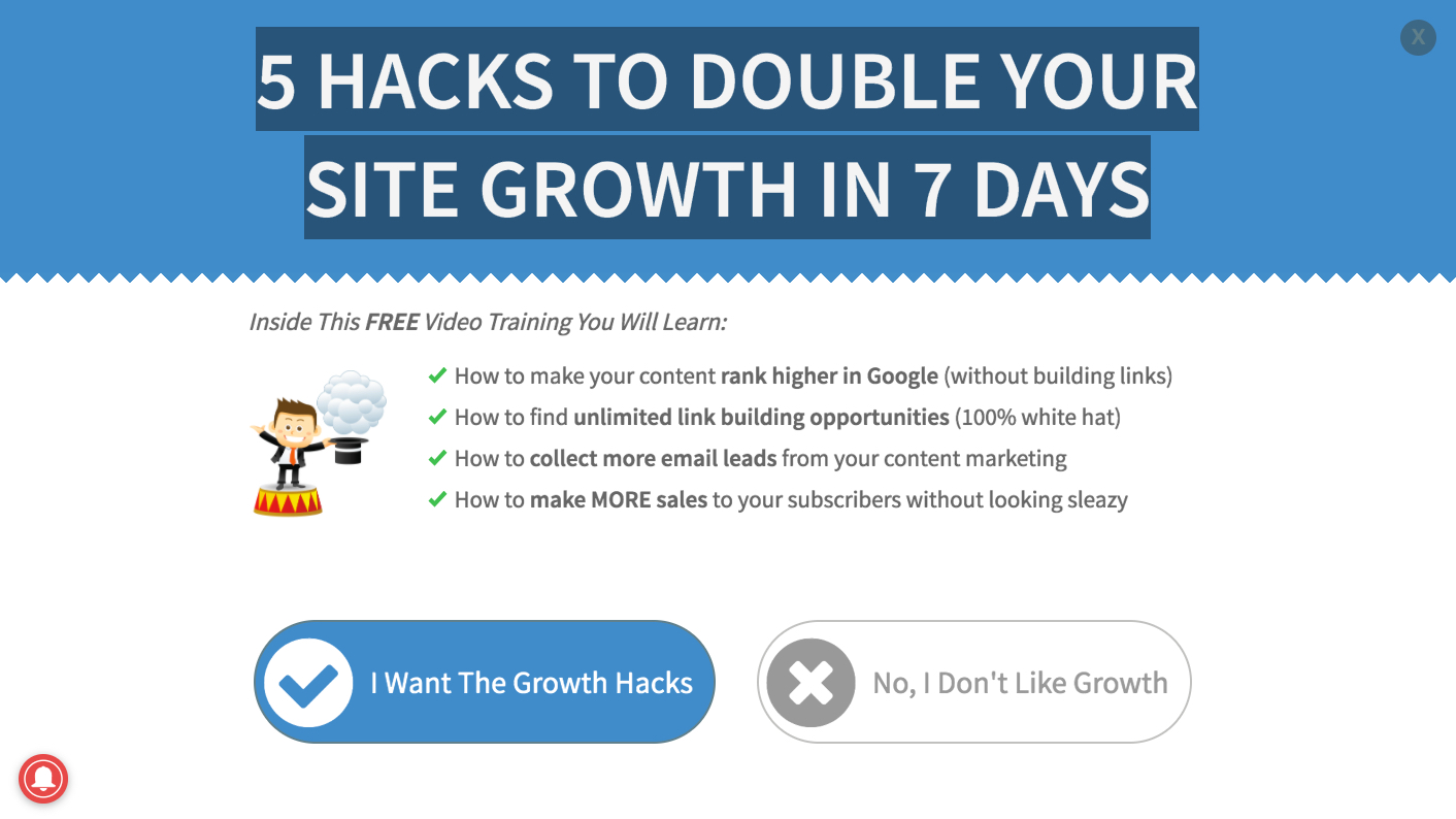
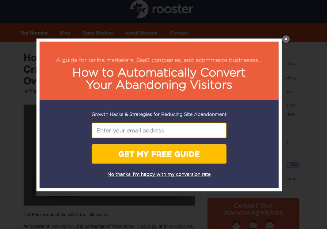
Let us show you four examples of effective popups.
This popup is from Authority Hacker:
Here’s one from GetRooster:
This popup is from AcessAlly:
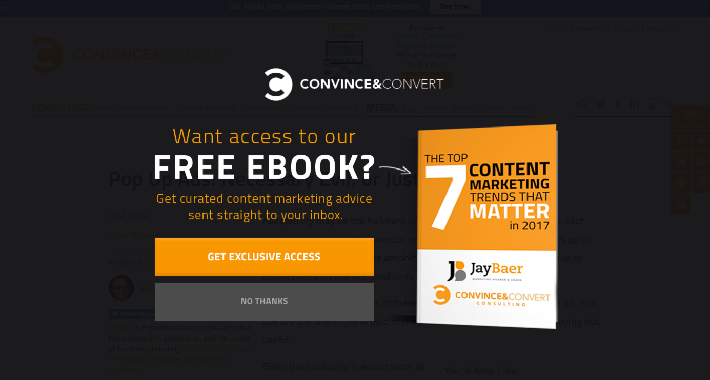
Here is one from Convince&Convert:
All the best-performing options have a clear ask and an obvious next action, and they provide obvious value to the user.
Keep in mind there are different types of popups. Here are a few of the popular ones:
- Timed popups. The popup appears after the user has been on the page for a certain amount of time.
- Scroll popups. The popup appears when the user scrolls to a certain point on the page.
- Slide-in popup. Instead of offering an intrusive popup experience, this popup slides into the user’s view, only partially obstructing the content.
- Entry popups. The popup appears as soon as the user lands on the page.
- Exit popup. The popup appears when the user is about to leave the page. The technology is a bit complex, involving cursor directionality, velocity and timing to determine whether the visitor is about to bounce.
Today’s popup technologies are advanced enough to keep you from having to do any programming or complicated jiggering.
Most popups allow you to customize them to your heart’s content. The framework and structure, however, are completely primed for popup success.
Instead of distracting yourself with issues of UX or conversion rate increases, ask yourself a simple question: How can I give the greatest value to my readers in the most obvious way?
If popups aren’t the answer, don’t use them.
But if popups can deliver value on that level, use them without regret.
33. Place CTAs everywhere
One major reason why most blogs aren’t as effective as they could be with their conversions comes down to one simple thing:
They don’t have enough CTAs.
Wait, what? CTAs?
CTA stands for call to action. It’s marketing jargon for asking the user to do something or to respond in a certain way.
It’s easy to think of the CTA in a simplistic way.
Buttons, right? A CTA is a button. Like this…

Whether or not you use the dreaded “submit” button copy is entirely up to you.
A CTA can be a button, but a CTA is a whole universe of things.
My point is this. Your CTAs should be more than just buttons. In fact, your CTAs should be everywhere on your page.
Let us be entirely transparent with you. We love blogging. We love the written word. We love content.
And when we feel as if our content is being crowded out by a bunch of rude CTAs, we get a little nervous. We might even get a little defensive.
If you’re feeling that right now, we understand.
But we still want you to consider the following statement: for your long-form blog to be effective, you should always be presenting the user with your call to action.
Let’s take a look at a few examples, and you’ll see what we mean by this.
Here’s a blog article from HubSpot.
At the very top of the page, before we read beyond the title of the article, we see no less than three CTAs.
(You could make a reasonable argument that the social sharing icons are also CTAs, but I’m not counting them.)
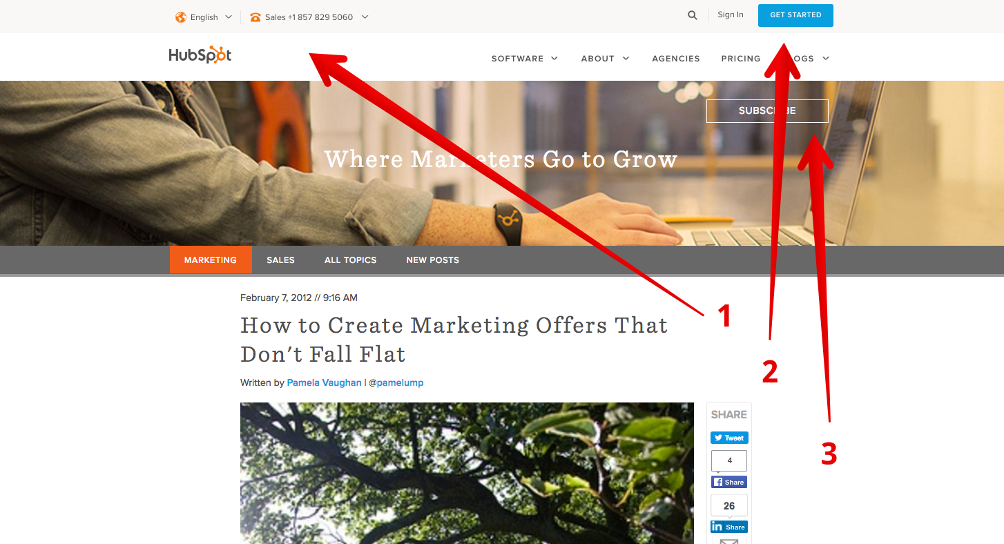
As you scroll down the page, watch what happens. It’s subtle, but you’ll notice how the top navigation bar fades into a persistent header.
Watch the gray bar at the top of the page:
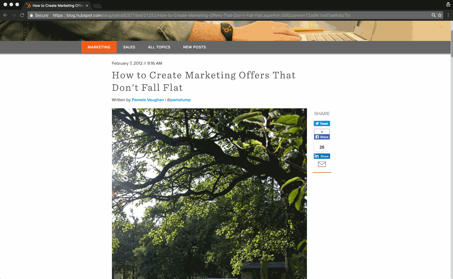
Now, no matter where you’re reading on the page, HubSpot is presenting you with a CTA:
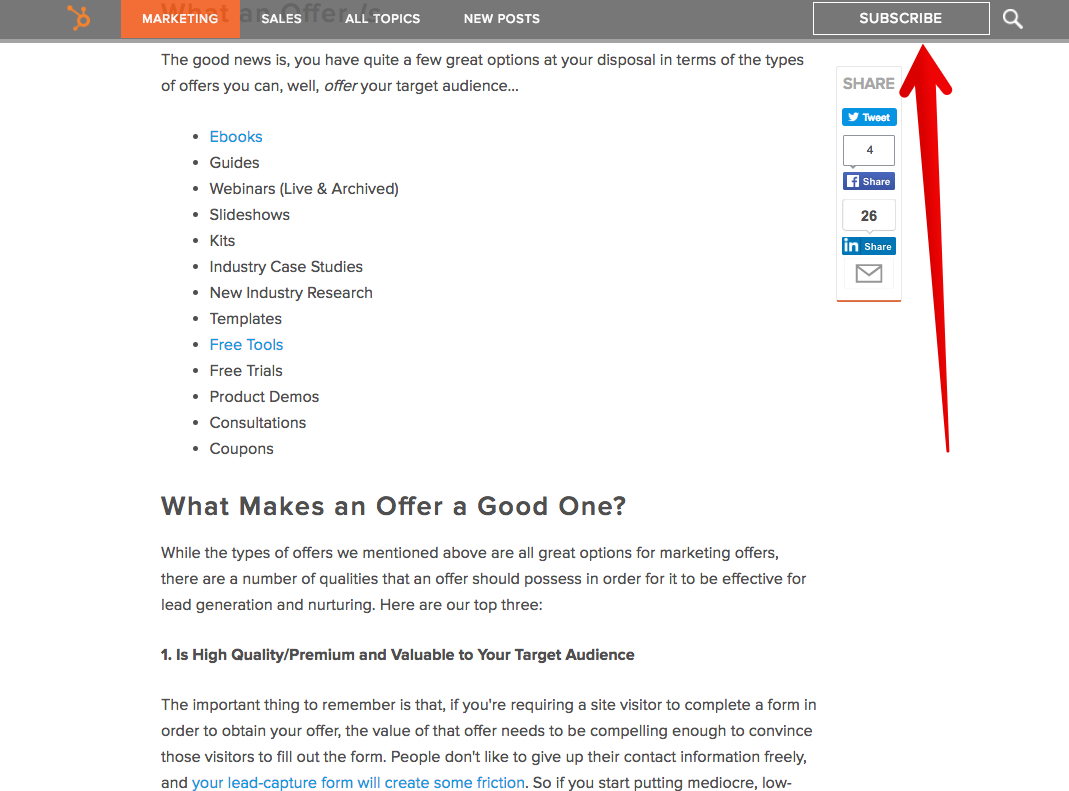
When you reach the end of the article, you are presented with three CTAs:
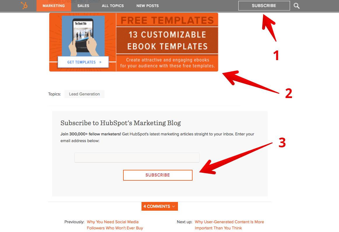
These CTAs are not intrusive or over the top. They are simple invitations to the user to take things to the next level.
As a long-form content creator, we are not bothered by it in the least.
Instead of distracting the user from the valuable content, it is inviting the user to go deeper.
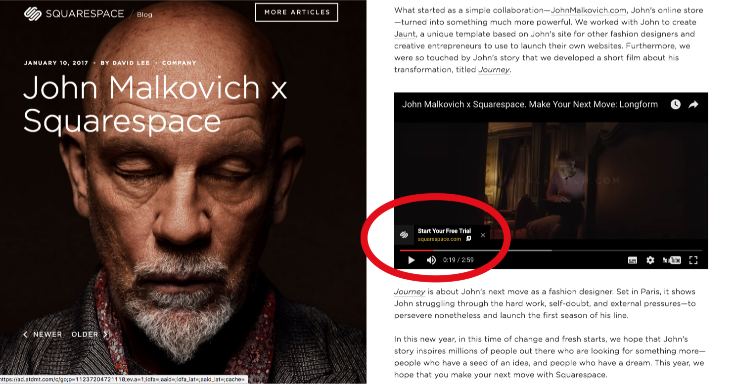
Let us show you another example, this time using a mixture of two content types—video and text.
Squarespace’s blog features this account of John Malkovich:

Perhaps the most outstanding feature of this content is its visual appeal. CTAs are visually understated, but they are still there.
One invites the user to read more articles. The other points to newer and older articles. And the most important CTA of all prompts the user to play the video.
Now that the user’s attention is focused on the video, a CTA is placed in their line of sight:
For users who are on the full video page, the CTAs are still there. Although obvious, they do not detract from the immersive visual experience of the video:
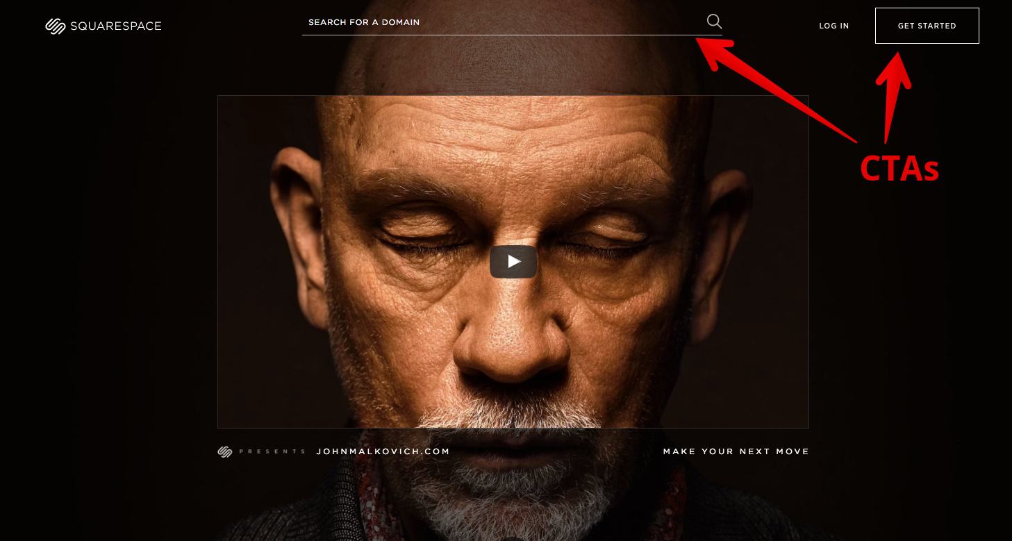
A business like Squarespace is focused on visual excellence. They have to be. User experience is paramount.
Their CTAs do not impair the visual appeal of the website at all!
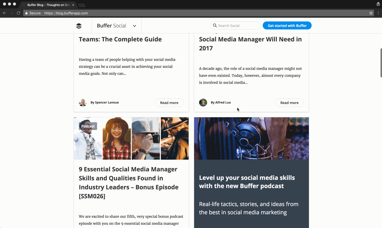
One of our favorite examples of CTA is Buffer.
Why? Because Buffer, a social media SaaS, is recognized for extraordinary content.
When you land on any of its blog articles, you’ll see this CTA:

The CTA is always in your line of sight.
In the gif below, you’ll see us scroll through the entirety of the the main blog page and then navigate to one of their long-form articles.
Don’t worry about catching the content we’re scrolling through. Instead, keep your eyes on the blue CTA at the top of the page:
Let’s take a closer look at one of their long-form articles.
The layout, formatting, and presentation is a paragon of design simplicity. Even so, there are two powerful CTAs:
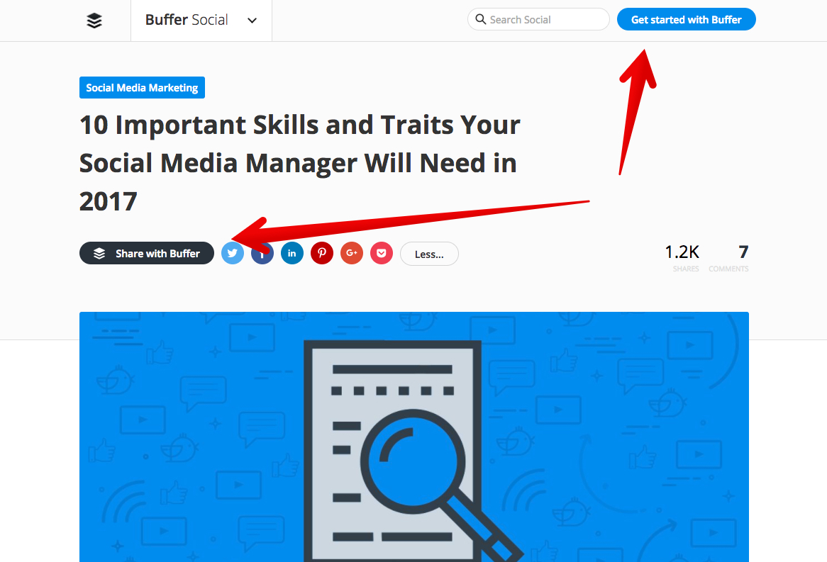
The CTA “Share with Buffer” is particularly powerful. Its intent is to share the article socially, but the actual event prompts the user to sign up for the service.
The article itself is 2,500+ words. That quantity speaks to the value of the content and suggests its high quality.
When you get to the end of the article, you’re again presented with several CTAs, not counting the social sharing icons:
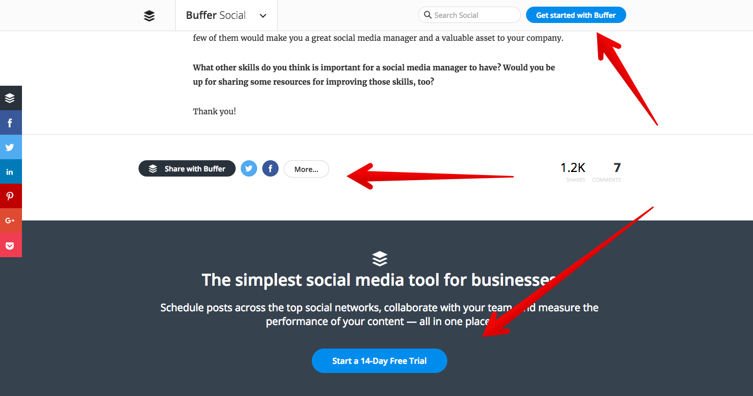
If you continue scrolling past the comments, you’ll reach the end of the page.
Even at the bottom, you’ll see more CTAs:
We think you’ll agree that Buffer has outstanding and valuable content. Its CTAs do not in the least detract from its quality content.
The reason we showed you this example is to demonstrate that conversions depend on CTAs.
Instead of hiding your CTAs or consigning them to a button or two, put them out there—everywhere!
According to the principle of least effort, users are not going to work hard to respond to your CTA.
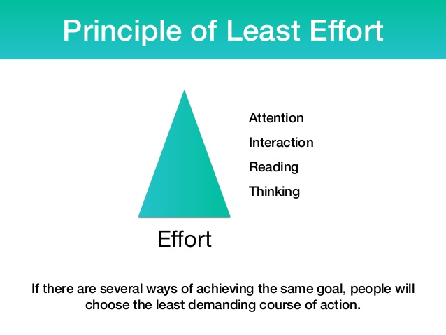
The principle of least effort has its most profound applications in information-seeking contexts and behavior.
An information-seeking client will tend to use the most convenient search method, in the least exacting mode available. Information seeking behavior stops as soon as minimally acceptable results are found.
What does this psychological factoid have to do with your CTAs?
This: Make your CTAs easy and available for the reader to access.
By virtue of their activity, your blog reader is an information-seeking client. Your CTA is designed to secure some level of commitment from your readers before they leave.
If you have clear CTAs distributed throughout the blog, you stand a greater likelihood of engaging their attention and securing their conversion.
34. Get more micro-commitments
You never want to ask people to make a purchase, especially a big purchase, without building relationships with them first. You don’t just do this by helping them or by providing them with free advice, you do this by training them.
In essence, you need to teach your visitors that every time you give them something, they need to do something in exchange.
An example of a micro-commitment would be asking people for a tweet if they want to continue to read your content.

Or if you are offering exclusive information on your website, you could ask people to give you their names and emails in exchange for that information.

In essence, you are training your visitors to jump through hoops. If they want something from you, they have to work a little and give you something in return for your offer.
Just think of a child asking you for a cookie. If you give the child one, she will soon ask you for two more, then four, then eight, etc. This is why parents make their children work for treats.
Why are micro-commitments important?
Now that you understand what micro-commitments are, the question that you probably have is:
Why are micro-commitments important?
Well, the answer lies within two psychological principles: psychological reactance and heightened attention.
Let me explain both terms quickly:
- Psychological reactance: people don’t like to be told what they can’t have or do. It’s related to our inner sense of freedom and resistance to be controlled by others. Let’s use a child as an example again. If you told a child that he can’t have something, he will typically do whatever it takes to get it. No matter how irrational it is, he will continue to fight to get it.
- Heightened attention: when something is hard to get, you pay more attention to it. Plus, in many cases, heightened attention can lead to obsession. A good example of this is a man ignoring a woman (or the other way around). She is more likely to want the man if he plays hard to get than if she could have him whenever she wanted.
Both of these psychological concepts play off of each other when you are trying to sell products or services on your website. If you force your visitors to jump through hoops and to make micro-commitments before you ask them to purchase something, your conversion rate should go up.
Here is an example of the hoop jumping and micro-commitments flow you can use within your sales funnel on your blog:
Hoop #1: Ask for a tweet or like
Ask people to tweet or like your content on Facebook before you let them read your content. To be a bit more user-friendly, you can always throw in a “no, thanks” link for people who aren’t interested in sharing your content before reading it.
Hoop #2: Ask for a name and email
Assuming the content your visitors just read on your blog was great, you can then ask them for their name and email in exchange for exclusive information. A simple way to do this is to place an offer for additional content at the bottom of your blog post, like this one:

Some people will give you their email address, while others will not.
Hoop #3: Prequalify your potential customers
Once you have their email address, you can build relationships with your visitors by giving them free advice. After sending them seven emails full of free valuable advice, you can then pitch them on your product or service.
Before you pitch them, however, you may want to try to make them prequalify themselves. Although this may seem counter-intuitive, making your visitors prequalify themselves will encourage more of them to purchase from you. Why? It’s because you are making them work harder for it.
You can do this by asking them a few simple questions before you let them buy from you.

Small purchases lead to larger ones
You can also use the concept of micro-commitments to upsell to your customers. By offering your visitors something that provides high value at a very low price, you can quickly gain a lot of customers… and from there, you can upsell to them.
For example, you could offer an ebook valued at $300 for only $27. When doing this, make sure you aren’t lying because if you claim your $27 ebook is worth $300 when it isn’t, you’ll end up losing the trust of your readers.
Once they purchase your $27 product, you can provide multiple one-click upsells.
You typically want your first upsell to be three to four times the price of the original product. So, in this case you could charge $97 for your first upsell. You’ll find that you should be able to convert 15% to 25% of your customers.
As for your second upsell, we’ve found that creating a product that is around 1.5 times of your original price converts well. So, a price point of $47 in this case would work, and 10% of your customers should take you up on this upsell.
As for your third upsell, we’ve found that creating a product that is the same price as your original offer typically converts the best. So, in this case it would be another $27 product, and you’ll find that 20% or so of your customers will take you up on this offer.
Throughout this whole process, you’ll find that you should be able to double your front end revenue by getting your visitors to bite on a small micro-commitment first.
35. Remember, headlines matter
Did you know that your attention span is shorter than that of a goldfish? A goldfish has an attention span of 9 seconds, while your attention span is only 8 seconds.
For this reason, the headline is one the most important elements you should be testing on your page.
So, how do you come up with headline variations? Well, you have a few options to test out:
- You can describe what your product offers, similarly to what we do with Crazy Egg: “a Crazy Egg picture tells a stunning story.”
- You can try to make a bold statement like Moz does with their headline: “there is a better way to do marketing.”
- You can use social proof within your headline like Basecamp does with theirs: “last week 6,703 companies signed up for Basecamp to manage their projects.”
- You can make a promise like VWO does with their headline: “increase your website sales and conversions.”
The possibilities of headline testing are endless. The headlines above are just a few examples of the types of headlines you can test.
But before you start A/B testing your headlines, you should check out a few success stories on VWO as they will help you come up with some headline test ideas. For example, the one on how Movexa increased their sales by 90% by making their headline clearer is interesting.
36. Replicate ad buys
Conversion optimization doesn’t start with your website. It actually starts with your traffic sources. No matter how much work you do to improve your design, some traffic sources will just convert better than others.
So, instead of focusing all of your efforts on maximizing your conversion rate from a design perspective, consider spending a portion of your time optimizing the conversion rate of your traffic sources.
A simple way to figure out what traffic sources are converting well is to look at your goals in Google Analytics:

If you notice that certain sources and campaigns are driving profitable traffic, you should spend more time and energy scaling them out. This should help you generate some quick wins.
On the flip side, if you don’t have your conversion tracking set up, you probably want to read these step-by-step instructions to help you set it up.
If you want to take it further, you can find out the traffic sources that are doing well for your competitors by using Semrush and Pathmatics. These tools will show you all of the places your competition is getting its traffic from.
The rule of thumb to follow when using these tools is: if your competition has been buying ads from certain sites for long periods of time, chances are they are converting well.
37. Free isn’t always free
Before you start optimizing your conversion rate, you will have to pick a split testing software. The software will track the changes you are making to your site, and it will tell you if the changes are helping or hurting your conversion rate.
There are a few options out there:
If you are technical and are able to make changes to your own site, you should use Google Analytics to optimize your conversions. If you aren’t technical, we recommend using Optimizely.
Sure, it costs money, but it is cheaper than it is to pay a designer and a developer to make changes to your website.
Conclusion
Although spending thousands of dollars on conversion consultants can make you more money, you can actually do a lot on your own. All you have to be willing to do is put in the time and effort.
There are many ways you can convert your visitors into customers; you just have to get creative.
The above methods are just some of the ones that worked for me and a few other companies out there.
From focusing on conversion optimization to hacking your way to growth, the possibilities are endless.
We wish we could say, “Yes, getting more conversions from your blog is easy!”
It is…. And it isn’t.
- Creating long-form content is not easy. At least not in our experience.
- Launching a comprehensive content marketing campaign is not simple.
- Hiring growth hackers, developers, marketers, and writers isn’t a breeze.
- Designing a compelling landing page and blowing it up with value isn’t a cinch.
- Conducting months of split and multivariate testing is complicated and time-consuming.
But boosting your conversion rates?
It doesn’t have to be that hard!
We’re not trying to end on a false happy note either. The fact is, with the right tools, you can get a lot more conversions from your blog.
Sprinkle in some popups, hand out CTAs like beers at happy hour, and you’ll get instant improvement.
We guarantee it.
As an added bonus we have created an infographic below in which we’ve broken down the techniques you need to follow and the strategies you need to implement to achieve your conversion goals.
Here’s how you can optimize conversions for the 3 major website types.