Have you ever visited a website and been greeted by a sudden, intrusive popup that feels more like a digital roadblock than a welcoming invitation? On some sites, it’s almost like the business doesn’t want you to see their content!
If you’ve succumbed to this, it’s likely a lightbox that left you feeling frustrated. Lightboxes are those (often annoying) popups that overlay the main content, making it impossible to interact with the website until you exit the lightbox.
We’re used to seeing lightboxes for things like newsletter signups, survey requests, and promotions. And used smartly, lightboxes can complement a visitor’s experience while getting site owners more clicks and conversions.
But sometimes, lightboxes hit you with a promotion or signup option as soon as a website loads.
These are the kinds that we usually don’t like. They’re akin to a salesperson jumping in your face as soon as you enter a store. Unless you’re really motivated to buy something, you might hit that back button and escape.
In this post, we’ll show you how not to be that annoying salesperson by using lightboxes effectively. We’ll look at how to make friendly pitches by focusing on timing, value, and user-friendly design, so you can display lightboxes that visitors actually want to see.
This post is for you whether you’re building your first website or gearing up your marketing for sales season. So let’s learn how to design visitor-friendly lightboxes that convert.
The Right Way to Use a Lightbox on Your Website
Using a lightbox well is all about timing and value. If you use a lightbox as just another popup, then that’s what it will be: another annoying thing that’s preventing a site visitor from finding the content they actually came for.
Lightboxes, by design, block the underlying content. An ill-timed lightbox can disrupt a user’s natural flow through your website, and it can be especially jarring if it interrupts an article or comes while someone is trying to make a purchase.
We’ve seen one, two, and even three lightboxes pop up at the same time: a newsletter signup, a promotional popover, and an exit intent popup when we tried to run from the page. Too many lightboxes feel like an army tactic, bombarding you for your attention.
Sometimes this happens because the website’s tech stack doesn’t play well together. It may use a separate pop-up element from their site builder provider, email marketing host, and maybe another CRM platform.
But often, the problem comes when sites have many things they want to push, and they don’t take the time to test their marketing from a user’s perspective.
Because in spite of their potential downsides, lightboxes can be a handy marketing tool for delivering important messages and updates, as well as for driving conversions.
Many brands use lightboxes to gather email signups, promote limited-time offers, announce competitions, and highlight new features. There are other kinds of lightboxes, too, like games and contests, and targeted offers that only pop up on select pages.
By offering valuable content or interactions like this, lightboxes can engage users, keeping them on your site longer and increasing the likelihood of conversions. You just need to use them in the right way, at the right time.
Make Them Valuable
First of all, make sure your lightbox gives users something they genuinely want or need—popups only are appreciated when they offer something truly valuable to your visitors.
Whether it’s an exclusive discount, a free resource, or access to premium content, the incentive should align with your audience’s needs and interests.
Your homepage is a good place to put general pop-ups for newsletters and promotions, since that’s where search engines will send most general traffic. You can use more targeted popups on different pages, according to your offers.
For example, if someone is on your Services page, it might make sense to have a popup video of you asking if they have any questions, and prompting them to schedule a call.
Or, if someone is browsing a category on your ecommerce site, you could target them with a discount for only those types of products. Since they’re already looking at the products, the exclusive discount might be a welcome sight that converts them into a paying customer.
Get the Timing Right
The next thing you need to do is get the timing right. Lightboxes are more welcome when they show up at the right time, just like a guest we don’t mind popping over to see us.
If you slow down your on-site promotions, users will be able to focus on your content, and later interact with your lightbox without getting overwhelmed.
To make your lightboxes more friendly, consider strategic triggers such as exit intent, scroll depth, or time spent on a page. This ensures your lightbox appears when it’s most relevant and less likely to annoy.
More Tips For Using Lightboxes
We’ve prepared a few more tips to help you make the most of lightboxes without distracting your visitors. Follow these best practices when designing your next popup:
- Make the Exit Button Clear: Ensure that users can easily close the lightbox. By including a prominent, easily identifiable “X” button in the top-right corner, users are more likely to get back to business instead of leaving your site.
- Provide Value in Exchange for Action: Always offer something of value in your lightbox, whether it’s a discount, a resource, or exclusive access. Use Clear CTAs to communicate what users will gain by taking a certain action.
- Limit Frequency: Avoid bombarding users with lightboxes. Set rules to control how often each specific lightbox is shown to the same visitor, and make sure your other marketing tools don’t interfere.
- Mobile-Friendly Design: Test how your lightboxes appear on different screen sizes to prevent usability issues. Sometimes, you might want to turn off a lightbox on mobile so it doesn’t get in the way.
- Carry Out A/B Testing: Continuously optimize your lightbox strategy by conducting A/B tests. Experiment with different lightbox triggers and content to find what website design practices work best for your website.
By using these tips and getting the timing and value right, you can make lightboxes work effectively and create a positive user experience on your website.
5 Examples of Lightboxes That Work
Ready to see some best lightbox practices in action? Let’s explore how websites in the wild use these features to their advantage without being pushy.
1. Newsletter Signup
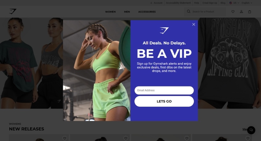
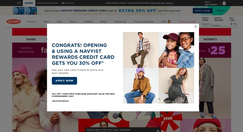
Gymshark runs a popular workout wear website. Since most successful ecommerce brands use a mix of regular email marketing, SMS, and other reengagement tactics to make sales, it’s crucial that Gymshark captures shoppers’ emails from the start.
Thoughtful Elements:
- The lightbox is well-timed and only triggered when users scroll down the page, so shoppers have time to look around before the popup.
- The bright colors and workout imagery really catch our attention.
- Users only have to enter their email, making it quicker and less intrusive to sign up.
2. Subscription Lightbox
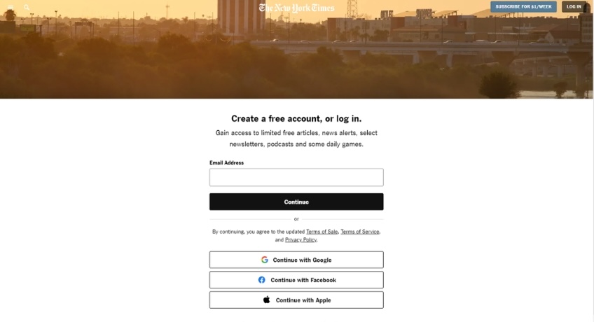
The New York Times hides some of its articles behind a paywall, providing access only to subscribers. It uses a lightbox to gate its content and encourage visitors to log in or become paying members before they can read this article.
Thoughtful Elements:
- The lightbox emphasizes the value of premium content and its exclusivity.
- It appears strategically when a user tries to access paid content.
- There are several ways for a user to log in or subscribe, including SSO sign in.
3. Promotional Lightbox
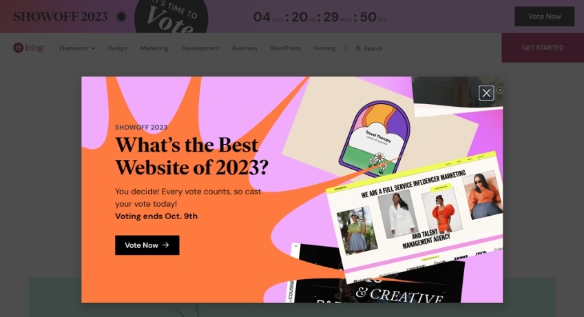
Elementor page builder packs a one-two approach to promote its Best Website contest. This colorful lightbox appears on scroll, but its CTA is mirrored in the site’s colorful sticky announcement bar.
Thoughtful Elements:
- The lightbox is bright and attractive, on-theme for the web design contest.
- The Vote Now button contrasts with the background so it’s easy to see.
- There’s a clearly visible option to dismiss the lightbox for users not interested in the contest.
4. Gamification Lightbox
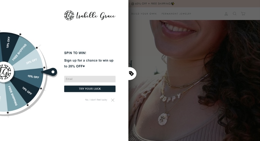
Isabelle Grace Jewelry loads with a spin-to-win popup covering the homepage. While we don’t normally like lightboxes on load, this gamified approach is fun and creative. It’s just one of a new host of tactics to surprise and delight visitors with a discount.
Thoughtful Elements:
- Games spark a moment of joy even before visitors enter your store.
- Users have to subscribe before they spin, letting the website collect their email, but they get a discount in return.
- The site’s branding is clearly visible, so visitors know this is part of the website experience.
5. Exit Intent Lightbox
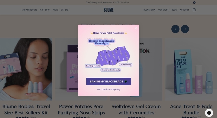
Blume sells self care and skincare products to teenagers, and has a well-designed, female-friendly website. This design of the exit intent lightbox really caught our attention.
Thoughtful Elements:
- Popup shows only when visitors try to leave the site, so it doesn’t interfere with shopping.
- Pretty branding and interesting illustrations make users want to look one last time.
- The CTA button is huge and includes an emoji, which is on-point for its audience.
We also appreciate that Blume doesn’t hit you with a second popup if you click back to the website and decide to leave again!
Final Thoughts About Lightboxes
As we’ve seen with the examples above, lightboxes can be valuable tools in website design, helping with lead generation and improved conversion rates. But they can also get in the way of a good user experience.
If you decide to use lightboxes on your website, pay attention to best practices and add some thoughtfulness and timing into the mix.
And if you find yourself overwhelmed with the idea of running a bunch of popups on your website, remember that they’re just one means for reaching a goal. There are several other ways to share the same information, and the only way you’ll know what works for your audience is to try and test out different marketing tactics.