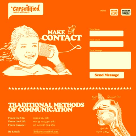
Contact forms are one of the most important gateways between your business and the outside world. While visitors can also interact through ecommerce checkout flows, support portals, or account pages, the contact form is where people reach out to you directly. Optimizing this touchpoint can lift conversions, accelerate sales cycles, and strengthen customer relationships.
Consider who might use your form: a standout job candidate, a potential partner, a high-intent lead, or a frustrated customer who can become a loyal advocate with the right help.
With so much riding on your contact form, it makes sense to ensure the experience is exceptional.
Regardless of purpose, a smooth, intuitive contact experience signals that your company respects people’s time—and encourages them to complete the form.
With that in mind, we’ve compiled five powerful tips—plus a quick checklist—to help you improve your contact form’s completion rate and get more qualified inquiries:
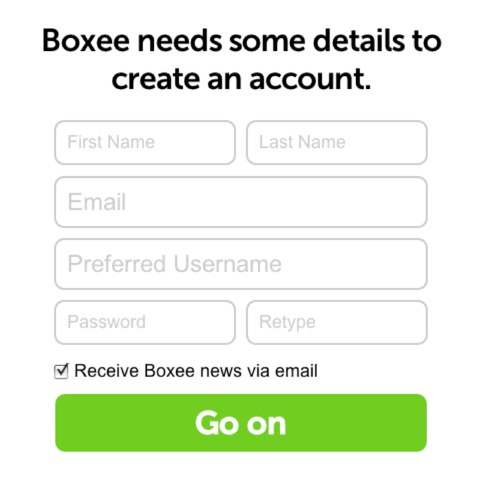
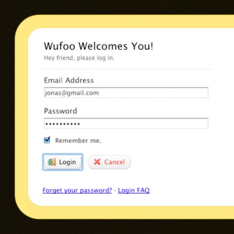
Lesson #1: Fewer form fields = higher conversions
When it comes to usability, simple almost always wins. Steve Jobs once said, “Simple can be harder than complex: You have to work hard to get your thinking clean to make it simple.”
The same principle applies to your contact form. If there’s one takeaway, it’s this: trimming even a single field often lifts completion rates.
Large-sample form benchmarks consistently show that fewer fields correlate with better conversions (e.g., going from four to three fields typically lifts completion rates). Exact lift varies by audience and offer, so test in your context.
Even removing one non-essential field can materially increase completions.
Improving conversions doesn’t have to be complicated. Audit your form and ask which fields are truly required to respond effectively right now. If a detail can be collected later (e.g., phone number, company size, budget), make it optional—or use progressive profiling after the first reply. Then A/B test your streamlined version and monitor lift.
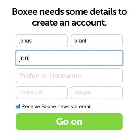
Lesson #2: Build trust into your contact form
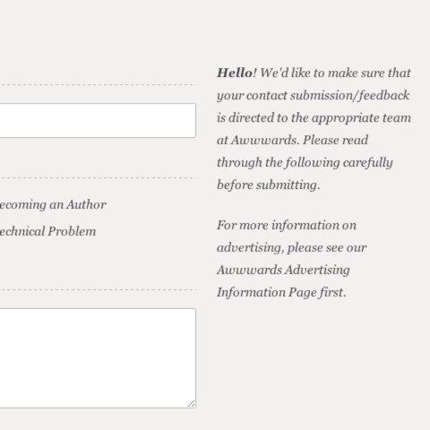
Submitting a form can feel risky—especially with a brand someone doesn’t know well. You’re asking for personal details like name and email, sometimes more. Earn trust before and during the experience.
Reassure people they’re contacting real humans who will respond—and that their data will be handled responsibly.
How do you build trust? Small cues compound into big confidence:
- Challenge every field: is it essential for the first reply, or can it wait until after you make contact?
- Provide concise instructions for tricky inputs (e.g., “Work email preferred” or “Include order # if available”).
- Remove brittle validation rules (like forcing one phone format). Accept common variations and international numbers.
- Explain how you’ll use their info and when you’ll respond. Link to your privacy policy and avoid forced marketing opt-ins. If you offer a newsletter, use a separate unchecked consent box and honor regional requirements (e.g., GDPR/CCPA/CPRA).
Trust signals—clear expectations, respectful data handling, and human tone—lower anxiety and increase the likelihood of submission.
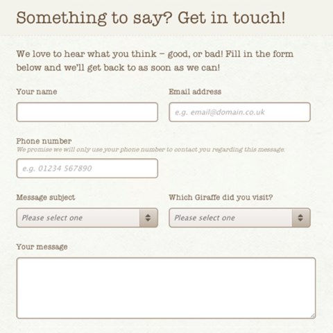
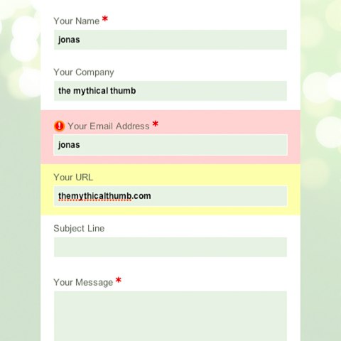
Lesson #3: Offer guidance while users fill out the form
Contact forms serve many audiences—job applicants, sales prospects, journalists, support seekers, and more. You need the right details to route inquiries quickly, without making the form feel complicated.
Guide people with thoughtful microcopy. Many forms skip this entirely, which leads to confusion and drop-off.
Want a conversion lift? Add helpful examples and format hints where mistakes are common.
Example (“ghost”) text can suggest formatting—like showing a phone pattern (123) 456-7890—so users don’t have to guess. Keep labels visible (don’t rely on placeholders alone) so people don’t lose context once they start typing.
Use short help text below fields for requirements, character limits, or what a strong message looks like. For complex fields, add tooltips that explain why you’re asking and how the info helps you respond faster.
Real-time guidance reduces errors and uncertainty—meaning fewer frustrations and more successful submissions.
Lesson #4: Remove every bit of friction
Simplification should be your default design approach. Reducing friction at each step helps people finish faster and abandon less.
Fix the keyboard tab order so it follows a logical flow—especially crucial on mobile and for keyboard users. Place “Submit” where people expect it and keep destructive actions (like “Cancel” or “Reset”) out of the primary path.
Use clear focus states (the active field is visibly highlighted) to help with orientation and accessibility, particularly on longer forms.
Enable in-line, real-time validation. If an email looks invalid or a required field is empty, surface a helpful, specific message immediately—not after submit. Preserve everything the user has already typed when showing errors.
Support copy-paste, browser autofill, and common shortcuts. Use autocomplete with standardized tokens (e.g., name, email, tel, organization, address-line1, address-level2, postal-code, country) and sensible name attributes so password managers and autofill work reliably. Small reductions in effort add up to big gains in completion rates.
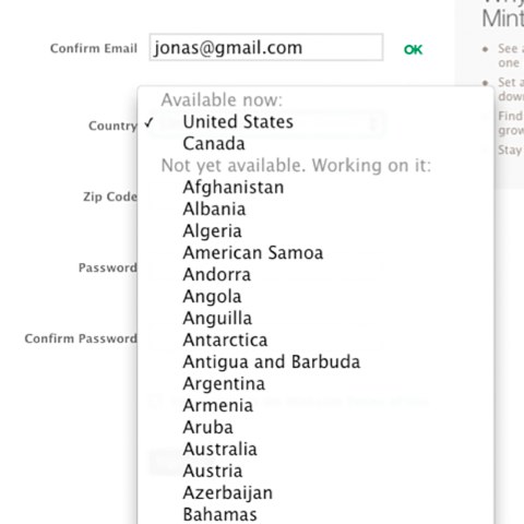
Lesson #5: Prioritize mobile-first design
Mobile traffic continues to grow. Designing your form for small screens first is no longer optional—it’s the baseline.
Mobile-first thinking keeps only what’s essential and influences readable layouts: labels above inputs, generous spacing, and large tap targets.
Don’t force users to scroll through endless country lists to find “United States.” Use relevance-based ordering, type-ahead search, or auto-detection when appropriate.
Use semantic HTML and specify input types so the right keyboard appears (number pad for phone, email keyboard for email). Add inputmode and mobile-friendly pickers for dates and times. Reduce typing by enabling address autocomplete where appropriate.
Leverage built-in mobile features: allow attachments from the camera or files, enable voice input where helpful, and ensure layouts adapt smoothly in portrait and landscape.
Optimizing for mobile benefits everyone. Even desktop users enjoy the streamlined design and faster flow.
Bonus: Accessibility, spam prevention, and post-submit follow-through
Accessibility: Pair every input with a visible label and an accessible name. Don’t rely on color alone to show errors; include clear text. Provide sufficient contrast, legible font sizes, and logical heading order. Use aria-describedby to associate help text and error text with fields. If you follow WCAG 2.2, pay attention to newer success criteria like Focus Appearance and Target Size (Minimum) to ensure tappable areas are large enough.
Spam & security: Use server-side validation in addition to client-side checks. Add lightweight bot protection (honeypot + time-based checks) and prefer low-friction options like Cloudflare Turnstile, reCAPTCHA v3, or hCaptcha over puzzle CAPTCHAs. Implement CSRF protection, rate-limit abusive submissions, and strictly validate/sanitize file uploads (type, size, malware scan).
After submit: Show a clear confirmation state with what happens next and typical response time. Send an autoresponder from a monitored address (not a “no-reply”) and include ways to reach you if it’s urgent. Route submissions to the right team automatically, log them in your CRM or help desk, and track a conversion event in your analytics platform (e.g., GA4) so you can measure improvement.
Conclusion
Reducing friction is the name of the game. The easier you make it to complete your contact form, the more conversions you’ll see. Everything—field count, helpful hints, accessible labels, and real-time error handling—affects success.
Designing with mobile users in mind improves the experience for everyone. Your contact form is a frontline connection to leads, opportunities, and customer success stories.
Make the experience smooth and trustworthy, and you’ll earn better engagement, more qualified submissions, and stronger relationships. Whether your goal is new customers, partnerships, hiring, or support, a high-converting contact form is a cornerstone of your digital strategy.