Launching a website is easier than ever—but getting it live is just the beginning. If your site isn’t designed and optimized around real users, it won’t convert, rank, or build trust.
Why does design matter so much? People form an impression of your site in as little as 0.05 seconds. That snap judgment is driven largely by visual design and clarity.
Design affects more than looks. It shapes conversion rates, perceived credibility, accessibility, and long-term growth. No site is “finished,” so treat design as an ongoing process of improvement.
Consider this: After a poor experience, most users won’t return. And according to a recent report, 77% of marketing agencies say weak design is the top problem holding client sites back.
Bottom line: If your design ignores user experience (UX), it’s working against you. This guide fixes that.
Web design blends art, psychology, and strategy. Follow these 12 best practices to improve performance, engagement, and search visibility—without sacrificing brand.
Use this checklist to ensure you have a winning design
- Minimize text
- Show, don’t tell
- Use short sentences
- Try shorter paragraphs
- Choose a color scheme that fits
- Make your CTA clear
- Reinforce actions with familiarity
- Simplify the navigation
- Optimize your design for mobile
- Prioritize SEO
- Monitor your page loading speed
- Continuously run A/B tests
1. Minimize text
Avoid overwhelming key pages with walls of text.
Blog posts and guides benefit from depth. But on home, product, landing, and about pages, keep copy tight and purposeful. Lead with the outcome your visitor wants, then support it with a few proof points.
Share what makes your business great in a few sentences—or even a single, punchy line. Save the deeper explanation for secondary pages.
2. Show, don’t tell
Images, icons, and simple diagrams communicate faster than text and help users grasp value at a glance. Use visuals to demonstrate benefits, steps, or comparisons.
Harry’s product page is a strong example:
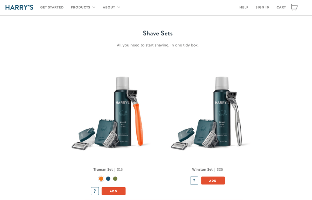
Say you sell premium shaving kits on subscription. Your razors are handcrafted and gift-worthy.
You don’t need a long paragraph to explain that. A clean product photo plus a line like “delivered to your door” does the heavy lifting. Four words and a strong image tell the story.
Use your homepage to hook attention with compelling visuals. Move detailed explanations, specs, and FAQs to supporting pages.
3. Use short sentences
Short sentences boost readability and comprehension—especially on mobile.
Avoid long, winding sentences. Mix short and medium lines to keep rhythm and make scanning easy.
Variety keeps readers engaged and reduces cognitive load.
4. Try shorter paragraphs
Break up big blocks of text with short, skimmable paragraphs—especially on pages designed to convert.
Don’t overdo one-liners everywhere, but favor brevity and clarity. Start each paragraph with a distinct idea so scanners can decide where to dive deeper.
Short paragraphs also make calls to action (CTAs) easier to spot. A standalone CTA line will outperform one buried in a dense block.
When you have multiple points, switch to bullet lists. Bullets improve comprehension and highlight key takeaways.
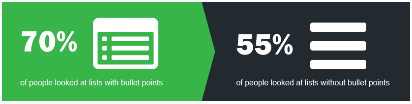
Bullets guide the eye, set expectations, and help readers retain what matters.
5. Choose a color scheme that fits your branding strategy
Your palette isn’t just a design choice—it’s a psychological cue that influences trust, mood, and perceived quality.
Users form judgments quickly, and color drives a big share of that impression. Start with your logo and core brand colors, then extend them consistently across buttons, links, and accents.
Consider Starbucks as an example.
When you picture the brand, you see its signature green. Their site reflects that.
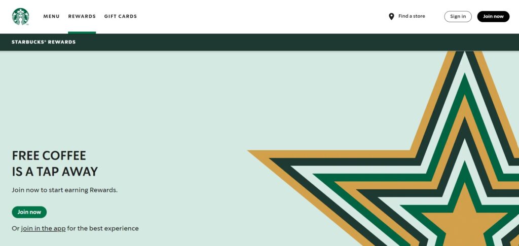
A green-forward theme reinforces identity. If the site were suddenly red and yellow, it would feel off-brand and confusing.
Go beyond aesthetics: ensure accessible contrast ratios for text and interactive elements, use color consistently for states (links, hovers, errors, success), and don’t rely on color alone to convey meaning.
Consistency builds familiarity—an important trust signal.
6. Make your CTA clear and obvious
Your call-to-action is the most important on-page element for conversions. Don’t let it blend into the background.
Many sites fail the “three-second” test: visitors can’t immediately tell what to do. Fix that with visual prominence (size, whitespace, contrast), action-oriented copy, and logical placement near value statements.
Don’t limit CTAs to the homepage. Add context-appropriate CTAs to product, pricing, features, and even long-form content.
Here’s a clean example from Litmus:
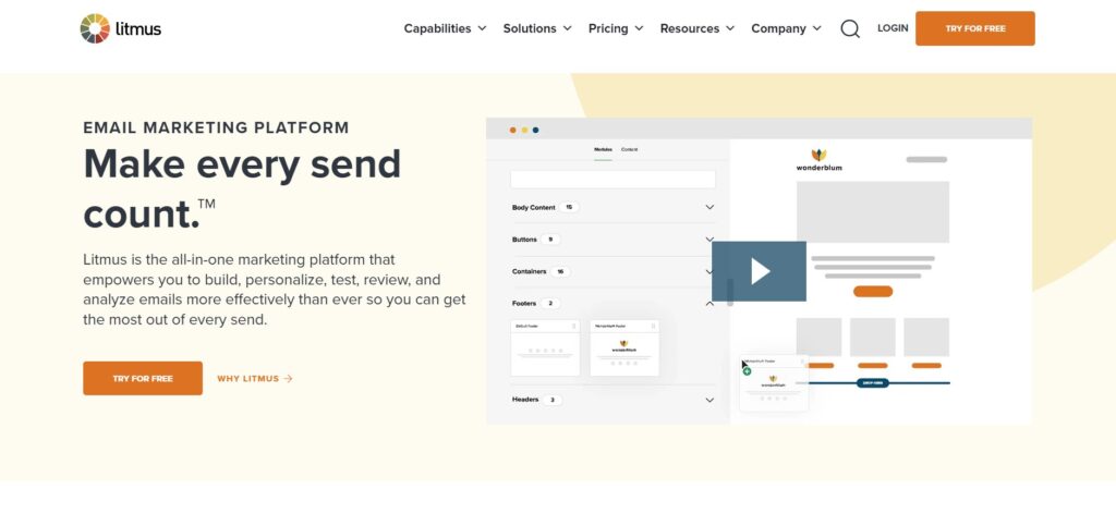
Minimal text. Clear layout. A standout “Try Free” button shown in multiple strategic spots. There’s no ambiguity about the next step.
Pro tip: On content pages, place a primary CTA above the fold and a second, context-aware CTA at the end (e.g., subscribe, download, or product demo) to capture intent at both entry and exit points.
7. Reinforce actions with familiarity
Consistency breeds trust. Use the same CTA language and styling wherever the action is the same.
Visitors rarely convert on the first page. If your CTAs vary wildly, you introduce friction. Keep the verb and visual treatment consistent (“Shop Now” versus “Buy it today” versus “Click to purchase”).
For example, on ecommerce sites avoid this:
- Homepage: Checkout now
- Category page: Buy it today
- Product page: Click to purchase
That variation creates unnecessary decision friction. Pick a single, clear directive (e.g., “Shop Now”) and stick with it site-wide.
See how MVMT handles this:
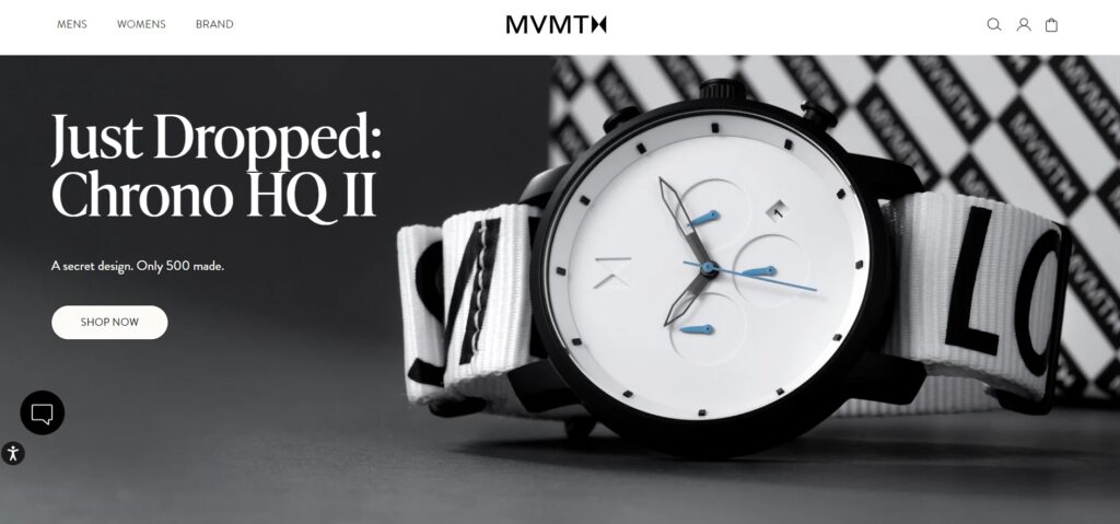
Across watches, sunglasses, and jewelry, the CTA remains “SHOP NOW.” Consistency, paired with a minimalist palette, creates a seamless path to purchase.
Extend this consistency to tone, layout, form fields, and microcopy. Predictable experiences reduce doubt—and increase conversions.
8. Simplify the navigation
Navigation should be effortless. If visitors can’t quickly find what they need, they’ll bounce to a competitor.
Think in user jobs: buy, compare, learn, contact. Make each job a few obvious clicks away. Keep labels clear and conventional—no cleverness required.
Don’t get too clever with menus. There’s a reason most sites use a simple top navigation bar: it works.
Limit top-level items to reduce cognitive load. This follows Hick’s Law: more choices lead to slower decisions.
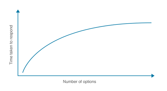
In the classic jam experiment:
- Day 1 — 24 jams on display: 60% stopped to try, but only 3% purchased
- Day 2 — 6 jams on display: 40% stopped to try, and 30% purchased
Fewer choices = less overwhelm = more action.
Apply this to your header. You don’t need a “Home” link—your logo already does that. That’s one less item competing for attention.
Square is a strong example.
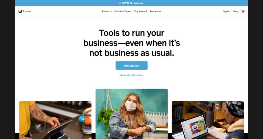
Their layout is clean, the menu is focused, and the primary CTA is unmistakable.
If you offer many products, organize with a dropdown or mega menu, and add a prominent search. Group detailed offerings under a single “Products” or “Features” tab—don’t surface everything at the top level.
Accessibility matters here too: make menus keyboard-navigable, provide visible focus states, and ensure touch targets are large enough on mobile.
9. Optimize your design for mobile devices
Most web visits now happen on phones. If your mobile experience is clunky, users will bounce—and search engines will notice.
With mobile-first indexing, Google primarily evaluates the mobile version of your site. Prioritize responsive layouts, readable typography, and tap-friendly controls.
- Layout: Use a single column, generous spacing, and sticky key actions (e.g., “Add to Cart”).
- Media: Serve responsive images (
srcset/sizes), modern formats (WebP/AVIF), and lazy loading. - Navigation: Keep menus short, make search prominent, and avoid hover-only interactions.
Mobile usability isn’t optional—it’s foundational to engagement and rankings.
10. Prioritize SEO
Design and SEO are inseparable. Plan structure, content, and components with search intent and user outcomes in mind.
For an ecommerce or lead-gen page, optimize around:
- Usability: Clear hierarchy, scannable sections, and intuitive paths to conversion
- Mobile responsiveness: No horizontal scrolling, readable fonts, accessible controls
- Keyword targeting: Reflect searcher language naturally in titles, headings, meta descriptions, and body copy
- Internal linking: Connect related pages to reinforce topical clusters and help discovery
- Headlines: Clear, specific, and benefit-driven—written for humans first
Create an XML sitemap to improve discovery and indexation. Pair it with clean URLs, descriptive breadcrumb trails, and well-structured headings.
Control duplicates with canonical tags, consistent internal links, and clear index/noindex rules—not with sitemaps alone.
Don’t neglect trust and credibility signals either:
- Domain signals: Choose a memorable, brandable domain. Exact-match domains aren’t required; consistency and clarity matter more.
- Site credibility: Prominent About and Contact pages, SSL by default, transparent policies, reviews/testimonials, and uptime reliability
- Backlinks: Earn links from relevant, authoritative sites in your niche through useful content, data, and partnerships (quality > quantity)
11. Monitor your page loading speed
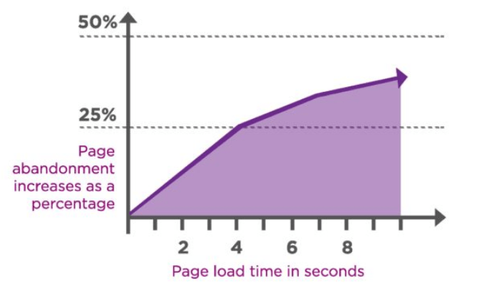
Speed is UX. Design choices—especially unoptimized media and scripts—directly impact load time, bounce rate, and revenue.
Hosting and traffic matter, but front-end decisions often cost the most. Every uncompressed image, render-blocking script, and animation adds delay.
Users expect pages to feel fast within a couple seconds. Aim to pass Core Web Vitals: fast first render, stable layouts, and responsive interactions.
Practical ways to speed up your design:
- Serve modern image formats (WebP/AVIF) and compress aggressively
- Use native lazy loading for images/iframes and defer non-critical scripts
- Preload critical assets; preconnect to key domains (fonts, CDN)
- Limit HTTP requests; remove unused apps, plugins, and third-party tags
- Minify and combine CSS/JS where sensible; inline critical CSS
- Adopt a CDN, HTTP/2 or HTTP/3, Brotli compression, and solid caching
Tools like WP Rocket can automate many WordPress optimizations. Use Google PageSpeed Insights to monitor performance and prioritize fixes.
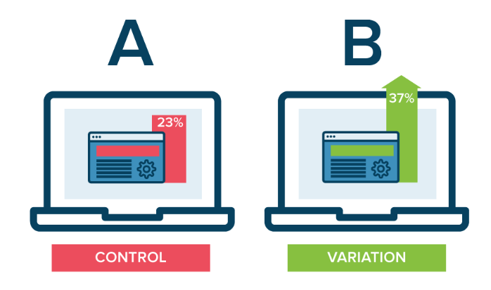
12. Continuously run A/B tests
Your website isn’t a one-time project. Use experiments to learn what actually improves conversions for your audience.
A/B tests compare two variations of a page element to see which performs better. Start with high-impact areas and iterate based on statistically sound results.
Begin simple: test CTA placement, contrast, or copy. Keep one meaningful change per test so you can attribute results clearly.
Smart A/B test ideas:
- Primary CTA placement (top vs. middle vs. bottom)
- Button contrast and size relative to surrounding elements
- CTA text (e.g., “Start Free Trial” vs. “Get Started Today”)
- Hero imagery or value proposition headline
- Headline specificity and benefit framing
- Number of top-level navigation items
If you’re new to testing, start here: Beginner’s Guide to A/B Testing.
Conclusion
Design decisions determine whether your site succeeds or stalls. Treat design as a lever you can pull—then measure the impact.
- Every site can improve. Use this checklist to prioritize updates that move metrics.
- Start small, iterate fast. You don’t need a total redesign—ship focused improvements weekly.
- Back decisions with data. Let user research, analytics, and experiments guide what you change next.
Your website is always a work in progress. The more you refine for clarity, speed, accessibility, and trust, the better your results.
Whether your site just launched or has years of history, these best practices will help you compete—and win—today and beyond.