When was the last time you took a truly honest look at your landing pages—through the eyes of a first-time visitor?
On paper, landing page optimization sounds simple. You may even be following a “proven” formula already.
Follow a few principles, earn attention, remove doubts, present a clear next step, and—boom—sales start rolling in.
Right?
In practice, it’s never that easy.
Everything we’ve learned shipping and testing landing pages points to a harder truth: great pages are deliberate, researched, and iterated—over and over.
Yes, there are fundamentals. But you also need inputs from your audience and data from your traffic before you can design a landing page that consistently converts.
- What are your customers thinking the moment they arrive?
- How did they find your landing page (ad, search, email, referral), and what promise got them to click?
- What headline will stop their scroll and make the value obvious in seconds?
- What device, browser, and connection speed are they on right now?
- What pain or job-to-be-done are they trying to solve urgently?
- What proof and path will make them say “yes” and convert today?
That last question—what will make them convert—matters most.
Do you want to know what we really care about on landing pages?
Conversions.
We want more of them—reliably.
You probably do too. According to the studies, only about 22% of businesses have historically reported being satisfied with their conversion rates, which means most teams still have big wins on the table.
Let’s get specific. Below are 10 landing page tactics we’ve used again and again to turn casual visitors into customers.
1. Keep it minimal
“Less is more” isn’t a cliché in landing page design—it’s strategy.
Science and research have shown that stripping away non-essential elements helps people focus and decide faster.
Minimalism is a reassessment of priorities—removing possessions, ideas, and activities that don’t add value—so what matters stands out.
What’s true in life is true in digital marketing.
As Tommy Walker explains in “Why ‘Simple’ Websites Are Scientifically Better”, clarity and simplicity reduce cognitive load. A minimalist website helps visitors process your offer quickly.
Your landing page is no exception.
The simpler, the better.
Overload a page with extra widgets, competing CTAs, and “just in case” sections and you create friction instead of momentum.
A common mistake: multiple offers on one page. Focus beats options. One page, one goal, one primary CTA. Secondary links (like “Learn more”) should support—not compete with—the main action.
That means keep the layout clean, the copy direct, and the form short. Reduce fields to only what you truly need now; everything else can happen post-conversion.
Take a look at this example from Vimeo:
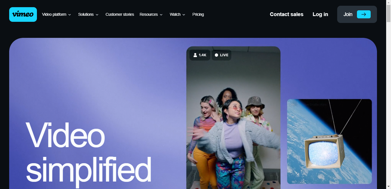
Clean, decisive, and easy to understand at a glance.
This Vimeo Business page pushes one thing: get Vimeo Business.
There’s no confusion about the next step.
- Wallet-out buyers click the primary CTA immediately.
- Researchers can watch the video or scroll for details—without getting lost.
Either way, the page has your attention.
Why? Minimal design, low friction, and a single clear path to conversion.
Fewer distractions and fewer decisions help visitors maintain focus—exactly what you need to lift conversions.
2. Use the five-second rule
We live in a microwave-speed world—your page has only moments to earn trust.
Stuff happens fast.
Your value prop must be crystal clear immediately.
We treat above-the-fold clarity like a five-second test: could a brand-new visitor “get it” in five seconds or less?
How do you achieve that?
Go back to minimalism: a specific headline, a supportive subhead, one primary CTA, and a hero image (or short looped video) that reinforces the benefit.
Keep key benefits above the fold. Don’t make visitors hunt for why the offer matters.
Craig Tomlin, a usability expert, explains why seconds matter:
The reason five seconds is so important is because of research showing people form snap judgments about a site’s quality in fractions of a second—sometimes in as little as 50 milliseconds.
Curious about those studies?
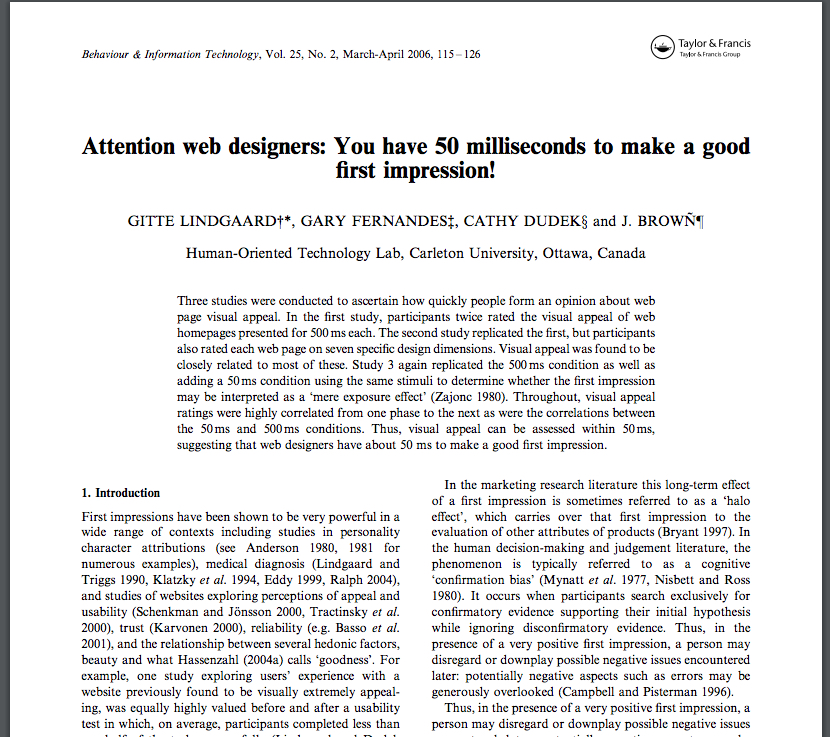
People decide whether they like (and trust) your page in five seconds or less.
You’ve felt this yourself when you evaluate landing pages.
For example, you see this ad in search results…
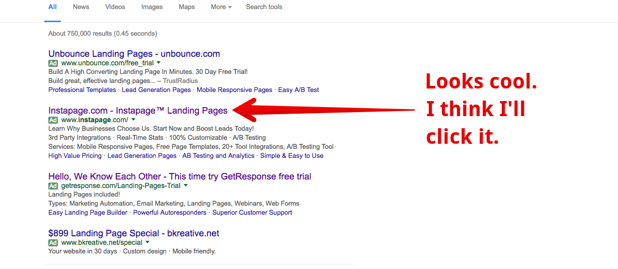
…and then you land here:
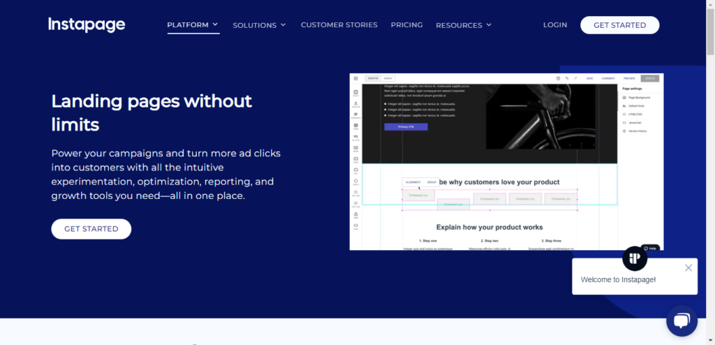
It took us under two seconds to scan the headline, subhead, and CTA.
Do we like it?
Color, imagery, spacing, and copy all nudge that instant judgment.
In five seconds, we’ve decided whether we like this page—and whether we’ll click the CTA.
That’s the five-second rule at work.
3. Make load time lightning fast
Delays kill conversions. Even small slowdowns increase bounce and lower form completion—especially on mobile.
Speed supports the five-second rule: visitors should understand the offer—and see your CTA—immediately.
If your landing page feels heavy, trim everything that isn’t essential and optimize assets. Aim to pass Core Web Vitals: fast Largest Contentful Paint, stable layout, and responsive interactions.
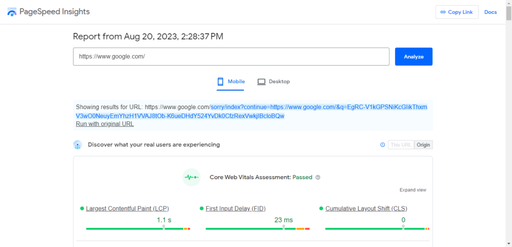
To check your speed, use Google PageSpeed Insights. Paste your URL, review opportunities, and fix the highest-impact items first (image compression, lazy-loading, removing render-blocking scripts, using a CDN, and minimizing third-party bloat).
4. Ditch carousels and sliders
Carousels might look slick, but they split attention and bury your primary message.
That’s why many teams put a slider above the fold—then wonder why engagement is low.
In testing, rotating features usually underperform a single, static hero with one clear CTA.
Notre Dame once tested a homepage slider and found only a tiny fraction of visitors clicked any feature:
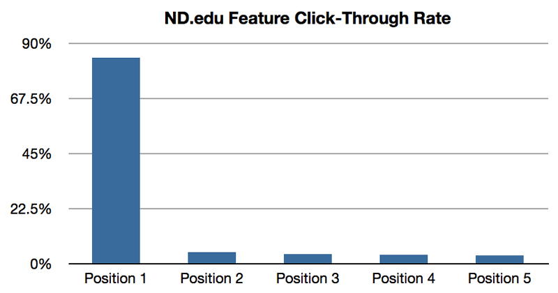
Not ideal.
When the thing to click keeps changing, people click less. Let your best message sit still and do its job.
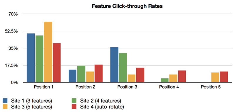
The takeaway: pick the most important thing your page should communicate—then commit to it with a single hero and CTA.
Decide what belongs in the hero instead of cycling through options—and watch clarity improve.
5. Use plenty of white space
Most visitors skim. Dense blocks of text slow them down and increase cognitive load.
Generous spacing improves comprehension and scannability—short paragraphs, clear subheads, and bullets make your message digestible.
In other words: let your copy breathe. High-contrast typography, adequate line height, and comfortable margins make reading feel effortless.
Follow this rule and navigation becomes obvious, section by section.
Notice how Buffer uses white space on its landing page:
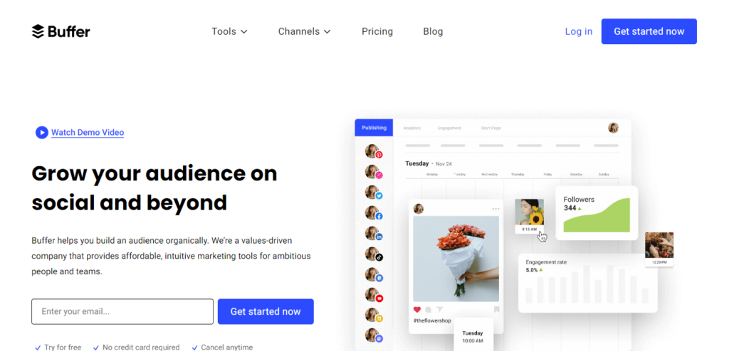
Compress the content and it barely fills a corner—white space gives the message room to land.
Apple is famous for this—brand, product design, stores, everything.
Its MacBook landing page leans into negative space:
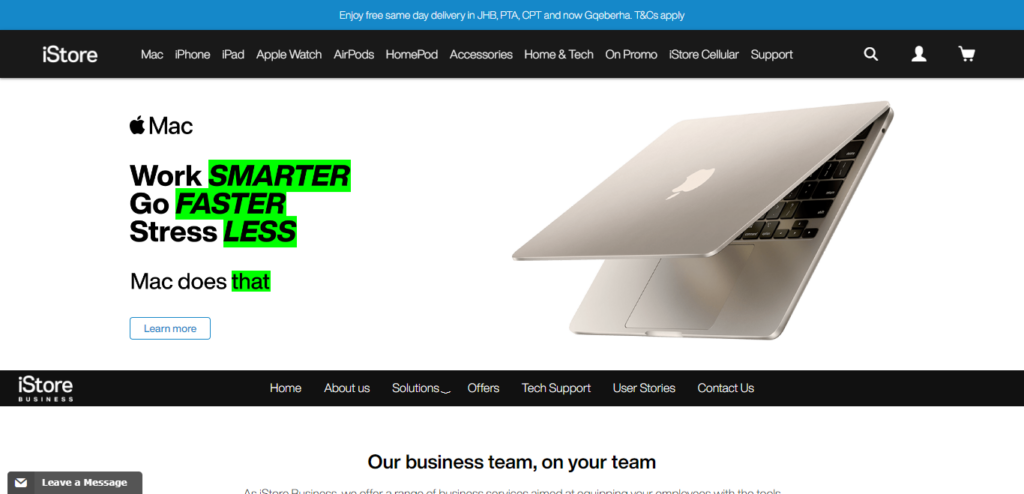
Borrow this playbook. If everything is emphasized, nothing is. Use space to guide attention to the few things that matter.
6. Use social proof for leverage
We’re social creatures. Seeing that others trust you lowers risk and accelerates decisions.
Often, the right proof snippet is all it takes to convert someone who’s on the fence.
Show recognizable customers (with permission), review counts, star ratings, awards, security badges, and outcomes (“+38% demos in 30 days”). Keep it compact and scannable.
We call a strip of well-known logos “logo porn”—and it works when used sparingly and honestly.
Crazy Egg highlights familiar brands that use the product:
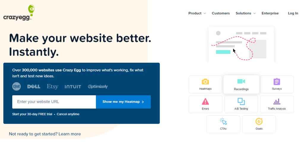
This takes little space and communicates trust at a glance.
Leadpages uses the same approach (on a landing page about landing pages):
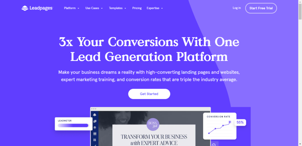
Use social proof to answer the quiet question: “Do people like me succeed with this?”
7. Make contact info readily available
Put yourself in a prospect’s shoes. If they can’t find a way to reach you, trust drops.
They’re wondering if you’re real—or if you’ll take their money and disappear.
Make your contact details visible without a click: phone, email, live chat, office address, and support hours. If you’re B2B SaaS, add compliance badges and links to docs and status.
Quip shows contact information right at the top. If you want to call, you can.
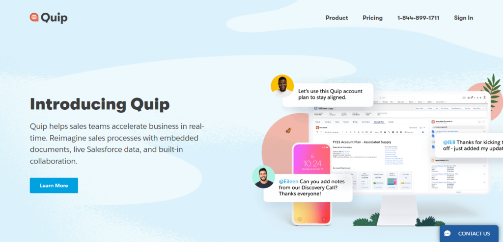
This signals legitimacy and lowers anxiety—especially for higher-ticket or mission-critical purchases.
8. Pepper in testimonials
Testimonials are old-school—and still effective when specific and credible.
Pair a short quote with the person’s name, photo, role, and company. Add the concrete result they achieved (“cut onboarding time from 14 days to 3”).
Quip’s landing page is a solid example:
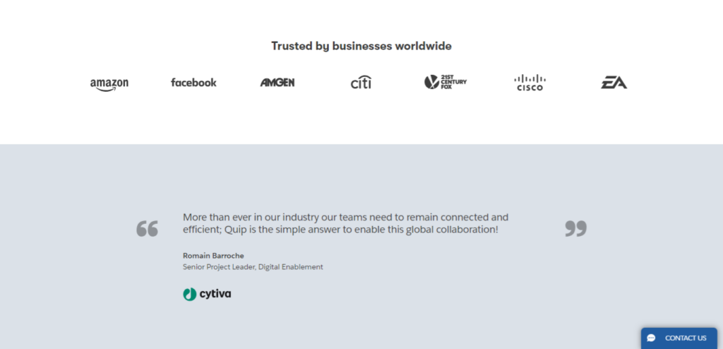
As HubSpot shows, the most persuasive formats include a headshot, full name, title, and a recognizable logo.
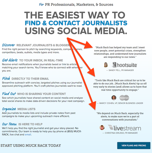
Some quotes will come from big names. Others will come from people who look exactly like your buyer—both types matter.
Tweet Hunter mixes testimonials from creators with small and large audiences.
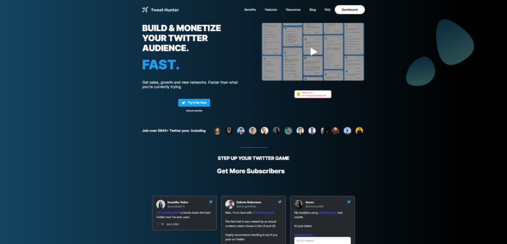
Done right, testimonials help a casual visitor picture themselves as a successful customer.
9. Add video
Short, purpose-built videos on landing pages can meaningfully increase conversions—especially for complex products.
That’s a lift you can’t ignore.
Yes, we still love minimalist layouts. You can keep things simple and use video strategically: one concise explainer or demo that reinforces the value prop.
Take ClickFunnels: its page shows a video that starts as soon as you arrive:
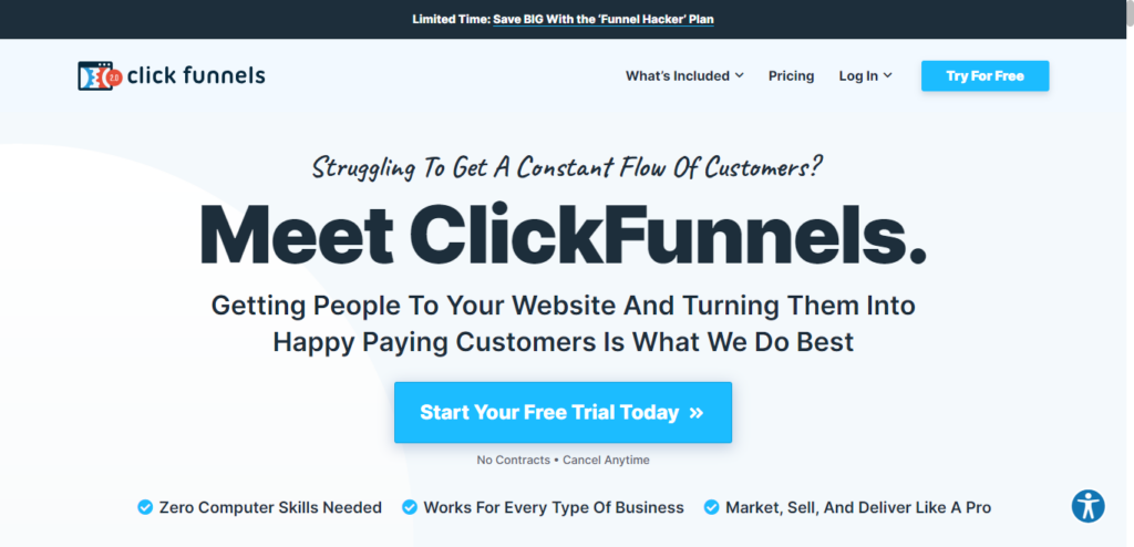
It’s quirky, human, and conversational.
We’re engaged.
After a minute or two, we’re more likely to convert because the benefits feel concrete. Pro tips: keep it short (under five minutes), include captions, make the first three seconds count, and don’t auto-play sound.
Use video to teach, remove doubts, and create a quick personal connection—not to add noise.
10. Add social share buttons
Debates aside, visible shares and easy sharing can influence behavior—people trust what others endorse.
Place share buttons where they support the goal (e.g., content-driven pages) and keep them unobtrusive on pure conversion pages. Pair with clear open-graph titles and images so shares look good everywhere.
Conclusion
Even visitors who didn’t set out to buy can be nudged to act when your page is clear, fast, focused, and credible.
Landing page optimization takes empathy and repetition. You’ll research customers, map their jobs-to-be-done, and test your way into the version that wins.
We’d never suggest skipping hard work like interviews, analytics, and message testing. That’s how you find the story that converts.
But when you need a practical playbook, these ten tactics help you move fast—ship a focused page, measure, and iterate.
Use them to build landing pages that attract attention, remove friction, and turn more casual visitors into customers.
