There are two dependable ways to make more money from your website.
The first is to attract more qualified traffic. The second—often faster and cheaper—is to convert more of your existing visitors into customers.
A/B testing is one of the most reliable ways to uncover those extra conversions.
If you’re ready to start A/B testing your website, smart move.
Structured experiments reveal which changes actually help you hit your goals instead of guessing and hoping.
Want to lift conversions?
Adjusting color contrast, button size, wording, or placement can all move the needle—sometimes dramatically.
A/B testing lets you prove what works, and running it continuously will make your site more efficient over time.
Before you begin, it’s important to understand the basics. It’s not a one-and-done task—it’s an ongoing practice.
Below, we’ll show you how to use this strategy to improve your business and boost your conversion rates in a methodical, measurable way.
If you’re just getting started and want a tool that makes experimentation and insight-gathering straightforward, Crazy Egg is a solid, beginner-friendly choice. It shows where people click, how far they scroll, and what gets ignored—so you can spot problems before you test.
You can set up simple A/B tests without a developer, and the results are easy to interpret. Heatmaps and scrollmaps make behavior crystal clear, helping you prioritize high-impact ideas.
When you want more depth, Crazy Egg’s session recordings let you watch real users navigate in real time. It’s not just testing—it’s learning how and why visitors behave the way they do.
That kind of clarity keeps your tests focused and effective.
Now let’s cover the fundamentals of A/B testing.
How A/B testing works
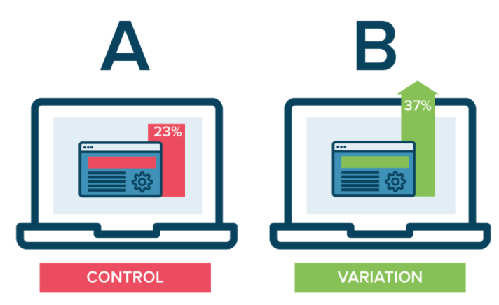
A/B testing is simple in concept: form a hypothesis about one specific element, create a variation, and run both versions simultaneously to see which wins on a clearly defined metric.
You’ll serve version A (control) to a portion of visitors and version B (variation) to the rest. The split should be randomized and consistent during the test window.
Here’s a visual representation to make it concrete:
Let the test run until you have enough traffic to detect a meaningful difference. Then ship the winner—or learn from an inconclusive result and test the next idea.
The hardest parts are deciding what to test and how long to run it. There isn’t one universal answer, but the guidance below will help you choose well and avoid common pitfalls.
Let’s dig in.
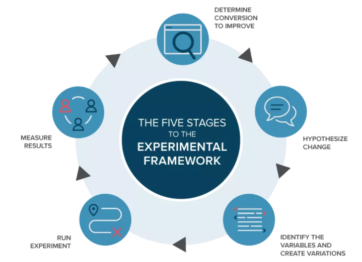
Set a clear goal for your testing procedure
Here’s a simple visual of a healthy experimentation process:
Start by choosing the single conversion you want to improve (your primary outcome). That might be purchases, trial starts, demo requests, or qualified leads.
Don’t tweak everything at once.
Changing multiple components simultaneously makes results ambiguous and hard to trust.
Instead, pick one element tied to your goal and isolate it.
If you’re unsure where to begin, these high-visibility components are great candidates:
Test your CTA buttons
When conversions are the target, start with the element that triggers them—the call-to-action.
CTAs vary by business and page type: buy now, add to cart, start trial, book a demo, subscribe, and so on. Align the test with the page’s intent.
Focus on one hypothesis at a time. If you test multiple changes at once, you won’t know which detail drove the impact.
That’s why you should be testing continuously —small wins compound fast.
Good first tests include size, contrast ratio (for accessibility), and placement. For example: “A larger, high-contrast CTA near the fold will increase the click-through rate.”
You can also test the CTA copy. Try clear action phrases against value-first messages to see which resonates with your audience.
Here are some power words often used to nudge action:
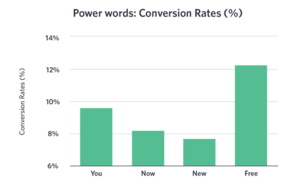
Do any of these appear in your current CTAs? If not, test a version that adds urgency or specificity without being spammy.
Here are more data points on action-oriented language:
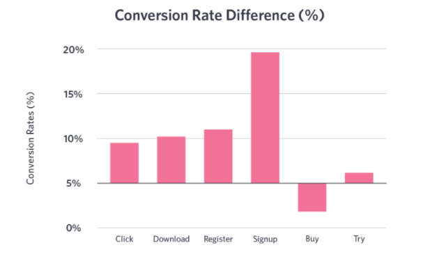
Based on patterns like these, you might hypothesize that “Sign up for free” will outperform “Download now.” The only way to know is to test it on your audience.
Once you finish one CTA test, move to the next variable: color, copy, then placement. Repeat on other key pages.
Fewer than half of websites have CTAs visible within three seconds. Making yours obvious and compelling is an easy competitive edge.
Evaluate your headings
After CTAs, test what visitors see and scan first—your headlines and subheads.
If the headline misses, many users won’t stick around to read the rest. Great headlines clarify the value proposition fast and reduce confusion.
Measure not only conversions but also engagement signals like scroll depth and average engagement time. Stronger headlines often raise both.
Here’s an example of a headline A/B test that isolates copy only:
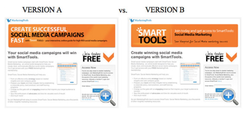
Everything is identical except the wording. In this case, version A drove a 27.76% lift in form completions over version B.
If your variants are within ~5% of each other, consider that a tie. To understand your site’s natural variability, run an A/A test before your first A/B to establish a baseline.
Improve your checkout process
Running an ecommerce site? Prioritize tests that reduce cart abandonment.
Experiment with checkout layout and friction points to see what helps more shoppers finish. Remove distractions. Surface trust signals where they matter.
Here are ideas to test:
Coupon field behavior (collapsed vs. exposed), guest checkout vs. forced accounts, the prominence and placement of security badges, express wallets (Apple Pay/Google Pay/Shop Pay), and a clear order summary above the CTA.
Here’s a subtle example from iHerb that illustrates decluttering during checkout:
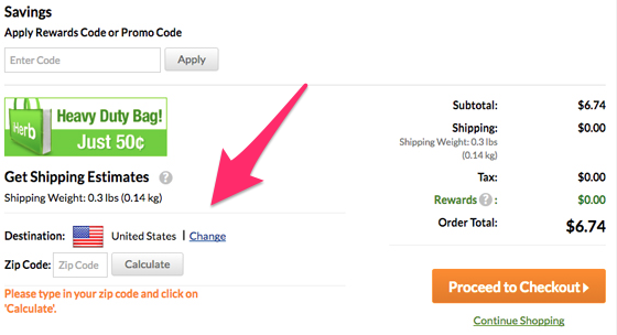
On the left, the shipping calculator is helpful—but a promotional image competes for attention.
Here’s the cleaner variation:
They removed the distracting image and moved the “Calculate” action closer to the primary “Proceed to Checkout” CTA—two small shifts that improve focus.
Simplicity usually wins in checkout. Test and validate.
Find out which images convert
Images shape first impressions. Test them thoughtfully.
Try different subjects (product-only vs. lifestyle), faces and expressions, background styles (full-bleed hero vs. white backdrop), and image positions relative to copy and CTAs.
Also consider file size and loading behavior—faster pages convert better. Keep testing placement and size after you’ve identified the best-performing image type.
Test different color schemes
Color influences attention, legibility, and emotion.
Associations differ by context, but contrast and clarity are universal. Test color for text, links, navigation, and CTAs while maintaining accessible contrast ratios.
Here’s an example focused only on button color:
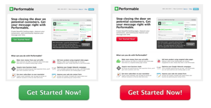
The layouts and copy are identical; only the color changes. In many contexts, “go” colors like green perform well, but don’t assume—test it on your audience and brand palette.
More elements worth testing:
- awards and media mentions (placement and quantity)
- testimonials and social proof (logos vs. quotes vs. star ratings)
- videos (autoplay off vs. on, thumbnail style, length)
- advertisements (presence, density, and position)
Each can change visitor behavior—and your conversion rate.
Once you’ve set a goal, write a clear hypothesis about the change you think will help, then design a test that isolates that change.
Example goal: increase signups.
Example hypothesis: “Making the primary CTA larger and more prominent on the homepage will increase signups.”
Now design the split test that fairly evaluates that idea.
Here’s an example from Yuppiechef:
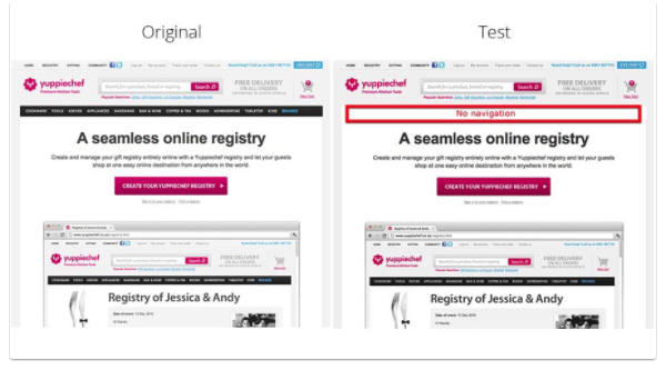
They hypothesized that the top navigation distracted users from the primary CTA.
In the variation, they removed the navigation.
The result: a 100% increase in conversions.
Highrise ran a similar headline-focused test on their homepage:
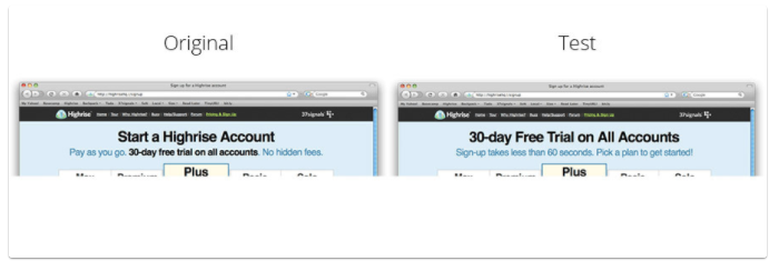
Changing the headline increased clicks by 30%.
In short:
- set one primary goal
- form a specific hypothesis
- run a clean A/B test
- analyze and act on the result
If you change too many things at once, you won’t know which change mattered—keep tests focused.
Select a platform to run your A/B tests
Okay.
You have a goal and a hypothesis.
Now you need a way to implement the test on your site.
You don’t have to be a developer to run quality experiments.
Plenty of tools make it easy.
Here are good places to start.
Visual Website Optimizer (VWO) is a strong all-around option.
It lets you design and measure tests with a what-you-see-is-what-you-get (WYSIWYG) editor, so you can create variants without touching HTML or CSS.
Editing headlines or CTA copy is quick, and you can ship tests without waiting on engineering bandwidth.
If you prefer, you can edit CSS or JavaScript for more advanced experiments—but it’s not required for simple tests.
One big benefit of platforms like VWO is freeing scarce IT resources while still running statistically sound experiments.
Optimizely is another popular choice for web experimentation.

In addition to classic A/B tests, you can run multivariate tests and target experiments to specific audiences or behaviors.
It’s easy to modify most on-page elements.
You’ll need a paid subscription to use Optimizely.
They offer a free trial so you can evaluate the workflow before committing.
Optimizely gives you a small code snippet to place on your site.
Follow the instructions and you’ll see experiment data populate in near real time.
If you have a mobile application, you can also run in-app experiments.
Unbounce is another solid option—especially for landing pages.
Here’s the gist:
Build conversion-focused landing pages, integrate analytics and marketing tools, and run A/B tests to optimize for more leads and sales.
Its drag-and-drop editor makes iterating on variants fast.
That simplicity is helpful when you’re moving quickly through test ideas.
It’s a paid subscription as well.
If you’re unsure which platform to choose, start with one of the options above and get your first few tests under your belt.
All of them can support a modern, goal-driven testing program.
Prioritizing The List
After a quick brainstorm you’ll have a long list of potential tests.
Prioritize by expected impact and ease of implementation so you work on the highest-leverage ideas first.
Ask: Will adding a testimonial in a high-visibility spot beat rewriting the CTA? Which has a higher potential lift and lower effort?
The goal is a ranked backlog—then you execute from the top down.
Keep a running log of ideas so good ones don’t get lost.
Examples to capture: new headline angles, alternative CTA copy, adding a free-shipping badge near price, surfacing payment options earlier, or simplifying forms.
Testing one variable at a time can yield steady, incremental wins. Big, well-reasoned changes can produce step-change results—experiment with both. When you’re new to testing, start small to learn the mechanics, then graduate to bigger swings.

Use a simple spreadsheet like this to track ideas, owners, hypotheses, start/end dates, and outcomes. Add a quick score for Impact, Confidence, and Effort to help with prioritization.
Remember: ten tiny wins might add up to 25%, but one smart, bold test can unlock 125% or more. Mix both approaches.
Setting Up The Test
Next, set up the experiment. In this walkthrough we’ll use Visual Website Optimizer (VWO); your exact steps may differ slightly by platform.
First, log in to VWO and click “Create Test”.

Select “A/B test” to set up a classic split test.
Multivariate or split-URL tests can come later, but A/B tests are the best place to start while you build confidence and process.

Enter the URL for the page you’ll be testing.

Use the WYSIWYG editor to create your variation—change the headline, tweak the CTA, or adjust placement. The editor preserves your site’s fonts and styling so variants look consistent.
You can inject HTML if needed, but many tests require zero code changes.

Define your goals. For this example, track the number of visitors who progress from the homepage to the next step in your funnel.
Then add your primary conversion—such as free account signups or completed purchases.

Intermediate metrics (like clicks to a signup page) are useful, but your primary decision should be driven by the final conversion that matters to the business.
For SaaS, that’s typically paid subscriptions; for ecommerce, completed orders and revenue per visitor.
Map the full flow and monitor each step to spot bottlenecks—but always choose winners based on the outcome that drives your bottom line.
Finally, name the test, add notes, set traffic allocation, and define targeting rules. Quick guidance on each:
- Name: Use a descriptive title like “Homepage — Headline Value Prop Test” so it’s easy to find later.
- Notes: Record the hypothesis, variant details, projected lift, and success criteria. This makes learning compounding and shareable.
- Traffic split: 50/50 is standard. You can throttle exposure if you need to limit risk, but avoid uneven splits unless there’s a strong reason.
- Targeting: Filter by device, location, or source if the test is only relevant to that audience (e.g., U.S. only, mobile-only).

Launch the test and monitor for obvious implementation issues (like a broken layout), then leave it alone until you’ve hit the required sample size.
The platform will randomly assign visitors—half to your control and half to your variation—so you can compare outcomes fairly.
When enough data accumulates, you’ll have a clear winner—or you’ll learn what to try next.
If the variant fails to improve the primary metric, stop it and move down your prioritized list.
Understand the statistics behind your data
An A/B test is a statistical experiment. Interpreting results correctly is as important as running the test itself.
Once results come in, you’ll need to separate real wins from noise.
Here’s a quick refresher.
If statistics wasn’t your favorite class, this will get you oriented fast.
Key concepts to know:
- mean (average result)
- variance (how spread out results are)
- sampling (how much data you need to detect a true effect)
The mean is the average performance—e.g., conversion rate.
Variance reflects how much those results fluctuate. High variance makes averages less reliable without more data.
Run an A/A test occasionally to understand natural variance and to catch setup issues.
Here’s an example of using A/A to measure variance.

These homepages are identical, yet one converted 15% better—pure variance.
Split traffic between identical pages on your site to find your baseline variance.
Why this matters:
If your A/B result shows a 15% lift and your natural variance is around 15%, that outcome isn’t trustworthy—it’s likely noise.
A baseline prevents false positives and helps you decide how long to run tests.
Sample size and duration matter, too.
There’s no fixed number of visitors or days that fits every site. Keep the test running until you’ve collected enough data to detect your minimum detectable effect (the smallest lift you care about).
Here’s what early results might look like after just a few days:
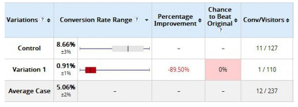
It might look like the variation failed.
But the sample is too small to be confident.
Two weeks later, the fuller picture emerges:
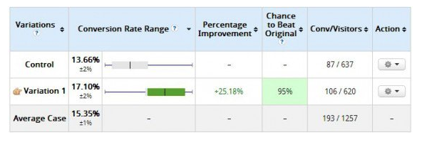
The variation shows a 25.18% improvement.
Lesson: watch for glaring issues early, but don’t “peek” daily and stop the test as soon as you see green—that inflates false positives.
Give your test enough time and traffic to be trustworthy, accounting for day-of-week effects and seasonality.
Use A/B tests to improve your emails
Your website isn’t the only place where experiments pay off. Email is a powerful testing channel, too.
All the usual suspects are testable: CTA copy, colors, images, and headings.
But email adds a few unique levers.
Test subject lines (value-forward vs. curiosity), preview text, send time and day, sender name, and message length. Hold content constant when isolating the subject line so you can attribute differences in opens and downstream conversions fairly.
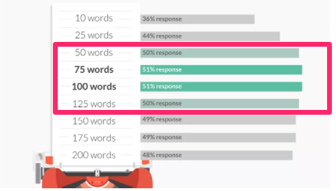
Test message length, too.
Some research has suggested shorter outreach emails (roughly 50–125 words) can perform well, especially for direct asks. Your audience and email type matter—so validate with your own tests.
Think beyond opens: track clicks and, most importantly, the final conversion that email is supposed to drive.
Email plus on-site testing gives you a full-funnel view of what really works.
Revisit your early tests
A/B tests shouldn’t run for only a day or two.
Plan for at least a few weeks per test to gather enough data for confident decisions.
If you run four or five CTA tests, that alone could span multiple months. Then you’ll move to headlines, images, colors, forms, and checkout.
By the time you cycle through a full backlog, your first tests may be a year old—revisit them. Products, audiences, and traffic sources evolve. What won last year might not be the winner now.
Conclusion
A/B testing remains one of the most effective ways to lift conversion rates and revenue.
But it’s not a single project—it’s an ongoing process. Keep iterating with focused, hypothesis-driven tests.
Start with high-impact elements like CTAs, headlines, forms, and checkout flow.
Then test visual and layout details such as images, color, and spacing.
Apply the same rigor to your email campaigns to optimize the full funnel.
When you finish one round, move to the next element—and then circle back to revalidate earlier winners.
You now have the essentials: what A/B testing is, how to run trustworthy experiments, and how to use the insights to grow faster.
If you haven’t started yet, plan your first test now. It’ll lower your cost per acquisition and give you a sustainable advantage over competitors who still rely on guesswork.