There’s a lot of noise about A/B testing and what it can actually do for a website’s performance. It gets overwhelming fast. I dug deep to separate what works from what’s just hype.
I turned a small cross-functional team loose—a writer, a software developer, and a designer—and had them test relentlessly for months. No idea was off the table. The verdict? Most test ideas don’t move the needle. But nine patterns consistently did, and you can deploy them right away.
One important note before you start: to get meaningful wins, you need more than a final conversion number—you need to see how people actually interact with your page. That’s where a tool like Crazy Egg shines with heatmaps, scroll maps, and click reports that reveal what gets attention (and what gets ignored).
Use those insights to spot friction and missed opportunities before you launch a test, so you’re not testing blind. Then spin up a clean A/B experiment: one clear hypothesis, one change at a time, proper device segmentation, and enough traffic to reach significance. Crazy Egg makes it easy to compare versions and confirm what actually drives results without overcomplicating the process.
9 A/B Testing Ideas that Really Work
1. Include Trust Signals
I’ve all bounced from a site that just didn’t feel right. That feeling usually comes from weak or missing trust signals—and it directly affects your conversion rate.
Trust signals are the icons, copy, images, and micro-elements that help visitors feel safe giving you their time and information. Err on the side of more (and more visible). Prioritize signals near high-risk actions like pricing views, add-to-cart, and checkout.
Common examples include independent ratings and certification logos, real customer photos, clear returns and warranty copy, SSL and payment badges, and straightforward contact info. Authenticity matters—link badges to their source when possible and avoid anything that looks decorative or fake.
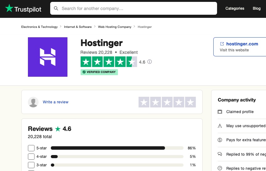
Here’s one example from web hosting giant, Hostinger.
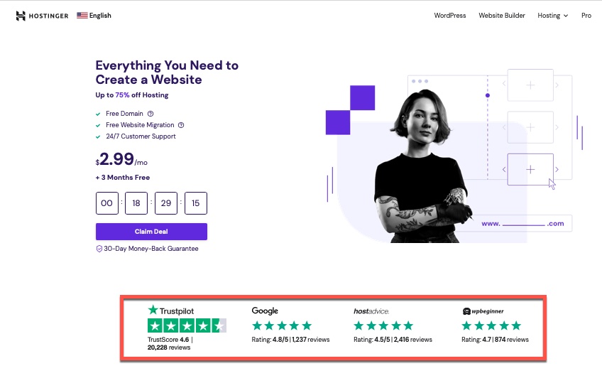
The third-party reviews shown on the Hostinger home page are clickable and send visitors to the source, which boosts credibility.
When you click on the rating, you go to the respective review site where you can read details and confirm the ratings are independent.
Trust marks—like Visa Secure (the current, EMV 3-D Secure program that replaced “Verified by Visa”), BBB Accredited Business, or Google Customer Reviews/Seller Ratings (which replaced the old Google Trusted Stores program)—also reduce anxiety at the moment of purchase. Place them close to forms and payment fields and pair them with plain-language assurances (e.g., “30-day returns,” “No hidden fees”).
Bonus: trust elements refresh your visual design and guide the eye when used intentionally. Just make sure they’re real, recent, and relevant to the decision on the page.
Text-based trust works, too. Prominent testimonials, with names and context, can outperform generic quotes. Try a short benefit-driven pull-quote beside your CTA.
Bottom line: make credibility obvious at the exact moment someone is deciding whether to engage or buy.
2. Remove Distractions
“Less is more” is especially true on home and landing pages. If your pages aren’t converting, take a hard look at visual noise, competing CTAs, and off-path links.
When visitors have to work to figure out the next step, most leave. A clean hierarchy, a single primary goal, and concise copy improve clarity and lift conversions.
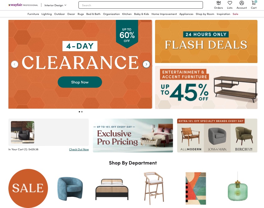
Wayfair is one of those sites that doesn’t follow this advice. On arrival, you’re hit with options everywhere. Unless you know exactly what you want, it’s easier to abandon than to sift through the noise.
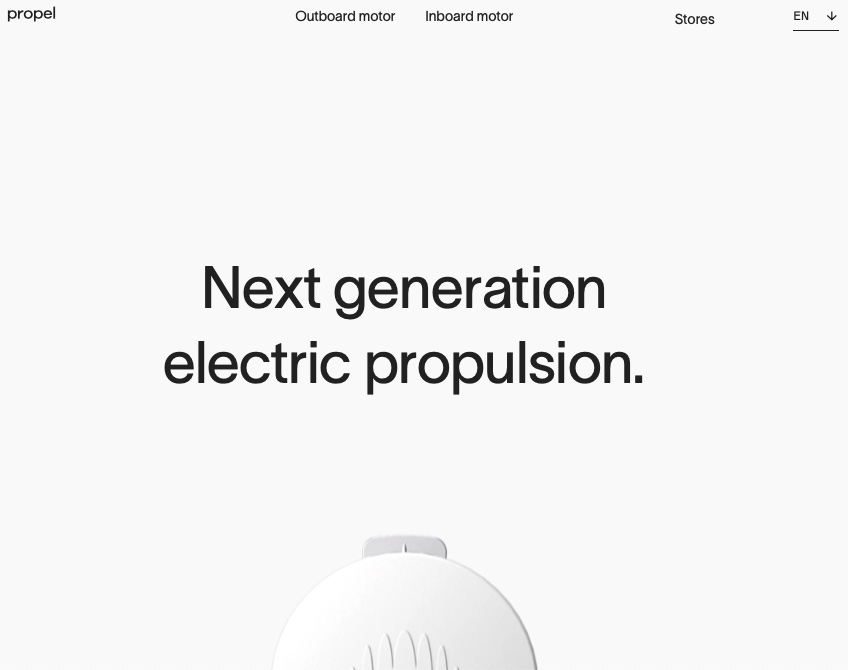
Contrast that with Propel’s launch page for its marine motors—singular message, obvious action.
You don’t need to go full minimalist unless that matches your brand. Do make the primary path unmissable, hide or demote secondary links, and keep copy scannable.
Quick tests: remove carousels, reduce navigation on landing pages, delay pop-ups until after engagement, and give your primary CTA generous white space so it stands out immediately.
3. Add Social Proof
People want evidence before they commit—especially online where they can’t touch the product. Reviews, ratings, and real-world results are powerful decision shortcuts.
This is social proof at work.
Whether it’s customer reviews, usage counts, or testimonials, well-placed proof nudges people to act. Emphasize recency, authenticity, and volume.
Nobody does it better than Amazon with star ratings and verified-purchase labels.
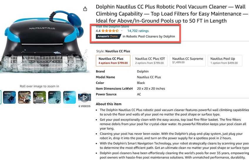
Those “Verified Purchase” tags filter noise and build confidence that the feedback is real.
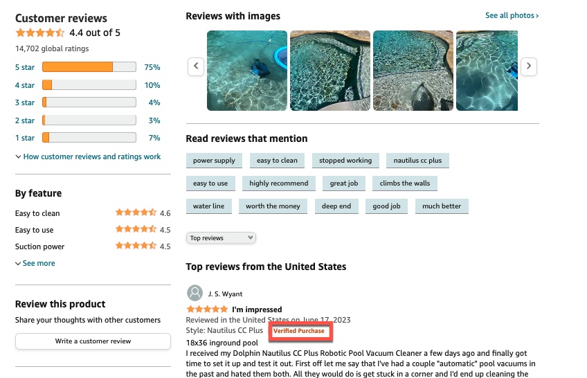
You don’t need Amazon-level scale. Ask every buyer for a quick review, make submission easy, and highlight the most helpful comments near the CTA. Show total ratings and averages, not just hand-picked praise.
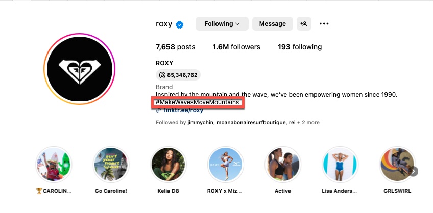
Invite customers to share purchases with a branded hashtag and feature their posts. User-generated photos consistently outperform studio shots for trust.
Surf brand Roxy does this with #makewavesmovemountains on Instagram. Shoppers become part of the brand story.
Even a little proof beats none. Start with a handful of authentic reviews and place them where they reduce doubt the most.
4. Reimagine Your CTA
Your call-to-action is prime real estate—the moment where attention turns into action.
Make it unmissable. The goal of the page is to earn that click.
Two levers matter most: the words and the design.
Skip generic labels like “Click Here.” Use action-plus-outcome copy that fits your brand voice (e.g., “Start My Free Trial,” “Get the Guide,” “Build My Site”). Pair with tiny risk-reducers nearby (“No credit card,” “Cancel anytime”).
Design-wise, choose contrast, size, and whitespace that make the button obvious without clashing. On mobile, consider a sticky CTA so it’s always within thumb reach.
Test one element at a time—label, color, size, position—and segment by device. Track clicks, downstream conversion, and time to action so you don’t pick a winner that only boosts empty clicks.
Set up Version A (control) vs. Version B (variant) so traffic splits evenly and the CTA change is the only difference.
Measure CTA clicks and completed goals for each version to identify the true winner.
If you’re new to testing, my detailed guide walks you through setup step by step.
5. Stop the Scroll
Attention is scarce. Keep critical information and your primary CTA visible without excessive scrolling.
If people have to hunt for the next step—or your CTA sits far below the fold—many will leave before they see it.
Design for fast decisions. Put the value proposition and CTA high on the page, then repeat CTAs after key sections for those who need more context.
Always check the mobile view. A layout that looks balanced on a 27 inch monitor can bury the action on a phone. Consider sticky bars, accordions for secondary details, and anchor links to reduce scroll fatigue.
6. Make Benefits Crystal Clear
Visitors arrive with a job to be done. Tell them—fast—how you help and what result they’ll get.
This applies to everything from recipes (“Dinner in 20 minutes”) to apparel (“Comfort that lasts all day”). Lead with outcomes, then support with features.
If clarity is missing, people bounce. If benefits are obvious at a glance, they keep reading and convert at higher rates.
There are many ways to do this effectively.
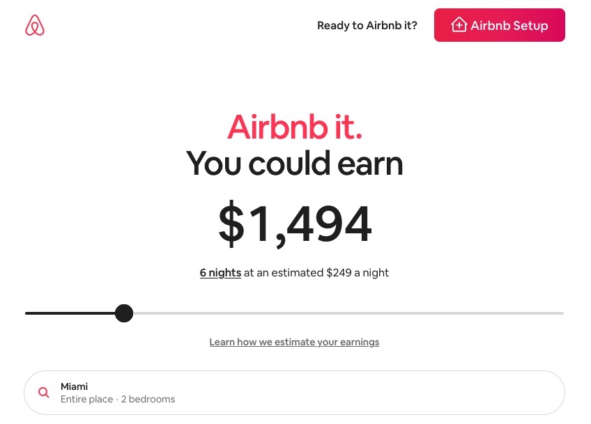
Airbnb does it by showing a prospective host’s estimated earnings—exactly the outcome the user cares about—personalized by location.
They also place the CTA right up top so action is effortless.
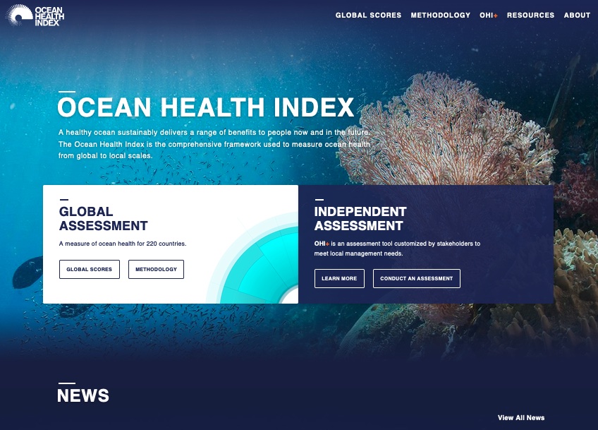
Ocean Health Index leans on short, clear copy paired with strong visuals—another fast path to understanding.
Common thread: the main benefit appears at or near the top and is understandable in seconds. Make that your baseline and watch conversion rates climb.
Pro tip: rewrite feature lines with “so that…” to force a benefit. Example: “Instant alerts so that you never miss a critical update.”
7. Put Your Headline to Work
Headlines are king. They’re often the first words visitors see and the fastest way to earn (or lose) attention.
They also have an outsized impact on conversion rates.
The good news: headlines are simple to test. No redesigns required—just new copy and clean measurement.
Great headlines are specific, concise, and concrete about the outcome. Skip fluff. Use plain language. Where it fits, numbers beat adjectives.
Helpful pattern: “{Desired outcome} without {common pain}.” Another: “{Result} in {time frame}.” Keep it honest and on-brand.
Make sure your headline aligns with the page intent and matches the promise that brought visitors there. Consistency from ad or search result to headline reduces pogo-sticking and lifts engagement.
Want more? Dive into my guide to writing great headlines.
8. Video, Video, Video
Short, focused videos—especially in the hero area—can lift conversions dramatically. They also work mid-page to explain tricky concepts in seconds.
Yes, video takes more effort to produce, but the reuse is excellent across product pages, email, YouTube, and social.
Follow a few rules: hook viewers in the first 3–5 seconds, keep hero videos under ~30 seconds (and most landing-page videos under ~60), add captions for silent autoplay, and include a text summary for accessibility and scanning.
Performance matters. Compress files, lazy-load below-the-fold videos, and choose a strong thumbnail. Then A/B test placement and length to find the sweet spot.
9. Breadcrumbs…Not Just for Cooking
Sometimes your desired action is a big ask—too much for a first click. Ease people in with micro-commitments (“breadcrumbs”) that build momentum.
Most visitors prefer to stay anonymous until they see value. Start with low-friction questions, then gradually ask for more as the user invests.
This foot-in-the-door approach increases completion rates for everything from quizzes and product finders to demos and financing applications.
Begin with one or two easy, anonymous questions.
Then move to a second screen with slightly more personal details—still lightweight—before your main request.
By the time you reveal the big ask, people have already opted in mentally and are more willing to complete the process.
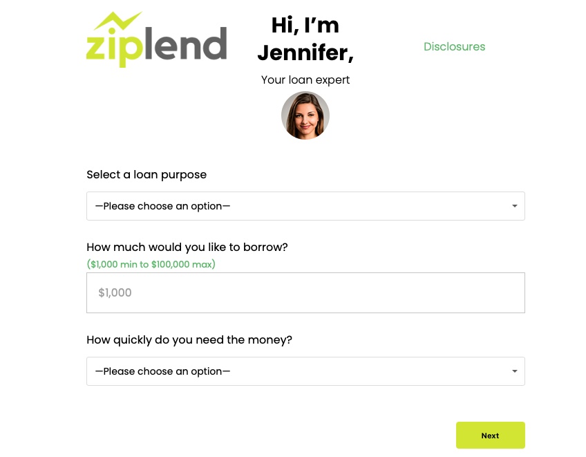
Here’s a great example from Ziplend. Loan shoppers are curious but cautious, so Ziplend breaks the flow into digestible steps.
The journey opens with basic, anonymous questions.
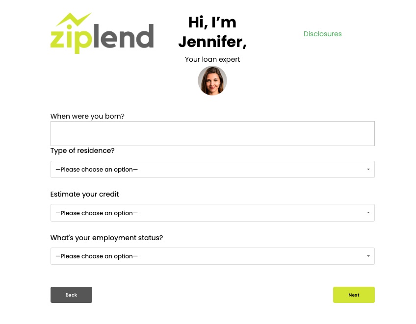
Click Next and the follow-up asks for modest personal info—enough to move forward without triggering alarm.
The third step introduces the bigger asks.
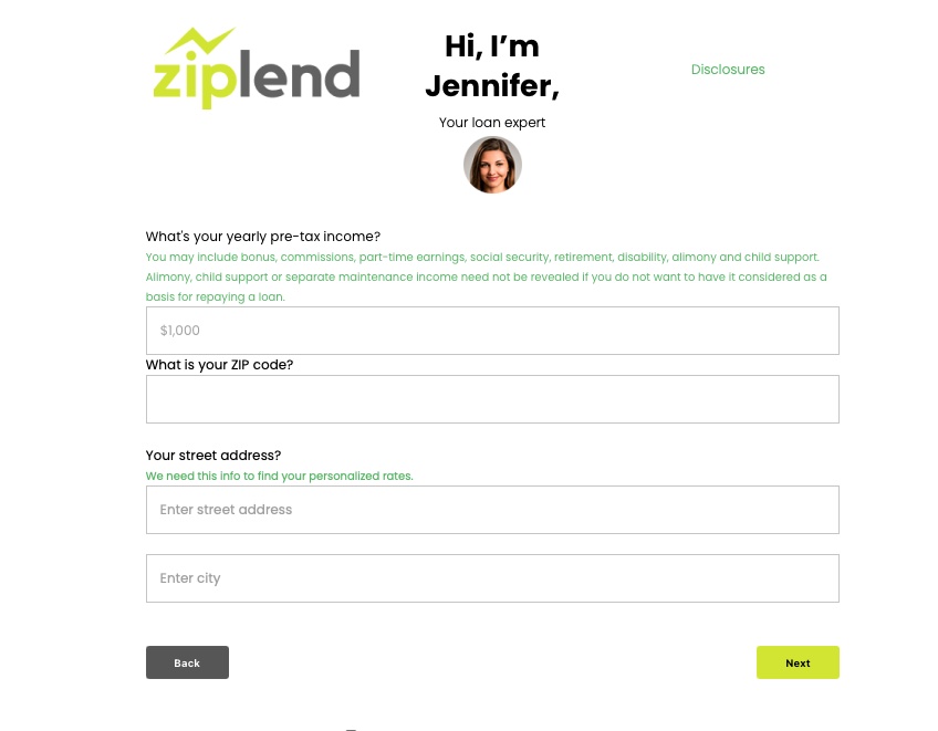
If a visitor reaches this point, they’re far more likely to finish the application.
Use breadcrumbs anywhere the first step feels risky. Add a clear progress indicator, explain why you’re asking for info, and allow people to save and continue later—small tweaks that dramatically improve completion rates.