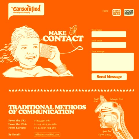
Contact forms are the rubicon for interactions between your company and the outside world. While there are many interaction points and forms on a site (from user account pages, ecommerce checkout flows, etc.), the contact form is the place where users come to connect directly with you. Improving the conversion rate of your contact form can mean big things for your business.
Think of all of the different use cases for your contact form: a superstar employee looking for a job, a potential game-changing partnership inquiry, a new business opportunity or a customer service question that can turn a user with a poor experience into a lifelong advocate.
With all that is riding on your contact form, don’t you think it’s worth spending the time to make it an experience that works?
No matter your use case, an easy contact experience shows users that you care about them.
So, in that spirit, we’ve assembled five tips and an infographic to help you increase the number of people filling out your contact form:
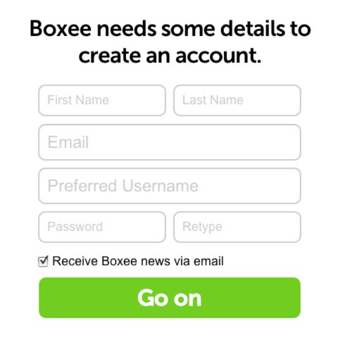
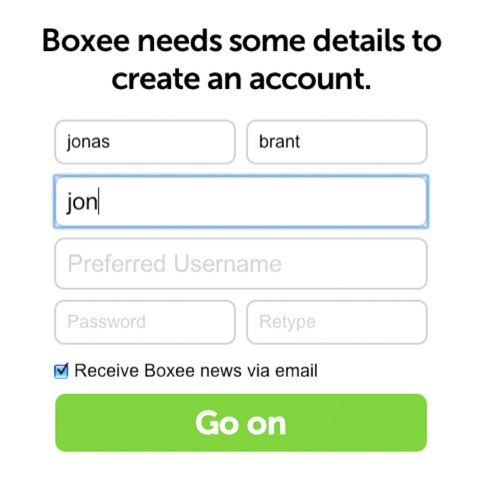
Lesson #1: Fewer form fields equal greater conversion
In many things, simple wins over complex. As Steve Jobs put it, “Simple can be harder than complex: You have to work hard to get your thinking clean to make it simple.”
Your contact form should be simple. If you take away one thing from this post, let it be that eliminating unnecessary form fields can significantly increase the conversion rate of your contact form.
In fact, in 2021 Dan Zarrella at HubSpot researched the contact forms of 40,000 of their customers and found that conversion rate improves by almost half when the number of form fields are reduced from four fields to three.
Stop and read that again: eliminate one form field and increase conversion by 50%.
Don’t you wish improving every part of your business was this easy? So, start here. Look at your contact form and decide what must stay and what can go. Do you really need people’s daytime phone numbers? Cut ruthlessly and measure changes in conversion. You should see them start to head in the right direction.
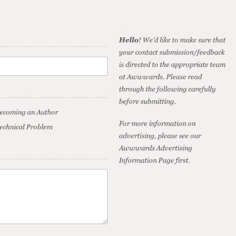
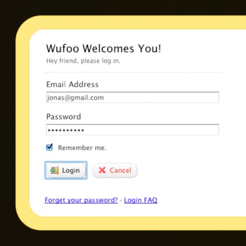
Lesson #2: Create trust on your contact page
People are reaching out to you, an unknown business entity on the web. If you think about it, that’s a big leap of faith. The user takes time out of his or her day to connect with you, and the first thing you do is ask for a bunch of his or her personal information, including name, email address and who-knows-what else. That’s why it’s imperative to create trust on your contact form.
Let people know that they’re connecting with people that are there to help them with whatever they need.
So, how do you create trust? Much like in the real world, it comes down to the little things:
- Related to point one, evaluate the information you request on your contact forms. If you’re asking for overly sensitive information, reconsider it and see if you can collect it from the user later in the process.
- Set expectations for each field clearly to reduce confusion and invalid input errors.
- Be user friendly – insisting that the user insert dashes for a phone number or making irrelevant fields mandatory doesn’t create trust, but it creates friction and unease.
- Clearly articulate what will be done with users information and why you’re asking for it. Let users know their email addresses won’t be added to any marketing lists, sold or shared with partners.
All of these little things create trust that increases the likelihood that a user will complete your contact form and reach out.
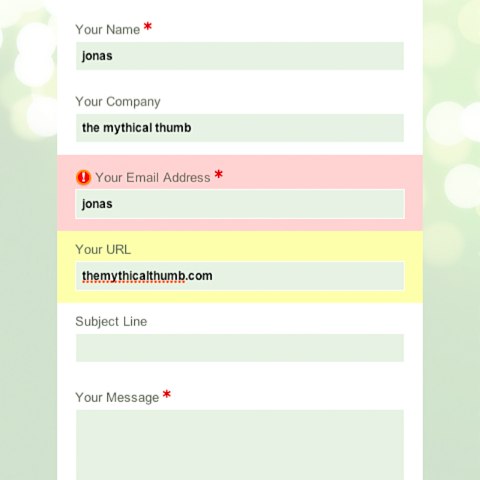
Lesson #3: Provide help along the way
Your contact form serves as a gateway for every type of visitor that may land on your website. From job seekers to salespeople, customers and potential customers, press and more, you’re designing for a very broad audience.
You need specific information from these users to best determine how to help them. A customer needs to be routed to customer service; a new partnership request needs to go to business development; and an inbound SEO inquiry needs to go to the trash.
Because you have needs when it comes to the data you collect, it’s critical that you articulate what you need and why you need it on your contact form. This is where help text comes in. Unfortunately, if companies typically make the contact form an afterthought, help text is an even lower priority. This can lead to some frustrating experiences and reduced conversion rate on your contact form.
How can you use help text to increase conversion? Again, it’s in the details. Provide ghost text in fields to let users know what should go there.
You can even hint at formatting with the ghost text. For example ghost text for phone numbers that use the (xxx) xxx-xxxx example will encourage users to complete the form in that style.
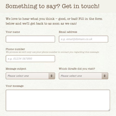
Provide help text below the fields to guide users’ input. When more complicated contact forms are used, provide tooltips next to each field that explain in detail the what and why of the information being collected.
By providing guidance and help in your contact form, you’ll ensure that users are able to make it through to form submission instead of giving up halfway through.
Lesson #4: Reduce friction everywhere
The idea of reducing friction is an ongoing theme. In fact, it should be your default approach to the contact form design. But there are specific elements you can build into your contact forms to reduce friction and improve completion conversion rates.
Set the tab order to allow the user to move quickly and sequentially through the fields. This is especially helpful for mobile and savvy Internet users. Pay particular attention to the final tab order of the Submit and Cancel buttons. Many quick tabbers will complete a form and expect Submit to be the next field. If they go to submit their information and inadvertently choose “Cancel” due to your field ordering, you’ve made someone very unhappy.
Field focus and highlighting: let users know where they are in the contact form. Highlight the respective field where the user is expected to input information. If they get distracted or if the form has many fields, they’ll be able to pick up quickly where they left off.
In-line validation is another way you can reduce friction. Some Javascripts can let users know if they have a malformed email address BEFORE they submit their inquiry. There’s nothing worse than hunting down an error after you’ve tried to submit your information.
In all areas of contact form design look for ways to reduce the friction of the process and watch your conversion rate rise.
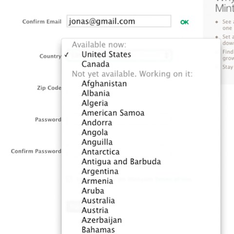
Lesson #5: Design for mobile first
Not only is the mobile audience growing ridiculously fast, designing for the mobile experience first can make your contact form easier to use. For starters, thinking mobile first ensures that you eliminate useless input fields.
If you’ve ever filled out a form on an iPhone, you know how painful each additional field can be. Thinking mobile first also drives important user interface decisions, e.g., whether you put field labels above or to the left of your form elements and what you set as your default options for certain fields.
You never want to be the developer that makes a US-centric audience scroll through 160 countries to get to the United States of America to complete the “Country” field on their mobile device.
Thinking mobile-first also ensures that you’re specifying form element types in your code. When you mark up your form properly, you’re able to leverage native UI elements such as the large, swipeable lists in iPhones and Android devices that make form completion much easier.
You can also code your contact form to take advantage of mobile capabilities to make form completion easier, driving up conversions. Why make users input their location information by hand if they can do so using their phones GPS with a single click? Can you allow photo uploads or voice-driven input? And can you design your forms to take advantage of different device orientations to open up more space for input?
An increasing percentage of your users will be experiencing your site and reaching your contact form on their mobile devices, so it’s critical that you design for their needs. The upshot is that you’ll be improving the experience for every user in the process.
Conclusion
Reducing friction drives conversion rate. No matter what you’re doing with your contact form, the more friction you can eliminate from the user experience, the higher you’ll be able to push your conversion rate. From form fields to help text to layout and design that make the user experience clear and consistent, these choices all impact how many people fill out your form.
By designing for the mobile user, you’ll not only service an ever-growing portion of your visitors, you’ll also reduce friction and improve the experience for desktop users. Contact forms are the interface between your company and the rest of the world.
Make the experience a better one, and you’ll find that communication and conversion will both improve. A higher conversion rate on your contact form can mean big things for your business: from new customers to new raving fans to new business deals and more, a high-converting contact form is an important aspect of any successful online presence.
Need some more inspiration?
We thought it would be fun to create an infographic that not only explains how you can boost your conversions by modifying your form fields, but also shows you the results well-known companies achieved through A/B testing their forms. Enjoy!