For web designers and website owners, shifting design trends can be a good thing or a bad thing. On the one hand, trends give us a deeper understanding of audience desires and preferences. On the other hand, they can very quickly lead to oversaturation. This presents a problem as a website owner, as it’s hard to wow visitors when your website looks exactly like everyone else’s.
With this in mind, we set ourselves the challenge of finding the freshest new website design ideas on the web—the kind that are sure to get your visitors clicking. We put hundreds of websites through rigorous testing in order to find the most engaging designs out there today.
In fact, some of these design ideas are so good, we’re jealous we didn’t think of them first.
1. Squarespace
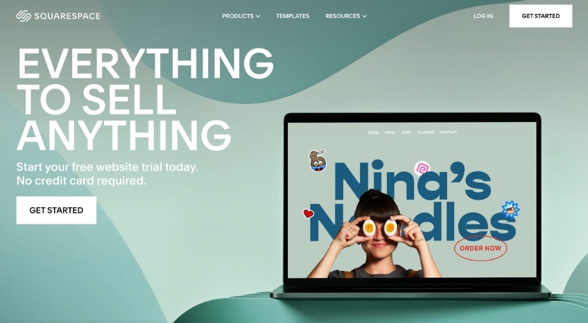
Key takeaway: You can go big and look great on any device.
A longtime web design leader and a favorite of professional developers, Squarespace creates a big impression with its slick, responsive homepage.
A combination of extra large text and bold, dynamic imagery creates an effortlessly cool effect, one that the Squarespace team has managed to replicate on mobile.
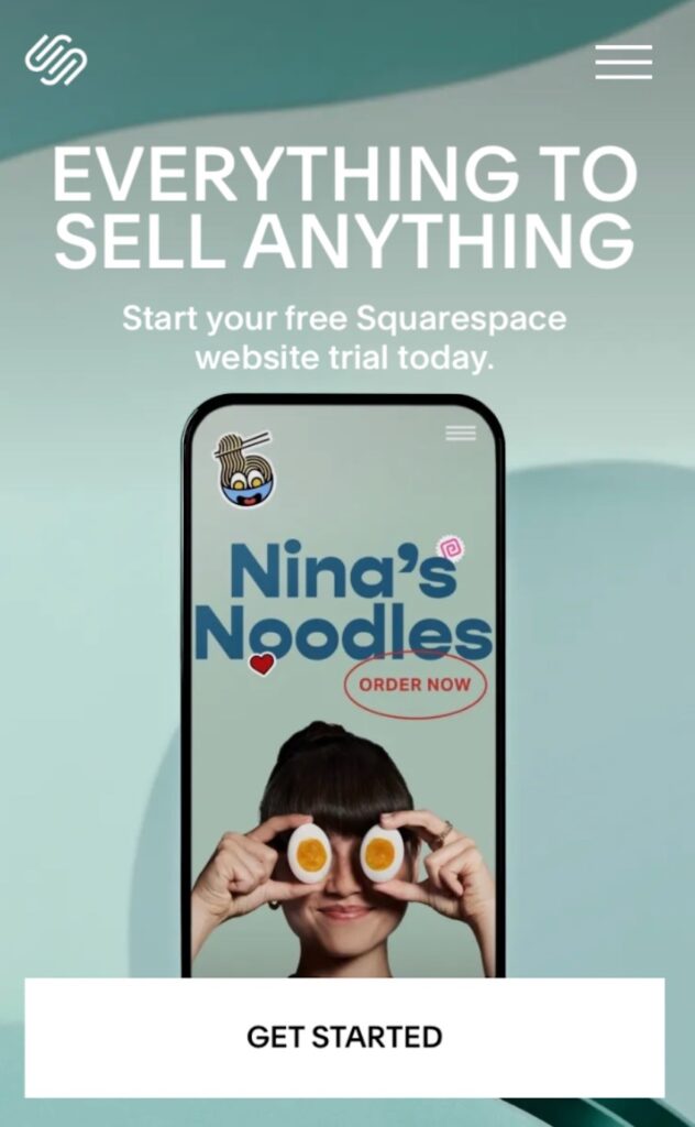
Notice how the homepage isn’t stuffed with information. By gambling on supersized fonts and keeping to one-sentence paragraphs, it’s allowed the graphic elements to hold the visitor’s attention, and, of course, keep them scrolling.
2. Cloudflare
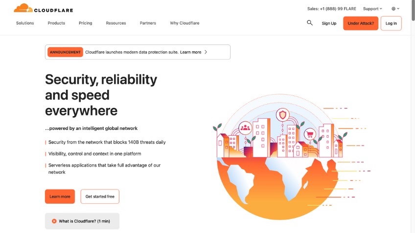
Key takeaway: Little details can make a templated site stand out.
Cloudflare’s homepage proves that you don’t need an enormous budget to make an impact. It’s using the same hero image template that’s free from any decent website builder.
The difference is that it’s nailing every single element.
The design team is also adding small details that take the homepage from good to great. Take for example the Under Attack? CTA button in the navigation bar, which connects visitors’ fears to Cloudflare’s services. It firmly embeds the message, “Under Attack? Call Cloudflare!” into the visitor’s consciousness.
Another element we love is the bright color palette. Orange is linked to feelings of anxiety and impulsiveness, making it perfect for cybersecurity services. Cloudflare’s homepage teaches us a great lesson—you can use color and unconventional CTAs to make an ordinary template look extraordinary.
3. What3Words
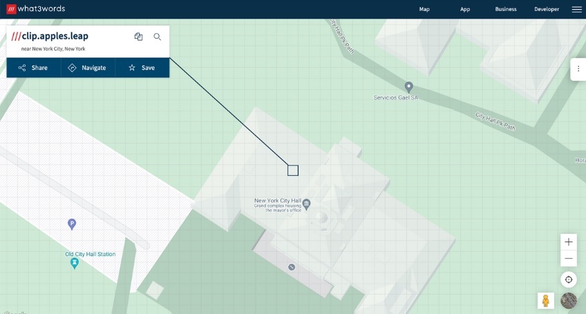
Key takeaway: Your homepage provides a huge opportunity to show off your product.
The team at What3words certainly weren’t afraid to take risks with their homepage, which positions their product at the heart of its design.
What3words is a proprietary geocode system designed to identify any location on earth with three dictionary words. In the screenshot above, you’ll see that they’ve used New York City Hall as an example, and highlighted its three-word address, clip.apples.leap. The example is specific to the visitor’s IP address, so when you visit their site, you’ll be shown an address close to your location.
It’s a gamble, but What3words’s product is easier to demonstrate than describe, so it’s one that really pays off. The key to this website’s success is how stripped back the rest of the design is—note how the minimal navigation bar contains just four words.
Interactive elements entice the reader to click and explore further. A few seconds after you arrive, a pop-up prompts you to search for your own What3words address.
4. Otta
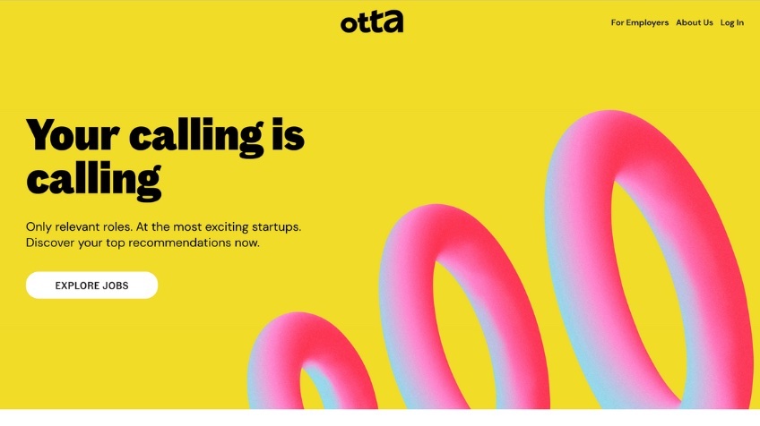
Key takeaway: Less is almost always more.
Otta’s homepage combines a maximalist approach to graphics with a minimalist approach to content. Note that there are only two bodies of text and four buttons above the fold.
This page isn’t stuffed with CTAs, so why are visitors so quick to click on it? It’s all about the simplicity of the design. By keeping navigational options to a minimum, the team at Otta are limiting distractions and helping readers focus on what’s most important: getting started with the product.
Neon yellows and pinks are rarely combined with a minimalist aesthetic (and may seem to go against website design best practices), but it really works here. These bright, energizing colors send the message that something exciting is waiting for you at the other end of that Explore Jobs button.
5. Monday.com
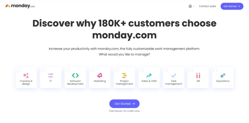
Key takeaway: Asking a question is often more effective than giving instructions.
When your company delivers multiple tools or services, you don’t have the luxury of using minimal copy. The team at Monday.com have found a clever workaround for their homepage, using a simple content block to highlight their services.
This doubles as an interactive element that gets visitors clicking faster. Asking “What would you like to manage?” instantly places the focus on the visitor’s needs, rather than the company’s achievements.
This is a brilliant way to entice prospects to move to the next stage in the marketing funnel, but it’s also just really smart design. Visitors get a clear overview of the product’s functionality without being bombarded by text. Notice how they’ve included very little copy in the navigation bar. This is a deliberate move that helps visitors focus on the key messaging.
6. Thursday
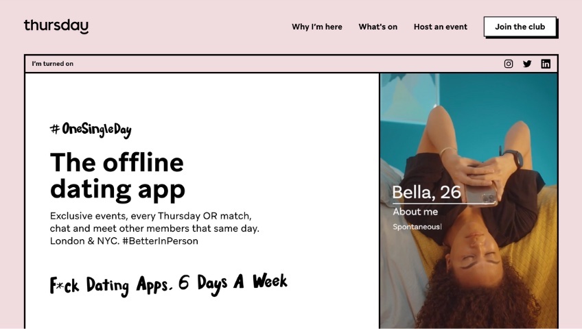
Key takeaway: Using a grid can help keep busy homepages organized.
The team at the dating app Thursday clearly have a lot to say about their product. On the homepage, they’ve included an introduction to the app’s concept, practical details like meetup locations and app availability, strategically placed CTAs, and clever phrasing like “I’m turned on.”
Website planning and content organization are the keys to success for this homepage design. The Thursday team uses a grid to house their copy, allowing them to add extra information without having to disrupt the typography hierarchy.
The grid also pays subtle tribute to a web browser interface from the early 2000s, which is a smart way to stir up feelings of familiarity and nostalgia in their key demographic.
7. Corstange Law Group
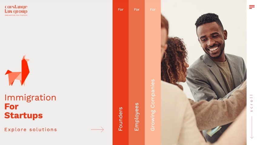
Key takeaway: An eye-catching menu design can help visitors personalize their journey.
Corstange Law Group’s homepage features a truly unique composition. They’ve ditched the navigation bar altogether, instead using a vertical menu to help visitors identify themselves on a list of the group’s three target demographics.
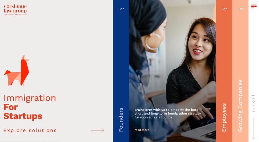
The menu expands on hover, offering key information on how they can address the reader’s specific needs. We love how the color palette is disrupted upon hovering, as a cool indigo blue joins the warm reds and oranges.
Another idea to steal is the designer’s use of arrows to help visitors navigate the page. Note the menu icon at the top right and the subtle Scroll prompt at the edge of the page. These tell the visitor where they need to go without adding additional copy to an already complex design.
8. Notion
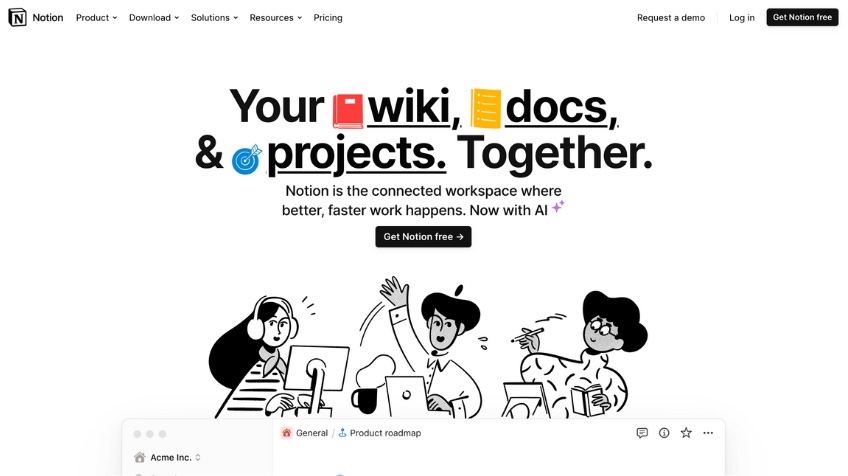
Key takeaway: Visual elements borrowed from your product are a subtle way to tell your company’s story.
Notion is known for its distinctive branding, which revolves around whimsical, monochromatic illustrations. This paves the way for a really impactful injection of color on its homepage.
By adding icons in primary colors to the heading, it’s not only adding visual interest to the page, but it’s subtly reinforcing one of the key benefits of the platform. Notion’s emoji-style icons will be familiar to anyone who’s used the product or seen one of their ubiquitous video ads, building instant familiarity.
We also love the peekaboo effect created by the Notion interface in the next content block—this is a clever way to get visitors scrolling, likely without even realizing they’re doing so.
9. The Ordinary
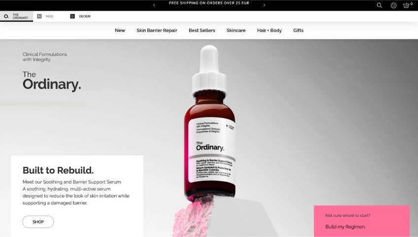
Key takeaway: Don’t be afraid to show off one product above the rest.
The Ordinary’s homepage design really builds on the concept of hero messaging. Not only have they placed their product front and center in the design, but they’ve used layout and photography to evoke strength and power.
By placing the bottle of serum on a platform and shooting it from below, The Ordinary’s creative team calls to mind an athlete on a podium. Where you’d expect to see other athletes, they’ve placed two content blocks, each one boasting an enticing CTA: “Shop” and “Build my Regimen.”
For a beauty brand with over 60 products to promote, focusing on just one product above the fold is a risky move. But it pays off, thanks to the team’s commitment to the concept and their extremely selective use of copy on the page.
10. RCA Records
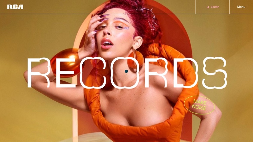
Key takeaway: You can say a lot with a single word.
Many companies would find it impossible to narrow the homepage copy down to just five words, but they can still take inspiration from the extremely restrained approach of RCA Records.
Its homepage features a very simple composition—an image, a single word of text, and a CTA button—but uses a dynamic layout with rotating words and imagery to keep visitors engaged.
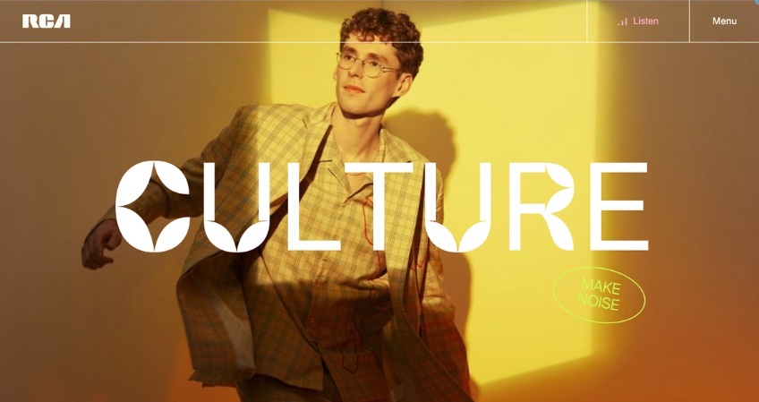
What we really love about this one is the Make Noise CTA button. The copywriting here is mysterious yet intriguing. It strikes just the right balance to interest visitors and guarantee click-through.
The XXL font size is another idea worth stealing. If you think you can edit your homepage copy down to a couple of words, this style is definitely worth testing out.
11. Tines
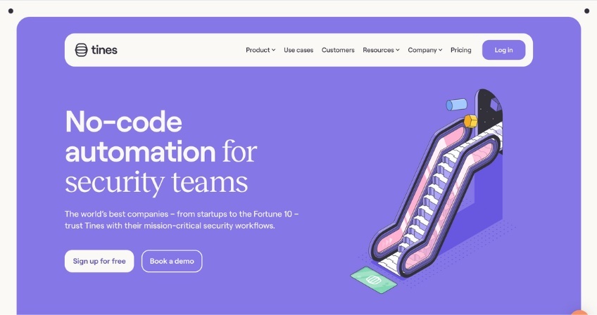
Key takeaway: The smallest of changes can transform a predictable layout.
Another great riff on a classic homepage template, this design borrows elements from software design, inspired perhaps by Tines itself, the startup’s automation platform.
Although the changes are subtle—a floating navigation bar and a block-color background layer with rounded corners—they’re significant enough to make the design feel bespoke.
We also love the inclusion of the Tines logo in the illustration. It’s on the mat at the bottom of the escalator. It really helps create harmony on the page, solving the very common problem of how to connect imagery to copy.
12. Masterclass
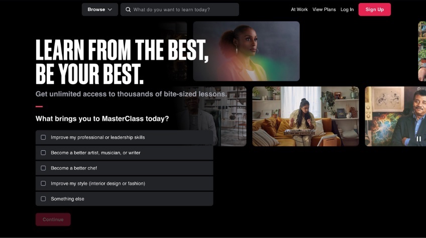
Key takeaway: Layering your content is a great way to highlight what’s most important.
User engagement was clearly a top priority for the team at MasterClass, who built their homepage around a simple question, “What brings you to MasterClass today?”
As we discovered with Cloudflare and Notion, asking your audience a question is a surefire way to pique their interest. The MasterClass homepage takes this idea a step further, by giving the question—and its multiple choice answers—the largest amount of space on the page.
By layering the question content over a dynamic photo gallery featuring course instructors, the MasterClass Team have delivered a personal and inviting journey for its visitors. The overall design makes you feel like a real person is listening to your answers on the other side.
13. Spotify Design
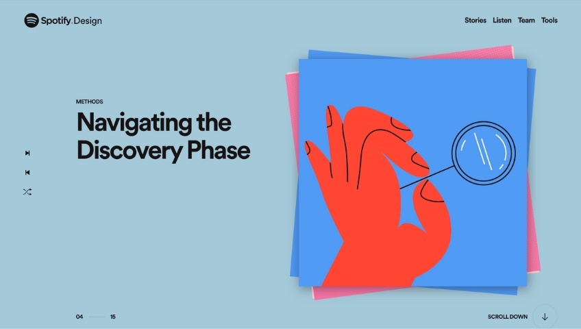
Key takeaway: Keep your visitors on the page by giving them opportunities to explore and discover at their own pace.
Changing color palettes within the visitor’s first 10 seconds is a bold move, but Spotify’s design team have never been afraid to try something new.
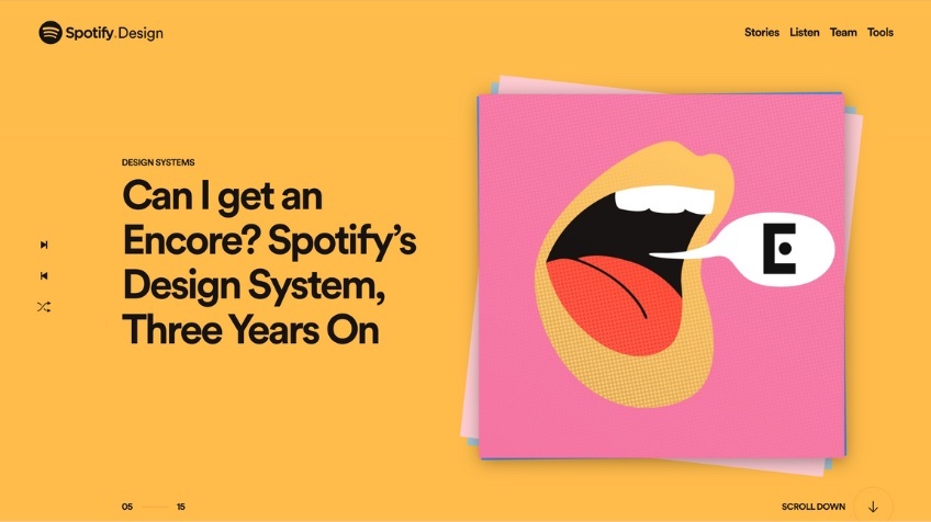
We love what they’ve done with the website for their product design community, Spotify Design. Inspired by one of the platform’s many predecessors—vinyl records—Spotify’s team have created a design that’s both dynamic and interactive. Visitors can click on the pile of “records” to dismiss them, allowing them to browse the website’s content at their own pace. By using imagery that’s consistent but not quite uniform, this layout creates variety and holds the visitor’s interest.
The “Scroll Down” prompt is another lovely touch. It lets visitors know that there’s more to explore below the fold.
14. Momofuku
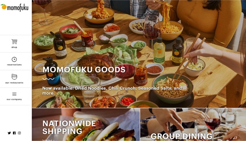
Key takeaway: Use stylized photography to appeal to your visitors’ senses.
Momofuku’s design team needed a way to give the brand’s restaurants and food products equal attention, so they decided to let their imagery do the talking. Rather than highlighting specific restaurant locations or products, they used highly stylized photography to evoke feelings of pleasure and belonging.
The grid layout here is simple but effective. More evocative imagery becomes the visitor’s reward for scrolling, while a chunky menu on the left-hand side provides relief from the visual fussiness of the photography.
We particularly like the use of icons in the menu. This is another great way to create harmony by contrasting those jam-packed photographs.
15. Thrive Digital
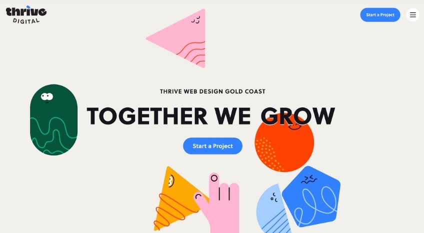
Key takeaway: Feelings of calm can be just as compelling as feelings of urgency.
Animation forms a backdrop to Thrive Digital’s homepage, but it’s not like any animation we’ve seen before. Humanoid shapes float about at a super slow pace, creating an incredibly satisfying lava lamp effect.
It’s a nice antidote to the fast-moving carousels and neon color palettes we’ve seen in abundance recently. The result is a feeling of calm and ease for the visitor. They feel as though they have time to pause and browse. The illustrated hand gently pointing them toward the Start a Project CTA button ensures they know exactly where to go next.
One last detail we think deserves a shout out—the cursor changes from a blue, opaque circle to a transparent pink on hover. This may seem like an aesthetic choice, but it’s also a practical one, as it allows the user to easily read the link text.
16. SurveyMonkey
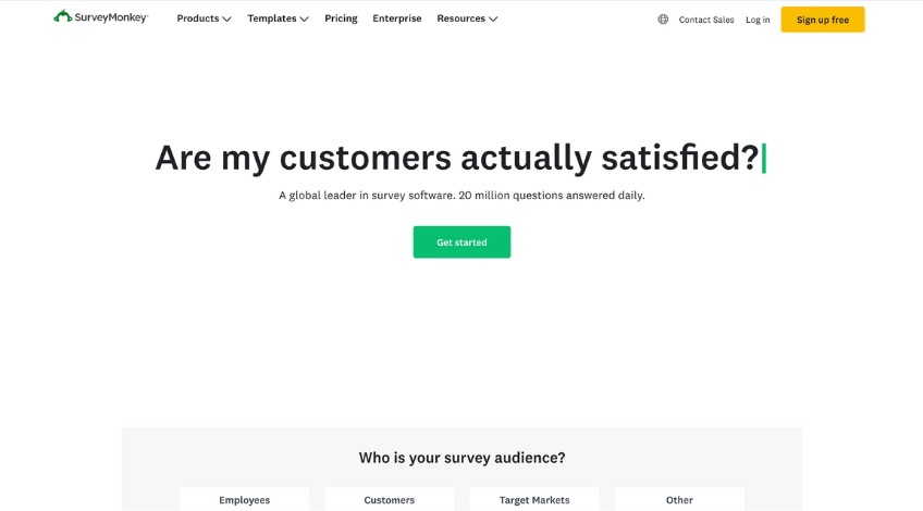
Key takeaway: Dynamic website elements can help you demonstrate some of your most compelling use cases.
Compared to some of the other website design ideas on this list, SurveyMonkey’s homepage may seem sparse, or even basic. But actually, it does everything a good website should do.
It tells us exactly where we need to focus, while keeping distractions to a minimum. It also shows interest in the customer’s journey by asking them a question: “Who is your survey audience?”
A dynamic series of questions forms the primary content block. These are questions the visitor might use SurveyMonkey to answer, like “Are my customers actually satisfied?” and “Are my employees happy at work?”
We really appreciate how these questions are echoed in the subheading, with the words, “20 million questions answered daily.” It’s straightforward and simple yet compelling.
17. Fpp
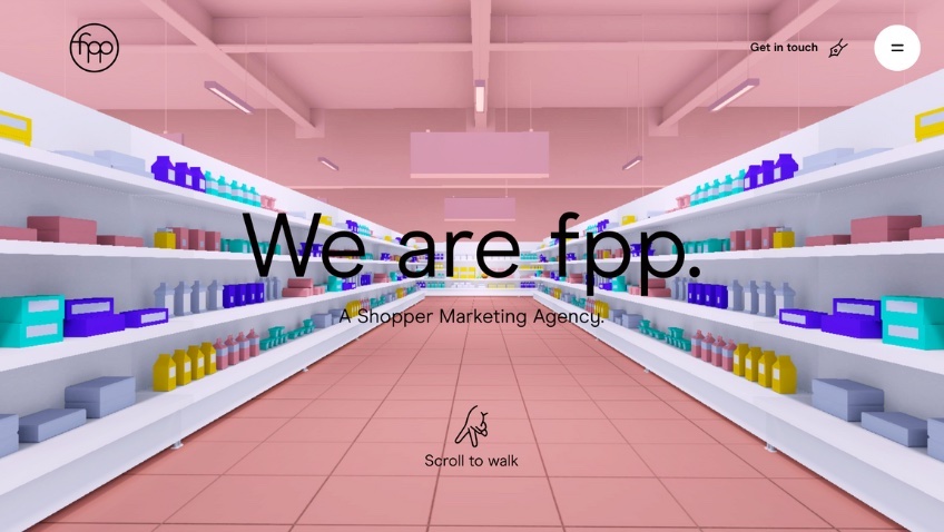
Key takeaway: Don’t just urge visitors to click a button. Invite them on an adventure instead.
FPP’s homepage animation is about as elaborate as they come, taking the visitor on an epic journey inside a pineapple. (Yes, a pineapple.) But the detail that earned it a place on our list is the “Scroll to walk” prompt, complete with an understated icon.
This idea could be used in a ton of different ways across different industries. For instance, a museum’s website could invite visitors on a virtual tour of a gallery, or an activewear brand could use this idea to lead customers up a mountain to a breathtaking view.
It’s accompanied here by bespoke animation, but it doesn’t have to be. A video background could work just as well.
Takeaways
While the website ideas on this list vary in strategy and approach, there are a few common themes across most of the examples:
- Personalization—make each visitor feel as if your website was tailor-made just for them.
- Minimalism—less is more when it comes to copy.
- Intriguing CTAs—a simple question like “Feeling stressed?” is a stronger CTA for a mindfulness app than “Find out more.”
If one of these ideas resonates with you and seems like a good fit for your brand, it’s definitely worth considering a website refresh.